

For issue 15 (fall 2012), we invited 26 typographers, designers and illustrators to make beautiful bitmaps by taking this vestigial part of digital type—the bitmap—and making it into something to be newly appreciated.
A Andrei Robu
B Jason Santa Maria
C Ryan Feerer
D Synoptic Office
E Jesse Ragan
F Ashleigh Brennan
G Delve Withrington
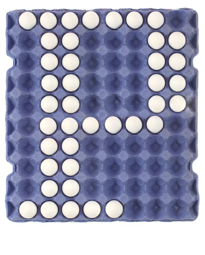
N Neuarmy
O Tiffany Wardle
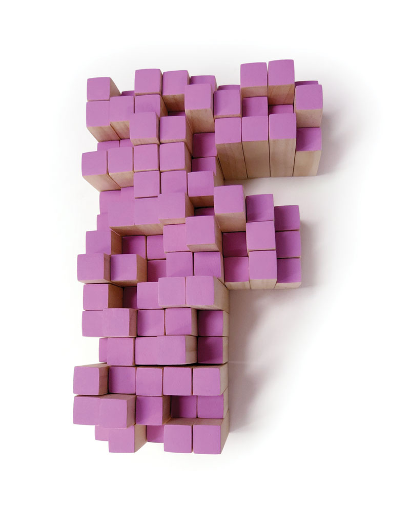
P Working Format
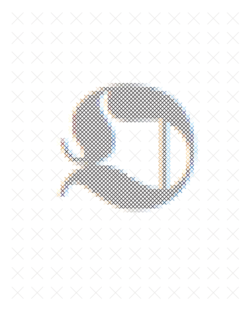
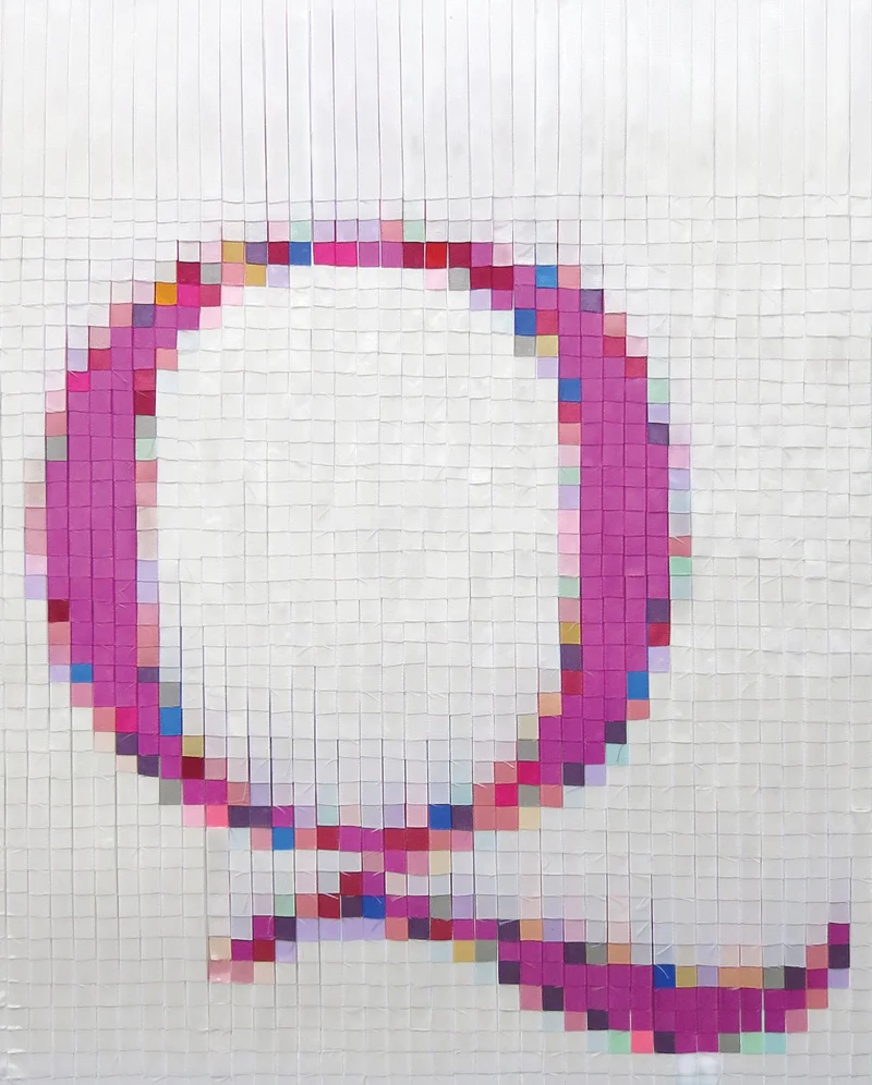
Q Dominique Falla
R Jeff Rogers
S Sawdust
T Carrie Gee
U Martin Gee
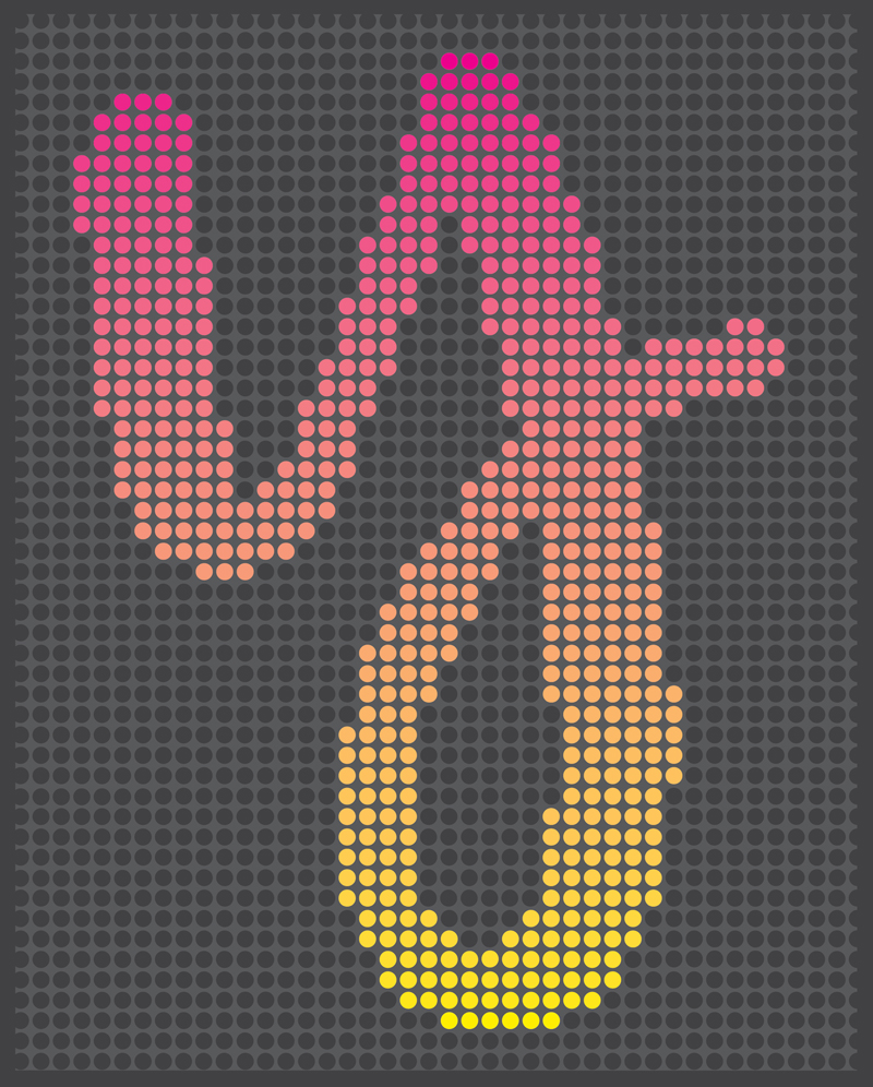
V Corey Holms
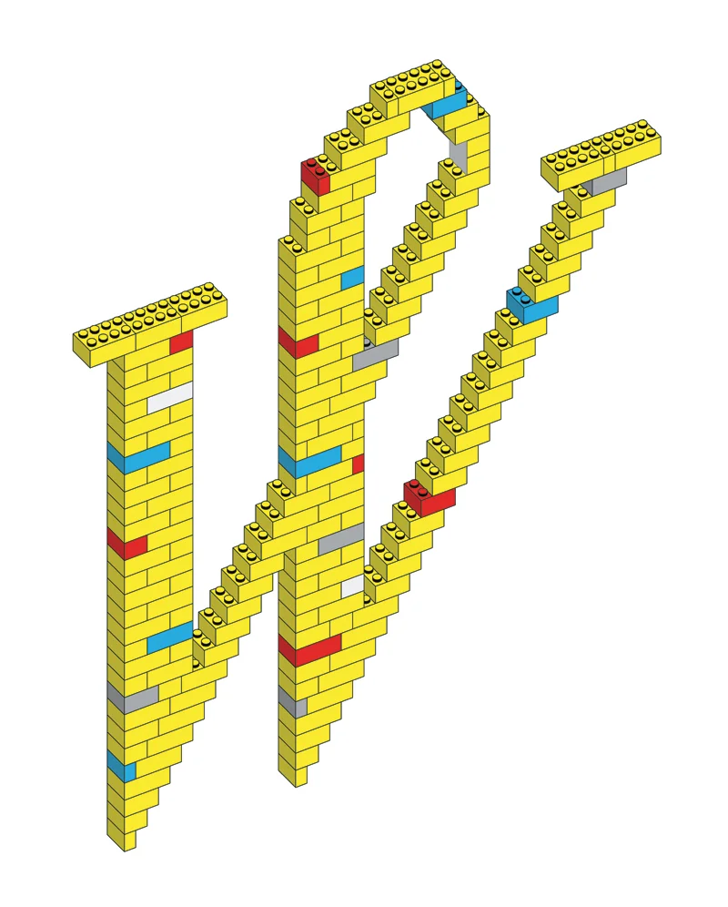
W Jason Wong
X Louise Fili
Y Emily Poe-Crawford
Z MaricorMaricar


PROCESS:
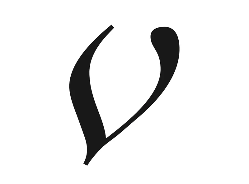
Corey Holms
The Process
When I was assigned the letter v, I was secretly thrilled — this was going to give me the opportunity to play with one of my favorite letterforms of all time, the Linotype Didot Italic lowercase v. It’s a very sensual letterform and is unique in form to that typeface.
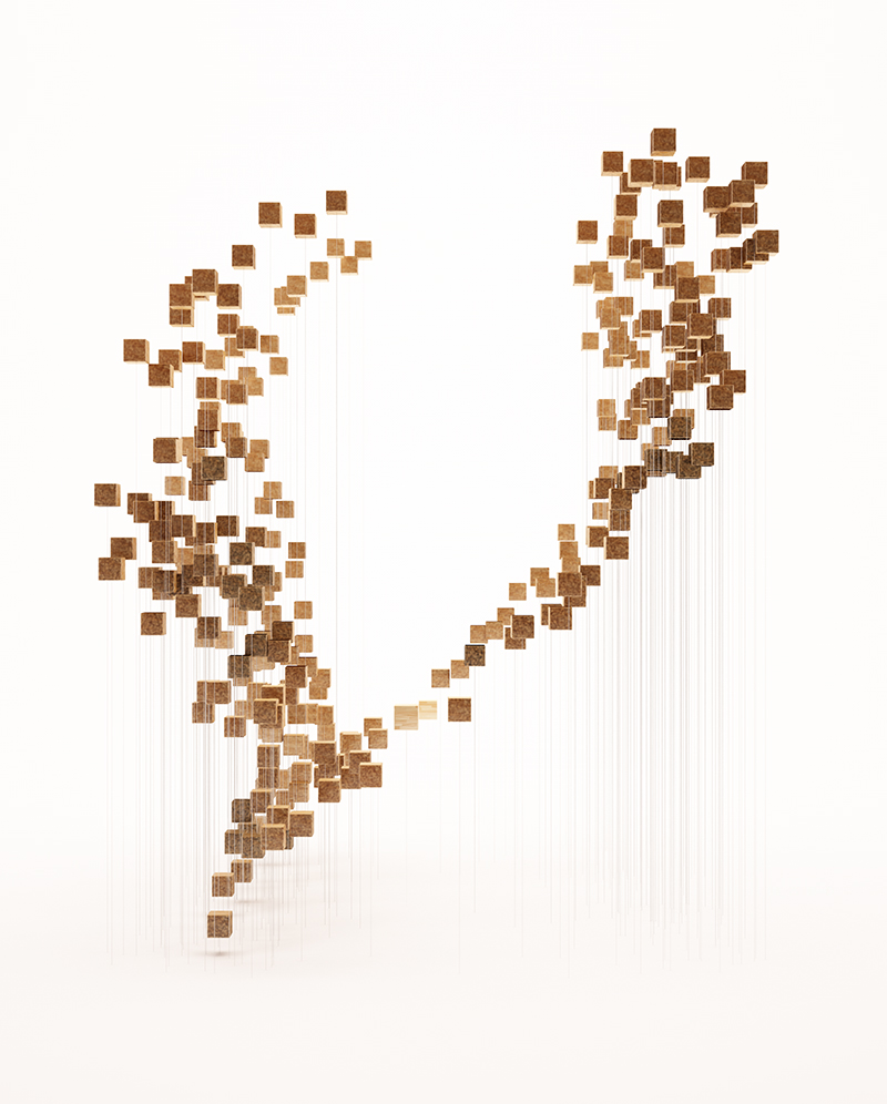
The Voxel
Although this is an obvious solution, I thought I’d try my hand at it. My first couple attempts were clean, but felt pedestrian. Just for redundancy's sake, a voxel is a volumetric representation of a pixel, as seen in popular videogames like MineCraft. Although this was the obvious solution, I believed in it, and this was the precursor to all of the subsequent explorations. Even though I was sure this was the direction I wanted to follow, I just couldn't seem to make it turn out the way I wanted.

As I mentioned before, I felt that these were a little too pedestrian and definitely “seen before.” So my next idea was to take the voxel and bring it into the real world. My first attempt at this was to take wooden blocks and affix them to stiff wire poles to make my v form. I really like this, but it felt cold, which is weird because wood is typically a warm feeling material. At this point, I did what I normally do when I start struggling on a project — abandon it, and try as many other things as I can, hoping that I'll be able to solve it in the back of my head while working on other things.
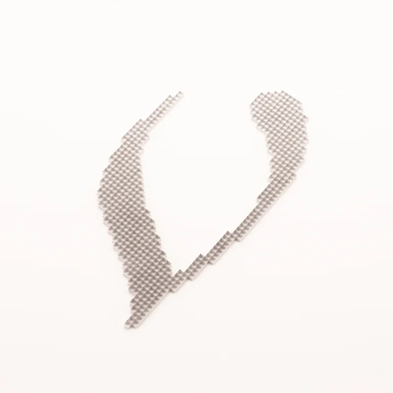
The LCD
A couple days prior, I took a picture of the v off my iMac monitor, the result can be seen here. While looking at that, I wondered what would happen if I tried to make it three dimensional. I thought that the LCD nodes made perfect capsules, so I thought that would be an obvious place to start. I took the capsules, arranged them in the grid, and recreated them as closely as possible to what I had on the screen. But instead of dimming the shapes to show the soft edges of the letterform, I decided to push them back in space along the Z-dimension.


Back to the Voxel
Although I liked that quite a bit, I was really starting to flounder at this point. My wife is a lampworker, so while she was working in the garage studio, we were talking about the project. I realized that I was still in love with the voxel idea, so I took inspiration from the work she was doing and turned it into what is now my final piece. I took the color and texture of her work and brought it to mine. The multi-dimensionality combined with the transparency of the pieces and the varied colors brings the warmth that I was looking for that I couldn't find in the original piece. You'll notice that it is exactly the same shape, and nothing changed other than the material, but it was just that shift that made the idea work. That one change alone was what the piece needed to go from not-quite-right to just right. The concept, as simple as it is, was what I wanted, and the execution was what was lacking.

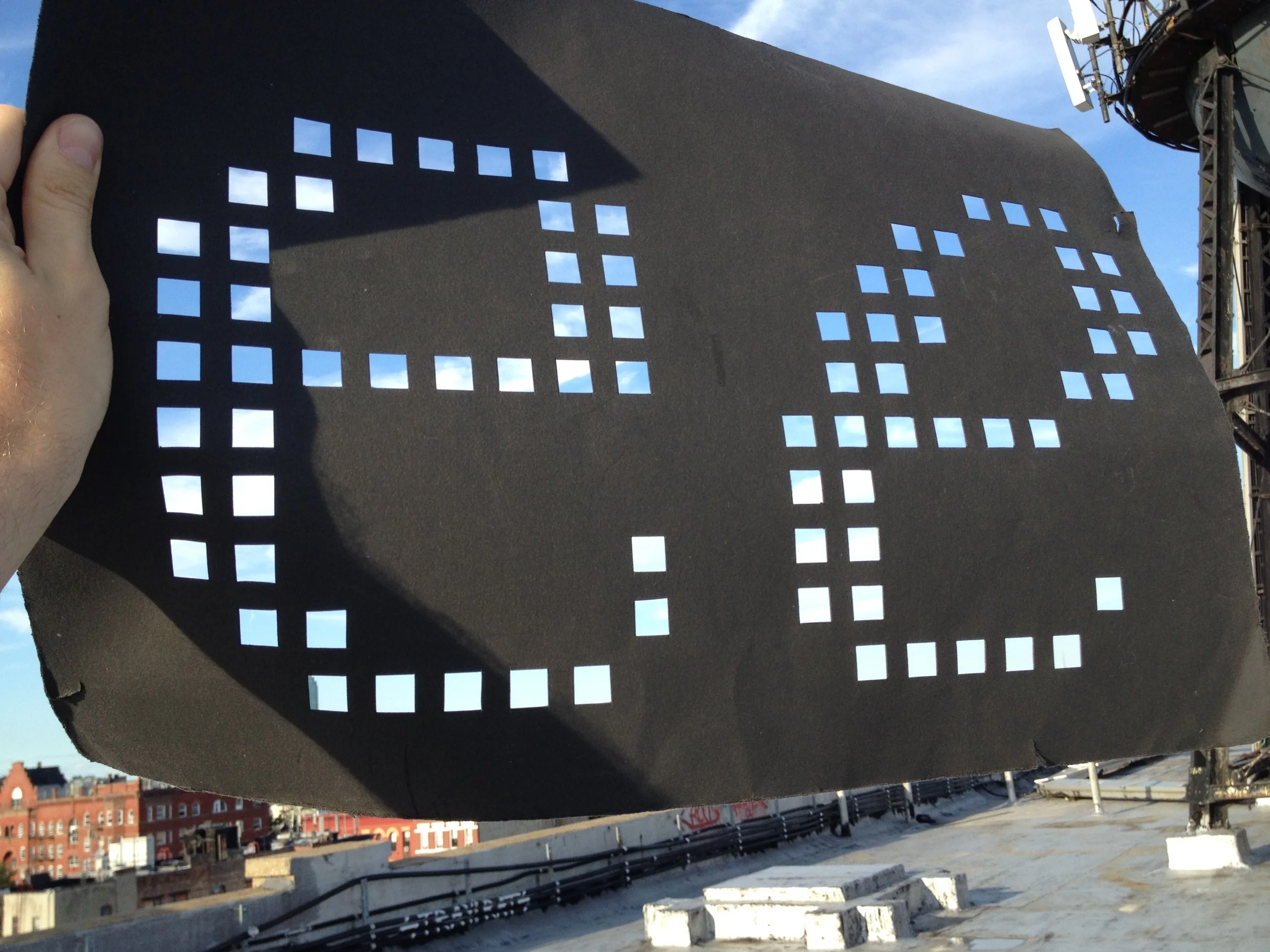
Experiments
Here are a handful of experiments that obviously wouldn’t work for various reasons, for example, they aren’t bitmap based, or in the example of the grid, the concept felt one-dimensional. I was playing around, literally experimenting with type and 3D, hoping to stumble across a new technique. I did, but nothing usable for the project. Thought you might enjoy the results.


I ended up having so much fun with this that it led me to create a Tumblr blog documenting some of these and other explorations that I've been doing since.
Located in Southern California, Corey Holms has juggled working for large agencies and running a private practice for a decade. Focusing on the fields of identity, type and entertainment design, his clients range from small boutiques to large multi-national firms. His work can be seen internationally in books and design magazines, for which he also writes articles on typography and type history. Corey’s commercially available typefaces are distributed through YouWorkForThem, MyFonts and Veer. Corey's commercially available photography is distributed through Getty.
PROCESS:
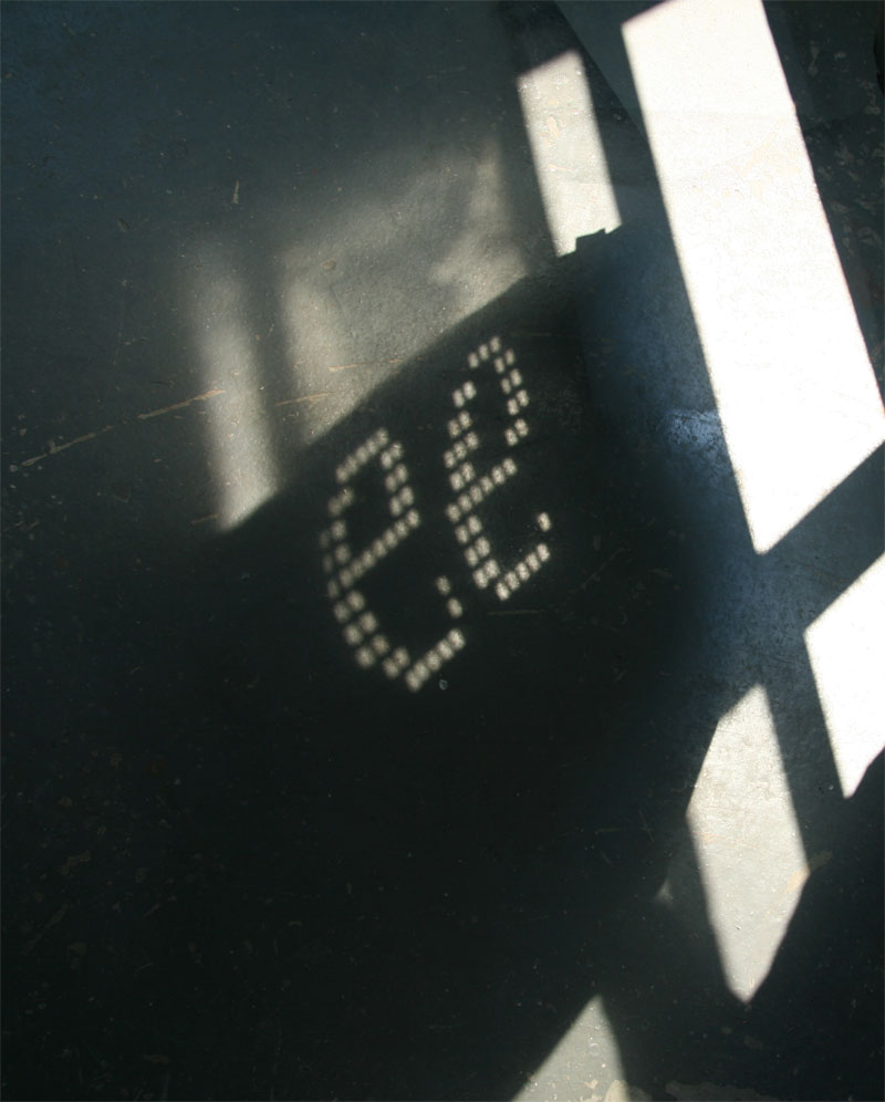
Jesse Ragan
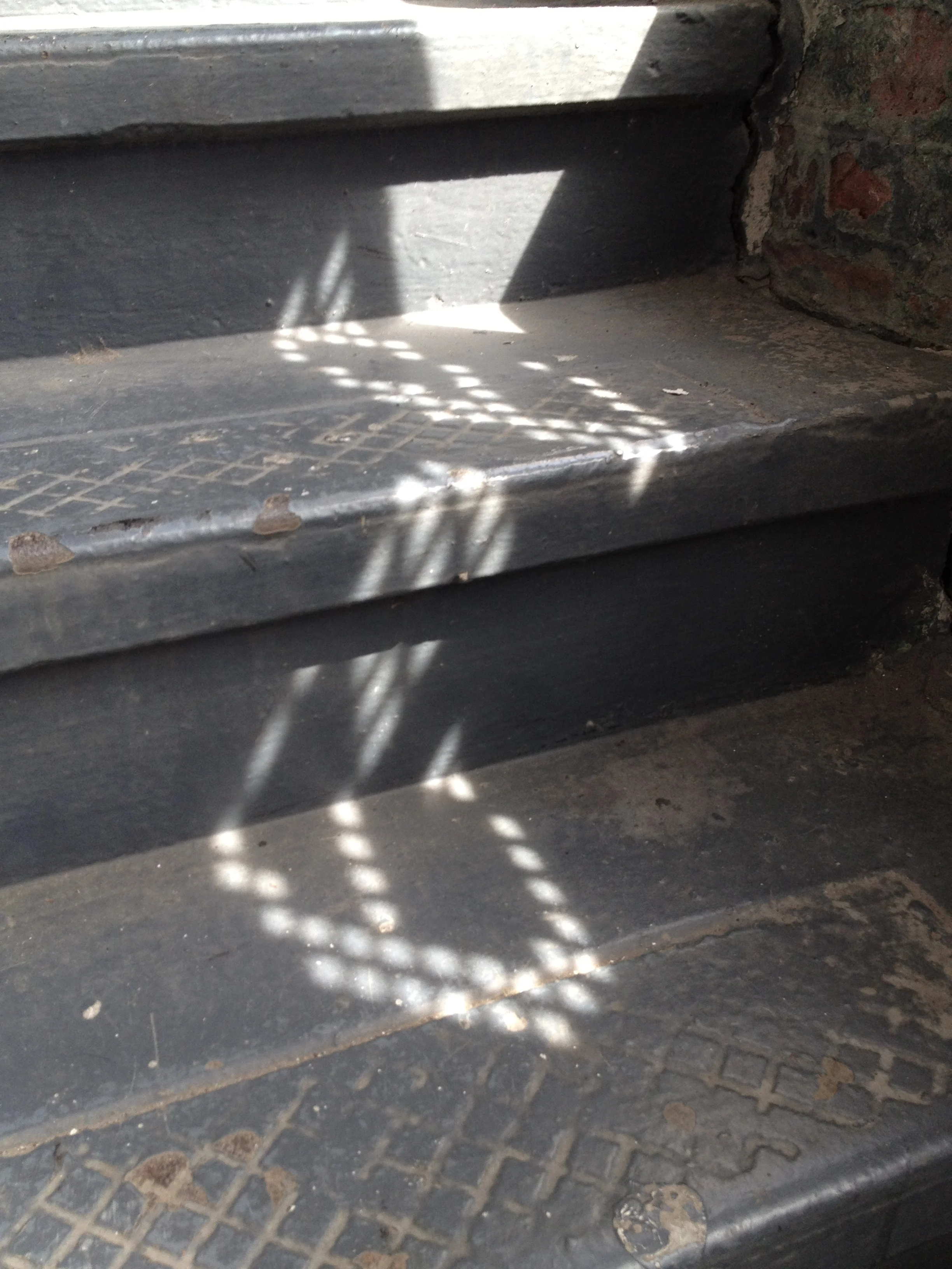
As a typeface designer, I constantly struggle to coax warmth from the strictures of digital drawings—a challenge which reaches its extreme on a low-resolution bitmap grid. Here, the light filtering through a window parallels pixels on a screen, but natural shadow distortion softens the cold grid of my letterforms.
Cut paper bitmaps.

Finding the right angles.
Ephemeral Es.

After graduating from Rhode Island School of Design in 2001, Jesse Ragan began his career at Hoefler & Frere-Jones, where he contributed to the design of Gotham, Archer, and many other typefaces. Since 2005, he has worked independently in Brooklyn and collaborated with type foundries (Omnes for Darden Studio; Showcard Stunt for House Industries). He teaches part-time at Type@Cooper, the typeface design certificate program he co-founded at Cooper Union in 2010. He also gives public lectures from time to time on his work as a designer and teacher.
PROCESS:
Dominique Falla

When I think of beautiful bitmaps, I think of pixels and I wanted to create a blurry pixellated effect with my letter. Each “pixel” that makes up the letter Q is the bottom of a strip of ribbon and I overlaid hundreds of different coloured ribbons to build up a multi-coloured effect. I wasn’t expecting the little bits of fluff at the end of each ribbon to appear, but it adds to the overall shimmering effect and I also love how the colours underneath show through the ribbons above.


Dominique Falla is an Australian designer/artist who works in a variety of craft mediums and combines them with a digital aesthetic to make tactile typography pieces.

PROCESS:
Joachim Muller-Lance
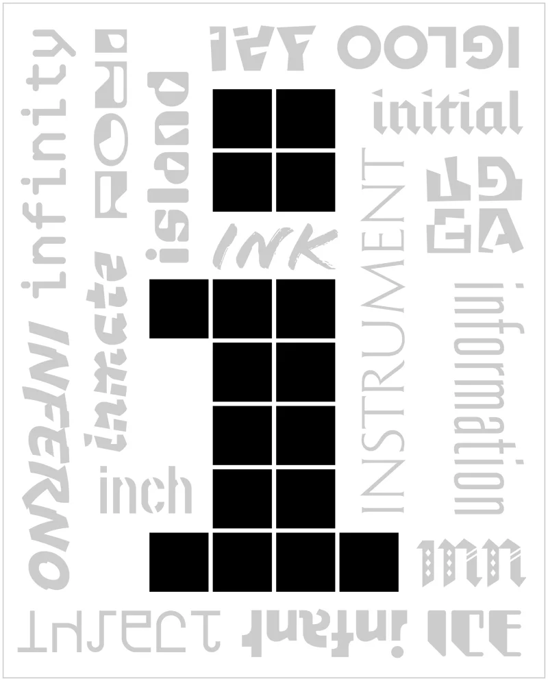
I specialize in pictograms, mascot characters, and typefaces—small things with meaning. While I love bitmaps, it bothers me that pixels have no inherent meaning. My work gives each pixel significance and engages the viewer in a guessing game. I was happy to be assigned the “i” for idea, information etc… One word that’s missing is “icon”—because that’s what all of them are.

The initial concept sketches.
Icon development.
Composition of elements.

Colour studies.

The finished piece.
Joachim Muller-Lance is an award-winning international designer, principal and owner of Kame Design in San Francisco since 1997. His work is characterized by an expressive, direct visual language that always comes to the point. Diverse background and interest in Asia and Europe make him quintessentially cross-cultural, between modernist and experimental. His approach is integrative, not additive: Shape and meaning turn into a coherent One, getting to the essence with consistency and simplicity. Powerful fresh impact and surprise are delivered through energetic, percussive visual language and novel, unusual musical color.
PROCESS:
Jason Santa Maria
I was given the letter “b” to reinterpret, and immediately thought of Mr. John Baskerville. Baskerville is responsible for many influential letterforms, but he also pioneered new techniques in printing, paper, and ink-making. He developed inks that were darker and richer than those in use by any of his contemporaries in the mid-18th century. And with that ink, Baskerville’s type came alive.
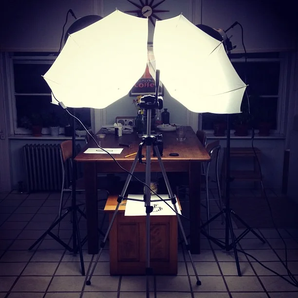
A photoshoot at the kitchen table.
The idea came together pretty quickly: big ink drops on paper and a quick photo before they all dried.

Jason Santa Maria is the founder and principal of the design studio Mighty, creative director for Typekit, a faculty member in the MFA Interaction Design program at SVA, co-founder of A Book Apart, former vice president of AIGA/NY, founder ofTypedia, a shared encyclopedia of typefaces online, and creative director for A List Apart, a magazine for people who make websites. He has worked for clients such as AIGA, The Chicago Tribune, Housing Works, Miramax Films, The New York Stock Exchange, PBS, The United Nations, and WordPress focusing on designing websites that maintain a balance of beauty and usability.


