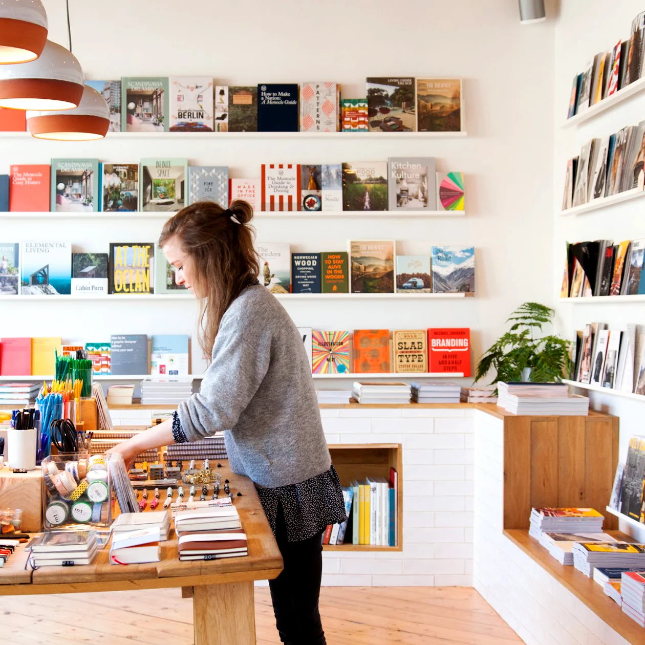
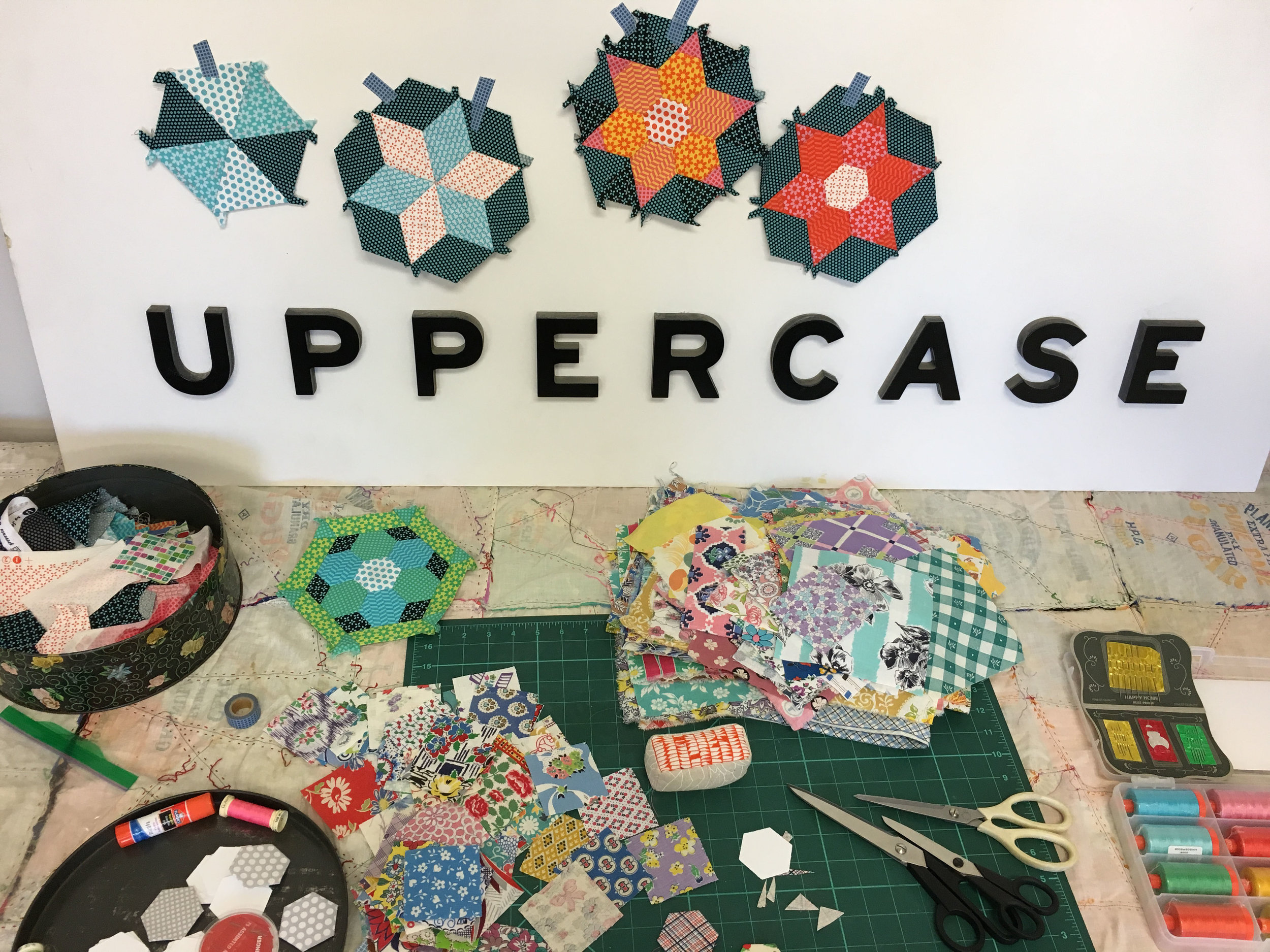
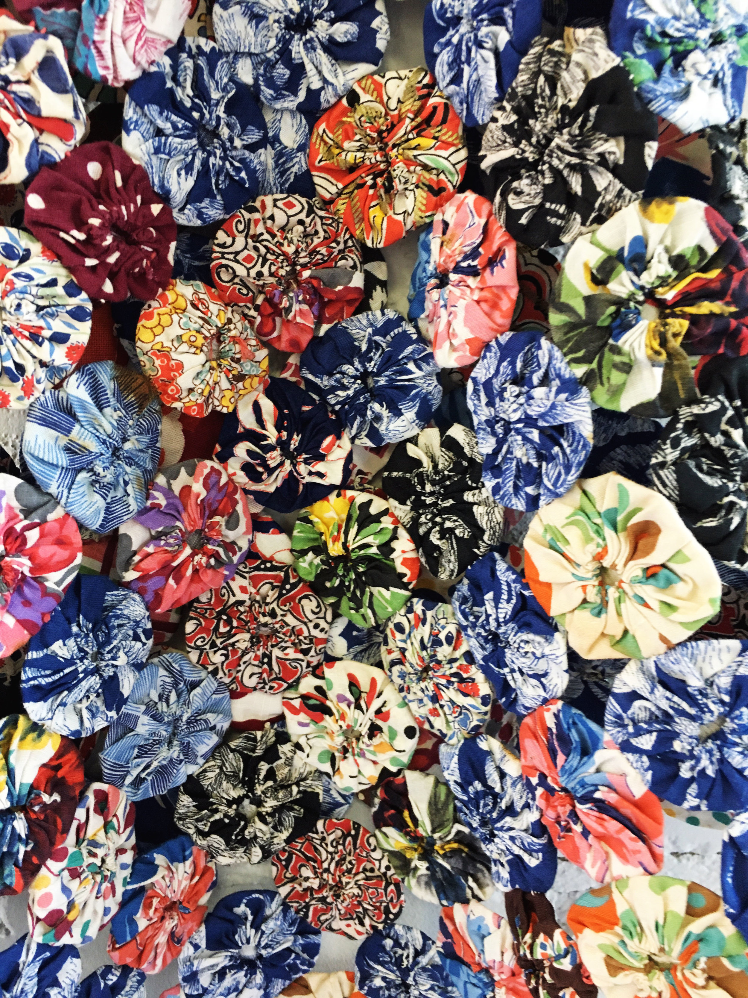
Fabric Flowers by Frieda Oxenham
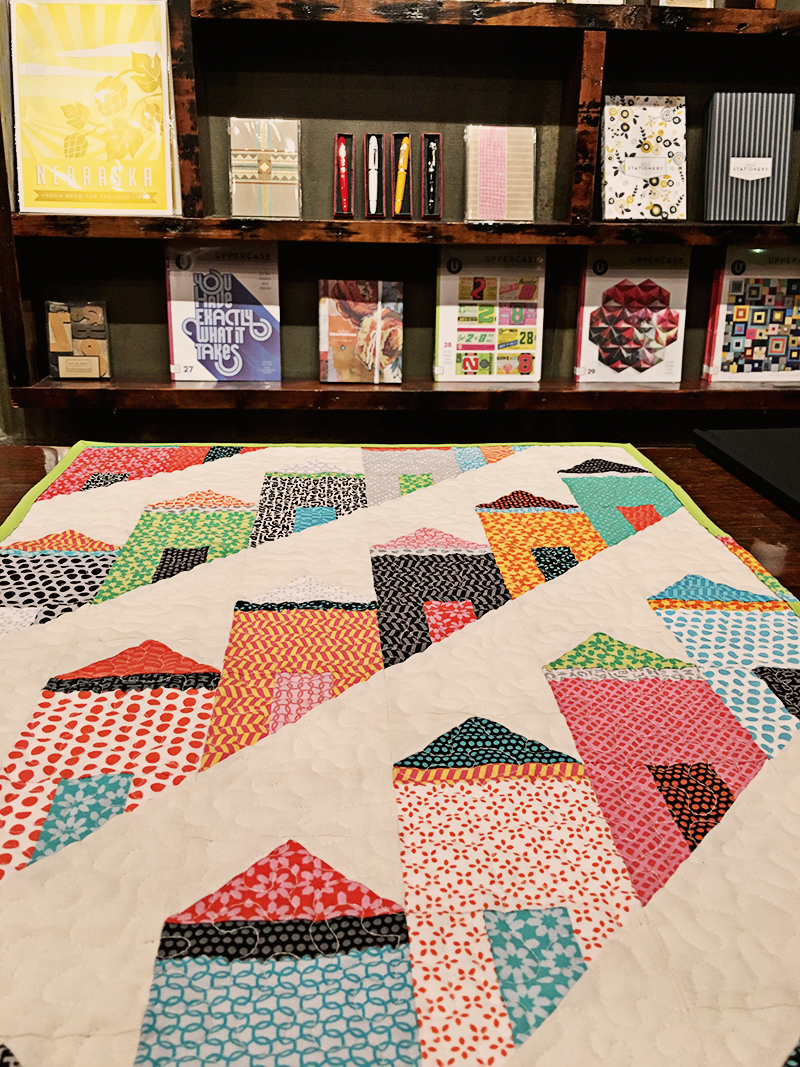
/Textile and mixed media artist Frieda Oxenham has made these beautiful flowers and quilt using the UPPERCASE collection from Windham Fabrics. Stunning!


Textile and mixed media artist Frieda Oxenham has made these beautiful flowers and quilt using the UPPERCASE collection from Windham Fabrics. Stunning!
Creativity has a societal and environmental impact. The processes and materials that we use in our art, along with our creative decisions, affect the world around us.
"What advice or recommendations do you have for being a responsible creative?" This is the question I ask readers in the open call for submissions for the spring issue of UPPERCASE. (The open call closes at midnight MT today, January 16.)
Nicole LaRue of Small Made Goods replies:
"I think we ought to leave room to take on projects that we are fiercely passionate about—ones that pull at our hearts and propel us to take action."

Nicole is the designer of the logo for this Saturday's Women's March. "I’m absolutely proud to have created the official Women’s March logo," she writes on her blog. "A logo that conveys diversity and women standing together and speaking out in a united voice—a voice that calls for solidarity, demands equality and confronts injustice."
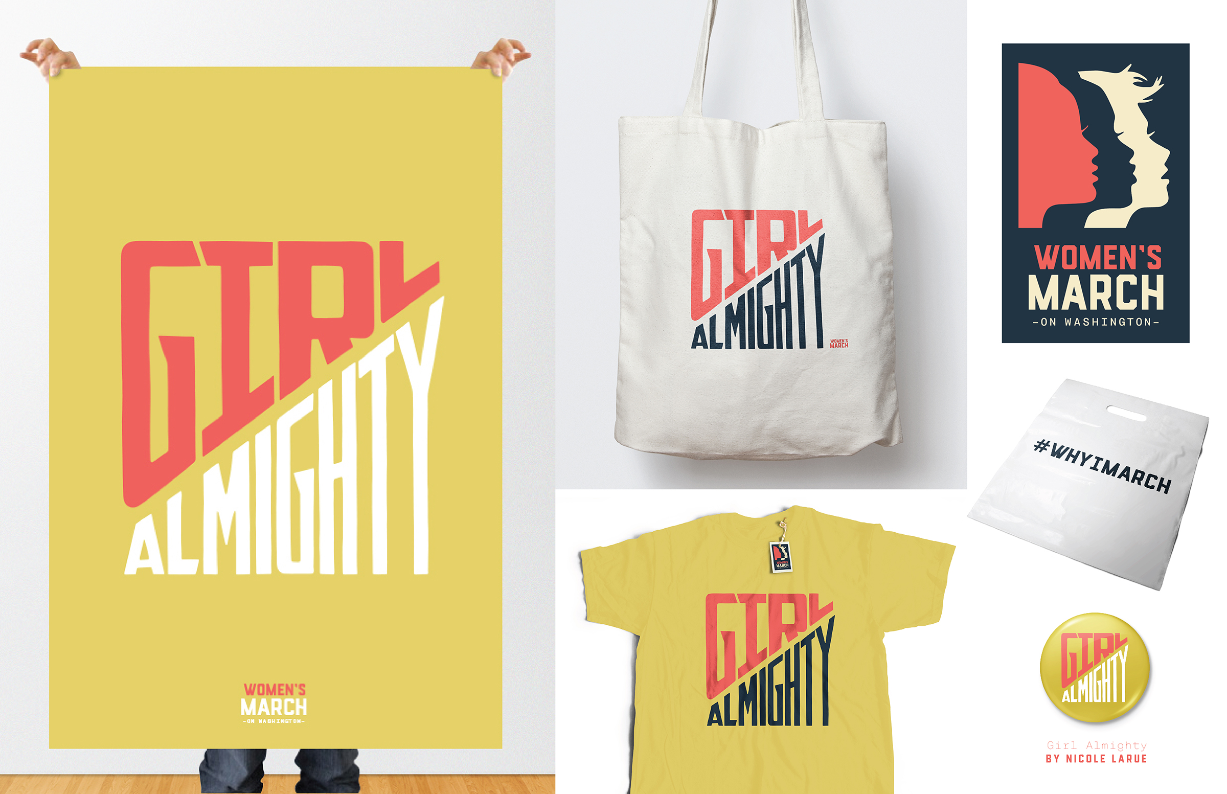
"I'm not always the most brilliant wordsmith," says Nicole, "so I can never claim to have the art of words… so instead of protesting with words, I protest with my art and with my design. And, sometimes this can be just as powerful."

Find more details about the Women's March on Washington or one of the hundreds of sister marches around the world happening this Saturday, January 21.
The march in Calgary starts at 1pm in front of the Famous 5 statue in front of Arts Commons.
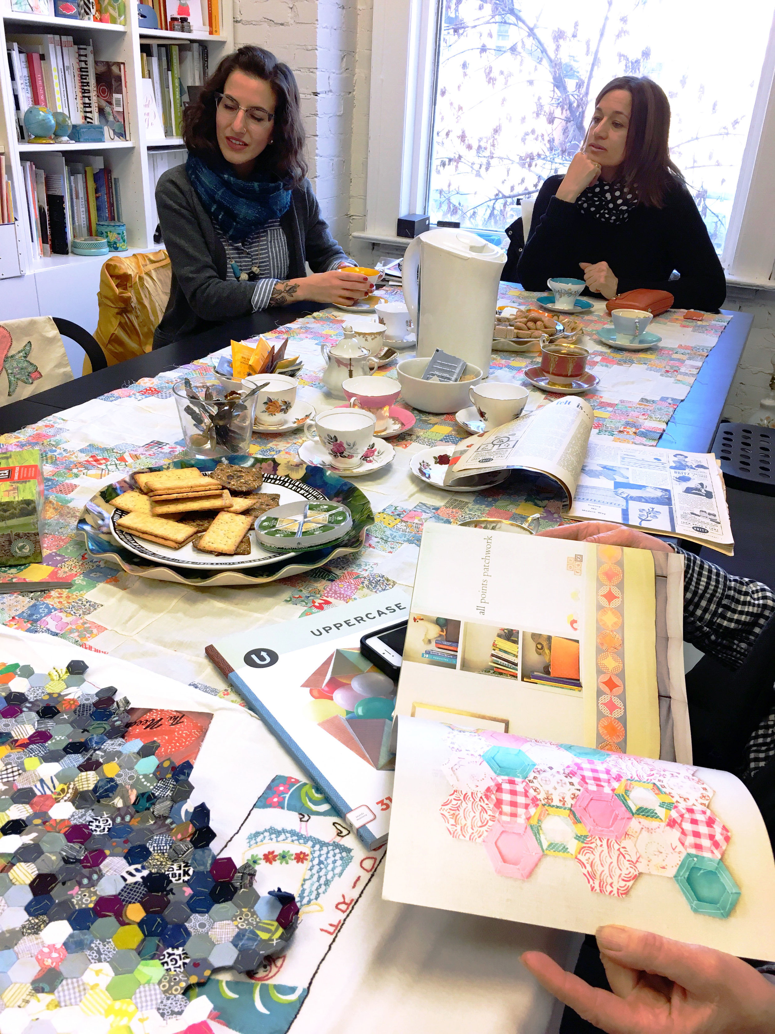
There are 100 portfolios presented in the Surface Pattern Design Guide, 2nd edition (published in the current issue #32). They were selected from 744 submissions from readers worldwide who represent a variety of styles and levels of experience—from students to seasoned professionals. Though there are plenty of digitally-created patterns, there are also artists who use more hands-on methods like linocut, mono-printing or textile manipulations.
Bessie Smith Moulton of Babayaga Exquisites is a multimedia artist who has concentrated on the book arts for the past two decades, although her love of design extends to all materials. The last few years she has explored textiles and surface design. Her fabric designs are derived from naturally dyed plant material or various printing techniques, sometimes enhanced with embroidery or by collaging fabric patterns.
Bessie tells us more about her work and amazing studio on stilts:


I retired from my work as a graphic designer a decade ago and finally have been doing the artwork I have always wanted to do, making artist's books. Also, by combining my living situation with that of my longtime partner, I was able to build a studio of my dreams. Previously, I did my art and design work in nooks and crannies, on the dining room table, or in spare rooms.
Click on the image to enlarge. Photo by Dana Hutchins.
Artists can work wherever they are, under any conditions. My studio is a bonus. It's large enough to hold workshops or studio visits. It is like a bird's nest built on stilts, over a pond, surrounded by trees and nature. There is a small Japanese garden below. I have named it Baba Yaga after the witch in the Russian fairytale who lives in a chicken coop, which moves around on chicken legs.
Click on the image to enlarge. Photo by Dana Hutchins.
It is a place where I can go to be contemplative, study, or find inspiration. It is a comfortable place with all the materials at hand to do textile work, monoprinting, collage or multimedia that go into making artist’s books.

Bessie in her basement studio.
I have an area in the basement of the house where I do printmaking, make paper, prepare cyanotypes and other crafts such as pottery, metal and glass work.
Joseph Campbell said it best, ”To have a sacred place is an absolute necessity…a place where you can simply experience and bring forth what you are and what you might be… a place of creative incubation.”
For 99 other profiles of Surface Pattern Designers, pick up the current issue of UPPERCASE magazine.

Do you use plastics, resins or similar materials in your art, craft and design projects? Do you make things that are shiny and glossy? Share your projects for possible inclusion in the April/May/June 2017 issue of UPPERCASE magazine. The submission form is open until January 16.
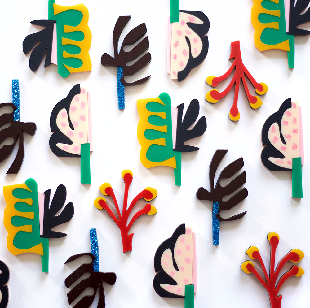
This colourful work was submitted by Jo Chambers of Studio Legohead.

Jo writes, "From a love of collage and colour came these Wonky Floral Brooches. There are four in the collection and based around my floral and foliage obsession."

Each brooch is handmade from acrylic and wood and comes in its own limited edition hand-painted gift box.

Looking at Jo's artwork and surface pattern designs, you can see how she has taken recurring motifs and translated them into dimensional objects.

"Through series of collage experiments documented via Instagram," says Jo, "it led me to make some wearable cutouts."

I love the exuberance and confidence of Jo's art! Visit her Etsy shop for brooches, art prints and more.
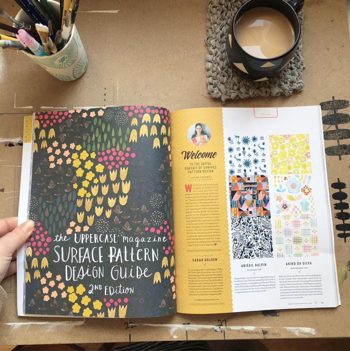
Image from Sarah Golden's Instagram
I'm pleased to share with you the title page for the Surface Pattern Design Guide, 2nd edition, illustrated by Sarah Golden. For an assignment in Lilla Rogers’ Make Art That Sells illustration course, students designed the opening title page to this guide. There were many outstanding designs to choose from! Sarah Golden’s submission was selected for her simple botanical motifs, playful composition and integrated handlettering—a great example of current styles in surface pattern.

The title page for the UPPERCASE Surface Pattern Design Guide, 2nd Edition, is illustrated by Sarah Golden. Look for the Guide as part of UPPERCASE issue 32 (Jan/Feb/March 2017).

From Sarah's Instagram
Sarah Golden is an artist and fabric designer living in Sacramento, California. Block printing and gouache are her favourite mediums to work with. She creates a modern and handmade style through carving and through hand printing on paper and fabric, along with her use of colour. A love for Scandinavian design, vintage fabrics and geometrics inspire her work. Sarah’s first fabric collection for Andover Fabrics comes out in February 2017.
The Surface Pattern Design Guide is part of issue 32. Subscribe today!

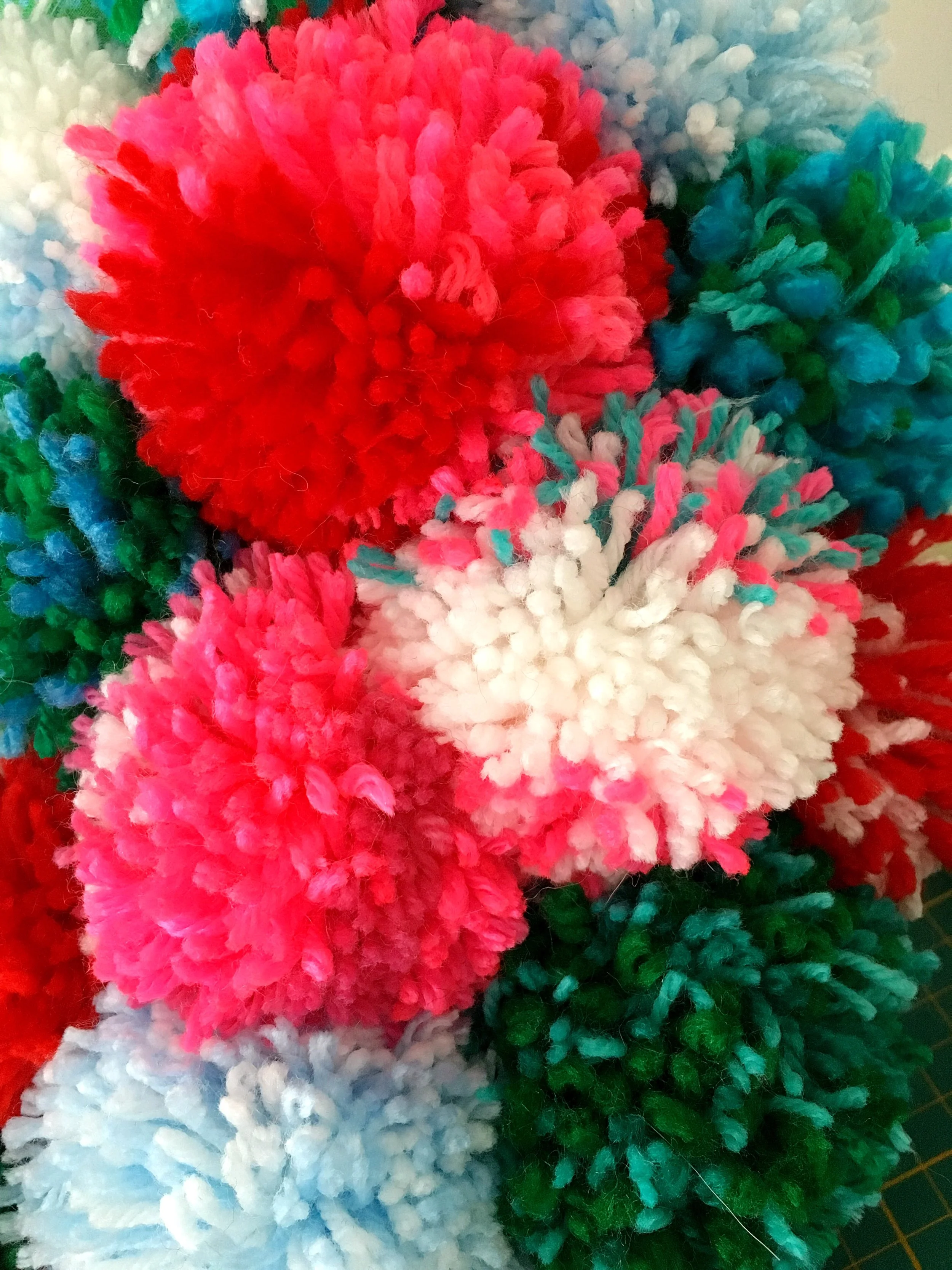
I ordered a Pom Maker tool and went a little overboard on making pom poms this Christmas!

I got this far and ran out of yarn! fortunately, my mother in law haD a good supply of yarn and I was able to keep POM and carry on.

The wreath wasn't done until after Christmas, but at least it will be ready and waiting for next year's festivities! Or perhaps I'll just bring it indoors to enjoy year-round. It's nice to pet it once and a while!
I hope you had a lovely holiday and are feeling rested and ready for the year ahead.
As I mentioned in my newsletter today, one of my goals for 2016 was to revamp this website. It's the digital window into what UPPERCASE is all about and very often the first in-depth experience someone will have with the magazine before they subscribe or see a copy in person. The site really needed some focus and a much stronger home page. And in the backend, I've had my site hosted with Squarespace for a decade (!!!) and the navigation and organization was getting out of hand.
I've been thinking about the redesign for months—gathering ideas, jotting notes, saving urls on websites that I like, musing about it, wishing it would magically get done by itself... but my print projects always necessarily take the forefront of my to-do list. And readers will know that I put out a LOT of pages in 2016. Four magazine issues and the 544-page Feed Sacks book!
With my workload done for the holidays and some mental space to tackle a medium that's quite a bit different than print, I started fleshing out the site redesign. I selected a new Squarespace template (I'm using Five) and got the basic framework ready. Full screen video on the home page has been on my wish list for years and I'm happy that there's the support to make that very easy to do now. With issue 32 fresh from the printer, I shot three different videos, trying to get the best possible result. I'm still not 100% satisfied with the video on the home page, but I'm sure I'll improve it with each subsequent issue. I'm a learn-by-doing sort of person!
After a very pleasant and mostly technology-free Christmas, on New Year's Eve—in that concentrated flurried feeling of having to get everything clean, sorted and ready for the change of the calendar—I dove in to the redesign. (Do you feel like that on New Year's Eve? I even felt compelled to clean the inside of my microwave. And I enjoyed doing it!)
The new design went live yesterday and there are still some elements to smooth out and improve upon, particularly on the blog page and some typographic elements... but the best thing about it is how this online renovation makes me feel enthusiastic and energized about the work I'll be doing in the coming year. A fresh new home for the new year.
There are two new volumes in the Encyclopedia of Inspiration in progress: Botanica and Stitch•illo will be coming your way in the first half of the year. (You can still order the set and Feed Sacks will ship right away or you can purchase the books individually.) I have more plans and projects that I look forward to sharing with you soon.
And of course, the mainstay and core of what I make and do: UPPERCASE magazine. The January/February/March issue is on its way to subscribers and will soon be at stockists worldwide.
Want to published in the spring issue? The open calls for submissions are posted and submissions are due January 16.
The 100 designers featured in the forthcoming issue 32 were selected from 788 submissions entered into the Surface Pattern Design Guide call for entries. Submitters without past or current fabric licensing arrangements were also eligible to enter into the UPPERCASE + Windham Fabrics New Designer Competition. Of these entries, I further whittled the selections down to 20 artists whose portfolios represented a variety of styles and personalities. From there, Mickey Krueger, Laura Jaquinto and the team at Windham Fabrics selected a winner who will receive a licensing deal with Windham Fabrics for their own fabric collection.
After considerable review of the artists’ submissions and online portfolios, Laura Jaquinto says, “Ultimately, we picked Mia Whittemore. Her variations in her illustrative style as well as her sense of colour was what sold us on her work. I think she nailed it in her brief bio: ‘Mia’s hope for her patterns is that they bring colour and joy to everyday life.’”
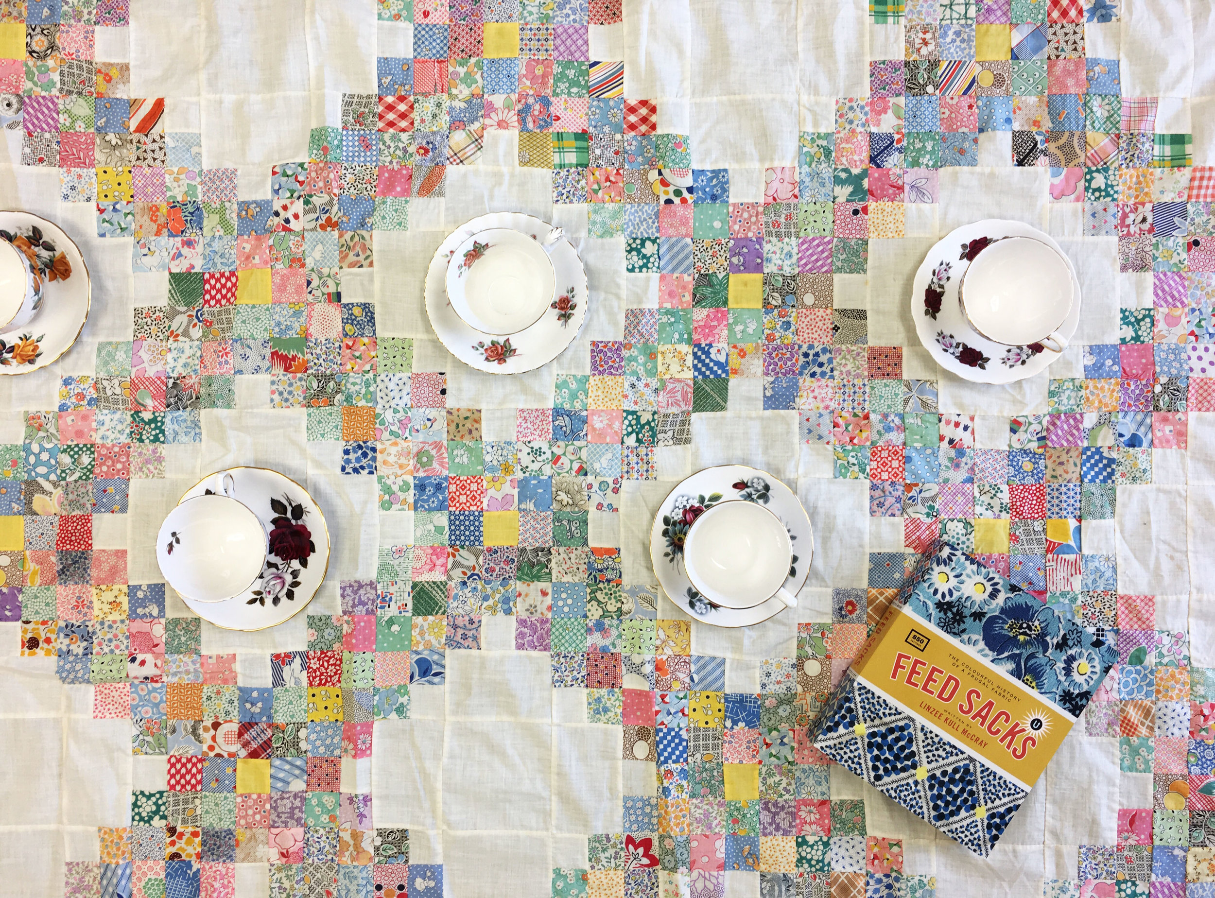
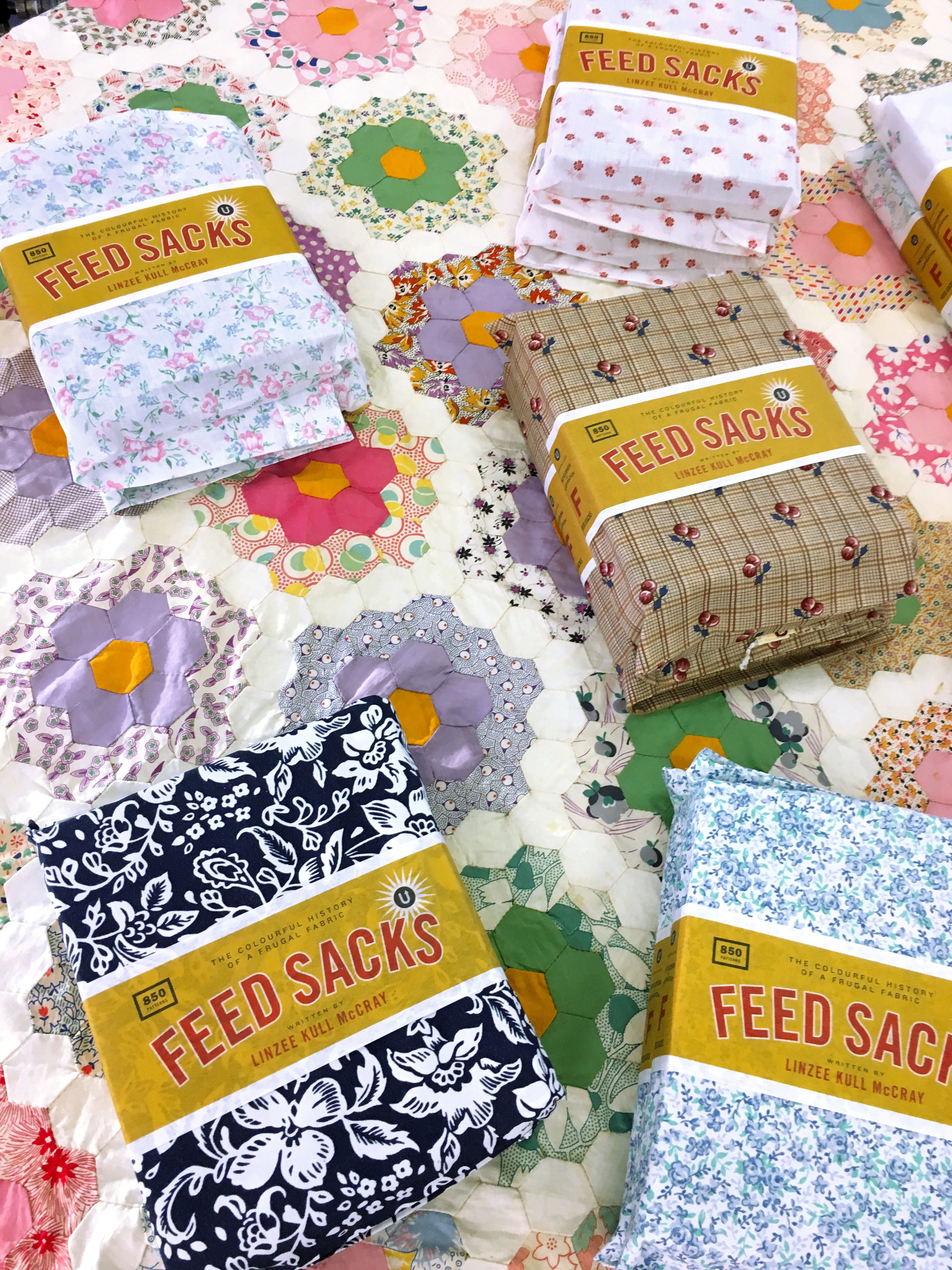
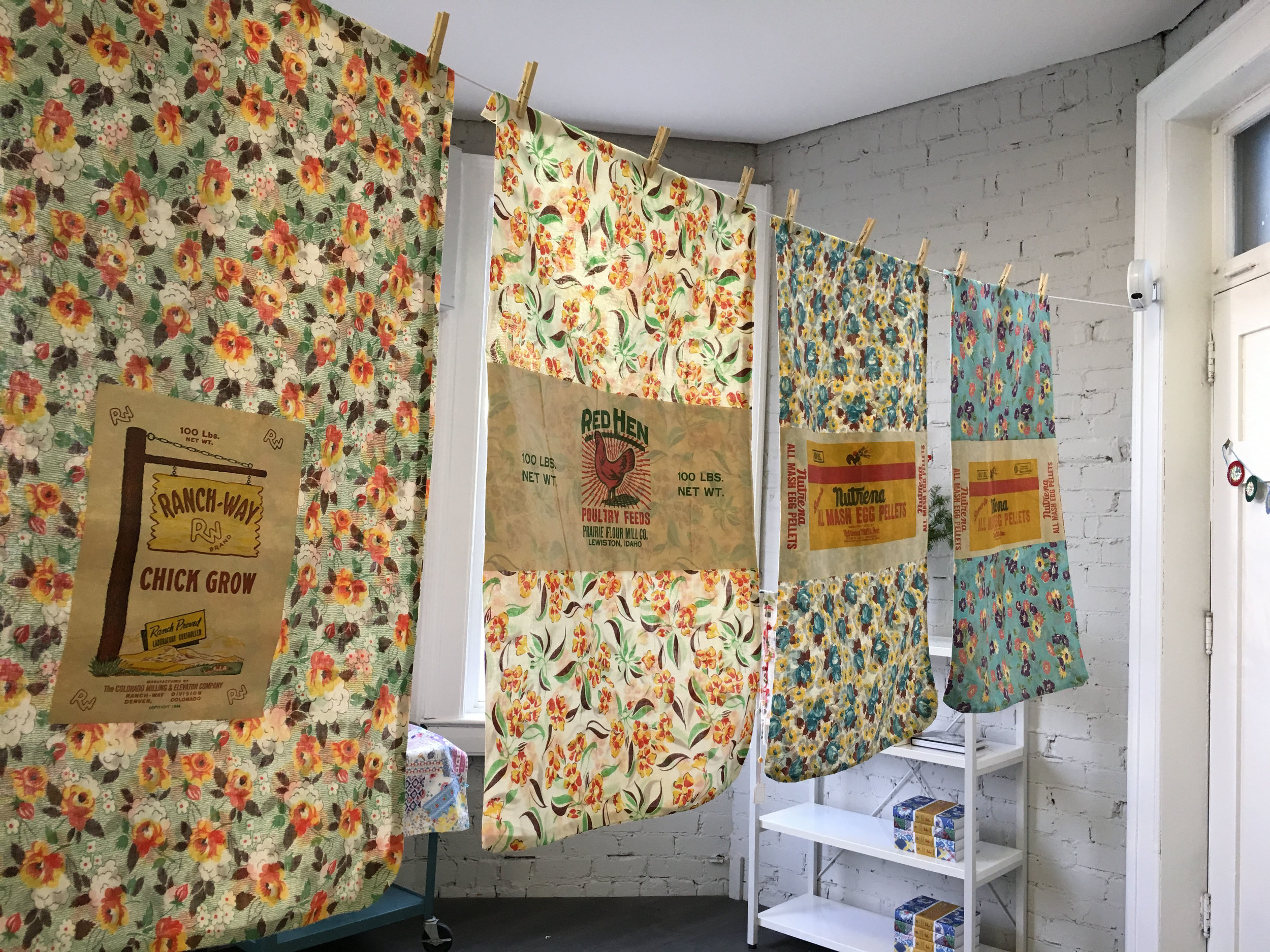
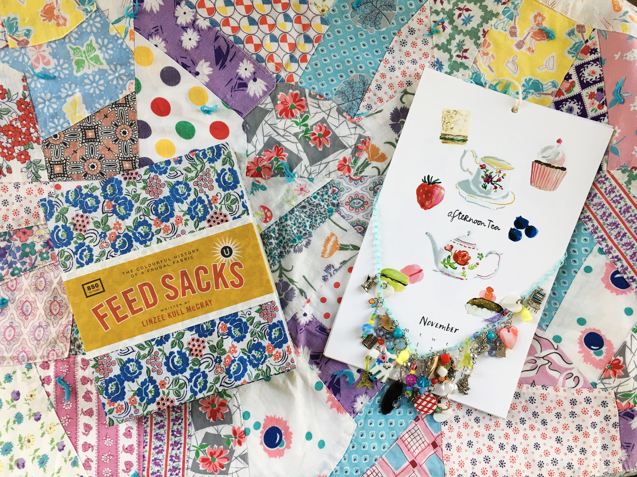

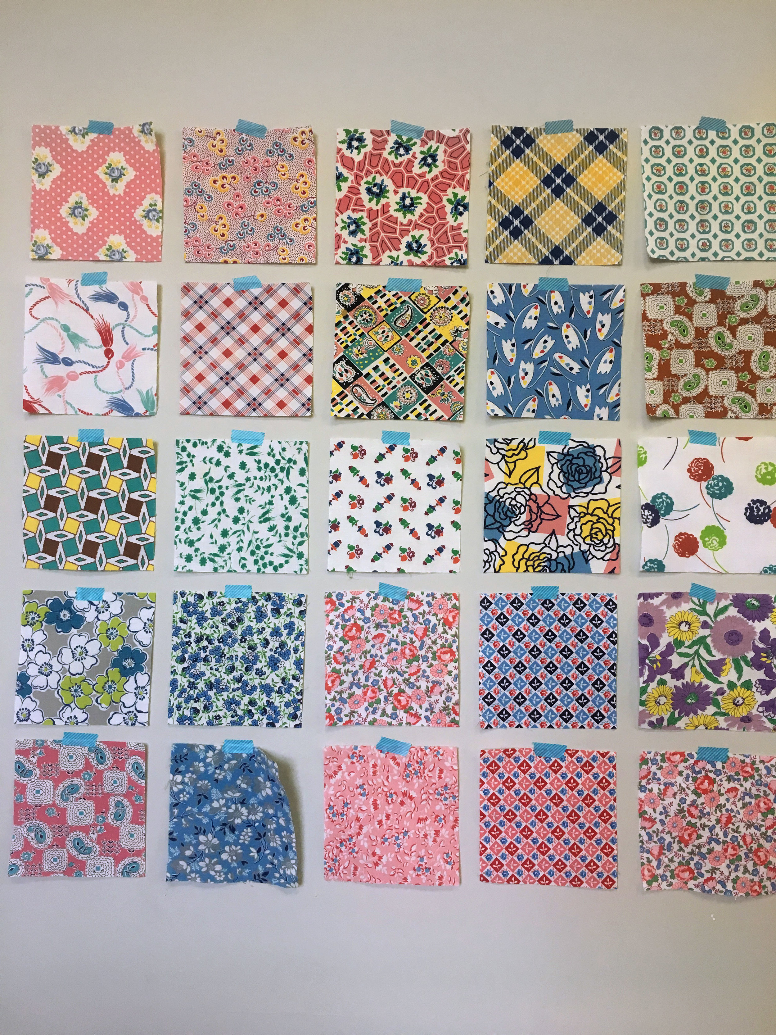
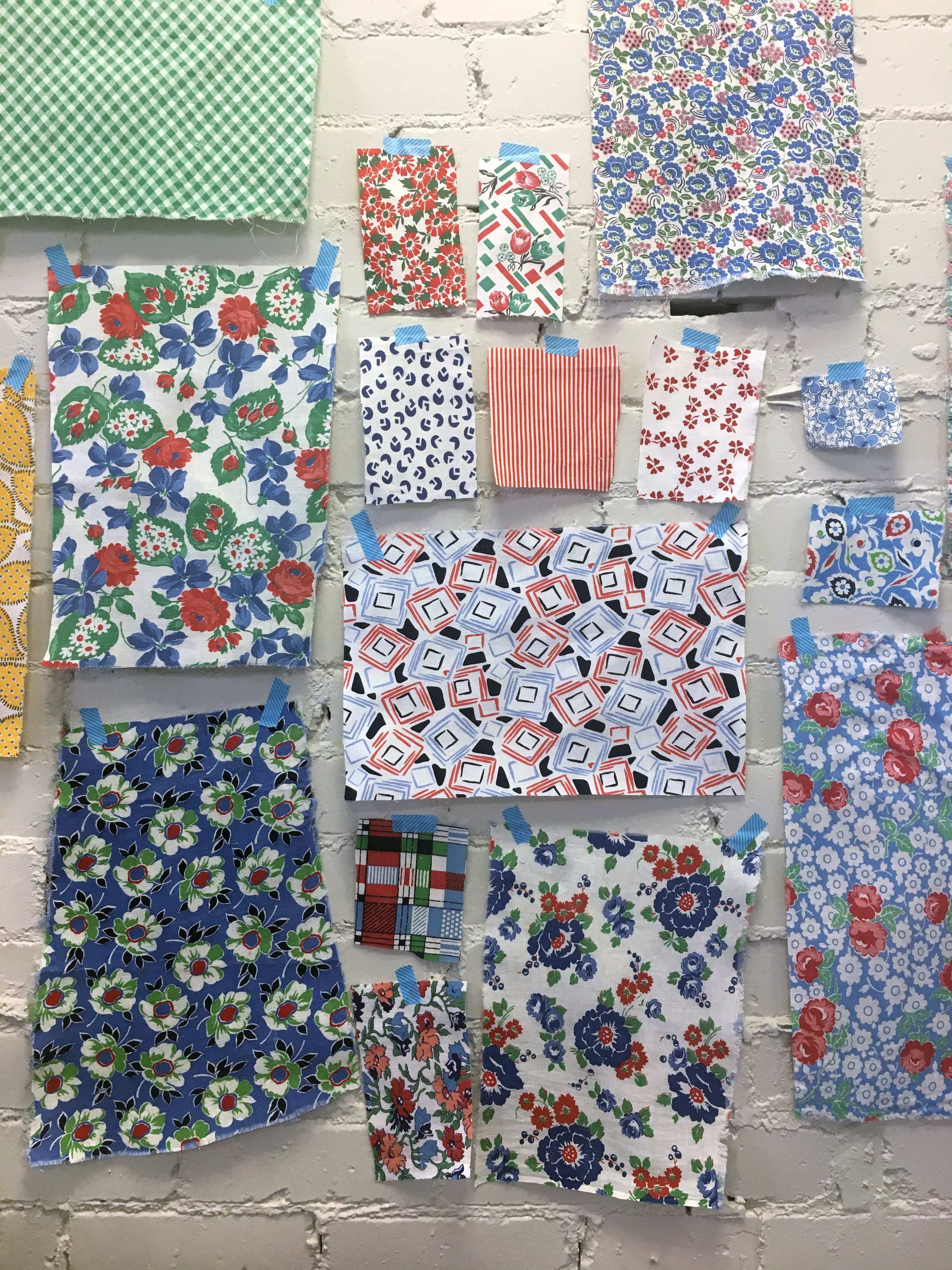

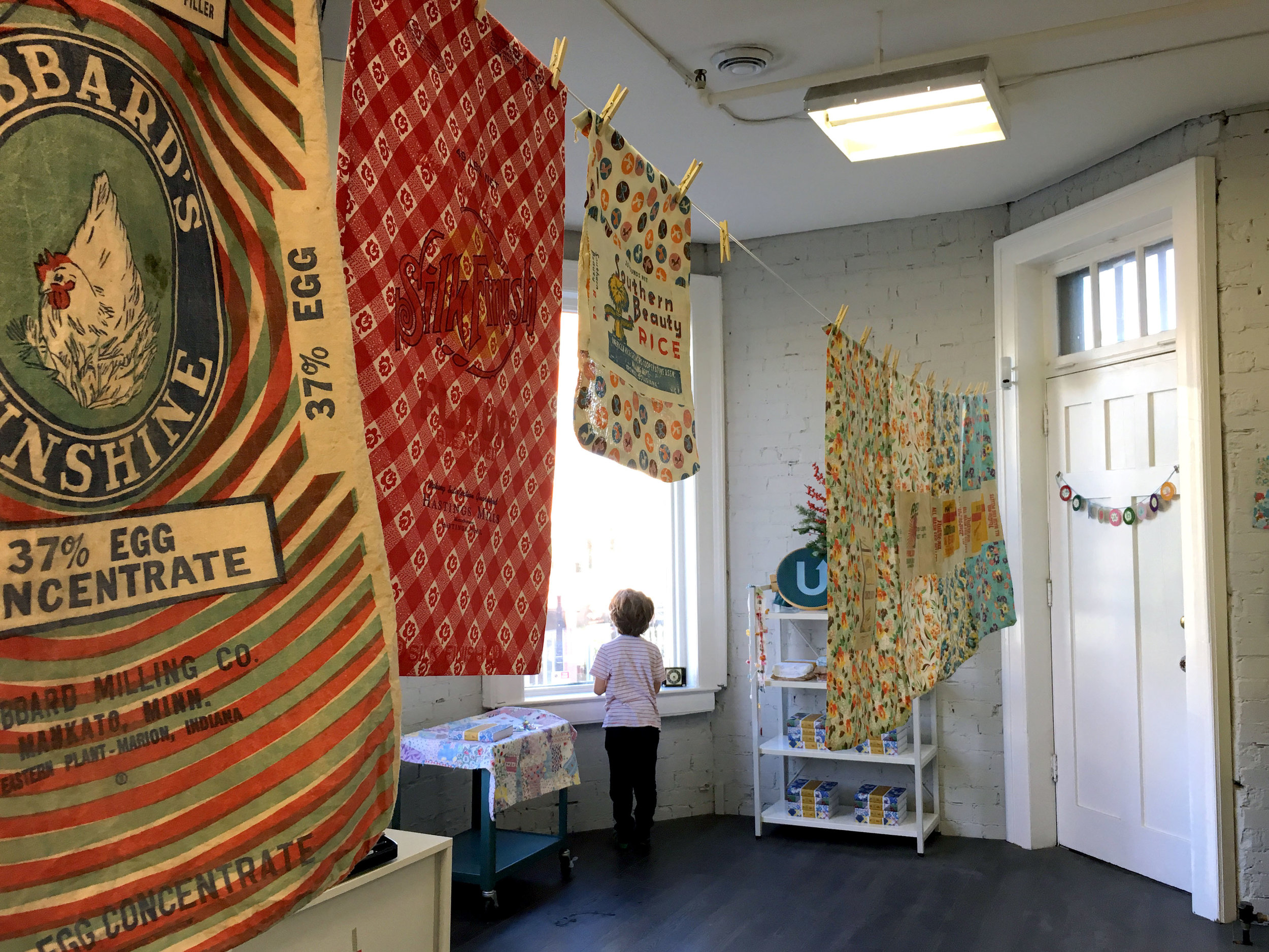

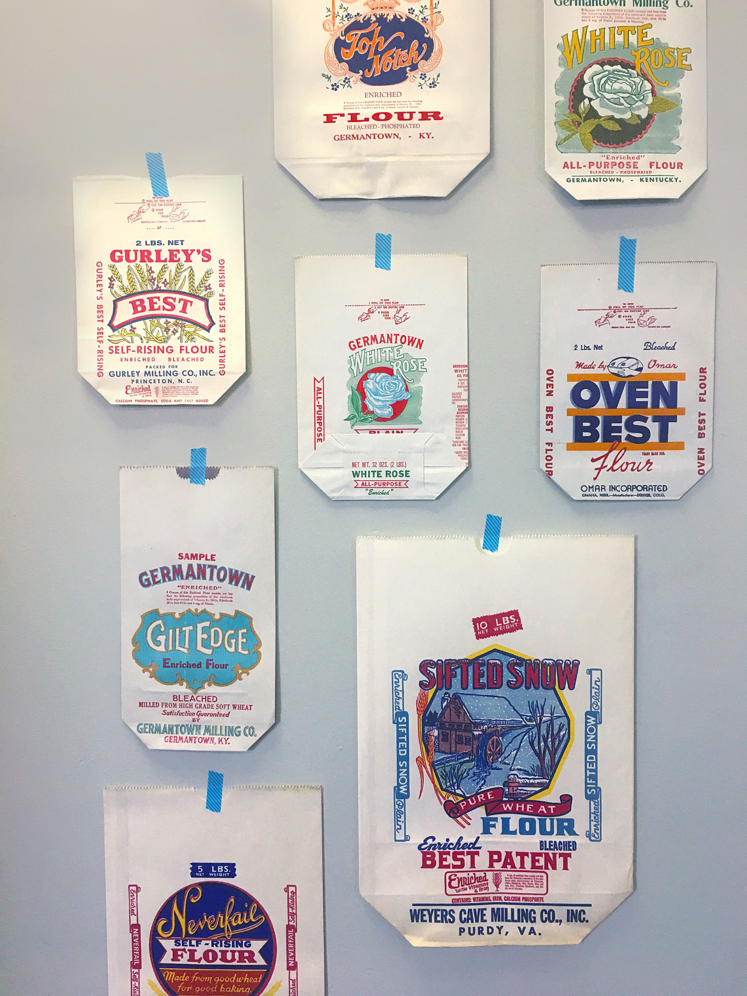
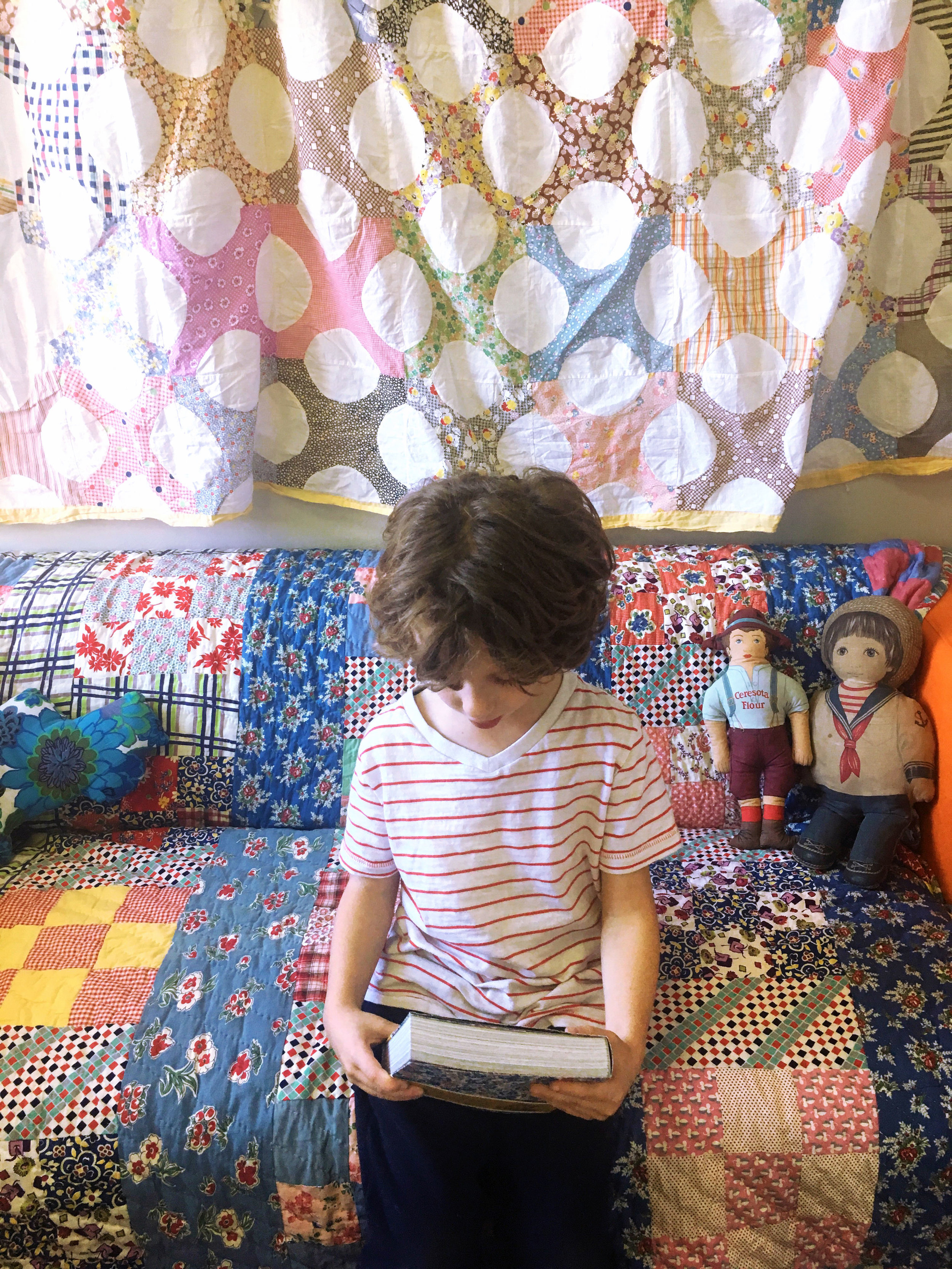
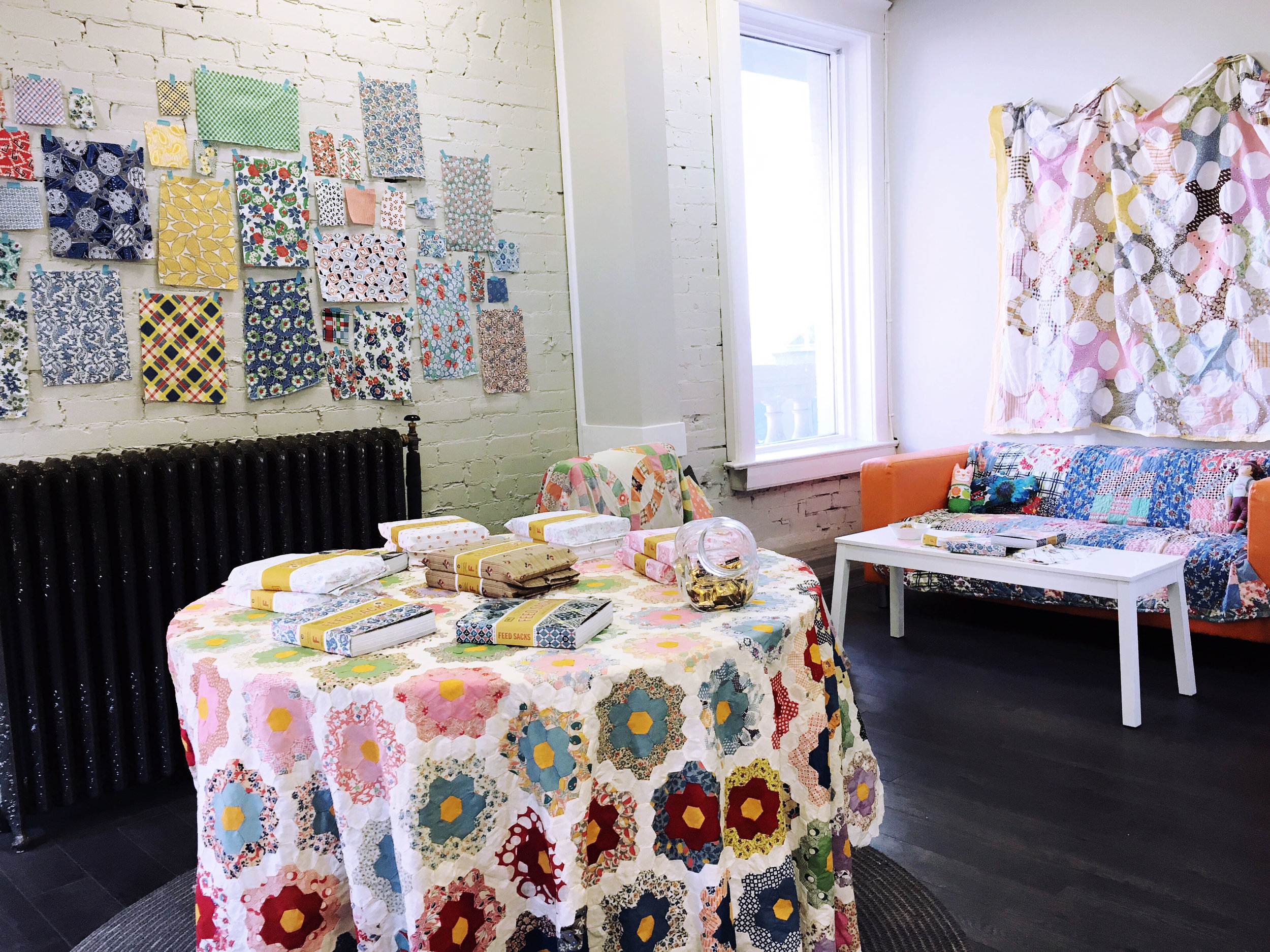
Thank you to everyone who came to the studio on Sunday, November 27 to celebrate the arrival of Feed Sacks: the Colourful History of a Frugal Fabric written by Linzee Kull McCray. All pre-ordered books have been sent out now—it is exciting to see them starting to arrive around the world! (If you didn't pre-order, the book is shipping from our fulfillment warehouses, but without the limited edition cloth sacks packaging.)

It doesn't have to be something complicated, just something simple showing your recipient that you took some time. Time is precious; showing someone that you took time out of the busy season to make something heartfelt is powerful and will be appreciated.
It could be a handwritten card, a little embroidery on a hankie, some cookies made from scratch, a simply sewn pin cushion, an ornament made from found objects, a collage of pretty pictures, a finger-painting made with your child, a snowman in the yard (Instagram him holding a message for your friend!), a crocheted granny square coaster, a handmade notebook of blank pages with a found-paper cover... these are just a few little ideas that pop into my head.
These days, it is too easy to get bogged down into the perceived perfection of Pinterest and the tyranny of step-by-step craft instructions. Today's the day to unplug from these distractions. Comparing yourself to others and following directions can be so detrimental to genuine creativity. Use your own ideas, your own resources, your own ingenuity... you will make something that is from you and your heart.
Be experimental. Be silly. Creativity comes from letting yourself go a little bit. If you worry about stitching a straight line, today's the day to zigzag. Just gather up all your creative supplies onto the table and see what emerges.
Happy Monday.

This Sunday, November 27, the UPPERCASE studio will be transformed into an exhibition of gorgeous vintage feed sacks. Join us for tea and some sewing with feed sacks in celebration of the release of the Feed Sacks book. Books purchased in person come packaged in a dress print sack and make a beautiful and unique gift!
UPPERCASE studio, second floor of the Devenish Building
Suite 201b, 908 - 17th Ave SW
2-5pm
So. That was a week that will go down in history.
Although I often contemplate the subjects for days, I always write my weekly newsletter the night before or the morning of actually sending it. I want these emails to be conversational—my musings about what's happening behind the scenes, what I'm working on and what I'm thinking. I strive to make them uplifting, encouraging, inspiring.
I'm drawing a blank on how to do that this week.
The last time I wrote anything political in my newsletter was at the end of June and although the majority of people who responded to that message chimed in with sympathetic feelings, I had some pushback from a small number of newsletter readers. "Keep politics out of your posts," someone wrote.
Perhaps that's wise advice for a business to follow.
But that's not staying true to my values.
I believe in equality and acceptance of others. I believe in the rights of the LGBTQ community. I support immigration. I'm concerned about the environment. I am against racism, sexism, misogyny and the spreading of hatred.
These are the values you will see reflected in my magazine.
As you look through the current issue #31, you'll see that this has been on my mind. I strive to include a diversity of perspectives—and often these stories are coming directly from you, my readers. If you're a reader of this newsletter or magazine and feel under-represented, I encourage you to submit your art and your stories. I'd love to hear from you.
Earlier this year, I gave away 100 subscriptions to individuals who couldn't afford them otherwise. Today, I'm pledging to do that again, but this time to non-profit community-minded organizations within Canada and the United States. If you work for a non-profit or know of one that would benefit from receiving some quarterly bursts of colour, art and inspiration, please make your suggestions here.
(If you'd like to sponsor a subscription for a fellow reader, that option remains in the online shop.)
Actually, now that I've written this message I'm starting to feel a bit better. There's always something you can do!
(This message was originally emailed to recipients of my weekly newsletter on November 15.)

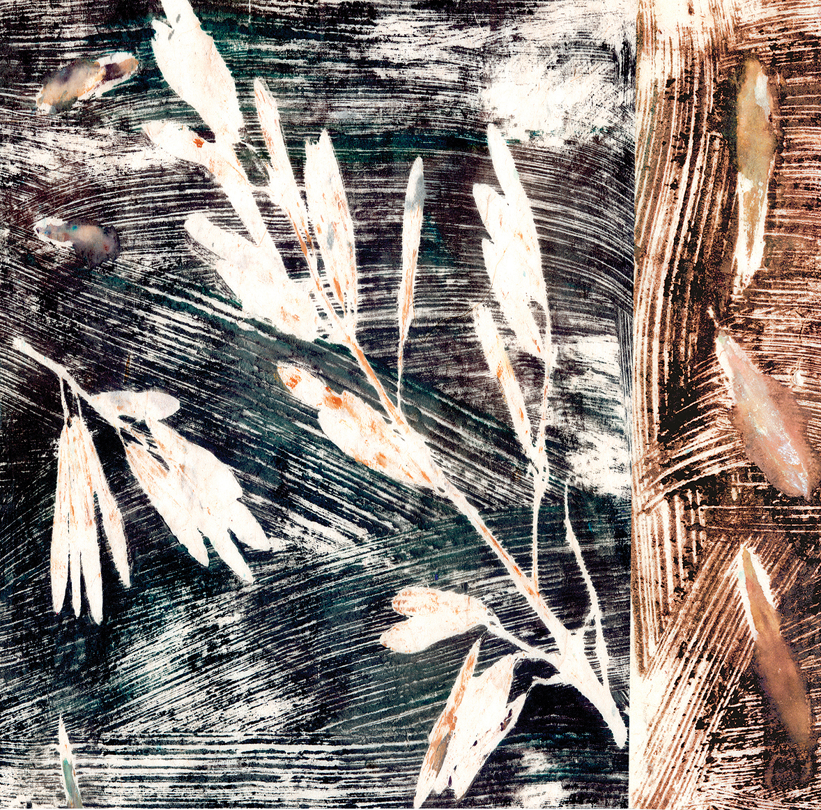
This example is by Catarina Guerreiro, a Portuguese print designer who submitted a nice selection of prints.
The Surface Pattern Design Guide call for entries closes on Monday, September 12 at midnight in Calgary. No exceptions! Don't wait until the very last minute, either, since your artwork needs time to upload to the system. The UPPERCASE + Windham Fabrics New Design Competition also closes then—to be considered for this contest, just click the appropriate box on the form.
Issue 31 is on press today! Mailing data will be finalized next week, on Thursday, September 15, so make sure you've subscribed, renewed or updated your address. (Don't forget to use the code "fallforit" for $15 off subscriptions and renewals.)
Have a nice (pattern-filled?) weekend!
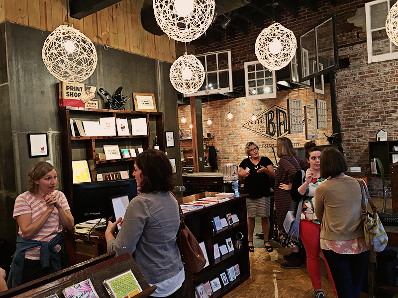
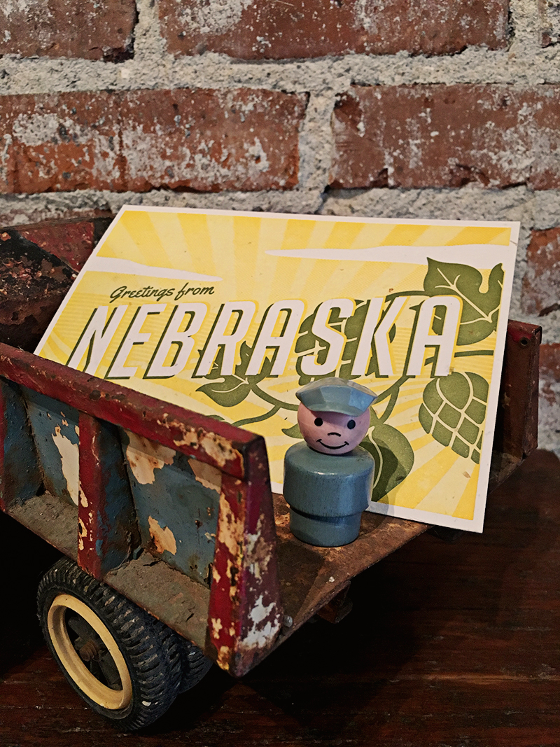
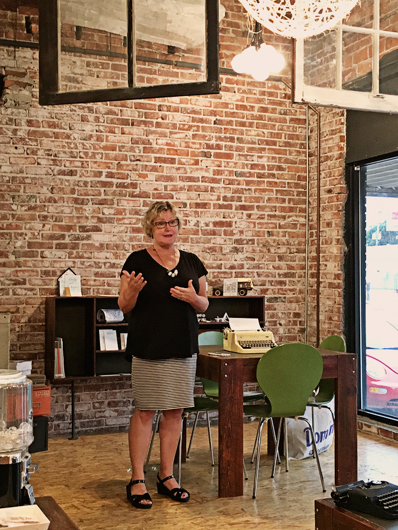
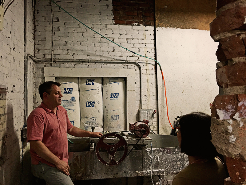
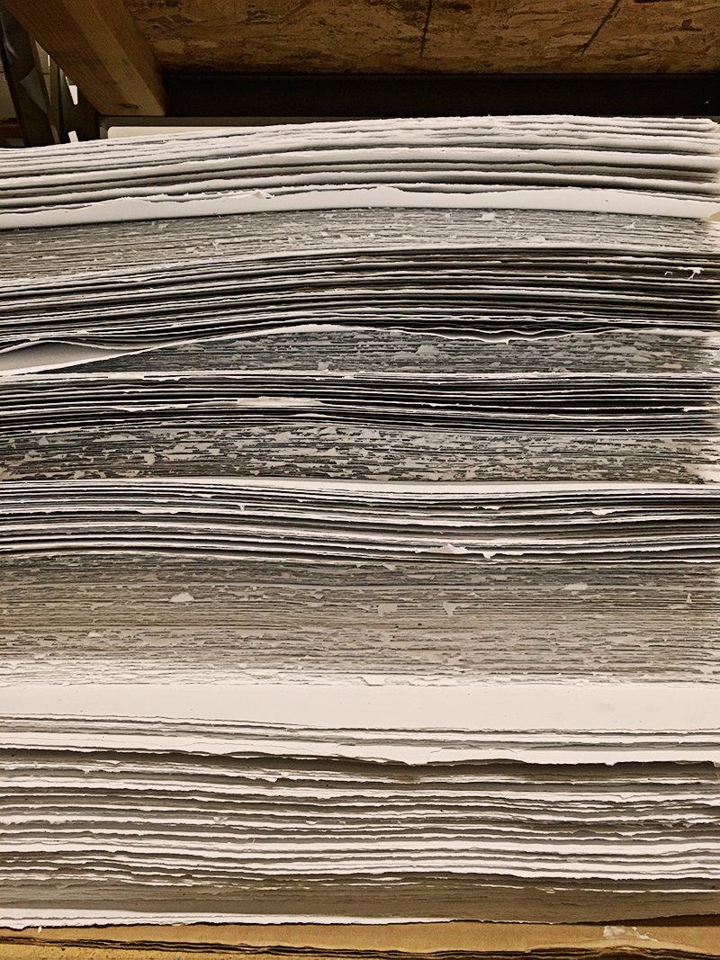
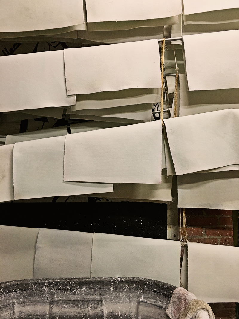
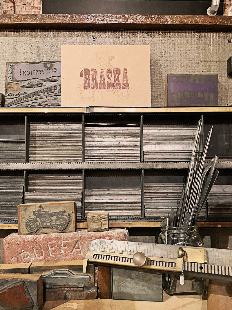
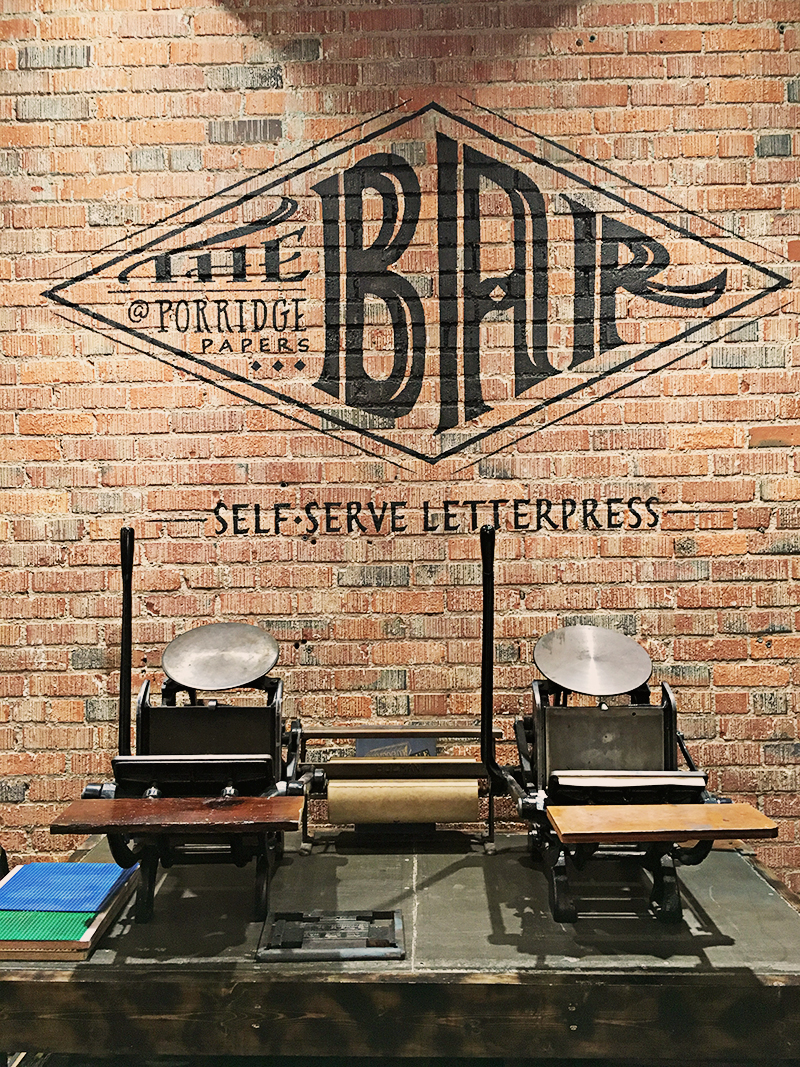
Here are some snapshots from the lovely Show and Tell we had on Friday, August 26 at Porridge Papers in Lincoln. Thank you to Christopher James for hosting us in this amazing letterpress and paper-making studio. (Captions will have to come later—posting this from the airport!)

Ever dream of being published in UPPERCASE? Or of having your own fabric collection?
Submit your work! Deadline extended to September 12.
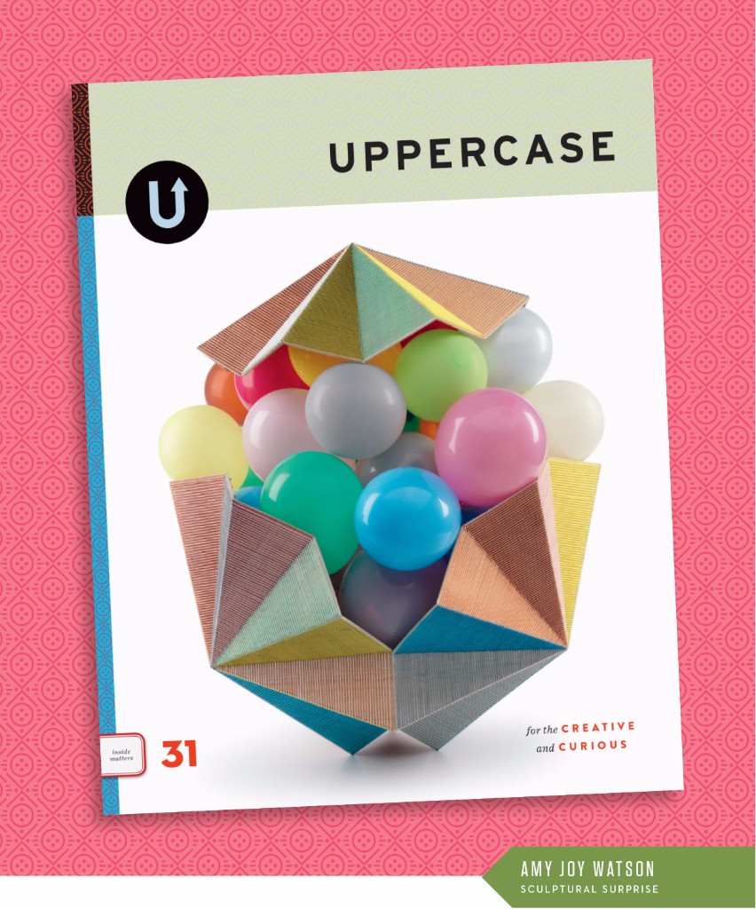
The fall issue (October/November/December) is nearly done. Just some proofing and final touches and this baby is off to the printer. The cover is by Australian artist Amy Joy Watson who used watercolour-tinted balsa wood laced together with embroidery thread to cradle balloons in this piece entitled Pop.

Here's a closer view:

It's always a challenge to find or commission one iconic image for the cover, something that encapsulates the themes and ethos of the magazine. But what I love about this image is that it has a sense of wonder and of surprise... you can just imagine those balloons lifting and spilling forth from the exterior capsule. It speaks to both themes: performance and costuming/garment-making. The artwork is in the act of becoming. Whether those balloons spill out, pop or eventually deflate—there is a performance at work. And, to my mind at least, the threaded container is like a jacket of sorts, protecting what lies within.
I also love how the facets and folds echo the cover of issue 29. I try to have some repeated element or motif; this helps to keep them all part of the same visual family.
And the background pattern?

I started with a simplification of the form of Amy's sculpture, the centre balloons represented by a circle with a triangle base and cover. The horizontal lines were inspired by her linear threads and the spine pattern from issue 28. Finally, the dots represent the balloons, but also the holes within a button, my nod to the garment-making theme.
As ever, UPPERCASE is a labour of love. Please subscribe, renew and tell your creative friends!

Dear Reader,
I scanned this collection of old drive-in movie theatre tickets for the fall issue. Aren't they pretty in their analog-ness? At a glance, they appear to be pretty much the same, but yet when you look at them individually they're full of quirks and moments of vernacular and typographic bliss.
I strive for this with each issue of UPPERCASE: to create something that feels familiar to its loyal readers, yet reveals new interests, unique details and fresh perspectives. The same, but different.
After 30 issues, the challenge doesn't get any easier. If anything, it gets harder. Because I keep pushing myself to do things I haven't done before.
Consider this: I am looking and searching and curating and evaluating visual culture on a daily basis for the magazine. I see a lot. And so in the magazine, I include things that really stand out. That spark my curiosity. People and subject matters that I am willing to invest my time and resources in getting to know.
In issue 31, the issue I'm designing currently, I'm exploring territory that challenges me personally. The general theme is "performance" and how it relates to the visual arts, craft and design. Whether it is performance art, theatrical sets and costume design, dance and movement—if I imagine my (introverted) self in some of these settings, I am really out of my comfort zone. But that's good. If I'm growing and learning and being inspired through this content, I know you, my readers, will too. Related to performance is the notion of costuming—how what we wear reflects who we are. (Or how we shape how the world perceives us through our clothing.) Garments and sewing clothes are another thread of exploration in this issue.
Creativity beyond yourself—creativity that tests your perceptions and expands horizons—now that's the best kind of inspiration.
Subscribe to UPPERCASE magazine.

Find out more and reserve your spot.
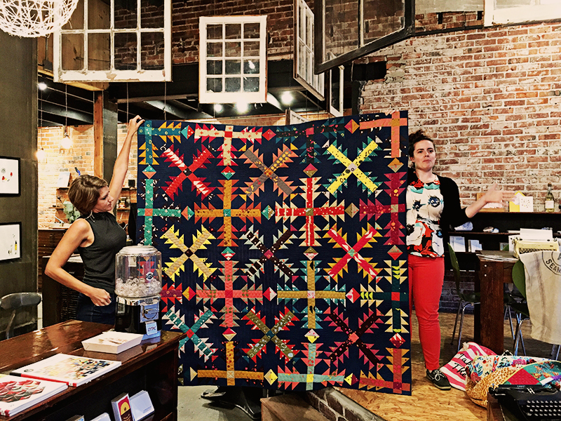
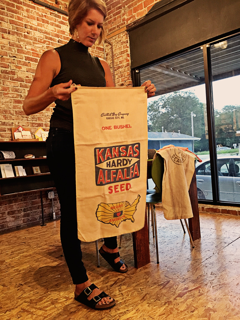
Heather Givans is the energetic force behind Crimson Tate. She's a quilt-shop owner in Indianapolis, fabric designer, quilt designer and maker. She's a fellow designer with Windham Fabrics, but I hadn't yet met Heather when I saw that she had tagged me in a somewhat strange Instagram picture a few days before this year's QuiltCon.

Once I met Heather in person, I realized that my fears of some bizarre internet stalking were unfounded. Turns out that the ransom-note style cutouts of faces were a fun little prop — during QuiltCon she put different pictures of fabric designers and quilters in one of the open pockets in her Letters from Home quilt displayed in the Crimson Tate booth and made with the UPPERCASE collection with Windham Fabrics.

Heather's fabric collection is also out now and UPPERCASE readers will love it. It's called Paper Obsessed and features designs and drawings inspired by notepaper, letter writing, paper airplanes and envelopes. It's very cute:
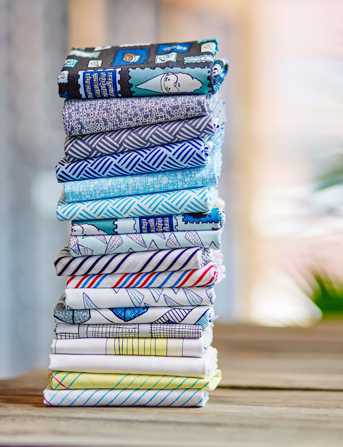
photos by Eric Lubrick

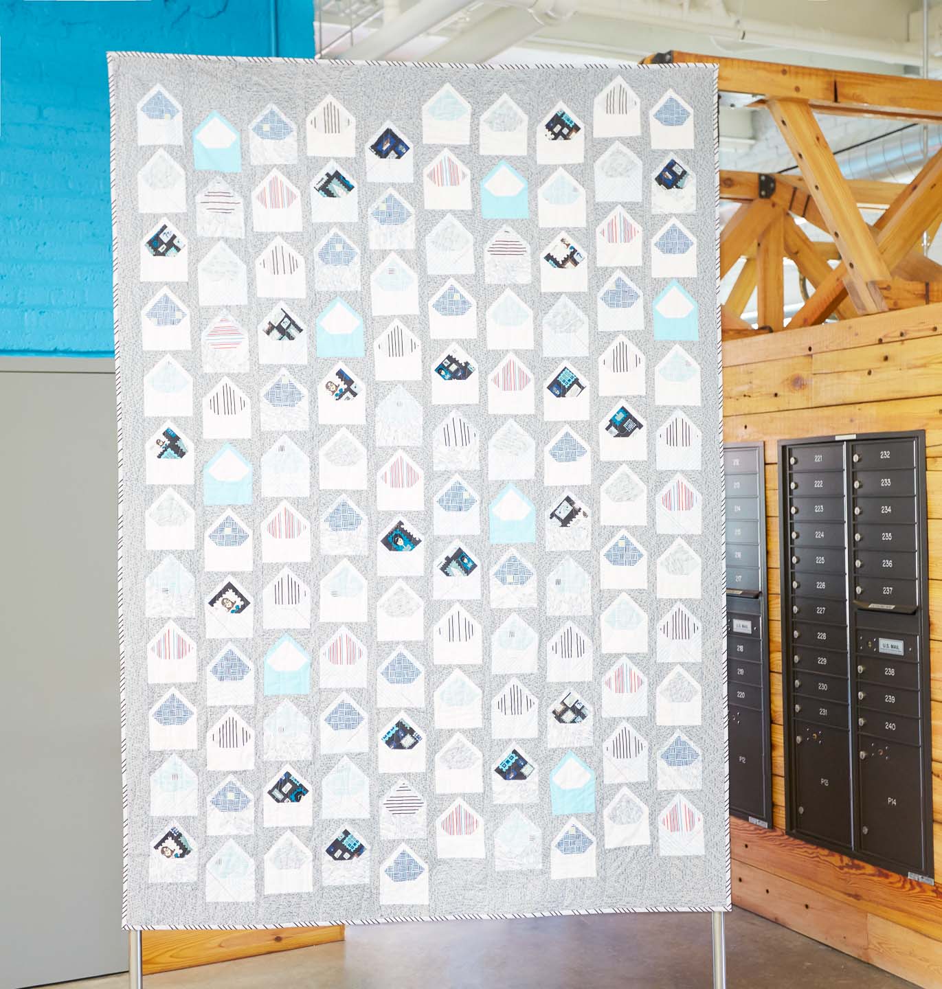
Above is the Letters from Home quilt in Heather's collection.
Heather writes, "Nothing is sweeter than a handwritten letter. The act of opening an ornately lined envelope only to find kind words from your grandma, mother, or friend is a treasure not soon forgotten. Create an heirloom quilt to mark milestones such as weddings and graduations, to honor those serving in the military, or to remember any special life event. A modern take on the signature quilt, Letters from Home is the ultimate love letter."
Her Look Book is really nice (I looked at it when I was working on my own, thanks for the inspiration, Heather!) The paper airplane motifs and quilts are clever, too.

Windham Fabrics is giving away a bundle of Paper Obsessed fat quarters on every stop of the Paper Obsessed blog tour! Heather is also including a pattern called the Correspondence Mini Quilt plus some Paper Obsessed swag.
July 12 Windham Fabrics :: http://windhamfabrics.wordpress.com
July 13 Heather Givans of Crimson Tate :: https://blog.crimsontate.com/
July 14 Sarah Sharp of {no} hats quilts :: http://www.nohatsinthehouse.com/
July 15 Janine Vangool of UPPERCASE Magazine :: http://uppercasemagazine.com/blog/
July 16 Karen LePage of Gentle Clothing :: http://onegirlcircus.com
July 17 Jenny Leisure / David Barnhouse of Crimson Tate :: https://blog.crimsontate.com
July 18 Heather Jones of Heather Jones Studio :: http://www.heatherjonesstudio.com/blog
July 19 Eric Lubrick of Eric Lubrick Photography :: http://oartooar.com
July 20 Annie Unrein of By Annie’s :: http://byanniecom.blogspot.com
July 21 Amanda Castor of Material Girl Quilts :: https://materialgirlquilts.com
July 22 Sara Lawson of Sew Sweetness :: http://sewsweetness.com/blog
July 23 Giuseppe Ribaudo of Giucy Giuce :: http://www.instagram.com/giucy_giuce
July 24 Karen McTavish of Karen McTavish Quilting Studio :: http://mctavishquilting.com/news
July 25 Kristen Wright of Two Blondes and a Sewing Machine :: https://twoblondesandasewingmachine.wordpress.com
July 26 Heather Givans of Crimson Tate :: https://blog.crimsontate.com


Fairy Tale Summer — our last class of the summer* — begins this coming Tuesday, June 21! We are re-running an edited version of the year-long class from 2014, “Year of the Fairy Tale.”
Assignments will be modified slightly for the summer session for a “doable” class, but you will have forever access so you can revisit the lessons anytime (and do the full assignments if desired). This is the last time this course will run live.
Class dates are June 21 – August 11, 2016; we will illustrate 8 fairy tales, one each week; each fairy tale includes both a drawing assignment (Tuesdays) and a mixed-media assignment (Thursdays).
Just $149. Click HERE for details and to sign up!
P.S. Previous “year of” participants can join again at no additional cost… email me to get on the list: carla@carlasonheim.com.


Photos above by Chris Young.
July/August/September 2016
Printed by The Prolific Group
Paper provided by Appleton Coated


Cover by Christy Batta

The UPPERCASE Circle is free for subscribers of the print magazine. Find out more.
UPPERCASE is a quarterly print magazine inspired by craft, design and illustration. A playful exploration of creativity, an affinity for vintage ephemera, and a love of handmade are some elements common in each issue. The magazine boasts high-quality paper and printing, a unique design aesthetic and incredible attention to detail.
Janine Vangool
publisher / editor / designer
Send a message →
* Before emailing submissions follow the guidelines here.
Glen Dresser
customer support
Please contact Glen for help with your purchases, wholesale inquiries and questions about your subscription. Include your full name and mailing address so that we can better assist you.
Send a message →
UPPERCASE publishing inc
Suite 201 b
908 17th Avenue SW
Calgary, Alberta T2T 0A3
403-283-5318
The studio is not open to the public—please get in touch to make an appointment. If you'd like to purchase our magazine and books locally, please see the stockist page.