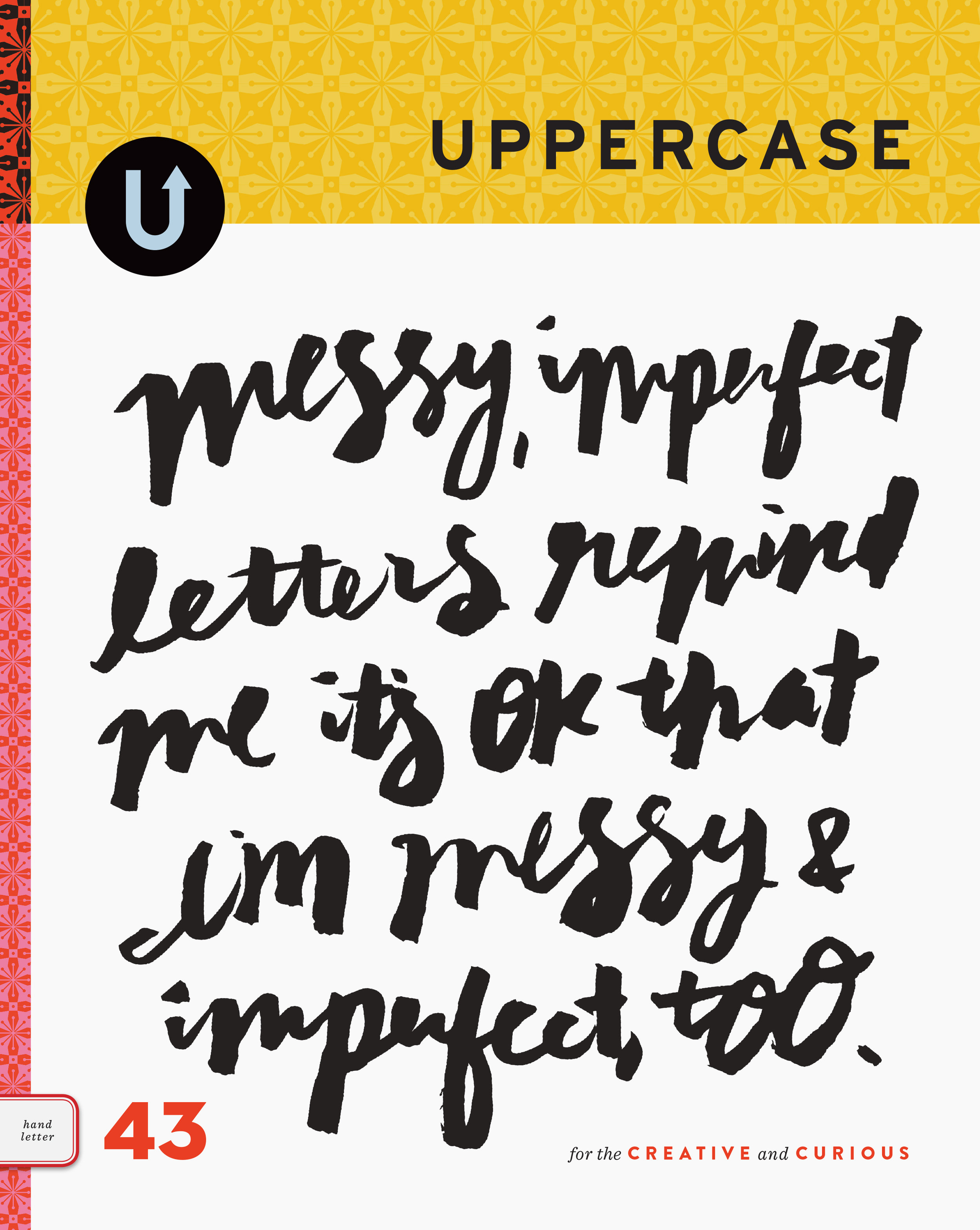
horn-tooting
/The Alberta Magazine Publishers Association hosted the Alberta Magazine Awards last Thursday. UPPERCASE received recognition for Best Art Direction of a Single Issue. GOLD for Issue 13 and SILVER for issue 15! The Judges had nice things to say:
ON ISSUE 13:
- This magazine is well suited for its audience. The variety and creativity in imagery and content works well to keep interest throughout.
- Uppercase is a visual treat from first page to last. The design is simple, engaging, and colorful, and provides the perfect counterpoint to the lush and diverse collection of imagery. There's a rich texture to the ever-changing selection of story presentations. Everything about Uppercase's design, from the paper selection, format size, to the delicate use of metallic ink on the cover, is in perfect harmony with the magazine's editorial mission.
ON ISSUE 15:
- A well curated collection of photos, illustrations, people and stories that remain true to the issue's theme, while still being fresh in approach.
- Uppercase's design is the complete package: smart, thoughtful, engaging design, great paper, a beautiful, graphic cover, and a rich treasury of imagery. Best of all, the design all works in harmony with the content and the magazine's crafty, DIY aesthetic.


