Preview my third collection with Windham Fabrics!
/At last, I can share with you what I was up to this past August. Sewing, sewing, sewing! Flip through the Idea Book and see more images here.

At last, I can share with you what I was up to this past August. Sewing, sewing, sewing! Flip through the Idea Book and see more images here.

My second Windham Fabrics collection is arriving in North American stores! The photo above is by Stash Fabrics and below, by Pink Castle Fabrics.

Share your UPPERCASE fabrics stashes and projects on instagram and twitter @uppercasemag #uppercasefabric. Thanks!
My mom, Bonnie Vangool, is a very prolific quilter! Here are some recent quilts that were shown at the Saskatoon Quilters’ Guild show on October 27 and 28.

The pattern was designed by Nancy Mahoney and appeared in the Fons & Porter Scrap Quilts magazine, Spring 2015 edition. The fabrics are from UPPERCASE Volume 2: Dots, Dashes and Diamonds, with the exception of the solid white.

This quilt incorporates fabrics from both of my collections plus lots of scraps from her stash.


Strike offs are hand-printed silkscreened swatches to show colour and registration.


This is the most stressful part of the process, because so much is left to personal interpretation when it comes to colour. Requested changes to the colour are communicated to the production manager at Windham, who passes them along to the print production folks, who are in this case, in South Korea.


Some colours are too dark, others skew to bright. Some are perfect, others need a bit more yellow, or a bit less yellow... or need to be warmer, or cooler... I mark down my comments for each design in each colour and discuss the requested changes with the production manager.

There isn't time in the schedule to see a second batch of strike offs, so the production team proceeds to make sample yardage based on the first round of comments. The sample yardage is used to make the projects for the look book, sample swatches for the sales team, plus sample fat quarter bundles and charm packs to give away at spring Quilt Market.
My second collection with Windham Fabrics will be available stores in November! Leading up to its release, I though I'd share some of the process and behind-the-scenes looks at how it came to be. Like my first collection, the designs are inspired by the patterns that appear on the cover and spine of UPPERCASE magazine.

As you can see, there was a lot to work with! It was a matter of whittling it down to create a cohesive collection, while adding in a few new patterns to tie it all together.

My design brief for Volume 2 was "the same but different." So designs that could work as basics, but also some with more colours within a pattern.

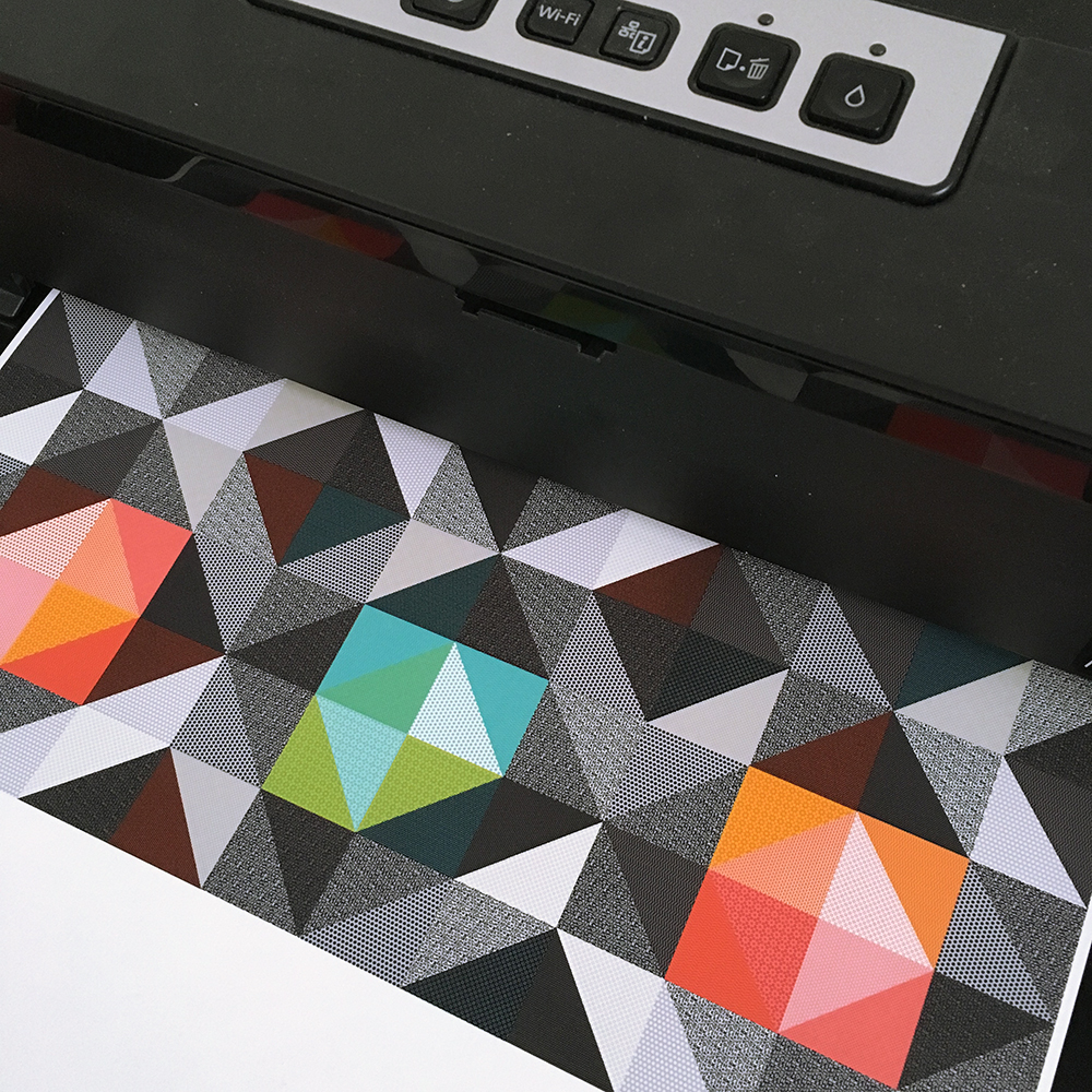
The fabric swatches on the left are from my first collection. They're placed on some paper ink jet printouts to see how they work together. The common motifs for Volume 2 are dots (both circular and diamond-shaped), diamonds (squares on an angle) and dashes (repeated lines).


The colour palette is similar to the first collection, with little hits of black giving some graphic punch to many of the designs. (Not all of the paper designs pictured in this post ended up in the final collection.)


Researching and designing (and collecting!!!) swatches for the Feed Sacks book also influenced the collection. There were two specific designs that I reinterpreted to fit within the collection.

These vintage feed sacks' diamond motif inspired some of the new patterns.


I made lots and lots of printouts with various colours and designs before narrowing it down to present to Windham.

In my next post, we'll look at the strike offs!


My name is Rosalyn Faustino and I am the founder of Calgary Craft Alert. (hi!) Janine and I are happy to be co-hosting the Creative Supplies Swap at UPPERCASE this Saturday from 1-3pm.
I was born and raised in Calgary and went adventuring in Toronto for almost 13 years and came back to become an auntie to my nieces and to have a new adventure with my partner in 2014. I graduated Specializing in Sculpture and Design and Art History and became interested in more traditional and domestic craft work such as weaving, sewing, and quilting. Although, I love to draw and practice penmanship.
Calgary Craft Alert started its online presence in November 2015—when I was 7 months pregnant with my little boy. I wanted to create an online space for the art and craft community for the city of Calgary to connect with one another.
My first year of having a newborn and starting a new venture was quite tough, as I didn't often get the chance to explore the city and attend shows. I used Instagram and Facebook as my main sources of researching local talent and I immediately started to build the Calgary Craft Alert website, albeit at a very slow pace. However, you will most likely see my family and I going on craft adventures, now that summer is here!

A few months ago, I had the opportunity to sew a couple sample projects for Janine's newest fabric look book, Volume 2: Dots, Dashes and Diamonds. The patterns used are also made by a local designer, Krystine Czepuryk of Pretty By Hand.

Sign up for Calgary Craft Alert newsletter for the latest local craft news. See you on Saturday!

Join me later this month at the spring Quilt Market in St. Louis, Missouri!
I'll be giving a presentation (and giving away free magazines and there will be a draw for fabric) on Saturday, May 20 at 11am in the Windham Fabrics booth. On Sunday, May 21 starting at noon, you're invited to come back to the Windham Booth for a fun and easy craft: making necklaces and rings with my new collection UPPERCASE Volume 2: Dots, Dashes and Diamonds.

Supplies and space are limited for the free jewellery-making session, so if you're going to be at Quilt Market, please RSVP here to reserve a spot.

It's a fabric ring of POWER!
If you're going to be showing at market or roaming around and would like to connect, please get in touch.
Now that the Look Book for UPPERCASE Volume 2 is published, I'm happy to share more pictures of my sewing room.

Fiber drums purchased online from Uline.ca were the perfect solution for storing 32 bolts of fabric!

They nestle in a narrow hallway—they're nice to pass by everyday.

There are 32 SKUs in this collection! So many patterns and colours to work with! These are the cool colours...

And here are the warm colours. They're basically the same palette as my first fabric collection, but this time there are more colours at play in many of the designs.

This shelf used to be Finley's changing table.

I've always wanted a family of calico cats. Thanks to Glen and Finley and their Christmas gift, I have these little guys to play with. I'd like to sew them clothing in my fabric and vintage feed sack scraps.

So cute. They appeal to my 8-year-old self.

Vintage thread spools. They appeal to my 40-something-year-old self.

Here's an overview of the sewing area. It's at the base of the stairs and opens out to the deck. The neat areas are on the perimeter since I was taking pictures for the Look Book—everything else was piled up in the middle!

There's nice natural light to sew and photograph by.

I look forward to sharing more behind-the-scenes photos and details of the projects I made.

Safe to say, if you see nicely cropped images from me, there's a lot of STUFF that I've omitted from the shot!

It's pretty incredible to have a first fabric collection, let alone Volume 2! Thank you, Windham Fabrics!

I'm pleased to present my forthcoming collection with Windham Fabrics, UPPERCASE Volume 2: Dots, Dashes and Diamonds.

Repeated motifs of dots, dashes and diamonds make up this pretty graphic collection—with a little vintage feed sack inspiration thrown in as well! The optimistic colour palette pairs well with both vintage and contemporary designs.

The collection is on sale now as preorders for fabric retailers—visit the Windham Fabrics website for more details and to place your wholesale order. It will be available in stores in November.

Peruse the Look Book here and find out more about the UPPERCASE (Paper) Quilt Block Challenge.

Thanks to my son for helping me with this post!

It'll be some time before the my new Windham Collection is available in stores (November 2017) but that doesn't mean we can't have some fun with it! Let's get our creative juices flowing... by playing with paper!
1) Download and print this pdf to play with the patterns from UPPERCASE Volume 2: Dots, Dashes and Diamonds. (Or see the spread of the new fabric in issue 33.)

2) Design an original or traditional quilt block or use the patterns to create a collage. (Print out multiple copies if you need more of a particular pattern.) You can add solid white or black if you like. The finished designs should be square.

3) Take a square photo of your creation and share on Instagram with the hashtag #uppercaseblock. The creations will be displayed in an online gallery.

Together, we’ll create a quilt design based on reader submissions. I’ll award some fabric to the favourites. Have fun!

See more of the UPPERCASE Volume 2: Dots, Dashes and Diamonds collection over here.


Textile and mixed media artist Frieda Oxenham has made these beautiful flowers and quilt using the UPPERCASE collection from Windham Fabrics. Stunning!
Ever dream of being published in UPPERCASE? Or of having your own fabric collection?
Submit your work! Deadline extended to September 12.
Heather Givans is the energetic force behind Crimson Tate. She's a quilt-shop owner in Indianapolis, fabric designer, quilt designer and maker. She's a fellow designer with Windham Fabrics, but I hadn't yet met Heather when I saw that she had tagged me in a somewhat strange Instagram picture a few days before this year's QuiltCon.

Once I met Heather in person, I realized that my fears of some bizarre internet stalking were unfounded. Turns out that the ransom-note style cutouts of faces were a fun little prop — during QuiltCon she put different pictures of fabric designers and quilters in one of the open pockets in her Letters from Home quilt displayed in the Crimson Tate booth and made with the UPPERCASE collection with Windham Fabrics.

Heather's fabric collection is also out now and UPPERCASE readers will love it. It's called Paper Obsessed and features designs and drawings inspired by notepaper, letter writing, paper airplanes and envelopes. It's very cute:
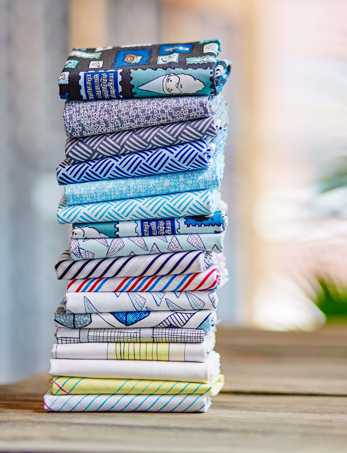
photos by Eric Lubrick

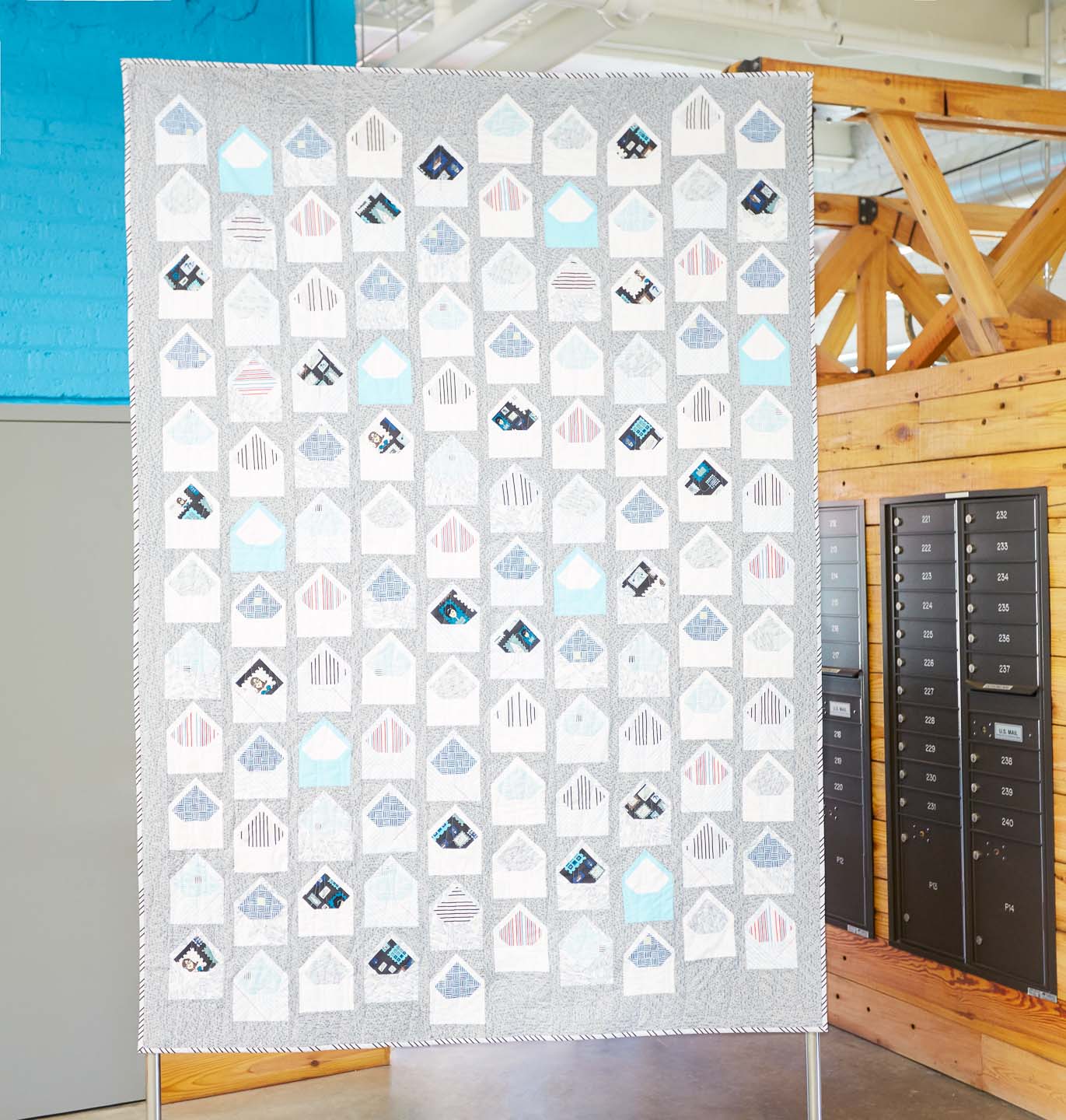
Above is the Letters from Home quilt in Heather's collection.
Heather writes, "Nothing is sweeter than a handwritten letter. The act of opening an ornately lined envelope only to find kind words from your grandma, mother, or friend is a treasure not soon forgotten. Create an heirloom quilt to mark milestones such as weddings and graduations, to honor those serving in the military, or to remember any special life event. A modern take on the signature quilt, Letters from Home is the ultimate love letter."
Her Look Book is really nice (I looked at it when I was working on my own, thanks for the inspiration, Heather!) The paper airplane motifs and quilts are clever, too.

Windham Fabrics is giving away a bundle of Paper Obsessed fat quarters on every stop of the Paper Obsessed blog tour! Heather is also including a pattern called the Correspondence Mini Quilt plus some Paper Obsessed swag.
July 12 Windham Fabrics :: http://windhamfabrics.wordpress.com
July 13 Heather Givans of Crimson Tate :: https://blog.crimsontate.com/
July 14 Sarah Sharp of {no} hats quilts :: http://www.nohatsinthehouse.com/
July 15 Janine Vangool of UPPERCASE Magazine :: http://uppercasemagazine.com/blog/
July 16 Karen LePage of Gentle Clothing :: http://onegirlcircus.com
July 17 Jenny Leisure / David Barnhouse of Crimson Tate :: https://blog.crimsontate.com
July 18 Heather Jones of Heather Jones Studio :: http://www.heatherjonesstudio.com/blog
July 19 Eric Lubrick of Eric Lubrick Photography :: http://oartooar.com
July 20 Annie Unrein of By Annie’s :: http://byanniecom.blogspot.com
July 21 Amanda Castor of Material Girl Quilts :: https://materialgirlquilts.com
July 22 Sara Lawson of Sew Sweetness :: http://sewsweetness.com/blog
July 23 Giuseppe Ribaudo of Giucy Giuce :: http://www.instagram.com/giucy_giuce
July 24 Karen McTavish of Karen McTavish Quilting Studio :: http://mctavishquilting.com/news
July 25 Kristen Wright of Two Blondes and a Sewing Machine :: https://twoblondesandasewingmachine.wordpress.com
July 26 Heather Givans of Crimson Tate :: https://blog.crimsontate.com

My life has been a blur since coming home from Quilt Market — I've been in full-on design mode and proofing mode to get issue 30 done. Which it is. Except for the whole printing, logistics and shipping part!
I met some nice and talented people at Quilt Market. I gave away some charm squares and there were also fat quarter bundles for sale, so now I'm starting to see what people are making. Fun!
I enjoyed seeing Laura Estes' sweet fabric flowers and I gave her a charm pack to play with.
"The Jumbo Coin Ruching Guide, TR700, designed by me and produced by Quilting Creations International is an acrylic tool used to mark 5 inch and 2 1/2 inch strips of fabric with a scallop line to stitch and draw up the fabric to form petals," she writes. "With the 5-inch charm squares, one scallop is marked on each of 19 or 20 squares, and as each petal is stitched and drawn up, they are joined together then formed into an approximately 6 inch bloom. The process is easy and fun for all skill levels, and there are some tutorials on my blog."

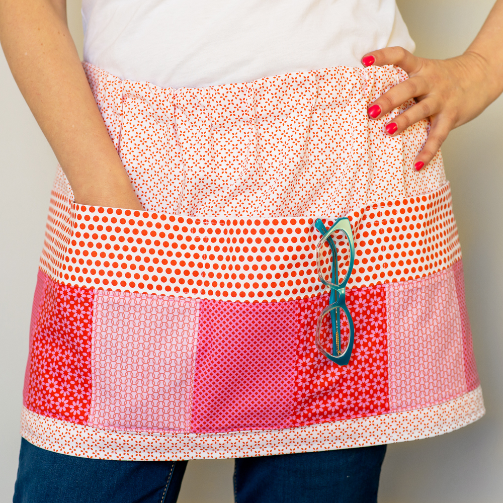
Inspired by an old apron with ample pockets found at a flea market, this modern take can hold your phone, cash and more. I call this my Craft Fair Apron since it would be handy if you're selling at a fair and need everything at hand.
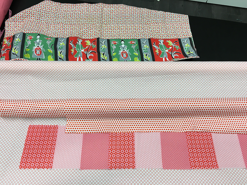
The original apron was basically a strip of fabric with a fancy printed pocket sewn on. The ties are threaded through a sleeve along the top so you can were the apron gathered or pull it around for a more sleek effect.
For my interpretation, I used strips of different fabric to mimic the pocket motif.

I didn't want to line the pockets, but I also wanted them to be nicely finished since I'll be reaching in there for my phone and notebooks frequently. So with half-inch seam allowances, I ironed the extra in half and folded neatly under. Then top stitched.


I like how it turned out. Maybe I'll just where it around Quilt Market to carry business cards and pins!


I call this quilt "Halfsies" since it started as a simple sketch on my computer with each square being reduced by 50% and so on. The pattern is available on the Windham website.


Here’s an idea come full circle: a quilt design inspired by the spines of UPPERCASE magazine—the thing that inspired this very fabric collection in the first place! My son was my willing model for the Look Book—he even art-directed some photos.
The quilt was sewn by Heidi Pridemore of The Whimsical Workshop for the Look Book. Free pattern available at windhamfabrics.com. This design is fat quarter friendly.

Hey, where'd everyone go?

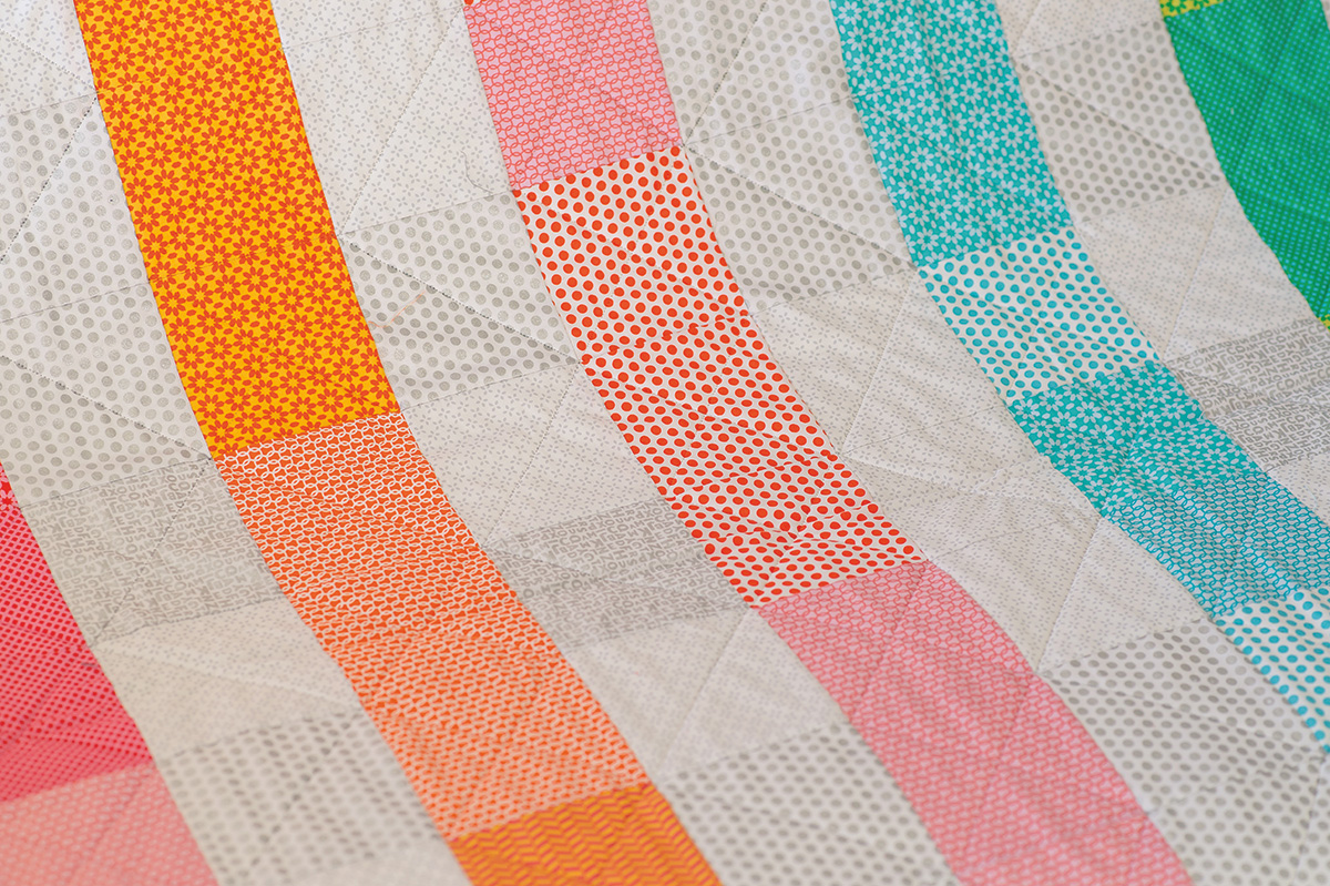
One of the challenges in making the Look Book for my fabric collection was designing the quilts that were going to be made! I'm not a quilter (yet!) but I'm a quilter-in-spirit! Fortunately, my mom is an amazing quilter (and quick, too) so she was enlisted to help make this quilt design that I call "Here and There Squares".

I wanted to design a quilt that would include all of the fabric options in one quilt, with the exception of the two silver metallics, so I started to play around with contrasting the colours with the grey tones.

It’s fun to play with lights and darks, warms and cools. In this quilt design, squares pop and recede and play tricks with your eyes.

This is a massive 96-inch square quilt. It was sewn and quilted by Bonnie Vangool.

Free pattern available at windhamfabrics.com.
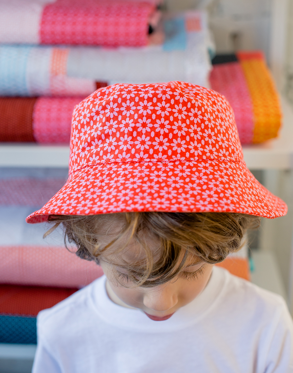
This is the simple reversible bucket hat, a free downloadable pattern from Oliver + S. Finley is a big fan of the colour red, so he chose the red and pink floral as one of the fabrics, the red chevron on the inside.

There are lots of great two-colour combos available in my UPPERCASE fabric collection.

I've never made a hat, but Liesl Gibson's instructions are simple to follow and that hat was easy to put together.
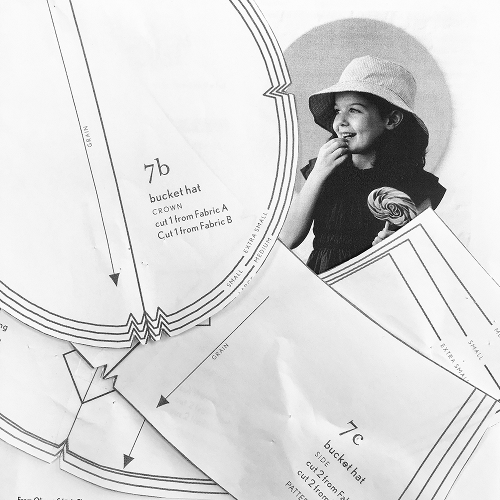
I made the largest size, but it is a little on the snug size, so I'll have to scale it up to make another... for me!
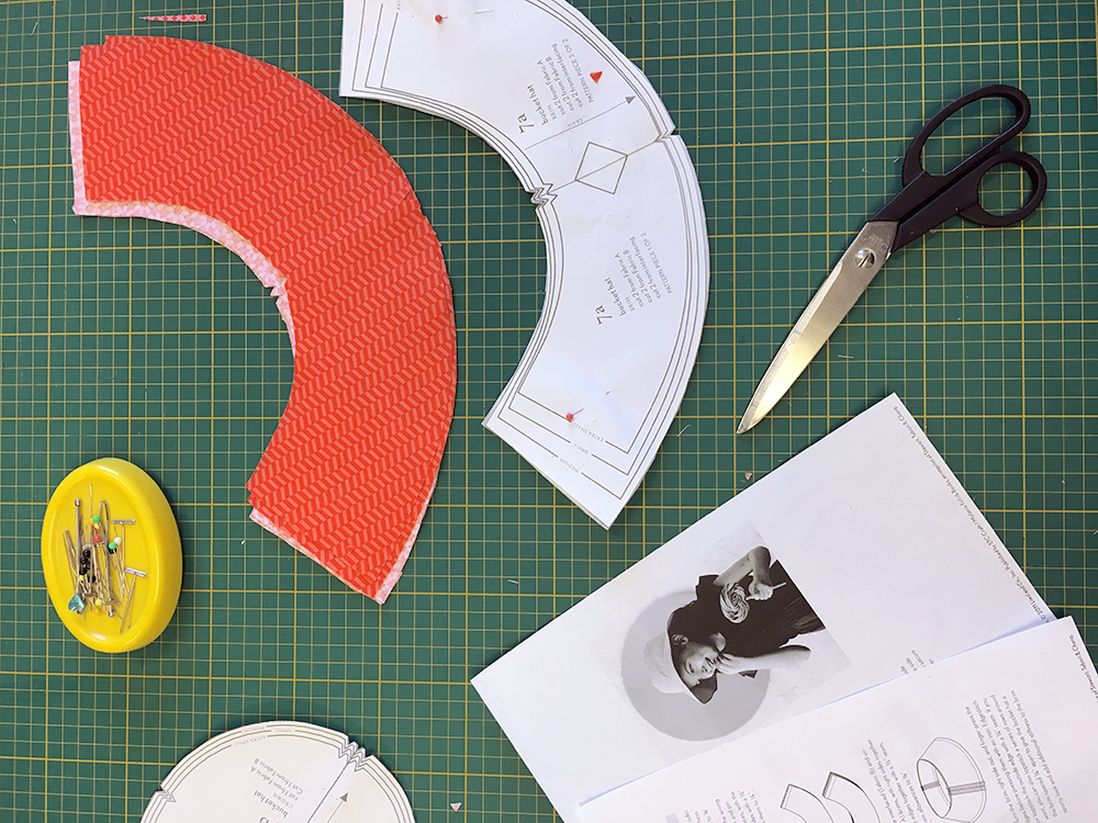
Download the pattern here.
Progress photos by me, finished project photo by Kirstie Tweed.

So anyone who knows me (or UPPERCASE) knows my fondness for typewriters. I call them the UPPERCASE mascots. So it was natural that I come up with some sort of typewriter and fabric project!
In fact, there's already a connection. If you look at the colours of my Royal Quiet DeLuxes and my fabric collection, they share a similar colour palette.

I decided to make a dust cover for a typewriter. You could quite easily adapt this process to make a cover for your sewing machine.
Please keep in mind that I'm not a DIY blogger or writer of craft instructions (nor do I plan on becoming either—I've got way too much to do already!) When it comes to sewing and making crafts, my usual process is to look at a lot of similar projects and read their instructions. Then I put that all aside, head over to my own project and available materials... and wing it!
Knowing that my fabric projects would be shared online, I took photos along the way. Keep in mind that I was figuring it out as I went along. And when things got complicated I sometimes forgot to take photos since I was concentrating or busy being frustrated.

Here's my rudimentary sketch of what I planned to make. Two sides with interfacing to make them sturdy, and, in a contrasting colour, piping to define the edges.

I selecting my fabric to coordinate with my favourite turquoise Royal. I had already made bias tape for a previous project and decided to use the extra to cover the piping.

I put some kraft paper on my table and loosely traced the typewriter on its side, leaving generous amount of room for the keys and knobs.
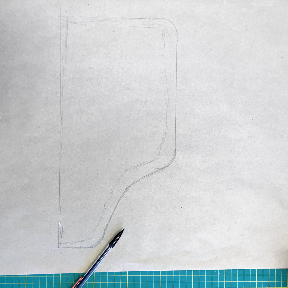
Next, I refined the curves and overall shape and added some extra allowance so that cover wouldn't be too snug.

I cut my template and then two pieces out of fusible, fairly stiff interfacing.
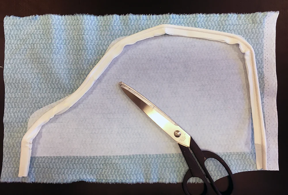
I used the outline to determine the length of piping I'd need. Using a basting stitch, I covered the piping with my bias tape.
I cut the shape out of the fabric half an inch around the interfacing plus an inch or two extra at the base.
I measured the desired width of fabric needed to cover the machine. For its length, I used the piping as a guide for how much would be required. In both cases, I added some generous amounts on either end to allow for hems and just in case. (Remember, I was making this up as I went along!) I also fused more interfacing to the front panel to give it some shape.
Next, I sewed one side, piping and top together. This involved a lot of pinning. I've only used piping once before about ten years ago, so I didn't exactly know what I was doing. The curves were difficult! But I just pinned it as precisely as possible and then sewed it slowly to avoid any puckers. Then did side two. The inside's not pretty, but you don't have to see that when the cover is on the machine! (Besides, I was sewing this for the Windham Look Book, so some selective photography and cropping could solve any glaring problems.)
Once the sides were both attached, I put the cover on the machine and folded up the hem as required and stitched it. With some steaming and ironing, the cover turned out ok. It looked a little plain, so I decided to dress it up a bit. I've had this plastic turquoise buckle for some time, so it seemed of the right era to suit a typewriter cover.

And with the bow... voila!

If I were to make another cover (I've got a dozen typewriters!), I might omit the piping and just make a fabric flange or something a little simpler—but I do like that contrasting pop of colour!
The top two photos and finished project photos are by Kirstie Tweed of Orange Girl for the UPPERCASE collection Look Book. Process photos taken with my iPhone.


The UPPERCASE Circle is free for subscribers of the print magazine. Find out more.
UPPERCASE is a quarterly print magazine inspired by craft, design and illustration. A playful exploration of creativity, an affinity for vintage ephemera, and a love of handmade are some elements common in each issue. The magazine boasts high-quality paper and printing, a unique design aesthetic and incredible attention to detail.
Janine Vangool
publisher / editor / designer
Send a message →
* Before emailing submissions follow the guidelines here.
Glen Dresser
customer support
Please contact Glen for help with your purchases, wholesale inquiries and questions about your subscription. Include your full name and mailing address so that we can better assist you.
Send a message →
UPPERCASE publishing inc
Suite 201 b
908 17th Avenue SW
Calgary, Alberta T2T 0A3
403-283-5318
The studio is not open to the public—please get in touch to make an appointment. If you'd like to purchase our magazine and books locally, please see the stockist page.