

type tuesday: Bookmania
/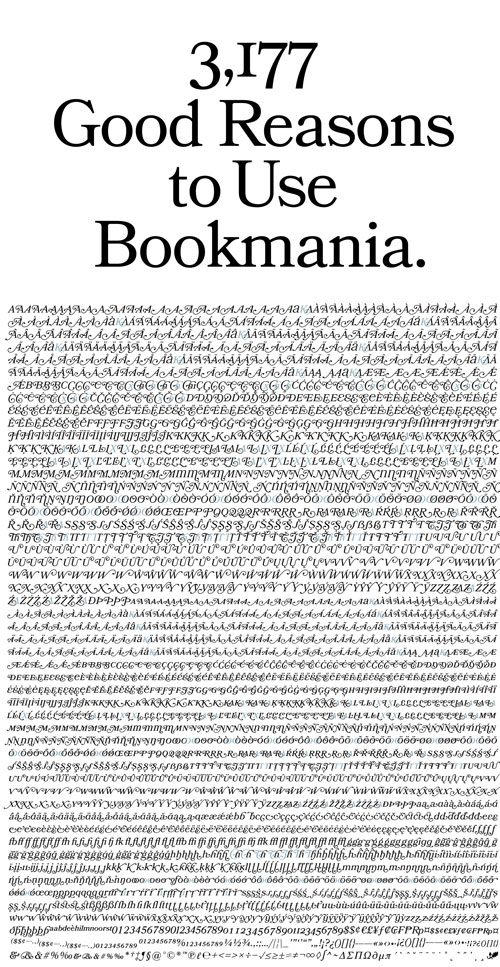
Prolific type designer (and UPPERCASE subscriber!) Mark Simonson has released a tour-de-force typographic family. A revival based on Bookman Oldstyle (1901), this Opentype release called Bookmania has a crazy number of alternates and swashes, as witnessed above, as well as weights from light to black plus italics.
Allow me to date myself: The very first "font" I ever purchased was Bookman: the Letraset version! My grandfather had commissioned me to design a logo for a cultural organization. Though desktop publishing was just becoming viable at this point, as a young highschool girl, I didn't have those skills and needed "professional-looking" (at least to my inexperienced eyes) letters for the design. The local art supply store had a wealth of amazing dry transfer letters from which I could choose. I remember standing there for quite some time before I settled upon Bookman. Drawn to its pretty capitals and classic looks, I paid a huge sum ($25?) for one sheet of letters. Next time I'm home visiting my parents I'll see if I can unearth the design. It would be good for a laugh! (And perhaps someday I'll share my typographic shame... Mistral.)


