Learn Brush Lettering at UPPERCASE with Christopher Rouleau
/Find out more and reserve your spot.

Find out more and reserve your spot.
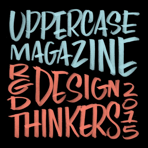

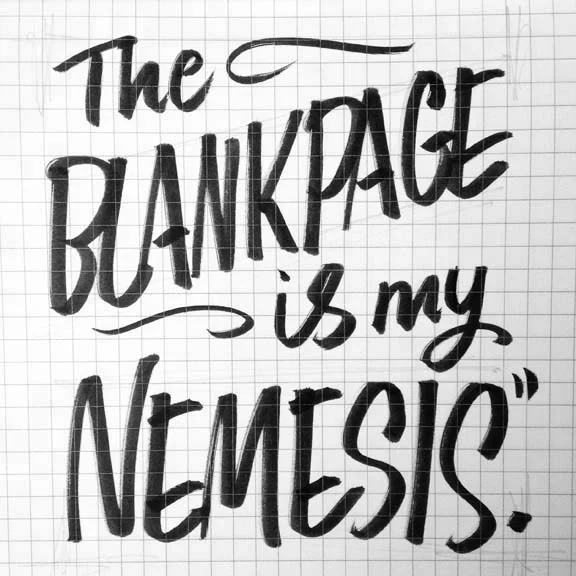
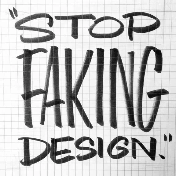
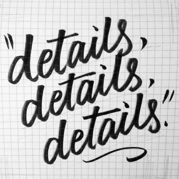
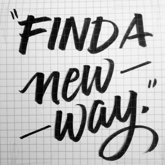
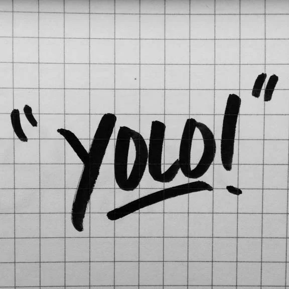
Frequent UPPERCASE magazine contributor Christopher Rouleau—and my Toronto correspondent!—brought his trusty brush pen to this year's Design Thinkers and did a great job of capturing those shareable sound bites that one gets when listening to speakers at a conference. For more details, please visit Christopher's blog. Look for Christopher's contribution in the January issue, in which he and other designers, typographers and letterers share their favourite numeral.
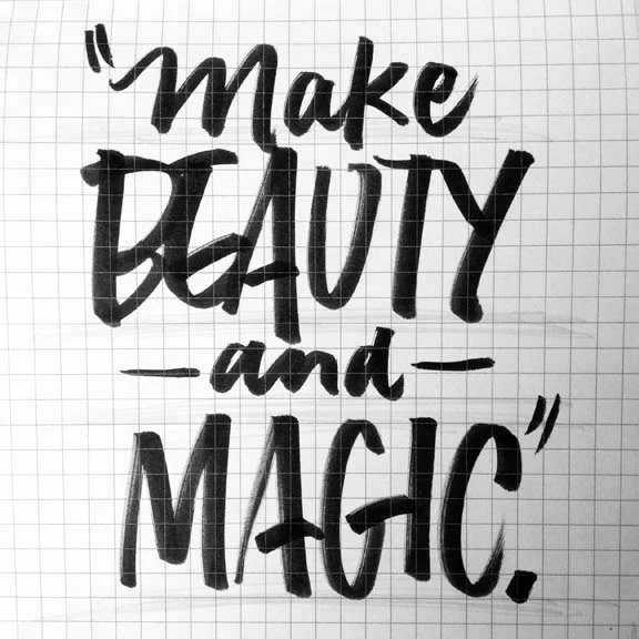
James Victore
James Victore Inc., Brooklyn, NY
"Beauty and Magic"
Josh Clark
Big Medium, Brooklyn, NY
Author: Designing for Touch
"Magical UX and the Internet of Things" (slides here)
Coralie Bickford-Smith
Penguin Books, UK
"Shelf Appeal: How Design is Helping Put Classics in the Hands of Readers
Look for a feature interview with Coralie and Christopher in next spring's issue of UPPERCASE.
Art Chantry
artchantry.com, Seattle, WA
"Art Speaks Posters Yell"

Jean-François Porchez
Typofonderie, Paris
"Adding Value to the Invisibility of Typefaces"
Annie Atkins
Graphic design for films, annieatkins.com
"The Secrets of Designing Worlds for Film"
Karim Rashid
Karim Design, New York, NY
"The Business of Beauty"
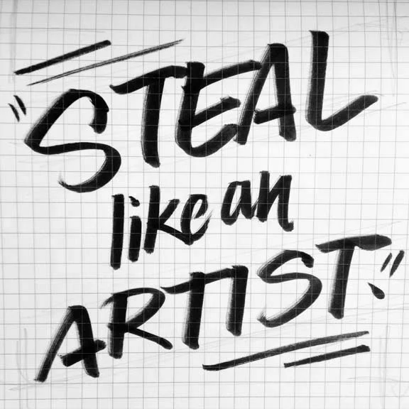
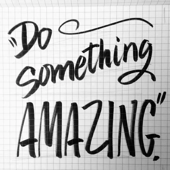
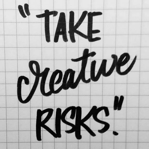
Austin Kleon
Designer, author: austinkleon.com, Austin, TX
"How to Steal Like an Artist"

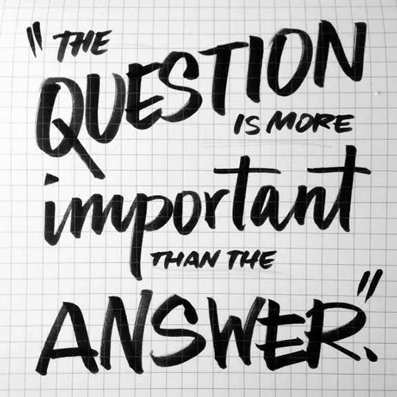
Manuel Lima
CodeAcademy.com, New York, NY
Author: Visual Complexity: Mapping Patterns of Information, The Book of Trees
"Visualization Metaphors: Unraveling the Big Picture"
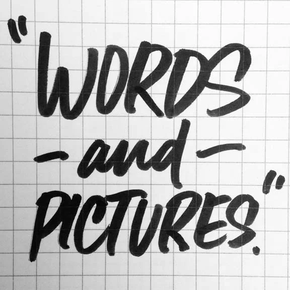
Chris Dixon
Design Director, Vanity Fair, New York NY
"Telling Stories with Words and Pictures"
Sebastian Padilla
Co-founder, Anagrama, Monterray + Mexico City, MX
"Going Fast to Nowhere"
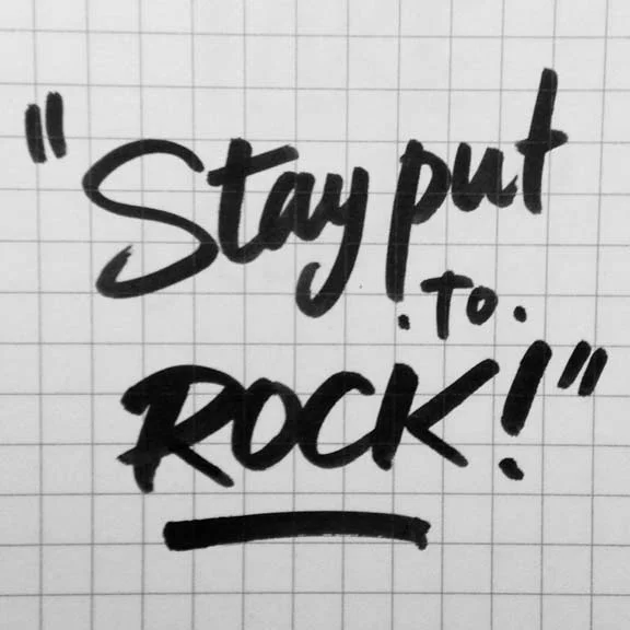
Michael Lejeune
Creative Director, Los Angeles Metro
"The Power of Staying Put"
Paddy Harrington
Founder, Frontier Magazine, Toronto, ON
"A Field Guide to Creative Adventuring"
Frank Chimero
frankchimero.com, ofanother.com, Brooklyn, NY
"Design is Borderlands"

Almenia Candis is a newcomer to the Denver area, so when she applied for one of the free TypeCon passes she wrote, "I would love to be able to attend and see first hand other type designers and inspiration in this new city that I've called home for the past 9 months."
Here's more from Almenia: "I've been a lover of type for some time and have recently taken up calligraphy as my obsession. I've acquired a lot of great inspiration from people all over on Pinterest and YouTube, including Kyle Gallant whom I'm so glad to see featured in recent UPPERCASE newsletter."
Made a video of myself doing Reddit's word of the day. Enjoy! Materials: Pilot Parallel Pens (all four sizes) Rhodia 8.3x12.5in Dotpad Pilot Razor Point II (for the date) Song: "New Output" by Sferro


Almenia is posting photos and videos from TypeCon, and you can see some of her previous lettering experiments and practices over on Instagram:


Hi all, I'm Allie, a graphic designer in Fort Collins, Colorado. I’m just starting out my career at a small marketing and public relations firm (with some freelance lettering and design work on the side) after recently graduating from Montana State University in Bozeman, Montana.
While in college, I spent a semester abroad in Italy, spending my days studying experimental type — needless to say, I have been in love with letterforms and type design ever since. I am so thrilled to be able to nerd out on typography for a weekend at TypeCon and I’m looking forward to sharing snippets with you guys!

Follow @uppercasemag and Allie on social media and check back here for dispatches from TypeCon. Thank you to TypeCon for the correspondents' free passes. Look for complimentary copies of UPPERCASE in the TypeCon goodie bags!
www.alliemcrae.com
www.instagram.com/alliemcrae
http://twitter.com/alliebmcrae

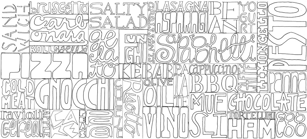
Lettering by workshop instructor Christopher Rouleau
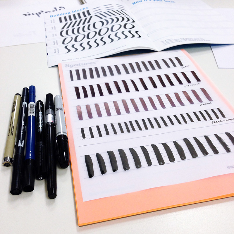
On Sunday, Calgary letter lovers were treated to a workshop taught by Toronto-based letterers Christopher Rouleau and Kyle Gallant. Organized by the Alberta South Chapter of the GDC, I volunteered my studio to be the venue. Chris is a multi-talented letterer and designer who also contributes frequently to UPPERCASE magazine. He and Kyle are co-founders of Ligatures, a club of type enthusiasts in Toronto.
I thoroughly enjoyed spending 8 hours dedicated to learning lettering and it was encouraging to see such an improvement in my understanding of how to letter thanks to great instruction and having the right tools to experiment with. I made a quick video, above. (I'm totally frustrated that I can't seem to focus my camera... even with bifocals and as much practice as I can... when I import the video and see it large, it's not in focus! Anyway... the video, above, blurry sections and all.)
Thank you to Spencer Goldade who organized the event for the GDC. There might be another workshop this winter if you missed out this time. If you're in Toronto tomorrow, there's a Ligatures meetup in Toronto called Type on Tap.


Awwww... thanks!
When I heard that UPPERCASE contributor Christopher Rouleau was planning a lettering workshop in Calgary, I offered him the use of the UPPERCASE studio if needed. Hooray! The workshop will be held in my studio! I look forward to taking the class and learning some lettering techniques from some really talented guys. The event is organized by the local chapter of the GDC. Here are the details:

GDC Alberta South welcomes Toronto letterers Kyle Gallant & Christopher Rouleau for a one-day intensive on the basics of brush pen lettering. In addition to learning the fundamentals of letterform construction, participants will also learn tips & tricks for composition, as well as how to digitize your work. The workshop offers creative enrichment and helps participants with all backgrounds – beginners & novice letterers – develop their own unique lettering style, which can then be applied into their future artistic endeavours, at work and beyond.
This is a full-day workshop will be held Sunday, July 12 from 9am – 5pm at UPPERCASE in the Devenish building. There will be a one hour break for lunch. The cost of this full-day workshop is $165. This price includes a workbook and the supplies you will need for the workshop, all of which you get to take home at the end of the day.
Kyle is a multi-faceted designer, skilled in calligraphy, expressive lettering, and even graffiti. He is a self-described “compulsive doodler” and passionate about all things type. He has co-instructed several brush pen workshops with Christopher in Toronto, include a special workshop at the agency Sid Lee.
Christopher is a freelance graphic designer & letterer, with a love for alphabets, antique lettering guides and old hand-lettered signs. He is comfortable working in a variety of media, including pen, chalk, paint & ink. Christopher has taught workshops in Calgary, and also co-instructed his first workshop with Type Camp in New York City this past May.
Kyle & Christopher co-founded Ligatures, a Toronto-based typography interest group, in the fall of 2013. Since the club’s inception, they have hosted almost 2 dozen public events, ranging from film screenings, lectures, draft & draws, type walks, as well as their first curated gallery show, Swash & Serif, last October.
Sign up here. Space is limited!

When I came across this print by Joey Hannaford, I just knew it would make an arresting cover. I love its graphic impact and the effect of overprinting the inks. The imperfection of the impressions shows off the beauty of wood type... and the XOX!? This issue is really "hugs and kisses" for the love of printmaking!
The background pattern is always inspired by the issue's content, so I repeated a registration mark as the pattern motif. The bands of colours on the cover echo Joey's print, with the blue band and yellow band mixing together to create the green corner accent.
Here's an excerpt from the forthcoming article about Joey, written by Adrienne Breaux.
For Joey Hannaford, the printmaking process itself is a part of the exploration. All of her prints are monoprints—every piece is a single, solo, never-will-there-ever-be-another-like-it print. Because she inks the letters by hand, she claims she could not reproduce identical editions if she tried. She uses letterpress printing techniques not as a technical process to make reproduction easier, but as a vehicle for artistic expression. She sometimes refers to her work as “painterly letterpress prints.”
“I like the very accidental things that happen when I’m working iteratively. When I’m making the prints, it’s almost like a recording of the things I’m thinking about at that moment in time,” says Joey. “It’s using the printmaking process as an evolution of developing images rather than developing them to a certain point, ‘freezing’ them and then editioning them.”
Read more in issue 25.

Jeff Canham
There's an intriguing exhibition of show card art opening this Friday at Calico in Brooklyn, New York. Here's more from show curator, Meredith Kasabian, whose grandfather was a show card painter:
The Pre-Vinylite Society is a loose network of self-ordained sign enthusiasts and advocates for creative use of urban space. The aim of the Pre-Vinylite Society is to encourage sign painters, sign enthusiasts, artists, writers, business owners, and the general public to be more aware of their aesthetic surroundings and take pride in their neighborhoods by creating, commissioning, writing about, and appreciating quality signage and public art.
The name “Pre-Vinylite” is derived from the Pre-Raphaelite Brotherhood, a group of 19th century English artists and writers who rebelled against the academic conventions of their day. The name also connotes the period before vinyl technology nearly decimated the hand-painted sign industry in the 1980s and serves as a commemoration of this pre-vinyl era, but not necessarily a wish to return to it. Despite the emphasis on a bygone era that “pre” suggests, the Pre-Vinylites are not a society of Luddites, shunning technology or advocating for a return to a “simpler” time. Pre-vinyl does not equal anti-vinyl.
The Pre-Vinylite Society aims to inspire a sharper cognizance of the aesthetic built environment and a desire to create and appreciate new, forward focused art that respects the traditions and techniques of the past. Ultimately, the Pre-Vinylites believe that artistic vigilance in the face of mass conformity can deliver us from a homogenous existence.

Donal McKernan
The Pre-Vinylite Society Show Card Show
Calico, Brooklyn
67 West St. #203, Greenpoint
January 9 - February 13, 2015
opening reception: Friday, Jan 9, 7-10pm

Pierre Tardif
Preview works from the exhibition here.
I'm working on the 24th issue of UPPERCASE magazine. TWO DOZEN ISSUES! That's over 2700 pages of content that I have designed over the years. This next issue will be released early in the new year and it felt like it was time to do a bit of a design revamp. It's easy to keep doing the exact same thing over and over, but I'm a graphic designer by training and getting to design my own magazine is the fun part of independent publishing. The underlying grid and basic typography is staying pretty much the same, but I'm introducing a new font family to keep myself challenged and to see each layout with fresh eyes.

In previous issues, I was using Bodoni Poster Italic for some of the headlines, but overall I was tiring of how bold it was. The new selection really isn't all that different—it is the Bauer Bodoni family. It's kind of funny that I've selected a typeface design from 1791, but it's a style I've always loved. My design intention with this revamp is to make the spreads feel a little bit lighter overall, a bit more sophisticated but still playful. More places to breathe, little typographic details to delight the eye, some fun typographic touches... all the things that I love about design.

I agonized over which font to purchase (there are so many permutations of Bodoni and of Didone-style typefaces), but now that I've had a few days to get to know it, I am happy with the decision. It works really well with all the existing fonts I use (Sentinel, Tungsten, Neutraface) and with various weights plus roman and italic, there is a lot of possible variation. Certainly room to grow!

Throughout my career as a graphic designer, the typography has always been front and centre to my design process and inspiration. I posted the image above of a page in progress on Instagram and viewer Samantha Epstein commented, "everything about this makes my heart sing". Her comment made me so happy! Yes — beautiful typography does make the heart sing!
And not only is the typography beautiful, the content in this issue is overwhelmingly so! I can't wait to show more as I progress through the design.

It goes to the printer on the 15th of December, so it is going to be one marathon effort over here to get through the design while filling orders and managing customer service. But I'm energized by the new design direction and look forward to each new page.


Art in the Age has a show of Scotty Albrecht's work opening later this week in Philadelphia.
"In The Distance Between Two Points, Albrecht explores themes of time, perception and interconnectivity. The artist took a holistic approach toward this exhibition, inspired by the concept that consciousness is informed by multiple factors, shaped by personal histories and past experiences. His goal was to create a body of work with layers of meaning, each piece functions individually yet many convey a larger message collectively, in relation to the others."


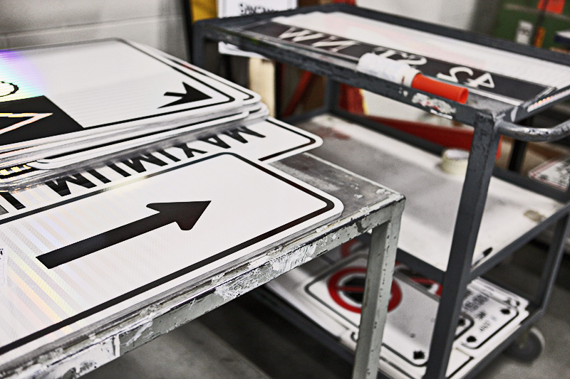


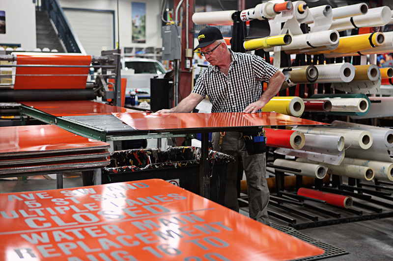


It's a fun weekend in the city of Calgary with lots of great events happening simultaneously. Today, my family and I went to Doors Open YYC to take a tour of the traffic operations sign shop. For the second year in a row, a news crew captured footage of Finley and his friend on a tour. You can see Glen and me in the background as well, I'm easy to spot in my yellow coat. Tours continue tomorrow at various sites across the city, but we'll be at Heritage Park's Railway Days!
I also went to Etsy Made in Canada this afternoon... photos to come after "bedtime routine".
Calligraphers are wise people. Get to know all of these fine folks in the forthcoming issue of UPPERCASE.
For more, visit the Garnata Display page on Behance.


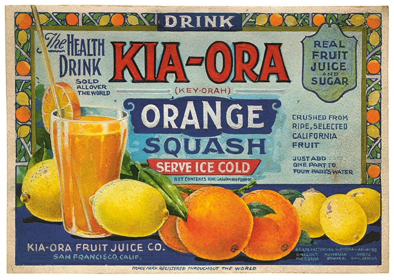

These amazing old labels are not lithographed... these are gouache mockups that were presented to clients for approval. Read all about this special collection from Letterform Archive in the current issue of UPPERCASE.

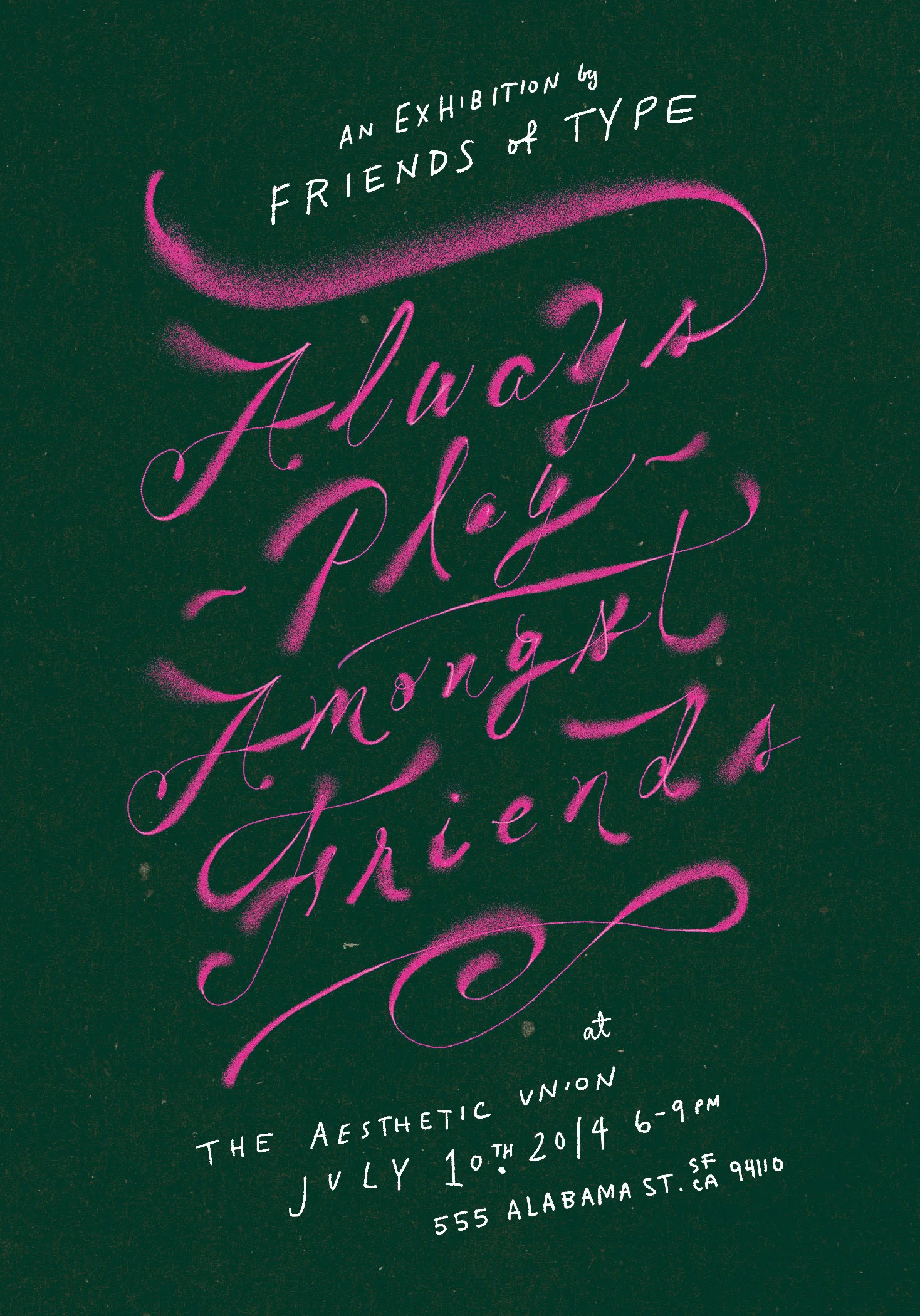
If I lived in San Francisco, I'd go to this!


Pawel Nolbert has created these intriguing paint-splattered sculptural illustrations out of a combination of real paint on acetate and digital manipulation. Clever!
{ via Type Worship }
Blossom Type by Alice Mourou, Dmitriy Petrov, Olesya Korsak and Nikita Schukin.
{ via Quipsologies }

In celebration of the AIGA National Design Center’s centennial year, an exhibition curated by Monotype called “Century: 100 Years of Type in Design” is on display at the AIGA in New York City until June 18.
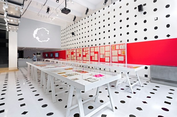
The exhibition, designed by Pentagram partner Abbott Miller celebrates typeface diversity and the role that texts and fonts have played throughout the past century.

"Monotype made the entirety of its libraries available to Miller for the project,” notes the Pentagram website. "The idea of multiplicity is highlighted in an environment that communicates the endless diversity of typographic form: the walls and floor are covered in a pattern of 1,058 different periods, drawing from 630 typefaces. Displayed in the gallery window, Miller’s identity for the exhibition is a letter “C” rendered in segments of different Monotype fonts."
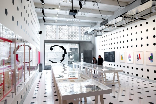
For location and hours of the exhibit, please refer to the AIGA’s website.

Signpainter Rick Janzen from Streamline Studios.

Happy students who participated in Rick Janzen's distressed signage workshop earlier this year.
Thanks to the industriousness of Dale Pidlisny and the Better Letters Company (posted about previously here), Calgarians with steady hands and a love of lettering are in for a treat! A Better Letters workshop with local signpainter Rick Janzen is scheduled for June 28-29 right here in Calgary.

Rick has decades of experience in film and TV, heritage reproductions and commercial sign painting. His filmography includes Return to Gunsmoke and Brokeback Mountain to more recent films like Inception and Hell on Wheels.

Head over to Rick's blog to read how he transformed Calgary's Heritage Park into a movie set.
"A short trailer for a documentary that I'm working on. It's about how the digital age has changed the sign industry and how it's made the art of hand lettering obsolete."
Space is limited to a dozen students, so register today to secure your spot!


Cover by Christy Batta

The UPPERCASE Circle is free for subscribers of the print magazine. Find out more.
UPPERCASE is a quarterly print magazine inspired by craft, design and illustration. A playful exploration of creativity, an affinity for vintage ephemera, and a love of handmade are some elements common in each issue. The magazine boasts high-quality paper and printing, a unique design aesthetic and incredible attention to detail.
Janine Vangool
publisher / editor / designer
Send a message →
* Before emailing submissions follow the guidelines here.
Glen Dresser
customer support
Please contact Glen for help with your purchases, wholesale inquiries and questions about your subscription. Include your full name and mailing address so that we can better assist you.
Send a message →
UPPERCASE publishing inc
Suite 201 b
908 17th Avenue SW
Calgary, Alberta T2T 0A3
403-283-5318
The studio is not open to the public—please get in touch to make an appointment. If you'd like to purchase our magazine and books locally, please see the stockist page.