First look at fall...

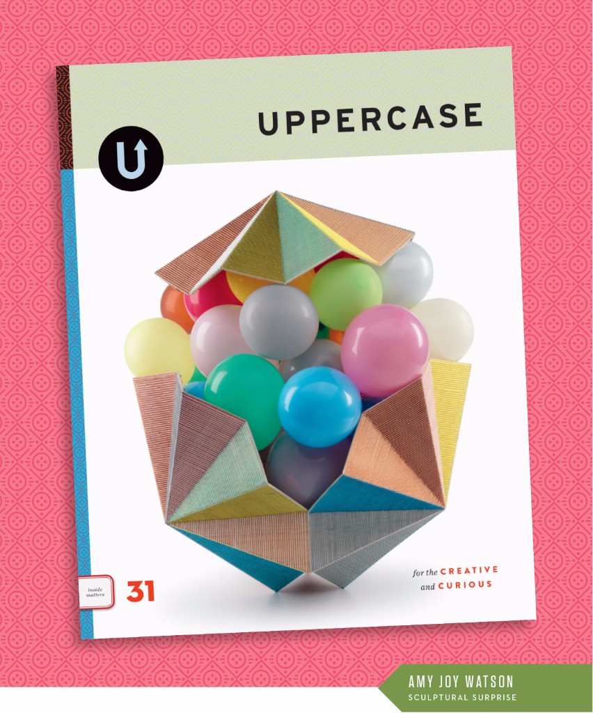
The fall issue (October/November/December) is nearly done. Just some proofing and final touches and this baby is off to the printer. The cover is by Australian artist Amy Joy Watson who used watercolour-tinted balsa wood laced together with embroidery thread to cradle balloons in this piece entitled Pop.

Here's a closer view:

It's always a challenge to find or commission one iconic image for the cover, something that encapsulates the themes and ethos of the magazine. But what I love about this image is that it has a sense of wonder and of surprise... you can just imagine those balloons lifting and spilling forth from the exterior capsule. It speaks to both themes: performance and costuming/garment-making. The artwork is in the act of becoming. Whether those balloons spill out, pop or eventually deflate—there is a performance at work. And, to my mind at least, the threaded container is like a jacket of sorts, protecting what lies within.

I also love how the facets and folds echo the cover of issue 29. I try to have some repeated element or motif; this helps to keep them all part of the same visual family.

And the background pattern?

I started with a simplification of the form of Amy's sculpture, the centre balloons represented by a circle with a triangle base and cover. The horizontal lines were inspired by her linear threads and the spine pattern from issue 28. Finally, the dots represent the balloons, but also the holes within a button, my nod to the garment-making theme.

As ever, UPPERCASE is a labour of love. Please subscribe, renew and tell your creative friends!

Admit One

Dear Reader,

I scanned this collection of old drive-in movie theatre tickets for the fall issue. Aren't they pretty in their analog-ness? At a glance, they appear to be pretty much the same, but yet when you look at them individually they're full of quirks and moments of vernacular and typographic bliss.

I strive for this with each issue of UPPERCASE: to create something that feels familiar to its loyal readers, yet reveals new interests, unique details and fresh perspectives. The same, but different. 

After 30 issues, the challenge doesn't get any easier. If anything, it gets harder. Because I keep pushing myself to do things I haven't done before. 

Consider this: I am looking and searching and curating and evaluating visual culture on a daily basis for the magazine. I see a lot. And so in the magazine, I include things that really stand out. That spark my curiosity. People and subject matters that I am willing to invest my time and resources in getting to know.

In issue 31, the issue I'm designing currently, I'm exploring territory that challenges me personally. The general theme is "performance" and how it relates to the visual arts, craft and design. Whether it is performance art, theatrical sets and costume design, dance and movement—if I imagine my (introverted) self in some of these settings, I am really out of my comfort zone. But that's good. If I'm growing and learning and being inspired through this content, I know you, my readers, will too. Related to performance is the notion of costuming—how what we wear reflects who we are. (Or how we shape how the world perceives us through our clothing.) Garments and sewing clothes are another thread of exploration in this issue.

Creativity beyond yourself—creativity that tests your perceptions and expands horizons—now that's the best kind of inspiration.

Subscribe to UPPERCASE magazine.