Tenderness

So. That was a week that will go down in history.

Although I often contemplate the subjects for days, I always write my weekly newsletter the night before or the morning of actually sending it. I want these emails to be conversational—my musings about what's happening behind the scenes, what I'm working on and what I'm thinking. I strive to make them uplifting, encouraging, inspiring.

I'm drawing a blank on how to do that this week.

The last time I wrote anything political in my newsletter was at the end of June and although the majority of people who responded to that message chimed in with sympathetic feelings, I had some pushback from a small number of newsletter readers. "Keep politics out of your posts," someone wrote.

Perhaps that's wise advice for a business to follow.

But that's not staying true to my values.

I believe in equality and acceptance of others. I believe in the rights of the LGBTQ community. I support immigration. I'm concerned about the environment. I am against racism, sexism, misogyny and the spreading of hatred.

These are the values you will see reflected in my magazine.

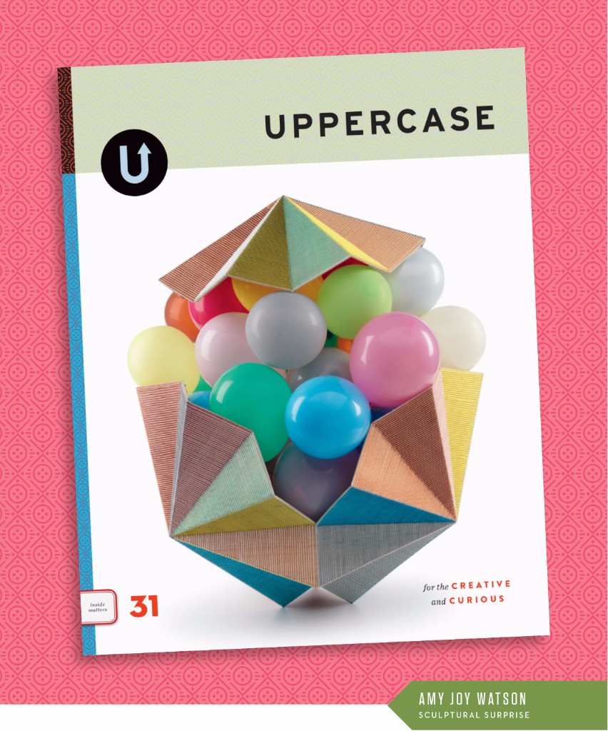
As you look through the current issue #31, you'll see that this has been on my mind. I strive to include a diversity of perspectives—and often these stories are coming directly from you, my readers. If you're a reader of this newsletter or magazine and feel under-represented, I encourage you to submit your art and your stories. I'd love to hear from you. 

Earlier this year, I gave away 100 subscriptions to individuals who couldn't afford them otherwise. Today, I'm pledging to do that again, but this time to non-profit community-minded organizations within Canada and the United States. If you work for a non-profit or know of one that would benefit from receiving some quarterly bursts of colour, art and inspiration, please make your suggestions here.

(If you'd like to sponsor a subscription for a fellow reader, that option remains in the online shop.)

Actually, now that I've written this message I'm starting to feel a bit better. There's always something you can do!

(This message was originally emailed to recipients of my weekly newsletter on November 15.)

First look at fall...

The fall issue (October/November/December) is nearly done. Just some proofing and final touches and this baby is off to the printer. The cover is by Australian artist Amy Joy Watson who used watercolour-tinted balsa wood laced together with embroidery thread to cradle balloons in this piece entitled Pop.

Here's a closer view:

It's always a challenge to find or commission one iconic image for the cover, something that encapsulates the themes and ethos of the magazine. But what I love about this image is that it has a sense of wonder and of surprise... you can just imagine those balloons lifting and spilling forth from the exterior capsule. It speaks to both themes: performance and costuming/garment-making. The artwork is in the act of becoming. Whether those balloons spill out, pop or eventually deflate—there is a performance at work. And, to my mind at least, the threaded container is like a jacket of sorts, protecting what lies within.

I also love how the facets and folds echo the cover of issue 29. I try to have some repeated element or motif; this helps to keep them all part of the same visual family.

And the background pattern?

I started with a simplification of the form of Amy's sculpture, the centre balloons represented by a circle with a triangle base and cover. The horizontal lines were inspired by her linear threads and the spine pattern from issue 28. Finally, the dots represent the balloons, but also the holes within a button, my nod to the garment-making theme.

As ever, UPPERCASE is a labour of love. Please subscribe, renew and tell your creative friends!

Admit One

Dear Reader,

I scanned this collection of old drive-in movie theatre tickets for the fall issue. Aren't they pretty in their analog-ness? At a glance, they appear to be pretty much the same, but yet when you look at them individually they're full of quirks and moments of vernacular and typographic bliss.

I strive for this with each issue of UPPERCASE: to create something that feels familiar to its loyal readers, yet reveals new interests, unique details and fresh perspectives. The same, but different. 

After 30 issues, the challenge doesn't get any easier. If anything, it gets harder. Because I keep pushing myself to do things I haven't done before. 

Consider this: I am looking and searching and curating and evaluating visual culture on a daily basis for the magazine. I see a lot. And so in the magazine, I include things that really stand out. That spark my curiosity. People and subject matters that I am willing to invest my time and resources in getting to know.

In issue 31, the issue I'm designing currently, I'm exploring territory that challenges me personally. The general theme is "performance" and how it relates to the visual arts, craft and design. Whether it is performance art, theatrical sets and costume design, dance and movement—if I imagine my (introverted) self in some of these settings, I am really out of my comfort zone. But that's good. If I'm growing and learning and being inspired through this content, I know you, my readers, will too. Related to performance is the notion of costuming—how what we wear reflects who we are. (Or how we shape how the world perceives us through our clothing.) Garments and sewing clothes are another thread of exploration in this issue.

Creativity beyond yourself—creativity that tests your perceptions and expands horizons—now that's the best kind of inspiration.

Subscribe to UPPERCASE magazine.

New Season, New Issue!

Hello spring, hello new issue! Number 29 is done and is on its way to subscribers worldwide! I received my advance copies and they are lovely. Here's the stack of subscriber copies waiting to go through mailing:

Can you smell the ink from where you are?

Each issue has a couple randomly inserted bookmarks featuring the illustrations and designs submitted by twenty artists. They were sent a stack of 50 bookmarks for their own use and thanks to quick couriers, some have already received their sample bookmarks, like Gabriela Larios and Pippa Shaw featured in the photo above. It was really fun to pair the front and back illustrations with one another!

The reader participation in each issue is really integral to the magazine. The open call for the summer issue is open until the end of March and I look forward to your submission. I love the surprise of what you submit!

I'm attempting to finish up a truckload of work today so that I can spend the rest of the week at home since Finley has the entire week off from school. I have some sewing plans, too!

Have a beautiful week!

Use the code "hoorayforspring" for CAD$15 off subscriptions and renewals. Select the two-year option from the dropdown menu and save another $30 off. Combine that with the discount code and you can get a two years of UPPERCASE for just CAD$115 ($88 USD) for a North America subscriptions. That's just CAD$14.38 ($11 USD) per issue.

Click here to view a preview of the entire issue.

Why we need the softness of craft during hard times.

I’m an optimist. UPPERCASE magazine is a celebration of beauty and creativity and joy. Within its pages, I’m able to construct an idyllic experience of a curated and edited point of view, a place and experience that my readers and I love to escape into.

But we are not immune to the realities of the world. When tragedy strikes afar or hits closer to home, we feel it. In harsh realities, we’re exposed, raw and uncertain.

It's during these hard times that we really need the softness of craft. To be wrapped in the embrace of grandmother’s quilt, to feel protected from the elements in a hand knit sweater, to caress a mug thrown by someone else’s hand on a potter’s wheel. These simple things reconnect us to our humanity and remind us of the goodness and potential of people.

I don’t think it is naive to turn to crafting and making or seeking out beauty. It is vital.

Piecing a quilt isn’t just about sewing fabric, it’s time to process emotions and patch together our feelings. A knitted sweater is an entanglement of love that our child wears when we can’t always be by his side. These things matter deeply. One stitch at a time, we can shape our surroundings.

We can control what we make — and what we do with it. 


(This message was originally sent to my newsletter recipients on Tuesday, November 17. The image is by Siobhan Rogers, featured in The UPPERCASE Compendium of Craft & Creativity.)

What's your "one thing"?

In one of my newsletters last month I asked, "What if you found that one thing that you go to sleep thinking about, that you dream about, that makes you leap out of bed with excitement and anticipation?"

That one thing that brings you into an unknown world full of new challenges? That one thing that will involve lots of learning and test you in ways you can't even anticipate? What's that one thing that might make you scared and nervous, but you still want to see where it takes you?

I'm grateful that I've found my one thing in UPPERCASE. I asked readers, "What's your one thing?"

Dutch illustrator Yvonne Windhorst-Maaskant replied with this great series of images. Please click through to discover her "one thing".

Sweet spot

I'm in a sweet spot in my creative projects right now. For ongoing projects, it means that the momentum of being nearly finished motivates me to get them done. For new projects, there's the excitement of seeing something that was in my mind start to be made real on the page. And best of all, there's room for new ideas to emerge and future projects to dream about!

The fall content is assigned and so in the hands of others momentarily, Glen and I are writing the Compendium profiles and are about halfway, I've got the book design and page layout underway (I bought a new font for this project, it's always fun and inspiring to work with a new typeface), a still-secret project is incredibly exciting, the granny square blanket I've been working on for SIX YEARS needs just a dozen more squares...

Everything is ticking right along, but none are so demanding that it is becoming overwhelming... yet! I know it's the calm before the storm because a week from now the fall content starts rolling in, The Typewriter book preorder data needs to be compiled and the Compendium will be in full production and my projects will shift from creative bliss to "what have I gotten myself into!?"

So I'm definitely going to enjoy the time right now.

To see the rest of today's newsletter and read excerpts from issue 26, click here. Sign up for my weekly newsletter for weekly free content.

Inspiration: the good, the bad and the pretty.

I’ve spent the better part of a decade searching for inspiration. 

At its heart, everything I make and do with UPPERCASE is curated and designed to inspire me—and by extension, you, my reader. By sharing the stories of talented creatives in a wide variety of disciplines, each magazine issue or book is full of inspiring people, places and things.

But the word “inspiration” is so-often employed these days, that I hesitate to use it. “Inspiration" is diluted. When it comes to creativity, what is truly inspiring? 

the good

When something you see or experience triggers a switch to “yes!” in your creative heart, that’s the best kind of inspiration. The kind that motivates you, that fires you up, that kicks you into action. It creates a desire to do something, to harness that inspired feeling and see where it leads you. It’s joyful, pure, instinctual. It has no judgments, no preconceptions, no deadlines: it simply is. yes!

the bad

One can be inspired by another artist and while it’s ok to admire, it is never ok to copy. Imitation is not flattering for the one doing the imitating. The phrase “taking inspiration” describes this darker side. If you find yourself relying too much on other people’s work when making your own, stop. If you’re judging your work against someone else’s work, stop. Step back and look at it objectively. Make a list of all the things that you love about that person’s work and all the traits that you aspire to achieve in your own work. Going forward, use that list as your guide and your motivation. 

the pretty

I think we’re overloaded by so much generic “inspiration” that we’re becoming desensitized. We pin on Pinterest, like on Instagram… but this infinite scroll of images—however gorgeous they may be—is training us for snap judgments and short attention spans. It’s a millisecond of inspiration that burns out nearly as soon as it began and you find yourself scrolling for another hit. Sometimes a good dose of pretty is just what you need, but the next time you find yourself in a hangover of pinning and liking, revisit your selections. Was any of it inspiring in a lasting way? 

With the twenty-fifth issue making its way into the world now, my hope is that I’ve done my job well and that UPPERCASE falls into the best category of inspiration.

May you come away from reading the magazine feeling joy and optimism, with a flicker of a new idea whispering, "yes!"


This message was originally published yesterday in my weekly newsletter. If you'd like to receive free weekly content like this, plus a look at behind-the-scenes of making a magazine, free downloads and news of how you can participate within the magazine, please sign up here. Thanks!

-Janine

Immeasurable value: a new issue or a new car?

This is a nice time in the cycle of the magazine… subscribers around the world are experiencing the joy of receiving the new issue in their mailbox. Thank you for sharing your excited tweets and beautiful Instagrams—not only do I enjoy seeing how the magazine fits into your daily life, but this 'social proof’ is vital in sharing the magazine to potential new readers in an authentic way. A magazine is only as good as its community of readers and you are the most valuable part of the entire UPPERCASE equation. I am grateful to have such an appreciative audience.

My hope is that the quality of content, level of inspiration, professional advancement and personal creative development offered by a year of UPPERCASE far exceeds the monetary cost of the subscription. When I hear stories about subscribers taking time out of a hectic day to spend quality time with a new issue (and your appreciation of the inky aroma), of connections and collaborations between readers, of the joy at being featured, or artists getting commissions and professional opportunities by being its pages, this is the kind of value that can’t be measured. This is the best kind, because it's from the heart.

In creating a physical product, there are always cost considerations for its production. When designing the current issue, I knew it would be fairly monochromatic—including the cover. Seb Lester’s calligraphic grocery list was conceptually the perfect fit, but it is a departure from UPPERCASE’s usually colourful covers. I wanted to add a little special something to give the cover some more pizazz… and with calligraphy nibs, silver spoons and heraldic shields as themes within the issue, a silver foil was meant to be. In fact, having a metallic spine is something I’ve wanted to do for a long time—UPPERCASE’s patterned spines are inspired by classic Little Golden Book’s signature gold-foiled spines.

Using a foil is an added expense; it requires making a die and running the cover through another press after the colour run. At a total cost of $2,215, I weighed the pros and cons and decided it was worth it. Not only is the metallic spine accomplishing one of my dreams on my design bucket list, it definitely adds to the cover appeal. For readers discovering the magazine in a stockist’s display its silver flash is eye-catching. And for subscribers receiving the magazine at home, it’s a special treat to see something different.

Producing a simple issue of UPPERCASE is expensive—the equivalent of buying a luxury vehicle every quarter! Issue 23 cost $37,561.82 in print production and freight, plus another $6000 in mail prep and postage to send the magazine to subscribers worldwide. That’s a huge investment and one that I make four times a year. I’m proud of the fact that in six years of the magazine, I’ve been able to pay my print bills consistently. To be sure, it is stressful to be faced with such expenses—and certainly it has been a challenge and a matter of juggling to make it work—but I love making this magazine.

Long live print!


This post was originally published as part of my weekly newsletter. See the full graphic-rich newsletter here and sign up for informative, inspiring and free weekly content right here.

This issue will inspire some terrible letters!

Dear Reader,

The fall issue has arrived! Draped in its silver foil spine, and complemented by an understated but dramatic colour palette throughout, it is certainly a visual departure from the full spectrum approach of the summer issue. As curator of the magazine—and as art director / graphic designer—I felt like I needed a bit of a palate cleanser after the full-on exuberance of issue 22. So issue 23 offers something a bit darker, a bit simpler… but just as delicious! Like a crème brulé or a café au lait for dessert.

The reason I loved Seb Lester's grocery list for the cover is that it demonstrates the commitment required to master penmanship—even composing a mundane list is an opportunity to practice. There’s the popular saying that “practice makes perfect”. Certainly as you view the amazing displays of calligraphic talent in this issue that adage might ring in your ears… there’s no way any of these letterers and calligraphers could have achieved their level of ability without countless hours of practice. But does it make them perfect? No. Not at all. No one is perfect and no one’s creative output is perfect. 

UPPERCASE content is selected and designed to be inspirational… there’s no doubt that after reading through this issue, you’ll want to pick up a calligraphy pen. But if you’re new or rusty, let me tell you want will happen… your first letters are going to be terrible! Your calligraphic aspirations will not flow effortlessly from the nib. Your hand will cramp and your letters will be awkward. Frustrated, you’ll inevitably compare your writing to what is displayed in this issue. But don’t despair! Come back to it the next day and try again. I guarantee that you’ll be a better calligrapher. And the day after that, you’ll be three times as good.

After creating 23 issues of UPPERCASE, it is still very far from perfect. There's a big list of things I want to try, redesigns I want to initiate, column ideas waiting in the wings. Budgetary and time constraints that affect what I can do... And there's probably a lurking typo or something that I missed. But each issue shows a lot of what I've learned over the years—and even things I've learned since the last issue came out in July. That's what I like to focus on. Practice makes progress.

Everything takes practice. The goal isn’t perfection.


This message was originally published in my weekly newsletter. If you'd like content like this (plus more — see the full version here) please sign up.

Time un-management

October starts the mad dash to the end of the year. For those of us in the business of making physical things for sale, so begins the marathon season of craft fairs, ramped-up marketing, 24-hour online selling and the retail frenzy of Christmas. It’s an important time of year—when a year can turn from loss to profit—but it’s also an exhausting one when the joy of creating and making is overshadowed by the reality of selling.

I’m not a good saleswoman. When UPPERCASE was a physical store from 2005-2009, I’d just let people wander in and do their thing. I’m not one to initiate small talk or sales talk, preferring to let the products sell themselves on their own merits. Sure, I’d be pleasant and answer questions and have conversations, but it was always an effort on my part. It felt unnatural to me, as nice as a customer was. When I closed my retail shop at the end of 2009, it was a relief. Not just from the financial strain of carrying the cost inventory and paying the magazine’s print bills, but that I could turn “off” for a while. I took a year of maternity leave before I returned to the shop and opened the doors, but this time solely as a publishing office.

That year at home with my new baby and running my magazine was one of tremendous growth. Maternity leave was profitable, even with shouldering the cost of rent on a space that I didn’t use for those months working from my basement with my baby at my side. It was proof that an online business of selling magazines, subscriptions and books could be viable enough to support my family. I’m so grateful that, a few years on, this remains true. 

My intent is always for the magazine to stand on its own merits and not need me to “sell” it overtly. Sure, I have to ask for subscriptions and support here in the newsletter and on social media—it’s vital to do so—but really I want the magazine to sell itself. Right now, Issue 23 is being packed up and prepped for shipping today, all set for its October 1 release. I hope you’ll see for yourself how lovely it is.

I’m looking ahead to 2015 and issue 24, to be released in January. I’ll have to have content finished up next month for design in November, printing in December. This will mark 6 full years of UPPERCASE magazine. If my time developing UPPERCASE magazine were a college education, I’d have a Master’s degree by now! 

I’m often asked how I get so much done in a day, as a one-person magazine company. Honestly, it depends on the day and where we are in the magazine’s cycle. My day is always a juggle of what is imperative and what I want to be doing, with the must-do always winning out. What I have learned, though, is that time cannot be controlled. It is basically unmanageable. Time is disobedient—it won’t stay put when you ask. So the way around this is that you have to be everything that time is not: you have to have discipline and set deadlines. You have to control how much time you spend on a task. You have to create a checklist of goals and dates. You have to stay strong in the current lest you be swept away.

Musing on the number 24 and the passage of time, I’m curious about your 24-hour day. What do you have to do in order to make time for being creative? What’s your day like? Submit your day in creativity here.


This message was originally published in my weekly e-newsletter—view the full graphical and extended version here. To receive the newsletter every Tuesday, sign up and I'll send you a free download of the UPPERCASE Surface Pattern Design Guide. Oh, and if you're brand new to the newsletter, there's a welcome discount code for you, too. Thanks!