Fabric flowers by Laura's Sage Country Quilts

My life has been a blur since coming home from Quilt Market — I've been in full-on design mode and proofing mode to get issue 30 done. Which it is. Except for the whole printing, logistics and shipping part!

I met some nice and talented people at Quilt Market. I gave away some charm squares and there were also fat quarter bundles for sale, so now I'm starting to see what people are making. Fun!

I enjoyed seeing Laura Estes' sweet fabric flowers and I gave her a charm pack to play with.

"The Jumbo Coin Ruching Guide, TR700, designed by me and produced by Quilting Creations International is an acrylic tool used to mark 5 inch and 2 1/2 inch strips of fabric with a scallop line to stitch and draw up the fabric to form petals," she writes. "With the 5-inch charm squares, one scallop is marked on each of 19 or 20 squares, and as each petal is stitched and drawn up, they are joined together then formed into an approximately 6 inch bloom. The process is easy and fun for all skill levels, and there are some tutorials on my blog."

Craft Fair Apron

Inspired by an old apron with ample pockets found at a flea market, this modern take can hold your phone, cash and more. I call this my Craft Fair Apron since it would be handy if you're selling at a fair and need everything at hand.

The original apron was basically a strip of fabric with a fancy printed pocket sewn on. The ties are threaded through a sleeve along the top so you can were the apron gathered or pull it around for a more sleek effect.

For my interpretation, I used strips of different fabric to mimic the pocket motif.

I didn't want to line the pockets, but I also wanted them to be nicely finished since I'll be reaching in there for my phone and notebooks frequently. So with half-inch seam allowances, I ironed the extra in half and folded neatly under. Then top stitched. 

I like how it turned out. Maybe I'll just where it around Quilt Market to carry business cards and pins!

Quilt: Spines

Here’s an idea come full circle: a quilt design inspired by the spines of UPPERCASE magazine—the thing that inspired this very fabric collection in the first place! My son was my willing model for the Look Book—he even art-directed some photos.

The quilt was sewn by Heidi Pridemore of The Whimsical Workshop for the Look Book. Free pattern available at windhamfabrics.com. This design is fat quarter friendly.

Hey, where'd everyone go?

Quilt: Here and There Squares

One of the challenges in making the Look Book for my fabric collection was designing the quilts that were going to be made! I'm not a quilter (yet!) but I'm a quilter-in-spirit! Fortunately, my mom is an amazing quilter (and quick, too) so she was enlisted to help make this quilt design that I call "Here and There Squares".

I wanted to design a quilt that would include all of the fabric options in one quilt, with the exception of the two silver metallics, so I started to play around with contrasting the colours with the grey tones.

It’s fun to play with lights and darks, warms and cools. In this quilt design, squares pop and recede and play tricks with your eyes. 

This is a massive 96-inch square quilt. It was sewn and quilted by Bonnie Vangool. 

Free pattern available at windhamfabrics.com.

Put this quick project on your bucket (hat) list.

This is the simple reversible bucket hat, a free downloadable pattern from Oliver + S. Finley is a big fan of the colour red, so he chose the red and pink floral as one of the fabrics, the red chevron on the inside.

There are lots of great two-colour combos available in my UPPERCASE fabric collection.

I've never made a hat, but Liesl Gibson's instructions are simple to follow and that hat was easy to put together.

I made the largest size, but it is a little on the snug size, so I'll have to scale it up to make another... for me!

Download the pattern here.

Progress photos by me, finished project photo by Kirstie Tweed.

Make a Fabric Cover for your Typewriter (or sewing machine)

So anyone who knows me (or UPPERCASE) knows my fondness for typewriters. I call them the UPPERCASE mascots. So it was natural that I come up with some sort of typewriter and fabric project!

In fact, there's already a connection. If you look at the colours of my Royal Quiet DeLuxes and my fabric collection, they share a similar colour palette.

I decided to make a dust cover for a typewriter. You could quite easily adapt this process to make a cover for your sewing machine. 

Please keep in mind that I'm not a DIY blogger or writer of craft instructions (nor do I plan on becoming either—I've got way too much to do already!) When it comes to sewing and making crafts, my usual process is to look at a lot of similar projects and read their instructions. Then I put that all aside, head over to my own project and available materials... and wing it!

Knowing that my fabric projects would be shared online, I took photos along the way. Keep in mind that I was figuring it out as I went along. And when things got complicated I sometimes forgot to take photos since I was concentrating or busy being frustrated.

Here's my rudimentary sketch of what I planned to make. Two sides with interfacing to make them sturdy, and, in a contrasting colour, piping to define the edges.

I selecting my fabric to coordinate with my favourite turquoise Royal. I had already made bias tape for a previous project and decided to use the extra to cover the piping.

I put some kraft paper on my table and loosely traced the typewriter on its side, leaving generous amount of room for the keys and knobs.

Next, I refined the curves and overall shape and added some extra allowance so that cover wouldn't be too snug.

I cut my template and then two pieces out of fusible, fairly stiff interfacing.

I used the outline to determine the length of piping I'd need. Using a basting stitch, I covered the piping with my bias tape.

I cut the shape out of the fabric half an inch around the interfacing plus an inch or two extra at the base.

I measured the desired width of fabric needed to cover the machine. For its length, I used the piping as a guide for how much would be required. In both cases, I added some generous amounts on either end to allow for hems and just in case. (Remember, I was making this up as I went along!) I also fused more interfacing to the front panel to give it some shape.

Next, I sewed one side, piping and top together. This involved a lot of pinning. I've only used piping once before about ten years ago, so I didn't exactly know what I was doing. The curves were difficult! But I just pinned it as precisely as possible and then sewed it slowly to avoid any puckers. Then did side two. The inside's not pretty, but you don't have to see that when the cover is on the machine! (Besides, I was sewing this for the Windham Look Book, so some selective photography and cropping could solve any glaring problems.)

Once the sides were both attached, I put the cover on the machine and folded up the hem as required and stitched it. With some steaming and ironing, the cover turned out ok. It looked a little plain, so I decided to dress it up a bit. I've had this plastic turquoise buckle for some time, so it seemed of the right era to suit a typewriter cover.

And with the bow... voila!

If I were to make another cover (I've got a dozen typewriters!), I might omit the piping and just make a fabric flange or something a little simpler—but I do like that contrasting pop of colour!

The top two photos and finished project photos are by Kirstie Tweed of Orange Girl for the UPPERCASE collection Look Book. Process photos taken with my iPhone.

Quilt: Pickets by Cheryl Arkison

Calgary's pretty lucky to have quilt author and educator Cheryl Arkison. And I was fortunate that Cheryl generously offered advice on my design and colour selections as I made my way through the fabric design process.

Last November, I invited Cheryl (with her cute son!) to the studio to see the sample rolls that Windham Fabrics had sent over—and to select what inspired her to make a quilt for the Look Book.

She decided on a low volume selection of prints, including the metallic silver dots and alphabet, with hits of turquoise and red/pink/orange. Cheryl's the master at improv quilting, so I was excited to see what she would make!

The quilt is called "Pickets" and you can see the repeating vertical picket-like shapes throughout the design.

I love the variety in scale throughout. The details are gorgeous—it is quilted with a repeating U motif, as you can see in the photo above.

I highly recommend Cheryl's quilt books, particularly A Month of Sundays that is beautifully photographed around Calgary's Heritage Park. Cheryl chronicles her (many!) projects on the go on her blog, Dining Room Empire. You can also learn from Cheryl in person and online.

Detail photos and finished project photos by Kirstie Tweed of Orange Girl Photographs.

Q & A with Mickey Krueger at Windham Fabrics

Windham pins and a bundle of UPPERCASE fabric on display at QuiltCon earlier this year.

Windham Fabrics is the quilt cotton division of a long-running family-run mill, Baum Textile Mills, which was founded in 1955. With a corporate history spanning so many decades—and changes of fashion—how does Windham balance traditional offerings with contemporary designs?  

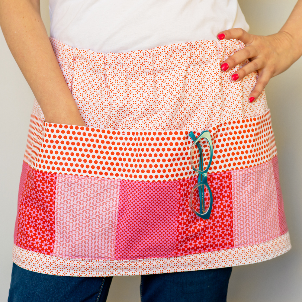
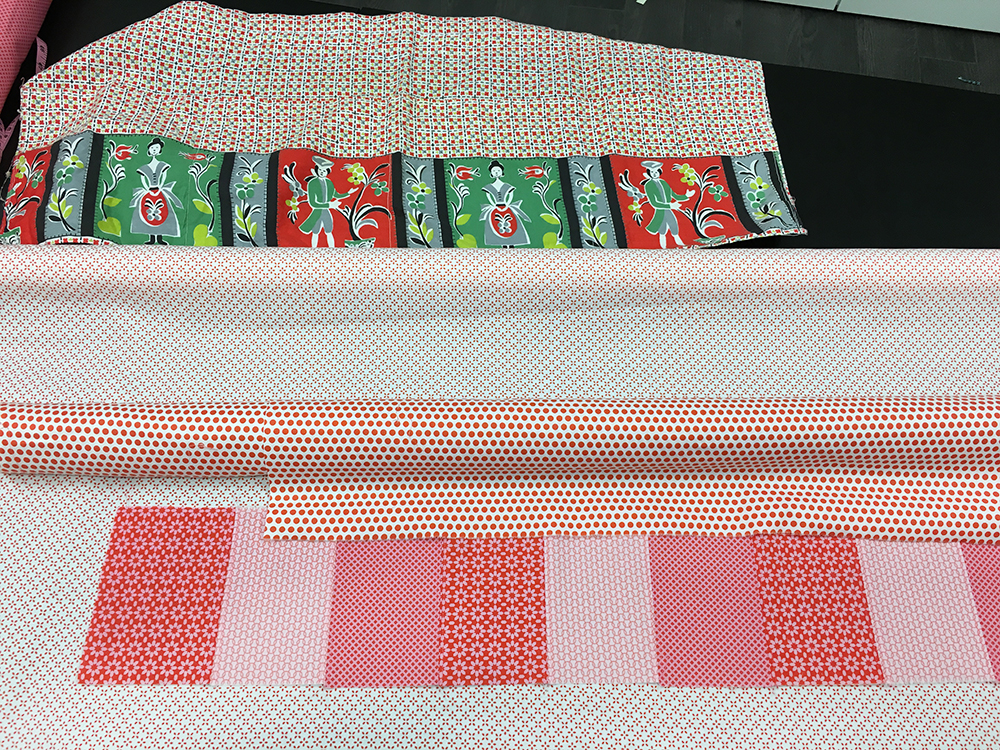
Traditional designs and their history are of particular interest to me. My office is filled with 19th-century document fabrics and quilts that offer some of the most stunning surface designs. Like in fashion design, the tastes of those buying our fabric evolve and change over time. We deal with trends and changes in the mood of the marketplace the same as any other creative company. Considering our depth in designers and their varied styles, sometimes we follow those trends, and sometimes we buck them. We like to think that no matter what the sewist is interested in, Windham will have something that attracts them.

What are the hallmarks of a best-selling design?

This is a question that we constantly ask ourselves, but have yet to find a clear answer. Because of the nature of our business we are designing for so many end uses, which makes answering this question even harder. When considering traditional versus modern designs there are some basic differences in the aesthetic of what is popular. But even considering designs for the same audience we have seen what we think are home runs fail, and ho-hum designs become best sellers.

What is the best part of your job?

Although I do not consider myself artistic, I do love the design process. We work with so many designers, and the way a collection is developed is different for each designer. It is always satisfying to see a well-done collection receive critical as well as commercial success. This is best when the collection comes from a designer who might not be well known within our industry.

What qualities do you look for when sourcing new designers or surface pattern designs?

We have a customer base with divergent tastes, and a variety of needs. As a result we are always looking for designers offering something that we don’t already “have.” I suppose the designers that I look for are those who are true to their own aesthetic, but can still stay within the “bounds” of what we know our customers will find pleasing. While I am not afraid of taking chances with designers, I am still running a business and must prudently consider what we think will sell. For this reason I like to get my sales and design experts involved in the selection process because everyone brings something unique to the table.  

Display wall in the Windham Fabrics booth at QuiltCon.

Are their specific trends in colour or motifs that you have noticed that are either ebbing or emerging?

I keep seeing clean lines, and simple motifs with generous use of negative space. With the help of the Internet, design proliferates very quickly. As a result, artists (and end users) pick up on trends very quickly, which can lead to a kind of sameness in design. The best designs come from those artists who can lend a uniqueness to a trend that separates them from the rest.

What is your advice for folks hoping to break into fabric design or to have their work licensed?  

Always be true to your own aesthetic, but don’t take for granted the needs of your client (or potential client). Be flexible, and be fast. If you are targeting a specific industry, learn a little about that marketplace, and present your designs in a way that the client will best understand in their own language.  


(This interview was originally published in the digital update version of the UPPERCASE Surface Pattern Design Guide, available as a free download when you sign up to the weekly newsletter. It was also published in issue 28.)

Step by Step

There were a lot of steps involved once Windham Fabrics said yes to an UPPERCASE collection. Here are the highlights of the process.

Decisions, decisions.
The first part of the process is to whittle down two dozen spine patterns into a more practical number.

Which colours?
Next, I survey the typical UPPERCASE colours and create a representational palette of hues used most often.

Colour corrections
I go through lots of ink cartridges printing off swatches and designs. I pair each design with the others to make sure everything is cohesive.

Subtle shades
Getting the colour just right takes a lot of comparison. It’s so subjective as well as being at the mercy of technology.

Strike offs
Once the designs and colours have been approved, Windham creates handprinted strike offs so that I can approve the colour and printing registration.

So thrilling
How exciting and fulfilling to see my name and logo on the selvedge! Shown here on the fabric strike off samples.

Project design
I design quilt patterns and select existing sewing patterns and projects that will best show off the beauty and versatility of the UPPERCASE collection.

It’s really real!
Weeks later, and 29 rolls of fabric arrive at my door. It’s still top secret. I have to create a look book that will be used by sales reps to sell the collection to fabric stores.

Sew, sew, sew.
Time to set up my sewing machine (and enlist the help of some friends and my Mom) to start sewing the samples.

Make (and admire)
Some of the projects combine paper and fabric, like these recovered sketchbooks in all sorts of enticing patterns. I can’t wait for the collection to be out in the world!

From pixel to paper to fabric

Back in 2009, as I sketched the initial design concepts for the launch issue of UPPERCASE, I knew one thing for certain: the magazine had to be thick enough so that it would have a perfect bound spine. This decision determined how many pages of content I would need—and also set the foundation for one of the most recognizable design elements of the magazine: the patterns that grace its spine.

With each issue, I design a repeat pattern that references the content within. The inaugural issue had circles as a recurring motif—bubbles, balloons and polka dots—so it was natural to start with a simple dot pattern. The second issue had a melting ice cream cone on the cover and so I drew a waffle hatch. In issue 5, I moved away from simple geometrics to a motif I call “butterfly floral,” simple ditties that echo the butterflies that appear in the cover illustration.

Lines, waves, bow ties, droplets, zig zags… the spine patterns were stacking up nicely! Each had their own personality, but over the years, an UPPERCASE style and colour palette began to emerge—and so did the inkling of an idea. Wouldn’t it be lovely to turn these spine patterns into fabric some day?

I’ve always been personally interested in surface pattern design, fabric, sewing and quilting—and I know many of my readers are, too—so it was illuminating to find out more about the industry in issue 21’s Surface Pattern Design Guide. The guide featured 100 designers and illustrators as well as advice from industry experts and was released in spring 2014.

UPPERCASE issue 21, cover by Molly Hatch. (Low inventory left—order this back issue soon if you'd like it for your library.)

The UPPERCASE Magazine Surface Pattern Design Guide as part of issue 21. Art by Jan Avellana.

A short while after that issue was released, I received exciting news from Jan Avellana, the artist featured on the cover of the Surface Pattern Design Guide—Mickey Krueger, president of Windham Fabrics had noticed her work and signed her to contract. In fact, Windham found quite a few new artists through that issue. 

In January 2015, I was invited to be a judge for QuiltCon and spent three intense days looking at hundreds of quilts. It was an amazing experience and quite a learning one, too, since I’ve never actually finished a quilt... yet! I did notice that there could be a niche for my patterns: simple yet interesting designs that could read as solids in both modern and traditional quilts.

In February of that year, I was filling subscription orders when I noticed that Mickey had renewed his subscription, so I sent a thank you email. The notion of UPPERCASE fabrics was still on my dream list, but I didn’t do anything about it just then. Later that month, Mickey wrote from Austin, where he was attending QuiltCon, to say that he was also fond of the quilt I had chosen for my Judge’s Choice, a stunning self-portrait by Melissa Averinos. I wasn’t able to attend QuiltCon in person, so I mustered up my virtual courage and sent the following message, with an attached photo showing a stack of magazines:

“I’m sure you have no shortage of ideas, but I’ve often dreamed that the spine patterns I create for each issue of UPPERCASE could be really nice for quilt fabrics!” 

Just hours later, he replied, “Fabric? Wanna talk?”

And the rest, as they say, is history. 

The UPPERCASE collection from Windham Fabrics will be on sale in fabric stores in June!

The Encyclopedia launch goal has been reached!

I'm amazed and grateful that we reached the initial project goal of $60,000 in only twelve days. That'll cover the production costs of Feed Sacks and Botanica.

My stretch goal is $90,000... the additional $30,000 would cover the production costs of the third volume, Stitch•illo. Regardless, I'm committed to publishing all three volumes.

I'm so buoyed by your enthusiasm for the project! Thank you!!!

Almost there!

Truly incredible, we're almost at my launch goal of $60,000 in pre-orders... fully a month before my timeline of the end of May!

The Early Bird pre-order pricing ends tonight, May 1, at midnight! Save $20 off the 3-volume Encyclopedia set while supporting the project in this pre-order stage. Full details over here.

Here's a gorgeous stash of Feed Sacks on loan from a Calgary quilter. Looking forward to photographing each lovely pattern for the first volume of the Encyclopedia.

Encyclopedia update

A few weeks ago, I took a Meadow Quilt workshop from Lizzy House. I've been slowly working on it since, using UPPERCASE fabrics (coming in a few months from Windham Fabrics!), some vintage fabric I've been collecting for a while, and some contemporary fabric from designers like Lizzy House, Denyse Schmidt and Cotton + Steel.

When a quilter completes a quilt, she starts another one, pulling from her ready stash of fabric and ideas. A painter finishes a painting and it's scarcely dry before his brushes start transforming a new canvas. An illustrator sketches in her notebook, fills up a page with ideas and doodles, and turns the finished page over for a new, blank sheet.

When I send an issue of the magazine off to print and I'm already deeply immersed in the next issue. If I have an idea for a book, I can't simply just let it be. It has to be made! Making books and magazines is my craft.

Since launching the UPPERCASE Encyclopedia of Inspiration last Wednesday, you've shown me just how much you appreciate my craft. As of today, Wednesday April 27, we've reached 70% of the project launch goal of $60,000. I did not anticipate such an amazing reaction in just one week and I am truly heartened and grateful and excited by your enthusiasm. It seems I've struck a chord with the Encyclopedia concept!

Pre-orders fund the production costs of creating each volume: paying authors, scanning and photography costs, prepress and print production. 

Please support the Encyclopedia project by pre-ordering the first 3-volume set at the Early Bird price of $100 ($145 outside North America). The prices include shipping of the three volumes. The price will increase to $120 in North America and $165 outside of North America after May 1. 

Thank you so much for appreciating this craft of making unique books and magazines. 

20% in 24 hours!

Thank you for an amazing response to the UPPERCASE Encyclopedia of Inspiration launch yesterday.

In less than 24 hours, 117 people have already pre-ordered their book sets! That's 20% towards the initial crowdfunding goal of $60,000 towards the printing and production of the books.

I'd love to keep that momentum going—and the quicker I can fund this project, the more time I'll have to dedicate to creating, editing and designing...

The Early Bird pricing of $100 for the 3-book set (shipped in North America, $145 shipped outside of North America) is on until May 1. 

Thanks!

Announcing... a big, beautiful project!

I'm so excited to share with you this new multi-volume book project:
 

the UPPERCASE Encyclopedia of Inspiration!!!


So you might be asking... "An encyclopedia? What do you mean? Who prints an encyclopedia in this day and age?"

Good questions!

When I'm working on UPPERCASE magazine, there are always topics that I come across that I wish I could dedicate more time and pages to. Ideas that are larger than what a magazine can hold. People and projects that I know UPPERCASE readers would love. Ideas that percolate in my head and grow into something bigger, broader and better... until I can't help but admit that I've got another book idea on my hands! The Encyclopedia concept is a framework for unifying seemingly unrelated topics into a cohesive editorial vision.

As avid readers of my magazine and previous books will know, I have a soft spot for outdated, analogue artifacts like typewriters and vintage textiles. Good old-fashioned encyclopedias are steeped in a similar nostalgia for me. Can you imagine the fun and excitement of a salesman coming to your home to sell you a set of books? Or of cutting out a coupon in a magazine and sending away via mail order for your first volume?

This project is a new take on the notion of an Encyclopedia. Each volume will be a full creative exploration of a particular topic, released in whimsical order. (You can arrange them alphabetically on your bookshelf if you're so inclined!) They'll be beautifully produced and printed and each book will be designed to fit within the set. I know how much you love collecting UPPERCASE magazines for their beautiful shelf presence and timeless content—the volumes in this Encyclopedia will be similarly covetable. So who commits to printing a multi-volume Encyclopedia these days? UPPERCASE does!

It's also open-ended. There is no shortage of inspiring topics to be explored and I look forward to adding more volumes to the project over the years. For the launch edition, I'm working on three volumes: FEED SACKS, a pattern sourcebook written by Linzee Kull McCray;BOTANICA, a fascination of all things floral through art, craft and lifestyle; and STITCH•ILLO, artists and illustrators telling stories through stitching and textiles. 


"How're you going to fund this? Why not Kickstarter?"

Curating, writing, editing, designing and printing a book is an expensive process. The editorial and production costs will average $35,000 per volume. My goal is to raise $60,000 towards these costs by the end of May.

Although I debated using Kickstarter, I know that you—my dear readers—are the folks who will be excited about this project the most. And we're in this together, it's not all or nothing like Kickstarter. I'm committed to making these books! Plus with all the experience and systems I have in place from my previous book projects, launching this on my own makes it easier in the long run. The enthusiasm of UPPERCASE readers has motivated me for the past seven years and I know you'll continue to do so. Thank you!


So please show your support for the project during this early making phase. Feed Sacks in underway and slated for publication in October. Botanica and Stitch•illo are also in progress and I'll announce their anticipated publication dates soon. Full descriptions are on the project site.

Support the Encyclopedia project by pre-ordering the first 3-volume set at the Early Bird price of $100 ($145 outside North America). The prices include shipping of the three volumes. The price will increase to $120 in North America and $165 outside of North America after May 1. 


"Can I get published in the Encyclopedia?"

Yes! Involving my readers is one of the joys of curating content for my projects. There's no entry fee to submit, please visit the Participate page to find out how you can submit your work for consideration.


So, that's what I've been working towards these past weeks... and some of these book concepts have been years in the making. There's even more detail over on the project launch site. 

It's exhilarating (and scary) to put this out into the world at last.

Thank you for your support!

Gratefully,

Janine