Wallpapers by Nottene

Kimberly Ellen Hall and Justin Hardison are the creative company, Nottene (pronounced [nuh-ten-uh]). Nottene was originally featured in the first edition of the Surface Pattern Design Guide. Since then, they've developed a line of wallpapers.

"Our papers are screen printed by hand in New York, and feature the signature and delicate motifs which are a continuation of the our interest in finding patterns in the small details of everyday life," says the pair.

I received their catalogue in the mail recently—though not in time to include it in issue 32 which was already designed at that point. But I thought I'd share a flip-through of it with you here. The inclusion of the actual samples shows how beautiful the wallpapers are—velvety and satisfyingly matte with hits of metallic. 

There's more to discover at Nottene.

Surface Pattern Design Guide: Shannon Newlin

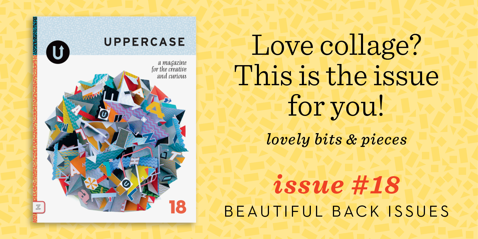
With the Second Edition of the Surface Pattern Design Guide included in the current issue, I thought it would be interesting to revisit some of the artists featured in the first edition of the guide which was published in spring of 2014 as part of issue 21 (sold out).

Shannon Newlin

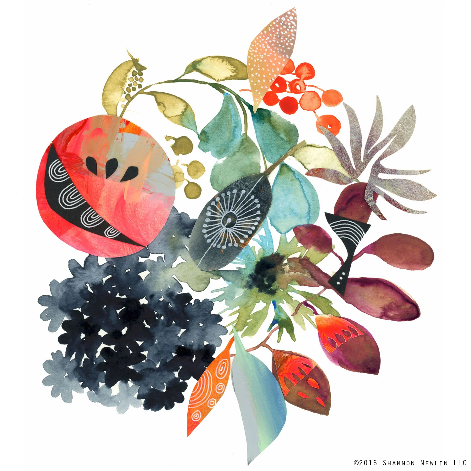
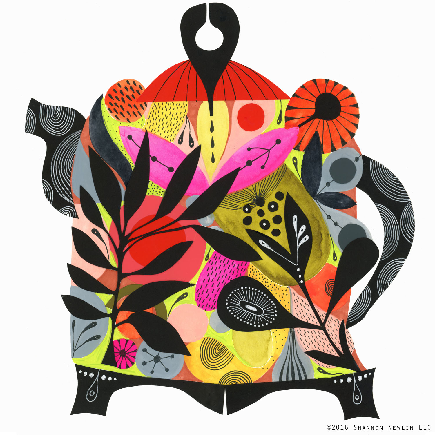
"After being featured in the 2014 Surface Pattern Design Guide I went on to submit my work to the West Elm in Charlotte, North Carolina," says Shannon Newlin. "They gave me the opportunity to sell my art in a month long art show and also become a West Elm LOCAL artist. In addition, I began licensing my work to manufacturers as well as annually participating in several indie art/craft shows. The art pieces shown here are just a few favourites from these shows."

"There have been several wonderful career opportunities since being featured in the 2014 issue." At the moment, Shannon is particularly excited: "I will have my first fabric line with FreeSpirit this spring!! It will be shown at the May 2017 Quilt Market. I am really looking forward to sharing this vibrant collection soon!"

The first edition is available as a free download over here.

From pixel to paper to fabric

Back in 2009, as I sketched the initial design concepts for the launch issue of UPPERCASE, I knew one thing for certain: the magazine had to be thick enough so that it would have a perfect bound spine. This decision determined how many pages of content I would need—and also set the foundation for one of the most recognizable design elements of the magazine: the patterns that grace its spine.

With each issue, I design a repeat pattern that references the content within. The inaugural issue had circles as a recurring motif—bubbles, balloons and polka dots—so it was natural to start with a simple dot pattern. The second issue had a melting ice cream cone on the cover and so I drew a waffle hatch. In issue 5, I moved away from simple geometrics to a motif I call “butterfly floral,” simple ditties that echo the butterflies that appear in the cover illustration.
Lines, waves, bow ties, droplets, zig zags… the spine patterns were stacking up nicely! Each had their own personality, but over the years, an UPPERCASE style and colour palette began to emerge—and so did the inkling of an idea. Wouldn’t it be lovely to turn these spine patterns into fabric some day?

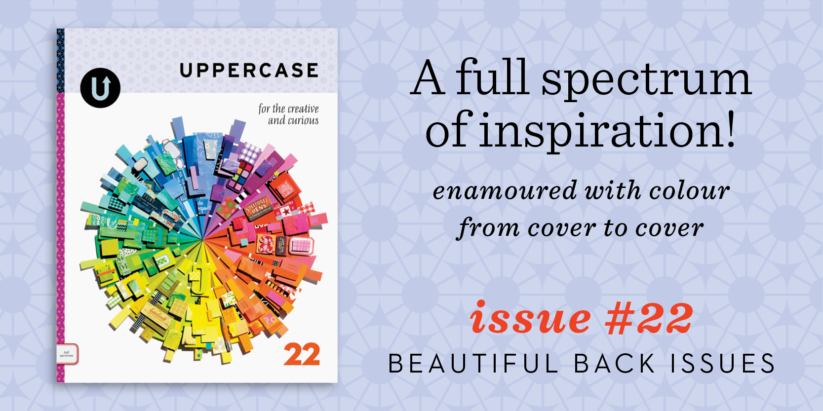
I’ve always been personally interested in surface pattern design, fabric, sewing and quilting—and I know many of my readers are, too—so it was illuminating to find out more about the industry in issue 21’s Surface Pattern Design Guide. The guide featured 100 designers and illustrators as well as advice from industry experts and was released in spring 2014.

UPPERCASE issue 21, cover by Molly Hatch. (Low inventory left—order this back issue soon if you'd like it for your library.)

The UPPERCASE Magazine Surface Pattern Design Guide as part of issue 21. Art by Jan Avellana.

A short while after that issue was released, I received exciting news from Jan Avellana, the artist featured on the cover of the Surface Pattern Design Guide—Mickey Krueger, president of Windham Fabrics had noticed her work and signed her to contract. In fact, Windham found quite a few new artists through that issue. 

In January 2015, I was invited to be a judge for QuiltCon and spent three intense days looking at hundreds of quilts. It was an amazing experience and quite a learning one, too, since I’ve never actually finished a quilt... yet! I did notice that there could be a niche for my patterns: simple yet interesting designs that could read as solids in both modern and traditional quilts.

In February of that year, I was filling subscription orders when I noticed that Mickey had renewed his subscription, so I sent a thank you email. The notion of UPPERCASE fabrics was still on my dream list, but I didn’t do anything about it just then. Later that month, Mickey wrote from Austin, where he was attending QuiltCon, to say that he was also fond of the quilt I had chosen for my Judge’s Choice, a stunning self-portrait by Melissa Averinos. I wasn’t able to attend QuiltCon in person, so I mustered up my virtual courage and sent the following message, with an attached photo showing a stack of magazines:

“I’m sure you have no shortage of ideas, but I’ve often dreamed that the spine patterns I create for each issue of UPPERCASE could be really nice for quilt fabrics!” 

Just hours later, he replied, “Fabric? Wanna talk?”

And the rest, as they say, is history. 

The UPPERCASE collection from Windham Fabrics will be on sale in fabric stores in June!

Back issues are just $10 through Monday.

Look at all the work I've done over the years! How time flies when you keep yourself passionately busy. 

All of my babies are available to enjoy while inventory lasts (issue 10 and 11 are running low at this point). On sale for just $10 apiece until end of day Monday, I'd suggest getting one of each. Subscribe starting with #23, the current issue, and you'll be all set for an inspired year ahead.

p.s. Use the code "thankyou" for another $15 off orders over $80.

Enter the Calligraphy-themed fabric design contest on Spoonflower!

Spoonflower is an easy digital printing service that turns your fabric (and wallpaper, and wrapping paper!) dreams into reality. I'm excited to be partnering with them for a fabric design contest (scroll down for details). In issue 21's Surface Pattern Design Guide, I chatted with Spoonflower co-founder Stephen Fraser. Here's an excerpt:


How many yards of fabric are typically produced by Spoonflower in a day?

We produce over 2,000 yards of fabric per day.

The weekly design challenges yield some impressive results, both in quality of design and the sheer number of participants. How are contest themes determined?

Picking contest themes is a lot of fun, and between the suggestions people send us and our own creative team we never seem to run out of ideas. I’m proud to say that we’ve held close to 300 weekly design challenges at this point and have yet to repeat a theme. The biggest challenge is not in coming up with new ideas but coming up with ideas that balance accessibility with our desire to inspire original work. “Vintage” is a fun idea, for example, but at this point we know that if we did a contest with that theme, the likely result would be a lot of people submitting vintage artwork they found on the Internet. It would be hard to separate the work of skilled artists trying to make their own work look vintage from actual vintage art being submitted by people who are just good scavengers of old artwork. So instead of “vintage,” we might try “vintage gadgets.” Having said that, most contest themes we choose have strengths and drawbacks. In the interest of encouraging people to think of our contests as accessible and fun, rather than cutthroat competitive, we moderate the entries very lightly. This is invariably frustrating to the more competitive artists who participate, but I think it’s a good balance of interests most of the time.

What makes a successful design?

I think what makes fabric designs successful is texture, which is ironic given that we sell fabric over the Internet, where its impossible to feel the texture. But in digital design—just as in the brick-and-mortar world, where the texture of fabric is a primary factor—texture is one of the things that makes a surface design stand out. You can see this in the work of Holli Zollinger, one of Spoonflower’s most successful designers. Her artwork is not flashy and her colours, from a digital standpoint, are quite simple and restrained, but she really incorporates texture successfully into colour and pattern in a way that is beautiful and pleasing. The other sorts of designs that are successful, at least in commercial terms, are niche subjects. These are narrow and specific subjects, which means that while they may not have huge audiences, they are easily located by people searching on Google. Because the competition for this sort of fabric is limited, they can often sell successfully in the marketplace.

Do you have advice for aspiring surface pattern designers?

Don’t be afraid to experiment! Fabric is like pizza—even a 'bad' design printed on pretty cotton is still kind of nice!


CONTEST DETAILS

Create a monochromatic pattern using varying shades of black, white or grey with calligraphy as a theme. The winner will be profiled in an upcoming issue of UPPERCASE. The deadline for entry is Tuesday, November 11, 2014. Visit the Spoonflower website for details on how to enter!

All over U

screenshot.png
Sample patterns from Melissa Watt's online portfolio.

Sample patterns from Melissa Watt's online portfolio.

It is always nice to hear from readers and discover how the magazine inspires them in ways I couldn't have imagined. Recently, Melissa Watts from the UK got in touch. She was one of the 100 artists included in the UPPERCASE Surface Pattern Design Guide earlier this year in issue #21.

Melissa writes, "I'd just like to thank you again for choosing me to be part of the Surface Pattern Guide earlier this year. You'll be pleased to know that one of my three designs featured, has recently been purchased by a Belgium baby wear company, which is my first pattern sale and a big thrill for me (I haven't actually properly launched myself as a pattern designer yet so it was a lovely bonus/surprise). They had actually seen the guide and kept me in mind for their A/W 15 range."

unnamed.png

"Whilst I was learning surface pattern design earlier in the year, I was playing and experimenting a lot. It didn't matter what it was—I would just play. This is where UPPERCASE came in. I had, at this point discovered your magazine and couldn't help myself take your logo....and play!"

I'm so happy that UPPERCASE inspired Melissa to experiment... and led to her first licensed surface pattern.

Beautiful new Cloud9 Fabrics by Elizabeth Olwen

Oh, Elizabeth! You always make such beautiful surface patterns! Congratulations on Wildwood, the latest release for Cloud 9 Fabrics. Warp & Weft is hosting an event with Elizabeth in a few weeks. If you're in Toronto, please go for me! Details here.

Read more about Elizabeth in Work/Life 3 and in issue #21's UPPERCASE Surface Pattern Design Guide. (If you sign up for my weekly newsletter, you will receive the guide as a free download!)

Hello Pattern by Judy Kaufmann

Judy Kaufmann has just released this fresh collection of patterns. "This collection has a wide selection of geometric, organic, typographic forms which can be applied from paper to fabric, from wood to walls." Her fantastical representations of her patterns in use is a terrific way of promoting this new work.

Judy is another talented designer who was featured in the UPPERCASE Surface Pattern Design Guide in the spring issue. 

Colours and Emotions with Maria Carluccio

In response to my weekly newsletter that I sent on Tuesday, Maria Carluccio shares this composition with us, made of chopped up old watercolour paintings. "It was so liberating!" she exclaims.

"Out with the old, in with the new—reusing old art to make new art."

"I highly recommend it as a fun way to explore colour connection," advises Maria. "After I pieced these together I started thinking about how colours remind me of emotions and feelings so I wrote in pencil the first thing that came to me when I thought of that swatch."

Maria is one of the 100 artists profiled in the UPPERCASE Surface Pattern Design Guide included in the spring issue (#21). The Guide is also available as a free download when you sign up for my newsletter—I'll send inspiring content directly to your inbox once a week!

Jason Taylor's Everyday Objects

Jason Taylor was featured in Issue #21, and has an exhibition this week at The Harley Gallery from June 11 to August 10, 2014. 

Here is an excerpt from Fun with Function written by Vinciane de Pape

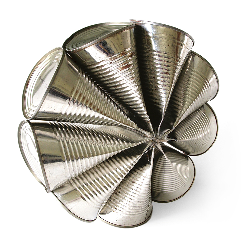
Jason Taylor is an established, UK-based artist and industrial designer whose innovative work plays with the form and function of readymade objects. His line of lighting and furniture designs has been sold internationally and exhibited in museums and art galleries around the world. Jason brings an artistic sensibility to his design process and enjoys the restrictions and challenges of creating unconventional products inspired by mundane objects.

Finding early on that he enjoyed manipulating and inventing simple designs from objects like tin cans, Jason pursued an education in design to follow his passion for experimentation and to further develop his skill set.

“I chose to do a 3D design course because of the techniques I could learn in different materials, but the focus was mainly on functional objects,” he explains. “An object would become my starting point and I developed different paths I could go down, such as developing a different function for it or remaking it in a different material.”

Somewhat frustrated with the compromises required by the commercial side of product design, Jason decided to go back to what he does best—experimenting with objects. This is when his Everyday Objects project came to life.

“I learned with a previous project that I could be more productive than I thought, and I also enjoyed the sculptural side,” Jason describes. “But what would be the reason and how could I make myself do it? I had seen other people do everyday photography projects and then thought of the double meaning of ‘everyday objects’ and I had to go for it.”

To read the full article about Jason Taylor in Issue #21, click here.

the Happy Happy Art Collective

After all taking the Make Art That Sells e-course in 2013, the ladies of Happy Happy Art Collective decided to form a group to support their common artistic goals and promote their work. 

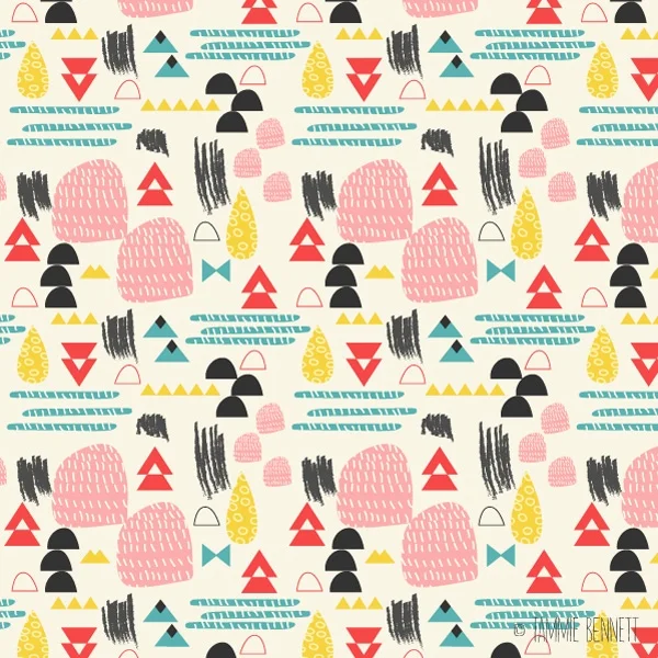
Happy Happy members Lauren Minco and Tammie Bennett are busy making preparations, and are on their way to SURTEX, while Denise HolmesEmily BalsleyJill HowarthPauline Grayson have been taking on exciting jobs and new clients. 

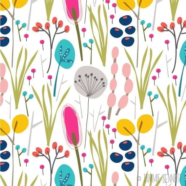
art by Tammie Bennett

Lauren has some excellent advice on her blog about preparing one’s portfolio for the big event:

"If you're doing Surtex, you definitely need enough art to actually show. Unlike other markets such as editorial and publishing, you don't just have examples of your work to show clients as examples of your skill…you make art beforehand that a company looks at and says "that would make a great XYZ! We'll take it!". Sure, there are still jobs in the industry that artists are commissioned for, but much of your work is made beforehand and is then available to license as you show your portfolio. 

Because of this, some people have hundreds and hundreds of pieces (sometimes even more!) depending how long they've been in the game. There are a lot of opinions about how many pieces or collections of art a newbie should have. I have enough work, but not as much as some of my peers do. However, I know that each piece is solid and nothing is filler. So even if an art director comes up and only has time to see a few pages out of my portfolio, I know they are gonna see my best work.” 

A few members of Happy Happy were featured in UPPERCASE’s Surface Pattern Design Guide. You can see pattern submissions by Emily, Pauline, Jill and Tammie in the free download of the Guide by clicking here.

Victoria Weiss of Butterpop Studio

Victoria Weiss is the founder of Butterpop Studio, an illustration, graphic design and web design shop based in New York. "I graduated from Parsons with a Communication Design degree, although my last 15 years has been mostly in animation, licensing, graphic and web design. I’ve lived in Hong Kong for some years as well and now freelancing from my house in Virginia Beach,” says Victoria. 

"I grew up in NYC and I spent many days in newsstands and bookshops just going through magazines in the mid nineties. Things have changed so much. Its hard to find ones with great content and treated with great care. UPPERCASE is beautiful."

Victoria’s on her way to SURTEX this year for the first time, and will be at booth 726.

"My portfolio is set up in a way for art directors to be able to use many icons to develop patterns for their collections. I’m aiming for wall art, stationery, gift, home decor and fabric companies this year. Also craft markets like scrapbooking.”

Be sure to check out Victoria’s website and stop by her booth at SURTEX! 

watercolour and florals by Nicole Tamarin

Nicole Tamarin works in watercolour and is drawn to classic themes and imagery, anything from florals to children’s to the everyday. She loves details and little extras, and tries to deliver a consistent level of polish to all of her work. She launched her business at SURTEX in 2012 and is excited to return for her third show this spring.

If you would like to know more about surface pattern design, you can download the UPPERCASE Surface Pattern Design Guide here

artist profile: Andrea Pippins

photo by Nicole Crowder

Andrea Pippins is an artist and designer with a passion for making others smile with her work. Using techniques like stamping and drawing, Andrea reinterprets her inspirations from many global cultures into designs that reflect her keen interest in rich hues, textural materials and mixed patterns. In her work, Andrea embraces colour, texture and scale with a fearless hand, offering a unique perspective in the hopes of inspiring others to enjoy the beauty of bold surface designs. 

How and when did you come across UPPERCASE? What do you enjoy about it? 

Wow, I can't remember, but I've been a fan for a very long time. I've always been drawn to the stories about other artists and their creative process. UPPERCASE does a wonderful job of capturing the essence of the artists and their spaces, and the overall design of the magazine is breathtaking.

You have been busy making new collages and drawings. One of those drawings is your piece called “I’ve Been Thinking.” Where did your inspiration come from for this artwork?

For a long time I've been enamored with the photography of Malick Sidibe and Seydou Keita. Their black and white photos are so rich with pattern and texture that it feels colourful, graphic and bold. I usually rely heavily on colour, so in this new piece I wanted to explore the idea of limiting my palette to black and white but still making an image that was very pattern-ful and rich. Like their photographs, they always feature a figure (or two). I did the same but brought in all of the "colour" into the figure. 

You have said that you reinterpret inspirations from many global cultures into your designs. What cultures influenced your Surface Pattern Design Guide submissions? 

I've been looking at a lot of global prints like and textiles from West Africa, India, the Middle East and ancient designs from Central America. I love the geometric shapes, the use of lines, and the simplicity in the colour palettes I've been observing in those works, and I wanted to create quirky interpretations of what I saw.

Why did you decide to submit your designs into the Surface Pattern Design Guide? What do you hope will come of being published in the guide?

To me, UPPERCASE set a lovely art and design standard and offers a different perspective of what artists and designers are doing today as makers. I felt that my designs would fit into that context nicely, and would also be a great way to share my work with new audiences.  

You work for a wide range of clients which proves that you are an incredibly versatile graphic designer. What’s your process for working with such a broad range of clients with different wishes for their final design projects? 

No matter the client, the process is always the same: fully understand their needs and use design thinking strategies to develop designs that effectively communicate what that client or brand represents. Their needs dictate and inform the process and what is produced. For me the strategies have to be fairly flexible to work with different clients and projects.

What projects are you currently working on?

I have my hands in so many things right now. I just wrapped up my collage series, which I had a self-imposed goal of using all the paper I had in that size and color. I have 51 completed altogether but I'm itching to do more because this personal assignment really forced me to stretch my creative muscle. Because the current ones are roughly 5"x7" I'd like to push myself and do some large-scaled versions. I'm also working on new ideas that would include some animation. Those are personal projects, but as a designer I'm working a few big assignments that will take me through the summer.

I was impressed by your 4 page resume of work that you have accomplished over your career. Given your wealth of experience, and a fabulous portfolio, where do you see yourself in the future? Will you continue to be a multi-disciplined designer, or do you desire to immerse yourself in a bigger long-term project? 

Thank you. Currently, I'd like to focus on developing more of my personal projects in addition to working on special collaborations, while also continuing to teach design. Being an artist and educator are the two main areas of my creative path that I want to develop. I would really like to make sure that everything I do aligns with those two important parts of me. So whether it's a creating a collection of shoes, a design collaboration with a cultural institution, or a speaking engagement with teens interested in design, as long as it fits in "artist" and/or "educator" I'm open to working on the assignment.

a dapper zebra and an odd flamingo

Paper & Cloth is a design studio in the UK with a strong focus on illustrational talent. "There has been the odd flamingo running crazy in the studio,” they write about their promo piece. "We are loving all the gorgeous painterly, inky trends we are seeing… Check out the dapper zebra. Inky and yet somewhat debonair don't you think?"

Joanne Hus' interview with Lilla Rogers

Joanne Hus is a digital illustrator whose clients range from Time Inc., Gillette, the Chase Manhattan Bank, Scholastic, and Papyrus. 

Joanne’s interview with Lilla Rogers, artist rep and educator extraordinaire is part of the UPPERCASE Surface Pattern Design Guide in issue #21. You can read the entire article in the free download of the Guide by clicking here.

a SURTEX lookbook by Nottene

Nottene is a multi-disciplinary design studio with a focus on textiles and illustration. In case you were wondering, Nottene, pronounced "huh-ten-nuh", means nuts in Norwegian. The studio is led by Kimberly Ellen Hall. With a Master’s in textiles from Central Saint Martins, Kimberly has worked from here to there in publishing, fashion and art. She has designed for Coach, Hussein Chalayan, the Village Voice, Peter Jensen, the Denver Art Museum and others. 

Nottene has designed a lookbook in preparation for SURTEX. Keep your eyes peeled for Nottene at booth 454! 

If you would like to know more about surface pattern design, you can download the UPPERCASE Surface Pattern Design Guide here


strawberries, bacon and jam by Holly Maguire

Holly Maguire is an illustrator based in Bristol, UK, with a big passion for surface pattern and textiles. Her work tends to include detailed yet playful and bright imagery made using gouache, and pen and ink. Holly really enjoys being able to apply her work to homeward, clothing and functional items. Her patterns are inspired by vintage design, packaging, fashion and popular culture. They often feature elements of nature and food, as well as everyday objects. 

Be sure to take a look at Molly’s Etsy page to purchase her cheerful patterns on prints and cards. 

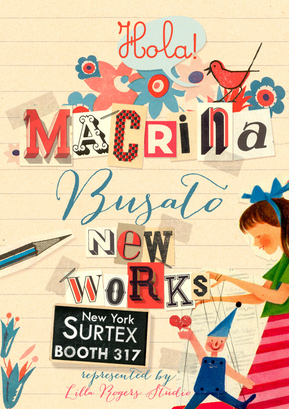
hola from Macrina Busato

Macrina Busato likes to work with by hand and explore the beauty of images from other periods, to make them say new things in new contexts while keeping a warm nostalgia. Her work is a mix of handmade drawings, ephemera, typography and calligraphy. Macrina is a cultural anthropologist who 15 years ago went progressively into graphs and surface design. Her studio in Madrid sometimes looks more like a library, full of antique science and technical books, old magazines and engravings. 

Macrina is attending SURTEX, and will be showing off some of her new work at booth 317. 

Zoe Ingram at SURTEX 2014

Zoe Ingram is a surface designer and illustrator with an honours degree in printed textile design. Her work has been described as design with a twist, lush, colourful, elegant, playful and organic. Zoe loves colour and often uses hand lettering, layering and textures in her work. Her clients include Robert Kaufman Fabrics, Midwest-CBK, Quarry Books, American Greetings and IKEA. Zoe won an international talent search and is now represented by Lilla Rogers Studio. 

If you would like to know more about surface pattern design, you can download the UPPERCASE Surface Pattern Design Guide from here