


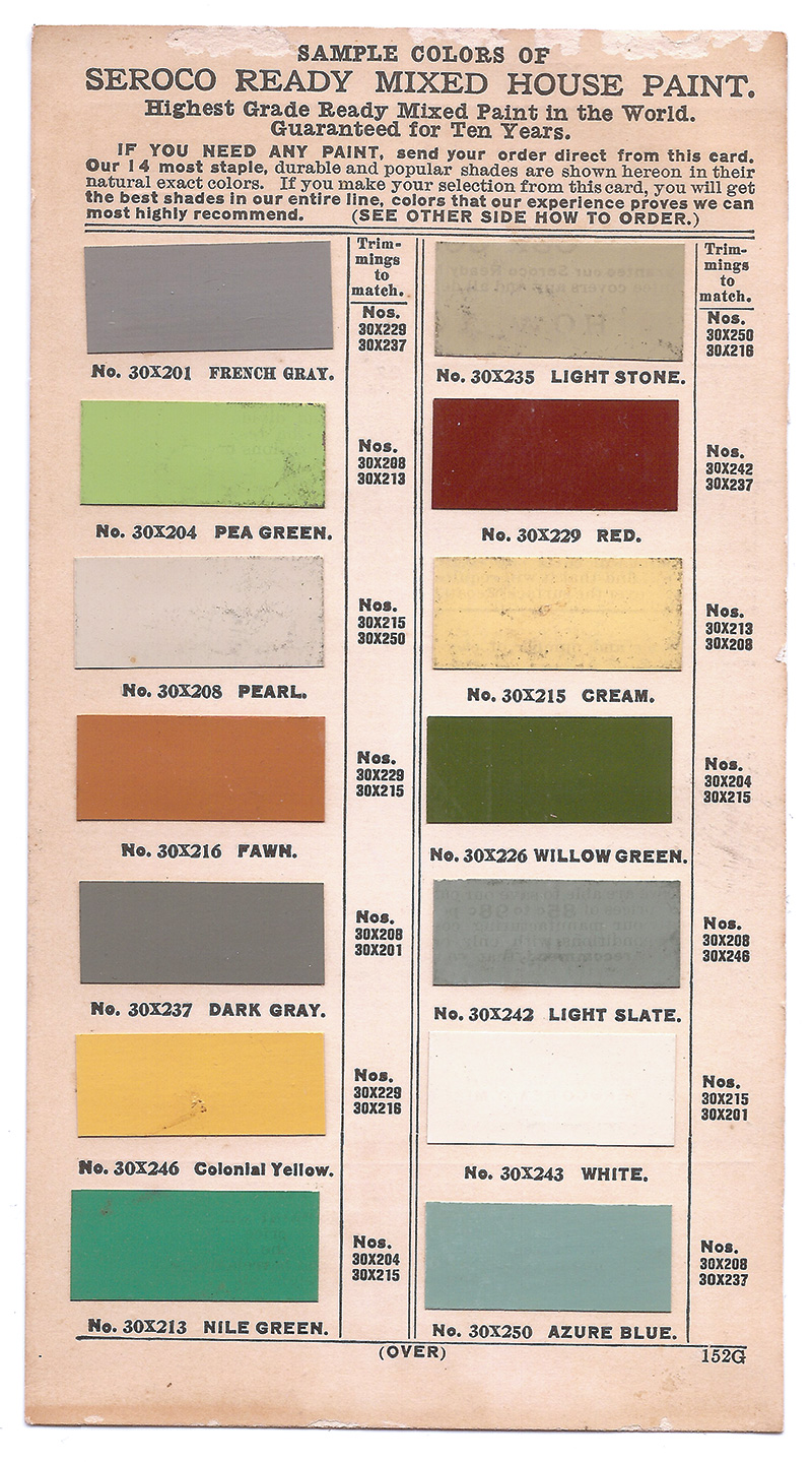
Some of the colour charts and wheels that were used as inspiration and reference for the design of issue #22. Please click on the image for credits.


Colour Charts
article by Correy Baldwin
originally published in UPPERCASE 22, Summer 2014

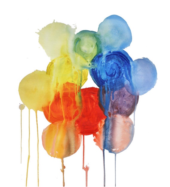
Nature has its own ways of displaying colour, and it does so with abandon; colours in their natural state are wild, uninhibited, free. They shift and vary, they grow and recede—always dynamic, always unpredictable. Colours like to mix it up, and they don’t sit still. These tendencies are inspiring, but not always practical—at least not from the standpoint of humankind. Let’s be honest: there are times when we need to contain colour, to isolate and dissect it.
Consumers need to see their colour options, and manufacturers need to ensure that those options remain consistent. Scientists need to classify what they observe. Designers and artists need to build colour sets, to select and combine, and mix and match. Sometimes we need to break things down to their elements, and sometimes we need to bring elements together to get a sense of the bigger picture. We need to pair up—or weed out—as we hunt for that ideal combination to suit that single purpose.
We do all this out of practical necessity, but it is also a form of play. Whether for work or pleasure, the need to isolate and combine has led to the creation of various organizing systems—colour charts, colour guides and colour wheels. All are ways of representing colours and their relationships to each other, and the possibilities within those relationships. We’ve come to rely on these systems, but to what end? Does colour have a regular order, or are we imposing one on it? And if colour does have an order, when, if ever, does it pay it any heed?
For the general appreciator of colour, the strict organization of a colour chart can be at once utterly pleasing and strangely unsettling: all those variations of shade and hue, pushed and prodded into repeating geometric shapes, lined up like laboratory test tubes. They remind me of the pastel, cookie-cutter bungalows that fill the suburban world of Tim Burton’s Edward Scissorhands—each one individual, yet conformist; hideous yet gorgeous.
There are just a few base, primary colours—a limited number of pure colours from which all others, through mixing, are made. But the space between these primary colours is the interesting place. As colours move across the spectrum, or around the colour wheel, they take on the qualities (and pigment) of whoever is next in line. This poses perplexing questions: When does one colour end and another begin? When does red cease being red and instead become yellow? And what of orange, the blended colour that the two make? Is orange ever its own thing? Can it ever be truly singular and whole? Can it ever be just itself?
These conundrums were posed by the artist Spencer Finch in his 2010 piece, "Where Does Red Begin and Where Does it End.” In the watercolour painting, Finch illustrates the shifting of orange into violet through 360 individual panels of paint. (The poet Katia Grubisic asked the even more troubling question, “What if red ran out?” in her 2008 collection, but that is perhaps another matter entirely.) Finch’s painting invites us to locate the exact moment when red begins and when it ends. Both artist and viewer know, of course, that the task is impossible, but it makes little difference—the joy is in the hunt.
How many colours exist? How do we represent all the possible variations? More to the point: is such a task possible? In 1692, a Dutch writer named A. Boogert produced a handwritten book, called Klaer Lightende Spiegel der Verfkonst, in which he described the process of changing the tone of watercolour paint by adding small portions of water. A. Boogert illustrates this process over more than 700 pages, creating a comprehensive and exhaustive catalogue of colour. The book was relatively unknown before being dug up in a French museum by a medieval historian named Erik Kwakkel, who shared the find on his blog just this April. What we find is this: you can daub water over the course of 700 pages and still come no closer to capturing each miniscule shift in colour. You cannot subdivide the infinite; it is an impossible task.
Graphic designers immediately compared the book to the famous Pantone Color Guide, the go-to guide for one of the biggest colour corporations around. The guide, which uses the company’s own Pantone Matching System, was first printed in 1963, and today dominates the public’s perception of what a colour chart looks like (a fan, rather than a swatch book or one-page chart), as well as why and how they’re used. Like other companies in the business, Pantone is constantly coming up with (and naming) new colours. By now they’ve likely surpassed even seventeenth-century A. Boogert in the multitude they’ve made available. And yet you can bet there are even more on the way.
How many colous exist? Despite our efforts to illustrate, organize, categorize, collect and count, we will never be able to find them all. Books like A. Boogert’s epic Klaer Lightende Spiegel and Pantone’s plethora of matching guides are like film reels, providing the illusion of continuity by artificially dividing what exists. The infinite amount of colours cannot be captured, not really.
With its structure of multiple squares of colour variations, the colour chart is a system for presenting possibility. Each geometric space is your life, and each colour is your life in a different shade or hue. Each possibility is an alternate universe: similar, but different. Not real, but possible. Opening a booklet of paint swatches allows a glimpse into these universes: this is my living room in caramel, in dusty rose, in olive green. These are the multiple universes of my living room.
The insistence on compartmentalizing is all around us. In my pantry, grains and pulses are lined up in their own individual canning jars: brown lentils next to green lentils next to red. Brown rice next to basmati next to jasmine. Each with its own unique characteristics. Each of us with our own unique preferences. Each jar filled with the promise of a possible meal. Individually, however, each of these items contain only half a protein; only by combining them can I truly be fed. The same could be said of colour. Likewise, on my spice rack are turmeric and coriander and cumin and cinnamon. Individually, each one is limited; only together can they create a curry.
On the prairies where I grew up, the comparison is just as obvious: ordered rectangles of golden wheat, the dustier tan of barley, green of peas, brilliant mustard of canola, the brief week when flax blooms an ocean-like purple blue. This separation, and strict containment, is necessary for the practical requirements of the industry. Grains are harvested separately, cleaned and transported and stored separately, and packaged and sold separately. Wheat is one thing, we learn, and rye something completely different.
And yet, how wonderful a multi-grain loaf tastes. How much its very own thing it is. I bake bread myself, mixing wheat with a spectrum of grains: kamut and rye and spelt—creating hues and shades of flavour. The wonder is in the combination. And yet, the combination is not possible without the initial compartmentalization. The one is not possible without the other.
Unlike you and I, nature is utterly at ease with the slippery nature of colour. Nature doesn’t compartmentalize; it interacts. It’s all a jumble. Why do we try to organize what is unorganizable? Is it for mere practical reasons? Does is come from a collective desire to control?
Perhaps, but it’s more than that. It allows us to do two very important things: it allows us to visualize possibility, and it allows us to combine. A presentation of colour choices is a starting point from which we can begin to blend, to mix, to experiment. Perhaps by first identifying structure, we’ve made it possible for ourselves to find true freedom, true creativity. •


