
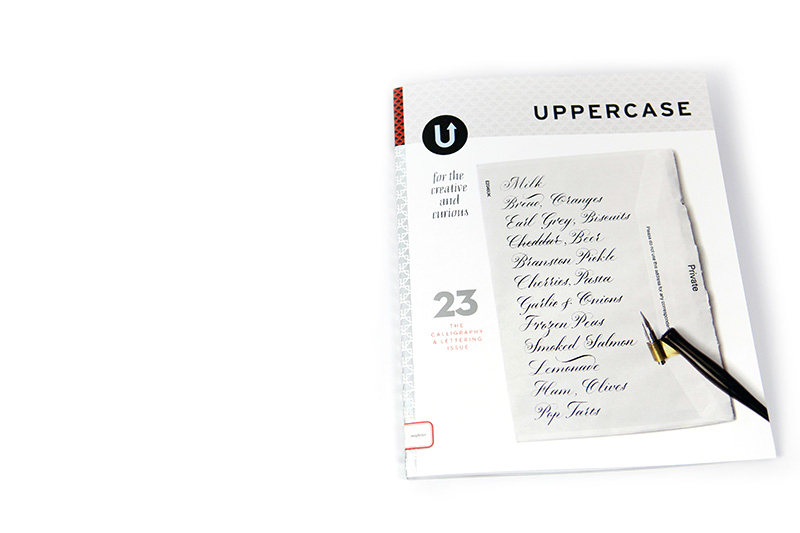
Issue 23
ORIGINALLY PUBLISHED OCTOBER 2014
DIGITAL RELEASE MAY 2017

The print version of this issue has been sold out for a few years now. This calligraphy and lettering-themed issue was particularly popular and it’s a shame that it is out of print. Since I can’t afford to reprint old issues (I have to spend on producing the next one), I thought I’d try an experiment and offer this issue as a digital version. UPPERCASE has been selected by the digital publishing service issuu to participate in an early version of their new digital sales feature. We've been using issuu for many years to host low res previews of our books and magazines—now we're able to also offer high resolution access to this beloved back issue. Access is $10 USD for the full 116-page magazine.
Please note that the page design was designed for print, so if anything looks too small you can simply zoom in. You can also click on the links to learn more about the profiled artists and their work (and see what they've been up to in the past couple of years!) Please also note that because this is an early version of the issuu system, you won’t be able to read or buy from the issuu mobile apps just yet, but you can still go to issuu.com in your mobile web browser.
Future issues of the magazine will continue to be exclusively print.
|||
Why a digital version?
I often receive emails from readers wondering if I have any unlisted copies of the older back issues for sale. Alas, if I did, I would put them in my shop! Print runs are limited and once an issue is sold out, it is not reprinted—I invest available funds into future issues' print bills, contributors and other expenses.
As an independent craft and design magazine that doesn't have any advertising or governmental support, it is important to recognize other ways to support the magazine. The content of each issue is evergreen and always inspiring, so I thought it was time to revisit this older content and give it a new life.
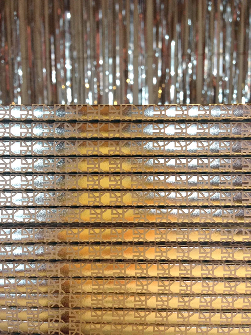
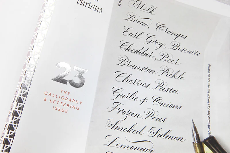
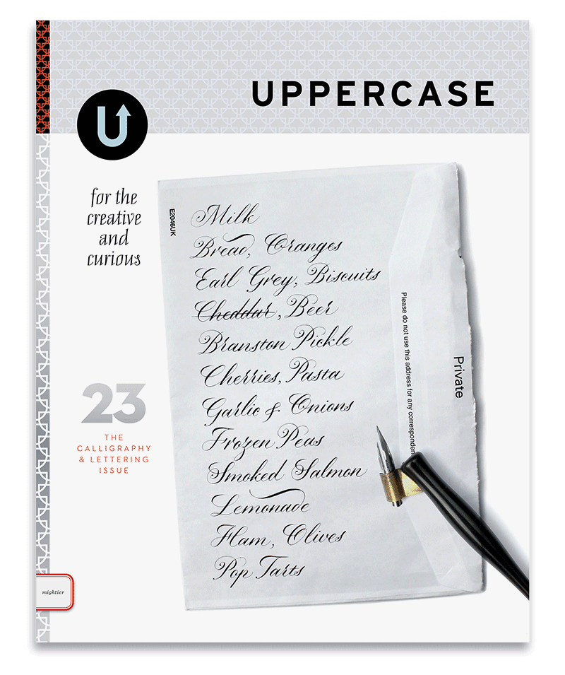
I will only consider making back issues available as a digital versions once the print version is sold out in my shop and at stockists worldwide. UPPERCASE is a print magazine and always will be. We love the feel of paper, the smell of ink and the unique tactile experience that only print-on-paper provides. We also love print bells and whistles—like the silver foil that graced the spine and cover of issue 23.
I hope you enjoy the terrific content featured in this digital issue. If this experiment proves to be a success, I will add other out-of-print back issues. And if you’re new to UPPERCASE, I encourage you to subscribe to the magazine in the medium of our first love: paper!
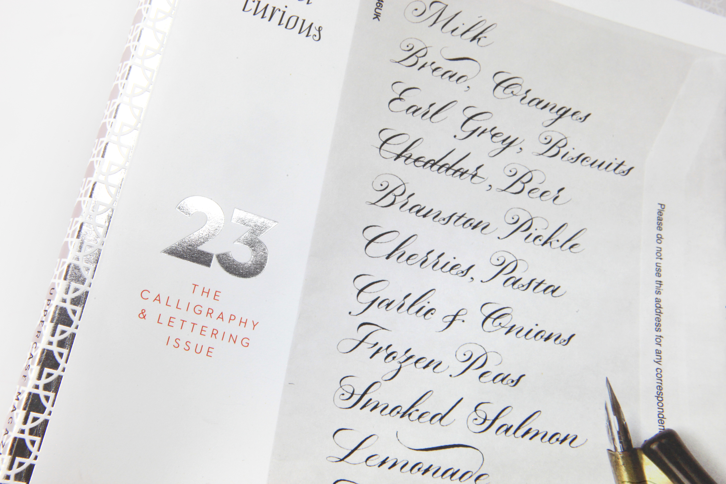
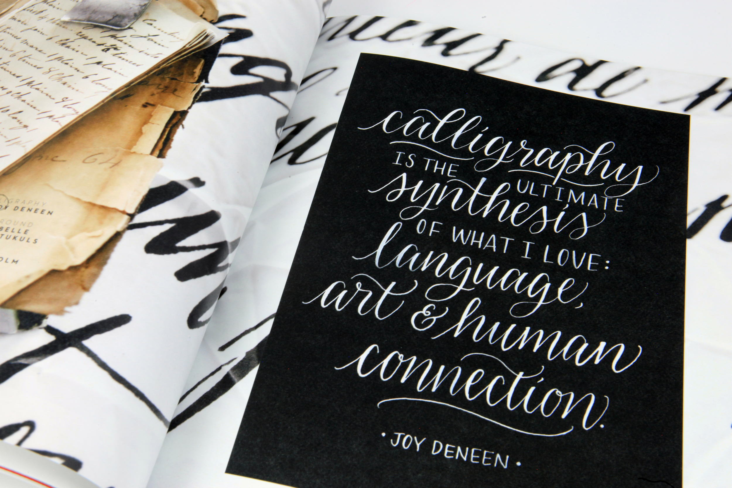
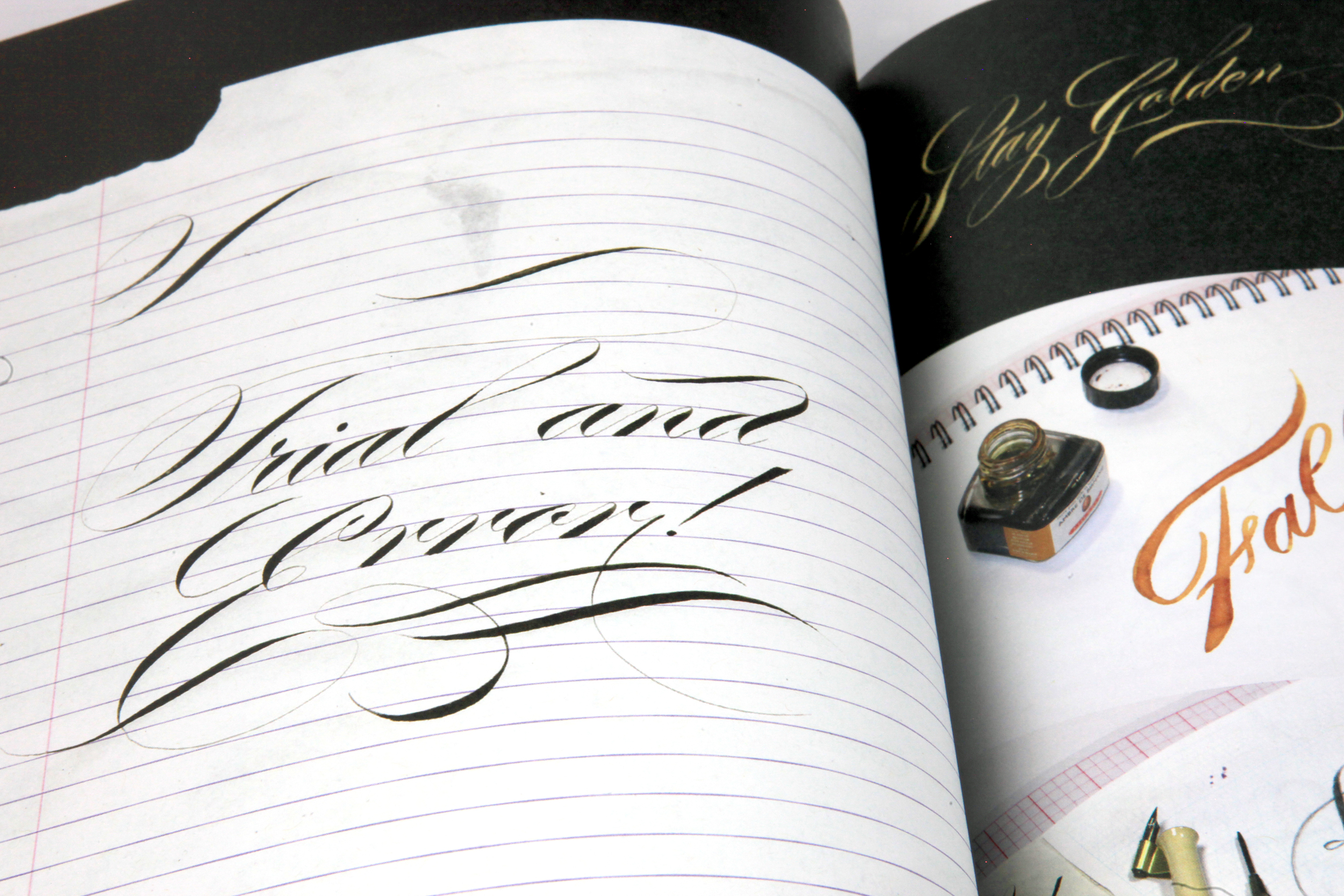
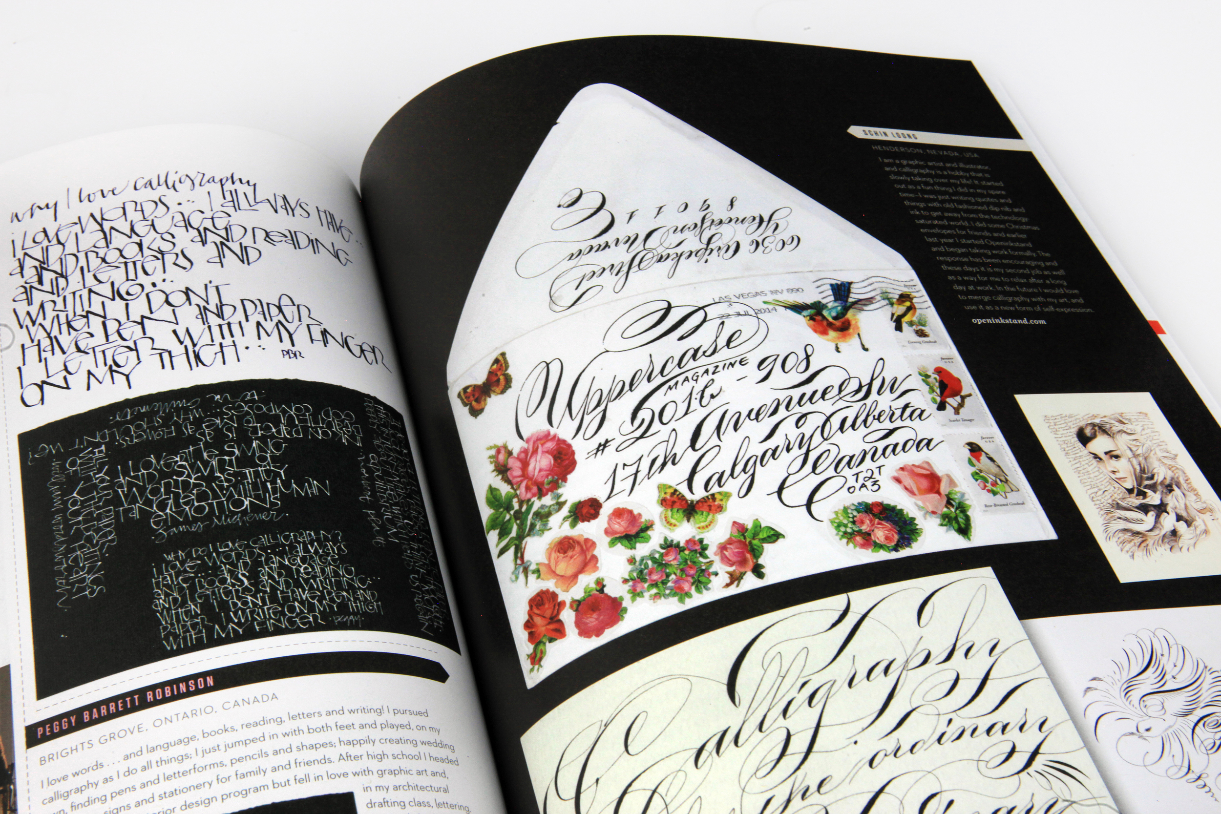
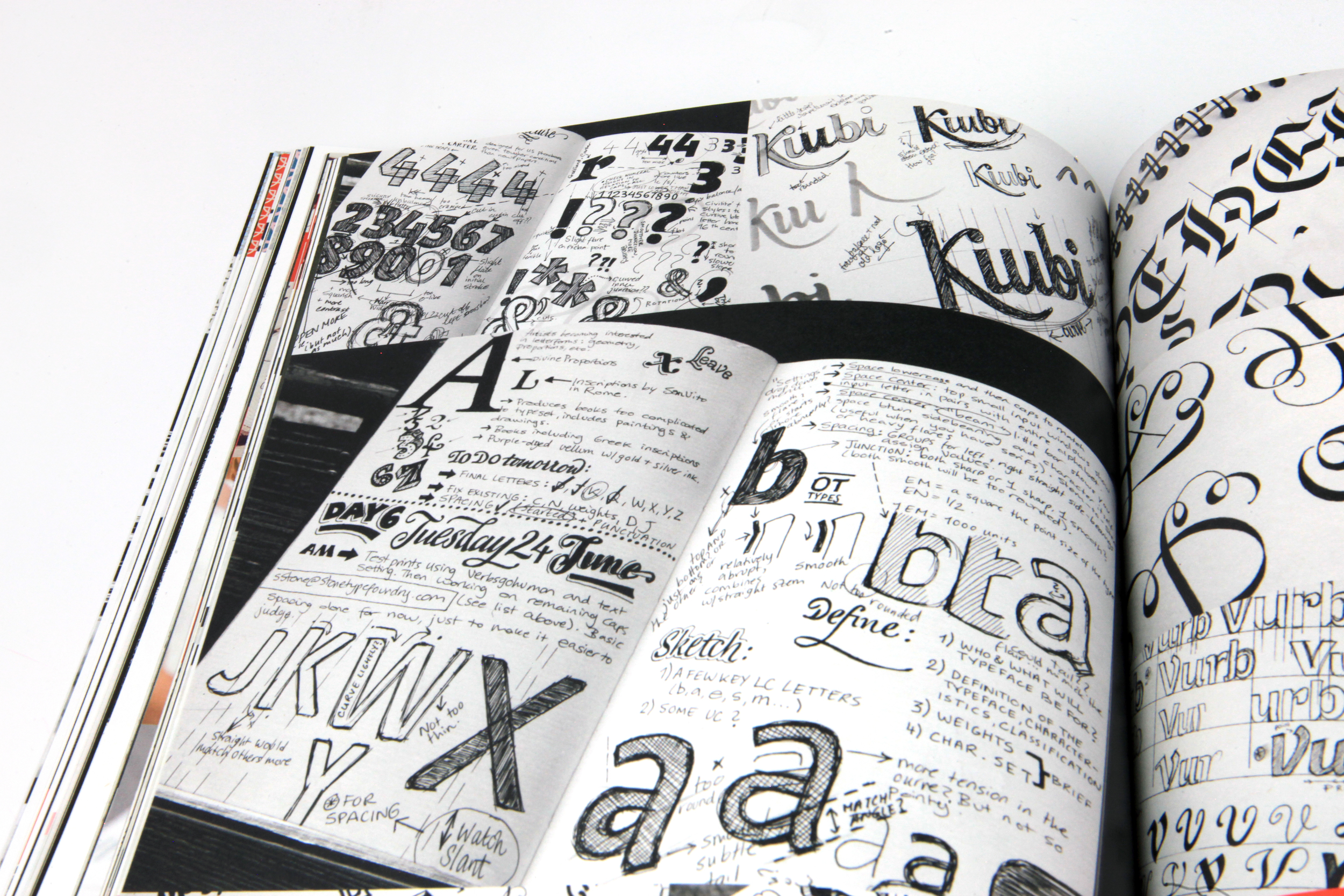
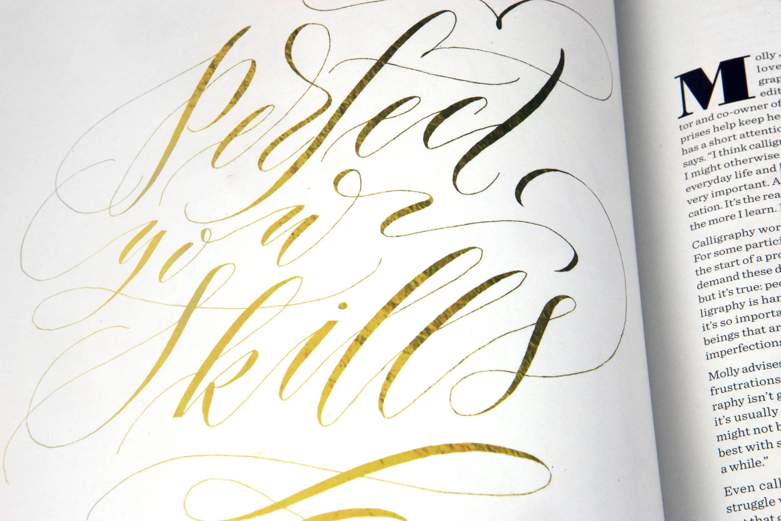
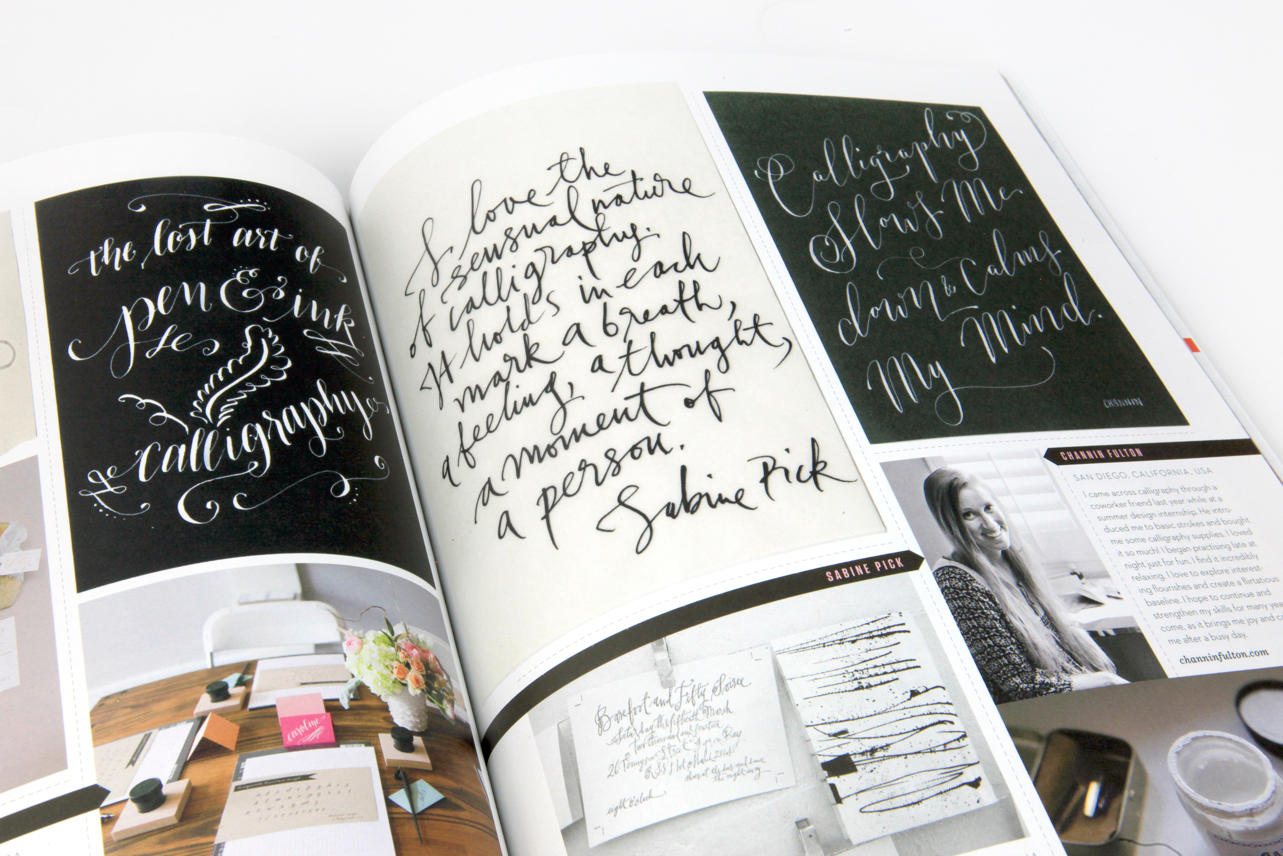
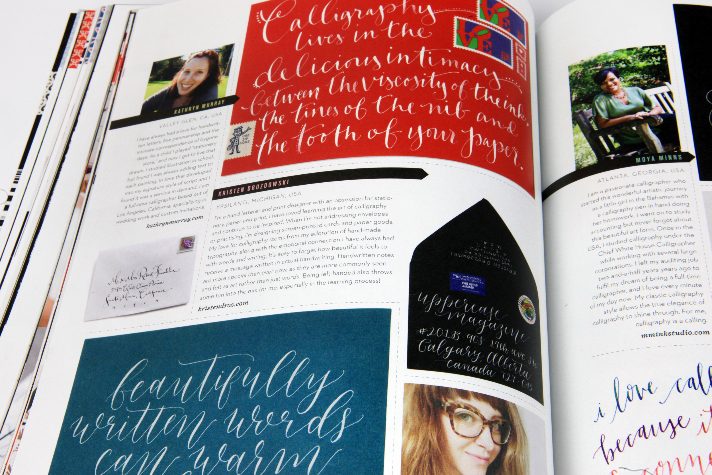
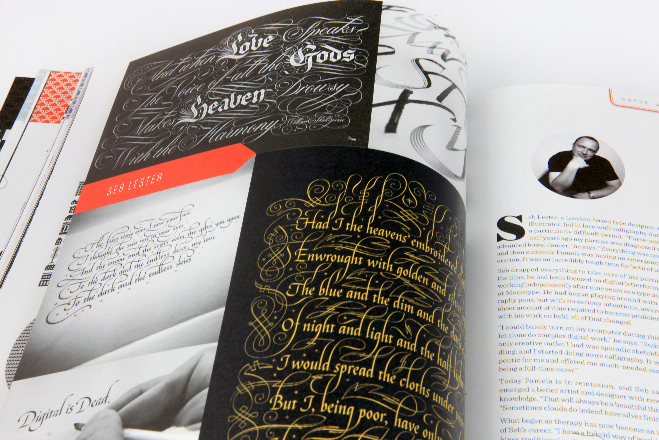
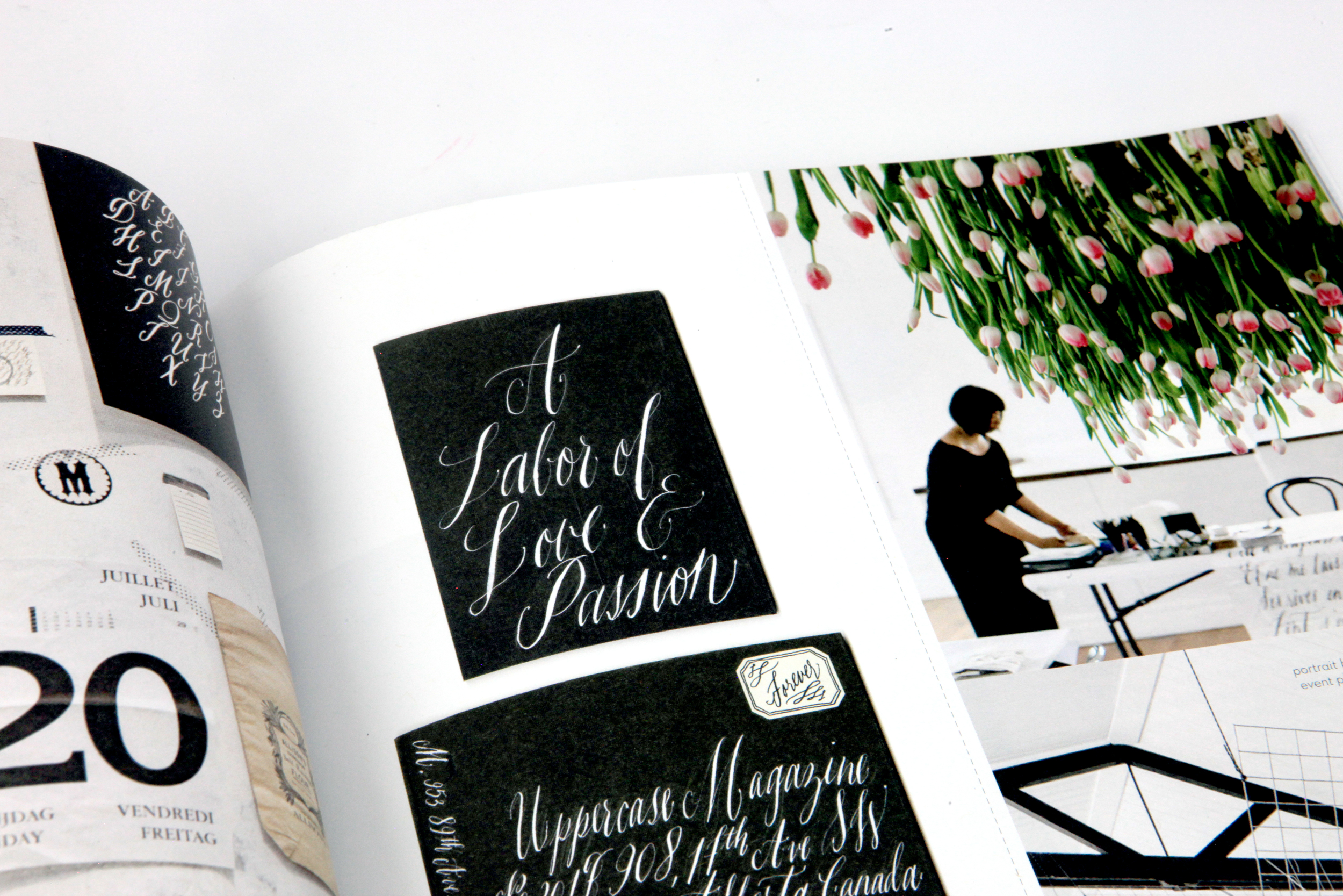
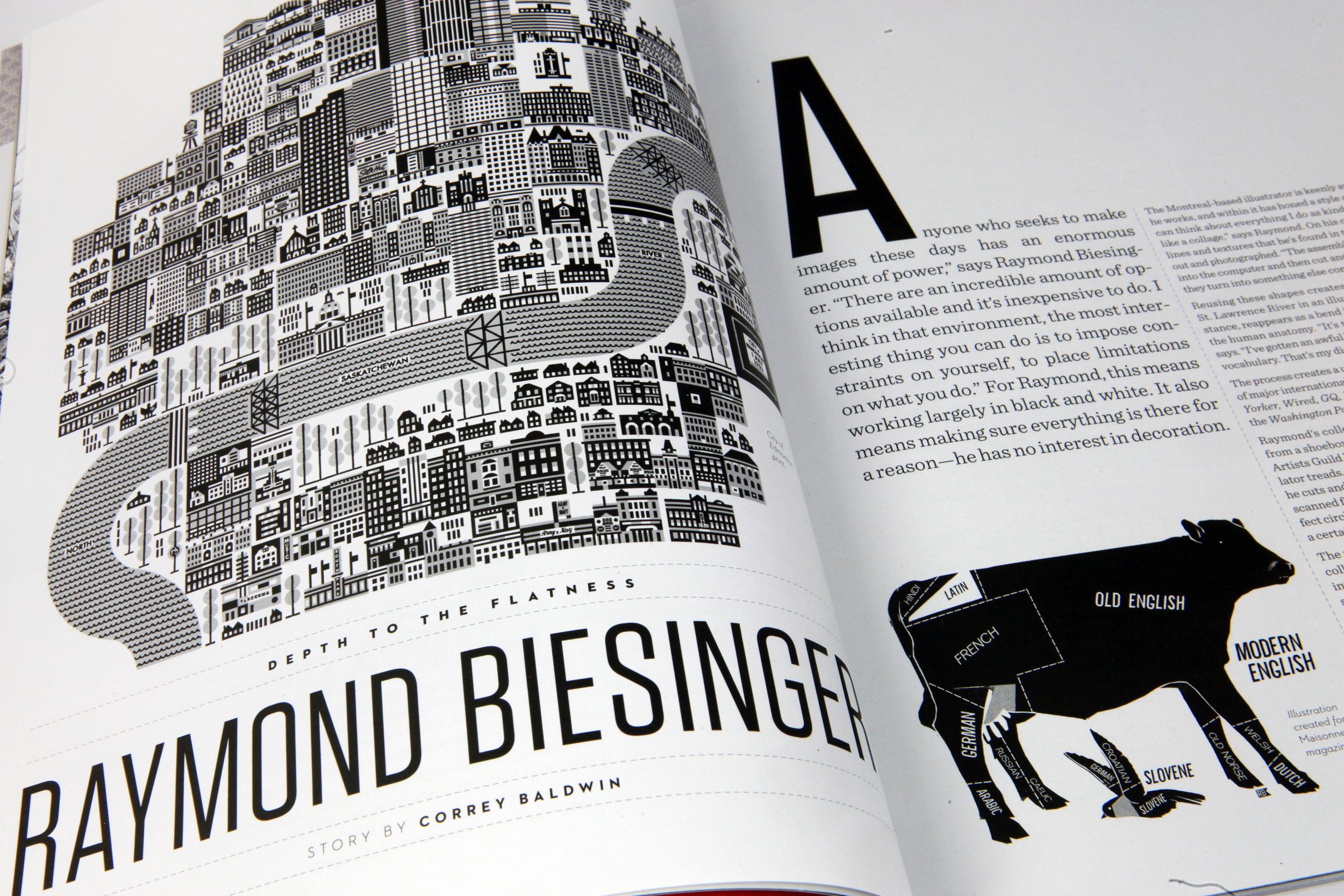
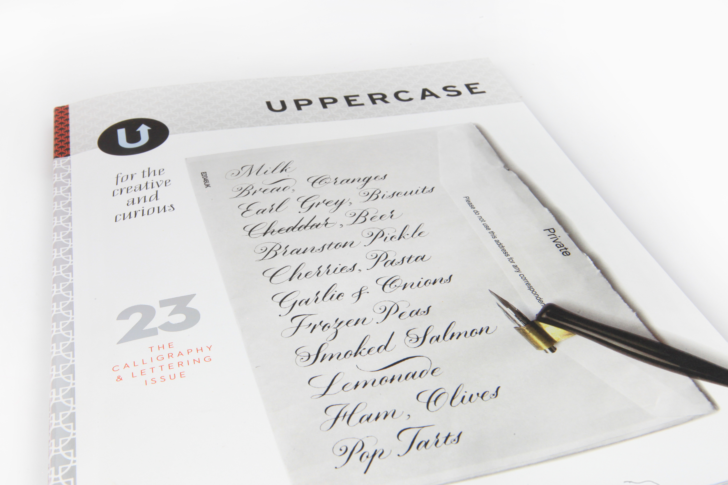
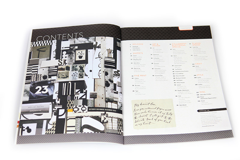
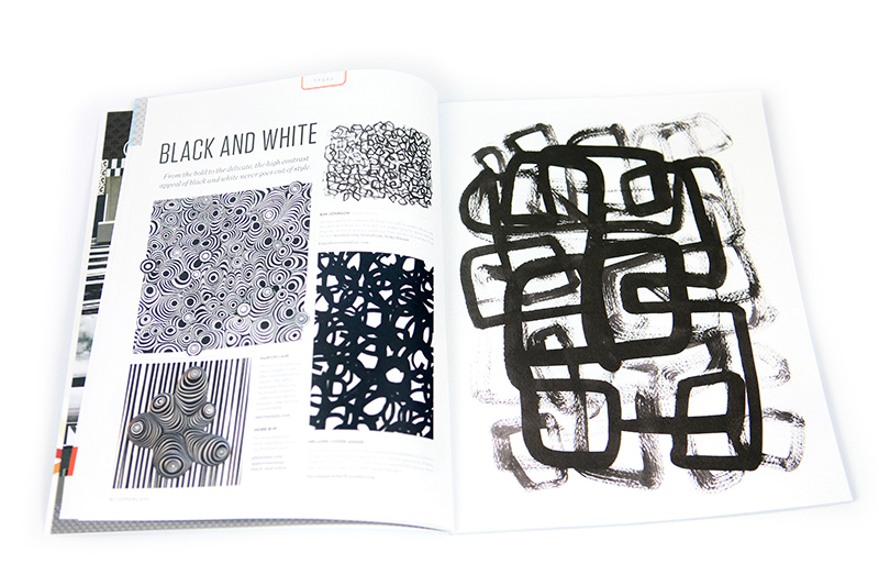
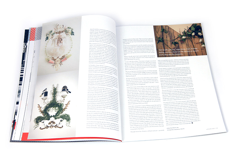
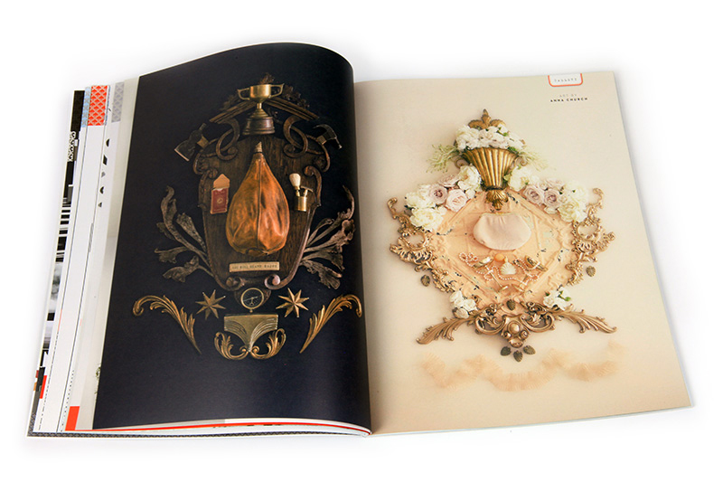
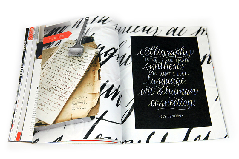
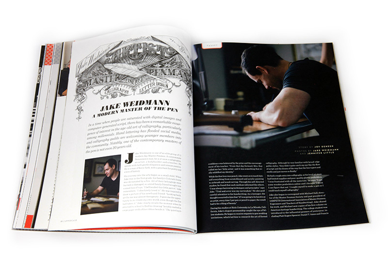
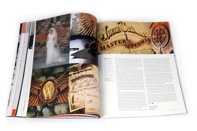
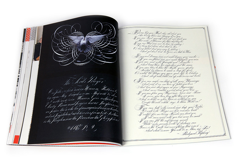
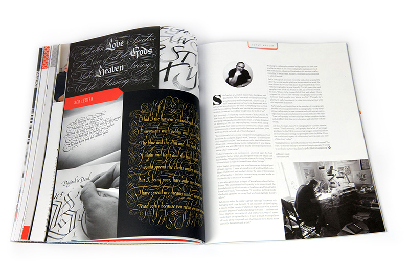
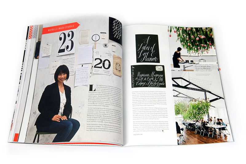
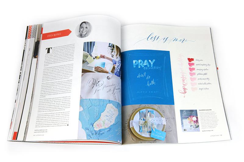
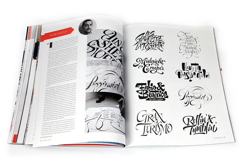
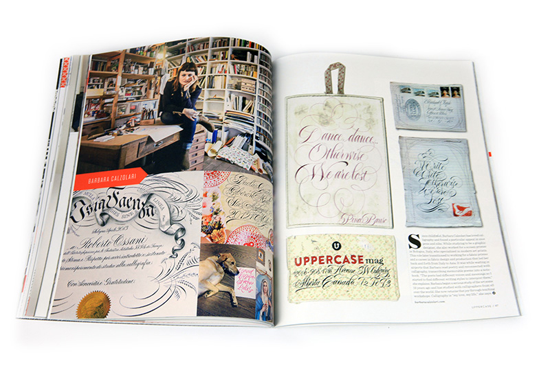
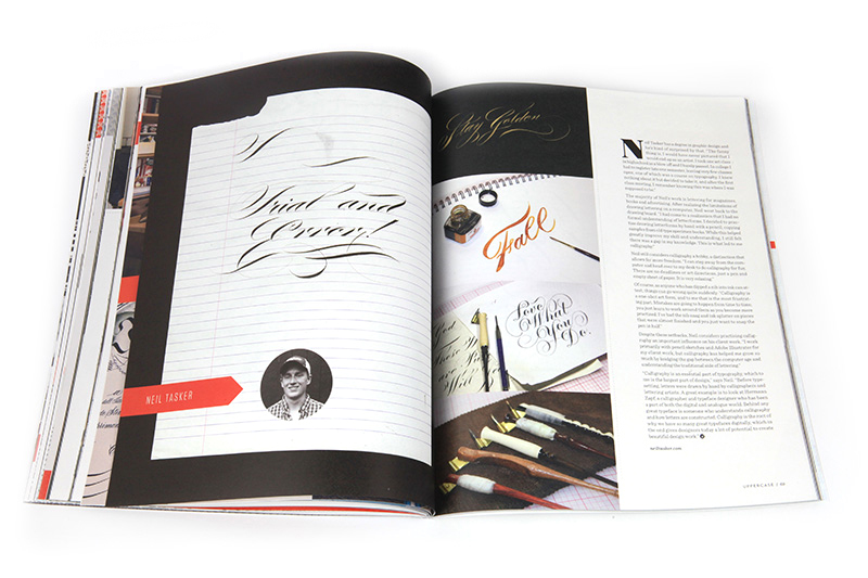
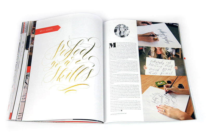
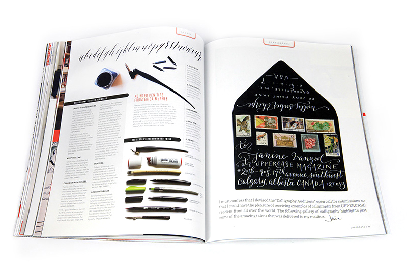
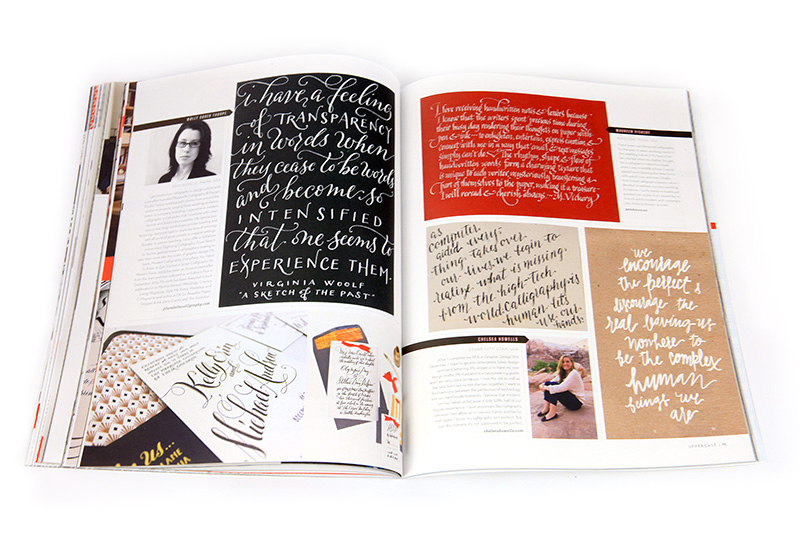
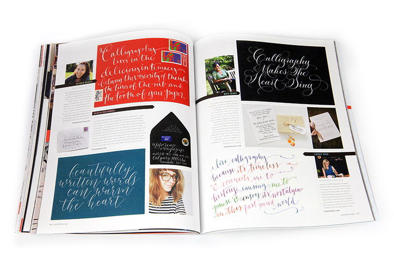
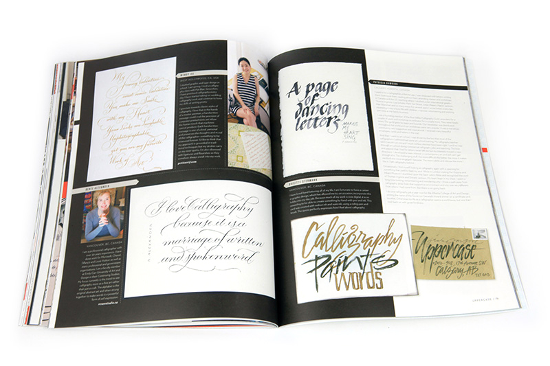
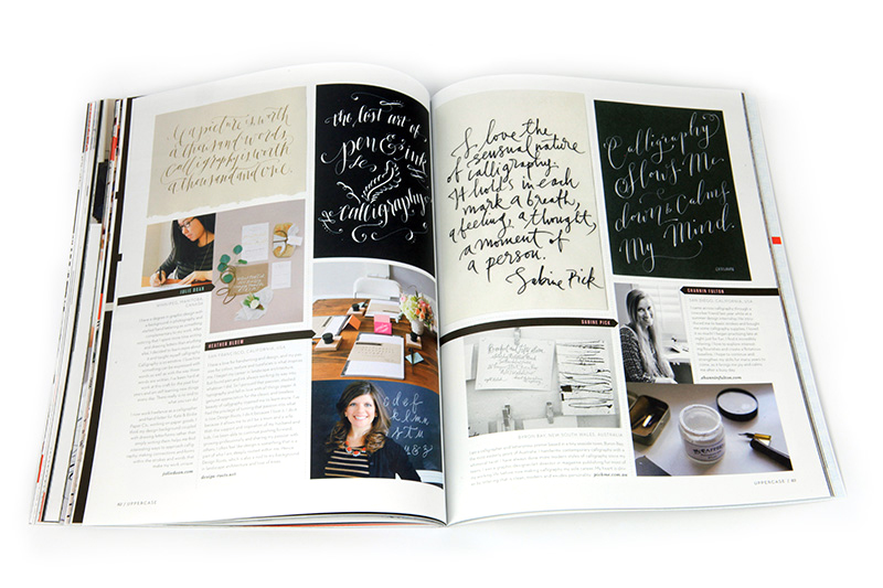
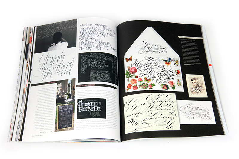
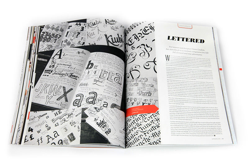
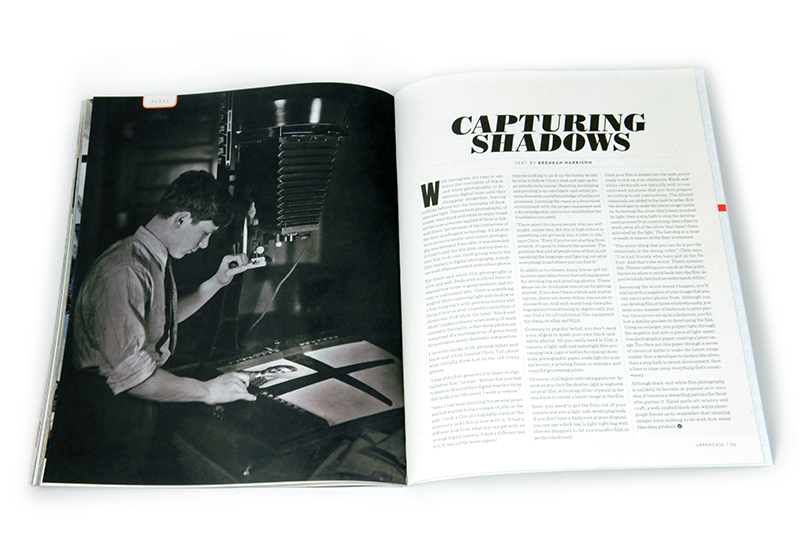
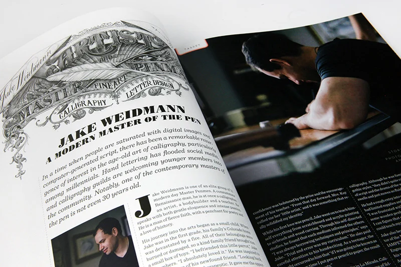
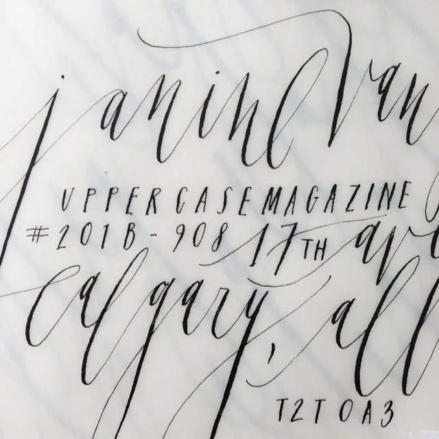
Celebrating things monochromatic—and the graphic appeal of black and white—issue #23 contains a special calligraphy and lettering section featuring Seb Lester (our cover calligrapher), master penman Jake Weidmann and profiles of Joy Deneen, Maybelle Imasa-Stukuls, Erica McPhee, Barbara Calzolari, Neil Tasker, Pietro Piscitelli and Molly Jacques. The experts offer tips for beginners and our talented pool of readers share their calligraphy work as well.
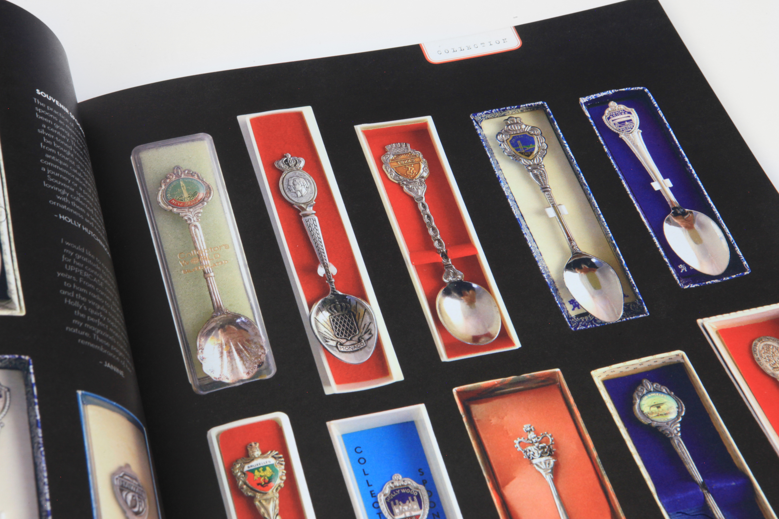
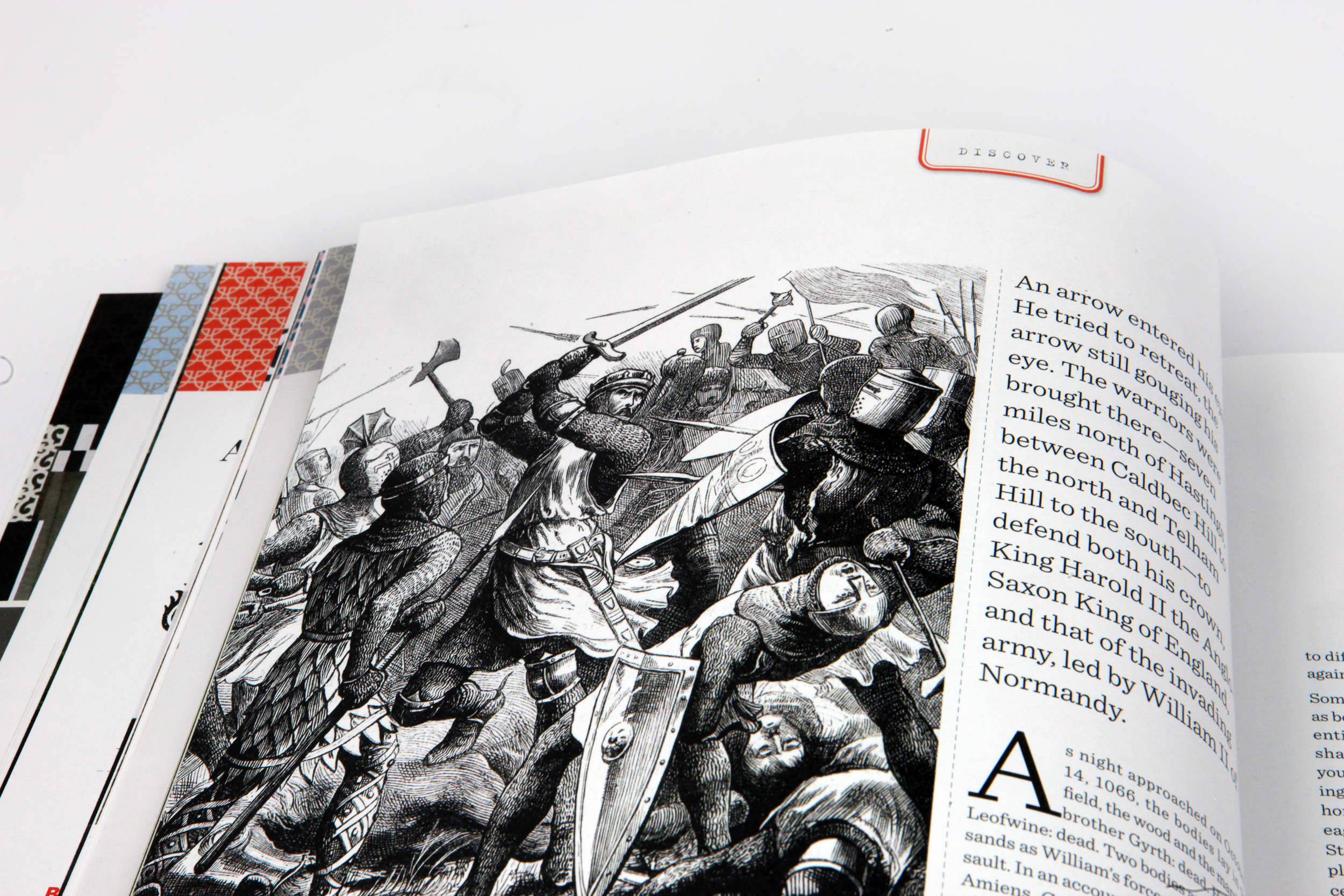
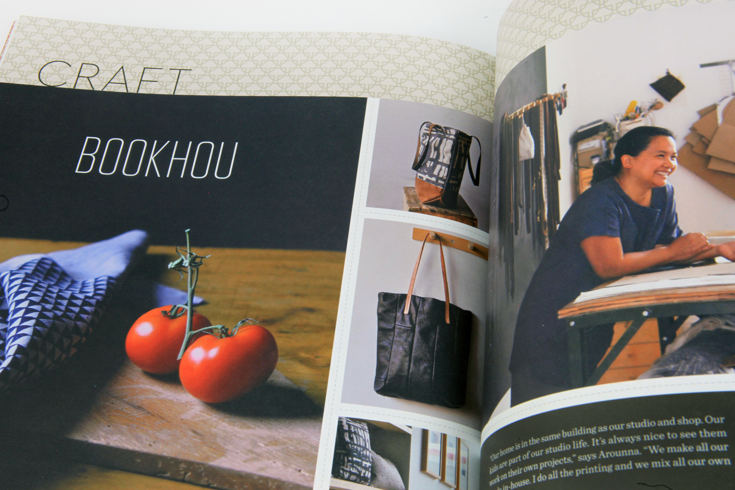
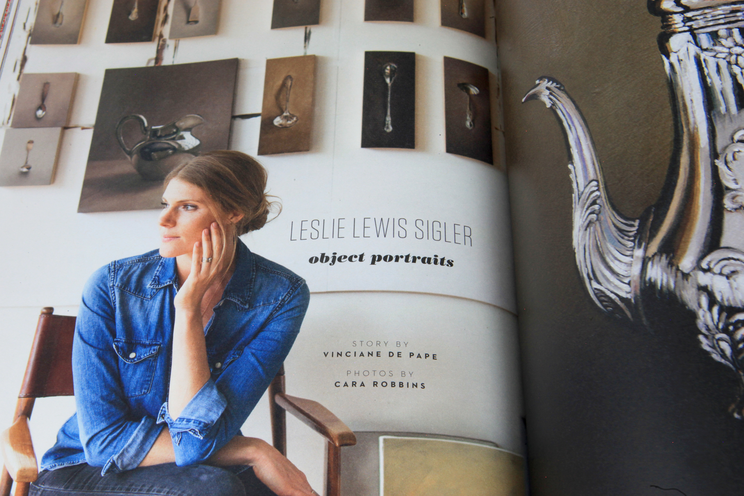
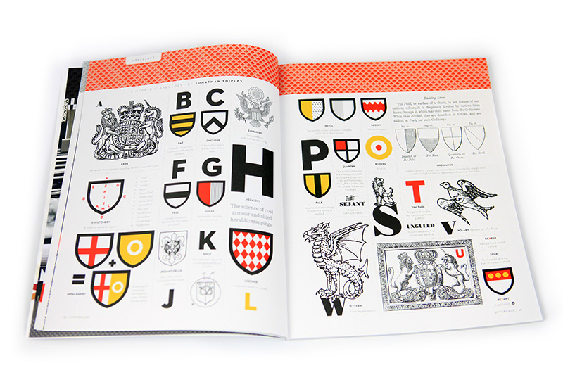
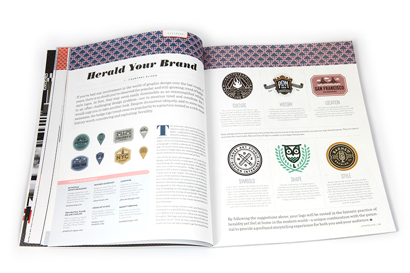
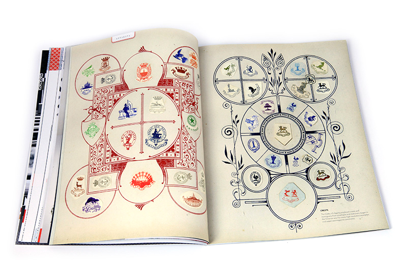
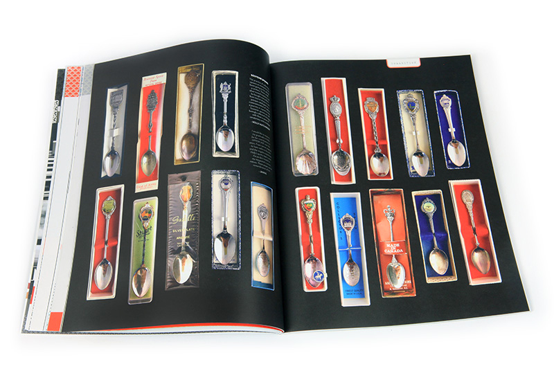
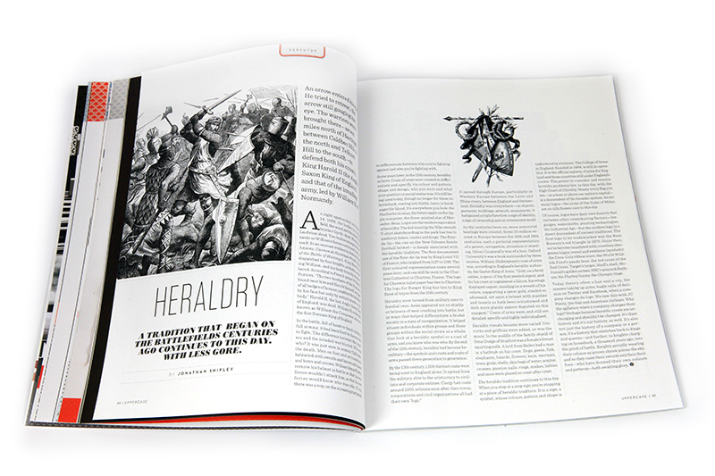
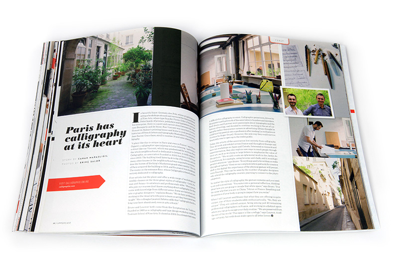
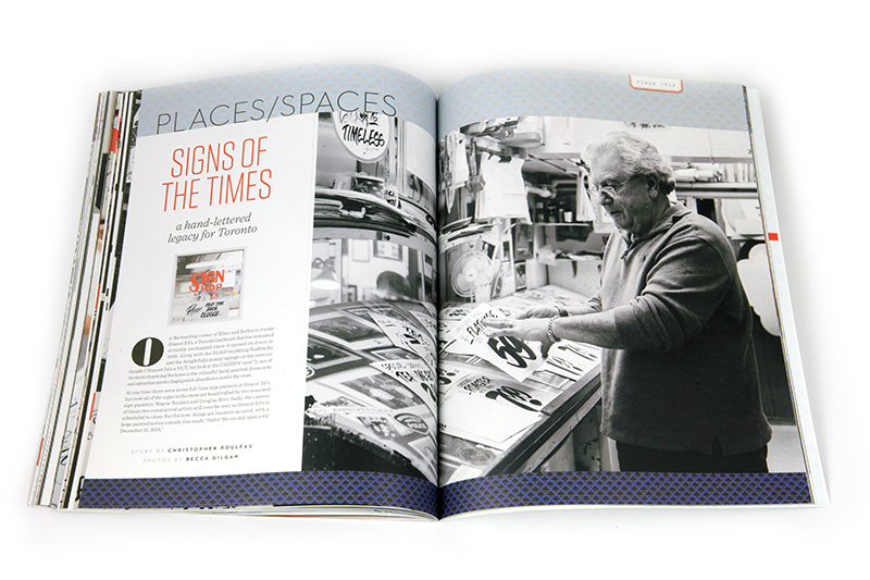
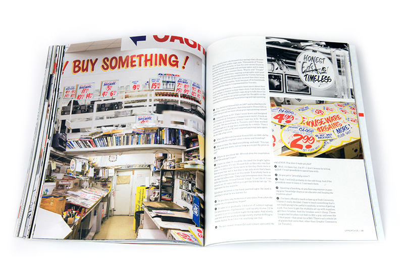
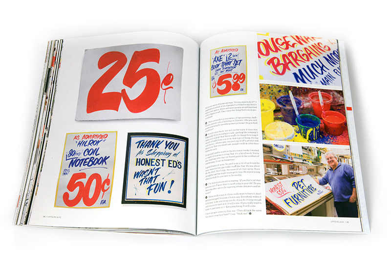
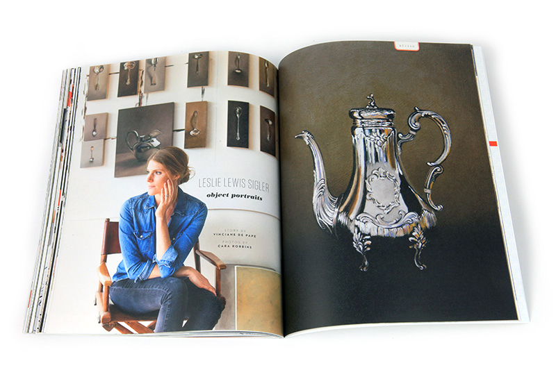
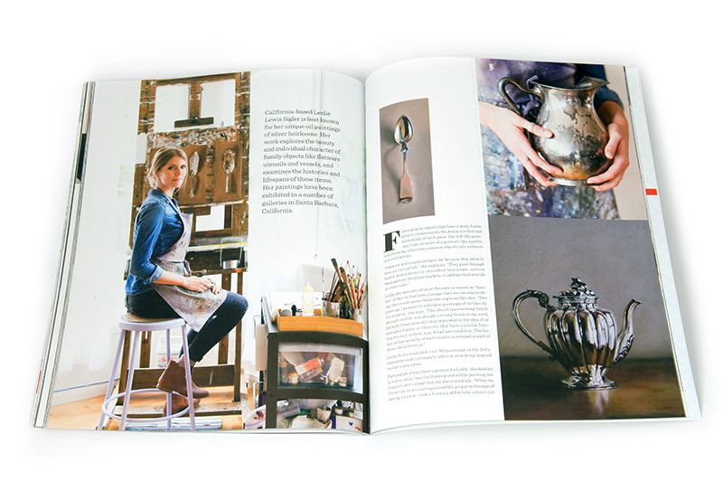
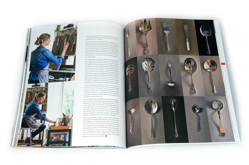
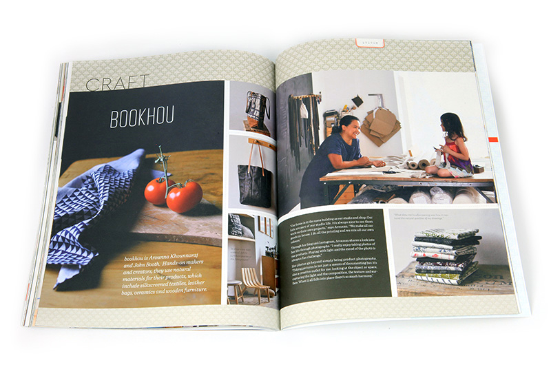
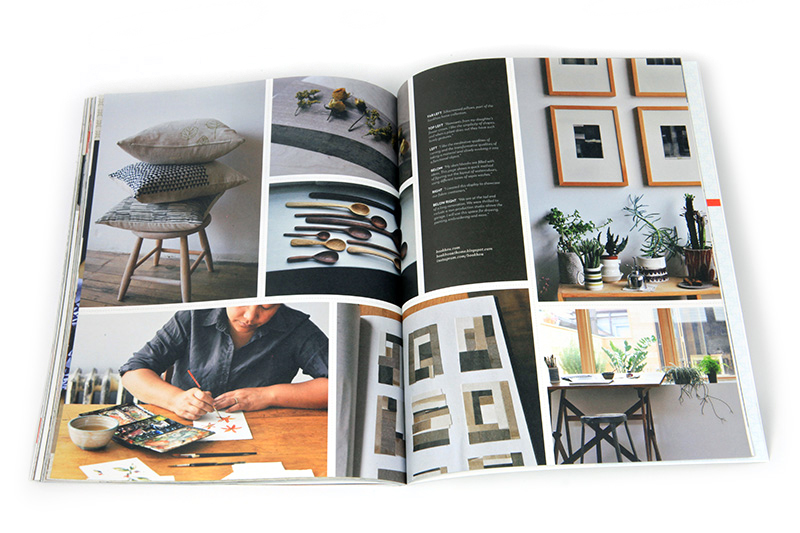
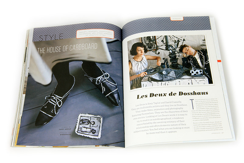
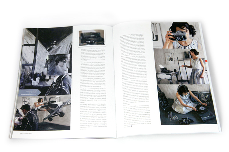
This issue also has articles about modern-day heraldry and how to use tradition and crests to design your brand; silver spoons painted and collected; the dynamic mother-daughter duo Tag Team Tompkins; a field trip to an in-house signpainter in Toronto's soon-to-be-extinct Honest Ed's; a visit to an enigmatic House of Cardboard; and a trip to a Parisian calligraphy guild.
|||
VIEWS OF THE PRINT EDITION 2014


|||
ISSUE 23 POSTS


Crests and Monograms

Enjoy these high quality featured ephemera: a Crests and Monograms Collectors' Book


