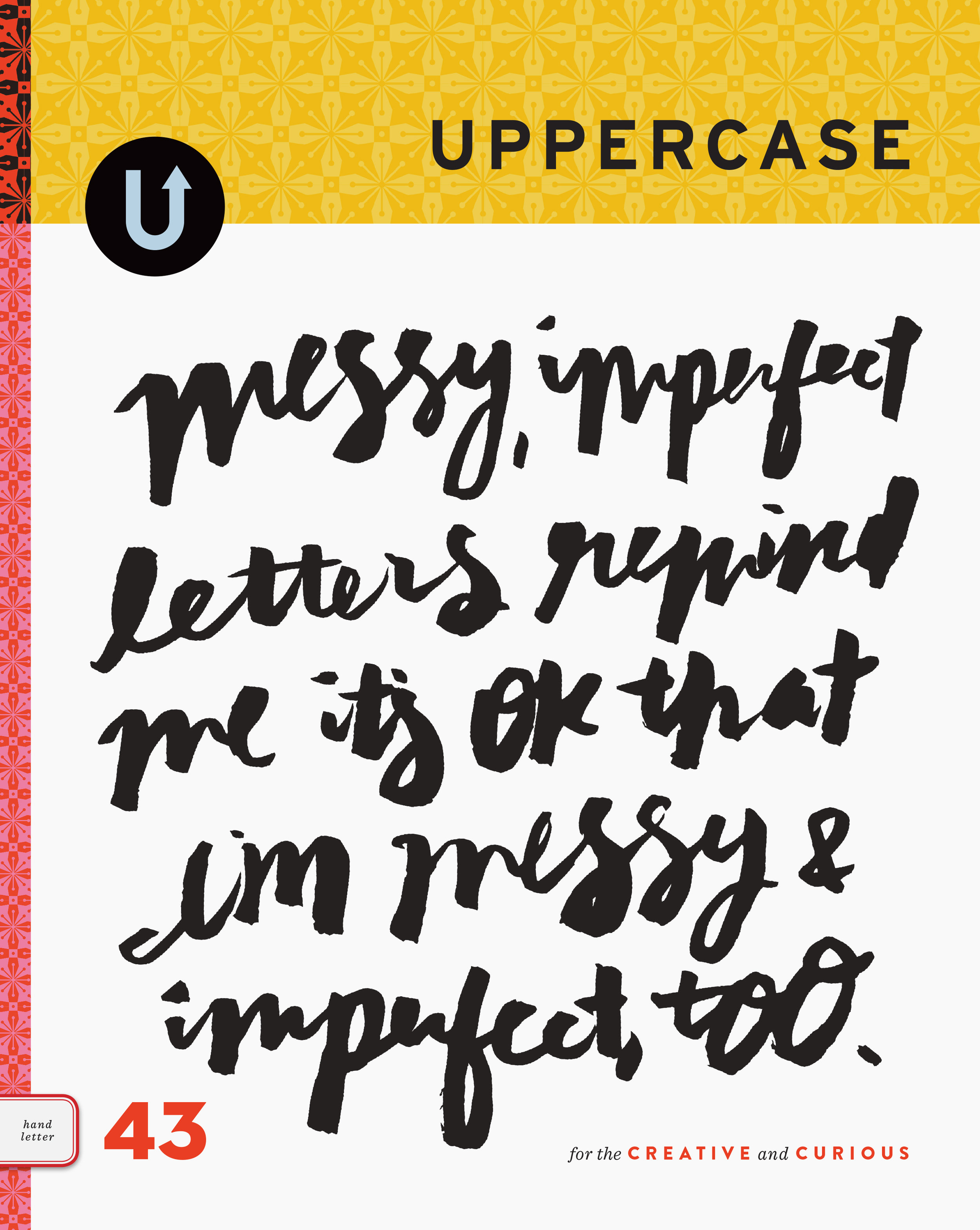
The spine pattern for fall
/The fall issue is heading to print just after Labour Day and I look forward to revealing the cover design, featuring the work of Seb Lester, on Tuesday! (Subscribe to my newsletter to see it first.) In the meantime, here's the pattern design I've developed, inspired by the content within the issue. In addition to the special calligraphy and lettering section in the fall issue, we also explore the influence of heraldry on traditional and contemporary art and design.
Starting from the observation that a calligraphy nib is somewhat shield-like and also thinking about the souvenir spoons that are featured in the Collections spread, I did some studies of the nib shape and shield shapes, ultimately going in this simple repeat so that the overlap of the shield vaguely references the split in a nib. It can't be too detailed or illustrative since it will be reproduced quite small (and in silver foil! I hope!) on the magazine's spine.
I can see foxes and bears in the motif as well, can you?


