Designing for Print

I’ve been in love with print and paper since I was young. My parents would bring home used paper from their offices, with typewriting or photocopied graphics on one side, and I’d cut these down and staple together little booklets—creating my own stories and drawings on the blank side of the page. I dreamed of these little books being printed en masse, available in bookshops and libraries.

When I was old enough, I began to pursue my interest as a career option. I had a few summer jobs in printing companies, working a process camera, doing negative stripping, plate-making and a bit of bindery. Years later, when I graduated from art college in 1995, computers and desktop publishing software had become graphic designers' primary tools. 

My first Macintosh computer was a PowerMac 7100 and I purchased the biggest monitor I could afford. The box took up the entire trunk of my car. Nicknamed Mr Big, the monitor was so heavy, so large and cumbersome that I couldn’t carry it up to my second-floor studio by myself and I had to call a friend to help. There I was, 22 years old with all the equipment I needed to start a career in graphic design: computer, monitor, scanner, laser printer and fax machine.

I had some natural design ability combined with what I had learned in school, but the one thing I was missing—even with an bit of experience in print shops—was how to properly design for print. How to spec paper, what sizes were economical, how to prepare for printing on coated versus uncoated stock, binding methods, spot varnish or flood aqueous? The terminology and the options were all new to me.

On some early jobs, I encountered a few older print salesmen who were patronizing and less than helpful, but eventually I found some really good companies with people willing to lend their expertise and help me learn, step by step. As my freelance design business grew, so did my knowledge of print and paper. I prided myself on providing “clean” files when sending jobs to prepress departments—something that saved me time and my clients money. I was interested in learning new techniques and printers were genuinely happy to help explain—which benefited me and my breadth of knowledge, but also them later on when I had clients who could afford a few “bells and whistles” when jobs went into print production.

Over the next dozen years, I freelanced for arts and culture clients as well as book and magazine publishers. Though I also did some signage, product design and digital projects, my focus and expertise was on print. When I decided to start my own publishing company and later launch UPPERCASE magazine, I had all the tools and skills and contacts at the ready to produce something beautiful in print.

My print education really has been learning by doing. I didn’t have a manual—or even Google, in the early days—to learn how things were done.


Designing for Print is a book by author, designer and educator Marina Poropat Joyce that really is "the epitome of print education.” Marina’s book covers all aspects of what a graphic designer needs to know when creating a print project. As I page through it, I am amazed to see all of the information, terminology and tips that I had learned (sometimes the hard way) from two decades of creating design for print. The book is thoughtful and thorough and an excellent resource for anyone about to set foot into the world of print on paper. And for experienced (ie older!) designers like me, it’s a great refresher. It’s also a useful reference, with standard paper and envelope sizes, paper weight equivalency charts and generalized print method cost comparisons. Designing for Print is the manual I wish I had way back when. Congratulations, Marina, for creating something so vital for new generations of print enthusiasts!

To find out more about this project, visit Marina's Kickstarter campaign.

Go to CAMP with Aaron Draplin!

The magnanimous Aaron Draplin is coming to town!

I've had the pleasure of meeting Aaron a couple of times now, most recently at the How conference in Chicago this past May where we were both speakers. I think it is safe to say that we are polar opposites when it comes to presentation style. Me: small, soft-spoken, trepidatious... while Draplin commands the room with his gregarious, entertaining and heart-felt delivery style. His presentations are AWESOME (he'll bring tears to your eyes) and I am happy that's he's delivering the love once again at this month's CAMP Festival in Calgary, September 21-22.

You can also get some time with Draplin and his design expertise in an afternoon workshop entitled "Logo Tips, Tricks, Triumphs, Turds, Threats and Tales from the DDC" on Sunday, September 20th. The fee is $150 and I'm sure you'll find it was well spent. Sign up now while there's still room!

UPPERCASE is involved in quite a few local events in the coming months. I'm sponsoring CAMP by giving away free magazines in the goodie bags!

Now let's step back a few years when Draplin was last speaking in Calgary. UPPERCASE writer Brendan Harrison interviewed him for issue 16:

Aaron Draplin photographed by Heather Saitz in the Lion's Den, Calgary 2012

Aaron Draplin is an American archetype, a kid from a small town in Michigan who moved west to become a self-made man. His pursuit of happiness led him to the American dream after his search for good times and deep powder put him on a path to becoming one of the best-known graphic designers of our time.

His love affair with thick line logos and Futura Bold began while he was still living hand to mouth in Bend, Oregon. His first design job was a graphic for Solid snowboards, but he was soon picking up work lettering café signs and designing logos for local businesses. This early taste of design success spurred him on to see if he had the chops to play with the big boys. To find out, he signed on for a degree in graphic design from the Minneapolis College of Art + Design. After graduating in 2000, he started to make his mark in the design world, doing a stint art directing Snowboarder Magazine before taking a senior design role at a big studio in Portland. 
Throughout it all, he continued to design personal projects that were close to his heart. In August 2004, he quit his full-time job and hung his shingle as the Draplin Design Co. In the years since, he’s worked for clients as large as Nike and the Obama administration and as small as the Cobra Dogs hotdog cart. And while a lesser designer would have enjoyed some much needed rest, Draplin co-founded Field Notes and transformed the way hipsters everywhere scribble down their ideas.

The phrase larger-than-life comes to mind when talking about Draplin, not because of his imposing physique but because of his oversize personality. On his recent Tall Tales from a Large Man speaking tour, he travelled the country holding audiences captive for hours with little more than a profane PowerPoint presentation and a gift for the gab.

On the day of his visit to Calgary, I pick him up from the lobby of a Best Western. He’s been working in his room all morning. We pile into my truck and drive to a diner on the outskirts of downtown, a place with taxidermy on the wall, ashtrays in the washroom and golden oldies on the jukebox. It’s the kind of place where Draplin seems right at home.

Writer Brendan Harrison and UPPERCASE publisher Janine Vangool have a chat with Aaron Draplin. Calgary, 2012. Photo by Heather Saitz.

We sidle into a booth and order breakfast. I turn on my recorder and plant it in front of him, opening my notebook to a page of questions I’d jotted down the night before. I ask him where we should start. “Wherever you want man, wherever you want. I can talk, man. So don’t be afraid to be like, hey, chill out a little bit.”

Photo by Heather Saitz.

I do no such thing. I’m happy to play the part of passive participant in our conversation, sitting back to enjoy his rambling replies. His stories meander and digress in the most enjoyable way, revealing plainspoken wisdom and insight into the life of a creative professional. Throughout our discussion, Draplin comes across as something of a cultural magpie, a life-long junker who figured out a way to incorporate his love for old memo books and ration tins into a signature visual style.

“As a designer, I always had an appreciation for old stuff,” he says. “Not in the sense of it’s like a movie prop – because I get a lot of that too. Kids are like, what are you, some kind of sentimentalist or something? I’ll take that word and run with it, no problem. I mean, what are you, a futurist? I’d rather look back at the restraint and try to use that in my new work. Using one colour effectively. Making a killer logo… There’s just a sense of like, that stuff’s on the way out and I don’t want it to go away.”

Aaron Draplin in the Lion's Den, Calgary, 2012. Photo by Heather Saitz.

Read the full article in UPPERCASE issue 16. And if you're in Calgary, please make a point of coming to CAMP and participating in Aaron Draplin's workshop. Other workshops on offer:

Learn How to Draw (Better) in One Day With Yuko Shimizu
Sunday, September 20th, 10:00 AM – 5:00 PM

Going Digital: Bridging the Gap
With Edward Keeble, David Nagy, Marc Binkley
Sunday, September 20th, 2:00 PM – 5:00 PM

As well as a programming workshop for kids.

The cover of issue 26

Art © the artist and courtesy of Pace/MacGill Gallery and Jackson Fine Art.

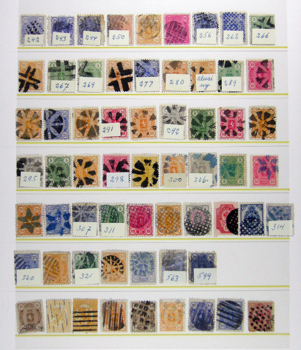
The cover of the summer issue features a print of "fancy cancels" documented by artist, photographer, author and educator Richard Benson. When I began curating this issue, I'd never heard of such cancellations, but research of philately lead to some interesting things! I came across an online stamp auction featuring these Finnish stamps (shown below), uniquely cancelled with cork marks. 

I love the play of the ink partially obliterating the stamp design; their variety of form and interplay with the image below echoing themes of both printmaking and surface pattern design... and how there's an expression of individuality despite the institutional nature of a postal system. My intention was to win the auction, scan the stamps at super high res and arrange them for the cover. When the bidding went beyond my means, though, I began my search anew. Lo and behold, Richard Benson had already produced an incredible series honouring fancy cancels—and with a variety of stamps, colours and cancels and technical prowess well beyond what I could have ever achieved. Perf-ection!

Launch your career with a free spot in The Ultimate Portfolio Builder course! (CONTEST CLOSED)

My friends at Make It In Design have a very special prize for ONE very lucky reader — a free place on the next The Art and Business of Surface Pattern Design – The Ultimate Portfolio Builder course worth $875 (£579).

The Ultimate Portfolio Builder is an advanced seven-week online professional surface pattern design course, consisting of an intense five-week class followed by two weeks of design reviews and live briefs. The classroom is accessible 24/7 so you can join from anywhere in the world, and fit the course into your busy life. Places on this course are limited, but one person from this competition will be guaranteed a spot. 

This course will give you all the tools and advice you need to grow, refine and strengthen your professional design portfolio, make your designs more sellable and give you the fast-track to trade show success.

Brought to you in association with Printsource, one of the top surface and textile design shows in the world, this course will provide you with exclusive insight to help you secure the right buyers for your work, deal effectively with clients, get trade show ready and discover the secrets to landing your dream work. Plus one lucky person on the course will win a free booth at Printsource Aug 2016 and $1,000 to get you to New York! 

Course alumni have gone on to launch their own design studios, win national awards, be featured in design books, on leading blogs and more. Fancy a bit of this action too? Read on to find out how to enter and read some of the student success stories here.


THE PRIZE

The prize: ONE place on The Art and Business of Surface Pattern Design – The Ultimate Portfolio Builder course starting May 25, 2015, delivered on-line.

How to enter: Check out the course website to find out more about it, then go over to this post on UPPERCASE and leave a comment below in no more than 100 words telling us why this course would benefit you right now and how it could transform your career. (Note: Please do NOT leave your comment on the Make It In Design blog, leave your comment below this post.)

Deadline: 5pm GMT on Wednesday 20th May 2015. Any comments left after this time will not be counted. The winner will be announced on Friday 22nd May 2015. Good luck!

Terms and Conditions: This competition is to win a place on The Ultimate Portfolio Builder course from Make it in Design starting May 25, 2015. One entry allowed per person. The winning place is not transferrable – either by date or to another individual and must not be sold on and no cash alternative will be offered in the event that the winner is unable to use the prize for any reason. By entering this competition you agree to your entry to be promoted on the Uppercase and Make it in Design website and their associated social networks. The judges' decision is final.

Gail Anderson: Those who can, teach.

This guest post is by Andrea Marvan, who attended the AIGA Y Conference on behalf of UPPERCASE


I spotted Gail Anderson since the beginning of the Y20 conference, she was chatting with colleagues and listening to the talks from the first row. Gail is a previous contributor for UPPERCASE (issue 10, see related post here) so I recognised her immediately, but I waited until the second day to approach her, as I’m a bit of an introvert and she looked rather serious and intimidating. Believe me, she is not.

New York-based designer, writer, and educator Gail Anderson is fun and kind, she is humble and brilliant, down to earth and absolutely fascinating. Gail began her presentation telling us about the time she posed for a photo with President Obama and – accidentally – grabbed his butt (!). And how she modestly muttered “I make posters” when she was asked by Barack (yes, for the purpose of this conversation we are on a first-name basis) what she did for a living.

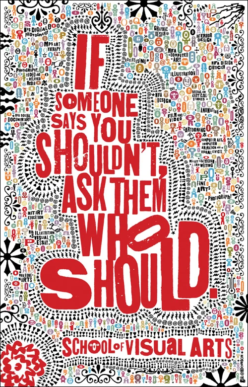
Through her career Gail has done way more than posters, and has won a few awards, including the 2008 Lifetime Achievement Medal from AIGA. Her credentials go from senior art director at the Rolling Stone magazine to co-author of several typography books, but what I want to focus on is her role as an inspiring teacher. Gail teaches in the School of Visual Arts MFA, undergraduate and high school design programs, and has lectured about design at organizations and conferences around the world, including a recent workshop she did for design students in Saudi Arabia, which landed her an invitation to a further workshop with none other than a princess.

Gail is the kind of teacher everybody should have. She is proud of her students and supportive, yet she challenges them, inspires them and pushes them to be better. As the topic of Y20 was “design moving forward”. Gail emphasised that, for her, design moving forward has been being a teacher. She beamed with pride as she showed us the new media work from some of her grad students; it was a delightful surprise featuring catchy music and flawless editing. She mentioned that, as the students came from many backgrounds, through exercises she made them comfortable with fonts. “I forced them to have fun! They become so rigid when dealing with typefaces.”

When asked why does she teach, Gail simply answered “I have had many great teachers and mentors through my life. Teaching helps me stay fresh.”

So, I say we should eliminate that infamous quote “Those who can, do; those who can’t teach” from our vocabulary, and start showing admiration to all teachers. How else will the new generations become extraordinary professionals, if not under the nurturing mentorship and guidance of remarkable teachers such as Gail?

Brian Gartside: Doing good work & work for good

This guest post is by Andrea Marvan who attended the AIGA Y Conference.


Brian Gartside is a 27-year-old graphic designer and typographer whose credentials include working at Pentagram, DDB New York, and more recently Deutsch Inc.

Brian began his Y20 presentation with advise for emerging graphic designers (and anybody in the creative industry, really) discussing “Things I wish I knew when I was studying to become a Graphic Designer.” Which can be summed up as doing good work, work that visually improves the space that it occupies. Here are the highlights:

  1. Make ads that don’t look like ads (or whatever you make, make it not look like that).

  2. Become a technical expert, be fast at the things you can control so you can spend time on the things you can’t.

  3. Build a diverse library of inspiration. It will help you be more authentic as it will reduce the risk of inadvertently copying someone else.

  4. Take a break. Have a hobby. Do something else for a bit, it will help you think.

This valuable insight from Brian’s very promising career (in October of 2014 he was named as an ADC Young Gun) was complemented by the second part of his presentation, where Brian discussed what he has learned in putting this knowledge into practice and how his skillset has helped him to do work for good.

Many of the projects Brian worked on while at DDB are partially credited for the creative revival of the agency, including The Drinkable Book, where he worked as a senior designer, and which brought the agency its first Cannes Gold Lion in two decades. The Drinkable Book integrates outstanding design and cutting-edge technology put to the service of a remarkable cause developed by Water is Life.

“The Drinkable Book is a life saving tool that filters water and teaches proper sanitation & hygiene to those in the developing world. Each book is printed on technologically advanced filter paper, capable of killing deadly waterborne diseases. And each page is coated with silver nanoparticles, whose ions actively kill diseases like cholera, typhoid and E. coli. Once water is passed through the filter, bacteria count is reduced by over 99.99%, making the filtered water comparable to tap water in the United States of America.”

We all want to use our skillset for the greater good, but at time the possibilities are overwhelming and the size of the task seem impossible to bear. As Brian put it, doing work for good is easier than we may think:

  • You don’t have to save the world. You might never change the world but what you can do is help the people that can change it. If there is something you believe in, find the company who is doing that important thing without the sexy, approach the company and bring the sexy! Make something people can’t ignore.

  • Agencies love pro-bono work because you get more creative freedom. Use that to your advantage but don’t be a scam artist.

  • Dead doesn’t mean dead. Proceed as if it happening. Persistency is key.

  • Beg for favours. If it’s a good project, people will want to help.

  • Don’t be afraid to invest in yourself. Don’t let funding hold you up. Get it done and sort it our later.

  • Be more than just a graphic designer. These projects happen though sheer force of will. Do whatever you have to do (wear all the hats you need to in order to get things done).

As the long round of applause and stimulating questions from the audience proved, we were all really inspired by Brian’s investment and igniting curiosity, and the endless possibilities of using creativity to help build a better world.


*For more information or to support the Drinkable Book project please go to www.waterislife.com  Photos courtesy of Brian Gartside

On a podcast with The Marketing Mentor, Ilise Benum

I recently had the opportunity to have a chat with "The Marketing Mentor", Ilise Benum. Ilise invited me to be a speaker at the HOW Design Live conference in Chicago next month. I'm also organizing a small event in Chicago for the evening of May 4, details will be announced soon. (Sign up for my newsletter on the sidebar or stay tuned here on on Twitter.)

What I learned from design clients led to my “retirement”... and launched a whole new career. 

Freelancing was an unexpected education in marketing, time management and business development. Having left client work to pursue her own projects, Janine will share how to turn frustrations and obstacles into your advantage and how to keep motivated and inspired. You'll get a personal look at how the magazine is made.

THURSDAY, MAY 7 • 4:15 – 5:00PM

Sharon Werner on The Importance of Creative Collaboration

This guest post is by Andrea Marvan

One of the most revealing Y20 talks was Sharon Werner’s insight on collaboration.

Sharon is the founder of Werner Design Werks, a small design studio of storytellers artists and designers located in Saint Paul, Minnesota. They do both large and small projects, from brand development to packaging, for companies of any size from all over the world. No matter the size of the project, their commitment is to create authentic brand stories that people care about.

During her presentation, Sharon described how her small team works on adapting and navigating to meet the future. They follow three simple steps: listen, talk, design; and work in collaboration with other designers so they are open and flexible to different points of view. “The answer to how do we keep moving forward is collaboration.” Collaborators bring inspiration as well as expertise to their projects they are part of the process from the beginning. Freelancers and junior designers attend meetings with clients, as it is important that they hear from the client directly. There is no hierarchy in her company, she believes that is how research and creativity flows best.

Werner Design Werks’ portfolio includes a series of children’s books, Alphabeasties and other Amazing TypesBugs by the NumbersAlphasaurs and other Prehistoric Types, published by Blue Apple Books. I couldn’t miss the opportunity to get a copy for my 4-year-old alphabet fan & zoologist, and Sharon kindly signed it with a cute note for him (“Tomas, T is for Tiger”).

Alphabeasties books were also a good example of collaboration between Sharon and Sarah Forss, senior designer at Werner Design Werks. The project started as a fluke, it was their own personal project and suddenly someone was interested in publishing it as a book. Sharon recalls thinking, “What can we bring to an alphabet book that hasn’t been done before? Typography, that’s what we know about!” and so the first book was born.  As the younger generations are paying more attention to design nowadays, the project aimed to demonstrate “that typography is fun, that type has a personality and can express more than simply the words being spelled.” It was a creative outlet but it not always easy to find the time to work on side projects. The tactics that worked for Sharon to push that personal project was treating it like a real project with a real client; carving up the time to do it. She emphasized the importance of giving personal projects the attention they deserve, from your website to a project you are passionate about.

Reading more about Sharon’s work I found an interview she recently did for AIGA. I thought I would include here part of it, because her collaboration working model really resonated with me and with the Y20 audience:

(AIGA): Clearly this is a model that has worked for you. I’m sure you’ve had opportunities to expand the size or staff of your studio, but you’ve chosen not to do that. Why did you made that choice?

(SW): Well, I love to work with a lot of different people. Sometimes I think when you’re in an office environment; there can be a lot of petty “officeness.” No matter what the agency, no matter what the environment, there’s just this stuff that happens that’s peripheral to the actual work. Sometimes the morning chitchat you have with colleagues is really nice and fun, but when it happens all day long, it’s crazy. I think having a smaller studio, we can avoid that, and then we can bring in people to work on very specific tasks and specific things. Then we can move on and bring in new people. You don’t get caught up in everyone’s personal issues. Another reason I’ve decided to keep the studio small is that I like to stay involved with the actual work and process. As an owner, it’s difficult to do that with more people. You tend to get caught up in the management of people.

Keeping the studio small allows us to stay more focused. We don’t need to sit down and have staff meetings. We know the status of everything that’s going on all the time. I personally like that, though I don’t know if that’s right for everyone. That’s just my personality. I don’t want to sit in a staff meeting. I just want to do the work and I want to brainstorm.”

For the full interview please see http://www.aiga.org/sharon-werner/

Sharon was featured in UPPERCASE issue #14 and at the end of her presentation she kindly agreed to pose with the magazine. Janine visited Sharon in her studio a few years ago, take a look in this post to see more.

Y20 AIGA Conference Day 1: Sharing a Universal Value

This guest post is by Andrea Marvan


As the sun starts to set over San Diego’s Mission Bay area, the first day of Y20 AIGA Conference is coming to an end. Participants head over the reception for cocktails and I look at the breathtaking view trying to allow everything to sink in. While I’ve always appreciated good design and I have an arts and communication background, I’m not a graphic designer and at times I worried my knowledge of design wouldn’t be up-to-date for the conference. But the AIGA talented group of designers shares a universal value: the passion for what they do and a strong sense of community. You don’t have to be in the industry to understand that.

Under the theme of Velocity, professionals from the design industry met at the at The Joan B. Kroc Institute for Peace and Justice on the beautiful campus of the University of San Diego, to discuss how to thrive in an accelerating landscape. The mix of presenters and their styles was for sure an eclectic one: from bold and colourful to elegant and sober.

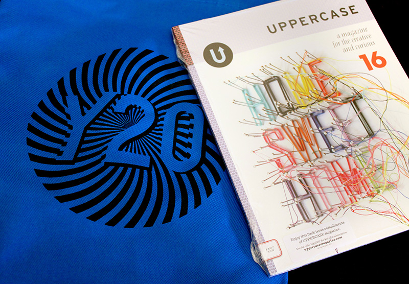
I got there bright and early and at 8:00 am the vibe was already energizing and thrilling. Janine had donated copies of the magazine and I got excited when I overhead people saying “Oh look, there is UPPERCASE” as they opened their goodie bags.

The day began with highly dynamic Mexican designers Jorge Gutierrez and Sandra Equihua, creators of the movie Book of Life, who spoke about the importance of sticking to your guns and learning to say no—which I will elaborate more on a later post.

Following the explosive Gutierrez–Equihua team was Michael Bierut, partner in the New York office of the international design consultancy Pentagram. He began his talk by saying “Are you ready to see some black and white geometric shapes?” I thought he was being funny for following such a colourful act by the Mexican duo. He was being serious, yet his elegant, clean and crisp work was far from boring, it was exquisite. With a very clever sense of humour, a dynamic composition and an incredible creative branding strategy his team was able to say so much with so little: “A 49 square grid can do anything for us”. It certainly did.

Mid morning lead to Julia Zeltser’s talk. She is the founding partner and creative director at Hyperakt, and provided valuable insight on community engagement and working for the non-for profit sector. She closed by saying, “We need to stay flexible, current and relevant to participate in the future. I hope you stay flexible and nimble.”

After lunch I found the unexpected, as I was not expecting to cry at a design conference! Designer and documentary maker Justin Skeesuck brought tears to our eyes and got a standing ovation when he spoke on how, due to a progressive neurological disorder, he had to redesign his life and use his creativity to adapt to literarily everything: from day-to-day situations to crossing the Pyrenees in a wheelchair.

And last but not least, Sharon Werner, founder of Werner Design Werks and a previous UPPERCASE contributor closed the afternoon session with an inspiring talk on collaboration and on how a small team can achieve wonders when they follow three simple steps: “we listen, we talk, we design.”

Each and one of these professionals of the industry have a very unique perspective, style and approach to design. Their client portfolio covers a wide range, from fashion moguls to non-for-profit organizations, but they all do the same for their clients: they provide fun and creative solutions.

As the day ended with a competition (Pixels of Fury, where 3 contestants had to design a poster in 20 minutes in front of a live audience), I left inspired, motivated and ready to come tomorrow for more

For the love of printmaking

When I came across this print by Joey Hannaford, I just knew it would make an arresting cover. I love its graphic impact and the effect of overprinting the inks. The imperfection of the impressions shows off the beauty of wood type... and the XOX!? This issue is really "hugs and kisses" for the love of printmaking! 

The background pattern is always inspired by the issue's content, so I repeated a registration mark as the pattern motif. The bands of colours on the cover echo Joey's print, with the blue band and yellow band mixing together to create the green corner accent.

Here's an excerpt from the forthcoming article about Joey, written by Adrienne Breaux.

For Joey Hannaford, the printmaking process itself is a part of the exploration. All of her prints are monoprints—every piece is a single, solo, never-will-there-ever-be-another-like-it print. Because she inks the letters by hand, she claims she could not reproduce identical editions if she tried. She uses letterpress printing techniques not as a technical process to make reproduction easier, but as a vehicle for artistic expression. She sometimes refers to her work as “painterly letterpress prints.”

“I like the very accidental things that happen when I’m working iteratively. When I’m making the prints, it’s almost like a recording of the things I’m thinking about at that moment in time,” says Joey. “It’s using the printmaking process as an evolution of developing images rather than developing them to a certain point, ‘freezing’ them and then editioning them.”


Read more in issue 25.

Happiness through typography

I'm working on the 24th issue of UPPERCASE magazine. TWO DOZEN ISSUES! That's over 2700 pages of content that I have designed over the years. This next issue will be released early in the new year and it felt like it was time to do a bit of a design revamp. It's easy to keep doing the exact same thing over and over, but I'm a graphic designer by training and getting to design my own magazine is the fun part of independent publishing. The underlying grid and basic typography is staying pretty much the same, but I'm introducing a new font family to keep myself challenged and to see each layout with fresh eyes.

In previous issues, I was using Bodoni Poster Italic for some of the headlines, but overall I was tiring of how bold it was. The new selection really isn't all that different—it is the Bauer Bodoni family. It's kind of funny that I've selected a typeface design from 1791, but it's a style I've always loved. My design intention with this revamp is to make the spreads feel a little bit lighter overall, a bit more sophisticated but still playful. More places to breathe, little typographic details to delight the eye, some fun typographic touches... all the things that I love about design.

I agonized over which font to purchase (there are so many permutations of Bodoni and of Didone-style typefaces), but now that I've had a few days to get to know it, I am happy with the decision. It works really well with all the existing fonts I use (Sentinel, Tungsten, Neutraface) and with various weights plus roman and italic, there is a lot of possible variation. Certainly room to grow!

Throughout my career as a graphic designer, the typography has always been front and centre to my design process and inspiration. I posted the image above of a page in progress on Instagram and viewer Samantha Epstein commented, "everything about this makes my heart sing". Her comment made me so happy! Yes — beautiful typography does make the heart sing!

And not only is the typography beautiful, the content in this issue is overwhelmingly so! I can't wait to show more as I progress through the design.

It goes to the printer on the 15th of December, so it is going to be one marathon effort over here to get through the design while filling orders and managing customer service. But I'm energized by the new design direction and look forward to each new page.

Design Thinkers, part 2

Christopher Rouleau shares more of his conference notes from Design Thinkers.

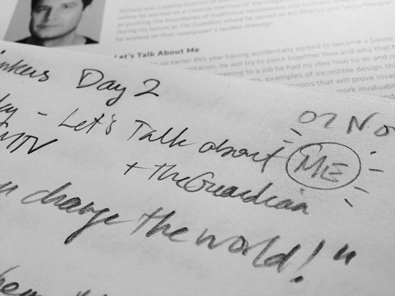
Richard Turley

Senior VP of Storytelling, MTV (previously: Bloomberg Businessweek)

"Let's Talk About Me"

  • "Typography can change the world!"
  • on bad clients: "the worse I made it, the more they liked it…"

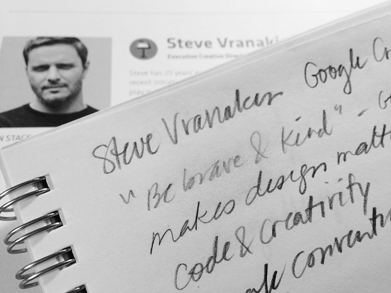
Steve Vranakis

Executive Creative Director, Creative Lab, Google

"Making Technology Matter, and Using Technology to Drive Creativity"


  • the description "must be brave & kind" was listed in a Google Creative Labs job posting
  • make design matter
  • coding = a creative discipline
  • developers = artists
  • code / poetry = right words in the right order
  • break the conventions / structures

Annette Diefenthaler, Ellen Lupton & Lawrence Zeegen

"The Future of Design Education"

What is the most important trait(s) for students leaving college / entering the workforce?

AD: one core skill is more important than multiple skills. A single skill permeates through a portfolio. Don't pretend you can do everything.

LZ: not skill sets, but mindsets / must be able to embrace new thinking – we're looking for innovators who will push the industry forward

EL: don't copy others / "nobody's going to be everything"

What is more important: critical thinking or technical skills?

EL: there should be no division—skill set and mindset should be integrated

AD: students must be adaptable and be able to teach themselves, or know how to acquire the skills they need

LZ: importance of learning both high tech and low tech (analog techniques), as well as learn from each other

How do you teach less-skilled students (the 90% "non-stars")?

LZ: educators are responsible for teaching the entire gamut of students, from all skill levels and backgrounds. strive for better, not best

AD: must question metrics – not just about graphic design "hard skills"
things to consider:

how is the student inspiring / challenging the discipline / industry?
how the student having an impact on his / her community?
how is the student able to communicate / inspire / teach others?
ultimately, educators must embrace diversity of skills and help break down barriers

Should software / technical skills be the core of design programs?

EL: critical thinking is more important that software knowledge
"teach spelling AND poetry in tandem" — always with an element of FUN

How important is coding fluency in a world where students are expected to be multi-disciplinary?

AD: students must have "digital fluency": able to use but not necessarily produce
ability to tell stories with existing apps, platforms, tools of visual distribution

How do you teach students to be "resourceful"?

EL: make students work within constraints, units, specific parameters, this teaches problem solving / resilience creates systems that can change / design is the most basic form of literacy for both designers and non-designers / empower students to do good: either at industry/agency level, or within their community

AD: time = money; make students execute projects in time constraints
find ways to "get to amazing" within 24 hours

What are your thoughts on design departments who are changing the course descriptions from "Graphic Design" to "Communication Design"?

EL: "I will go to my grave as a graphic designer!"
"graphic design" connotes discipline, long standing traditions
"communication design" connotes business, marketing, PR (yuck)

LZ: "graphic design" doesn't adequately describe the tasks any more

What are the constraints of a 3-year design degree? What would you add/change?

LZ: too insular
gap between real money / real time
need to connect graphic design with everything else

EL: too much focus on self, homework, etc. / add communal spaces to create a studio experience, encourage peer-to-peer learning, which is invaluable / also, make all classes electives…

AD: most classroom spaces are terrible – feel too "school-like"
learning / working environments affect how we think, act, and the quality of our work

Visit Christopher's blog for more, including his notes on Jessica Walsh and Erik Spiekermann. Our thanks to Design Thinkers for the press pass to this annual event.

Inspired by Little Golden Books

UPPERCASE magazines on display at this past weekend's New Craft Coalition.

Did you know that UPPERCASE's spines were originally inspired by Little Golden Books? I've always loved their eye-catching golden spines and wanted my magazine to have a similar recognizable shelf presence, even when displayed spine out. Using a silver foil for issue 23's spine brings that idea full circle. It's nice when childhood inspirations still apply to your adult life!

Getting through the unpretty

An issue of UPPERCASE begins as a nebulous entity in my mind.

In this ideation phase, distraction is my friend. Making connections between disparate topics, leaving room for serendipity and chance—that’s what makes UPPERCASE good. Early on, an issue is a rough assembly of ideas, imagery and thoughts. It’s a hazy thing in the distance that requires concentration on my part to make it happen. 

Each decision—from who writes what article, to whom I decide to profile—takes me closer to it, bringing it slightly into focus with each step forward. By the time an issue of UPPERCASE is at the design phase, I have been thinking about its content for six months or more. At this point, I have concrete items to work with—thousands of words, gigabytes of images and 116 blank pages—but I often feel like this is the most unfocused stage of the entire process.

This is the “unpretty” phase of design when all the words and pictures are splattered onto their designated spreads so that I can take inventory of what I have to work with. It can be overwhelming to sort through everything; and there are moments when my ideas for the overarching theme seem lost in visual clutter. This is the stage that I liken to sculpture: the design is in there somewhere, but I have to hack away all the unnecessary material to reveal what it is supposed to be. I start to live inside the design, getting to know how this particular issue is going to work: the structure, the connecting colours and sympathetic visual motifs.

Designing becomes a series of decisions made to resolve different perspectives:

me / you
What am I trying to accomplish as a designer?
What do my readers want to experience? 
What are my intentions?
Will there be an element of surprise?
Do I love it?
Will you love it?


sharp / blurred
Are the themes evident to the reader?
Do the ideas and design leave room for play and discovery?
Does the issue feel cohesive?
Will it inspire new ideas and connections for the reader?


micro / macro
Is the kerning on this word ok?
Should I hyphenate this paragraph?
Should I have one or two columns of text?
Should the article be four pages or six?
Does the headline on this page look good?
Does this article fit well at this point in the magazine?
Does the issue fit with what readers expect of UPPERCASE? 


As I switch between these perspectives, an issue of UPPERCASE begins to emerge. After I’ve answered all of these questions (and many more!), it’s ready to print.


(Want content like this delivered to your inbox each Tuesday? Sign up for my newsletter here.)

The spine pattern for fall

The fall issue is heading to print just after Labour Day and I look forward to revealing the cover design, featuring the work of Seb Lester, on Tuesday! (Subscribe to my newsletter to see it first.) In the meantime, here's the pattern design I've developed, inspired by the content within the issue. In addition to the special calligraphy and lettering section in the fall issue, we also explore the influence of heraldry on traditional and contemporary art and design.

Starting from the observation that a calligraphy nib is somewhat shield-like and also thinking about the souvenir spoons that are featured in the Collections spread, I did some studies of the nib shape and shield shapes, ultimately going in this simple repeat so that the overlap of the shield vaguely references the split in a nib. It can't be too detailed or illustrative since it will be reproduced quite small (and in silver foil! I hope!) on the magazine's spine.

I can see foxes and bears in the motif as well, can you?

Collector's Edition

Irma Boom photographed by Ivan Jones

Irma Boom photographed by Ivan Jones

As a book-lover and designer/publisher of books, I'm always interested when a new compilation of design work comes out. It is a chance to discover interesting formats, designs and "why didn't I think of that!" ideas all in one place. I'm immersed in the design of The Typewriter book which, at 320 pages currently, is quite the undertaking. I printed out a mini mockup to work on the page flow, which reminded me of Irma Book's tiny book.

Sample spread from Collector’s Edition, Innovative Packaging and Graphics by Stuart Tolley

Sample spread from Collector’s Edition, Innovative Packaging and Graphics by Stuart Tolley

“The future for book designers is becoming more and more interesting. I think we are in the Renaissance period of making books. I have to think about why something should be a book and not a website. This challenge makes me want to continue designing books.” –Irma Boom

114.jpg

Art Director Stuart Tolley wholeheartedly agrees with the importance of creating physical design objects. Through publisher Thames & Hudson, he has produced Collector's Edition: Innovative Packaging and Graphics: "a visual culture book showcasing the new wave of beautifully produced, limited edition, large format, graphic design and packaging for music, book, magazines."

The book is organized into sections categorized by boxed sets, multiples, handmade and 'extras' such as collectible memorabilia and objects.

If you're in London, the book launches with an exhibition running from August 19 to 31. Find out more here. I look forward to adding Collector's Edition to my library.

Greetings from Canada

"A short teaser for Greetings From Canada, a limited edition run of fine letterpress postcards featuring the work of 10 Canadian artists, illustrators and designers. The first project of its kind in the country, it aims to elevate the art of letterpress printing while showcasing a selection of some of the best creative talent Canada has to offer." 

Back in the day, I had my own set of postcards called "Greetings from Canada." I used to sell them when UPPERCASE was a public gallery.

inside the design

Issue 22 of UPPERCASE magazine is inspired by colour. With such a broad topic, I had to find a way to tackle it within one issue.

Like many graphic designers, I thrive on constraints. So I gave myself some rules to follow: 1) The issue would be organized Roy-G-Biv-style, going from red at the front of the book through to violet at the last page. 2) The arrangement of the content and structure of the magazine would stay the same as any other issue of UPPERCASE. For example, the Beginnings column is the first few pages of the magazine and would therefore feature predominantly red imagery. I set out to find an artist whose work uses a lot of red: Canadian painter Janet Hill has been in my inspiration file for years and her paintings are punctuated with ruby accents. At the other end of the spectrum, I described the concept to longtime contributor Andrea Jenkins, who wrote a musing on her love/hate relationship with the colour purple. With these guidelines in place, I assigned and curated content—sharing my art-directed rainbow concept with our contributors and featured artists along the way.

I am so grateful to all the amazing contributors and featured artists who shared my colourful vision for this summer issue and turned in some spectacular work. UPPERCASE issue #22 will be released July 1. 

Subscribe here.