


Go to Amsterdam and look inside issue 23!
/Thank you to the fine folks at Athenaeum Boekhandel in Amsterdam for making this flip-through movie of the current calligraphy and lettering issue. If you're ordering from Europe, Athenaeum has quite a few back issues in stock (even the increasingly rare issue #10).
Fossil
/
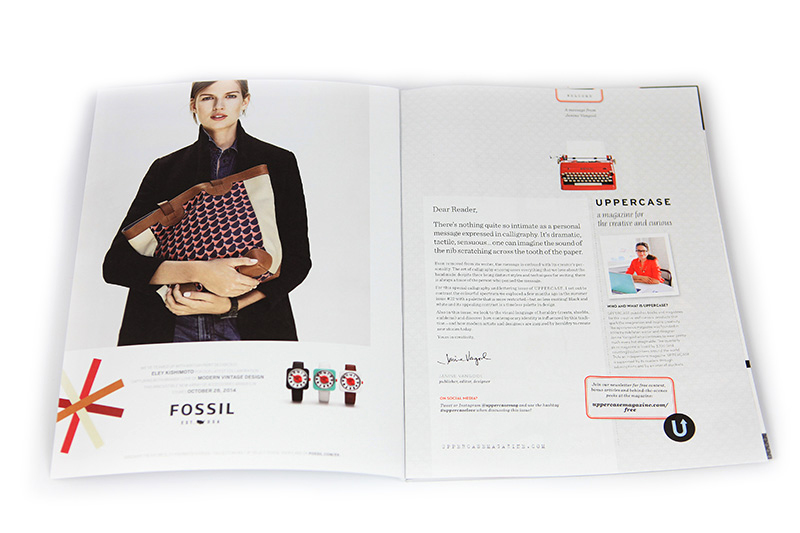
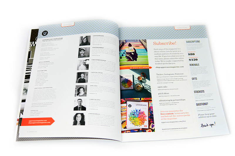
There is very little advertising in each issue of UPPERCASE. This is partly by design since the few ads I do run have more impact for the advertiser and hold more interest for the reader (and leave more room for content!) but it is also out of necessity. Being a one-woman magazine operation means I don’t have a lot of time to dedicate to finding advertisers. My goal is to find two advertisers per issue—one for each of the inside covers—plus an assortment of Calling Card ads and Peeps round out each issue. I was happy when, out of the blue, the folks at Fossil contacted me about placing an ad in the current issue. They’re certainly the biggest brand that has advertised with UPPERCASE, but they’re also a great fit: with beautiful products that I personally already use (my watch, for example) and a company culture driven by design, Fossil has employed and supported many illustrators and designers within the larger UPPERCASE community.
I’ve been a solo designer pretty much my entire career, working my way up out of the room off the kitchen, the basement, a public gallery space and now to a nice studio office. But I’ve never worked for another company and I am particularly intrigued by how bigger brands nurture creativity and foster great work environments. I was curious about how UPPERCASE fits into life at Fossil so I reached out to Laura Pike-Seeley, the librarian at the Fossil headquarters in Richardson, Texas. (Please note that this profile was entirely initiated by me and is not a sponsored post.)

What kinds of books, magazines and reference materials are at the Fossil Library?
The Fossil Library is open to all employees, but specializes in connecting our design teams to Fossil’s shared creative resources. We have a variety of materials, from books on Expressionist woodcuts and jazz album covers to a circulating iPad full of digital magazine subscriptions.
Fossil subscribes to dozens of design journal titles, including, of course, UPPERCASE! Other popular titles include Kinfolk, Vogue Accessory, Wallpaper, Print and many more. We also hold management and leadership titles, graphic and watch design annuals and paper samples
In addition, the Library manages collections for our product design teams, the largest being our collection of retail and vintage samples. Imagine a circulating library, but instead of books, it’s bags, belts, textiles and anything else you can imagine.

How is the library curated?
You can’t always anticipate where creativity will lead people, so much of the collection development is in response to designers’ requests or from conversations with employees about the directions their work is taking. That said, the library fills gaps and anticipates user needs by acquiring titles that are crucial for a well-rounded design resource center to offer. The other major driver is our seasonal brand stories— the Fossil brand team helps to curate resources that will support their vision for upcoming seasons.

How did you hear about UPPERCASE magazine?
This first time I flipped through an UPPERCASE issue was at Salvage Ltd in Arlington, Massachusetts. When I came on over three years ago and started managing our journal subscriptions, UPPERCASE was a magazine I knew that the Library, as a resource center for hundreds of creatives, had to have. This impulse was confirmed over and over again, as it’s one of our most popular titles.

UPPERCASE is adored for its...
The magazine is so well curated and colorful—it just makes you smile. According to our designers, UPPERCASE is adored because it’s eclectic, practical and made for creatives by creatives. Charming, whimsical, surprising—these are all words used by our designers to describe UPPERCASE.
As many Fossil employees are lovers of historical ephemera, we are always delighted to see celebrations of the cultural paper trail in UPPERCASE—like the piece on ham radio cards from issue 20 and the midcentury letterhead feature from issue 19.

What kinds of materials are in the archives?
We’re currently celebrating Fossil’s 30th birthday, so our archives have been heavily mined this year. The archives contains packaging (we have a full archive of our signature watch tins), catalogs and mailers, advertising collateral, newsletters, press releases, merchandising props, and of course, product, including watches, bags, belts and clothing. Our digital archives holds commercials, internal videos and our art department’s work from the past twenty years or so. The archive is growing as we are striving to collect some of our oldest and rarest designs. And several times a year, the library works with design leaders to pick the best of the best designs to add to our seasonal archive.

What is the coolest item in the archive?
It's tough to pick just one! We do have some particularly great items seen in the retro future story, which is a recurring theme that has popped up again and again over the years at Fossil.
As early as 1991, you can see a retro-futuristic influence in Fossil's packaging and product. These robots, rockets, ray guns, galactic travelers and other symbols of other-worldly adventures were inspired by late 1950s visions of a fantastic future.
Fossil has looked to the story of retro future once again for the Holiday 2014 collection. Taking the best elements of midcentury design culture and infusing it with humor and whimsy is what Fossil does best.

How do designers at Fossil typically use the library services?
It’s a function of both reference and inspiration. Someone may need to get a better grasp on a subject they are already familiar with, or perhaps a topic they have been assigned to research, and we work together to locate the best resources. Other times, they come from a place of curiosity or a desire for new thinking. Our fully-automated library consists of about two thousand books—big enough to provide a little of most things design-related, but small enough to easily browse for inspiration, both in person and through the digital catalog.

How does the library assist the Fossil brand and company culture?
The Library is here for anyone to use for inspiration, reference, or simply a place to get away from your desk and computer for a little while. It’s a welcoming, open space that encourages creativity and collaboration, which are both so crucial to the Fossil identity. Quite simply, the Library is a creative haven.
Based on what people are interacting with in the library, can you see trends in style and design emerging?
It seems that one of the biggest developments in creative culture is a shift toward authenticity and craftsmanship, even as creatives retain a passion for technology and how it can support innovation in design. 3D printing, wearables, hackerspaces—these emerged from a desire to explore what role technology plays in self-expression, and the urge to find self-fulfillment through the creative process. Maker culture supports innovation that is practical, progressive and collaborative. It’s an emotional, optimistic movement that touches all aspects of design, especially at a company like Fossil that looks to both the history and the future of style and design to define our aesthetic.

Thank you to Laura and the team at Fossil for sharing these behind-the-scenes with us! For a look at Fossil design process, visit their blog. And please check out the Eley Kishimoto x Fossil collaboration that is advertised in the current issue—it's full of pattern designs plus some really bold retro-inspired watch designs. Would you or your brand like to advertise in the pages of UPPERCASE next year? Download the media kit over here.
Calling Card: Paper and Ink Arts
/After reading the current issue, you're probably inspired to pick up a calligraphy pen! I'd like to suggest a visit to Paper and Ink Arts, one of the advertisers who supported the content creation of this issue by purchasing a Calling Card ad.
Even if you're a seasoned calligrapher, you'll always be in need of new ink, nibs and paper and it is great to have a reliable source for your favourite things.


In addition to calligraphy supplies, you'll also find general creative supplies like markers, paints, papers.. even adjustable craft tables! Thanks again to Jennifer of Paper and Ink Arts for her support of UPPERCASE magazine.

If you'd like to have your Calling Card appear on the blog, sidebar, social media and in print, they cost just $400. Select an image that best represents you, your product or service (squarish image 3 inches wide at 300dpi ), then click here to upload it and get your Calling Card ad designed by me and shared with the UPPERCASE community. You'll be supporting UPPERCASE content creation, boosting your profile, be immortalized in print and be serving the community with your creative offerings
Inspired by Little Golden Books
/


UPPERCASE magazines on display at this past weekend's New Craft Coalition.
Did you know that UPPERCASE's spines were originally inspired by Little Golden Books? I've always loved their eye-catching golden spines and wanted my magazine to have a similar recognizable shelf presence, even when displayed spine out. Using a silver foil for issue 23's spine brings that idea full circle. It's nice when childhood inspirations still apply to your adult life!
Featured Stockist: Brick and Mortar Living
/
You can pick up a nice collection of UPPERCASE magazines, including the current issue, at Brick and Mortar Living in British Columbia. Brick and Mortar is "a quaint little shop in the heart of historic downtown New Westminster, filled with local designs, unique gifts and nostalgia for the home" whose mission is to "bring a sense of community, warmth and merriment to the adventure we call shopping." I love independent shops like this! Go visit them this weekend if you can.
For a stockist near you, please check this list. If you'd like to recommend a shop or would like to stock UPPERCASE, please be in touch!
This issue will inspire some terrible letters!
/Dear Reader,
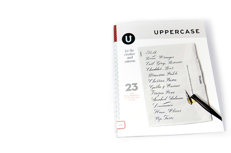
The fall issue has arrived! Draped in its silver foil spine, and complemented by an understated but dramatic colour palette throughout, it is certainly a visual departure from the full spectrum approach of the summer issue. As curator of the magazine—and as art director / graphic designer—I felt like I needed a bit of a palate cleanser after the full-on exuberance of issue 22. So issue 23 offers something a bit darker, a bit simpler… but just as delicious! Like a crème brulé or a café au lait for dessert.

The reason I loved Seb Lester's grocery list for the cover is that it demonstrates the commitment required to master penmanship—even composing a mundane list is an opportunity to practice. There’s the popular saying that “practice makes perfect”. Certainly as you view the amazing displays of calligraphic talent in this issue that adage might ring in your ears… there’s no way any of these letterers and calligraphers could have achieved their level of ability without countless hours of practice. But does it make them perfect? No. Not at all. No one is perfect and no one’s creative output is perfect.
UPPERCASE content is selected and designed to be inspirational… there’s no doubt that after reading through this issue, you’ll want to pick up a calligraphy pen. But if you’re new or rusty, let me tell you want will happen… your first letters are going to be terrible! Your calligraphic aspirations will not flow effortlessly from the nib. Your hand will cramp and your letters will be awkward. Frustrated, you’ll inevitably compare your writing to what is displayed in this issue. But don’t despair! Come back to it the next day and try again. I guarantee that you’ll be a better calligrapher. And the day after that, you’ll be three times as good.
After creating 23 issues of UPPERCASE, it is still very far from perfect. There's a big list of things I want to try, redesigns I want to initiate, column ideas waiting in the wings. Budgetary and time constraints that affect what I can do... And there's probably a lurking typo or something that I missed. But each issue shows a lot of what I've learned over the years—and even things I've learned since the last issue came out in July. That's what I like to focus on. Practice makes progress.
Everything takes practice. The goal isn’t perfection.
This message was originally published in my weekly newsletter. If you'd like content like this (plus more — see the full version here) please sign up.
First look at issue 23.
/What's the very first thing modern independent publishers do when a new issue arrives? That's right: share it on Instagram and Twitter!
Get the current issue in the shop now.
Time un-management
/October starts the mad dash to the end of the year. For those of us in the business of making physical things for sale, so begins the marathon season of craft fairs, ramped-up marketing, 24-hour online selling and the retail frenzy of Christmas. It’s an important time of year—when a year can turn from loss to profit—but it’s also an exhausting one when the joy of creating and making is overshadowed by the reality of selling.
I’m not a good saleswoman. When UPPERCASE was a physical store from 2005-2009, I’d just let people wander in and do their thing. I’m not one to initiate small talk or sales talk, preferring to let the products sell themselves on their own merits. Sure, I’d be pleasant and answer questions and have conversations, but it was always an effort on my part. It felt unnatural to me, as nice as a customer was. When I closed my retail shop at the end of 2009, it was a relief. Not just from the financial strain of carrying the cost inventory and paying the magazine’s print bills, but that I could turn “off” for a while. I took a year of maternity leave before I returned to the shop and opened the doors, but this time solely as a publishing office.
That year at home with my new baby and running my magazine was one of tremendous growth. Maternity leave was profitable, even with shouldering the cost of rent on a space that I didn’t use for those months working from my basement with my baby at my side. It was proof that an online business of selling magazines, subscriptions and books could be viable enough to support my family. I’m so grateful that, a few years on, this remains true.
My intent is always for the magazine to stand on its own merits and not need me to “sell” it overtly. Sure, I have to ask for subscriptions and support here in the newsletter and on social media—it’s vital to do so—but really I want the magazine to sell itself. Right now, Issue 23 is being packed up and prepped for shipping today, all set for its October 1 release. I hope you’ll see for yourself how lovely it is.
I’m looking ahead to 2015 and issue 24, to be released in January. I’ll have to have content finished up next month for design in November, printing in December. This will mark 6 full years of UPPERCASE magazine. If my time developing UPPERCASE magazine were a college education, I’d have a Master’s degree by now!
I’m often asked how I get so much done in a day, as a one-person magazine company. Honestly, it depends on the day and where we are in the magazine’s cycle. My day is always a juggle of what is imperative and what I want to be doing, with the must-do always winning out. What I have learned, though, is that time cannot be controlled. It is basically unmanageable. Time is disobedient—it won’t stay put when you ask. So the way around this is that you have to be everything that time is not: you have to have discipline and set deadlines. You have to control how much time you spend on a task. You have to create a checklist of goals and dates. You have to stay strong in the current lest you be swept away.
Musing on the number 24 and the passage of time, I’m curious about your 24-hour day. What do you have to do in order to make time for being creative? What’s your day like? Submit your day in creativity here.

This message was originally published in my weekly e-newsletter—view the full graphical and extended version here. To receive the newsletter every Tuesday, sign up and I'll send you a free download of the UPPERCASE Surface Pattern Design Guide. Oh, and if you're brand new to the newsletter, there's a welcome discount code for you, too. Thanks!
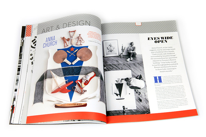
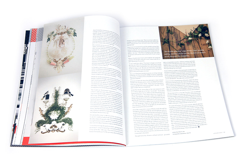
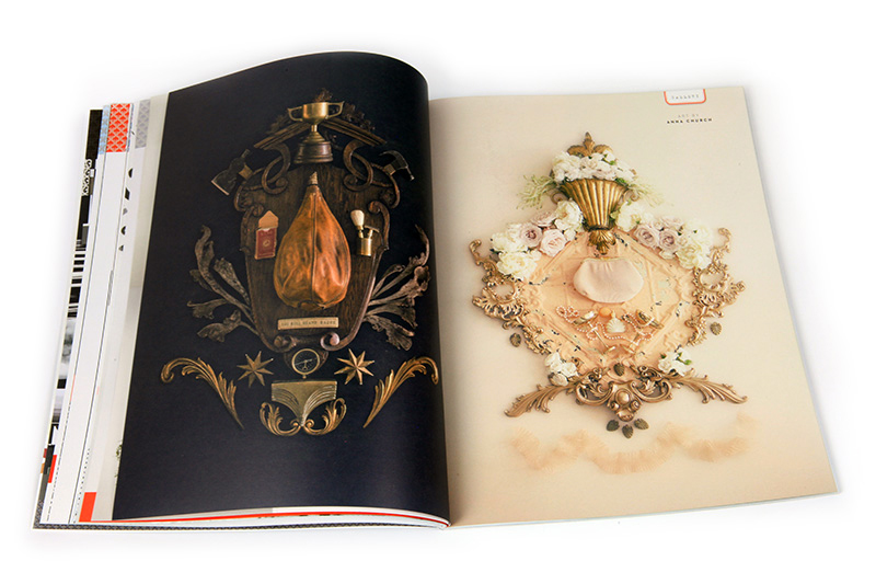
Anna Church: "Once the idea comes to me it's like a rush."
/Here's a lovely video about Anna Church and her Insignia series. You can discover more about Anna in the forthcoming fall issue.
Let's reach this milestone together!
/Dear Reader,
When I first started UPPERCASE magazine back in 2009, I had no experience in managing a quarterly publication. I certainly didn’t know anything about “circulation management”, renewals and such. My primary goal was to reach 400 subscribers by the time the first issue shipped, and, when that was met, to reach 1000 subscribers by the calendar year-end. This would be enough subscription income to break even on the first year’s production costs. At the time, it was hard to see past the first year and those first four issues. But we made it! And then, I was faced with the reality that most businesses face: customer retention.
Though new subscribers were coming, those inaugural 400 were up for renewal. Half of them never renewed. Ouch! When it comes to percentages, I can’t help but fall back into my grade-school measure of success: high percentages mean good grades. 50% certainly felt like a failing grade. And it’s hard not to take it personally and think, “Why don’t people like me?" I know now that typical renewal rates for magazines are low. There’s always something newer out there, more competition for readers’ attention and wallets. (Here’s a fact: UPPERCASE was launched before the iPad came out!)
It will always be two steps forward, one step back. The magazine’s renewal rate averages 33%. I’ve had to acclimatize to this fact, and temper my expectations and be mindful of this number and how it affects my business on a cyclical basis. Each quarter brings an attrition, but with new subscribers steadily discovering UPPERCASE, as long as the overall number of subscribers is growing, then it’ll be ok. I have a core group of extremely loyal subscribers who renew consistently and purchase gift subscriptions for others, and I am very grateful for your continued support! I hope that all the interesting articles from our contributors, great imagery and inspiration-filled issues will convince readers to keep subscribing. I hope that you also find value in these weekly newsletters, my blog and social media streams.
The magazine has grown surely and steadily over the years and as of this moment, there are 3,879 active subscribers who will be receiving issue #23 in a few weeks. It would be awesome to reach a milestone 4,000 subscribers! Please share this message with your friends and colleagues and on social media and let’s see if we can do it together.
So, how do you ensure that you’re bringing in both new customers while keeping the existing ones happy?
After nearly six years and 23 issues, I’ve found that what works best for me is simply: do the work. First and foremost, create something of value. Pour your heart and soul into it. Invest yourself, invest your own money. Be open and honest. Be available and accessible. Put yourself on the line. If you prove every day that you’re committed, people will go all-in for you.
This message was originally published in my weekly newsletter. To see the newsletter, click here. Sign up for newsletters right here and you'll receive a free download of the UPPERCASE Surface Pattern Design Guide.
The wisdom of calligraphers.
/Calligraphers are wise people. Get to know all of these fine folks in the forthcoming issue of UPPERCASE.
Let the design marathon begin!
/It's my annual Labour Day Weekend design marathon! These are last few days before the fall issue heads to the printer. Your subscription would be great encouragement... thank you. (If you're a brand new subscriber, start with #22 and I'll ship that to you on Tuesday and #23 will follow in October.)
The cover reveal!
/How will a sweater look with a particular yarn? What will a quilt look like when it's done? How will inks layer in a silkscreen? How will a sketch translate to final art? How will the ceramic vase look when glazed and fired?
When you embark on creating something new, it's all about having confidence in your ideas—and the ability to visualize what you want. The same is true in design for print: although you can approximate how something will appear in print, there are plenty of instances when you have to use your imagination, have faith in your idea and just go for it.
I've been imagining the next cover to have a shiny silver foil on the spine and on the number 23. Like this:

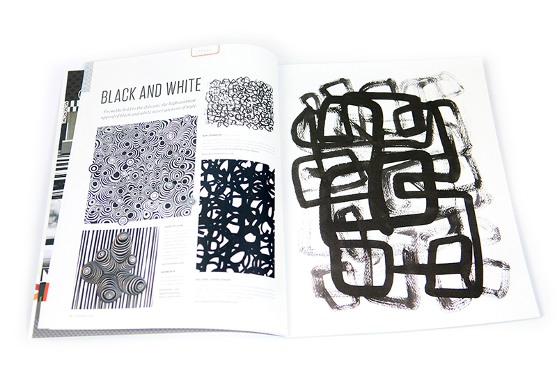
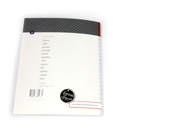
In contrast to the summer colour issue, the fall edition is decidedly toned down in hue—but not in inspiration or creative excitement!
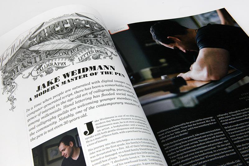
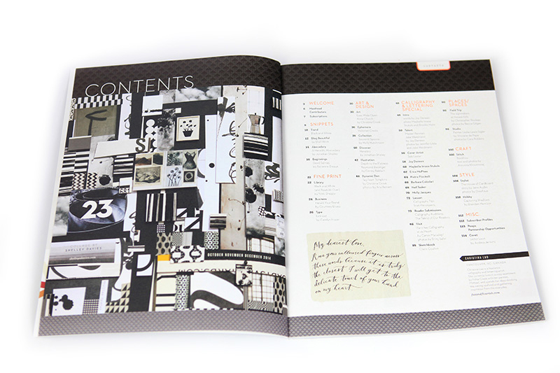
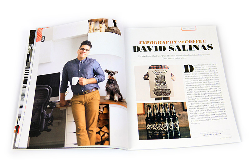
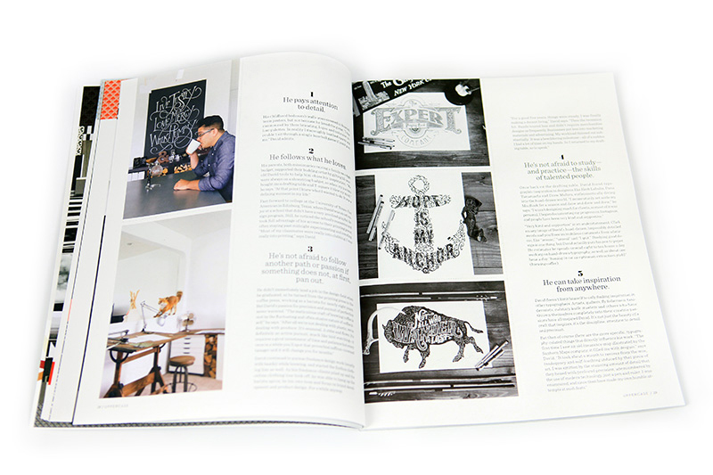
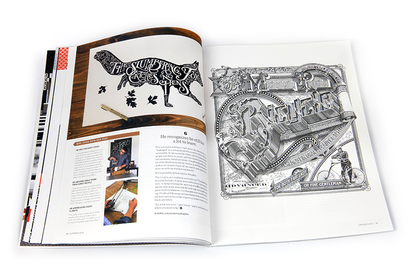
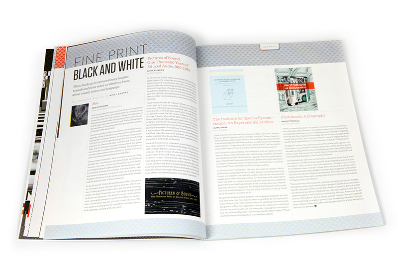
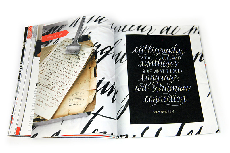
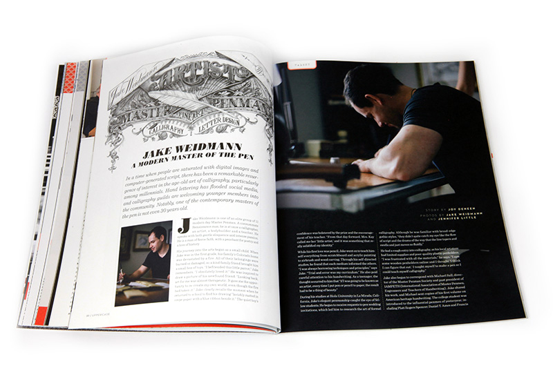
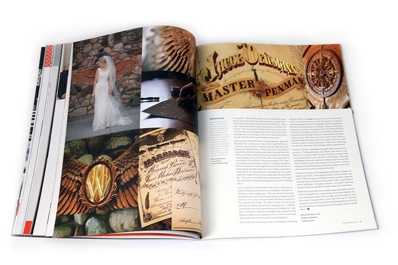
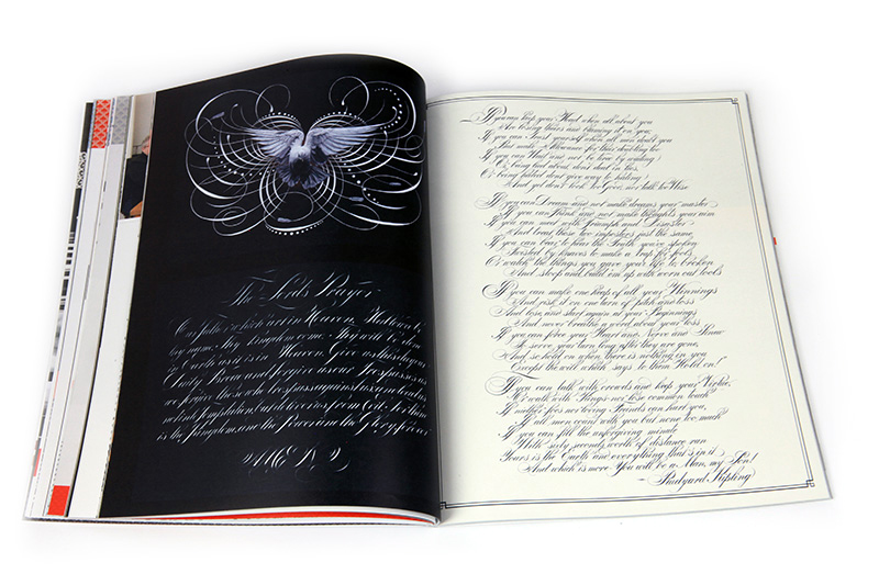
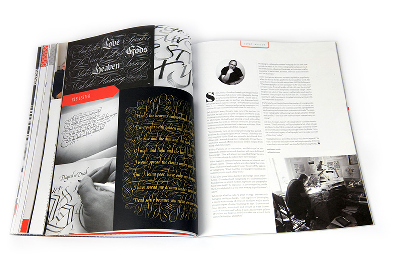
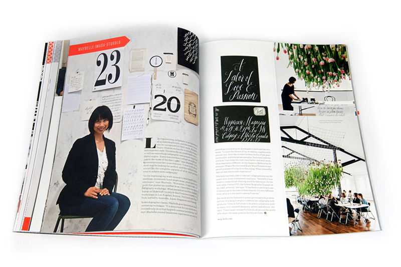
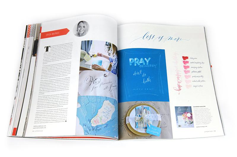
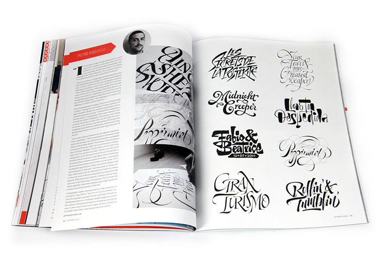
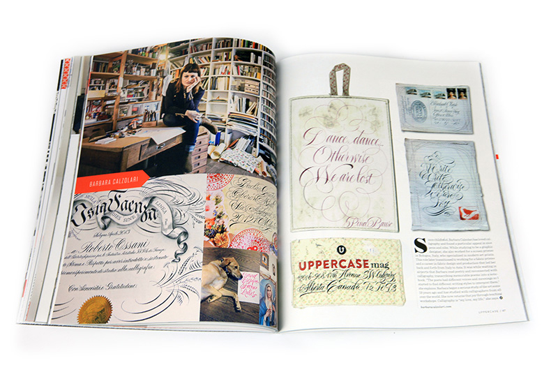
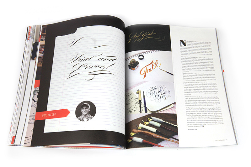
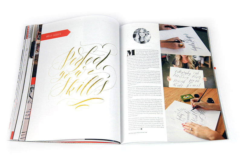
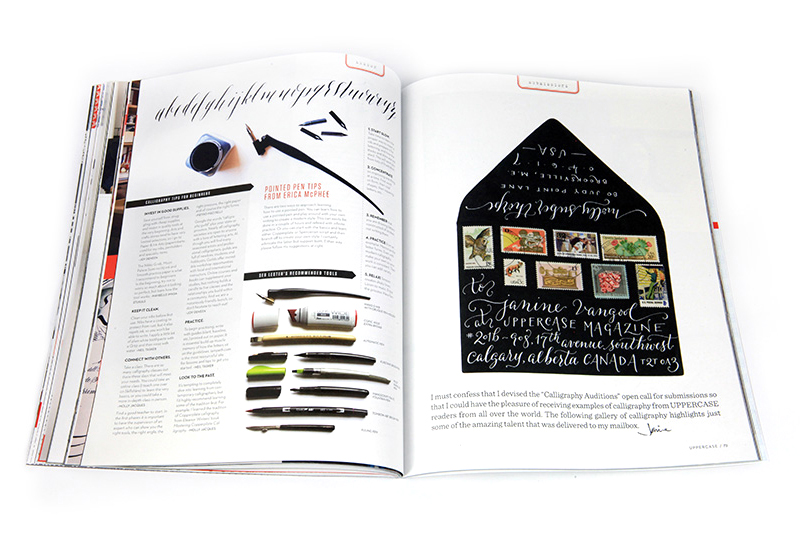
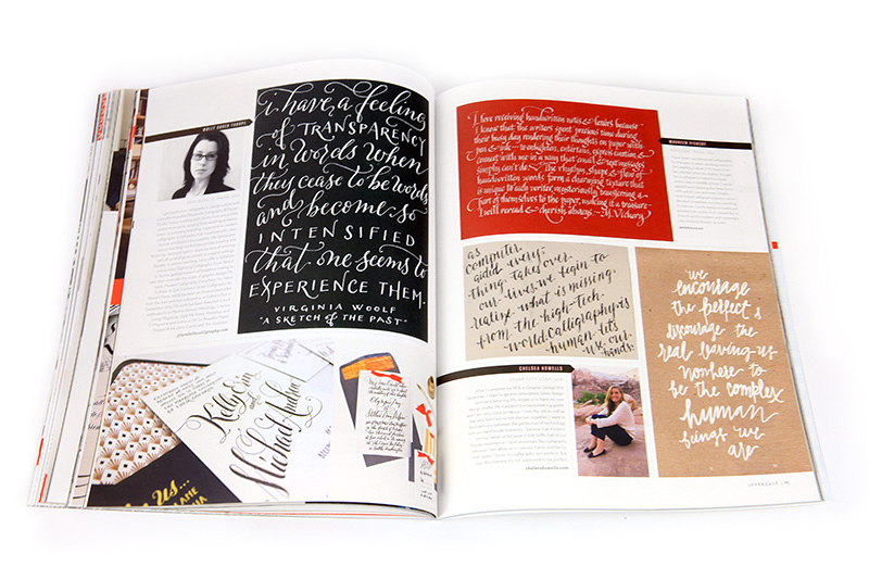
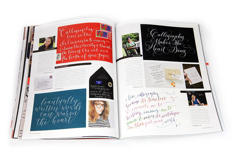
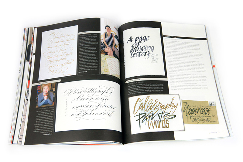
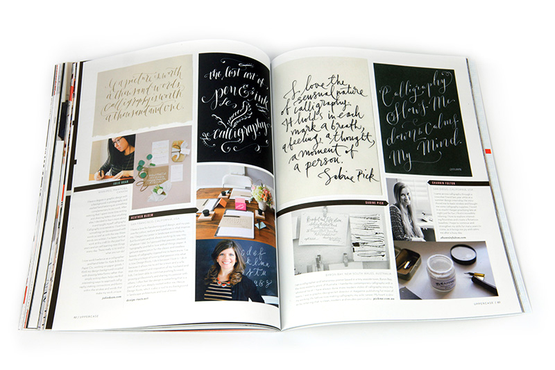
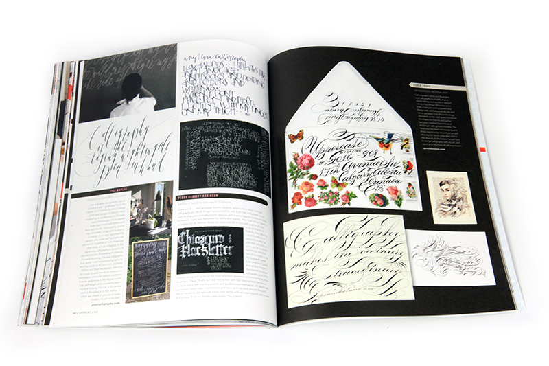
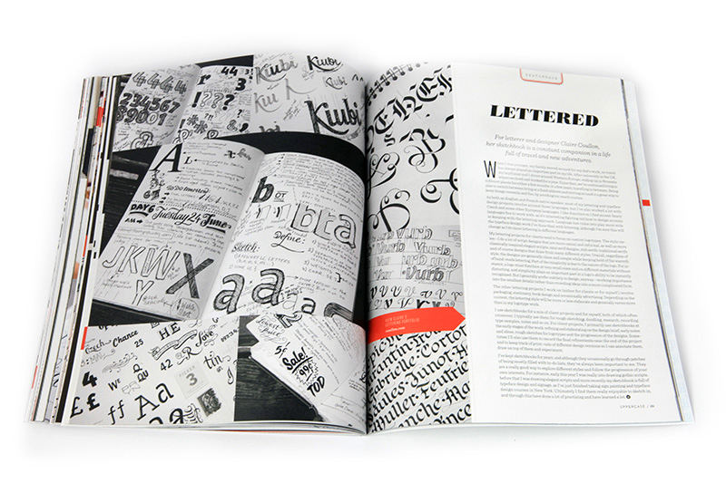
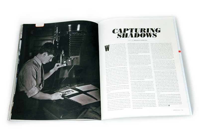
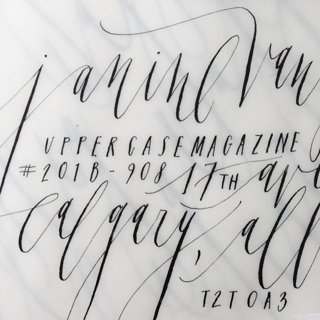
Celebrating things monochromatic—and the graphic appeal of black and white—issue #23 contains a special calligraphy and lettering section featuring Seb Lester (the cover artist who created this fun calligraphic grocery list), master penman Jake Weidmann and profiles of Joy Deneen, Maybelle Imasa-Stukuls, Erica McPhee, Barbara Calzolari, Neil Tasker, Pietro Piscitelli and Molly Jacques. The experts offer tips for beginners and our talented pool of readers share their amazing calligraphy work as well.
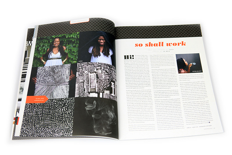
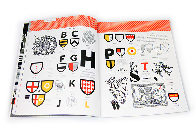
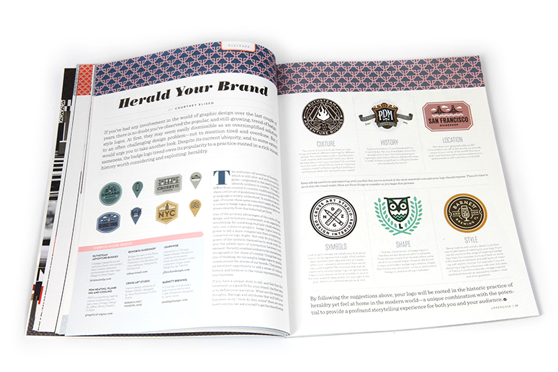
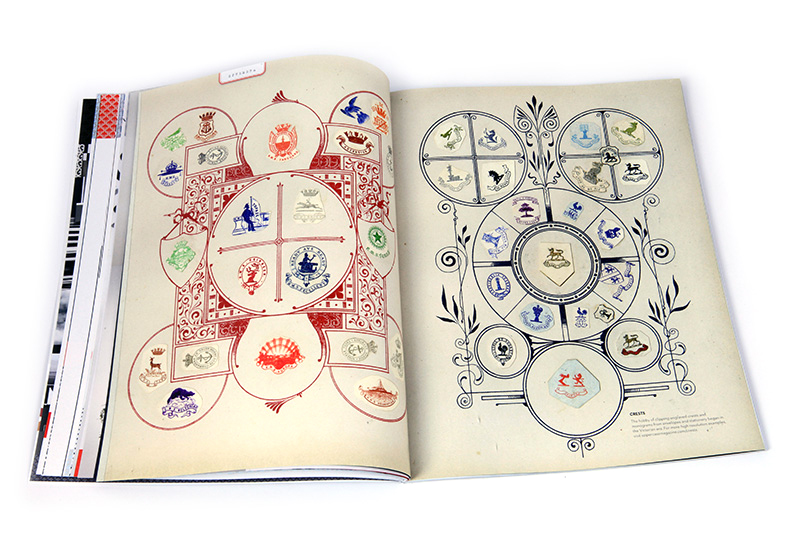
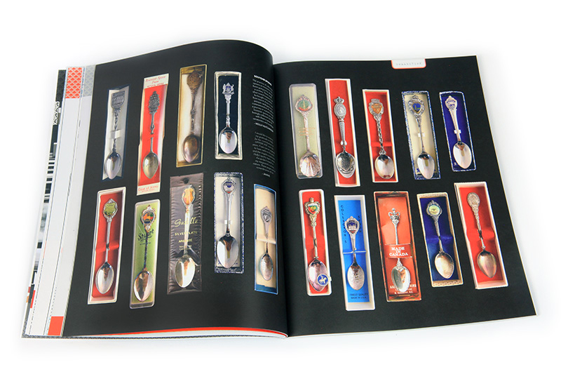
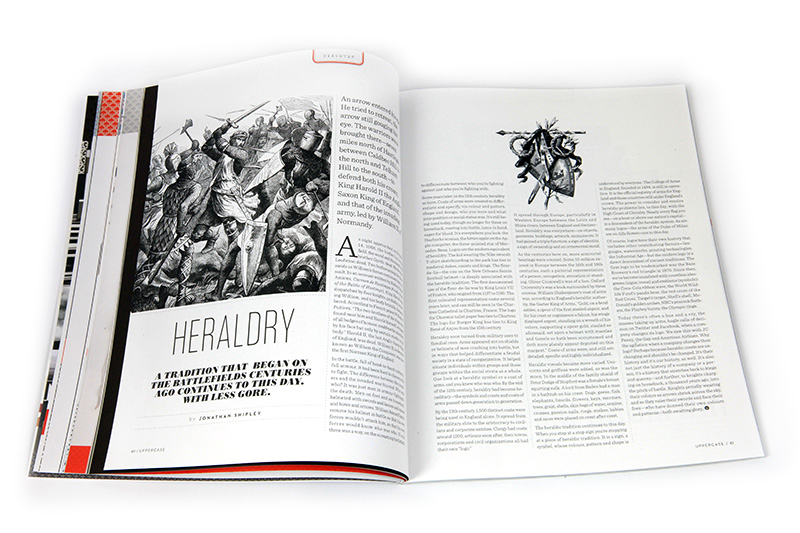
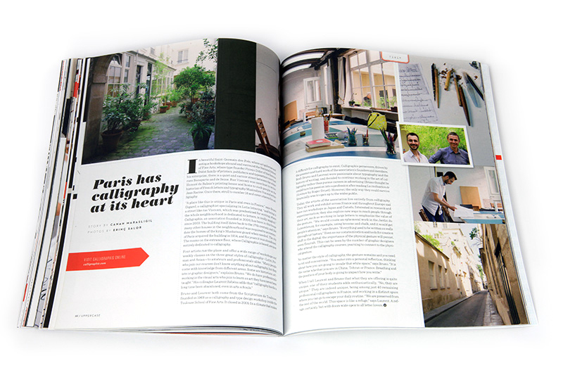
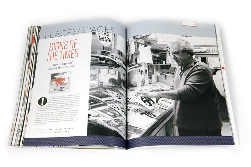
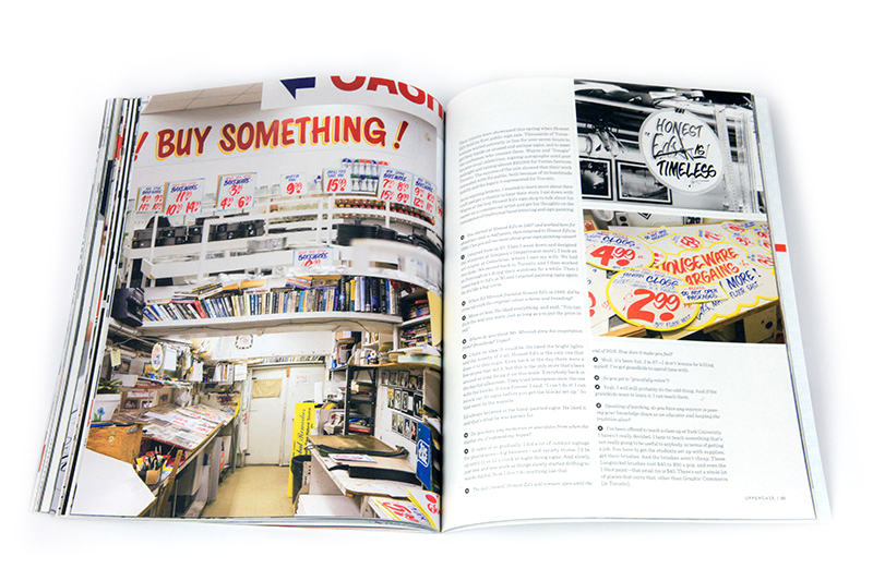
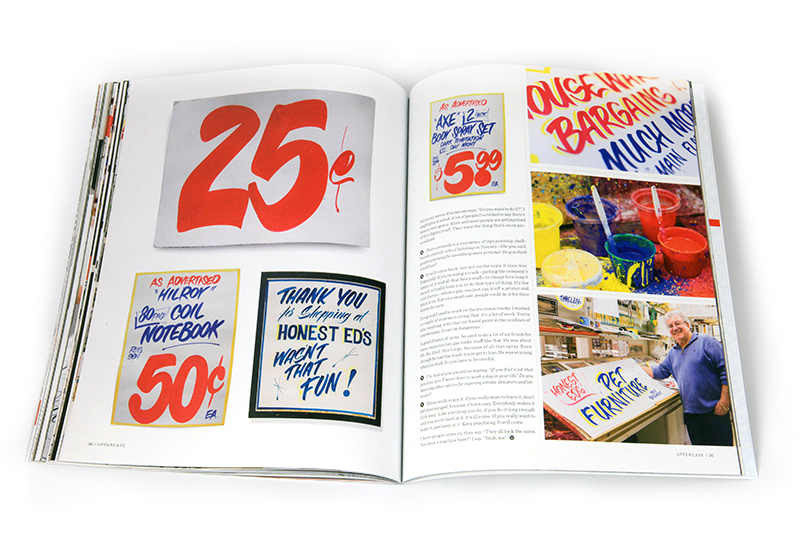
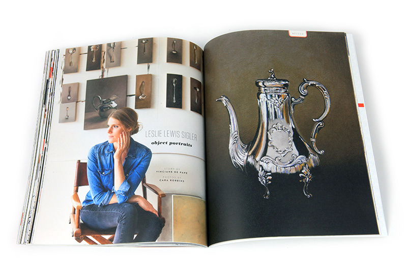
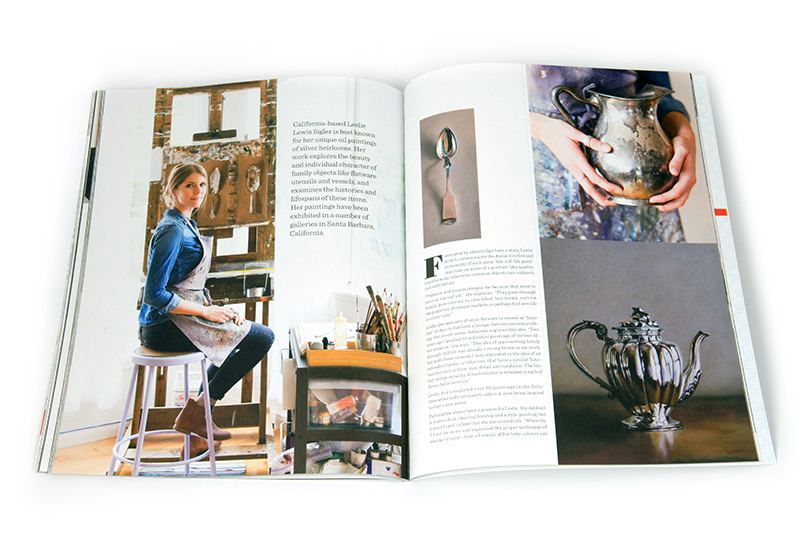
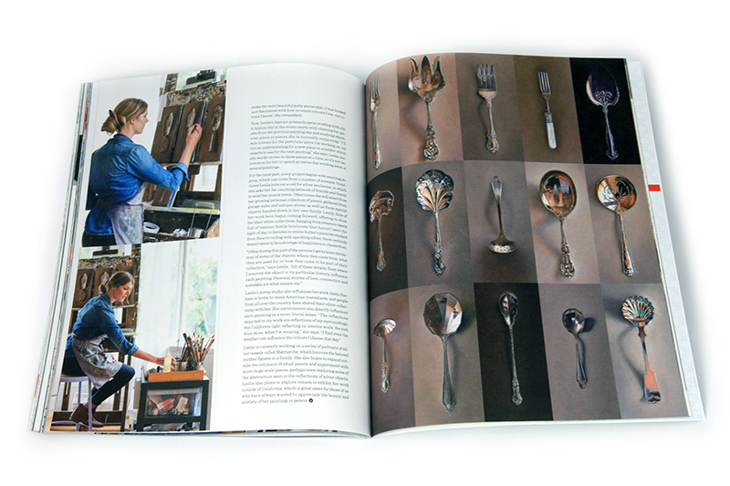
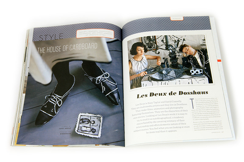
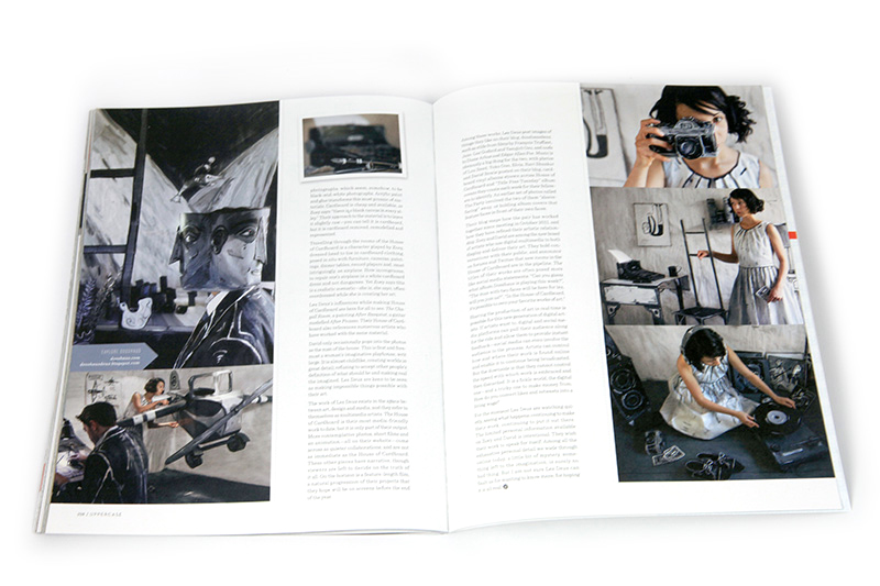
This issue also has articles about modern-day heraldry and how to use tradition and crests to design your brand; silver spoons painted and collected; the dynamic mother-daughter duo Tag Team Tompkins; a field trip to an in-house sign painter at an old-fashioned department store; a visit with the enigmatic inhabitants of a House of Cardboard; and a trip to a Parisian calligraphy guild.
I've got one week left to get the design finished up and off it goes to the printer!
Want to keep that summer feeling? You can still subscribe starting with issue #22. I'll mail it to you right away and then you'll get the fall issue when it is released in October. Or if already have a copy of #22, subscriptions starting with fall are available here.
The spine pattern for fall
/
The fall issue is heading to print just after Labour Day and I look forward to revealing the cover design, featuring the work of Seb Lester, on Tuesday! (Subscribe to my newsletter to see it first.) In the meantime, here's the pattern design I've developed, inspired by the content within the issue. In addition to the special calligraphy and lettering section in the fall issue, we also explore the influence of heraldry on traditional and contemporary art and design.
Starting from the observation that a calligraphy nib is somewhat shield-like and also thinking about the souvenir spoons that are featured in the Collections spread, I did some studies of the nib shape and shield shapes, ultimately going in this simple repeat so that the overlap of the shield vaguely references the split in a nib. It can't be too detailed or illustrative since it will be reproduced quite small (and in silver foil! I hope!) on the magazine's spine.
I can see foxes and bears in the motif as well, can you?
Calligraphy Auditions: deadline is July 21
/
Call for Submissions: Issue #23
Calligraphy
The fall issue of UPPERCASE magazine will have a special focus on the art of calligraphy. I'd love to see your work and share it with our readers!

The submissions for "Calligraphy Auditions" are in two parts. Your digital submission and a mailed-in example of your work. The best submissions will be featured in the print edition of the magazine as well as on our blog.
Mail in a 5 x 7 example on card stock (either in an envelope or sent as a postcard) showing off your calligraphic skills by writing about why you love calligraphy or demonstrating what makes hand-lettered messages so appealing. The card should be exclusively calligraphic.
UPPERCASE magazine
#201b - 908, 17th Avenue SW
Calgary, Alberta, Canada
T2T 0A3
The online application form will close on July 21, 2014, so you must complete that before mailing anything. Mailed submissions should arrive before July 25, 2014.
To submit your work, click here.
dip, splatter, scratch: intimate calligraphy
/{ via @fatwreck RT @garywhitta }
The call for calligraphic submissions is open!
Calligraphy Auditions
/
The summer issue is freshly printed, but I'm busy working on the next one! In contrast to the colour issue I've just completed, issue #23 (October) will be monochromatic with a special focus on calligraphy.
I have to admit that I've devised this call for submissions so that I can have the pleasure of receiving your amazing examples of calligraphy... The submissions for "Calligraphy Auditions" are in two parts. Your digital submission (a bit about yourself, photos of you, your studio and work) PLUS a mailed-in example of your work showing off your love of the art of calligraphy. Certainly one of the most endearing aspect of calligraphy, particularly in correspondence, is the joy that a hand-lettered message provides its recipient. I look forward to receiving your submissions and appreciating them in person!
Please read the complete details on the submission page.


