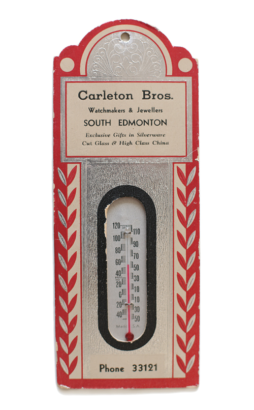
Paper-mounted thermometers were popular advertising giveaways (back in the day when telephone digits were oh-so-simple). Pastoral scenes with sheep and mountains told the temperature courtesy of the local funeral parlour, while plump babies and fluffy puppies decorated those for dairies and grocers. This fancy number, above, with silver foil and embossing was the proud token of customer appreciation from the Carleton Bros. Watchmakers and Jewellers. ebay.com
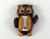
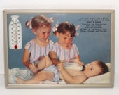
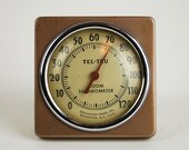
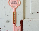
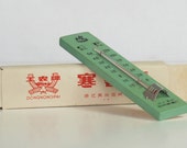
I've created a Treasury on Etsy of vintage temperature devices.
From issue #13: No matter which way the wind blows, a weather vane (also known as a weathercock for its traditional cockerel motif) is usually more decorative than functional. A common motif in rustic kitchens and 60s kitsch, its arrowed silhouette adorns tea towels, plates, Pyrex and barkcloth curtains.
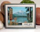
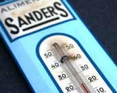
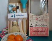
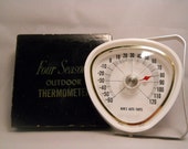
We had a giveaway for this vintage tea towel and a vintage thermometer (you have to read the magazine for the details on how to win—there's a giveaway in each issue) and Dale P. in Calgary is our winner!
Ok, so here's my second attempt ever at "fashion blogging"!
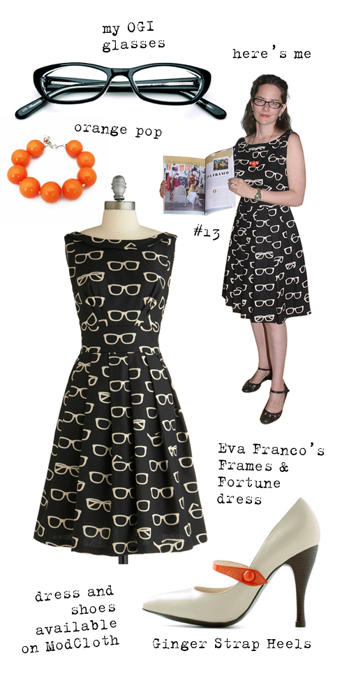
Eva Franco's Frames and Fortune print and dress seem to be tailor-made for me. It's available on ModCloth with a selection of other great Eva Franco dresses (and these shoes).
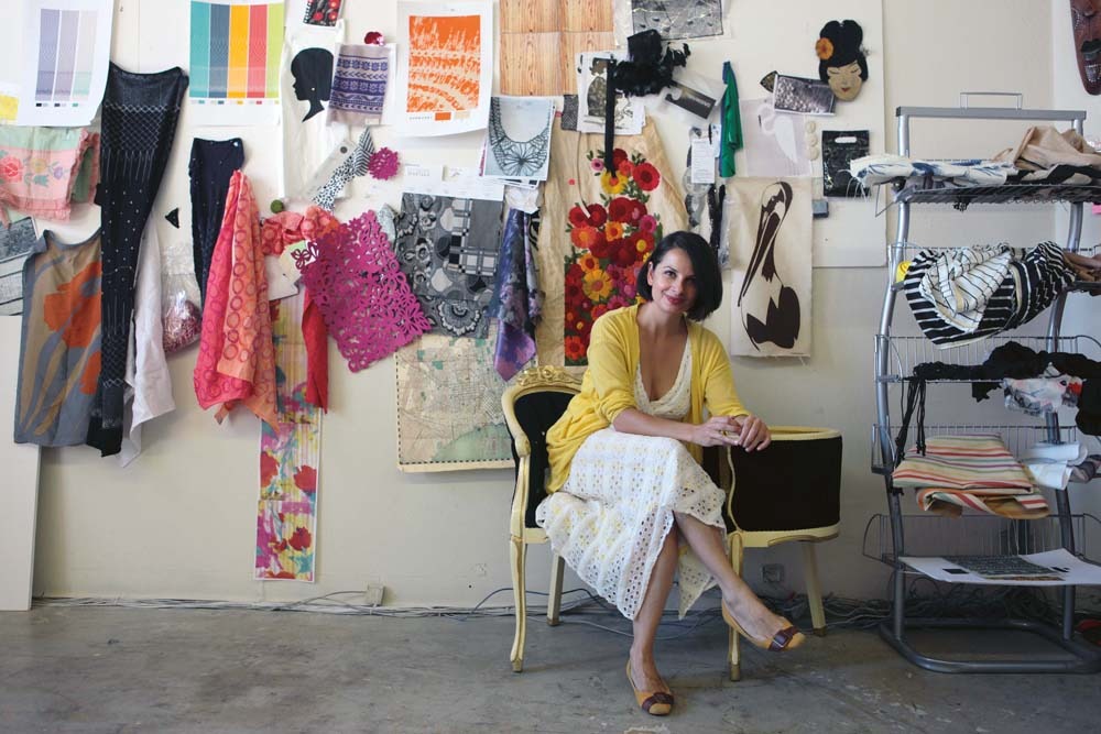
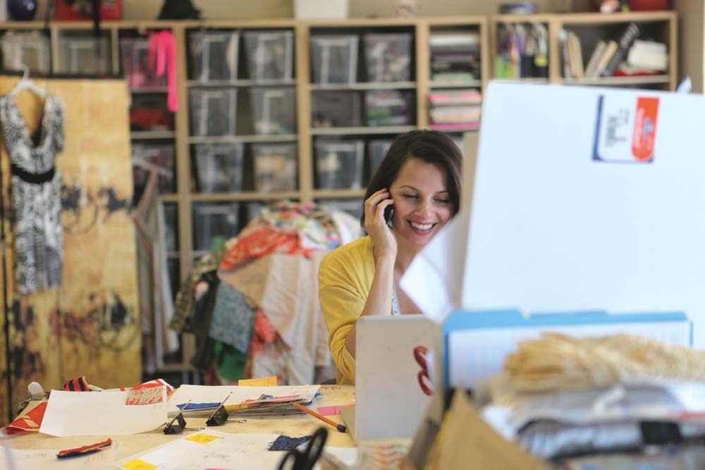
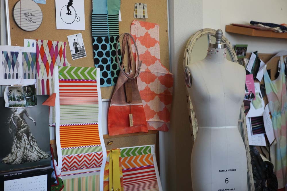
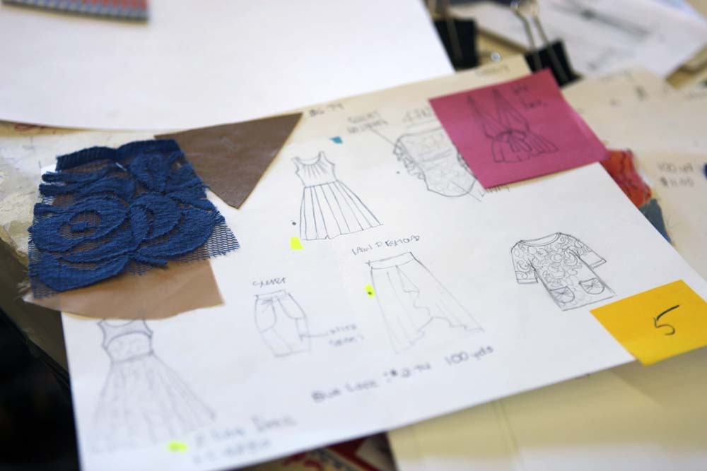
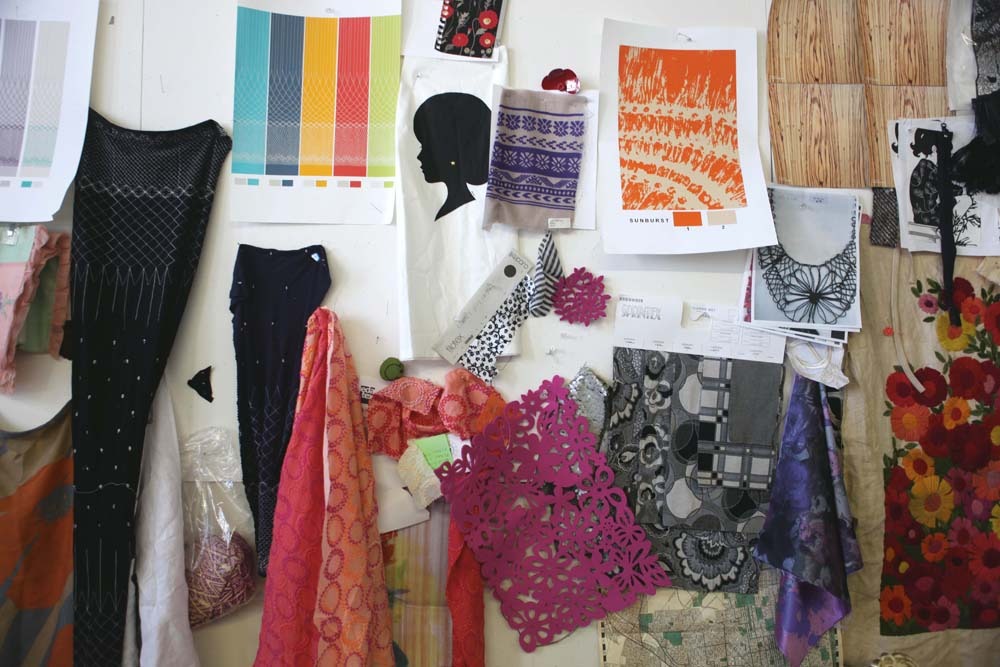
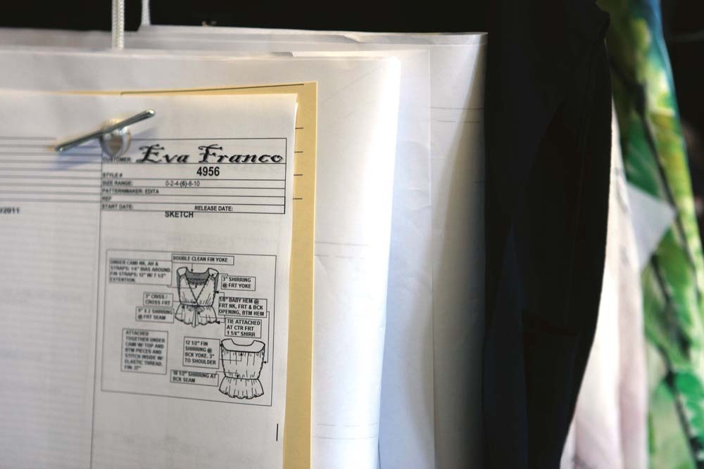
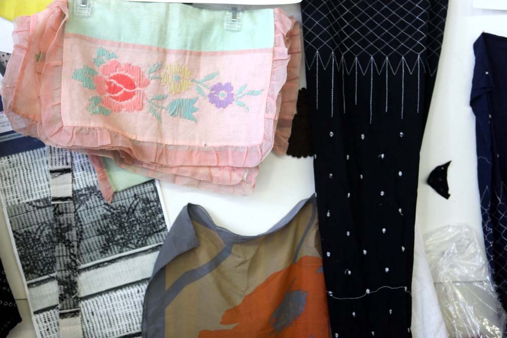
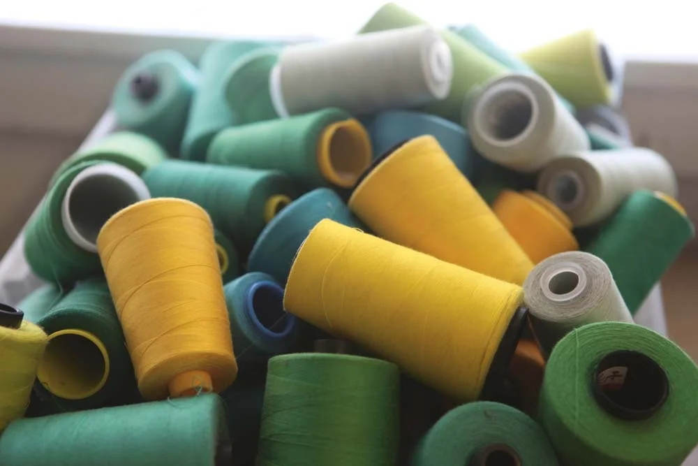
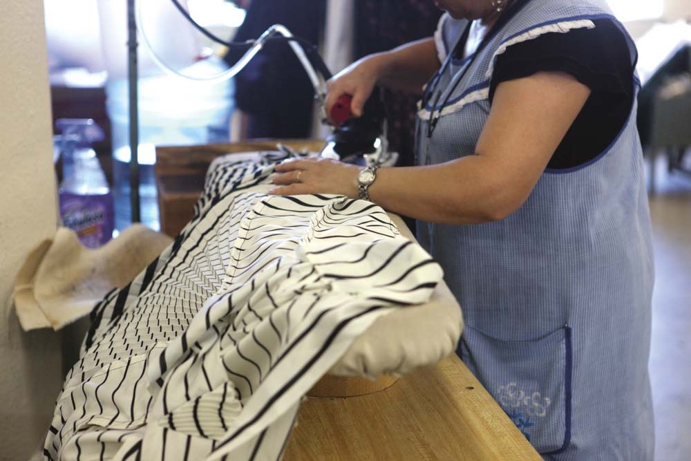
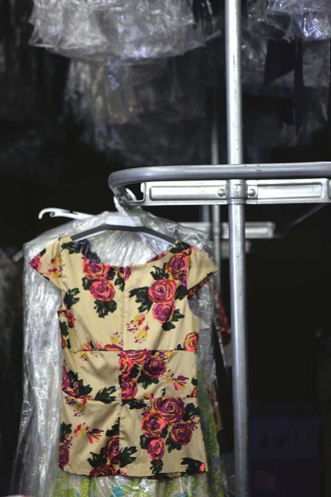
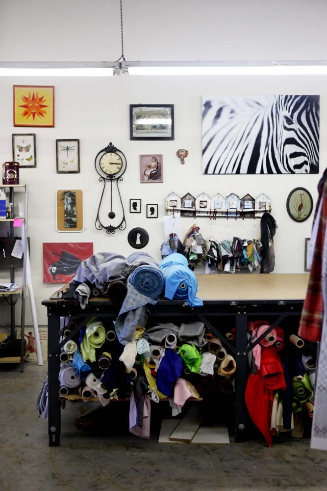
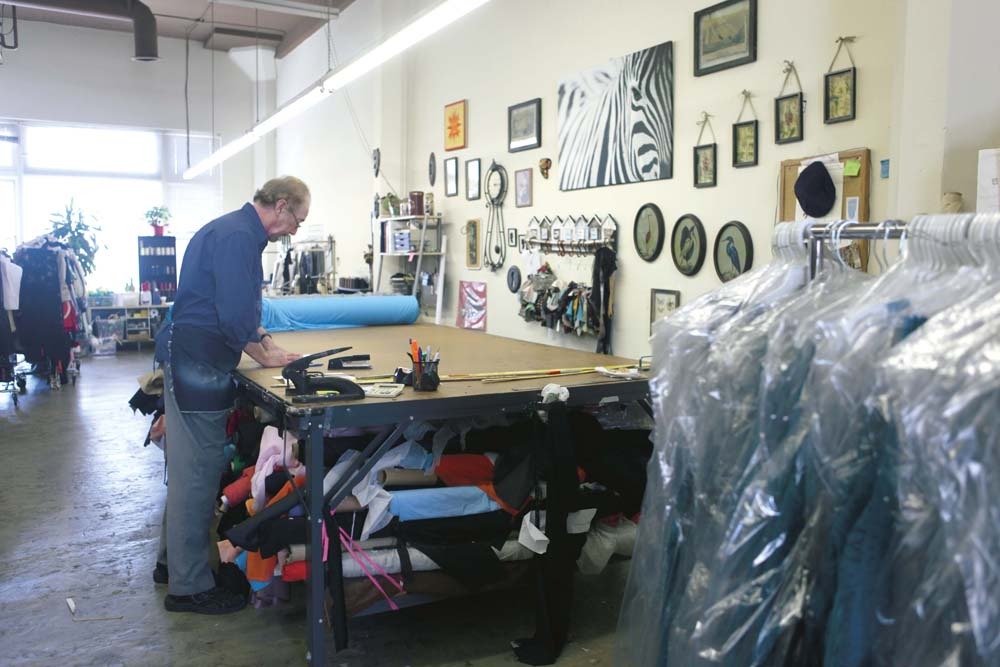
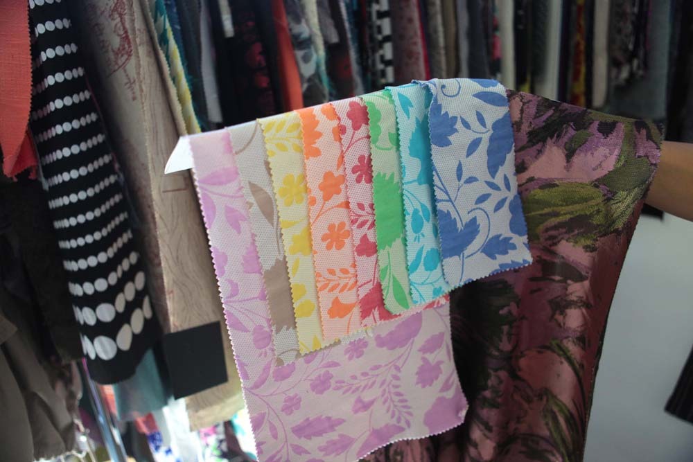
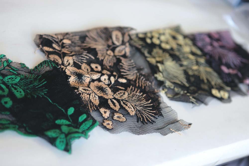
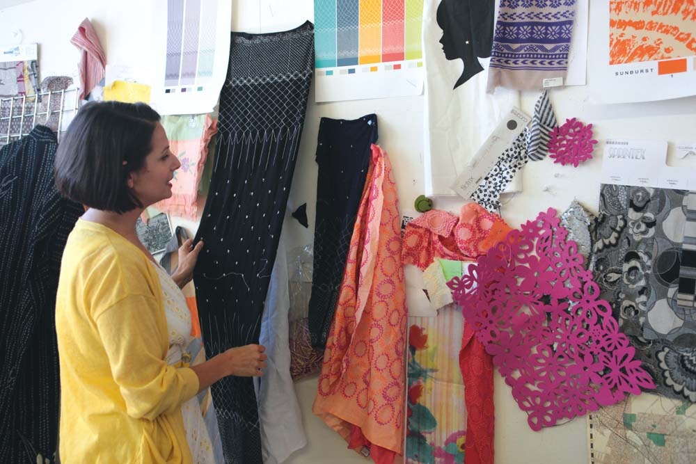
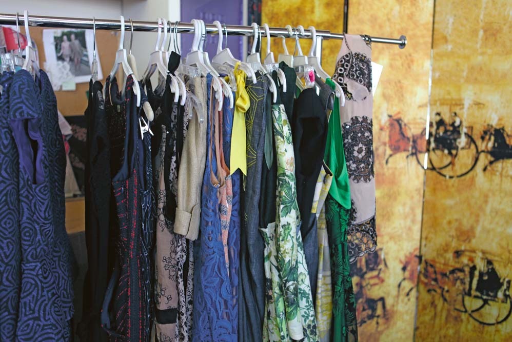
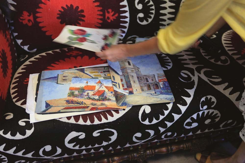
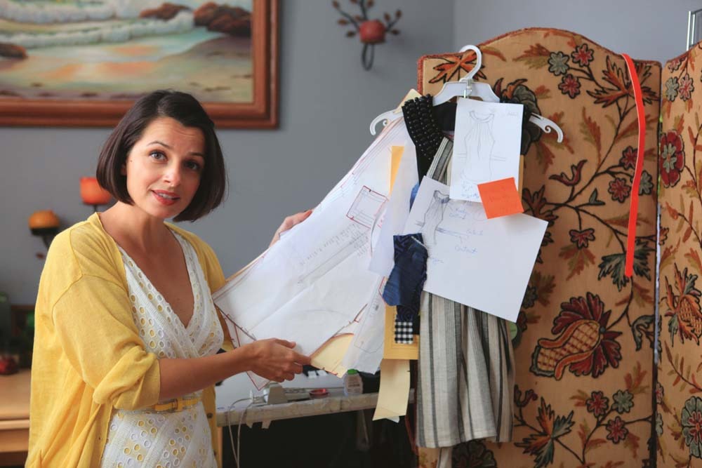
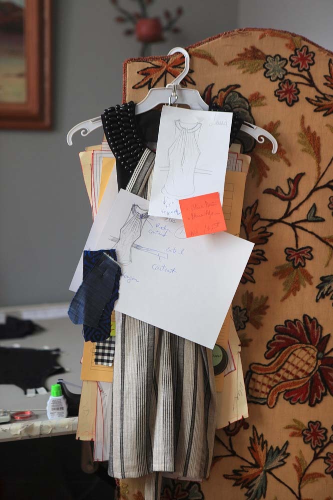
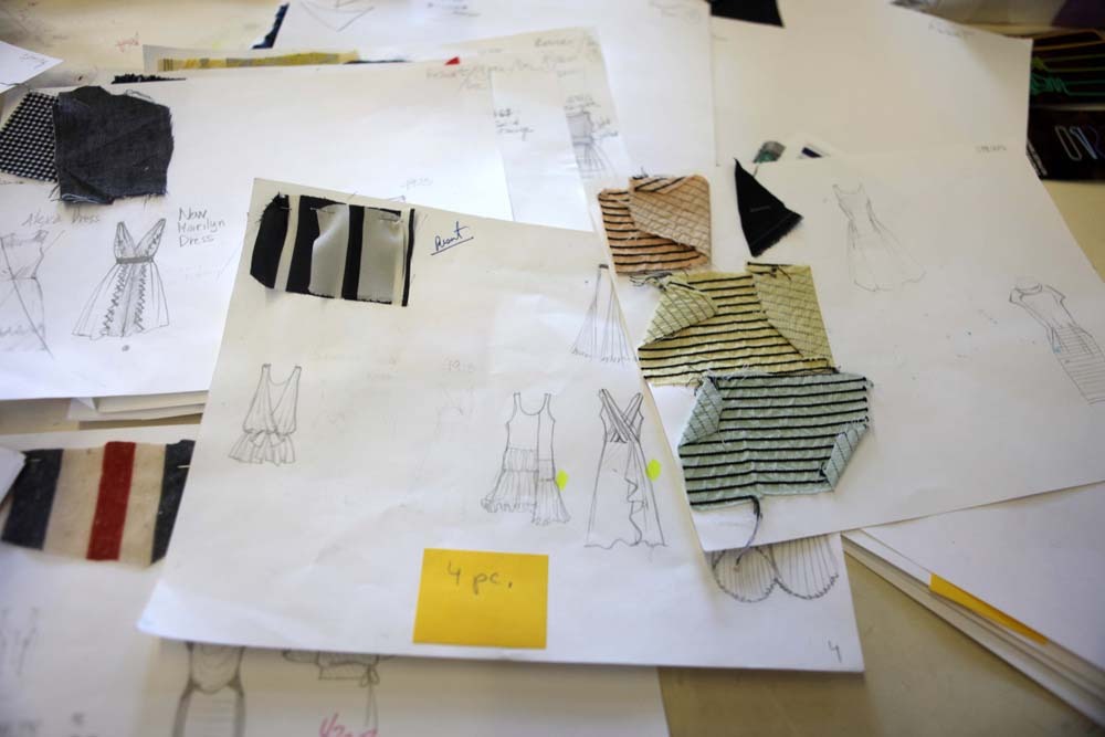
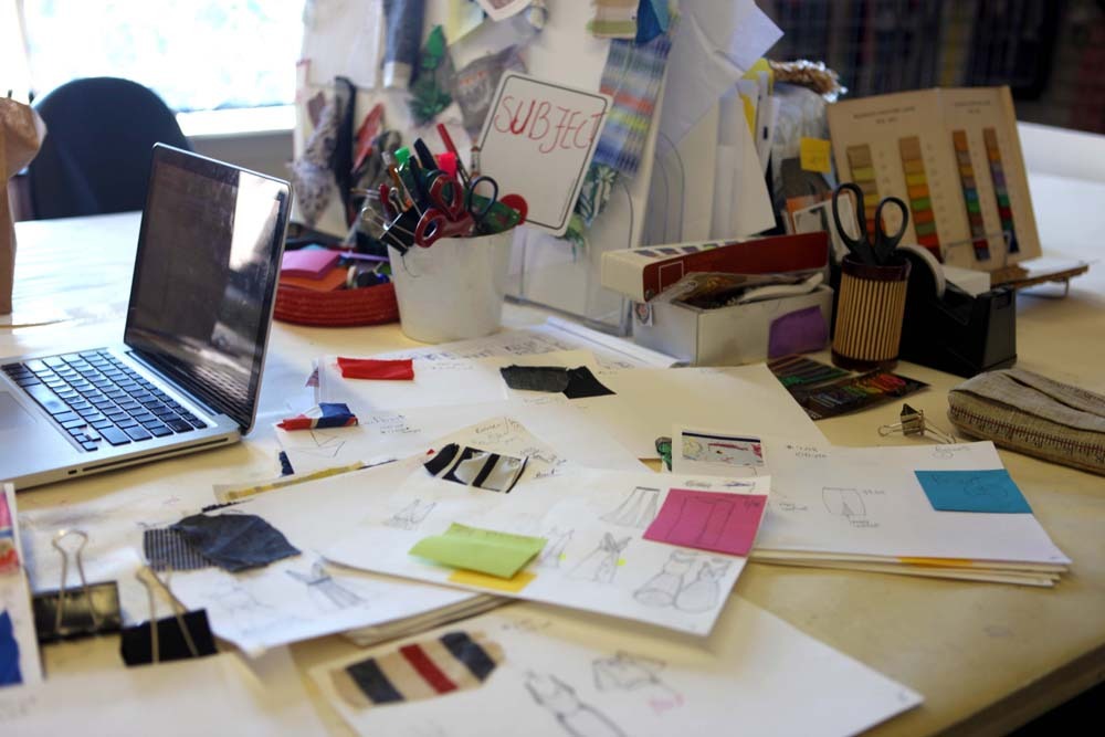
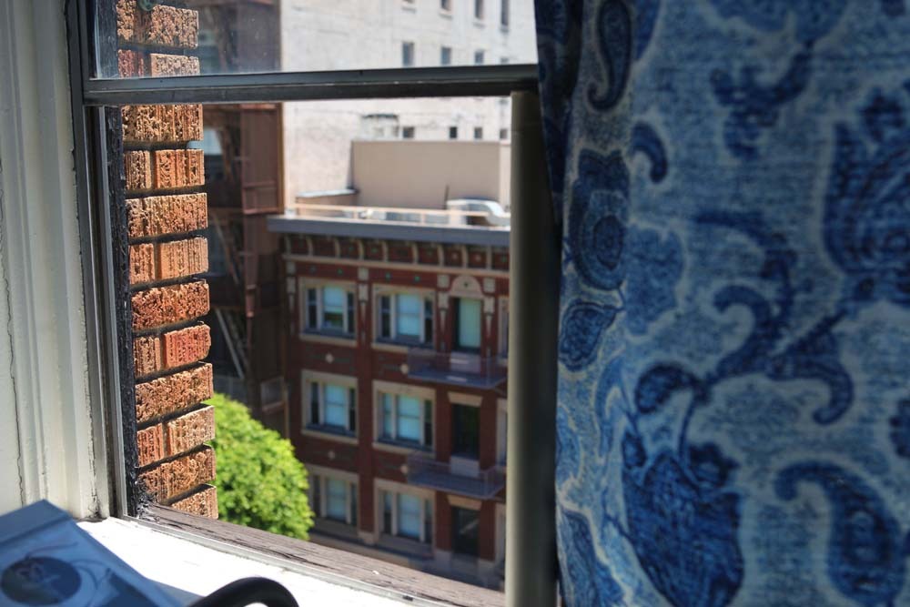
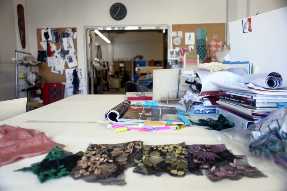
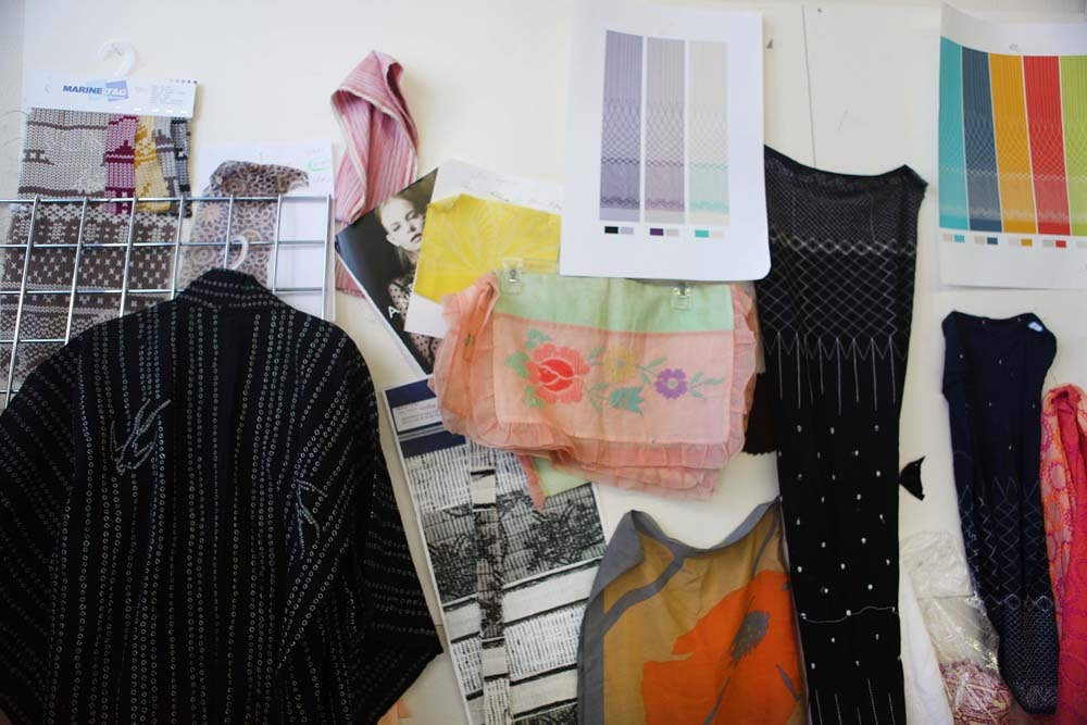
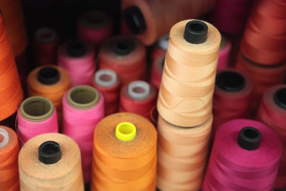
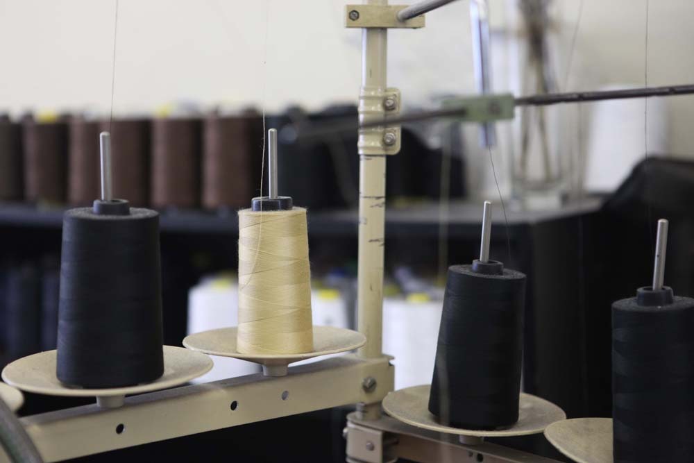
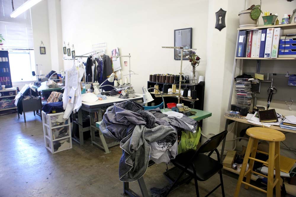
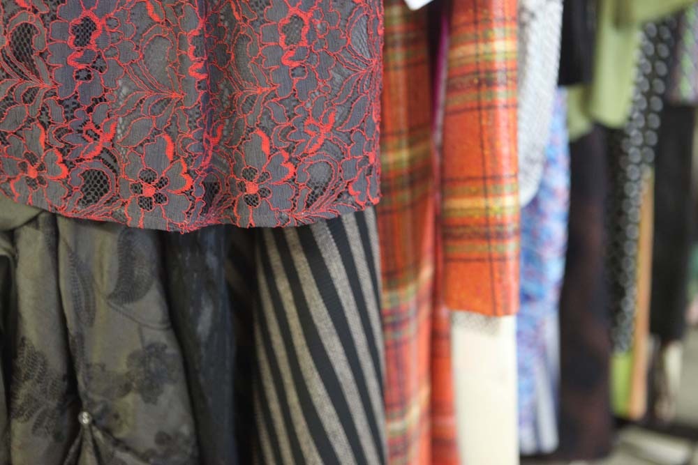
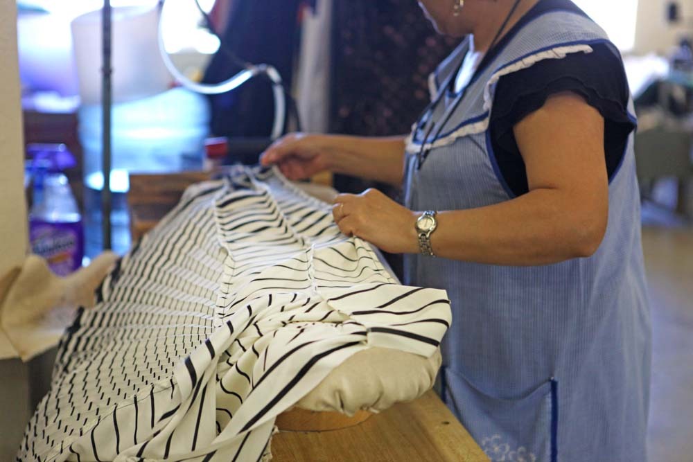
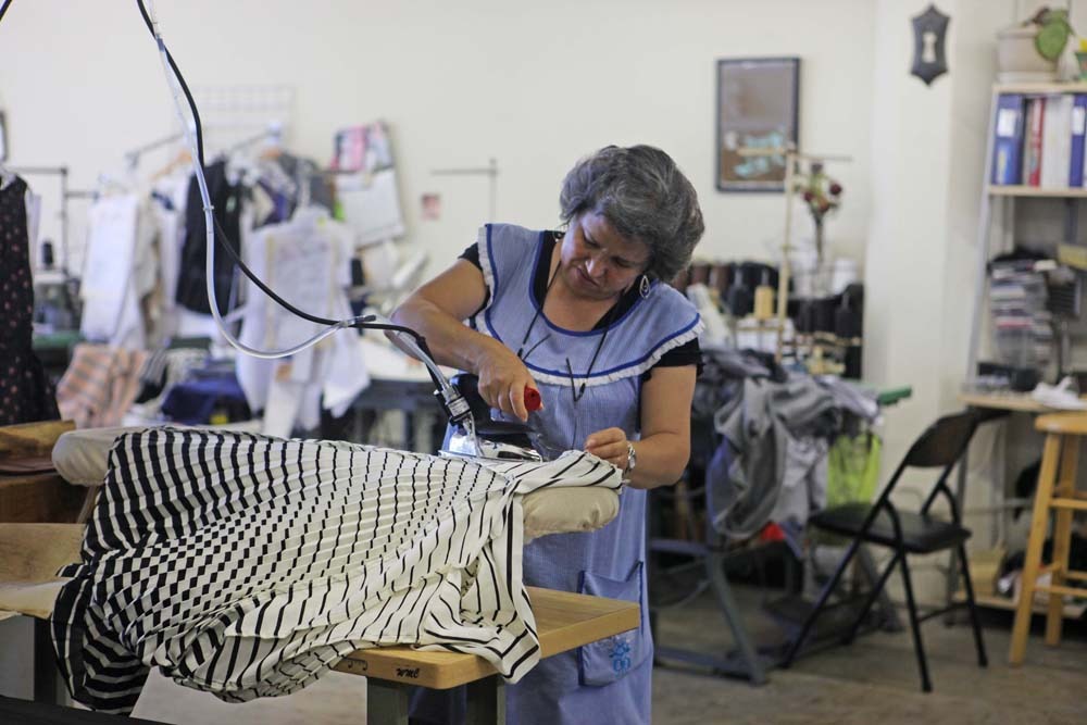
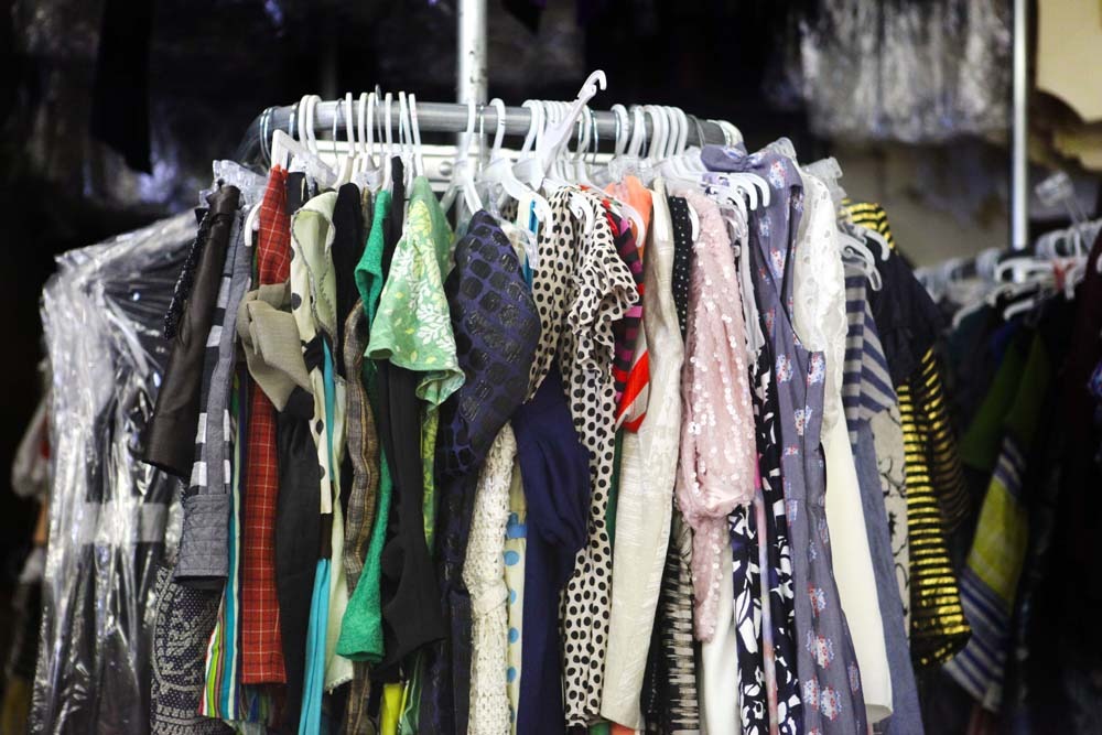
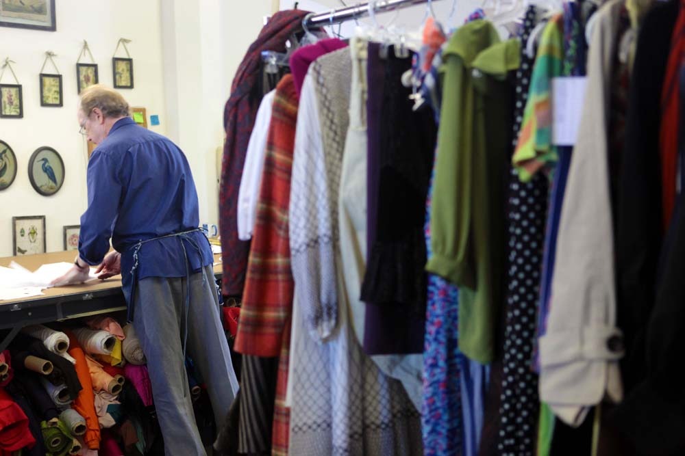
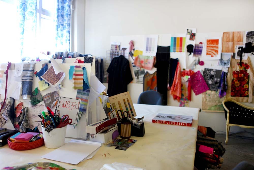
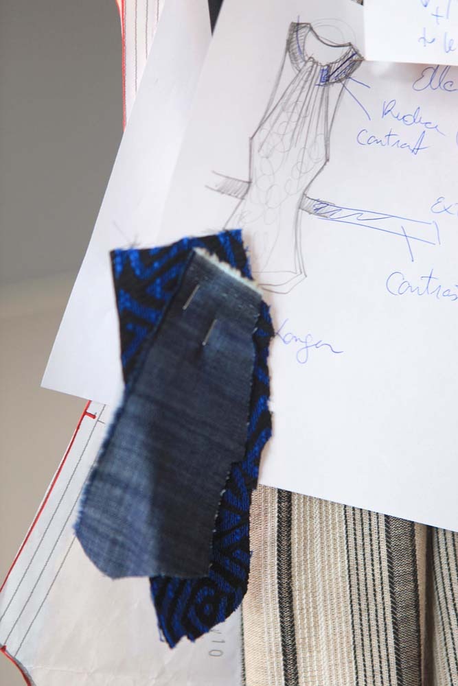
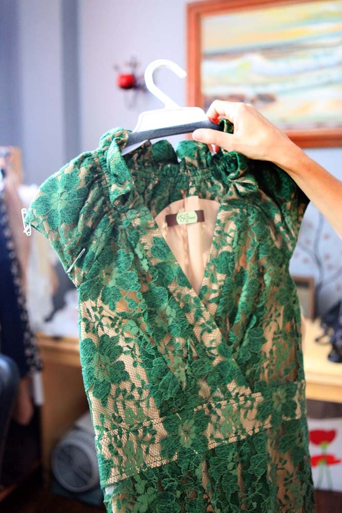
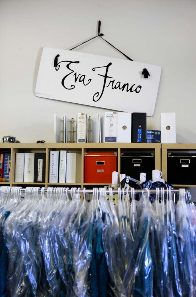
In Issue #13, I shared my experience about visiting the Eva Franco studio in Los Angeles last summer. It was an amazing experience to meet with Eva and see the full scope of her fashion enterprise: from the inspirations and sketches to the samples, manufacture and warehousing. I'll be posting more about Eva throughout the day—let's start with her design process!
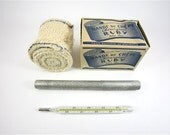
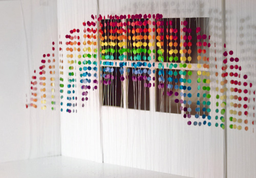
In issue #13 we profiled Lilla Rogers and her line of craft supplies, Ruby Violet. Lilla also heads Lilla Rogers Studio which represents nearly 40 illustrators.
One of our intrepid Surtex reporters, Alanna Cavanagh spoke with Lilla about the many facets to her creativity.
Alanna: Lilla you run a thriving illustration agency, work yourself as an artist and have recently launched Ruby Violet. How do you possibly do it all? Lilla: Well...actually I've just finished writing a book for Quarry/Rockport that will reveal many of the ways I have done it! It's called "I Just Like to Make Things: How to Have Fun, Stay Inspired and be Successful as an Artist" and it's due out February 2013. It contains lots of great photos and interviews and has a ton of advice on how to make a living with your art.
A: Wow I can't wait for it to come out - and I'm sure many UPPERCASE readers feel the same way. The "stay inspired" bit from your title strikes me right away because in our 24/7 plugged in world of blogs and Pinterest I find many artists suffer from a bombardment of images which can really dull their creativity. How do you advise artists to stay inspired? L: You have to fill the cup up but not to overflowing. There needs to be a continual process of taking in and then giving out. If you take in too much and don't produce you'll feel saturated. On the other hand if you just give out (produce art) but don't take the time to look around and see what's going on...your work will get stale. It's a matter of balance.
A: Your artists' work always looks so fresh and 'on trend'. Do you do anything to help them achieve this? L: Each season I send all my artists a trend report which is filled with what I see are the emerging images, colour ways etc. For example last Christmas the report contained vintage ornaments and deer!
A: In an earlier interview for UPPERCASE you explained that in the 1980s you felt that the best energy and interesting illustration work was happening in magazines but now you feel it's in surface design. Do you still feel this way? L: Absolutely! Surface design is positively exploding right now. There are so many areas within it. For example home decor, apparel, and fabric. All of them are expanding. This is our 6th year doing the Surtex show and it just keeps getting better.
A: What advice would you give an artist who is hoping to break into surface design? L: Read as much as you can on the topic. Keep up with what's going on in the marketplace and stay current with technology. Come to Surtex and walk the show the first year to decide if it's for you. Make up as many pattern designs as you can and if doing a show figure out a way to present them nicely. Remember that you can often create many new patterns by simply altering the images and colours of an existing pattern. In general I would like to say to illustrators and agents that no industry stays the same forever. It is bound to change and those that embrace the change and remain positive will do fine!
A: Such great advice Lilla. In addition to your book and more Ruby Violet designs what can we look forward to seeing from you in the future? L: In 2013 I hope to launch an online course on making a living with your art. I just love to teach and help artists learn how to make pieces that sell. Keep your eyes peeled for it!
A: We will Lilla. Thanks so much for your generous insights.
The creator of one of the plush dolls from issue #13 recently dropped a little internet love on UPPERCASE. Mon, of Weiwabo created the raindrop doll above. An etsy shop is planned where you will be able to pick up these amazing creations.
In the current issue (#13), Carolyn Fraser has an excellent article about Cash's Labels—the last woven label manufacturer in Australia. While visiting the plant, Carolyn shot some footage on her phone. I'm learning Final Cut Pro X, so here's something I've edited together.
Weather is a powerful muse in a number of ways, and when it comes to music, it seems to fall into four categories: songs that evoke weather or seasons, but does not mention them directly; songs that uses weather as a metaphor for the themes of the song; songs that use weather as part of the background of a story of scene; and lastly, songs that are simply about the weather.
Earlier this year, the Weather Channel had a tournament, NCAA style, matching 64 weather-themed songs against one-another to determine a weather music champion. Readers voted on songs in head-to-head matchups, and after 63-such matchups, The Beatles Here Comes the Sun was crowned champion. While the reader-voted aspect of the competition was always going to favour mainstream classics (like other contenders Over the Rainbow, Singin' in the Rain, and White Christmas), it's a little disappointing that more contemporary music wasn't featured, even in the early rounds. I think U2's Beautiful Day and Adele's Set Fire to the Rain are the only pieces from the last decade featured. One can also question whether some of the songs are really songs about weather. Is Ice Ice Baby a 'weather' song in any sense of the word? I'll save you the trouble of googling the lyrics: it's not.
So, with the weather channel having taken care of the mainstream selections, what are your favorite underrated weather-themed music?
I think one could probably identify an entire bracket of 64 Tom Waits songs that feature weather imagery in one way or another, with the comic musings of Emotional Weather Report (with tornado watches issued shortly before noon Sunday, for the areas including the western region of my mental health and the northern portions of my ability to deal rationally with my disconcerted precarious emotional situation); and the simple observations of Strange Weather (All over the world / It's the same / Strangers talk only of the weather) being a couple top contenders.
UPPERCASE contributor Alanna Cavanagh visited with Lourdes Sánchez for issue #13. Alanna recently posted some pictures of the day she spent with Lourdes, and her dog Moonpie, for the interview. Alanna also links to Lourdes' site. Scrolling through the images there is an inspirational way to kick off your weekend.
An article by Jonathan Shipley in Issue 13 explores how the climate around Seattle has influenced the art community of that city. He links the insular, self-reflective spirit of the arts community there to the famed damp and dreary weather of the Pacific Northwest.
Driving out onto the prairies from my home of Calgary today, I was thinking back on Shipley's piece and contemplating how weather shapes Calgary's arts. It's a question that anyone can ask of their own town. Despite the wet conditions that I was driving through, Calgary boasts itself to be the sunniest city in Canada or North America, depending on who you ask. (Environment Canada lists it has having the most sunny days in Canada, at 333.) The other weather phenomenon that we lay claim to is the similarly cheerful chinook: a foehn wind (you can look it up in your Issue 13 abecedary!) that can warm the chilliest winter days by fifteen or twenty degrees.
When I think about how that shapes Calgary's artistic identity, the one thought I keep coming back to is just how gosh darn hard it is to be a curmudgeon here. The coldest days of the year are bright and clear, and a chinook may be just around the corner. Summer is short, but filled with days so perfect that even the sun lingers long past any civilized bedtime. One can't even become cynical about the sunniness, in the way that one might in more tropical climes. Trying to characterize the spirit of an entire community is always difficult, but I do feel like we have far more optimists than cynics. Within the city as a whole, the cultural community can feel a little bit neglected, but at the same time there's often genuine, heartfelt belief that the city is on the cusp of a sea-change in terms of its awareness of local culture, and thus our role within our city. That's not to say there's no cynicism—about self, about the community, about life in general, but I always feel like there's a bit of an optimist's streak underlying so much of the creative work that's done in the city.
So now I'll put the question out to you: how does the weather of your city affect the artistic community and the work that's done there?
With Janine in London this week, Finley, Percy and I were making our own modest trip out to my parents' farm, about an hour from Calgary. Along the way, I couldn't help noticing that the colours were very reminiscent of Eloise Renouf's cover of Issue 13: a heavy grey sky, silver of granaries and shimmering asphalt, yellow fields and road markings. And I thought to myself that if Janine were along on the trip, she would likely take a bunch of photos and then do a blog post about the colours.
Courtney's first typographic memory was discovering her father's extremely meticulous handwriting as a child. From then on she carried a pad of paper with her everywhere, feverishly trying to perfect her own and create new styles. Little did she know it would lead to a life-long obsession with typography. The obsession forged a path to Syracuse University, where she studied Communications Design. She then landed in New York and hasn't left since.
When not attached to the computer, Courtney collects business cards from New York restaurants, plays with her gocco printer and catches live music wherever she can.
Jenn Kitagawa spotted this thematic window display at Type Books in Toronto. You may remember their amazing video The Joy of Books. It is always worth another look.
Sitting here in the Calgary airport awaiting my flight to the UK, I've been browsing the websites of some of the folks who RSVP'd for next Friday's Meet and Greet at Ray Stitch (see the sidebar at right for details). Pui Yee Cheung has a nice design portfolio and this rainbow fits our weather theme of issue #13. This rainbow invite, below, is quite clever.
Pantone Eggs by Jessica Jone (How About Orange)The Pantone motif is a simple designer icon that lends itself to parody, play and product design. Jessica Jones has made Pantone eggs by dipping them in dye and creating the type by printing onto inkjet temporary tatoo paper.
I'd like to thank Jessica for sharing one of her other DIY project photos in the current issue. I compiled art and craft inspired by the elements (sun, wind, temperature) and featured her project of using Inkodye to make sun prints on fabric.
Hmm.... I wonder if you could sunprint an Easter egg? Maybe next year...
Thanks to everyone who came to visit. It was heartening to see such a nice turnout since it has been a while since I've been able to put so much effort into an event. (Click the photo above to see more images in Flickr.)
Our silver-lined clouds offered these UPPERCASE pots of gold as prizes. I found some nice acrylic wedding favour boxes and filled each with a selection of golden beads, sequins, pins and papers.These gold seals are from an office supply company and I used my custom embossing seal. It pays to be a packrat, since I had these gold stickers lying around for years.
UPPERCASE
CURRENT ISSUE
Cover by Christy Batta
The UPPERCASE Circle is free for subscribers of the print magazine. Find out more.
For the creative and curious
UPPERCASE is a quarterly print magazine inspired by craft, design and illustration. A playful exploration of creativity, an affinity for vintage ephemera, and a love of handmade are some elements common in each issue. The magazine boasts high-quality paper and printing, a unique design aesthetic and incredible attention to detail.
* Before emailing submissions follow the guidelines here.
Glen Dresser customer support Please contact Glen for help with your purchases, wholesale inquiries and questions about your subscription. Include your full name and mailing address so that we can better assist you. Send a message →
UPPERCASE publishing inc Suite 201 b 908 17th Avenue SW Calgary, Alberta T2T 0A3 403-283-5318
The studio is not open to the public—please get in touch to make an appointment. If you'd like to purchase our magazine and books locally, please see the stockist page.