Brush Lettering workshop at UPPERCASE July 12

When I heard that UPPERCASE contributor Christopher Rouleau was planning a lettering workshop in Calgary, I offered him the use of the UPPERCASE studio if needed. Hooray! The workshop will be held in my studio! I look forward to taking the class and learning some lettering techniques from some really talented guys. The event is organized by the local chapter of the GDC. Here are the details:

Join Toronto letterers Kyle Gallant & Christopher Rouleau for a one-day intensive on the basics of brush pen lettering.

GDC Alberta South welcomes Toronto letterers Kyle Gallant & Christopher Rouleau for a one-day intensive on the basics of brush pen lettering. In addition to learning the fundamentals of letterform construction, participants will also learn tips & tricks for composition, as well as how to digitize your work. The workshop offers creative enrichment and helps participants with all backgrounds – beginners & novice letterers – develop their own unique lettering style, which can then be applied into their future artistic endeavours, at work and beyond.

This is a full-day workshop will be held Sunday, July 12 from 9am – 5pm at UPPERCASE in the Devenish building. There will be a one hour break for lunch. The cost of this full-day workshop is $165. This price includes a workbook and the supplies you will need for the workshop, all of which you get to take home at the end of the day.

Kyle is a multi-faceted designer, skilled in calligraphy, expressive lettering, and even graffiti. He is a self-described “compulsive doodler” and passionate about all things type. He has co-instructed several brush pen workshops with Christopher in Toronto, include a special workshop at the agency Sid Lee.

Christopher is a freelance graphic designer & letterer, with a love for alphabets, antique lettering guides and old hand-lettered signs. He is comfortable working in a variety of media, including pen, chalk, paint & ink. Christopher has taught workshops in Calgary, and also co-instructed his first workshop with Type Camp in New York City this past May.

Kyle & Christopher co-founded Ligatures, a Toronto-based typography interest group, in the fall of 2013. Since the club’s inception, they have hosted almost 2 dozen public events, ranging from film screenings, lectures, draft & draws, type walks, as well as their first curated gallery show, Swash & Serif, last October.

Sign up here. Space is limited!

Win a Printmaking Sampler!

The current issue features 75 talented printmakers from around the world.

Their work is diverse—from monoprints to linocuts to silkscreen to marbled paper and more... so it makes for a very informative and inspiring guide to the possibilities of printmaking.

Participants and some contributors for this issue were invited to submit samples of their work for insertion in subscriber copies of the magazine (for those who were active subscribers as of mid March).

From 10 art prints to letterpress editions of 300, the samples were sent to my studio over the course of a few weeks. I certainly made the postman work hard!

I kept a few samples (and saved a few of my favourites for myself) and consolidated the rest to send onwards to my printer for insertion. (A few other submissions arrived after I photographed these images, so not quite all of them are shown here.)

And now... the giveaway! I will be doing a draw for three Printmaking Samplers, assembled from a selection of the wonderful prints shown above. The winners will receive 40-50 prints and cards each.

1) One winner will be randomly selected from current subscribers.

2) One winner will be randomly selected from folks who became new subscribers April 26 through midnight May 1. So if you're not a subscriber yet, head on over here to purchase your subscription.  

3) Show your love of UPPERCASE magazine by posting an image of UPPERCASE magazine or books on Instagram using the hashtag #uppercaselove and one winner will be randomly selected from those submissions at the end of May 1.

Good luck!

And here's the full list of participants from the Profiles in Printmaking feature plus a few other fine folks who donated samples. Thanks for sharing your talents with us!

Meet UPPERCASE's QuiltCon 2015 Correspondent, Linzee McCray

Alas, I can't be in two places at once, so while I'm over here in Australia, Linzee McCray is in Austin experiencing QuiltCon and will be our correspondent on the scene. -Janine

Linzee McCray

Greetings! Linzee McCray, here. I’m a quilter, knitter, embroiderer, and a former weaver and spinner. I’m also a long-time writer and editor who’s had the good fortune to focus on textiles, fiber, and craft for nearly a decade. So I’m especially excited about covering QuiltCon 2015 for UPPERCASE.

I pitched my first modern quilting story in 2009, when I noticed that while traditional quilt guilds had been around for decades, blogs and Flickr were changing the status quo. If modern quilters—those interested in functional quilts influenced by modern design—couldn’t find like-minded sewists down the street, they sought them out online. In January, 2009, Jacquie Gering’s virtual quilting bee, Project Improv, drew 225 participants via her Tallgrass Prairie Studios blog. In October of that same year, the first Modern Quilt Guild meeting took place in Los Angeles. Quilters from geographically diverse regions, including Denyse Schmidt on America’s East Coast and Weeks Ringle and Bill Kerr in the Midwest, were designing quilts with a modern feel, too. All this coincided with a rising interest in handmade goods and DIY.

Linzee's string-pieced quilt

Not surprisingly, fabric-lovers are a tactile bunch, and the opportunity to both touch quilts and meet face-to-face with other quilters spurred the growth of the Modern Quilt Guild. Today, there are more than 100 groups around the world, as well as many individual members. In 2013, the Modern Quilt Guild organized the very first QuiltCon in Austin, Texas, to bring many of them together.

Mod Nine Patch Pattern by Elizabeth Dackson, pieced by Linzee.jpg

I missed that first QuiltCon, which is why I’m especially looking forward to this year’s speakers, workshops, and exhibitions. If you can’t make it, I’ll share some of the excitement and eye candy with you.

Vintage feed sack crazy quilt

If you will be attending, I hope to say hello in person. In addition, I’ll be doing a demo on Friday at 12 noon in Exhibit Hall B, sharing information about UPPERCASE, including a special QuiltCon subscription discount, and expanding on the story about feed sacks that I wrote for the latest issue. Join me to learn more about this remarkable bit of history, which touches on issues of recycling, early marketing to women, and of course, fabric. (Feed sacks so fascinate Janine that she had 10,000 tiny pieces of vintage feed sacks applied to each cover of issue #24. Janine is sending along 10 copies of that issue—come to the demo for a chance to win one!)

Ripe bananas and other outtakes from issue 22

Cover artist Shelley Davies was wonderful to work with. And she is always so generous with her creativity! Above's an "outtake" called Ripe Banana.

I asked Shelley to make the collage for the cover because of her affinity for working with paint swatches, her love of incorporating type into her work and her overall exuberance for bright colour. Here are some more colourful compositions from Shelley. 

Here are some roughs that Shelley made when working on the cover. We decided that the radiating colour wheel was more dynamic, but these studies are nice on their own!

Reader pics: Tiffany Pratt

“Colour is life energy and one of the most powerful pure forces. It is the air that I breathe. How and why I choose certain colours is deeply personal for me, and I do it with a lot of purpose. I associate people with colours, I see experiences and moments through colours and I always dream of colours. This is why I need to create, make and design. Colour acts as the road map through my life and sets me apart, making who I am and how I see the world special.”

Read all about Tiffany Pratt in the current issue and follow her colourful Instagram here.

thank you for the thank you!

The open calls for submission have been so well-received lately — thank you for all your great contributions to #22. Now that this issue is "put to bed" (ie off to the printer), I emailed everyone who submitted and today I got this lovely photo back from Aunyarat Watanabe, an illustrator in Japan who was also a runner-up in the recent They Draw and Travel contest.

With so many great submissions and limited space in the magazine, I couldn't include everything. But I will share more here on the blog in the weeks to come. And the printer proofs are coming by courier on Monday, so I'll share pics of those on Instagram.

Would you like a nice pile of back issues, like Aunyarat has? You can now purchase our entire collection of available issues in our Back Issue Collection. And if you want to go all-in with UPPERCASE, add a subscription starting with #22 in there as well! The code "brightsummer" can be used for $10 off.

Pysanka: The Eggsquisite Art

As a special treat for you this Easter weekend, here is an entire article from our current issue. Writer Brendan Harrison delves into his heritage to discover the art of decorated eggs.

Photos by Sharon McIntyre. Eggs painted by Donna Elkow.

Growing up, I didn’t identify strongly with any particular ethnic background. Typical dinner fare in the Harrison household consisted of ground beef paired with a rotating selection of starches. Lunches alternated between cheese slice sandwiches and Pizza Pops. Breakfast unfailingly came from a cereal box.

Vestiges of my parents’ heritage remained, subtly informing our traditions and beliefs.

And yet, looking back I realize that vestiges of my parents’ heritage remained, subtly informing our traditions and beliefs. Easter in particular was a holiday where my mother’s Romanian roots showed through, and not only in her insistence on following the Orthodox calendar. Like many children, we’d spend afternoons dyeing and decorating hard-boiled eggs. Unlike other families, however, before we could eat these eggs, we had to tap our eggs against one another, end to end, in the hopes of cracking our opponent’s egg, while ritualistically calling and responding, “Christ is risen. Truly He is risen.” The person whose egg remained unbroken would be the victor. This competition was taken seriously and seemed entirely normal to me.

While we kids spent hours attempting to fortify our eggs through decoration, my father, having little in the way of a competitive spirit, would amuse himself by coming up with increasingly complex designs for his eggs. One year he came home with a handful of strange implements that he’d purchased from the local Ukrainian church. Instead of boiling his egg as we did ours, he poked a hole in either end and blew the raw yolk and whites into a bowl. As we scribbled on our eggs with crayon and dipped them into a single vat of dye, he lined up a series of dyes from lightest to darkest and applied beeswax to his eggs between dips. When he finished with the dye, he placed his eggs in a warm oven to melt the wax, then wiped them gently with a cloth as he removed them, revealing vibrant eggs unlike any we’d seen before—delicate and intricate and beautiful.

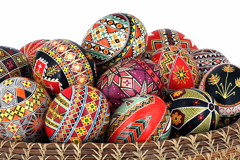
This was my first exposure to the ancient art of pysanka. Although this technique of wax-resist egg decorating is most closely associated with Ukrainian culture, the practice is widespread across many Eastern European countries. The word pysanka derives from the Ukrainian “pysaty,” which means “to write,” and refers specifically to eggs decorated with the written wax method (our primitive crayon and dye versions would be closer to the Ukrainian krashanky—boiled eggs dyed a single colour to be blessed and eaten at Easter). The purely decorative pysanky hold a place of importance in Ukrainian culture that can be difficult to overstate. When the Ukrainian-settled town of Vegreville, Alberta, sought a symbol to celebrate its heritage, they built a 31-foot-long, three-and-a-half-story tall, two-ton sculpture of an intricately decorated Easter egg.

But how did egg decorating come to play such an important role in Ukrainian culture? Archaeological evidence suggests that eggs decorated with sun symbols were part of pre-Christian sun god worship, revered as symbols of the renewal of spring. As the Christian faith began to take hold in these regions, eggs were repurposed as symbol of the resurrection and soon came to play an important role in Ukrainian Easter rituals. By the 15th century, this practice had become widespread, as evidenced by an intact pysanka from this era found in Lviv. The tradition was passed down from mother to daughter through the generations into the early 20th century. As emigrants sought new opportunities in North and South America, they brought the tradition with them, keeping it alive even as Soviet authorities were banning it in the motherland as a forbidden religious observance.

Traditionally, the women of a family would make pysanky in the last week of Lent. They would heat a vat of beeswax on a stove to the melting point, then dip a stylus with a conical reservoir into it. Dyes would be prepared in a variety of colours from traditional plant- and animal-based formulas, including extracts from dried plants, roots, bark, berries and insects. Working from lightest to darkest dyes, they would apply wax to the eggshell between colours to keep the covered section protected, building up the complexity of their designs layer by layer. Although the image most commonly conjured up by the thought of a Ukrainian Easter egg is of a complex geometric pattern, the variety of designs and approaches is vast and laden with symbolic meaning that changes from region to region. The most popular include nested geometric patterns, waves, spirals, farm implements, and animal and plant motifs, as well as Christian symbols.

Pysanky are crafted today in much the same way they always were, though they are frequently created for artistic rather than religious purposes. The only equipment required for creating your own pysanka are raw eggs for a canvas, a needle (or specialized egg blower if you’re feeling fancy) to remove the innards of the egg, dyes in a variety of colours, beeswax for melting and machined brass styluses (known as kistka, psychok, psyak or pysal’tse, depending on region) for applying the wax to the egg in a variety of thicknesses. Unlike standard vinegar-soluble Easter egg dyes, Ukrainian eggs require specialized water-soluable dyes, and you’ll want to get at least the six basic colours—yellow, orange, light blue, light green, bright red and black. Once you get the basics down, you’ll be amazed at how quickly you can come up with heirloom-quality eggs that you’ll want to keep around long after Easter.

If you've enjoyed this content, please subscribe to our quarterly print magazine.

my top three tips for the perfect pitch

Last week I was interviewed by writer Christine Chitnis for her forthcoming online course, Pitch Perfect. Available through Squam Art Workshops, this 4-week course will give you the foundation for creating professional pitches. Whether you're a writer or an artist or artisan trying to get your work published, it's an informative and worthwhile course. 

I receive pitches daily, so I've seen my fair share of great and not-so-great pitches. Here are my tips on creating a solid pitch.

please note: If you've never communicated personally with me before and are pitching an idea to UPPERCASE, it is very important to follow the instructions posted on the submissions page. First off, it tells me that you have done some research by reading the website and secondly—and importantly!—it shows me that you can follow and respect direction... Definitely something I take into consideration when commissioning someone to create content or an illustration.
 

1. know the magazine

Know our audience, the tone of our writing and be familiar with past issues as to not pitch a topic close to something we have recently covered. From my perspective, if a person wants to be in the pages of UPPERCASE, they will have made the effort to read past issues and (bonus!) already be a subscriber.


2. understand what makes a good article

Communicate the story of an artist or how they fit into the UPPERCASE ethos rather than just showing a sample from a portfolio.


3. pitch something original

If someone has been amply covered in big magazines, then they're generally not a good fit for UPPERCASE. We naturally shy away from celebrity and fame, that's just not what UPPERCASE is about. Strangely, I have received submissions where the author introduces the pitch saying they read about so-and-so on such-and-such blog or magazine and would like the opportunity to write something for us. Why would we want to do something that has already been done?


Bonus tip for illustrators and photographers: include examples of your work in your pitch! I'm perplexed when I receive emails from illustrators who send generic messages saying they would like to work with me, but have just sent a text-based message and ask me to click over to their website to see. It is so easy to attach an image and makes a much better—and quick—impression. You may have only just sent one pitch out that day, but the editor receiving yours has likely seen dozens. Our submission form allows you to upload examples, so it is easy to select your best jpg and upload it. Oh, and never send unsolicited files via a file transfer service like Hightail—that's the equivalent of trying to force your way into someone's home uninvited. 
 

Be patient once you've sent in your pitch or portfolio. Definitely don't email an editor a few days later asking, "Did you get my submission?"

I spend a time every few weeks combing through all the submissions. Ideas submitted months earlier might start to fit into emerging content themes. It definitely will take a while before you hear from me, but know that I have received your idea and am giving it careful consideration. I appreciate that you are entrusting not only your ideas with me, but often your hopes and dreams of getting published.

soulful shooting with Alessandra Cave


photo by Alessandra Cave 

post by Cara Howlett 

Alessandra Cave is a professional photographer from San Francisco, California whose photographs have been featured in Issues 19 & 20 of UPPERCASE. Her photos radiate life using natural light and soft texturing. 

Alessandra recently released her first book entitled Shooting with Soul. A “how-to” book of sorts, Alessandra guides new (and experienced) photographers through 44 photography exercises encouraging them to learn the skill of photography, as well as learning more about themselves. 

“As you embark on this journey to shoot images with soul, you should dive into this adventure knowing that your camera is not what matters most when it comes to creating images that you and others will love,” writes Alessandra in the book’s introduction. 

“The real magic comes from your heart and how you see the world in your own unique way.”

Shooting with Soul guides its readers through photography exercises like taking photos of family traditions, taking a nature walk and capturing the surroundings, and bringing their camera to work to see their work environment through a curious lens. 

In each exercise, Alessandra includes photos to illustrate the assignment, as well as instructions on how to achieve the best photos possible.

One of my favourite exercises is Exercise 7: What is in your bag?

"From the most obvious to the most unexpected, each thing we carry holds a story, an idea, and a feeling," writes Alessandra. 

I love that Alessandra is really encouraging readers and participants of Shooting with Soul to capture unique traits about themselves. No two people carry around the exact same items in their purse, backpack or wallet. What do those contents say about you and your life? 

Here are the contents of my bag. 

photo by Cara Howlett

These are the items that are always with me, whether I am at work or out and about, these possessions always come along for the ride. 

As you make your way through Shooting with Soul, your photography skills will improve as well as, Alessandra says, “find a window into your soul.” Her exercises encourage you to slow down, take a look around, and capture what means the most to you. 

photo by Alessandra Cave

shine bright


post by Cara Howlett

Jan Avellana is a mixed-media and digital artist from Honolulu, Hawaii. Her beautiful pattern was chosen for the cover of the Surface Pattern Design Guide, as well as two other designs being showcased in the guide. 

Jan has a Kickstarter project called “Shine Bright,” in which she hopes to raise $7,500 for a year-long project that will enable her to build a substantial body of new work. 

“Shine Bright” will be a collection of mixed media collages, digital illustrations and paper mache dolls inspired by Jan’s dream to light up the darkness with her artwork. 

For more info on Jan’s Kickstarter project which ends on April 4, click here. 

pitch perfect

I am still going through the long list of submissions I received during UPPERCASE's open pitch. I received 82 submissions from folks around the globe hoping to be featured in the pages of UPPERCASE or to write, photograph or illustrate for the magazine. Some submitters simply wanted me to see an image that related to one of the topics I was accepting pitches for; others sent in-depth explanations with great detail. I have to say that the most arresting pitches had one or two stunning images, a brief paragraph of explanation, some evidence of the author's basis of research or their access to experts, and—this is the key—their pitch left me wanting to find out more. As the editor of the magazine, if I am intrigued by the story, I am more inclined to commission the article. After all, an article is an investment of valuable resources as well as my time to oversee it.

A few more tips when sending UPPERCASE a pitch:

1. familiarity with the magazine—know our audience, the tone of our writing and be familiar with past issues as to not pitch a topic close to something we have recently covered. From my perspective, if a person wants to be in the pages of UPPERCASE, they will have made the effort to read past issues and (bonus!) already be a subscriber.

2. understanding of what makes a good article—communicate the story of an artist or how they fit into the UPPERCASE ethos rather than just showing a sample from a portfolio.

3. pitch something original. If someone has been amply covered in big magazines, then they're generally not a good fit for UPPERCASE. We naturally shy away from celebrity and fame, that's just not what UPPERCASE is about. Strangely, I have received submissions where the author introduces the pitch saying they read about so-and-so on such-and-such blog or magazine and would like the opportunity to write something for us. Why would we want to do something that has already been done?


If you are looking for more good advice on how to pitch ideas to publications, UPPERCASE contributor Christine Chitnis has the e-course for you: Pitch Perfect. Available through Squam Art Workshops, this 4-week course will give you the foundation for creating professional pitches. Whether you're a writer or an artist or artisan trying to get your work published, this looks to be an informative and worthwhile course.

Christina Crook TedX talk

Christina Crook's guest blog posts for UPPERCASE, along with her sabbatical from the Internet, inspired her recent TedX talk. 

Letting go of Technology: Pursuing a People Focused Future

In the spirit of ideas worth spreading, TEDx is a program of local, self-organized events that bring people together to share a TED-like experience. At a TEDx event, TEDTalks video and live speakers combine to spark deep discussion and connection in a small group. These local, self-organized events are branded TEDx, where x = independently organized TED event. The TED Conference provides general guidance for the TEDx program, but individual TEDx events are self-organized.* (*Subject to certain rules and regulations)

Christina Crook, off-line exploring, spent 31 days typewriting letters to a friend rather than turning to the internet for distraction, entertainment and affirmation. Her Letters from a Luddite project garnered national media attention and her book Digital Detox: Rethinking Our Lives Online, is forthcoming from New Society Publishers (Fall 2014.) Crook's poetry, essays and interviews on art, culture, technology and religion have appeared in UPPERCASE, CBC.ca, Vancouver Magazine, Today's Parent and the Literary Review of Canada.

thanks for the thanks

Sass Cocker and Diesel

Our current issue features an extensive Stationery Guide with 50 profiled stationers and paper goods companies. Australian company Ask Alice is included and proprietor Sass Cocker emailed this fun image in thanks:

"Congratulations on another freakin' A-M-A-Z-I-N-G issue of UPPERCASE. I can't thank you enough for featuring Ask Alice... not once, but twice! It's a real honour for me. My cute Mum was teary eyed when I showed her and has since purchased several copies!"

Looks like her dog Diesel was a little too enthusiastic with the paper flag! (But we love to devour paper products, too. Like this lovely blank notebook with multiple found and upcycled paper stocks.)​

Thanks, Sass!​

fans all around

​The cover of the latest issue of Covet Garden was illustrated by Work/Life 3 participant and regular UPPERCASE contributor Alanna Cavanagh. Covet Garden is interested in spaces that have not been styled by interior decorators and that reflect the passions and interests of those who live in them. In a happy coincidence, Michelle, one of Covet Garden's participants, happens to be a fan of issue #16

more hat theft

Issue #14 cover artist Jon Klassen was awarded the 2013 Caldecott Medal for This Is Not My Hat a book he wrote and illustrated. 

From Caldecott's press release:

In this darkly humorous tale, a tiny fish knows it’s wrong to steal a hat. It fits him just right. But the big fish wants his hat back. Klassen’s controlled palette, opposing narratives and subtle cues compel readers to follow the fish and imagine the consequence.
“With minute changes in eyes and the slightest displacement of seagrass, Klassen’s masterful illustrations tell the story the narrator doesn’t know,” Caldecott Chair Sandra Imdieke said.

Congratulations Jon!

calling all iowans

There is an upcoming gathering for the creative and curious in Iowa City. New stockist, Home Ec. Workshop is hosting a party on January 25 to celebrate the local connections of an article in issue #16. The piece explores the work of Sonya Darrow who draws upon her Czech heritage and local goodwill as a source for her folkloric creations. The profile was written by Linzee Kull McCray, photographed by Heather Atkinson with make-up services provided by Tonya Kehoe-Anderson. 

London: open studios at Cockpit Arts

Francisca Prieto emailed to let us know about her new work and open house at her studio in Cockpit Yard, London, November 30 – December 2 . I had the pleasure of meeting Francisca earlier this year on my trip to the London Book fair and Meet and Greet at Ray Stitch. Stay tuned for a post about Francisca coming up later today.

For details about the open house visit the Cockpit Arts website—it's a great site, nicely designed with plenty of information and links to discover.

meet our guest photographer Yvonne Rock

yvonne's puppy, ten ten, and her boyfriend akira

ten ten, a sleepy and cute boston terrier

yvonne makes simple coffee with friends into something beautiful

an example of Yvonne's wedding photography

capturing the details with selective focus

I am happy to introduce you to the photography of Yvonne Rock, our guest photographer who is covering the Unique NYC craft event this weekend.

"i am a new photographer based in washington dc (available worldwide) specializing in portrait and lifestyle and slowly branching out into weddings. i also happen to be bilingual- japanese/english. i love coffee (lately i've been covering a single cafe in each city i visit), 60's makeup, discovering special hidden fashion magazines, traveling and simple clean design. and instagram (username: yyyvonne)! i live in dc with my boyfriend, akira, and our boston terrier, ten ten (she only understands japanese).

byline: Carolyn Fraser

When it comes to UPPERCASE magazine contributors, the quality of writing by Melbourne-based letterpress printer Carolyn Fraser is always top-notch.

CAROLYN FRASER

As an editor, I look forward to Carolyn's articles because I know that they will be informative, but also contain beautiful writing. I am happy to see that Carolyn is contributing to the Etsy blog with an article about The Nicholas Building:

"For many, the Nicholas Building is the last stronghold of an artistic culture that thrived in downtown Melbourne in the late eighties and early nineties, before cafés opened and the old warehouses and office buildings were converted into luxury apartments. Designed by Harry Norris and constructed in 1926, the once grand building has steadily declined from its early days as a model commercial office building to the scruffy decrepitude it’s in today. The toilets often don’t work. Piles of tiles lie smashed at the base of the walls from which they’ve fallen. Crazy nests of telephone and electrical wires sprout from the ceiling. But rather than recognise these hazards for what they most probably are – evidence of a possible death trap – Nicholas Building tenants hold onto these signs as a guarantee of their continued tenancy."

Look for an article about tintypes written by Carolyn Fraser in issue #16 and enjoy our back issues, each with a gem of writing by Carolyn. Fingerprints, kiss impressions in letterpress, fancy dress, Cash's labels to amateur chemistry and typographic specimens... Carolyn has covered a lot of creative territory over the years!