Fresh: Joan Garcia

Whether you are a fresh graduate or mature artist, it is often a dream to be published for the first time! In the current (and future) issues of UPPERCASE, I have a new column dedicated to featuring such talents.

In issue 35, we meet Joan Garcia, a recently retired public school teacher who would like to become a professional illustrator.

“I have been drawing and painting all of my life and I would like to make this dream of growing as an artist and creating and selling my work a reality. My background has been as an educator of young children with an emphasis on children’s literature. Children’s storybooks and illustrations have always been such a strong part of my life. I feel my work reflects a love of stories and a strong love of colour. My dream clients would be people who appreciate a story told through art and my dream would be to illustrate a book.”

The acrylic painting of the white haired woman is my great aunt Antonia from Spain. The layers of this piece include dressmakers’ pattern tissue, sculpting medium used with stencils and hand-painted coloured tissue paper, giving the impression of Spanish tile in the background. 

The girl with the bow is my grandmother Nina as a young girl. I have a photo of her in sepia and I have always loved it—especially the bow. She loved colour and was a very happy, optimistic lady.

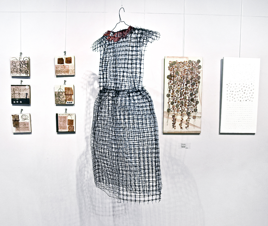
A combination of mono print and ink illustration, pieces in the Menagerie collection are created with archival inks from handcut stamps and detailed with pen and ink.  Image sizes are approximately 3x5 inches.

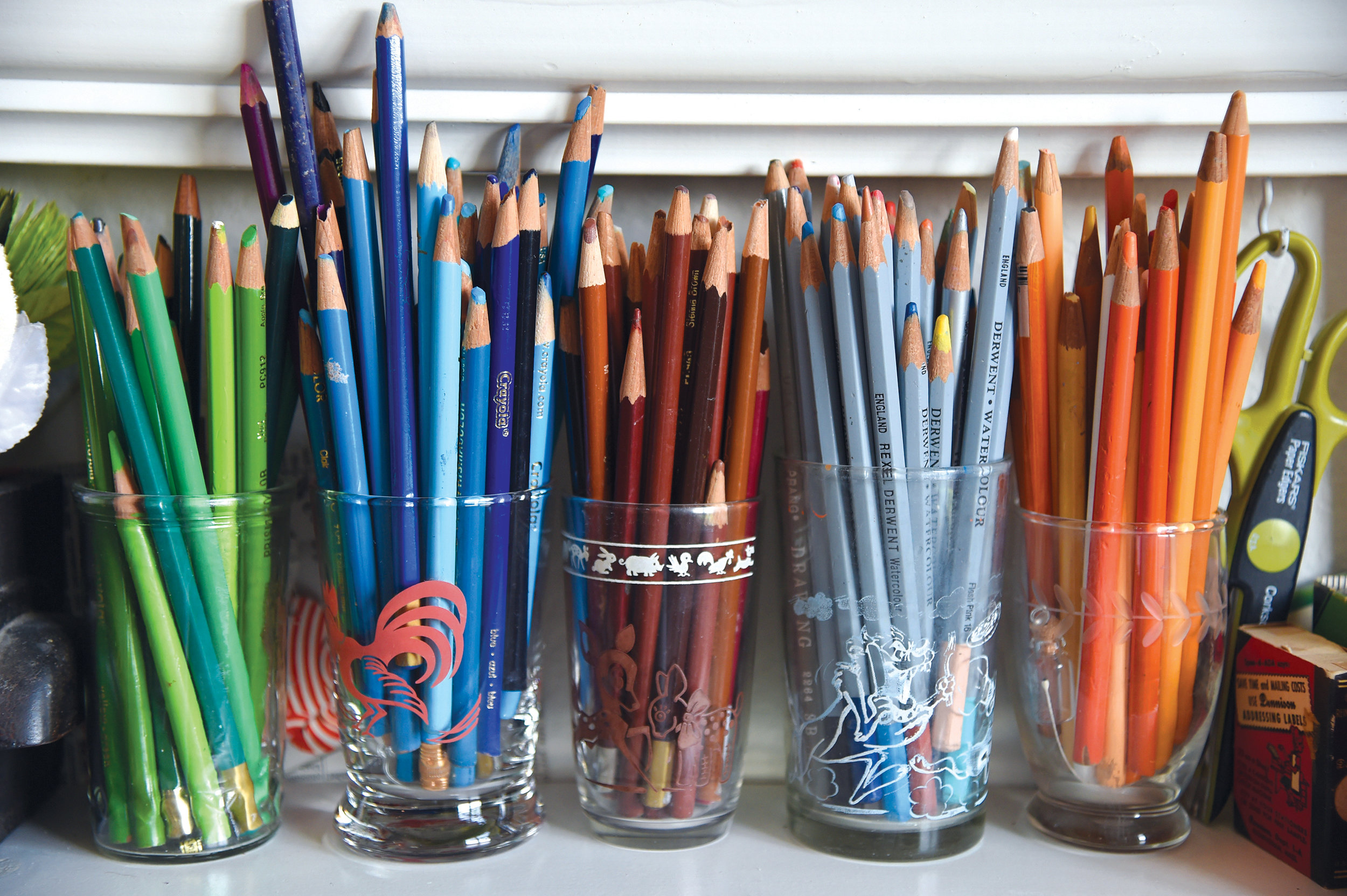
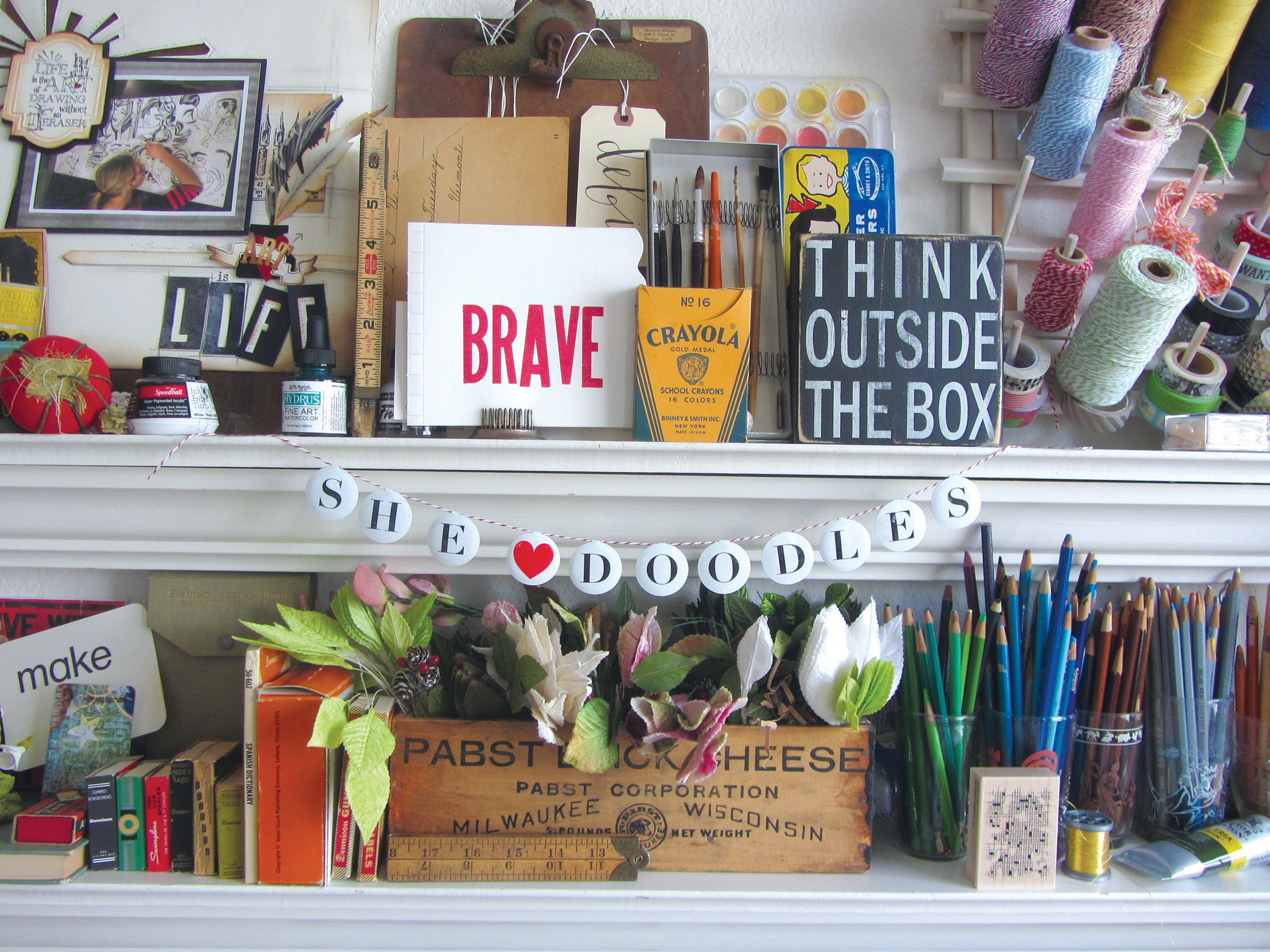
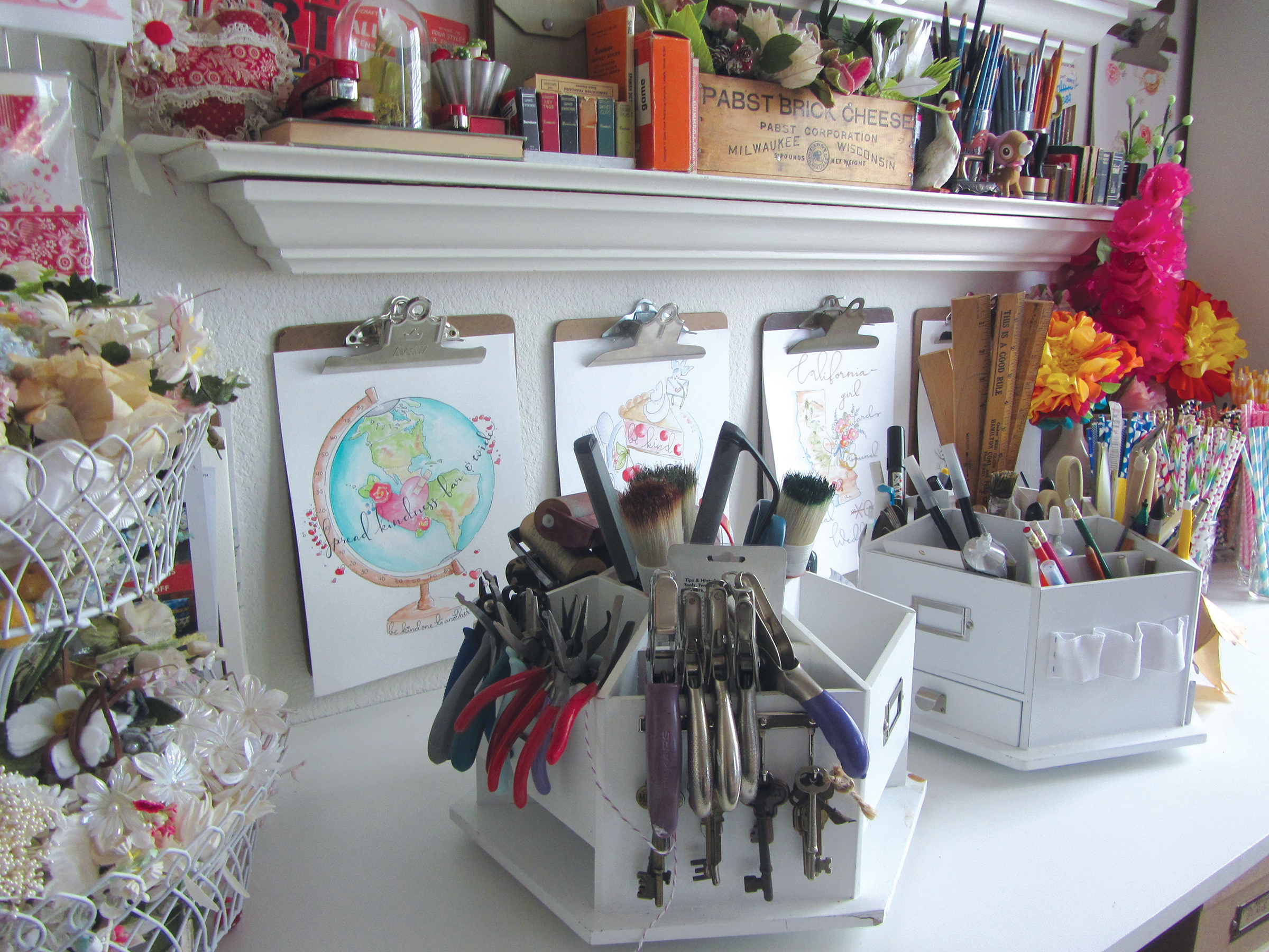
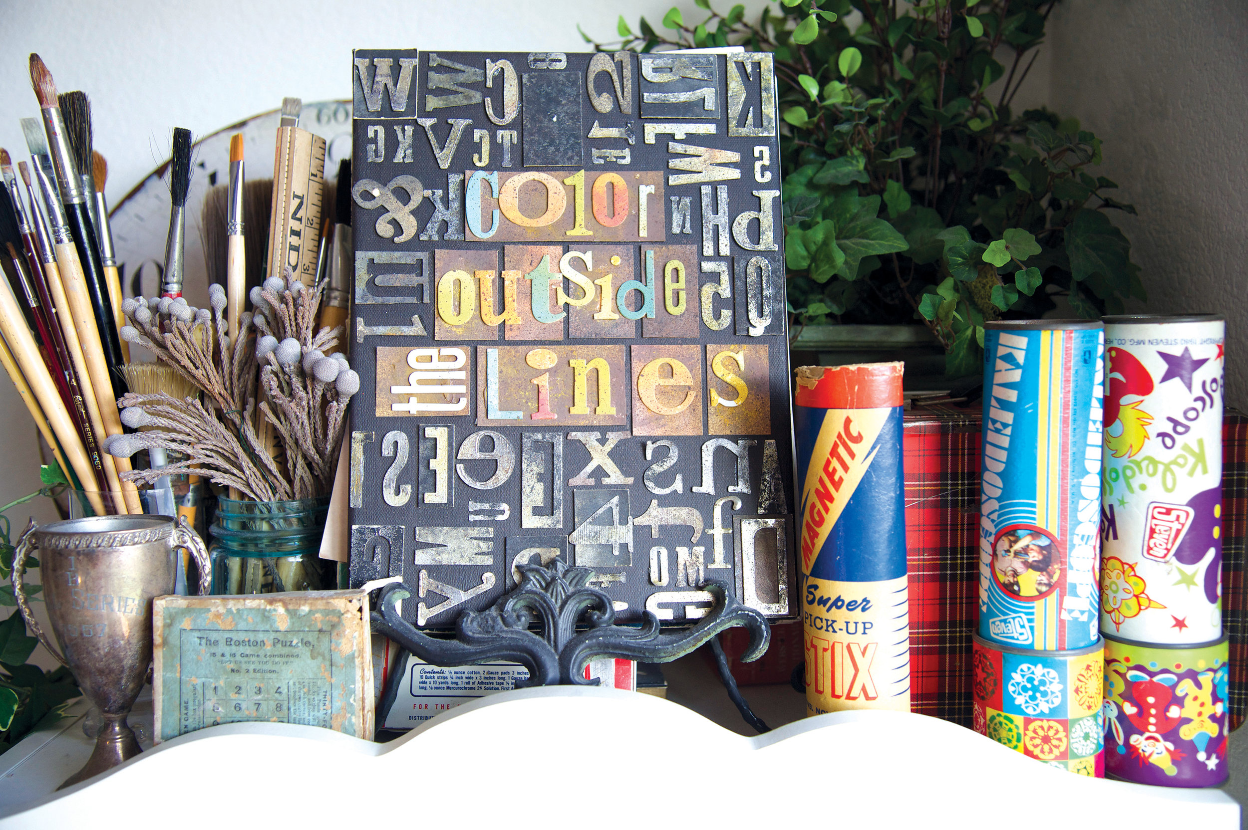
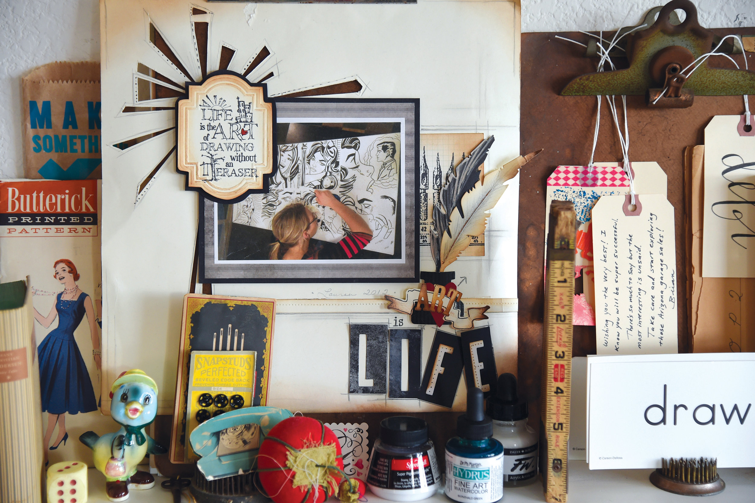
I always work in my journal while my paint dries on my canvas. It keeps the flow going!

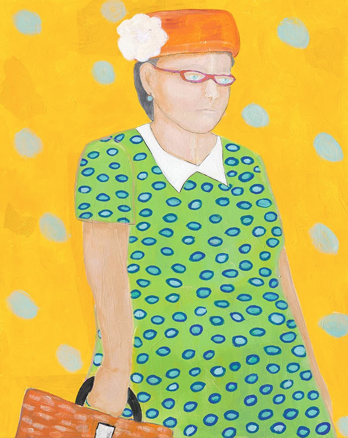
Paola 58 is part of my "influential women" series.

See more from Joan on her website and Instagram. Do you dream of being featured in print? Apply here.

For Courtney Beyer, a trip overseas led to a whole new career path

Here's an inspiring story from an UPPERCASE reader. It would have been a good fit to the content of the summer issue #34's Explore issue, but I had already finished that issue when I heard from Courtney. She writes, "I went to Granada, Spain for an Islamic Art workshop that I signed up for on a whim. It changed my life and now I am a pattern designer."

"Last September traveled to southern Spain and Morocco to celebrate my 30th birthday and take in as much Islamic pattern tile as possible. At the time I was a web designer in Silicon Valley and feeling like I was going to more meetings then designing. Before the trip I came across a workshop in Granada, Spain called the Art of Islamic Pattern, a 5-day workshop to learn to draw Islamic patterns and visit the Alhambra." The dates of the workshop lined up with her itinerary and she signed up. "I am usually not this spontaneous," she admits. 

But this leap of faith turned out to be life-changing. "I reconnected and re-valued the craft of drawing and pattern making," she says. "I also connected with other artist on the trip who were mostly Arab in background either from England or the Middle East. I learned so much from them, about history—and about how much is actually not taught in school."

"The trip set me on a path to quitting my job." Inspired to start creating with her hands again, she decided to specialize in block prints and surface pattern designs through her company Courtney Beyer Design that she founded in January of this year. "I sell hand-printed cards, journals and tea towels on my Etsy shop and I am working on a pattern line."

Courtney says that one of her instructors taught the class a prayer that she now recites to herself before taking on a creative assignment or project:

May we all be guided by truth
May we have beauty revealed to us
and may it result in the good 

There's more to Courtney's story and art over on her website.

A story of UPPERCASE connections

Kim Fox

One of the fun challenges when putting together an issue of UPPERCASE is curating the various artists and topics that will appear within its pages. I usually have a few themes to help focus my attention when assigning articles to my contributors or when inviting artists to be profiled. Sometimes, the thread of connection between one article to the next is obvious, other times a bit more obscure. At least to me, all articles within an issue are related in one way or another. Once an issue is edited, designed and printed, it is out of my hands and into the world where I hope it will inspire readers and help them make their own creative connections.

How and why an issue might affect an individual reader's life isn't something I can typically know. That's why I was so happy to receive a message from Kim Fox, an artist from Pittsburgh. She wrote in to share "a little story about how your magazine changed my life." I first discovered Kim's work at Porridge Papers in Lincoln, Nebraska, where author Linzee Kull McCray and I were researching our Feed Sacks book. I just love Kim's upcycling of vintage tins combined with quilting motifs, so I followed her on Instagram right away.

Kim has been working with tin as a material for 5 years or so. Through her company Worker Bird, she straddles "the border between wanting to create fine art and making products for wholesale and retail."

"A couple of years ago I fell in love with traditional quilting and the array of patterns and the stories behind them. I started "tin quilting" on salvaged wood and my work took off in a new direction. I began thinking about wanting to put together a gallery exhibit of contemporary quilters with a mix of traditional fabric quilters and makers using other materials. I had in mind a fabric quilter and myself but it felt like something was missing—that a third component would really tie it together but I didn't know what that was." Lo and behold, issue 30 arrived in her mail and Kim read Linzee's article about cover artist Laura Petrovich-Cheney, who makes wooden quilts using salvaged wood (the cover art features debris from Hurricane Sandy.)

Issue 30 cover by Laura Petrovich-Cheney

"I fell in love with her work immediately and knew that she was my missing link. But I'm new to this world and she's so established and wonderful so I didn't really know what to do with this new love." Kim kept Laura in mind for months until one day last October "I just thought OK—it never hurts to ask so just reach out to her!"

In fact, the cover for issue 30 was Laura's first major article and magazine cover. Laura decided to forego the usual fee that I pay my cover artists; instead she received that value in actual copies of the magazine. Laura smartly leveraged the magazine feature to send it to potential galleries and to gain interest in exhibitions of her work. When Linzee and I were in Lincoln, we toured the International Quilt Study Center & Museum and photographed a portion of their feed sack archives. I brought a copy of issue 30 to give to the museum's curator—which was the museum's first introduction to Laura's work. I am thrilled to report that Laura will have a solo exhibition at the International Quilt Study Center & Museum in 2018.

Laura Petrovich-Cheney

Back to our story... Laura returned Kim's email that day, excited by Kim's work and ideas. "She had been thinking along the very same lines about a similar exhibit," recalls Kim. "We began corresponding and chatted on the phone and decided to proceed together toward the same goal. We met in NYC in January for a coffee and then walked over to the gallery in Brooklyn where she had some work on show. The gallery, A.I.R., is a womens' co-operative gallery founded in 1972 to further the work of women artists and Laura is a working member of the gallery which affords her a solo show every 3 years. She proceeded to suggest that we do our quilting show at the same gallery this fall when she was slated for a solo show." 

The pair began to look for other non-traditional quilters. "We traded Instagram pictures of great work we found and also began forming our thoughts about the work that we're doing—issues of 'women's work' and 'men's work' along with the use of recycled materials and the environment."

Now a year later, their exhibition Beyond the Bed Covers featuring Kim Fox, Laura Petrovich-Cheney, Rachel Farmer, Ariel Jackson, Luke Haynes, Carolina Meyer, Faith Ringgold and Jessica Skultety opens on October 12 in Brooklyn. (Incidentally, Luke Haynes was profiled in issue 16 in 2013.)

Luke Haynes

Ariel Jackson

And there's more good news! "I have since been asked to include work in an exhibit in Providence, Rhode Island," says Kim "and have been approached by a gallery in Morgantown, West Virginia for an exhibit in 2018. I owe this new direction to you and your magazine!!!!"

Kim Fox

Although I'm certain that Kim and Laura would have eventually discovered each other, I'm thrilled that their connection was made through the printed magazine! It is a proud moment for me to know that such a ripple effect of positive experiences came about because of UPPERCASE.

Mrs. Williams: an homage to a homemaker

The "Ready for Dinner" Housedress

Artists Melanie Thompson and Judith Barnett have created a stunning installation in praise of women's work. "We are the makers of every item in the show," says Melanie. Melanie is a basket maker and mixed media artist. "Judith," describes Melanie, "is an accomplished seamstress with no formal art background but boundless enthusiasm."

Installation view.

Triptych by Melanie Thompson

"The installation of a 1950s kitchen was inspired by an old wooden recipe box given to Judith by her 93-year-old neighbour Mrs. Williams. The box held a lifetime's recipes, all beautifully scripted in pen and ink. The idea that this box represented the lifetime of one woman's work seemed too great not to acknowledge in art. The strong emotional and nostalgic feelings it provoked felt like a call to make a body of work that referenced the era of the homemaker in the 1950s-honouring women’s work."

The "Everyday" Housedress

Installation view.

"We have made a wide variety of art pieces evoking the homemaker style of the 50s," describes Melanie. "The iconic apron and house dress have been rendered in knitted copper wire, pattern paper, tea stained canvas covered with written recipes, cotton embroidered and dyed with onion skins, image transfer on painted organza, recipe pages, black garden netting and pieced material remnants. There are mixed media wall pieces using stitching, buttons, collage, embroidery, and acrylic paint. Mixing bowl sets made with looping copper wire, handmade paper, and chicken wire as well as stitched samplers on baking trays and a cutlery box with utensils from the era. We have stitched and repaired clothing, small wire houses, recipe books deconstructed, handmade books, a set of pot holders and a tea cozy made from used tea bags and so many more items too numerous to describe. It needs to be seen to be fully appreciated."

Apron made from chicken wire.

The work is on view at the Artcraft Showcase Gallery on Salt Spring Island, British Columbia until
July 5, 2017.

Editor's note: Below these paper dresses, the third card from the left is from the UPPERCASE book Feed Sacks: The Colourful History of a Frugal Fabric by Linzee Kull McCray.

LanaBetty: Leaving the Corporate Life

Photos of Lana Lepper by Jeanie Ow of Stu-di-o by Jeanie.
"I didn't know a photograph could make me feel so happy or beautiful until I saw her work," says Lana.

Lana Lepper designs and makes contemporary geometry-inspired jewellery. “I love my craft fiercely and passionately,” she says. “It’s unparalleled to any other task or job I've ever performed.” She lives in Vancouver with her husband and dog. “We live in a small (but not too small) apartment overlooking the city of Vancouver.” She has a bachelor of science in biology and enjoys snowboarding. (“And I'm cocky about how good I am,” she admits.)

Nearly two years ago, Lana was laid off from a corporate job. “I was devastated. I sobbed and sobbed and sobbed, worrying about how I would pay my mortgage or how I would share my perceived failure with my husband and friends.” She felt like she had failed, that she wasn’t good enough. For the job, for anything. “What if I never worked again? Would my husband still love me? Think of all the nasty terrible fears you have deep down inside you about your performance or job expectations—those fears hit me like a wall and nearly drowned me in their miasma.”

Fortunately, Lana’s husband showed his support. “He told me that we would adjust. Find our centre and continue to achieve our goals. He said he trusted me. He believes in me.” Her friends rallied around her as well as she tried to find new footing.

For years she had been living a double life, one in the corporate world, the other as a jewellery designer LanaBetty in the off hours. With a holiday season fast approaching, Lana and her husband decided she should give the holiday markets her absolute best effort. “I decided that I would attack the markets with ferocity and passion. I would get angry about my job loss and funnel that energy into design, production and sales. I would fix up my website. I would set targets and hit them.” The backup plan? “If it all tanked, I would put LanaBetty on hold and look for another corporate job.”

Lana’s primary goal, though, was to be happy. “No more working with stress so high I couldn't sleep. No more working so hard I forgot to eat. No more pushing papers for a company that didn't care.”

“It's been almost two years now and I can honestly say I am happy. I have never worked so hard in my life. Every moment is spent on social media or in the studio. Everything I have done before this moment has prepared me for the next. I have had my jewelry featured in blogs, on models, in magazines, doubled my sales and have kicked up quite a niche market in custom jewellery.”

Lana has found that the most satisfying aspect of running her creative enterprise is that she is accountable to herself. “There has never been anything more empowering or satisfying.”

She is quick to share some hard-earned advice:

“Dive head first into your passion and let every single moment be the best moment. Be happy with who you are and content when you get into bed every night. Strive for greatness and (sometimes) be humble about it. Be proud of yourself and always, always, do what makes you happy.”

Visit LanaBetty's website and instagram

Do you find beauty in incongruity or in similitude?

I receive hundreds of submissions every year (perhaps the number even tops 1000? There are a lot of them—some from my open calls, others unsolicited). And I'm grateful for each and every one of them! I try to put as many as I can in print, but often there are more ideas than number of pages. And since the magazine is quarterly, it can take a long time for a very good submission to find its way into print.

I want to share more of these submissions—folks have put talent and effort into them and they deserve to be read and appreciated. I'm going to post more of them in my newsletters and here on the blog, and though it might not be as thematic and ordered as in context of a print magazine, there's beauty in the random surprise.

Let's start with Clare Dean, who submitted the piece below as part of the Open Pitch a couple of months ago. Clare offers us (me!) perspective on letting things be a bit more uncontrolled and organic.
 

Do you find beauty in incongruity or in similitude?

by Clare Dean


Over the past few years, in addition to being a publishing consultant and mother of small chatty boys, I have worked as an artist, illustrator and pattern designer. As my style has developed, like many others I have given a lot of thought to my point of view. Do I have one? What are my convictions? What I am trying to say? Initially, I created work that I hoped would merely ‘delight’, but it soon became obvious to me that there was a lot of ‘delightful’ work out there that pursued a similar theme. What was I trying to ‘say’, if anything at all? As a philosophical theology graduate, and the wife of a philosopher, it seems that I am attracted to thought and meaning. 

A couple of summers ago, I attended a modern dance performance/dramatic piece in Boston. The overall perspective they communicated could be reduced down to the idea that everyone and everything is the same – that we exist, and others and other things exist, and there is comfort and complicity in our similitude. I thought about it, and realized that I believe and find comfort in the opposite – that everything is various and different, and that beauty can be found in complexity. In pursuing this idea further, I realized that a common trait in my work is an almost random incongruous assemblage of things and beings. 

I delight in mismatching and juxtaposing images to partly highlight the absurdity of the assemblage of things, but also to celebrate the richness in life. Why not, for example, place a poodle on a vintage 1970’s footstool, or a parrot flapping around an antique rocking horse? To me, the combination of these items painted to highlight their beauty celebrates them as individual objects and beings, while saying ‘look how strange – we live in a world where someone shaves a poodle’s fur into funny balls, and also makes and owns a swirly patterned stool on which to rest your feet. Ultimately, the fact that I am drawn to capturing the incongruity is all the more absurd.

Visit Clare's portfolio.

Studio Tour: Debi Adams

If you'd like your studio to be featured here, in my newsletter or in the print magazine, please submit your photos here. Thanks! This is a colourful glimpse into Debi Adams' workspace. Let's hear more from her:

"I'm Debi Adams and I have been creating since about the 7th grade. Although I went to college to be a teacher, art has always been and continues to be my passion. It is also my occupation, having worked in some form of the industry for nearly 35 years. Born and raised in Southern California, with my children grown and gone, I relocated to Phoenix to work at another art-based company. Adjusting to living in an apartment (from living in a home) has had it's challenges in creating a do-able workspace. However, where there is a will there is a way and, I made this work for me. Of course, I am a MAJOR junker and bargain hunter and enjoy looking for unique items to decorate or organize my art room. Very few items have come from a store with the exception of the drawers and they will be replaced as soon as I found some vintage piece that I can't live without and will work. The pieces that embellish my space are inspirational. I love to find the story behind each one, if possible. Just recently I have begun to add my own art to my corner of the room, which is my dining room by the way. If there was one word to describe my art or my style it would be eclectic. I love it all and feel so fortunate to GET to do what I love everyday."

Graphics for a Cause

Creativity has a societal and environmental impact. The processes and materials that we use in our art, along with our creative decisions, affect the world around us.

"What advice or recommendations do you have for being a responsible creative?" This is the question I ask readers in the open call for submissions for the spring issue of UPPERCASE. (The open call closes at midnight MT today, January 16.)

Nicole LaRue of Small Made Goods replies:

"I think we ought to leave room to take on projects that we are fiercely passionate about—ones that pull at our hearts and propel us to take action."

Nicole is the designer of the logo for this Saturday's Women's March. "I’m absolutely proud to have created the official Women’s March logo," she writes on her blog. "A logo that conveys diversity and women standing together and speaking out in a united voice—a voice that calls for solidarity, demands equality and confronts injustice."

"I'm not always the most brilliant wordsmith," says Nicole, "so I can never claim to have the art of words… so instead of protesting with words, I protest with my art and with my design. And, sometimes this can be just as powerful."

Find more details about the Women's March on Washington or one of the hundreds of sister marches around the world happening this Saturday, January 21.

The march in Calgary starts at 1pm in front of the Famous 5 statue in front of Arts Commons.

Jane Lui's year-long one-take wonder

Here's a fun submission I received this week, from Jane Lui a musician in Los Angeles.

Jane writes, "Long time reader and first-time subscriber to your magazine, so glad to be onboard with your empire. I'm a musician/songwriter who likes cardboard as a medium, and have spent most of the year building miniature sets for a one-take music video that we just released. Hot air balloon, forest machine (moves), city scape for aerial shot.... I like seeing evidence of the hand; this is my approach to life in general. it hasn't made me much money, but has made me very happy."

Here's Jane's video!

In perusing her site, I also enjoyed her cover/mashup of Pharrell's "Happy" — bonus that it includes a typewriter! "I'm classically trained, but like the alphabet, you learn it then throw the rules away to make it yours. I like music, but I love sound. It's really invigorating to find musicality in things not meant for music: handmade music boxes, typewriters, service bells, jugs, suitcases, books, glassware. Some will call it a carefully crafted sound, I think it's just obsessive because I know I'm neurotic. I try to make my stuff feel lovable, enduring, and usually think too hard doing so and forget to eat lunch 3 hours ago."

National Stationery Show: Katie Leamon

The National Stationery Show and SURTEX are both coming up fast (May 17-20) and I know a lot of UPPERCASE readers will be heading to New York to show their paper goods and surface pattern designs. Alas, a trip to NYC is not in the cards for me since I've just returned from Chicago and might have to go to Toronto in early June. In between, I have to design issue 26!

Instead, I will share some of the promos that I've been receiving from UPPERCASE readers. First up, is Katie Leamon, a luxury card and stationery brand based in London. "We all love UPPERCASE magazine here in the studio," writes Georgia Fraser. 

"With a design studio in central London and a family run production studio in the heart of the English countryside, Katie achieves her illustrious style, aiming to revisit the tangible qualities lost in a lot of today’s mass production. The brand designs, creates and delivers beautiful hand finished collections of original paper products. All products are proudly made in England with incredible care and attention to detail at every stage of their journey."

Katie Leamon's product photography by Laura Hutchinson is top notch! Just the right balance of clarity for the products and a touch of styling.

If you're showing at NSS or SURTEX, please share your efforts on Instagram and Twitter using the hashtag #uppercasereader and either #NSS or #surtex. 

Calling Card: Tempest Studios

Artist Erika Schulz believes in keeping busy. "I have a few series of artworks ongoing at the moment. I don't believe in tackling one subject at a time, so I switch between spaceships and robots, medieval gargoyles, birds, nature, and fantasy/macabre illustration. I try to challenge myself to grow as an artist."

"My inspirations are as diverse as my subjects, although if you knew me well, nothing I do would seem such a stretch. I grew up in a house surrounded by Asian artwork, collected by both my mother and grandmother. Summers were spent near the ocean or a mountain lake. My father introduced me to The Lord of the Rings, and Dune at an early age, which lead me to Star Trek. Fantasy novels were always my prefered escape, and throughout my life I have been fascinated by ancient history. What a strange melting pot, but perhaps not that uncommon. Nature, fantasy, fiction, and history, what a wonderful world for creativity and imagination."

She has a busy month ahead: Her Alberta Aviary series will be on display from November 15 to December 4 at the Bluerock Gallery in Black Diamond, Alberta. (Bluerock Gallery is also a fine stockist of UPPERCASE magazine.)

Then, she'll be showcasing her work at Red Deer's "All Things Pretty Market" on November 22 and 23rd. 

Prints, cards and zines are available on her Etsy shop.

Thank you to Erika Schulz for supporting the content in UPPERCASE issue 23 by purchasing a Calling Card ad. If you'd like to have your Calling Card appear on the blog, sidebar, social media and in print, please visit our advertising for the details.