National Stationery Show: Katie Leamon

The National Stationery Show and SURTEX are both coming up fast (May 17-20) and I know a lot of UPPERCASE readers will be heading to New York to show their paper goods and surface pattern designs. Alas, a trip to NYC is not in the cards for me since I've just returned from Chicago and might have to go to Toronto in early June. In between, I have to design issue 26!

Instead, I will share some of the promos that I've been receiving from UPPERCASE readers. First up, is Katie Leamon, a luxury card and stationery brand based in London. "We all love UPPERCASE magazine here in the studio," writes Georgia Fraser. 

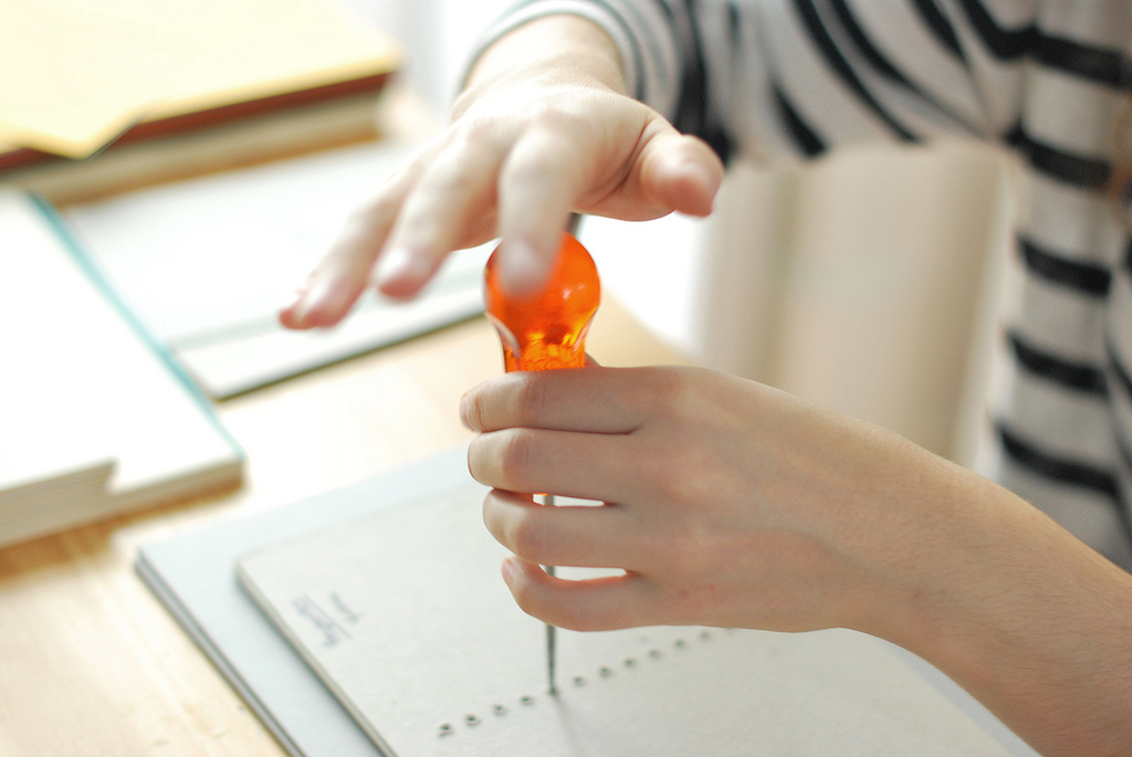
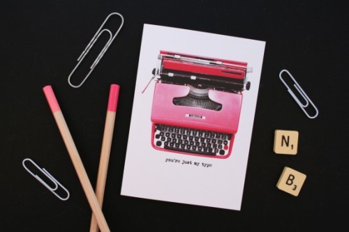
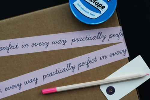
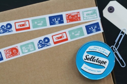
"With a design studio in central London and a family run production studio in the heart of the English countryside, Katie achieves her illustrious style, aiming to revisit the tangible qualities lost in a lot of today’s mass production. The brand designs, creates and delivers beautiful hand finished collections of original paper products. All products are proudly made in England with incredible care and attention to detail at every stage of their journey."

Katie Leamon's product photography by Laura Hutchinson is top notch! Just the right balance of clarity for the products and a touch of styling.

If you're showing at NSS or SURTEX, please share your efforts on Instagram and Twitter using the hashtag #uppercasereader and either #NSS or #surtex. 

Win a Printmaking Sampler!

The current issue features 75 talented printmakers from around the world.

Their work is diverse—from monoprints to linocuts to silkscreen to marbled paper and more... so it makes for a very informative and inspiring guide to the possibilities of printmaking.

Participants and some contributors for this issue were invited to submit samples of their work for insertion in subscriber copies of the magazine (for those who were active subscribers as of mid March).

From 10 art prints to letterpress editions of 300, the samples were sent to my studio over the course of a few weeks. I certainly made the postman work hard!

I kept a few samples (and saved a few of my favourites for myself) and consolidated the rest to send onwards to my printer for insertion. (A few other submissions arrived after I photographed these images, so not quite all of them are shown here.)

And now... the giveaway! I will be doing a draw for three Printmaking Samplers, assembled from a selection of the wonderful prints shown above. The winners will receive 40-50 prints and cards each.

1) One winner will be randomly selected from current subscribers.

2) One winner will be randomly selected from folks who became new subscribers April 26 through midnight May 1. So if you're not a subscriber yet, head on over here to purchase your subscription.  

3) Show your love of UPPERCASE magazine by posting an image of UPPERCASE magazine or books on Instagram using the hashtag #uppercaselove and one winner will be randomly selected from those submissions at the end of May 1.

Good luck!

And here's the full list of participants from the Profiles in Printmaking feature plus a few other fine folks who donated samples. Thanks for sharing your talents with us!

Planning on paper

I started off the new year with this image on Instagram and to my surprise, it is my "most-liked" photo to date!

I love paper products. Did you know that UPPERCASE started as a gallery/store and I used to sell my own greeting cards and handmade notebooks? I also sourced hard-to-find paper goods and would scour the web for interesting things to bring into my shop.

When I launched the magazine in 2009 (and then had a baby in 2010), my time and resources became very limited, so I made the decision to close my retail shop in Calgary in order to focus on the magazine. I don't regret that decision... with one exception. The miss the fun of ordering beautiful paper goods from around the world!

Lately I've been feeling a little too tethered to technology... that my brain is becoming dependent on a computer, laptop or phone. Though I could totally geek out on some productivity app (I have) or Google calendar hack to get it working just the way I want it (I tried), I decided to unplug and give analogue a go this year. Finding the perfect day planner is was no small task, though. I'm very particular about the typography and design that I have to look at day after day! I almost resorted to designing my own one-off custom planner. I used to do design a unique-to-me planner back in my freelance design days, print it double-sided on my laser printer and have a local bindery but a spiral on it. For the sake of time, though, I decided to look online.

I'm always seduced by Korean day planners. Their websites always include beautiful shots of the planners "in use" with decorations of stickers and washi tape and perfect printing that is oh so appealing. Once stumbling on this site, and after hours of comparing one journal to another, I decided on the Object Diary by Livework.

To kit up my planner, I purchased some decorative stickers and place marker stickers. I also got a sticky note checklist pad, so that I can move my list from one week to the next. There are always projects or errands that you know will likely take longer than a few days, so these I'm writing on the sticky list.

I liked that this journal has each day listed on the left hand page and that the right hand side is blank. I don't typically have lots of appointments in the day, so I don't need a lot of space there. I'm going to use stickers to call attention to big tasks (like the dot showing the day mailing data goes to the printer... tomorrow) and the flag that indicates when I want to have all the content for issue 25 assigned.

On the right hand page, I'm going to jot down larger tasks or goals for the week, as well as observations or notes about the week. If I write something down anywhere that is an actionable item that needs to get done, I'll put a little check box next to it.

The book also has a month view, where I'm using washi tape (from Omiyage) to block off time. The thin checked tape is my typewriter book final countdown to getting it done, the floral circle is the day that a new issue is released. Finally, the orange checked wash is showing my upcoming trip to Austin, Texas where I'll be a judge for QuiltCon. (Any of you going to QuiltCon? The judging happens a month before the convention, so don't be alarmed.)

It's not practical to try and keep all my to-do lists in paper form, and there are plenty of instances when digital is the only way to go. For that, I'm using Evernote for my ongoing project lists and details and I suspect that I will still employ Google for some repeating monthly tasks that could benefit from a digital reminder.

My intention with the tape, stickers and, really, the journal itself, is to take some daily time to think, plan, breathe and declutter my to do list so that I don't get feeling overwhelmed. I also want to record more of me and my thoughts in the planner... thoughts and ideas that get lost when they're dumped into the endless storage of the cloud. 

By making the experience a little bit fun (pretty stickers!) and routine, I'll see how well this new system works out.

Calling Card: The Other Alice

Alice Young remembers the first time she picked up a professional ink pen. "I was captivated. Ink is alive—flowing and liquid—with an independent will and life of its own." Though she does her daily work as a graphic designer, her after-hours passion is calligraphy. "When I'm tired of being slick and sensible," she says, "'The Other Alice' emerges."

"In my calligraphy, I strive for a high level of craftsmanship, but I am wary of the trap of perfection. Hand lettering should retain the human touch, which has a natural rhythm and imperfection."

The Other Alice's Etsy shop offers a selection of calligraphy-based artwork printed on high quality cards with white and coloured ink on premium recycled stock (Neenah Environment). 

Thank you, Alice for supporting UPPERCASE magazine through this Calling Card.

Calling Card: Blackbird Letterpress

Blackbird Letterpress is the name of Kathryn Hunter's creative and prolific letterpress company.

Kathryn Hunter started Blackbird Letterpress in Lafayette, Louisiana, in her friends' house in 2003. Blackbird began with the purchase of a Chandler and Price "Old Series" platen letterpress (circa 1904) from a long-time printer in Hammond, Louisiana. The movable type came from a printer outside of Chicago. One crisp October weekend (well, crisp in Illinois, not necessarily in Louisiana), Kathryn and her friend flew to the big midwestern city, loaded a couple tons of type and cabinets and other goodies out of a basement into a moving truck, and drove it back to Bayou Country. A collection of vintage printer's cuts came from a long-time printer in New Iberia, Louisiana (the trip was luckily much shorter that time). Blackbird Letterpress currently works out of a mural-clad building in Baton Rouge, which they share with a metalworking business and two frisky guard dogs. 

Their Etsy shop is stocked with Christmas cards, paper ornaments, perpetual calendars and handmade notebooks. Blackbird Letterpress can also be commissioned for custom letterpress projects and beautiful wedding stationery.

Thanks to Kathryn for her Calling Card. (If you'd like to be featured in a Calling Card post and have your ad in the Winter issue of UPPERCASE and on the blog sidebar, I have three spots left!)

Calling Card: Thomas-Printers

There's nothing like being up close and personal with a letterpress card; they're such beautiful, tactile objects. Kseniya Thomas is the founder of Thomas-Printers and also a co-founder of Ladies of Letterpress.

Kseniya writes on her side, "Letterpress and love are often said in the same breath. It’s easy to understand why: there are few things in life where we can be involved, from start to finish, in making a beautiful, useful product; meet committed, interesting people with each new project; and use triumphantly antique tools every day as well."

If you have some holiday card designs, you're planning a wedding or need some business stationery, Kseniya would be happy to hear from you! She has generously extended a 25% discount to UPPERCASE readers who place orders before December 31.

My thanks to Thomas-Printers for supporting UPPERCASE and its fine content by being a Calling Card advertiser. If you'd like to have your Calling Card appear on the blog, sidebar, social media and in print, they cost just $400 Canadian ($352 USD depending on the exchange rate). Select an image that best represents you, your product or service (squarish image 3 inches wide at 300dpi ), then click here to upload it and get your Calling Card ad designed by me and shared with the UPPERCASE community. You'll be supporting UPPERCASE content creation, boosting your profile, be immortalized in print and be serving the community with your creative offerings. Deadline for the winter issue is November 15.

Beautiful Books by Bari Zaki

UPPERCASE reader Bari Zaki makes these gorgeous books using traditional European and Japanese techniques. In addition to blank books, box-making, she also binds photography portfolios and photo albums.

Bari writes:

I have been a hand-bookbinder for 25 years and so your recent newsletters had a particular resonance with me. My career began with a simple yet intense curiosity; I saw a blank book that was made by hand and it sent my heart into a pitter-patter of delight… How do you do that, I wondered?!  I went in search. Since then I have made literally hundreds of books and have several stacks of them in my home, which have become permanent fixtures.

"Many people say to me that they love my books but they are too special to write in… I hear that a lot in fact. I thought about scribbling on the first page as an ode to making the first mess, so to speak." Whether they are left blank to be admired for their integral beauty of form and construction, or filled with sketches and notes, Bari's books live up to the ultimate goal of any book: to inspire.

Visit Bari's shop to see more. 

Calling Card: The Paper Flea Market

Trina Lucido is an artist and paper enthusiast. "I can't resist beautiful paper, old or new, and see potential in every piece I find," she says. "These papers find their way into my artwork which includes greeting cards, art journals, mixed media pieces and home decor." As her collection of papers and haberdashery grew, Trina decided to open up shop as The Paper Flea Market to share her finds with other paper and vintage lovers. 

She has scrapbookers' cuts of vintage wallpaper, lovely old hat labels, vintage buttons on cards (I can't resist a good old button!) and so much more... like any good flea, there's lots to discover!

The Paper Flea Market is the first official Calling Card that will appear in the fall issue of UPPERCASE. In addition to the ad appearing in lovely ink on paper in 10,000 copies of the magazine, a Calling Card ad will reside on the UPPERCASE blog sidebar for the duration of the forthcoming issue. I'll also share the ad with my Twitter followers and do a blog post, such as this one, to offer as much value as I possibly can to your $400 investment. The next issue goes to print after the Labour Day weekend, so there's still time to get your Calling Card if you get in touch soon. I look forward to sharing more Calling Card profiles here in the blog over the next weeks. Please click the Calling Cards already on the sidebar to discover more.

To make your Calling Card, choose an image that best represents you, your product or service (squarish image 3 inches wide at 300dpi ), then click here to upload it and get your Calling Card ad designed by me and shared with the UPPERCASE community. You'll be supporting UPPERCASE content creation, boosting your profile, be immortalized in print and be serving the community with your creative offerings.

Thank you to The Paper Flea Market!

Grafolita

Catarina Vaz is a Lisbon-based designer who makes beautiful notebooks. She describes her company, Grafolita, as "a small universe where paper, ink and colour rule." 100% crafted by hand, Catarina's notebooks are letterpress-printed and bound one by one. 

"Grafolita is about one person who self teaches doing what she needs in order to do what she wants: Special handmade notebooks, through traditional techniques, that are reinterpreted and used in a new design approach, in the care for finishings and materials."

photos by Rui Abreu

Polkka Jam cards and calendars

Here are some graphic and simple cards from Finland's Polkka Jam.

"Polkka Jam is the family company of Kristiina Haapalainen and Sami Vähä-Aho. Our studio is located in Kemiö, archipelago of Finland where we distribute Polkka Jam collection to dozens of boutiques across Finland and abroad. Our production is focused on the imagery that we design and create together. Our products bring beauty and joy to every day life. High-quality materials, domestic production and the timeless imagery of our designs help ensure our products stand the test of time. Our designs are inspired by nature and everyday life, and they embrace soft values. We are dedicated to our work and passionate about design and illustration."

Their shop also features some sweet totes, whimsical children's bedding and some pretty fabulous serving trays. I'm so tempted to start a collection of illustrated birch serving trays...

UPPERCASE everyday notebooks are here!

Everything looks so good together!

The pattern I designed for issue #19 is one of my favourites. It is inspired by Icelandic knitwear and mineral crystal shapes.

A set of two, warm colours.

Each set comes with a black hex pencil.

The notebooks are completed and look and feel wonderful! I was so excited I took these Instagram videos and shots as I opened up the packages. All the details came together so nicely, even the crystal clear bag that keeps everything secure is the perfect fit.

UPPERCASE everyday notebooks are available in our shop now! Just in time for holiday list-making and gift-giving.

type tuesday: typewriter valentine

card by Nancy & BettyNancy & Betty Studio is the name of the stationery company created by Hannah Bidmead. Named after her grandmother Betty and her twin sister, Hannah's studio is based in Canterbury, England. "Inspiration also comes form the simple and often quirky things, involving subjects such as typewriters and Polaroid cameras—beautiful, functional objects. We like simple graphics and strong colours, with a nod to retro themes," writes Hannah. With typewriters as graphic inspiration, deco tape and fun visual puns, Nancy & Betty is right up UPPERCASE's alley!

Perfect tapeMixed tape

Type Tuesday: Bob's Your Uncle


As a follow up to the typographic seating featured last week, Martin Yeele, cofounder with his wife Michele of the stationery company Bob's Your Uncle, sent me pictures of SIT benches designed for a recent exhibition in Boston.

Bob's Your Uncle's products are distinctly typographic and bold. How fun to design a notebook and just plaster a big A on the cover!

National Stationery Show: Carta Inc.

Carta, inc. by Angela Liguori originally from Rome, Italy, is a graphic design studio specializing in custom made stationery, invitations, hand-bound and limited edition books. The cotton ribbon line is directly imported from Italy and Carta, Inc. is the exclusive importer of this product in the USA. The paper designs and ribbons are internationally distributed to stationery shops and home boutiques. (Flip through their wholesale catalogue.) Carta is sharing a booth with Albertine Press.

National Stationery Show: May Day Studio

May Day Studio's designs are inspired by (and created from) vintage wood type and printing plates, and soft cotton paper. Owner Kelly McMahon is also introducing a new line of photo albums—the cover papers are linoleum-block printed from her original designs, and hand-bound one at a time. She is exhibiting at the show with a group of other printers under the name of The Ladies of Letterpress.