Lilla Rogers' Gorgeous Garden

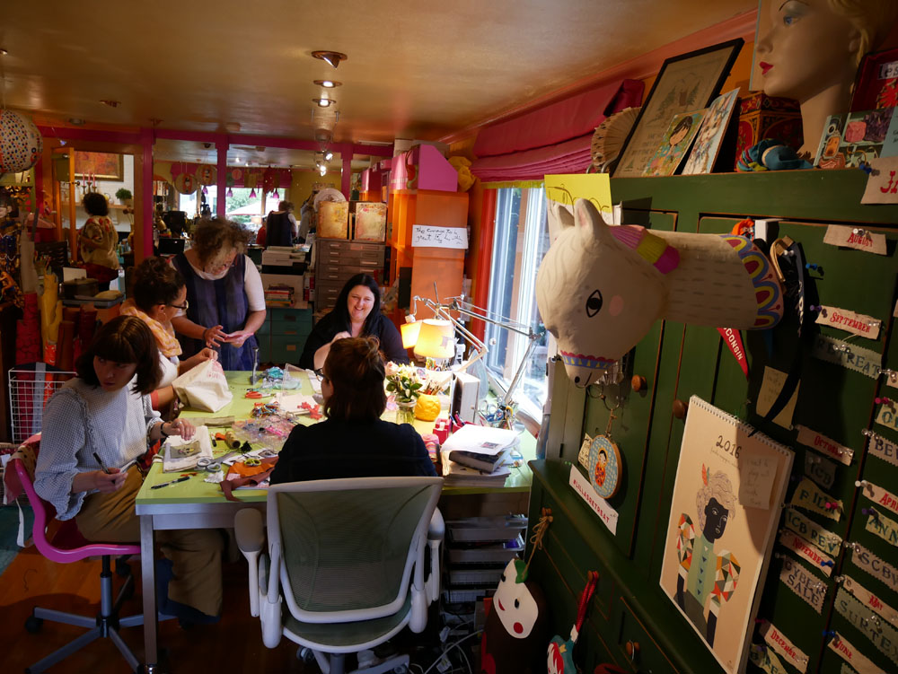
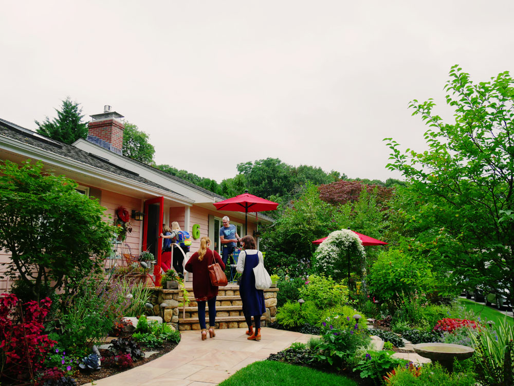
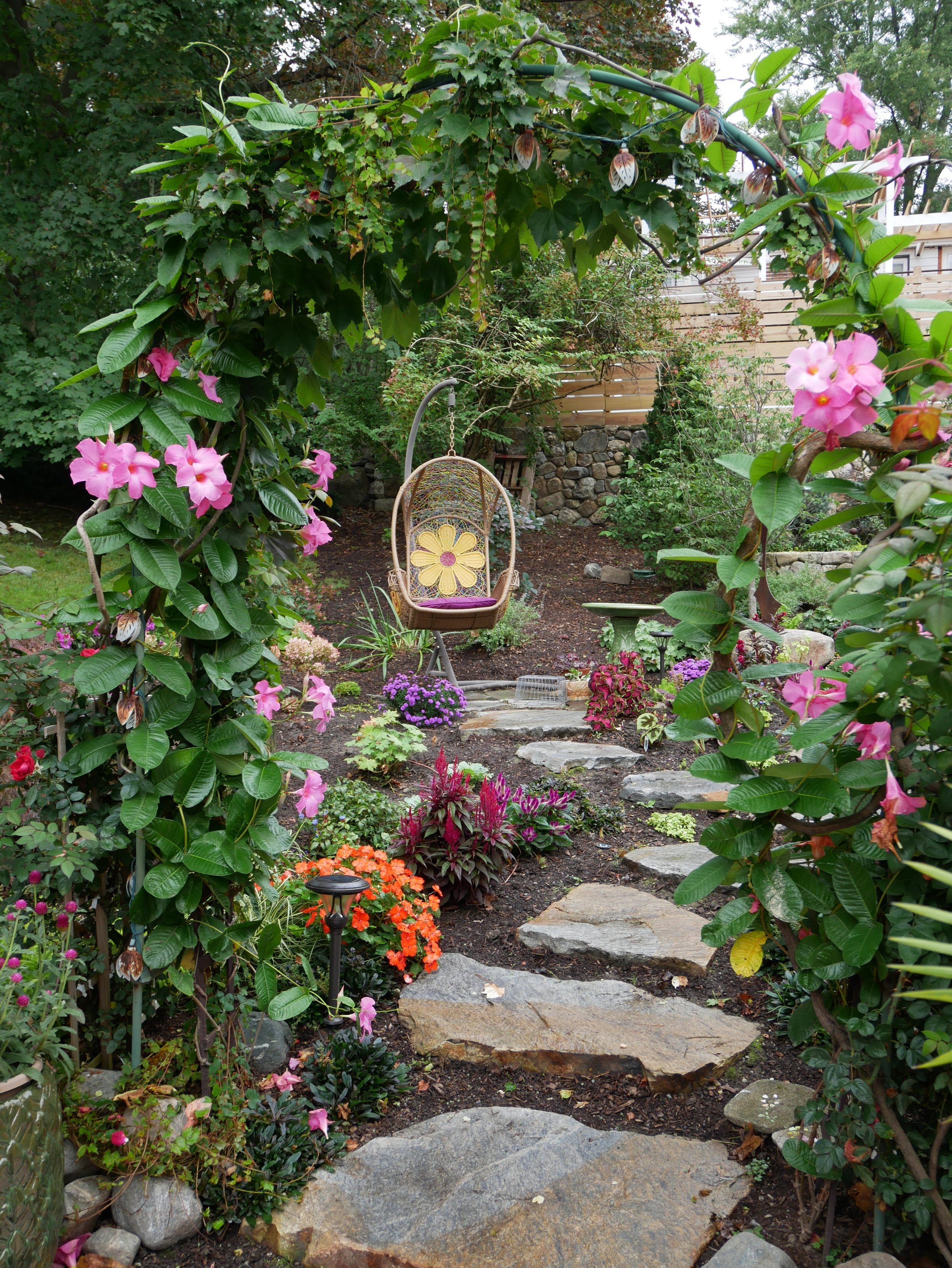
Illustration rep Lilla Rogers' home studio is inspiring (see this previous post) but her gorgeous yard is competing for attention. Full of pinks and lush greens, the yard has many places to sit, ponder and sketch, linked together with meandering paths and changes of elevation.

Lilla worked with Susan Redmond of Redmond Design Group on this backyard design project, that was completed earlier this year. "We had redone the front yard the previous year," says Lilla. She so enjoyed the process and collaboration with Susan, that this year they redid the back.

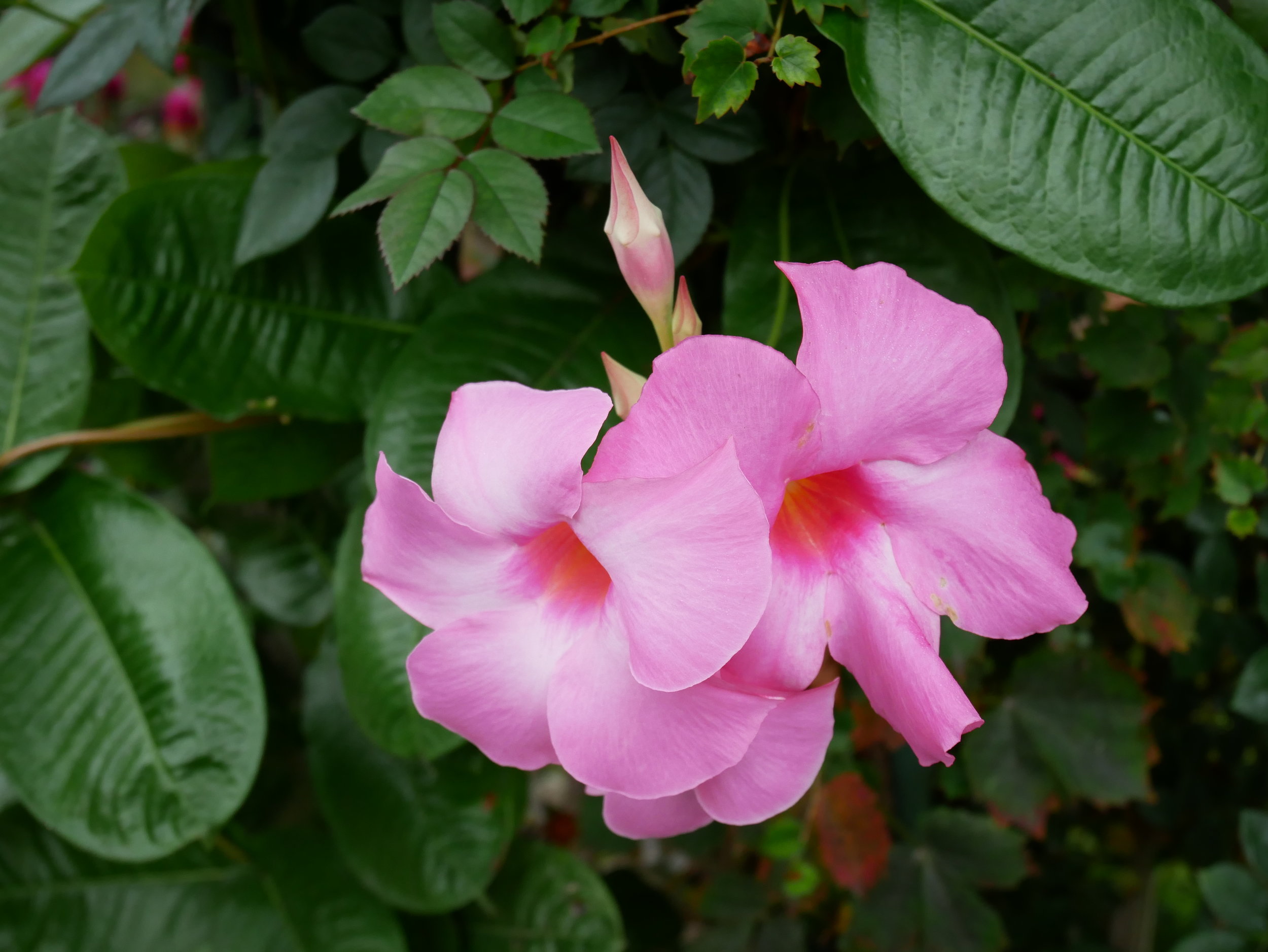
"We worked on the design together. It all started innocently enough," Lilla explains. "I simply wanted a fenced area to keep out the groundhogs, rabbits and chipmunks from my cutting beds and vegetables. Ha ha ha," she laughs. "Then project creep happened, happily." She added three garden arches "smothered in mandevilla and climbing red roses" along with lots of bird houses, a bird bath, many paths and an egg swing—"which is great for meditation."

Walking up the path leads to a very cute potting shed, that Lilla uses for writing—and perhaps as a retreat and studio for visiting guest artists someday.

A fenced area keeps critters out of her cutting garden; its symmetry offers a nice geometric contrast to the rest of the yard.

With decorations by both Lilla and her artists, the yard is punctuated by personality and colour.

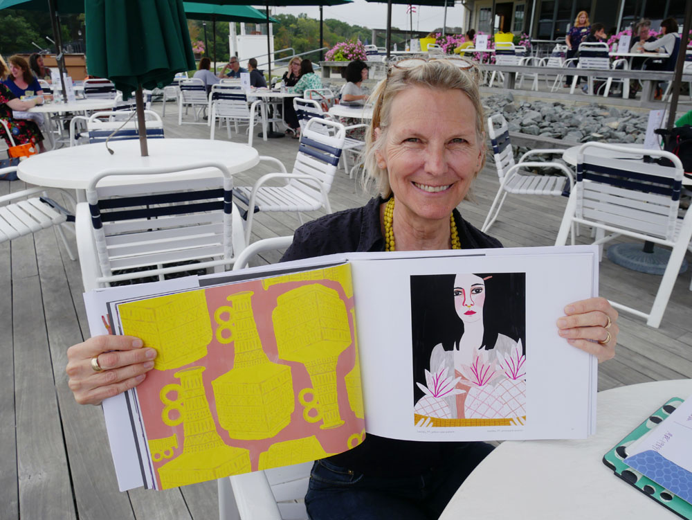
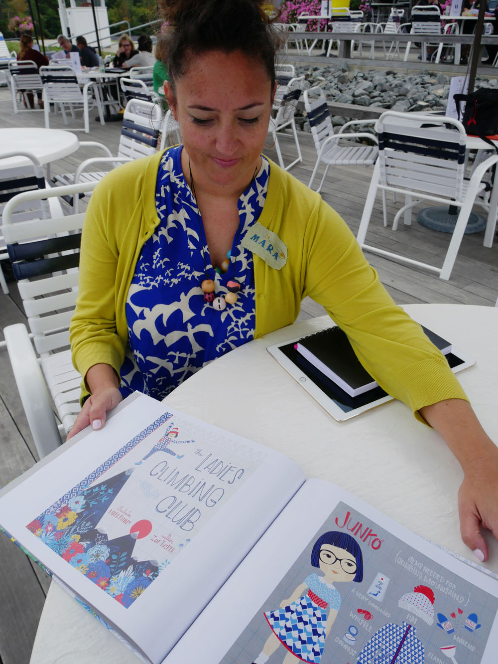
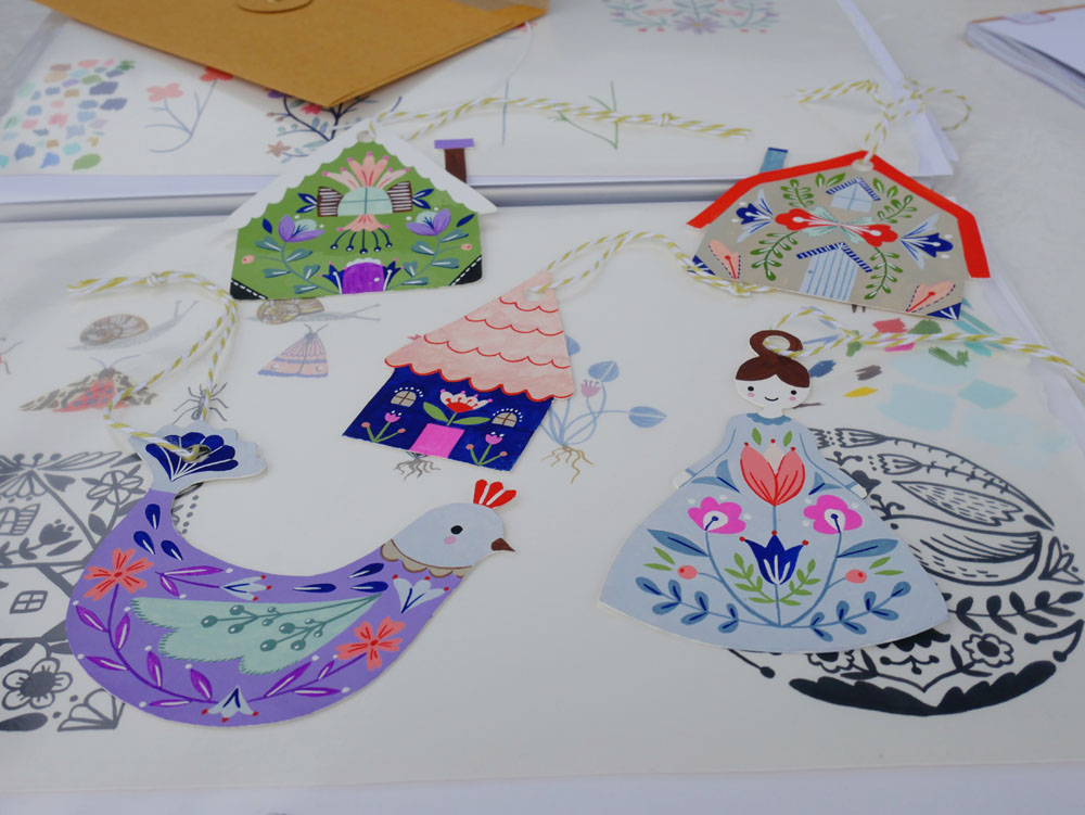
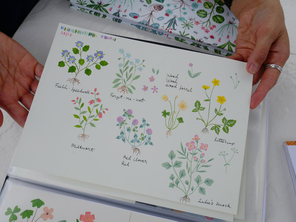
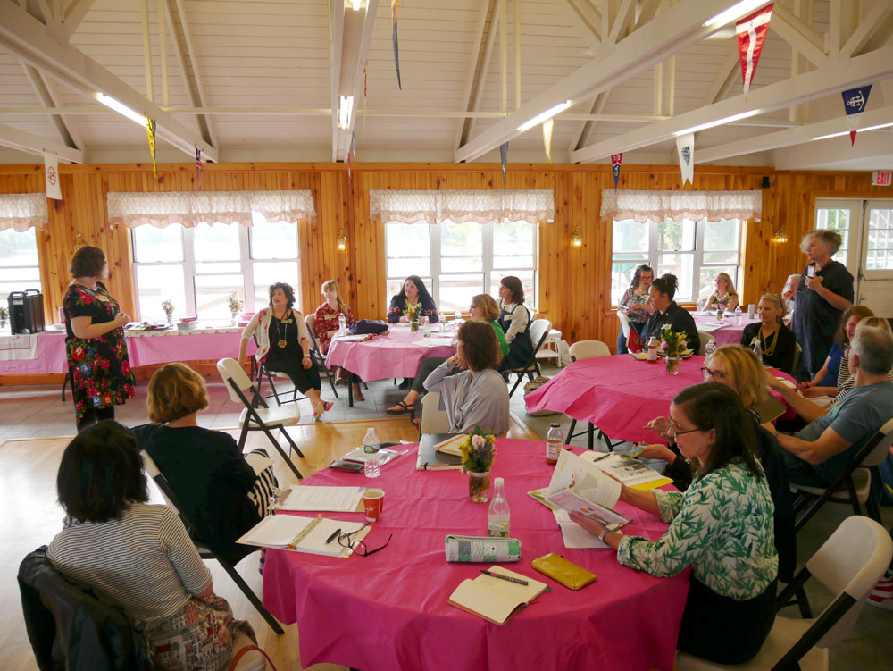
Thank you, Lilla, for inviting me to your 2017 artists' retreat.

A story of UPPERCASE connections

Kim Fox

One of the fun challenges when putting together an issue of UPPERCASE is curating the various artists and topics that will appear within its pages. I usually have a few themes to help focus my attention when assigning articles to my contributors or when inviting artists to be profiled. Sometimes, the thread of connection between one article to the next is obvious, other times a bit more obscure. At least to me, all articles within an issue are related in one way or another. Once an issue is edited, designed and printed, it is out of my hands and into the world where I hope it will inspire readers and help them make their own creative connections.

How and why an issue might affect an individual reader's life isn't something I can typically know. That's why I was so happy to receive a message from Kim Fox, an artist from Pittsburgh. She wrote in to share "a little story about how your magazine changed my life." I first discovered Kim's work at Porridge Papers in Lincoln, Nebraska, where author Linzee Kull McCray and I were researching our Feed Sacks book. I just love Kim's upcycling of vintage tins combined with quilting motifs, so I followed her on Instagram right away.

Kim has been working with tin as a material for 5 years or so. Through her company Worker Bird, she straddles "the border between wanting to create fine art and making products for wholesale and retail."

"A couple of years ago I fell in love with traditional quilting and the array of patterns and the stories behind them. I started "tin quilting" on salvaged wood and my work took off in a new direction. I began thinking about wanting to put together a gallery exhibit of contemporary quilters with a mix of traditional fabric quilters and makers using other materials. I had in mind a fabric quilter and myself but it felt like something was missing—that a third component would really tie it together but I didn't know what that was." Lo and behold, issue 30 arrived in her mail and Kim read Linzee's article about cover artist Laura Petrovich-Cheney, who makes wooden quilts using salvaged wood (the cover art features debris from Hurricane Sandy.)

Issue 30 cover by Laura Petrovich-Cheney

"I fell in love with her work immediately and knew that she was my missing link. But I'm new to this world and she's so established and wonderful so I didn't really know what to do with this new love." Kim kept Laura in mind for months until one day last October "I just thought OK—it never hurts to ask so just reach out to her!"

In fact, the cover for issue 30 was Laura's first major article and magazine cover. Laura decided to forego the usual fee that I pay my cover artists; instead she received that value in actual copies of the magazine. Laura smartly leveraged the magazine feature to send it to potential galleries and to gain interest in exhibitions of her work. When Linzee and I were in Lincoln, we toured the International Quilt Study Center & Museum and photographed a portion of their feed sack archives. I brought a copy of issue 30 to give to the museum's curator—which was the museum's first introduction to Laura's work. I am thrilled to report that Laura will have a solo exhibition at the International Quilt Study Center & Museum in 2018.

Laura Petrovich-Cheney

Back to our story... Laura returned Kim's email that day, excited by Kim's work and ideas. "She had been thinking along the very same lines about a similar exhibit," recalls Kim. "We began corresponding and chatted on the phone and decided to proceed together toward the same goal. We met in NYC in January for a coffee and then walked over to the gallery in Brooklyn where she had some work on show. The gallery, A.I.R., is a womens' co-operative gallery founded in 1972 to further the work of women artists and Laura is a working member of the gallery which affords her a solo show every 3 years. She proceeded to suggest that we do our quilting show at the same gallery this fall when she was slated for a solo show." 

The pair began to look for other non-traditional quilters. "We traded Instagram pictures of great work we found and also began forming our thoughts about the work that we're doing—issues of 'women's work' and 'men's work' along with the use of recycled materials and the environment."

Now a year later, their exhibition Beyond the Bed Covers featuring Kim Fox, Laura Petrovich-Cheney, Rachel Farmer, Ariel Jackson, Luke Haynes, Carolina Meyer, Faith Ringgold and Jessica Skultety opens on October 12 in Brooklyn. (Incidentally, Luke Haynes was profiled in issue 16 in 2013.)

Luke Haynes

Ariel Jackson

And there's more good news! "I have since been asked to include work in an exhibit in Providence, Rhode Island," says Kim "and have been approached by a gallery in Morgantown, West Virginia for an exhibit in 2018. I owe this new direction to you and your magazine!!!!"

Kim Fox

Although I'm certain that Kim and Laura would have eventually discovered each other, I'm thrilled that their connection was made through the printed magazine! It is a proud moment for me to know that such a ripple effect of positive experiences came about because of UPPERCASE.

Lilla Rogers' Artist Retreat

I was invited to give a presentation at Lilla Rogers' Artist Retreat, September 17–19 in Arlington, Massachusetts. The first day was programming for the artists. On the second day, I was one of many art directors talking about what we do and how we work with artists and commission work. With representatives from teNeues, Hallmark, Candlewick Press, BlueQ and other publishing companies, it was an honour to be included! Following the presentations, there was a "speed dating" round in which the artists came to show each of us their portfolio, one on one. On the third day, Lilla let me hang around her studio and participate in craft day, bedazzling canvas tote bags. Here's a video showing snippets of that afternoon:

Anne Bentley, Clairice Gifford, Mara Penny, Lilla Rogers, Flora Waycott, Kate Mason, Marenthe Otten, Katie Vernon, Trina Dalziel. Front row: Terri Fry Kasuba, Jessica Allen and Sarah Walsh. Not pictured: Suzy Ultman.

Mrs. Williams: an homage to a homemaker

The "Ready for Dinner" Housedress

Artists Melanie Thompson and Judith Barnett have created a stunning installation in praise of women's work. "We are the makers of every item in the show," says Melanie. Melanie is a basket maker and mixed media artist. "Judith," describes Melanie, "is an accomplished seamstress with no formal art background but boundless enthusiasm."

Installation view.

Triptych by Melanie Thompson

"The installation of a 1950s kitchen was inspired by an old wooden recipe box given to Judith by her 93-year-old neighbour Mrs. Williams. The box held a lifetime's recipes, all beautifully scripted in pen and ink. The idea that this box represented the lifetime of one woman's work seemed too great not to acknowledge in art. The strong emotional and nostalgic feelings it provoked felt like a call to make a body of work that referenced the era of the homemaker in the 1950s-honouring women’s work."

The "Everyday" Housedress

Installation view.

"We have made a wide variety of art pieces evoking the homemaker style of the 50s," describes Melanie. "The iconic apron and house dress have been rendered in knitted copper wire, pattern paper, tea stained canvas covered with written recipes, cotton embroidered and dyed with onion skins, image transfer on painted organza, recipe pages, black garden netting and pieced material remnants. There are mixed media wall pieces using stitching, buttons, collage, embroidery, and acrylic paint. Mixing bowl sets made with looping copper wire, handmade paper, and chicken wire as well as stitched samplers on baking trays and a cutlery box with utensils from the era. We have stitched and repaired clothing, small wire houses, recipe books deconstructed, handmade books, a set of pot holders and a tea cozy made from used tea bags and so many more items too numerous to describe. It needs to be seen to be fully appreciated."

Apron made from chicken wire.

The work is on view at the Artcraft Showcase Gallery on Salt Spring Island, British Columbia until
July 5, 2017.

Editor's note: Below these paper dresses, the third card from the left is from the UPPERCASE book Feed Sacks: The Colourful History of a Frugal Fabric by Linzee Kull McCray.

Creative Supplies Swap recap

The Creative Supplies Swap was a success! We had fun, enjoyed talking craft and creativity and everyone went home with a little something new to play with.

Thank you to my co-host Rosalyn Faustino of Calgary Craft Alert and to all the enthusiastic folks who came out to share and snoop!

If you're interested in starting your own swap in your community, I've compiled some tips.

Go to CAMP with Aaron Draplin!

The magnanimous Aaron Draplin is coming to town!

I've had the pleasure of meeting Aaron a couple of times now, most recently at the How conference in Chicago this past May where we were both speakers. I think it is safe to say that we are polar opposites when it comes to presentation style. Me: small, soft-spoken, trepidatious... while Draplin commands the room with his gregarious, entertaining and heart-felt delivery style. His presentations are AWESOME (he'll bring tears to your eyes) and I am happy that's he's delivering the love once again at this month's CAMP Festival in Calgary, September 21-22.

You can also get some time with Draplin and his design expertise in an afternoon workshop entitled "Logo Tips, Tricks, Triumphs, Turds, Threats and Tales from the DDC" on Sunday, September 20th. The fee is $150 and I'm sure you'll find it was well spent. Sign up now while there's still room!

UPPERCASE is involved in quite a few local events in the coming months. I'm sponsoring CAMP by giving away free magazines in the goodie bags!

Now let's step back a few years when Draplin was last speaking in Calgary. UPPERCASE writer Brendan Harrison interviewed him for issue 16:

Aaron Draplin photographed by Heather Saitz in the Lion's Den, Calgary 2012

Aaron Draplin is an American archetype, a kid from a small town in Michigan who moved west to become a self-made man. His pursuit of happiness led him to the American dream after his search for good times and deep powder put him on a path to becoming one of the best-known graphic designers of our time.

His love affair with thick line logos and Futura Bold began while he was still living hand to mouth in Bend, Oregon. His first design job was a graphic for Solid snowboards, but he was soon picking up work lettering café signs and designing logos for local businesses. This early taste of design success spurred him on to see if he had the chops to play with the big boys. To find out, he signed on for a degree in graphic design from the Minneapolis College of Art + Design. After graduating in 2000, he started to make his mark in the design world, doing a stint art directing Snowboarder Magazine before taking a senior design role at a big studio in Portland. 

Throughout it all, he continued to design personal projects that were close to his heart. In August 2004, he quit his full-time job and hung his shingle as the Draplin Design Co. In the years since, he’s worked for clients as large as Nike and the Obama administration and as small as the Cobra Dogs hotdog cart. And while a lesser designer would have enjoyed some much needed rest, Draplin co-founded Field Notes and transformed the way hipsters everywhere scribble down their ideas.

The phrase larger-than-life comes to mind when talking about Draplin, not because of his imposing physique but because of his oversize personality. On his recent Tall Tales from a Large Man speaking tour, he travelled the country holding audiences captive for hours with little more than a profane PowerPoint presentation and a gift for the gab.

On the day of his visit to Calgary, I pick him up from the lobby of a Best Western. He’s been working in his room all morning. We pile into my truck and drive to a diner on the outskirts of downtown, a place with taxidermy on the wall, ashtrays in the washroom and golden oldies on the jukebox. It’s the kind of place where Draplin seems right at home.

Writer Brendan Harrison and UPPERCASE publisher Janine Vangool have a chat with Aaron Draplin. Calgary, 2012. Photo by Heather Saitz.

We sidle into a booth and order breakfast. I turn on my recorder and plant it in front of him, opening my notebook to a page of questions I’d jotted down the night before. I ask him where we should start. “Wherever you want man, wherever you want. I can talk, man. So don’t be afraid to be like, hey, chill out a little bit.”

Photo by Heather Saitz.

I do no such thing. I’m happy to play the part of passive participant in our conversation, sitting back to enjoy his rambling replies. His stories meander and digress in the most enjoyable way, revealing plainspoken wisdom and insight into the life of a creative professional. Throughout our discussion, Draplin comes across as something of a cultural magpie, a life-long junker who figured out a way to incorporate his love for old memo books and ration tins into a signature visual style.

“As a designer, I always had an appreciation for old stuff,” he says. “Not in the sense of it’s like a movie prop – because I get a lot of that too. Kids are like, what are you, some kind of sentimentalist or something? I’ll take that word and run with it, no problem. I mean, what are you, a futurist? I’d rather look back at the restraint and try to use that in my new work. Using one colour effectively. Making a killer logo… There’s just a sense of like, that stuff’s on the way out and I don’t want it to go away.”

Aaron Draplin in the Lion's Den, Calgary, 2012. Photo by Heather Saitz.

Read the full article in UPPERCASE issue 16. And if you're in Calgary, please make a point of coming to CAMP and participating in Aaron Draplin's workshop. Other workshops on offer:

Learn How to Draw (Better) in One Day With Yuko Shimizu
Sunday, September 20th, 10:00 AM – 5:00 PM

Going Digital: Bridging the Gap
With Edward Keeble, David Nagy, Marc Binkley
Sunday, September 20th, 2:00 PM – 5:00 PM

As well as a programming workshop for kids.

The Maker's Atelier

The Maker's Atelier, in Brighton, UK, is celebrating its first birthday. I thought you'd enjoy reading about this lovely place with impeccable design, so here's an excerpt from their press release:

Frances Tobin

Frances Tobin and The Maker’s Atelier

Designer Frances Tobin has been making clothes for as long as she can remember, her mother taught her. When she left home, she trained in fashion and textiles graduating from The Royal College of Art in London. She went on to design for many leading fashion brands in Italy, the US and the UK, including Gucci, Les Copains, Esprit, French Connection and Warehouse.

Throughout her design career, Frances has always continued to make her own clothes. But she has never used shop bought patterns, as they don’t have the look that she wants. When someone suggested she publish her own dressmaking patterns, she thought yes, why not! Here was an opportunity to create something special.       

So she created The Maker’s Atelier for women of any age or shape - who know how to dress well, but can't always find what they want. Her aim is to help fashion-conscious women, create beautiful clothes to wear with style. She takes the key shapes from current fashion trends, refines them into clear dressmaking patterns, and then sources the perfect fabric. Frances believes that the simplest shapes in the finest fabrics make the most successful clothes.

The patterns and making-kits are sold exclusively from the website, and the making-experiences take place in a beautiful, vaulted atelier in Brighton's Kemp Town. The courses are suitable for beginner and intermediate dressmakers; they focus on fabric selection and making an individual item from the current range. Lunch, refreshments, maker’s gift bags and, of course, the finished garment, are all included in the experience.

I bought 50,000 postage stamps on eBay!

Sometimes I think I publish magazines and books (The Typewriter comes to mind!) solely so that I can justify time spent on eBay searching for weird and wonderful things. Getting these things is a business expense, after all! So this weekend I bought a carton of stamps: 50,000 loose stamps from 1870s through the 1970s that will be inserted into glassine envelopes and shared with all current UPPERCASE subscribers.

I can't wait for it to all arrive and to start parcelling up the stamps into pretty and inspiring little bundles for you guys! I'm going to need help, though, so if you're in Calgary and available the week of June 15 for some total stamp immersion, please be in touch. thanks!

Subscribe or renew before June 10 to get one of the glassine envelope stamp packs inserted into your issue. (And just to reiterate: if you have an existing subscription, you'll get the glassine envelope of stamps with issue 26. It's a bonus for being a subscriber!)

Marthe Armitage: Making Takes Time

In a rather special corner of London next to the Thames is the home of Marthe Armitage, octogenarian wallpaper designer extraordinaire. An old red brick wall wraps around her home and continues on past other homes where some of her children live. Binker, a perky Jack Russell Terrier, scuttles between the family homes, keeping a weather eye on the whole.

In this somewhat idyllic spot, Marthe Armitage has lived, brought up her family, and designed and hand-printed wallpapers for many decades. She is now ably assisted by her daughter Jo Broadhurst. Marthe married architect Edward Armitage in the early 1950s when she was just 20. She soon had three small children and was feeling her way toward something that would satisfy her creatively—something that might fit in with the inevitably frantic and fluid hours that child-raising requires.

So begins our story about Marthe Armitage, beautifully written by Jane Audas and deftly photographed by India Hobson. "Sharing a cup of tea with Marthe, Jo, India Hobson (our photographer) and Binker was a time out of time," writes Jane. "Marthe’s house is a new build (designed by her son, another family architect) but is redolent of a life well lived amongst creative things. She has her own wallpapers on several walls, and her own oil paintings on top of them. It is an embarrassment of riches, really." 

I'm honoured that Marthe allowed us into her home. Although I wasn't able to be there personally, Jane and India did such a wonderful job through their words and pictures, that we can all share in an afternoon with a woman who has let creativity lead her through life.

Purchase the current issue here as a single copy or part of a subscription.

Win a set of lettering and illustration pens from Sakura

Regular readers of UPPERCASE magazine will observe that there are very few ads in each print issue. Sometimes two pages plus the Calling Cards and Peeps, sometimes fewer than that! Truth is, as a one-woman operation, I don't have a lot of time to sell ads. But sometimes, advertisers seek out the magazine and it becomes a natural fit. Like when Sakura of America, makers of the Pigma pen, reached out to advertise in UPPERCASE. You'll see their print ad in the fall illustration-themed issue of UPPERCASE. In the meantime, we're collaborating on a giveaway!

I've been using Pigma Micron pens since college. They're really are part of any designer and illustrator's tool kit.

Sakura has recently introduced a new line of Pigma Professional Brush Pens to the line. These pens use the same rich, black, archival ink, but with expressive brush nibs in fine, medium and bold tips. They're perfect for illustration and lettering projects. I had some fun experimenting with the boldest nib, below.

Master penman Jake Weidmann, whom we featured in the calligraphy and lettering issue 23, tries out a finer version below. Wow, his talent is awesome!

To win one of five Sakura Pigma Pen prize packs, please leave a comment about why you love inky black pens over on this Instagram photo. Make sure you follow @uppercasemag and @sakuraofamerica. This promotion is open to legal residents of the 50 United States, District of Columbia and Canada (except Quebec). You must be over the age of 13. Contest is open until May 18. The winners will be selected at random from the Instagram comments. Good luck!

Inspiration: the good, the bad and the pretty.

I’ve spent the better part of a decade searching for inspiration. 

At its heart, everything I make and do with UPPERCASE is curated and designed to inspire me—and by extension, you, my reader. By sharing the stories of talented creatives in a wide variety of disciplines, each magazine issue or book is full of inspiring people, places and things.

But the word “inspiration” is so-often employed these days, that I hesitate to use it. “Inspiration" is diluted. When it comes to creativity, what is truly inspiring? 

the good

When something you see or experience triggers a switch to “yes!” in your creative heart, that’s the best kind of inspiration. The kind that motivates you, that fires you up, that kicks you into action. It creates a desire to do something, to harness that inspired feeling and see where it leads you. It’s joyful, pure, instinctual. It has no judgments, no preconceptions, no deadlines: it simply is. yes!

the bad

One can be inspired by another artist and while it’s ok to admire, it is never ok to copy. Imitation is not flattering for the one doing the imitating. The phrase “taking inspiration” describes this darker side. If you find yourself relying too much on other people’s work when making your own, stop. If you’re judging your work against someone else’s work, stop. Step back and look at it objectively. Make a list of all the things that you love about that person’s work and all the traits that you aspire to achieve in your own work. Going forward, use that list as your guide and your motivation. 

the pretty

I think we’re overloaded by so much generic “inspiration” that we’re becoming desensitized. We pin on Pinterest, like on Instagram… but this infinite scroll of images—however gorgeous they may be—is training us for snap judgments and short attention spans. It’s a millisecond of inspiration that burns out nearly as soon as it began and you find yourself scrolling for another hit. Sometimes a good dose of pretty is just what you need, but the next time you find yourself in a hangover of pinning and liking, revisit your selections. Was any of it inspiring in a lasting way? 

With the twenty-fifth issue making its way into the world now, my hope is that I’ve done my job well and that UPPERCASE falls into the best category of inspiration.

May you come away from reading the magazine feeling joy and optimism, with a flicker of a new idea whispering, "yes!"


This message was originally published yesterday in my weekly newsletter. If you'd like to receive free weekly content like this, plus a look at behind-the-scenes of making a magazine, free downloads and news of how you can participate within the magazine, please sign up here. Thanks!

-Janine

Brian Gartside: Doing good work & work for good

This guest post is by Andrea Marvan who attended the AIGA Y Conference.


Brian Gartside is a 27-year-old graphic designer and typographer whose credentials include working at Pentagram, DDB New York, and more recently Deutsch Inc.

Brian began his Y20 presentation with advise for emerging graphic designers (and anybody in the creative industry, really) discussing “Things I wish I knew when I was studying to become a Graphic Designer.” Which can be summed up as doing good work, work that visually improves the space that it occupies. Here are the highlights:

  1. Make ads that don’t look like ads (or whatever you make, make it not look like that).

  2. Become a technical expert, be fast at the things you can control so you can spend time on the things you can’t.

  3. Build a diverse library of inspiration. It will help you be more authentic as it will reduce the risk of inadvertently copying someone else.

  4. Take a break. Have a hobby. Do something else for a bit, it will help you think.

This valuable insight from Brian’s very promising career (in October of 2014 he was named as an ADC Young Gun) was complemented by the second part of his presentation, where Brian discussed what he has learned in putting this knowledge into practice and how his skillset has helped him to do work for good.

Many of the projects Brian worked on while at DDB are partially credited for the creative revival of the agency, including The Drinkable Book, where he worked as a senior designer, and which brought the agency its first Cannes Gold Lion in two decades. The Drinkable Book integrates outstanding design and cutting-edge technology put to the service of a remarkable cause developed by Water is Life.

“The Drinkable Book is a life saving tool that filters water and teaches proper sanitation & hygiene to those in the developing world. Each book is printed on technologically advanced filter paper, capable of killing deadly waterborne diseases. And each page is coated with silver nanoparticles, whose ions actively kill diseases like cholera, typhoid and E. coli. Once water is passed through the filter, bacteria count is reduced by over 99.99%, making the filtered water comparable to tap water in the United States of America.”

We all want to use our skillset for the greater good, but at time the possibilities are overwhelming and the size of the task seem impossible to bear. As Brian put it, doing work for good is easier than we may think:

  • You don’t have to save the world. You might never change the world but what you can do is help the people that can change it. If there is something you believe in, find the company who is doing that important thing without the sexy, approach the company and bring the sexy! Make something people can’t ignore.

  • Agencies love pro-bono work because you get more creative freedom. Use that to your advantage but don’t be a scam artist.

  • Dead doesn’t mean dead. Proceed as if it happening. Persistency is key.

  • Beg for favours. If it’s a good project, people will want to help.

  • Don’t be afraid to invest in yourself. Don’t let funding hold you up. Get it done and sort it our later.

  • Be more than just a graphic designer. These projects happen though sheer force of will. Do whatever you have to do (wear all the hats you need to in order to get things done).

As the long round of applause and stimulating questions from the audience proved, we were all really inspired by Brian’s investment and igniting curiosity, and the endless possibilities of using creativity to help build a better world.


*For more information or to support the Drinkable Book project please go to www.waterislife.com  Photos courtesy of Brian Gartside

Jorge Gutierrez and Sandra Equihua: Saying “no” to the big shots

Y20 Aiga Conference Day 2 post by Andrea Marvan

Jorge and Sandra opened the Y20 Conference on Friday morning. Sandra is a graphic designer and character designer for television and feature films, and her husband Jorge is an animator, painter, writer and director. They are a very dynamic couple with a hyper-Mexican over-the-top style, as they define it themselves. Jorge once suggested the idea of being the next Diego Rivera and Frida Kahlo but Sandra fiercely rejected it “you are not cheating on me!”

Together, they created and designed “El Tigre, The Adventures of Manny Rivera”, a project that earned Equihua an Emmy. And more recently they worked on “The Book of Life”, a CG-animated feature for Reel FX, where Sandra was the lead character designer. Executive produced by Guillermo del Toro and directed by Jorge, “The Book of Life” was Jorge’s life-long dream project and his love letter to their beloved Mexico.

Jorge

Jorge’s graphic style is a bit more experimental while Sandra’s is clean and bold, yet you can see how their style perfectly complement each other, like a good marriage. Jorge is loud and fun, he uses animated sounds and a variety of voices when he speaks (after all he is a specialist in cartoon voice overs!), and Sandra laughs at his stories as if she were hearing them for the first time. They are absolutely charming and extremely talented.

Sandra

Through their presentation, they shared stories about how their studio Mexopolis started and discussed the importance —and sexiness—of turning work down, as odd as it might sound. They are a very determined team and through their career they have been able to work only on projects they truly believe in. They have managed to insert Mexican elements in their work, even when the project had nothing to do with Mexico, and to portray Mexico proudly and with a sense of humour. “We’ve made our bosses like Mexico,” said Sandra, and I beamed.

Being Mexican myself, my opinion and my admiration for them might be biased, but their talent and creativity transcend borders and cultures. Their advice could not be more valuable to any professional in the industry: “Stick to your guns. Learn to say no, you want to work with something you can live with.” and they have ruled their careers by this principle, even if it meant quitting huge projects. Yet, saying no have turned them—as Jorge puts it—into “the hottest girl in town” because they fought for their projects to allow them creative freedom and they have stayed true to their passion. Because of this, Jorge and Sandra have been able to successfully accomplish personal creative vision and commercial success. It had also led them to fail sometimes, but that’s ok, because for them “Failure is great. Failure is the bricks of the pyramid of success.”

*Images courtesy Jorge Gutierrez and Sandra Equihua


Compendium entries close March 31

Image by Sophie Stock

BE BRAVE

This is a snapshot from surface pattern designer Sophie Stock's inspiration board, one of the recent submissions to the Compendium. I hope you'll be just as brave and enter your creativity into the UPPERCASE Compendium of Craft and Creativity.

The entry form for this book project closes in a few days: Tuesday, March 31 at midnight MST.

You've got the rest of the weekend to pull together your images and answer the questionnaire. You can do it!

Read the latest news about the Compendium and get to know Sophie here.

The Pre-Vinylite Society Show Card Show

Jeff Canham

Jeff Canham

There's an intriguing exhibition of show card art opening this Friday at Calico in Brooklyn, New York. Here's more from show curator, Meredith Kasabian, whose grandfather was a show card painter:

The Pre-Vinylite Society is a loose network of self-ordained sign enthusiasts and advocates for creative use of urban space. The aim of the Pre-Vinylite Society is to encourage sign painters, sign enthusiasts, artists, writers, business owners, and the general public to be more aware of their aesthetic surroundings and take pride in their neighborhoods by creating, commissioning, writing about, and appreciating quality signage and public art. 

The name “Pre-Vinylite” is derived from the Pre-Raphaelite Brotherhood, a group of 19th century English artists and writers who rebelled against the academic conventions of their day. The name also connotes the period before vinyl technology nearly decimated the hand-painted sign industry in the 1980s and serves as a commemoration of this pre-vinyl era, but not necessarily a wish to return to it. Despite the emphasis on a bygone era that “pre” suggests, the Pre-Vinylites are not a society of Luddites, shunning technology or advocating for a return to a “simpler” time. Pre-vinyl does not equal anti-vinyl.

The Pre-Vinylite Society aims to inspire a sharper cognizance of the aesthetic built environment and a desire to create and appreciate new, forward focused art that respects the traditions and techniques of the past. Ultimately, the Pre-Vinylites believe that artistic vigilance in the face of mass conformity can deliver us from a homogenous existence.

Donal McKernan

Donal McKernan

The Pre-Vinylite Society Show Card Show
Calico, Brooklyn
67 West St. #203, Greenpoint
January 9 - February 13, 2015
opening reception: Friday, Jan 9, 7-10pm

Pierre Tardif

Pierre Tardif

Preview works from the exhibition here.

Calling Card: Jennifer Joanou

Jennifer Joanou is one of those multi-talented artists who finds a way to express themselves no matter what the medium or the method. The first iteration of her creative career was as a fashion designer in Los Angeles; her work was popular in Hollywood and was sold in Barneys. Then about ten years ago, she began art journaling and found that it encompassed all her loves: fabric, photography, paper and paint.

Her website has an intriguing opening page and is a great invitation inside her journals, which are extensively presented. She also shares work in progress on her blog.

Postcards and stickers of her journal pages are available in her shop. Gift them as a set, send them to friends or tack them to your inspiration wall as incentive to start your own journal in 2015.

Thank you to Jennifer for supporting UPPERCASE magazine through the purchase of a Calling Card. I'm pleased to report that the Calling Card page for the forthcoming issue is now full, but if you're interested in being part of the spring issue, spots are now open.