Girl Friday: Jessica Brilli

I received a submission this week to share with you. I had already bookmarked Jessica's paintings before but they definitely merit posting on the blog!

Jessica Brilli explores the beauty in artifacts that have withstood a radical transition of function—from practical use to design inspiration and decor. These artifacts have an immediate and lasting appeal, now captured in Brilli’s paintings. 

Although many of the objects—vintage typewriters, cameras, and radios—are not widely used anymore, they still have a place in our lives, for admiring and remembering more than using. Brilli investigates our cultural fascination with near-obsolete commodities. Will today’s technological devices have a similar effect in the future, or will their impression be fleeting because of their transient nature?

Jessica is a graphic designer/painter living in Quincy, MA. She works at The Radcliffe Institute for Advanced Study at Harvard University. "I design by day, and paint by night," she writes.

Etsy & UPPERCASE: Leah Giberson

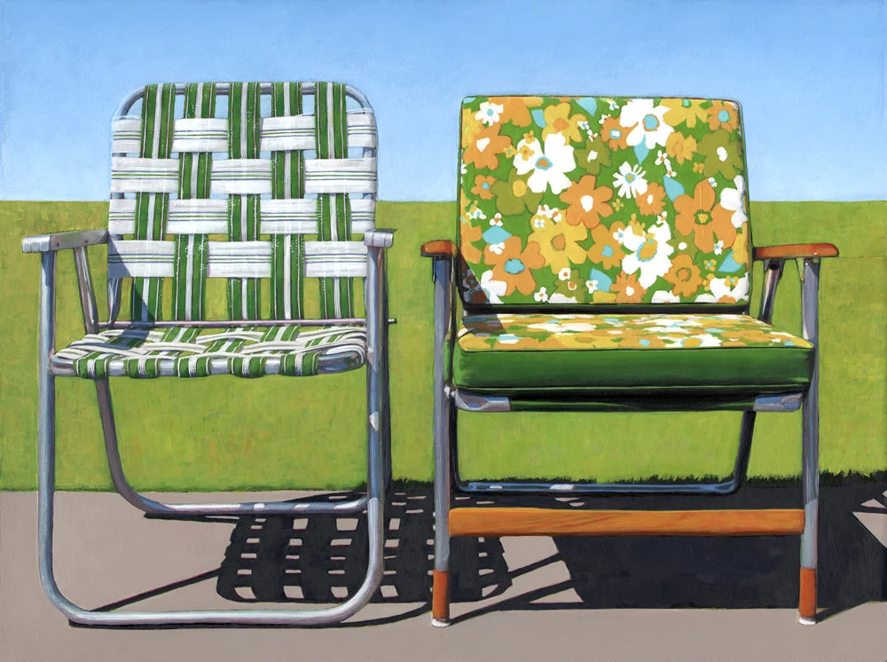
To keep that summer feeling alive, the simplest solution is to purchase a print (or original!) Leah Giberson and hang it in your home to admire year-round. Lawn chairs, pools, airstream trailers and California homes are typical subject matter... but depicted in a not-so-typical way. Leah uses photographs as the base inspiration for her paintings, but with her use of graphic colours, shadows and composition she elevates the subjects into icons.​

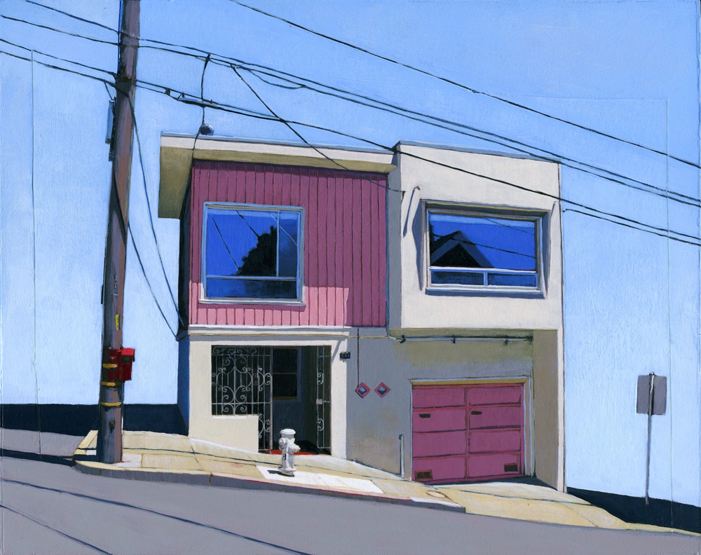
Cleverly edited Noe Valley, San Francisco​

UPPERCASE featured Leah back in issue 6's Work-in-Progress Society pages.​

Your subject matter is a nostalgic suburbia full of lush greens, manicured lawns and perfect skies. The scenes are idealized vignettes depicting manmade environments—the perfect house, a shiny Airstream trailer—yet the paintings are devoid of people. Your creative process, in which you paint over photographs, allows you to become an editor as well as an artist. What do you choose to exclude and why?

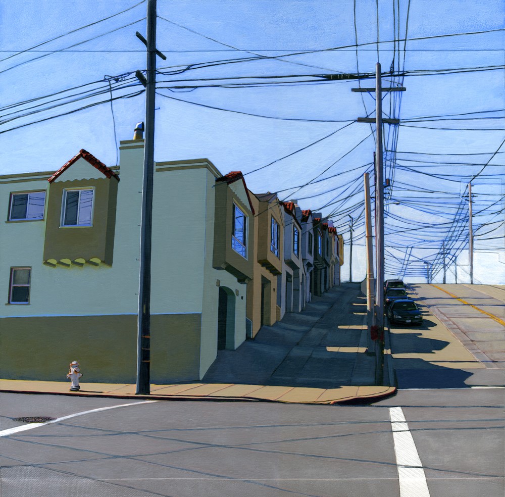
I paint over anything that feels unnecessary or distracting. This often includes neighboring homes, buildings, trees, and occasionally people. After simplifying the scene, I can focus on the parts that resonate with me like the looming shadows, tenuous connections of power lines or the reflected worlds visible in windows or on shiny surfaces. This process of distillation and embellishment is something we all do in our daily lives already. We highlight some moments, cover up others and either ignore or make assumptions about the rest in an attempt to find meaning in our experiences and reinforce our existing narratives. In short, we see what we want to see. 

​Bernal Heights, without neighbours.

Why are you drawn to these particular scenes? What do they represent to you?

Suburbia has always been intriguing, yet foreign to me. I was raised by artists deep in the woods of New Hampshire in a cluttered old farmhouse full of art and all things handmade but we also had our share of painful struggle as a family. I learned about suburban life mostly from TV shows and on trips to visit my grandparents. From my limited and naïve perspective, I assumed the families in these homes felt safe, happy and at ease in their seemingly perfect worlds. I wanted that in my life too. As an adult I now realize that a flawlessly groomed lawn or manicured hedge does not guarantee any of those things, but I remain fascinated by these places and the disconnect between their fact and fiction. 

How has posting work on Flickr been part of your development as an artist?

A couple years ago I started using Flickr on a daily basis when I was commissioned to make a large painting and wanted to post images of my progress for my client to see. Before I knew it, there were lots of other people leaving thoughtful comments and initiating some pretty interesting dialogues. I also discovered that I was reaching a MUCH larger and rapidly expanding audience than I ever had with my etsy shop, portfolio site or neglected blog. Flickr quickly became and has remained an integral part of my work flow and the site I update and check out more than any other.

In addition it has also led to a series of somewhat collaborative work. During the summer of 2008 I came across a photograph on Flickr that completely captivated me. Until that point I had only used my own photographs in my work, but I desperately wanted to make a painting based on this one. I contacted the photographer and asked for her permission. It turned out that she was thrilled with the idea and (I’m happy to say) with the results. Since then, I have completed at least 30 small paintings based on other people’s photographs and continue to look for new images out there that resonate with me. The photographers I’ve worked with thus far have been incredibly generous, enthusiastic and appreciative. It’s been a wonderfully positive and inspiring experience and has connected me with people and places from all around the world.

an art stroll with Vivienne Westwood

In the video below, fashion designer Vivienne Westwood shares two of her favourite paintings on display at Tate Britain. Frank Auerbach's 'Oxford Street Building Site' (1959/60) and JM Whistler’s 'Nocturne: Blue and Silver - Cremorne Lights'  (1872) have personal significance for the designer.

I don't often post about "celebrity designers", but Westwood certainly embodies our creative and curious mandate. The 71-year-old is an example of how creative experimentation and constant learning are keys to a youthful outlook on life.​ She keeps a blog—diary entries that she has written longhand that someone else types and then posts—so you can catch a glimpse at her daily life.

hello neighbour: David Daley

David Daley is a new neighbour in Art Central. He received a month-long St[art] residency courtesy of the Calgary Allied Arts Foundation and is painting in a studio in the lower level. I was immediately interested in knowing more about David's work since it combines signpainting, design ephemera and arresting colour combinations. Given the confident execution of his work, I was surprised to learn that David has only been painting for a year. His fine lines and meticulous work at first look to be silkscreened when in fact they are painted by hand with fine brushes.

My career as a mixed collections conservator has seen me working in art galleries and museums to preserve and interpret artworks and objects of cultural property. Over the years, I have acquired a very good understanding of artistic styles and design aesthetics. No longer content to simply preserve the works of other artists and originators, I’m now finding ways to express the artistic ideas I have been collecting for a long time.

I have a fascination for nostalgia and love vintage aesthetics and styles. To me, learning about other eras and exploring the sense of ripeness that different times possess is fascinating. Examining the timelessness and subjectivity of modernity compels me: every age is modern for those who live in it. But what things are constant about popular culture and sub-culture and what things are ever-evolving? What remains ageless and what is a fleeting trend?
— DAVID DALEY
I have started making paintings from images taken from black market 20th century erotic material. Tijuana Bibles were illicit underground comic books which put comic characters, celebrities and even politicians of the day in sexually explicit situations. The little booklets were mass produced from the 1930s to the 1950s and I have used the cover designs to make paintings in vintage or pop-art colour schemes.
I like to produce art that has a raw visual appeal: art that I think looks good. To me, the flirtatious messaging in the Tijuana Bible covers carried over well to the paintings by expressing a playful and fun look at life and sex. Fashions come and go but some of the pleasures in life transcend the prevailing modes.
— DAVID DALEY

If you'd like to get in touch with David, please contact him by email.​