bright summer

It's going to be a colourful summer.

We're happy to share the cover for Issue #22 (out in July)! Our summer issue is all about colour, hues, pigment and paint. Janine has art directed the issue in a spectrum of colour—from vibrant red tones to deep violet shades. 

Use the code 'brightsummer' to save $10.

Subscribe today to get your own issue!


connecting creatives around the world


Talia Tordjman is an artist and professor living in Israel. In 2012, she documented the moments in her life leading up to her 50th birthday on her blog My Countdown. She had included UPPERCASE magazine in one of the moments and so we did a little mention on our blog. Through this post, Alba Bici discovered Talia and an online friendship was formed.

Recently they had the chance to meet in person, with Alba making the trip from Italy to visit Talia in Tel Aviv. "Our common denominator was UPPERCASE. We are both passionate about it," says Alba. 

We're happy that UPPERCASE played a small role in this story of friendship without borders. 

spring subscription sale

Issue #21 goes to the printer today, but you can still subscribe (and save)! 

Explore the world of surface pattern design in our form, function and ornamentation issue. Whether you're a crafter, a hobby photographer on Instagram, a part-time blogger or a parent with a creative child — you play a daily role in decorating your world. Be inspired to consciously shape your surroundings with our 116 pages of gorgeous images and uplifting content.

This spring issue also contains a special UPPERCASE magazine Surface Pattern Design Guide, profiling 100 surface pattern designers with tips and advice from industry experts.

Use the code springsale to save $10 off your subscription.*

Lotta Jansdotter shares tips for creating a life full of pattern.

Mosaic tiles by Dear Human.

Cover artist Molly Hatch.

Photos of Mariko Paterson's workspace taken by Jessika Hepburn.

Angela Pingel's fabric stash.

*Code valid until end of day Sunday March 9 (MST).
We're sorry code cannot be used retroactively.

golden bees

Bee Kingdom, the glass-based studio collective we profiled in issue #17, is about to open a new exhibition titled Gold. 

From the Bees: 

“Glass has a lot in common with gold; thin gold foil can be rolled into the glass, certain glass colours become gold-like or chrome under flame and red/ruby glass is made in part by melting solid gold into a tank of liquid glass.”

The exhibition opens in Calgary on March 7th.

Images courtesy of Bee Kingdom

a pair of Purcells

Photo courtesy of Andrew and Carrie Purcell.

As Janine is busy working on our forthcoming spring issue, we're looking back at a popular spring issue from a few years ago: issue #9. This issue was inspired by food and gardening. Issue #9 is the oldest available back issue available; once it is sold out it will not be reprinted so get your copy while you can. 

Andrew and Carrie Purcell

For issue #9, UPPERCASE contributor Tara O’Brady spoke with professionals in the food and photography industry to explore the ranging aesthetics, influences and passions of those who create and chronicle the delicious. We caught up with Andrew Purcell to hear what he and his wife, food stylist Carrie Purcell, have been up to.

Have you had any new books and projects come out since #9 was released? 
Together we have had about 10 books come out, a few shot together and a few separately. A few highlights were books from Carrie: Feel Good Food by Giada De Laurentiis and What's For Dinner by Curtis Stone. For Me, Meatless by Martha Stewart and Year Round Slow Cooker for Taunton Press that we did together. We have also had about 15 magazine covers from magazines like Food Network, Martha Stewart Living, Country Living and many others.  

Are there any new trends in food or food styling that you’re seeing? 
Living in NYC we really see the restaurants start the trends. It's funny to see a food trend start to take off and then spend the next year photographing it like crazy for all the magazines trying to take advantage of the trend.

Has your style of photography changed? If so, how and why? 
I wouldn't say that our work has changed very much as our approach is the same, we just have a little more diversity to what we can do. From Carrie, having more control on all types of styling and myself being able to use different lighting and a different style depending on what the client is looking for. We both have more control than we did a few years back.

What’s your favourite issue of UPPERCASE and why? 
We of course have always loved our issue as we were featured with people we really like. But we have always been in love with the cover of issue #2. I'm a sucker for a great graphic cover.

Is there anything else you’d like to share?  
Our blog is about to relaunch as a better database for our recipes and images. We will have loads of new recipes and images every week.

Andrew and Carrie are longing for summer wanted to share their recipe for a summer drink (pictured above). You can read the entire piece by Tara (and get a copy of her recipe for butter-roasted walnuts with thyme honey) in issue #9

beautiful food with Aran Goyoaga

Photo by Aran Goyoaga.

We’re looking back at issue #9. Our food and gardening inspired issue is almost sold out. Grab your copy today. 

It’s no easy task; a mediocre food photograph is flat—unappetizing, without spark. An exceptional photograph of food, however, is full of life—the butter on that biscuit looks as though it could drip at any moment, the curl of steam coming up off a bowl of pho seems to twist and rise as you stare, salivating, at the frame. Styling and photographing food is the craft of making the viewer not only want to taste the food that’s presented, but making them believe they can already.

For issue #9, UPPERCASE contributor Tara O’Brady spoke with professionals in the food and photography industry to explore the ranging aesthetics, influences and passions of those who create and chronicle the delicious. 

Aran Goyoaga

We caught up with Aran Goyoaga to see what she’s been up to since that issue came out.  

Have you had any new books/projects come out since issue #9?
My book Small Plates & Sweet Treats came out in October 2012 and it was named one of the top six books of 2012 by Good Morning America. I moved to Seattle nine months ago where I opened a photography studio where I teach workshops, bring other photographers to teach as well as hosting communal dinners. I also teach food styling and photography workshops all over the world so life has been really busy the last few years.

Are there any new trends in food or food styling that you’re seeing?
I think simplicity and a very natural style is still prominent, or at least that is what I respond to. I think the trend is back to neutrals and whites, but like everything, I don't like to think as food photography in terms of trends because each story deserves a mood and a perspective.

Has your style of photography changed since the issue came out? If so, how and why?
It has definitely changed also in the sense of simplicity. Moving to Seattle has also really muted my colours and my light inevitably and I have been very inspired by that. It has a new process of discovery.

What’s your favourite issue of UPPERCASE and why?
I loved the cover of issue 5 which I actually framed and hung in my daughter's room.

Is there anything else you’d like to share?
I created a shop where people can view upcoming events in my studio and purchase tickets online. Stay tuned as I have great photographers coming to Seattle!

Visit Aran's blog Cannelle et Vanille for her recipe for roasted carrots with honey, sage and garlic (pictured above). You can read about Aran and her career as a food stylist in issue #9, our food and gardening inspired issue. Issue #9 is our oldest available back issue and is almost sold out. 

food, love and creativity

We’re looking back at issue #9. Our food and gardening inspired issue is almost sold out. Grab your copy today. 

Photo by Lyndsay Sung of Coco Cakes who is also featured in issue #9.

In issue #9 we asked readers how a love of food inspires creativity. 

"How anyone that is creative or loves art could not be inspired by food, I don’t know. How can one not be inspired by a perfectly ripe avocado?"

"I feel such a pure joy of discovery when I see that creamy green skin for the first time, when I realize that’s it’s neither pale and flavourless nor overdone and brown. It makes me so happy. The beauty of it. I am inspired by food every day, we all are, whether we realize it or not. Everyday, when we pull ingredients out of the fridge, we are being inspired by food. You can tell so much about a person by what they cook. Your daily food choices speak volumes about your life and who you are. The food I eat inspires me to think creatively, to try new things, to experiment with the possibilities of life. That is art. Food is the ultimate creative expression because it can be consumed, quite literally, by the audience. It is not only a visual experience, but one that involves all the senses, giving it a leg up on more traditional art forms. It definitely is an artist’s instrument, and not just in the kitchen. Like wood in the hands of a carpenter or oil in the hands of a painter, food can be molded into all sorts of things, from a dress to a sculpture to a spice cake. It’s really up to you." 

— Erin Bealmear, aka dessert girl (where design and dessert meet.)


How has a love of food inspired your creativity?

Leave a comment below or tag us on twitter or instagram (@uppercasemag).

catching up to Susan

Photo by Meagan Lewis

We’re looking back at issue #9. Our food and gardening-inspired issue is almost sold out. Grab your copy today. 

Susan Black was a contributor to #9 and one of the subscribers we profiled in that issue. We asked her what she's been up to since that issue came out and found out that she's been busy. Very, very busy! 

Susan's print "bold floral' is available in her Etsy shop. 

What’s changed in your work/life since 2011? 
WOW! so much—my creative career has really taken off since 2011. In January of 2012 I took Beth Nichol's & Kelly Rae Robert's e-course Hello Soul, Hello Business and it completely changed my creative life. It lit a fire in me where I'd thought a fire had already been burning fairly brightly. In May of that same year because of that e-course I created a promo/portfolio pdf mailer and sent it out to my top 25 dream companies. I heard back from the first of many within 30 mins of sending it out ! I now have close to 100 of my illustrations licensed with a variety of fantastic companies. I still keep an Etsy shop well stocked (as I do find Creative Directors still are searching Etsy for artists). I have a near daily photo blog of my life in seaside Nova Scotia.

I'm a bit obsessed with taking photos and carry my camera everywhere. I think of that blog as my visual gratitude journal as well as the place where I honestly talk about the struggles & triumphs of being a self employed creative person (and one that lives in a fairly remote though beautiful location). The online world has been crucial in my growth as an artist/designer.

Susan's print 'lost' is available in her Etsy shop. 

What new projects have you released since issue #9 came out?
I have over 30 images licensed on greeting cards with Madison Park Greetings and another dozen or more with Design House Greetings. I also have many of my designs licensed with MagnetWorks (garden flags, mats, yard signs). I was recently chosen as one of 10 artists to design three sizes of illustrated garden poles for Studio M (a gift & garden division of MagnetWorks). Plus, I'm super excited to have a brand new, top-secret Susan Black gift and home decor collection being released this summer with another fantastic artist focused company. My collage illustration can be found on all sorts of products from greeting cards to wall art. I consign my work in 2 fabulous curated Nova Scotia art/design gift shops—Inkwell Modern in Halifax and Dots & Loops in Lunenburg. 

Links
Daily photo blog
Portfolio blog
Web site
Etsy shop

You can see Susan's contribution to our floral gallery in issue #9, our food and gardening inspired issue. Issue #9 is our oldest available back issue and is almost sold out. 

the hopefulness of spring

This morning, as the light snow falls in Calgary, we're looking back at issue #9. Did you know that issue #9, our food and gardening-inspired issue is almost out of print? Purchase this back issue today, before they're all gone. We do not reprint back issues nor are they available as digital downloads.

"There’s a sort of restlessness that occurs just before spring. A growing impatience, one that has us longing to cut winter off at the knees and run willy nilly into the hopefulness of spring. We stand at the edge of one season and peer longingly into the next—one that promises warmer weather, longer days, a life lived outside again. Spring. Suddenly, the signs are everywhere. Tiny pops of purple crocus in the unlikeliest places, clumps of happy yellow daffodils, trees that seem to explode with blooms. " — Andrea Jenkins, Issue #9

You can read Andrea's entire piece in issue #9, our food and gardening-inspired issue. Issue #9 is our oldest available back issue and is almost sold out. 

hey honey...

We’re looking back at issue #9. Our food and gardening inspired issue is almost sold out. Grab your copy today. 

hey honey...

text and photos by Tara O'Brady

If you look into a hive there’s a mysterious order there, the combs alive with intentional activity.

When I think of honey bees, the first image conjured is that of childhood storybook illustration; of fat and fuzzy, buzzing bees, the sort I once described elsewhere as striped kumquats on wing. 

Those in my mind are bees that would be at home about the words of A.A. Milne, keeping a plump bear merry company as he filled his “rumbling tumbly “ with honey from the hive.

The trouble is, that image of bees of my imagination, with them as foolish as Pooh Bear himself, is not one that the grants the honey bee the full credit it is due.

In reality, honey bees are much more enigmatic. In looks, they are slender, lanky almost, with an elongated abdomen and lacking the all-over furred appearance of the bumblebee. It’s as though they were streamlined with work in mind.

Honey bees, like stingless bees and bumblebees, are intensely organized, social creatures.If you look into a hive there’s a mysterious order there, the combs alive with intentional activity. 

Then of course, there’s the honey.


You can read the entire piece by Tara (and get a copy of her recipe for butter-roasted walnuts with thyme honey) in issue #9, our food and gardening inspired issue. Issue #9 is our oldest available back issue and is almost sold out. 

popcorn with Julie

From Alice Eats: a Wonderland Cookbook by Pierre A. Lamielle and Julie Van Rosendaal

We’re looking back at issue #9. Our food and gardening inspired issue is almost sold out. Grab your copy today. 

I have lots of cookbooks but very few are well-thumbed and stained. Most of my favourites come from Julie Van Rosendaal. Her cookbooks are the first ones I go to when baking—I always have a freezer stash of her oatmeal muffins and her breakfast bean cookies

Julie is a fixture on the Calgary food scene and always generous with her time and talents (see below for a recipe she passed along). She shared her creative career, as a food writer, with us in issue 9. We decided to catch up with her to see what she's been up to (and it's a lot!) since that issue was released. 

What’s changed in your career since issue #9? 
Looking back, my career hasn't changed a whole lot since 2011. I've been writing more for bigger magazines (like Readers Digest and Western Living) and I've learned to say no a little bit more. But I still do radio and TV, write and blog. I'd like to say my to-do list  has changed since 2011, but there are still some of the same things on it, like my total blog redesign! 

What new projects have you completed since issue #9 came out? 
Spilling The Beans, a cookbook I co-authored with my best friend since junior high, Sue Duncan, came out in the fall of 2011, and Alice Eats: a Wonderland Cookbook, which I co-produced with illustrator/chef Pierre A Lamielle, was released in fall of 2013. In the spring of 2013 I launched RollingSpoon.com with my friend and ex music magazine editor Elizabeth Chorney-Booth - it's a web magazine that combines music and food - we talk to musicians about what they like to cook, and eat on the road. Everyone has a food story, and it's something that connects us all on a very personal level. If you want to get to know someone, getting a peek in their fridge or sitting down at the dinner table with them is a great way to do it.

You can read more about Julie's creative career as a food writer in issue #9, our food and gardening-inspired issue. Issue #9 is our oldest available back issue and is almost sold out. 

Sriracha Caramel Corn

10 cups popped popcorn
1 cup packed brown sugar
1/2 cup corn syrup or Rogers Golden syrup
1/4 cup butter
1 tsp. baking soda
1-2 tsp. Sriracha (or to taste)
sea salt

Preheat the oven to 250F and put the popcorn in a big bowl.

In a medium saucepan, combine the brown sugar, corn syrup and butter and bring to a boil over medium heat. Reduce the heat and boil without stirring, swirling the pan occasionally, for 4 minutes. Remove from heat and stir in the baking soda and Sriracha – it will foam up at first, but stir it well to get any lumps of baking soda out.

Quickly pour over the popcorn and stir (with a heatproof spatula or tongs) to coat well. Spread out onto a rimmed baking sheet and bake for 30 minutes, stirring once or twice. Cool and break apart. Serves a medium-sized crowd

Ex Postal Facto 2014

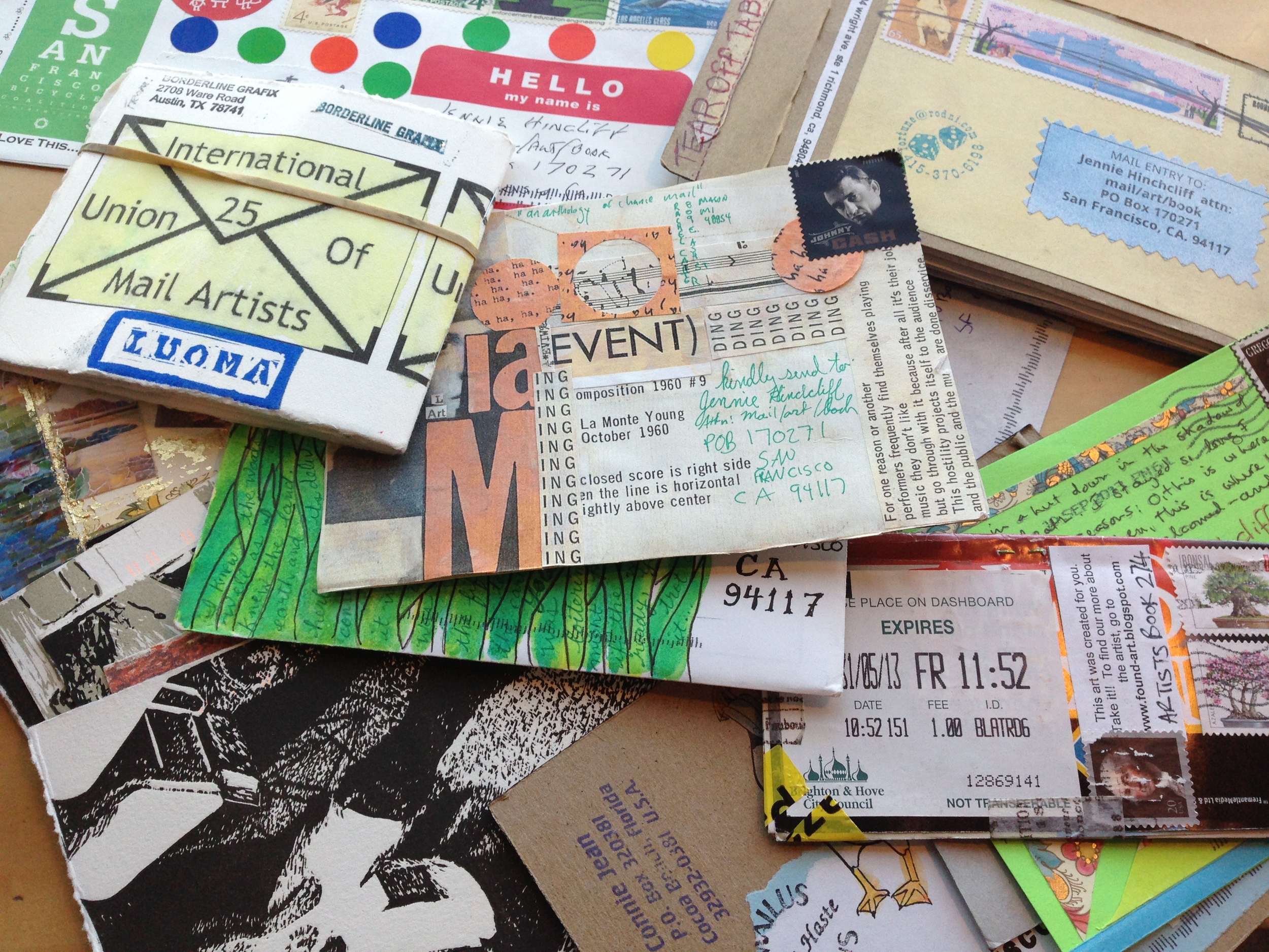
A three day celebration of correspondence art, letter writing, and faux philatelics will be held this weekend in San Francisco. Ex Postal Facto runs tomorrow until Sunday at various venues around the city.  

Kicking off the conference the San Francisco Center for the Book will host an opening reception for their exhibition “Mail/Art/Book.” Showcasing pieces by contemporary artists working in the genre of correspondence art, the exhibition also provides a historical perspective of Networker/ postal culture in the bay area. 

On Saturday a vendor expo will be held at the historic downtown San Francisco Elks Lodge, featuring small press publishers and artists whose work highlights faux postage (a.k.a artist stamps), postal art, and/or letter writing. 

Rounding out a weekend of events, the San Francisco Main Library hosts two different lectures. Featured speaker Lowell Darling will discuss his long-time association with the mail art scene in a panel titled “The History of West Coast Mail Art” moderated by San Francisco visual artist and writer John Held Jr..

Click here more information on the Ex Postal Facto 2014 conference. 

spring peep

Publish your news in honest-to-goodness ink on paper.

We're now accepting peeps for issue #21.

You may have noticed in our Winter issue, that we're moving to a mostly ad-free environment in the magazine. This means that peeps are the only page of advertising in UPPERCASE magazine. This makes your peep even more valuable than before!

As always, the peeps system is self-serve and one of the easiest things you'll do today. If you have any questions email Erin

Consider combining your peep with one of our new online ads for a powerful one-two marketing punch!

Submit by Saturday, February 15 for inclusion in our spring issue!


Wondering what a peep is? Think of a peep as a creative cross between a tweet, the community newspaper classifieds and a type specimen. Thanks to lithographic technology, these "paper tweets" leave a lasting impression. And with beautiful typography and design for each message (typeset by UPPERCASE designer Janine Vangool), these peeps transform a classified into something classy.