


Design Writing
/
I often wonder how people who seem to produce so much manage to do it. The answer? Heller gets up at 4am. And there still aren't enough hours in the day.
In an interview with Gothamist, Heller discusses working with illustrators. This is of particular interest to me because the next UPPERCASE book, Work / Life will be investigating the relationship between illustrators/photographers and their clients. (more details will be posted soon!)
When I looked for illustrators, I looked for someone who fit the criteria of being extension of myself. I dreamed of being an illustrator but couldn’t because I didn’t have talent to do it, even though I did do it in the early days of my career. I looked for someone who has authorship. A person or persons I would hire had to be able to speak a language on a mass level, but one that wasn’t clichéd and could take the common and make it uncommon. The people I ended up using a lot are those people who had that ability. There are those always those people who can’t do it. People I could would try to groom, but in the end wasn’t able to.
SVA is currently hosting a retrospective exhibition of Heller's career. Visit his website, too. The man has so many books that they need to presented in alphabetical categories.
Taking Things Seriously
/
Is it possible to be in love with a book?
Yes.
Taking Things Seriously: 75 Objects with Unexpected Significance is the object of my affections. First of all, the cover photograph is stunning. The book's modest dimensions make the act of reading a very intimate affair. The perfect binding and crisp, precise page trim lend this little block of book importance and heft. The page design is simple and elegant and lets the personality of the objects be fully appreciated, elevating the most mundane to that of a museum artifact. Taking Things Seriously presents a curious mix of items with personal significance to its owners: dirt piles, an ugly Santa, childhood toys, bizarre gifts, found objects... with the right circumstances, an ordinary object can have extraordinary significance. The contributors to this book are creative individuals (designers, writers, artists, architects) and all the entries are equally well-written, humourous, insightful and quirky.
This book is something to treasure.
(copies are available in UPPERCASE for $21.95... and soon will be available on our online store: launching very soon!)
Beautiful / Ordinary
/
Another collection of small, beautiful and singularly useful objects: the clothespin.
"Numerous reasons can be observed for the different variations in form and functional interpretations - it is exciting to see how many variations can be generated for such a minimal structure - a lesson in the evolution of products, a lesson in change as inherent human need, as well as the need to interpret, to innovate, to say the same thing differently."
They're very typographic.
Pencil Perfection
/
Bob Truby's Brand Name Pencils website is an amazing place. With over 100 catalogued pencil brands cross-referenced by ferrule type and era, it is a great resource for the pencil collector. At first you might think that a "pencil collector" is a rare breed, but with just a few short clicks and searches, you will discover many people sharing this obsession. Certainly, the skilled and sophisticated design of Truby's site is one of the best (designed by his graphic design friend, Jeff (hey Jeff, what's your website?).
Truby is a highschool art teacher in Oregon and his intention with his website is to create "a visual encounter with the incredibly diverse world of brand name pencils. I hope you will be amazed at the sheer number of pencil brands once produced in the USA and abroad. Sadly those days are over and the craftsmanship, skill and pride once put into the ordinary pencil is but a thing of the past."
I asked Truby what the appeal is of collecting pencils. He replies, "The appeal is truly a mystery. All I can say is that I know other pencil collectors and they feel the same way. I think the pencil in and of itself is a great collectible. Cheap, almost endless names, model numbers, manufacturer names, countries.....and of course they can be very old indeed." He grew up in a family of collectors (beer cans, match packs, coins, stamps, baseball cards and Hot Wheels), but his focus is now on the pencil collection.

Here are a few more places worth a visit: How a pencil is made and Doug Martin's Pencil Pages (the advertisement above is from his gallery). Leadholder.com (below) celebrates the drafting pencil and its history.

Penciltalk

Louise Fili
/
Louise Fili specializes in logo, package, restaurant and book design. Her work is recognizable for its delicate typography and elegant reinventions of historically-influenced packaging. I first admired her work as a design student in the mid-nineties, when I would render, by hand, copies of her logos that I would see in design annuals. Her book collaborations with her husband, prolific design writer Steven Heller, were also early influences on my studies.
The New York website, Cravings, recently interviewed Louise about her love of all things Italian and on designing for restaurants. Click here to hear the interview. View Louise Fili Ltd.'s portfolio here.

Neo Japanesque Graphics
/ PIE
PIEAvailable at UPPERCASE $90

Helvetica
/
A rare event: an evening devoted to typography! Veer is presenting a screening of Helvetica, the documentary film about the ubiquitus typeface on Tuesday, May 8. I'm sure it will sell out, so get your tickets today.
Date: Tuesday, May 8, 2007
Doors open: 6:00 pm
Screening: 7:00 pm to 8:30 pm
Q & A with the Director: 8:30 pm to 9:00 pm
Reception: 9:00 pm (Marquee Room)
Location: The Uptown Theatre, 612 - 8th Avenue SW
REGISTRATION DEADLINE: Friday, May 4th
Tickets: $15 each (catering included)
To register, email your name to register.absouth@gdc.net
Payment to be made by cash or cheque at the door.
Please note that there is limited seating available.
Wallpaper Hockey
/
Last night, as we were watching the Flames game, Glen was using his laptop. I assumed that he was keeping on top of the latest scores and sports discussions, but he was actually browsing this beautiful German wallpaper website. Needless to say, I was really impressed. What a guy!


Vintage Crate Labels
/


There is a nicely designed website call Box of Apples that features a gallery of crate labels.
In the 70 years between the 1880s and the 1950s, millions of colorful paper labels were used by America's fruit and vegetable growers to advertise their wooden boxes of fresh produce that was shipped throughout the nation and the world.
Collectors value crate art for its colorful design and its ability to trace the social and political history of American agriculture.
Beginning primarily in the southern regions of California, labels became an industrywide necessity to communicate the appeal of fresh produce to Eastern buyers. In the fast-paced setting of Eastern auction halls and commission markets, buyers could not see the fruit, which was individually packed in tissue paper and sealed in a wooden box. The brightly colored, attractively designed label soon became the growers' chief advertising device, the symbolic window from which the fruit could be judged.
You may purchase variously-sized giclee reproductions of Plan 39's collection of labels. Check out their closeups of the labels to appreciate the complexity of the original printing process and the wonderful use of colour found on these masterpieces of type and illustration.
(I have a modest collection of vintage food and drug labels, some of which make their way into my Eclecto paper packs, available in store or by email.)
Pretty / Disturbing
/

Florence Broadhurst
Who knew that a book about a wallpaper designer could be so full of deception and intrigue! Florence Broadhurst was a woman who changed her identity, nationality and profession to suit her personal goals and desires. From a career as a songstress in Shanghai, to a French couturier named Madame Pellier, to a British socialite/painter depicting the Australian landscape, Florence went from one glorious creative career to the next. (At least, she made her incarnations seem glorious… she had no qualms about telling lies about her credentials, associations and past.)
The book attempts to unravel the truth of Florence's true nature. Interspersed throughout are pretty, kitchy, outlandish and modern wallpaper patterns that ultimately Broadhurst is most famous for. Interviews with past associates reveal that it is likely Florence never actually drew any of her designs (she was going quite blind while at the helm of her company!) and that most are the creative work of the young women whom she employed and left uncredited.
Although Broadhurst lived to be in her seventies (she'd proclaim that she was twenty years younger), she was brutally murdered in her wallpaper showroom in 1977. Her murder remains unsolved, although clues link Australia's notorious Granny serial killer as likely suspect.
The book itself is beautifully designed with a lush red cloth cover with opaque white silkscreened florals. Pretty and disturbing - a rare thing in the realm of design books.
Available at UPPERCASE $32.95
Good design...
/
I'm looking forward to reading the new book by Gordon Bruce about Eliot Noyes (published by Phaidon). My particular interest is Noyes' involvement in the industrial design of typewriters. (via Coudal)
Eliot Noyes (1910–77) was a remarkable figure in twentieth-century design. An architect who began his career working in the office of Walter Gropius and Marcel Breuer, he went on to become the first Director of the Industrial Design department at MoMA in the 1940s. From the late 1950s until his death in 1977 he was Consulting Director of Design for IBM, Mobil Oil, Westinghouse and Cummins Engine Company, and was responsible for bringing about a change in the way that these corporations, and others that followed, were to think about design and its impact on business. He enlisted pioneering designers, notably Charles Eames, Paul Rand, Ivan Chermayeff and Tom Geismar, to help him bring about innovative architectural, graphic and industrial design. He was personally responsible for the design of some notable twentieth-century classics, such as IBM’s Selectric typewriter …
Kate Spade
/
Kate Spade's design sense is always impeccable and now it is translated into a beautiful website called "Behind the curtain." It has a nice mix of readable content plus some great eye-candy. (Found via Oh Joy! who is doing a fantastic job of guest-blogging at Design*Sponge.)


A new Beyond
/
It took over a year since the last one, but there is indeed a new issue of Beyond available in UPPERCASE or through the magazine's website. Beyond is a non-profit magazine based in Calgary and it was one of the very first design projects I had when I was fresh out of college (thanks to Aaron Leighton with whom I co-designed the first issues). In the past decade, the magazine content has changed considerably — along with my design sensibilities and ability. This issue sports a new masthead and typographic style to reflect the maturing content. Preview Issue 15's content at the Beyond site.
The cover image is by photographer Karin Bubas.
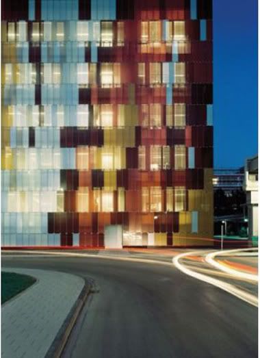
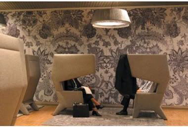
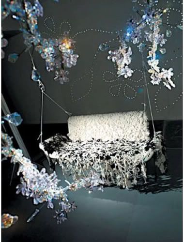
Patterns in Design, Art and Architecture
/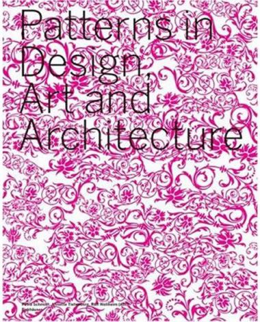 In 1908, Adolf Loos condemned decor as a 'sure sign of the degeneration of society". In his essay, 'Ornament and Crime,' he explained how if one give in to his desire for ornamentation it is obvious he has no regard for the greater good of society. Much like someone who would cover themselves in tattoos, Loos proposed, the ornamentation of architecture and utility objects is a bold display of 'childish behavior, sexual recklessness and dissipated hedonism'.
Oh how things have changed.
Pattern is exploding back onto the scene in architecture, art and design, and is constantly being reinvented and rediscovered by such designers as Heinrich Weid, Francis Soler and Olaf Nicolai. This beautiful text exhibits contemporary pattern use in textiles, landscaping, industrial design, architecture, interior design, and art while recounting the history and impact of this fundamental design tool.

Packaging for fashion
/
There's a good article about packaging design for fashion at the International Herald Tribune by author Alice Rawsthorn.
Most have opted for one of two default design styles for their boxes, bags and logos (or visual identities, as graphic designers call them). One style belongs to what we'll dub the Voguettes. These are the brands with forgettably pleasant packaging, whose logos look more or less like Bodoni, the elegant serif typeface that Alexander Liberman adapted in 1947 to create the lettering that spells out Vogue's title on the magazine cover. Now that style seems very Vogueish, which is presumably why Giorgio Armani, Burberry, Dior, Piaget, Pucci and Vera Wang have adopted similar typefaces.


