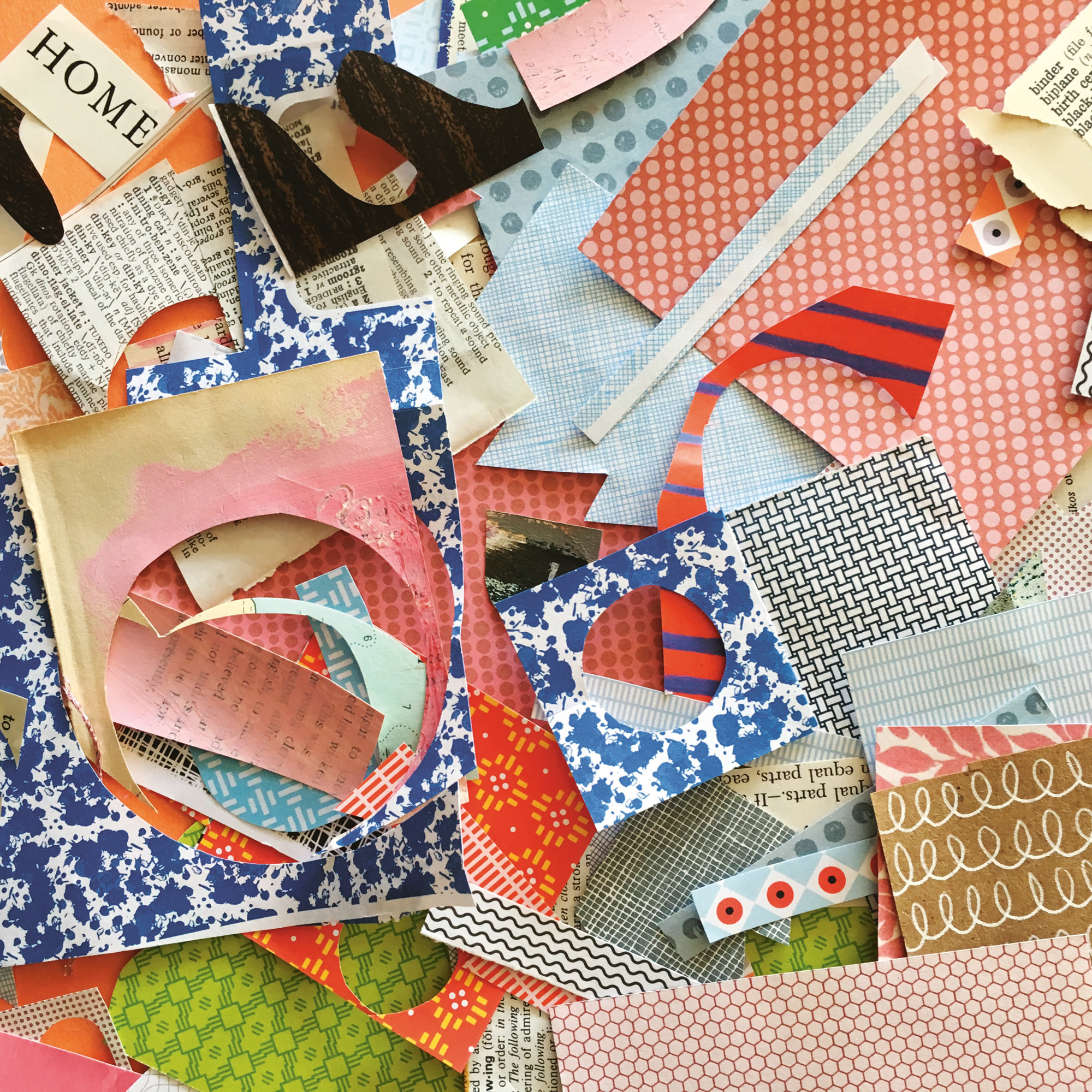
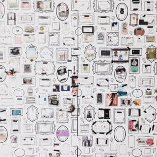
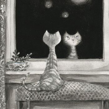
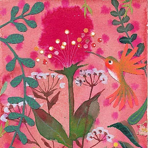
Issue 41's cover, animated by Lucie Duclos!

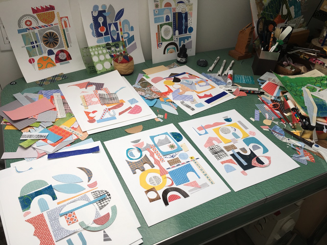
The cover of our new issue is by UPPERCASE subscriber Lucie Duclos, whose colourful and patterned collages caught my eye on Instagram.

I liked the idea of creating a cover with found patterns (plus a few from past UPPERCASE covers). It's abstract with a nod to mid-Century shapes, and the dimensional shadows make you think that the elements are still at play. (Don't sneeze!)

"I have always been interested in pattern design on textiles," says Lucie. "My grandmother was an avid and talented seamstress and would bring me along on Rue St-Hubert in Montreal where all the little fabric shops were lined up for several blocks. She would head straight for the remnant bin in search of the perfect little “coupon de tissu” as she called them in French. I was in awe of her skills and was fascinated by her considerable fabric stash and how quickly she could transform a piece of fabric into a stylish and fashionable garment. Everyone in the family had something made for them by grand-maman Lucile. I was named after her and she remains a powerful source of inspiration in my life."

Lucie lives in Victoria now, where she teaches design workshops such as an intro to fabric design. She also offers many online courses.

Fresh: Joan Garcia

Whether you are a fresh graduate or mature artist, it is often a dream to be published for the first time! In the current (and future) issues of UPPERCASE, I have a new column dedicated to featuring such talents.

In issue 35, we meet Joan Garcia, a recently retired public school teacher who would like to become a professional illustrator.

“I have been drawing and painting all of my life and I would like to make this dream of growing as an artist and creating and selling my work a reality. My background has been as an educator of young children with an emphasis on children’s literature. Children’s storybooks and illustrations have always been such a strong part of my life. I feel my work reflects a love of stories and a strong love of colour. My dream clients would be people who appreciate a story told through art and my dream would be to illustrate a book.”

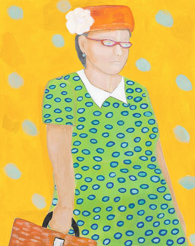
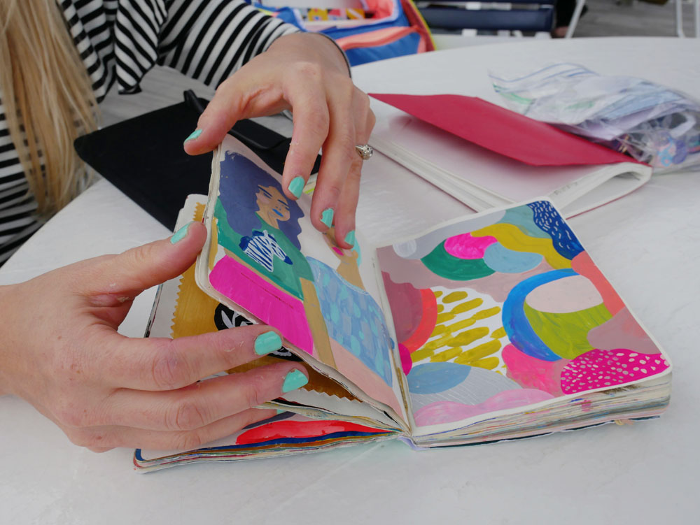
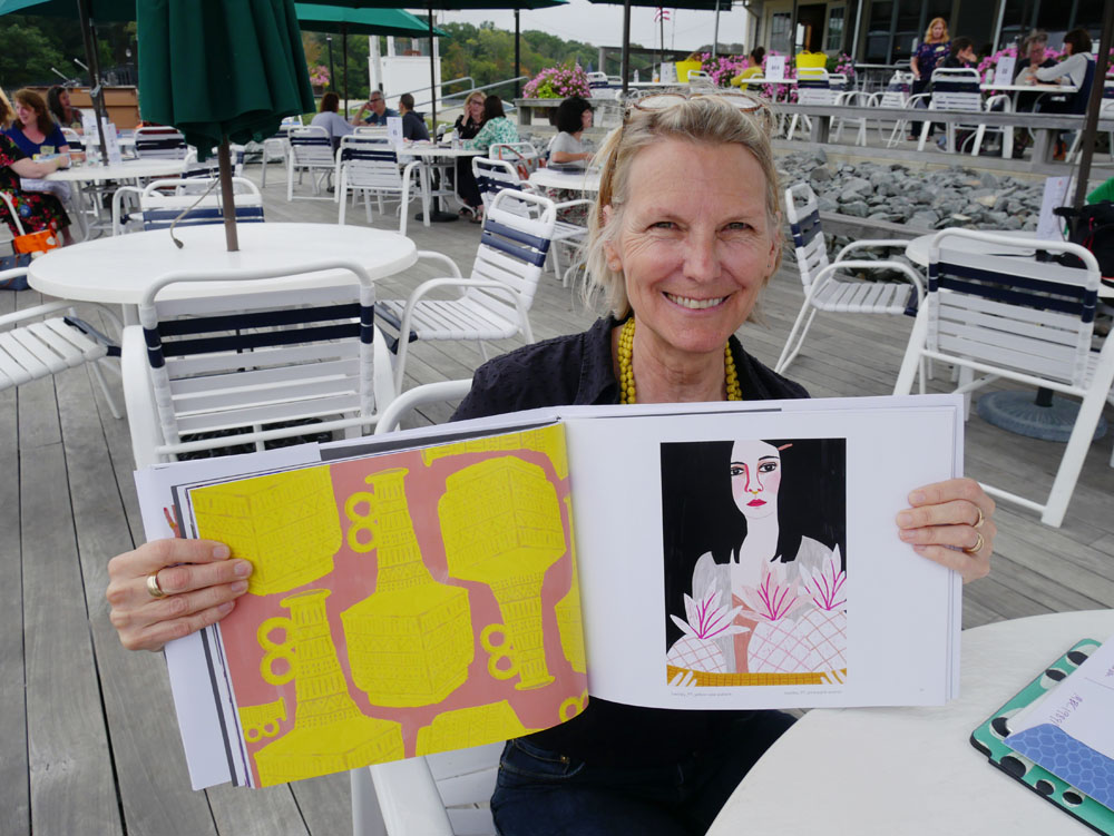
The acrylic painting of the white haired woman is my great aunt Antonia from Spain. The layers of this piece include dressmakers’ pattern tissue, sculpting medium used with stencils and hand-painted coloured tissue paper, giving the impression of Spanish tile in the background. 

The girl with the bow is my grandmother Nina as a young girl. I have a photo of her in sepia and I have always loved it—especially the bow. She loved colour and was a very happy, optimistic lady.

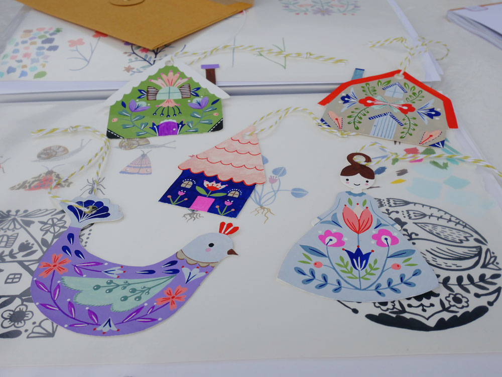
A combination of mono print and ink illustration, pieces in the Menagerie collection are created with archival inks from handcut stamps and detailed with pen and ink.  Image sizes are approximately 3x5 inches.

I always work in my journal while my paint dries on my canvas. It keeps the flow going!

Paola 58 is part of my "influential women" series.

See more from Joan on her website and Instagram. Do you dream of being featured in print? Apply here.

Lilla Rogers' Gorgeous Garden

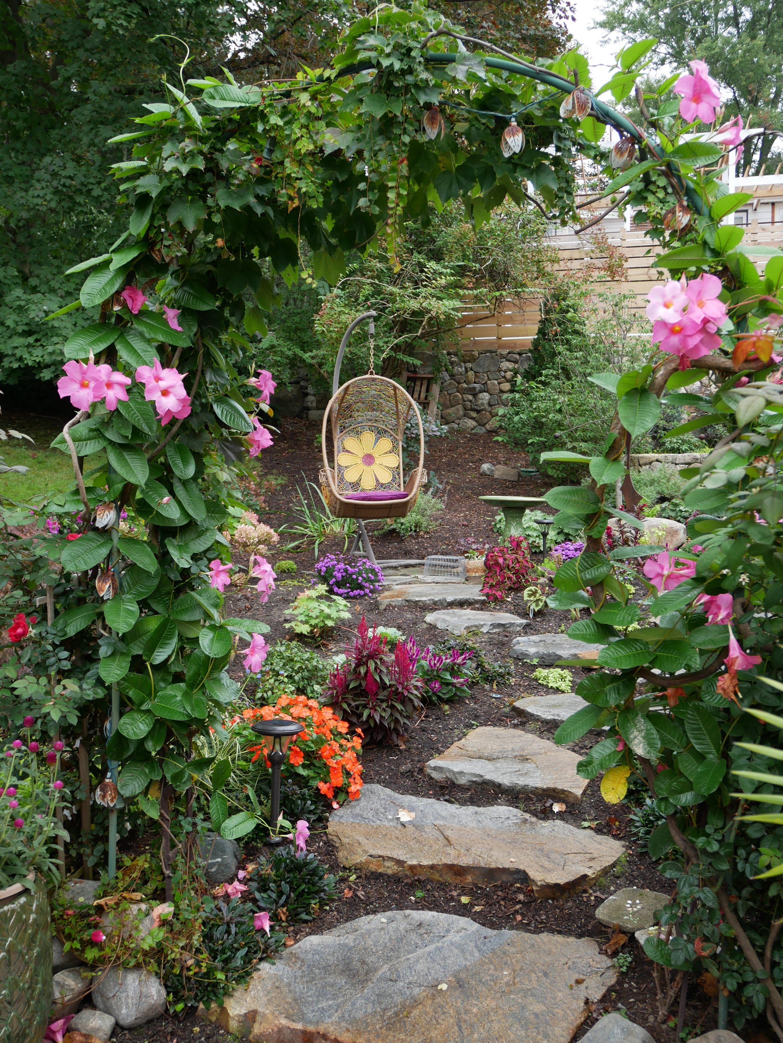
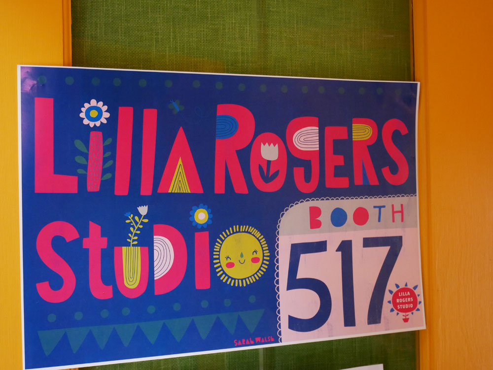
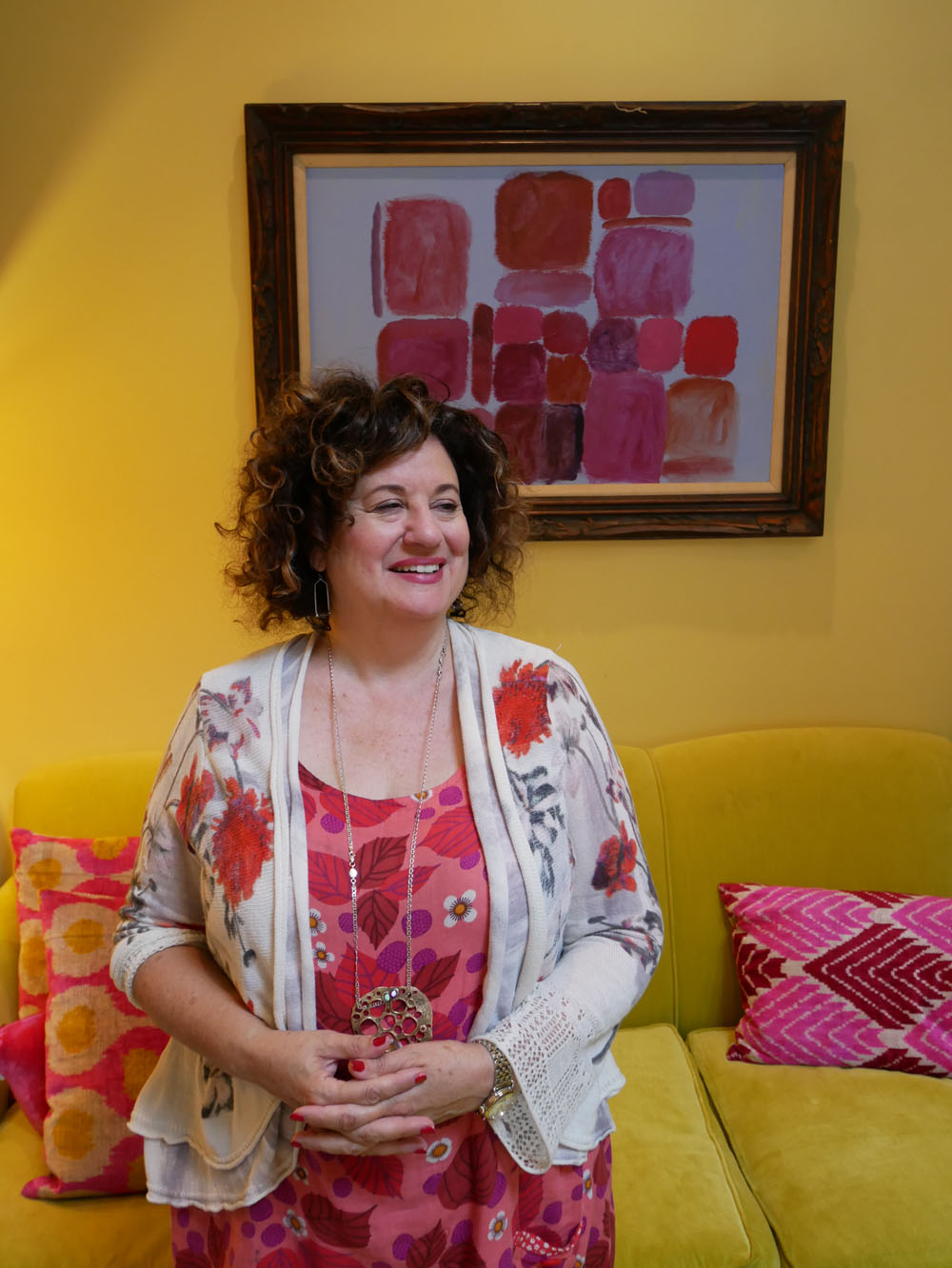
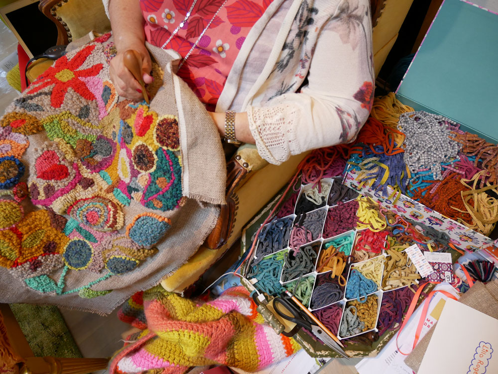
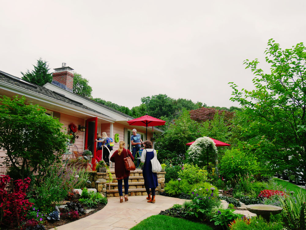
Illustration rep Lilla Rogers' home studio is inspiring (see this previous post) but her gorgeous yard is competing for attention. Full of pinks and lush greens, the yard has many places to sit, ponder and sketch, linked together with meandering paths and changes of elevation.

Lilla worked with Susan Redmond of Redmond Design Group on this backyard design project, that was completed earlier this year. "We had redone the front yard the previous year," says Lilla. She so enjoyed the process and collaboration with Susan, that this year they redid the back.

"We worked on the design together. It all started innocently enough," Lilla explains. "I simply wanted a fenced area to keep out the groundhogs, rabbits and chipmunks from my cutting beds and vegetables. Ha ha ha," she laughs. "Then project creep happened, happily." She added three garden arches "smothered in mandevilla and climbing red roses" along with lots of bird houses, a bird bath, many paths and an egg swing—"which is great for meditation."

Walking up the path leads to a very cute potting shed, that Lilla uses for writing—and perhaps as a retreat and studio for visiting guest artists someday.

A fenced area keeps critters out of her cutting garden; its symmetry offers a nice geometric contrast to the rest of the yard.

With decorations by both Lilla and her artists, the yard is punctuated by personality and colour.

Thank you, Lilla, for inviting me to your 2017 artists' retreat.

Lilla Rogers' Artist Retreat

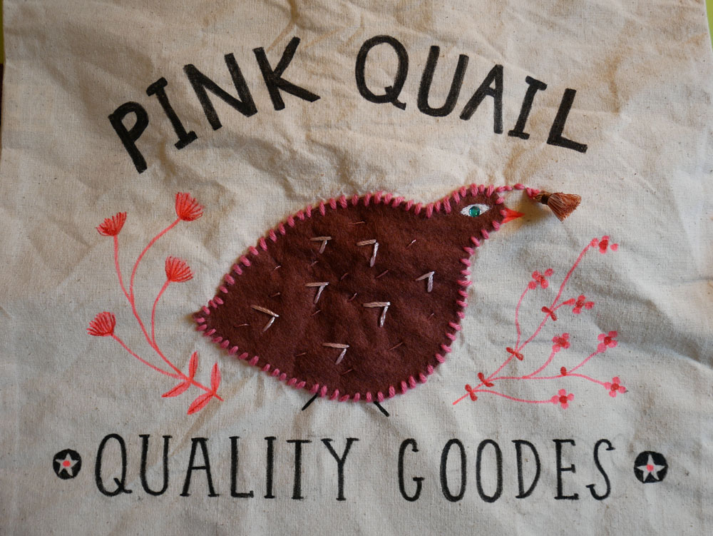
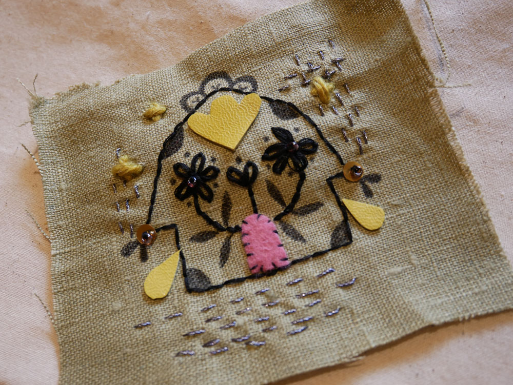
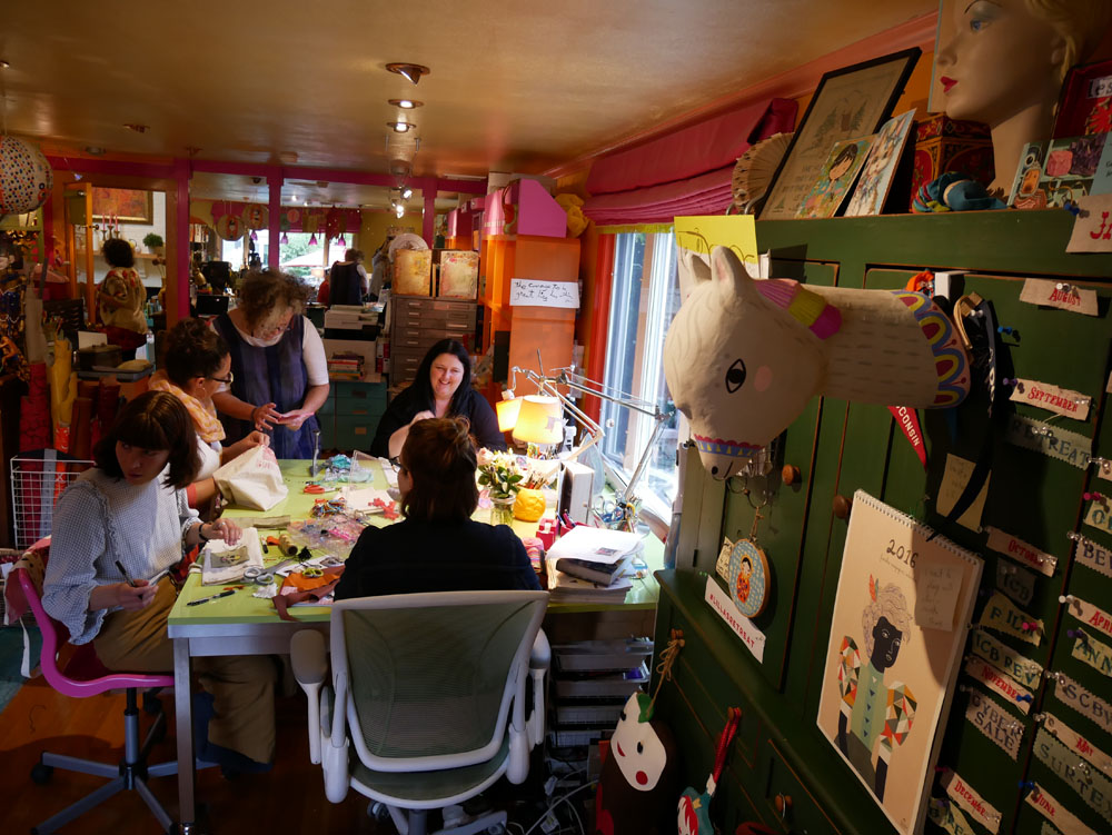
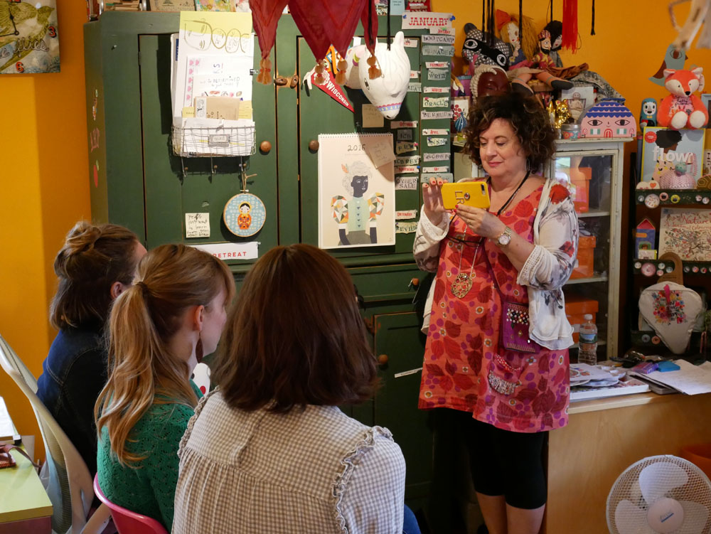
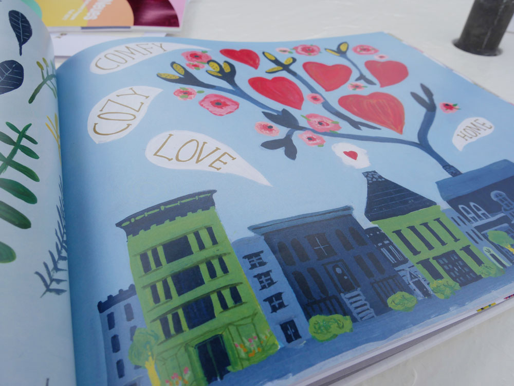
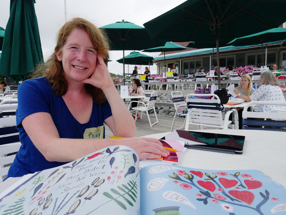
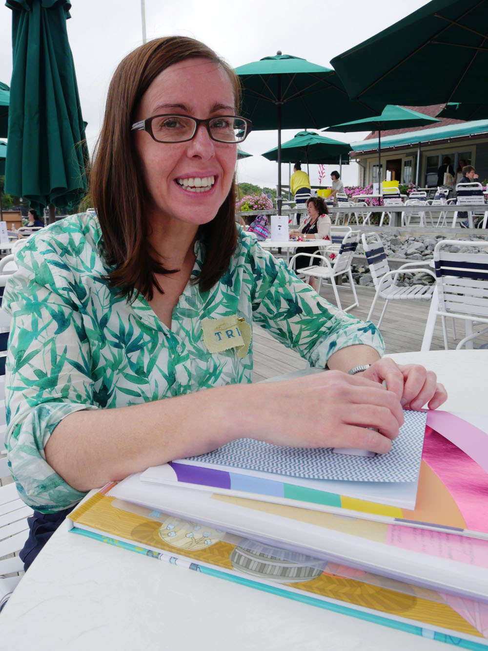
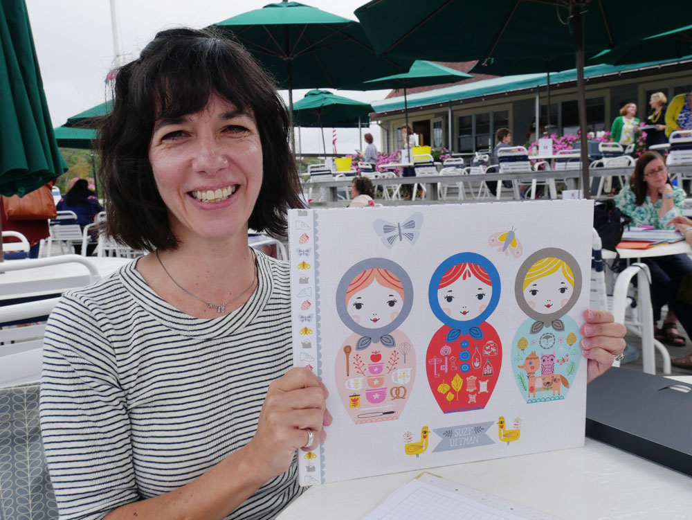
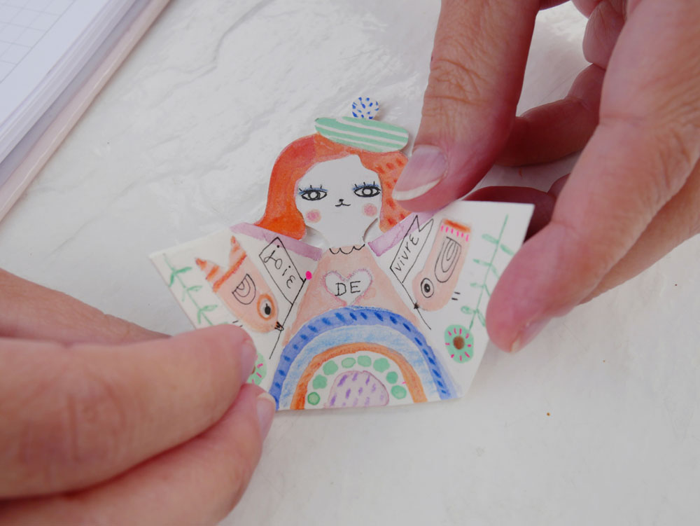
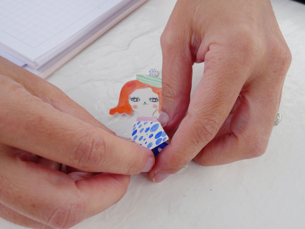
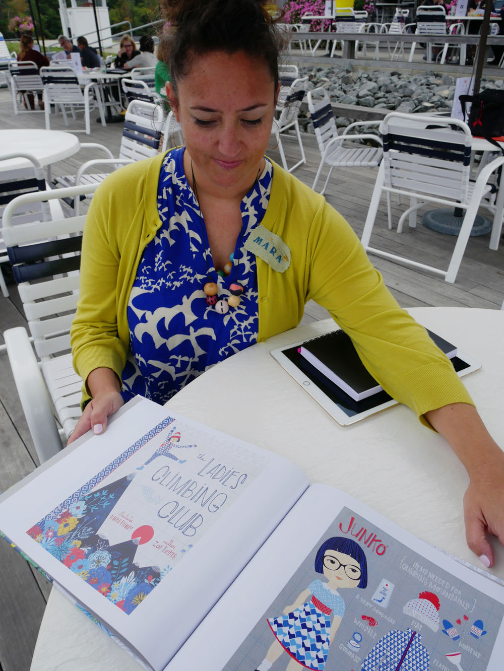
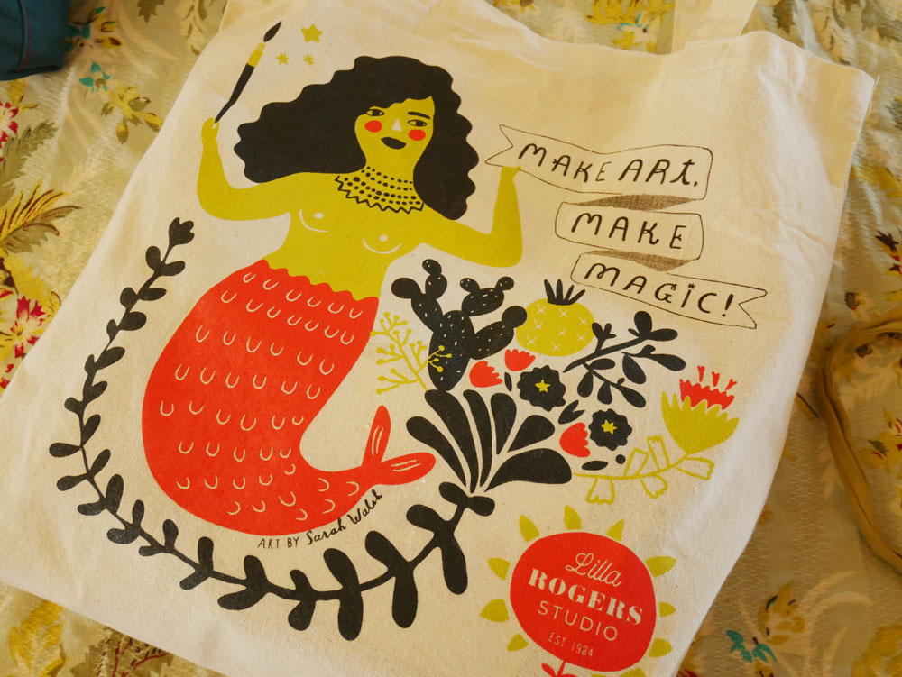
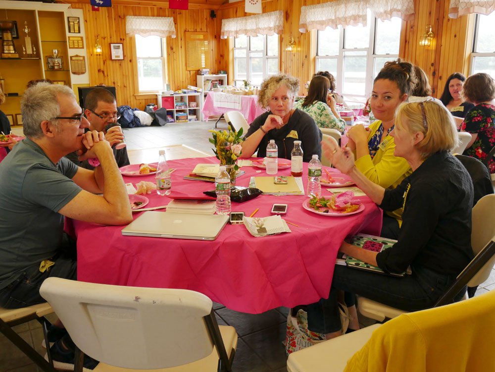
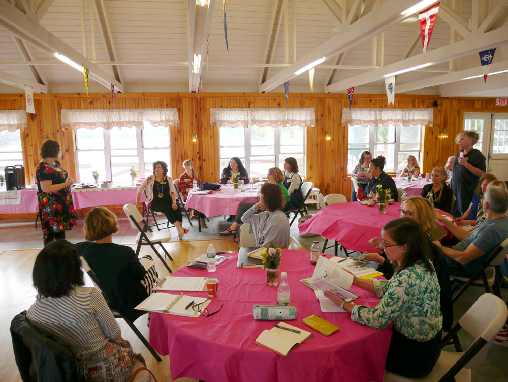
I was invited to give a presentation at Lilla Rogers' Artist Retreat, September 17–19 in Arlington, Massachusetts. The first day was programming for the artists. On the second day, I was one of many art directors talking about what we do and how we work with artists and commission work. With representatives from teNeues, Hallmark, Candlewick Press, BlueQ and other publishing companies, it was an honour to be included! Following the presentations, there was a "speed dating" round in which the artists came to show each of us their portfolio, one on one. On the third day, Lilla let me hang around her studio and participate in craft day, bedazzling canvas tote bags. Here's a video showing snippets of that afternoon:

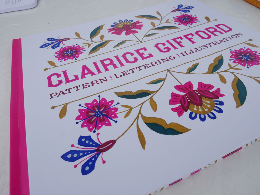
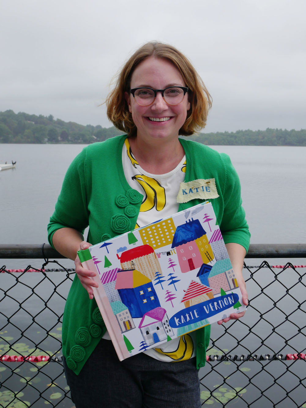
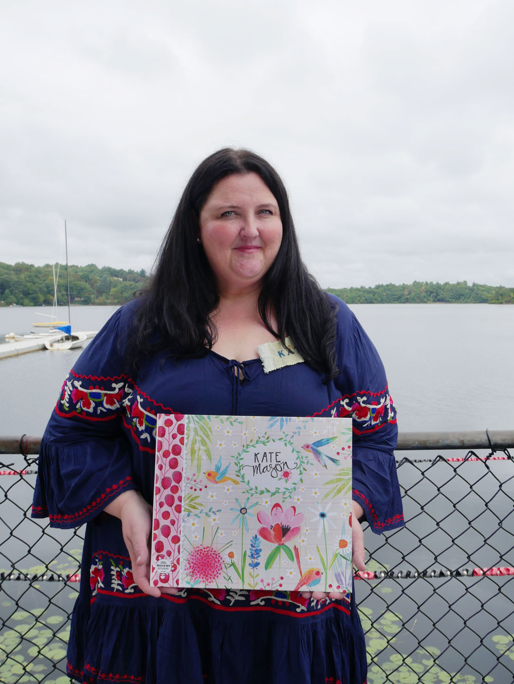
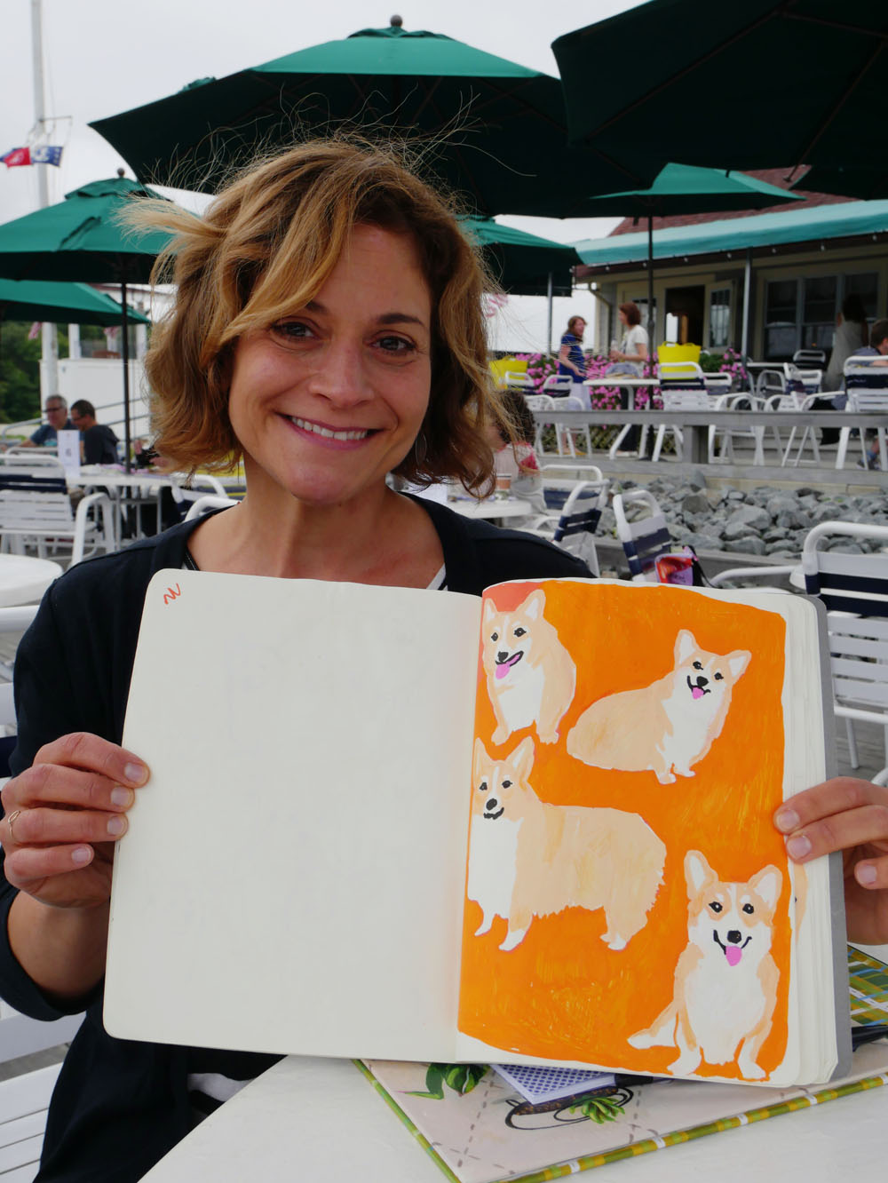
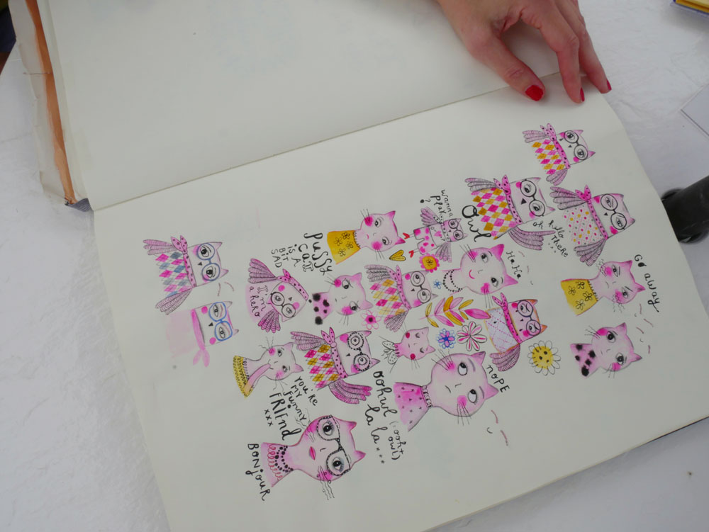
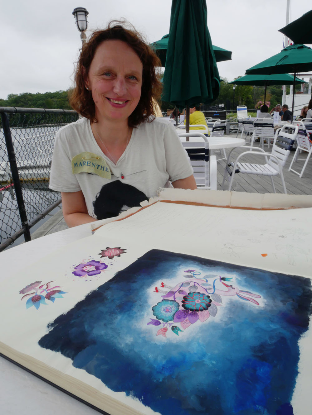
Anne Bentley, Clairice Gifford, Mara Penny, Lilla Rogers, Flora Waycott, Kate Mason, Marenthe Otten, Katie Vernon, Trina Dalziel. Front row: Terri Fry Kasuba, Jessica Allen and Sarah Walsh. Not pictured: Suzy Ultman.

Do you find beauty in incongruity or in similitude?

I receive hundreds of submissions every year (perhaps the number even tops 1000? There are a lot of them—some from my open calls, others unsolicited). And I'm grateful for each and every one of them! I try to put as many as I can in print, but often there are more ideas than number of pages. And since the magazine is quarterly, it can take a long time for a very good submission to find its way into print.

I want to share more of these submissions—folks have put talent and effort into them and they deserve to be read and appreciated. I'm going to post more of them in my newsletters and here on the blog, and though it might not be as thematic and ordered as in context of a print magazine, there's beauty in the random surprise.

Let's start with Clare Dean, who submitted the piece below as part of the Open Pitch a couple of months ago. Clare offers us (me!) perspective on letting things be a bit more uncontrolled and organic.
 

Do you find beauty in incongruity or in similitude?

by Clare Dean


Over the past few years, in addition to being a publishing consultant and mother of small chatty boys, I have worked as an artist, illustrator and pattern designer. As my style has developed, like many others I have given a lot of thought to my point of view. Do I have one? What are my convictions? What I am trying to say? Initially, I created work that I hoped would merely ‘delight’, but it soon became obvious to me that there was a lot of ‘delightful’ work out there that pursued a similar theme. What was I trying to ‘say’, if anything at all? As a philosophical theology graduate, and the wife of a philosopher, it seems that I am attracted to thought and meaning. 

A couple of summers ago, I attended a modern dance performance/dramatic piece in Boston. The overall perspective they communicated could be reduced down to the idea that everyone and everything is the same – that we exist, and others and other things exist, and there is comfort and complicity in our similitude. I thought about it, and realized that I believe and find comfort in the opposite – that everything is various and different, and that beauty can be found in complexity. In pursuing this idea further, I realized that a common trait in my work is an almost random incongruous assemblage of things and beings. 

I delight in mismatching and juxtaposing images to partly highlight the absurdity of the assemblage of things, but also to celebrate the richness in life. Why not, for example, place a poodle on a vintage 1970’s footstool, or a parrot flapping around an antique rocking horse? To me, the combination of these items painted to highlight their beauty celebrates them as individual objects and beings, while saying ‘look how strange – we live in a world where someone shaves a poodle’s fur into funny balls, and also makes and owns a swirly patterned stool on which to rest your feet. Ultimately, the fact that I am drawn to capturing the incongruity is all the more absurd.

Visit Clare's portfolio.

“Making Art a Practice: In and Out of the Sketchbook” with Cat Bennett

Carla Sonheim is hosting a new class with instructor Cat Bennett. You might recall our feature about Cat in issue 27 of UPPERCASE. “Making Art a Practice: In and Out of the Sketchbook” is a 6-week online course that includes 12 video classes. "We’ll spend two days drawing in the sketchbook with a focus on colour, line and shape," describes Cat, "and then jump out of the sketchbook to do a bigger project. We’ll draw and paint the world around us— food, clothes and the objects in our homes, plants and landscape, and people. And we’ll do so in different ways—painting using only lines, making cut-paper images using only shapes, then bringing line and shape together in different ways."

"Our goal is to draw and paint in experimental ways and to get ideas for our own work. We’ll mostly work on a larger scale outside of the sketchbook and try things out. We’ll approach everything we do with a spirit of adventure and discovery!"

To watch a video of Cat and to register, please visit the Carla Sonheim website.

Thank you to Carla for her continued support of UPPERCASE magazine and its original content through a Calling Card ad.

Spring Sale at Make Art That Sells

I'm so excited to be part of Lilla Rogers' Make Art That Sells as part of a special ‘live review’ for MATS (Make Art That Sells) Part A and Part B. These self-paced courses are on sale NOW until Friday, April 8.

Lilla and I will be getting together (virtually) to offer comments and reviews of some of the assignments created for her course. The best assignments will be featured in future issues of UPPERCASE magazine!

Lilla and me!

I'm pleased to announce that I'm going to be part of Lilla Rogers' Make Art That Sells as part of a special ‘live review’ for MATS (Make Art That Sells) Part A and Part B self-paced courses in April. Lilla and I will be getting together (virtually) to offer comments and reviews of some of the assignments created for her course.

Here's more info from Lilla's announcement:

Who is eligible to participate?

This bonus live review is exclusively for participants of the self-paced MATS A and MATS B classes — but don't worry, you can still register if you aren't in yet! 

In order to participate you must be registered for MATS A and/or MATS B by Monday 11 April. There will be two reviews, one in each classroom, so if you are registered for both A and B you will get access to TWO brand new assignments and TWO chances to get your work in front of Lilla and Janine!

So what do I have to do to get my work in front of Lilla and Janine?

You will need to complete one or both assignments by the deadline given in class, and upload it to a dedicated online gallery. Lilla and Janine will view every single piece in the gallery, and then choose a selection of pieces to include in the review based on what they think will be most valuable for everyone in class to learn from. A video recording of the review will then be shared in class a few days later. It is an incredible opportunity to hear from both a top magazine editor and a top agent. Whether they are talking about your submission or someone else’s piece, there will be a ton of takeaways that you can drink up to feed your own work. 

What markets will be covered?

That's hush-hush right now. All will be revealed shortly…

When will the assignment be released and due?

The assignments will be released on Monday April 11, 2016 and will be due by Monday April 25, 2016. The review will take place shortly after that. 

For more info, see the announcement.

Lilla and I are very excited about this and look forward to seeing your work!

Congratulations to Aga Kobylinska

I had the pleasure of sending some good news today to Aga Kobylinska, the winner of the Make It In Design Module 3 Giveaway! Aga is a surface pattern designer based in Warsaw, Poland.

"It’s wonderful, vibrant city, full of fantastic opportunities," she writes. "I love to live and work here. But I’m also addicted to travels! I’m constantly fascinated by the beauty of nature, cultural diversity and human creativity."

When I asked her how she felt about being the recipient of the free class, in which she'll learn how to monetize her surface pattern designs, Aga replied, "I've never felt ready enough to send you my portfolio for review so I'm amazed by your email even more." I think that's a very common feeling... we never think our portfolio is good enough or ready or finished. I'm glad that Aga and the dozens of other artists took the leap to share their work with all of us. Having the confidence to share your work is the first step in building a successful career.

Follow Aga on Instagram and see more from her portfolio.

If you're wondering how Aga was selected, I read all 77 comments and clicked over to the participants' links. (Remember to read contest directions carefully! It is stated clearly in italics that to enter you must include a link to your website or instagram. If you don't have a portfolio yet, then you're not quite ready for this class.) From reviewing the links, I narrowed it down to 12 of the best portfolios and then the team at Make it in Design selected the winner.

How to Get an Agent (and Do I Really Need One?)

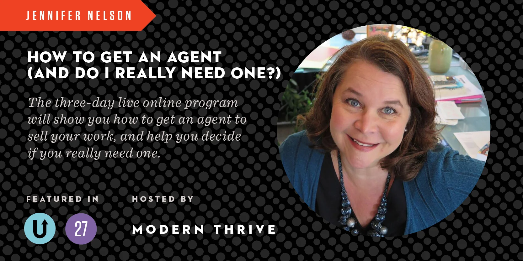
Jennifer Nelson, contributor to the October/November/December issue #27, is offering an intensive 3-day online workshop hosted by Modern Thrive entitled "How to Get an Agent (and Do I Really Need One?)." This live online workshop will take place March 16th-18th at 2pm EST. From assessing your career to making a plan to understanding how artist representation works, Jennifer will present real-world knowledge about a career in illustration.

Jennifer is a professional artist's agent and the founder of a Boston-based illustration agency Jennifer Nelson Artists. She has spent more than twenty-five years working in the art world as an art director, designer and agent.

Save $20 on your registration with discount code "UppercaseVIP." Sign up here. Hurry, the course starts March 16!

The Makers Summit

This guest post is by Tatjana Mai-Wyss, a freelance illustrator in South Carolina. She was our correspondent at last week's Makers Summit in Greenville.

UPPERCASE donated magazines for the Makers Summit goody bags. Photo from the Makers Summit Instagram.

Last weekend I was lucky enough to spend a couple of inspiring days at the Makers Summit in Greenville, South Carolina. This conference is billed as an “event designed for creative entrepreneurs who want to grow successful businesses". I was impressed to learn that the guests and attendees had come from all over the country. How lucky for me to live less than an hour away!

Tatjana with the business card wall.

Attendees could stick their cards to the wall.

The event takes place on the 5th floor of a new office building in the middle of the city. The space is bright and airy; two floors connected by an open staircase with great views of downtown Greenville. The workshops, peer group meetings and expert consultations are held in various classrooms, while the keynote speakers and discussion panels bring everyone back to the stage area.

On Friday, keynote speaker Justina Blakeney kicks things off with a bang. She is enthusiastic, colorful and engaging in person, and her talk makes a definite impression on everyone. Throughout the weekend speakers refer back to her thoughts on finding your passion, focusing on your goals (remember your “north star”) and prioritizing your worklife. Personally I like the part about “moving on”, finishing a project and moving through to the next thing without obsessing too much. (My new mantra will be: "is it good enough?”) I’m impressed by how approachable and charming she is, and enjoy meeting her later over succotash and bourbon/ginger ale cocktails at the “Best Craft Party Ever."

Lettering print by @jennyhighsmith from the goody bag. Photo by @kukajuice.

Most of our lives as creatives are spent in our offices/studios and on our own, so the best part (and also the most challenging sometimes) is being part of a group and meeting so many interesting people in such a short amount of time. It’s so much fun to know that your badge gives you licence to walk up to a stranger and ask any amount of questions over your morning coffee.

Photo from Makers Summit Instagram

Speaking of coffee, the food at the summit deserves mention. There is stylish coffee (and fresh smoothies) throughout the weekend, beautiful (and delicious) cakes for Friday’s coffee break, three fun venues for Friday’s party (my favorite is an outdoor terrace with colorful cushions and twinkly lights) and a decadent breakfast buffet on Saturday. Homemade donuts for saturday’s coffee break continue the party atmosphere, and now that I think of it, the emphasis on good food might be a southern thing.

Photo from the Makers Summit Instagram

The focus of this conference is really on making something concrete and getting it out there, so the discussion panels centre on resources and funding for small businesses, scaling up and managing a growing business, and marketing all around. The panelists have a good variety of approaches and perspectives and answer questions thoughtfully. 

Workshops, peer group and expert sessions can be a bit more customizable and let you ask questions specific to your experience.

It will probably take some time for me to digest all the information from the Makers Summit, but I’m very glad I went, and very happy to have made new friends and experiences.

Follow Tatjana on Instagram and see more of her portfolio here.

Make it in Design: Course Giveaway!

Together with our friends at Make it in Design, we are offering a very special prize to ONE very lucky reader - one free place on the next Module 3 class of The Art and Business of Surface Pattern Design worth $CAD680 (£359)!

Module 3 – ‘Monetising your designs’, is a five-week online course where you will learn everything you need to know to monetise your designs! The classroom can be accessed around the clock so you can join from anywhere in the world, and fit the course into your busy life. 

The course details the major money-making opportunities available to you as a designer, including; freelancing, licensing, selling outright, manufacturing and more! Module 3 also includes free access to leading trend forecasting site WGSN for a limited period AND the Make it in Design little black book of industry contacts!

Course alumni have gone on to launch their own design studios, win national awards, be featured in design books, on leading blogs and more. Fancy a bit of this action too? Read on to find out how to enter.

The class includes the following:

• How to identify multiple streams of income for your designs
• How to sell and license your designs (what they don’t teach you at art school!)
• The ins and outs of freelancing
• How to get into manufacturing your own product
• How to choose the right distribution channel for you
• How to negotiate a contract that is right for you
• How not to get ripped off
• How to manage your time and money
• How to manage stock levels
• How to get a job in design
• How to stay motivated

Plus:

• How to create a pattern portfolio to show to potential clients
• How to apply patterns to mock-up product templates and room sets
• How to turn a placement print into a technical repeat for wallpaper or fabric
• How to design a Trade Show Brochure in Adobe Illustrator

Invaluable industry information such as colour print specifications for both paper goods and textiles.

You will do this by actually creating a mini portfolio for potential licensing clients; a trade show plan and a business development plan.

PLUS you will learn everything you need to know about trade shows (getting in, getting ready and getting customers!)

AND the Make it in Design money-can’t-buy bonus little black book of industry contacts!

And if that wasn’t enough, you also get full access to leading trend forecasting site WGSN for 90 days (this alone is worth more than the entire cost of the course!

THE PRIZE

One place on The Art and Business of Surface Pattern Design – Module 3 ‘Monetising Your Designs’ runs for 5 weeks from April 4, 2016, delivered online) 

How to enter: 

Check out the course website to find out more about it, then head back here and leave a comment at the bottom of the post in 50 words telling us why this course would benefit you right now and how it could transform your career. You must include a link to your website or Instagram to be considered.

Deadline: March 14 Any comments left after this time will not be counted. The winner will be jointly selected by UPPERCASE editor Janine Vangool and The Make it in Design team and announced on March 17.

Good luck!

Terms and Conditions:

This competition is to win a place on Module 3: Monetising your designs starting April 4, 2016. One entry allowed per person. The winning place is not transferrable – either by date or to another individual and must not be sold on and no cash alternative will be offered in the event that the winner is unable to use the prize for any reason. By entering this competition you agree for your entry to be promoted on the Make it in Design and Uppercase website and their associated social networks. If you have already signed up for the April Module 3 class and are selected as the winner you will be offered a refund. 

Happy Cat

Cat Bennett is an illustrator and author who is featured in the current issue with a fun interview by Vicki Turner. Cat wrote in when her copy of the magazine arrived: "I came home last night to find my copy of UPPERCASE!!! Wow, what a thrill to open it! I am in the company of so many inspiring young artists and know I’ll be getting tons of pleasure poring over their work!" She goes on to say, "It is a fantastic resource of inspiration and so beautifully designed. I especially love how you find and give space to so many different artists from all over the world. I think you are part of changing the paradigm by honouring the artist in all of us!" Thanks, Cat!

Cat has a new book launched this month: The Drawing Club of Improbable Dreams: How to Create a Club for Art. Here's the book description:

"The Drawing Club of Improbable Dreams shows how to create a drawing club to grow our art and creative selves. What makes this drawing club different from a regular drawing class is the one rule we apply to all we do. Rather than looking for what’s wrong, we look for what’s strong and interesting, for what we love and what we most desire, and then we learn how to build on that. The book gives instructions for how to get going and lesson plans for three full 8-week sessions that will take a club through its first year. The exercises are designed to hone skills, visual thinking and the ability to explore freely without fear of mistakes. We learn too how a club can become a sanctuary for creative exploration and for being the artists we dream of being."

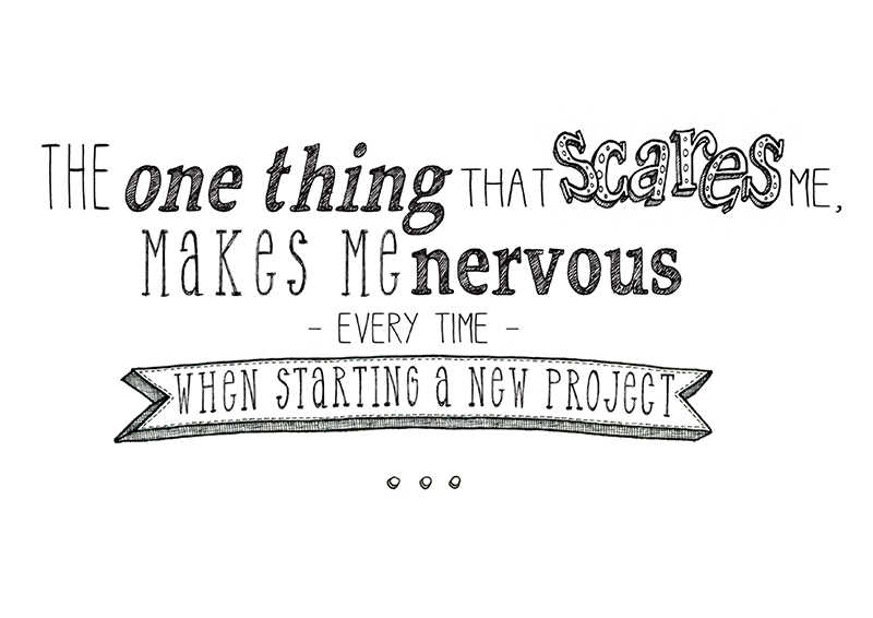
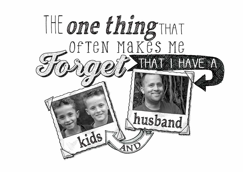
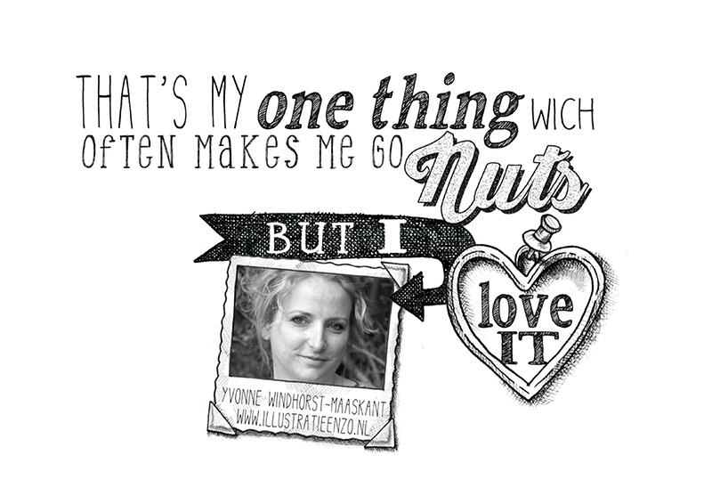
What's your "one thing"?

In one of my newsletters last month I asked, "What if you found that one thing that you go to sleep thinking about, that you dream about, that makes you leap out of bed with excitement and anticipation?"

That one thing that brings you into an unknown world full of new challenges? That one thing that will involve lots of learning and test you in ways you can't even anticipate? What's that one thing that might make you scared and nervous, but you still want to see where it takes you?

I'm grateful that I've found my one thing in UPPERCASE. I asked readers, "What's your one thing?"

Dutch illustrator Yvonne Windhorst-Maaskant replied with this great series of images. Please click through to discover her "one thing".

Make Art That Sells with Lilla Rogers

When it comes to illustration and licensing, I return to Lilla Rogers time and time again. She is the expert! I've featured her in issue 13, 17 and 21.... and the graduates of her program have been published many times, particularly in issue 21's Surface Pattern Design Guide.

Lilla's latest course, Make Art That Sells Part A is starting October 19. The course will guide students in building a professional portfolio while learning all about the most lucrative markets for art: bolt fabric, home décor, children’s books, wall art and the gift market.

If you want to break into these areas, I urge you to take her course. Having seen the work created by her graduates, I can see the difference that Lilla makes in artists' confidence and know-how.

My only caution is to hold true to your own style, your own voice... it is often too easy to start emulating other successful illustrators who have gone through the course. The best thing you can do for long-term success is to trust your vision, hone your style and point of view and you'll find your place in the big world of commercial art-making. The guidance and professional insight you'll gain from Lilla combined with your drive and dedication will be a winning combination.

Speaking of winners, the finalists for the Global Talent Search have been announced! As one of the industry judges looking over 49 finalists, I'm pleased with the results. Congratulations to Katie Vernon who was both the judge's top choice as well as people's choice. The overall winner, selected by Lilla, will be announced next Tuesday following their final round assignment.

In revealing the finalists, Lilla has some great advice about such competitions, which I think also applies to when you're submitting work to one of my open calls, too. Lilla writes, "Entering a competition is a scary and exciting thing. A competition can elevate our industry by pushing artists to make their very best work. At the same time, it's hard when you don't get picked. Back when I was an illustrator, I would use the experience of not getting into a particularly coveted competition as a motivator to up my game. It worked. I sincerely hope those not chosen do the same." 

Sign up for Make Art That Sells and maybe we'll see you in the Global Talent Search finalists next year!

Win a spot in The Ultimate Portfolio Builder! (Comments Closed)

See the winner here.

Together with our friends at Make it in Design, we are offering a very special prize to ONE very lucky reader - one free place on the next The Art and Business of Surface Pattern Design – The Ultimate Portfolio Builder course worth $895 (£579).

Places on this course are strictly limited and are highly sought after, but one person from this competition will be guaranteed a place! 

The Ultimate Portfolio Builder is an advanced seven-week online professional surface pattern design course, consisting of an intense five-week class followed by two weeks of design reviews. The classroom is accessible 24/7 so you can join from anywhere in the world, and fit the course into your busy life.

This powerful course will give you all the tools and advice you need to grow, refine and strengthen your professional design portfolio, make your designs more sellable and give you the fast-track to trade show success.

Brought to you in association with Printsource, one of the top surface and textile design shows in the world, this course will provide you with exclusive insight to help you secure the right buyers for your work, deal effectively with clients, get trade show ready and discover the secrets to landing your dream work. Plus one lucky person on the course will win a free booth at Printsource Aug 2016 and $1,000 to get you to New York! 
Course alumni have gone on to launch their own design studios, win national awards, be featured in design books, on leading blogs and more. Fancy a bit of this action too? Read on to find out how to enter.

The Ultimate Portfolio Builder includes:

  • Five weeks of exceptional in-depth teaching on subject matter (objects, characters, nature, geometrics, typography and abstract), colour and media, the power of recolouring, designing for occasions, genre and style, audience and market and so much more

  • A series of advanced design challenges to help you grow as a designer and build a strong, rounded portfolio

  • An array of LIVE briefs from real companies looking to sign the next big talent – is it you?

  • A series of video based technical masterclasses from guest designers on typography, characters, photography, mixed media collages and more, to hone your professional design skills

  • Invaluable individual work reviews from Rachael Taylor, Janine Burrows and Khristian A. Howell

  • Insight into the practicalities of managing a growing design studio

  • Trade show planning advice direct from Printsource New York

  • Opportunity to put questions to Rachael Taylor

  • 90 days’ free access to the top trend forecasting site WGSN

PLUS

  • One lucky person on the course will win a free booth at Printsource New York, August 2016 and $1,000 towards the cost of travel to the show

  • An incredible four-part creative brief from Printsource to help you attract the clients you want and the kind of work you dream of

  • Bonus material on managing your finances, how to be your own career strategist and thinking outside the box

  • Access to a huge library of textures to give your work depth and distinction

  • Access to exclusively styled room set images ready-made for you to render your designs on

  • A selection of colour palettes intended to help you push your colour choices

  • And a whole lot more – this course really is jam-packed full of goodness!


The prize: ONE place on The Art and Business of Surface Pattern Design – The Ultimate Portfolio Builder course starting September 21, 2015, delivered on-line.

How to enter: 

Check out the course website to find out more about it, then come back to this post and leave a comment with a link to your website, Facebook, Twitter or Instagram so that we can contact you and write in no more than 50 words why this course would benefit you right now and how it could transform your design career.

Deadline: 5pm GMT on Friday September 18, 2015. Any comments left after this time will not be counted. 

Good luck!


Terms and Conditions: This competition is to win a place on The Ultimate Portfolio Builder course from Make it in Design starting September 21, 2015. One entry allowed per person. The winning place is not transferrable – either by date or to another individual and must not be sold on and no cash alternative will be offered in the event that the winner is unable to use the prize for any reason. By entering this competition you agree to your entry to be promoted on the Uppercase and Make it in Design website and their associated social networks. The winner will be jointly selected by Janine Vangool and Rachael Taylor and announced by Sunday September 20. The judges’ decision is final.

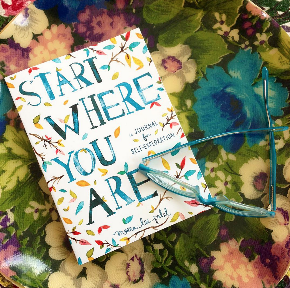
Start Where You Are: Meera Lee Patel

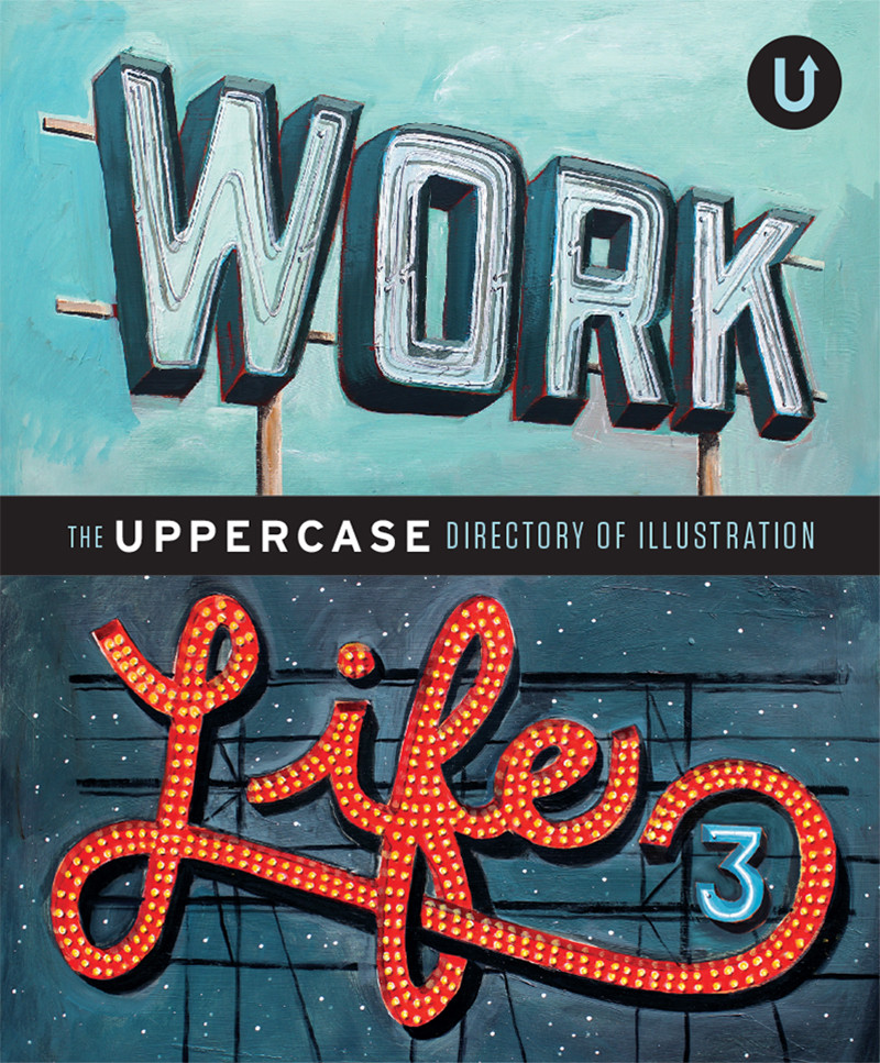
Since we first profiled illustrator Meera Lee Patel in Work/Life 3: the UPPERCASE directory of Illustration, this talented artist has authored and illustrated two books.

“My work has evolved in what feels like a very natural, steady progression, and my career has as well. I published my first book, Daily Zen, in the fall of 2014, and began working on Start Where You Are in the fall of 2014. I've also expanded my line of stationery and textile goods and began selling to retailers around the world. I feel incredibly lucky to be writing and illustrating books, which has always been my dream, and am grateful to be where I am on this path.”

The most recent book is a motivational journal with illustrated quotations. “I wanted to make a book that helped people navigate through the chaos and confusion of everyday life. Start Where You Are guides readers through the practice of introspection by using a series of prompts (writing exercises, questions, charts, and graphics), and helps them feel more connected to themselves, the people around them, and the world itself.”

Meera has always been interested in the publishing industry. Four years ago, she graduated from college and secured a job with a publishing company. “I edited papers and put my knowledge of the Oxford Style Manual to good use. I enjoy writing and literature to a very intense degree—it's what fuels most of my illustration and propels me to tell stories with my work.”

However, the desk job wasn’t for her. “It was only a few months before I knew I'd slowly go insane if I didn't make a drastic change. With a slew of pent-up creative energy and strong desire for self-sustenance, I opened up an Etsy shop, started to take commissioned illustration jobs and began, once again, to let my imagination guide me.”

The transition from words to pictures was natural. “I grew up telling stories with my words; eventually I learned to tell them silently, with scribbles, colour and feeling. I'd always been a creative soul, writing and illustrating my own short stories and novels from a young age, using my imagination as fuel to create my own happiness.”

Creating inspirational books is an organic fit for this artist and her bright and spirited work. “Growth and evolution, as a person, is a natural and necessary process, and self-reflection plays such an important role in facilitating both. Reading so many life lessons from so many inspirational people reminded me (again and again) that anything is possible, both personally and creatively. I may not always currently be where I hope to go, but writing this book has helped me appreciate exactly where I am.”

Mapping Memories (in Washi Tape)

We featured illustrator and blogger Sara Barnes in issue 24 and she recently got in touch to introduce me to her latest project, Speckled Canary. Speckled Canary produces "fun, sometimes-collaborative art projects on a global scale."

Let's let Sara describe the inaugural project:

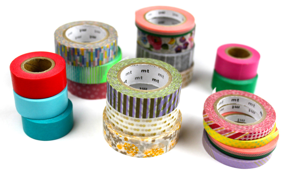
The project is called Mapping Memories, and it revolves around washi tape. Isn't that stuff great? It has so many bright colours and patterns—everything is more fun with washi! Mapping Memories takes advantage of these slightly-transparent tapes and invites participants to make art with it. 

Theme: The project theme is "memories," (your memories, specifically). Once someone is done, they will send their finished piece to me and I will add it to a special map showcasing everyone's washi tape memories around the world. See what that map looks like—it's a custom Google map

Partnership: Speckled Canary has partnered with the wonderful online ship, Omiyage. They've generously provided an exclusive discount code for participants.

Contest: There's a contest aspect to Mapping Memories, with prizes for the top three artworks. Omiyage and Speckled Canary are providing prizes. 

No tape? No problem! There are so much variety in washi tape that it can be overwhelming to choose! For participants who don't have any tape, we're offering a special "Washi Tape Starter Kit" that comes with 5 rolls of custom-selected tape from the following brands: MT, maste, and Classiky. The kit is $15 and available internationally. 

For those who already have a ton of tape, the cost to participate is cut by a third - $3 gets you into the project + an exclusive promo code for 20% off anything in the Omiyage shop.  

The deadline for signing up is August 16.