Moments

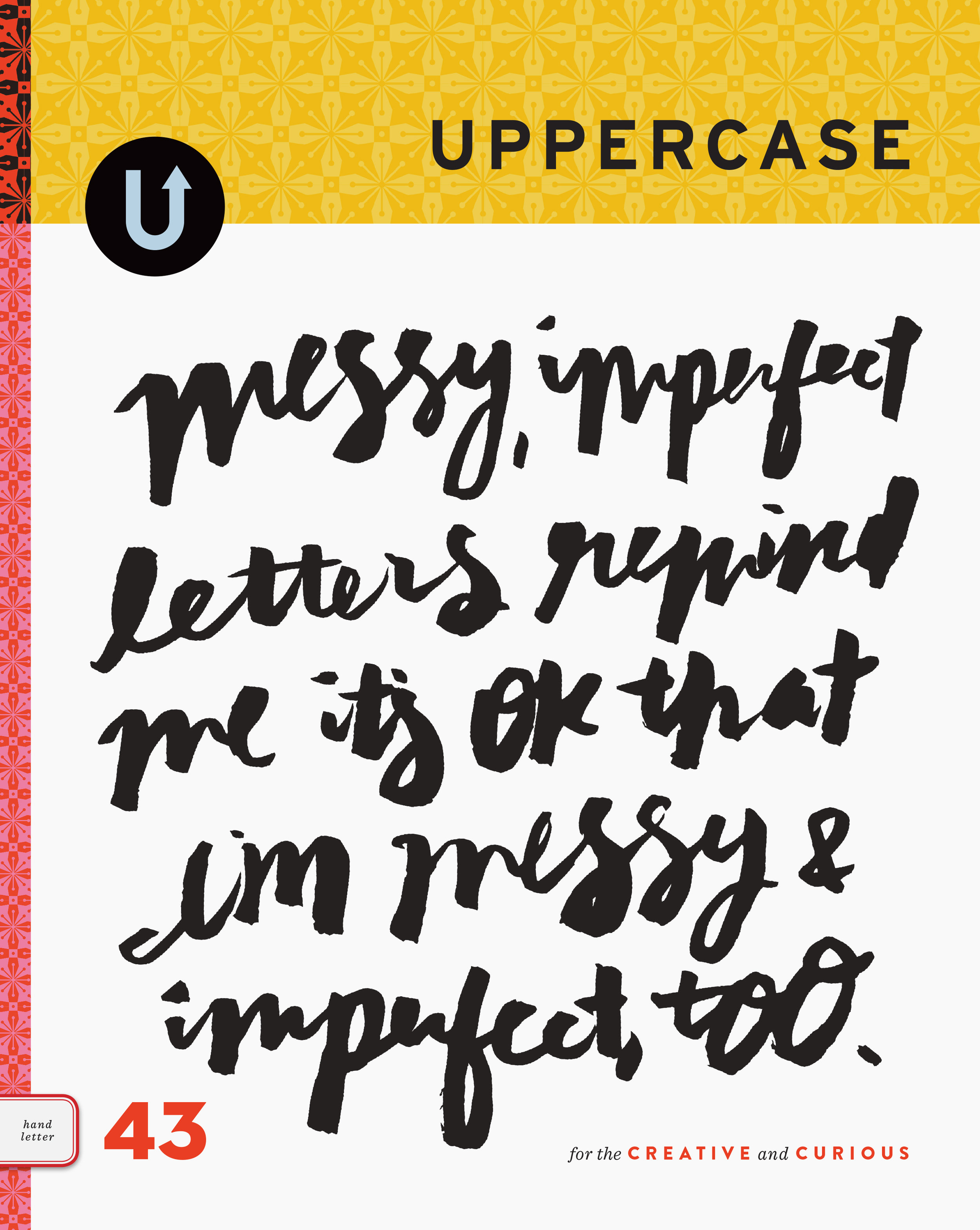
Deidre and I both agree that there are moments on this blog that we wish we could freeze and admire for a while. Some of my favourite posts have just looked so pretty, or they had lovely flow from one to the next, or they were personally important (such as this week's announcement of UPPERCASE magazine.) However, the attraction and strength of a blog is its steady stream of updates: it lives in the moment. And so we'll continue to splash inspirations on these scrolling, virtual pages.

Within the magazine, I aspire to create moments of perfection, preserved in print. Each issue will be a beautiful object, representing months of heartfelt, earnest work. We hope that our magazine will become a tangible part of your lives.

And now, here's some inspiration for this Thursday morning:


Michael Bierut (Design Observer) has been capturing moments of thought part of his daily routine: sketching ideas and taking notes faithfully since 1982. "Together, these well-worn books create a history of my working life that spans three decades."

The Happiest Book

Alex Ostrowski writes, "In one way or another we are all looking for happiness. Some people even say that man's sole purpose for existence is to hunt down and capture this intangible and elusive treasure. In 2006 researchers at The University of Leicester concluded that Denmark is the happiest country in the world - this was good enough for me. In March 2008 I made the decision to visit happiness, and embarked upon a pilgrimage to find it. My experiences are presented in this book.

Only one copy exists."

Portfolio: The Reins of Chaos


Last week I mentioned a job I was working on for a client. It is fresh from the printer and ready to be shared! This small book is for the Ottawa Art Gallery's recent exhibition of work by Mary Anne Barkhouse. Called "The Reins of Chaos", the artist's work is partially inspired by the book of Revelations. Curator Emily Falvey explains, "The Reins of Chaos is a cheeky exploration of apocalyptic metaphors within the grand narrative of Canadian colonialist history. Comprising two new installations, the exhibition presents the story of the four horses of the apocalypse. According to conventional interpretations, these ghoulish emissaries collectively represent Conquest, War, Pestilence, and Death. With her usual wit, however, Barkhouse has turned them into children's toys. At first, they are young rocking horses, carefully training for their role as heralds of Armageddon. In The Four Horses of the Apocalypse and the Donkey of Eternal Salvation (2008), they have matured into coin-operated kiddie rides from the '50s and '60s."

I decided to create a small, bible-like book to complement the artist's themes. The cover is a textural paper called cordwain and the title is embellished with gold foil. The source of the rocking horse icon was one from one of the installation shots that was traced in photoshop and made into a bitmap image.

Although I am taking on fewer client jobs in order to focus on UPPERCASE and its many (many!) facets, design projects such as this one for the Ottawa Art Gallery are truly why I love designing for other people: their stories, their images and their ideas allow you to discover your own creative voice.

The Penrose Annual 1958


The Penrose Annual was a showcase of printing and the graphics arts published between 1895 and 1982. Volume 52 (1958) is an extraordinary demonstration of craftmanship—and showmanship! Various examples of specialty printing techniques and paper stocks were submitted by printers from around the world throughout the year, and then bound in the annual. Newspaper samples, tipped-in illustrations, foldouts, inserts, spot colours... the Penrose is perhaps the single most inspiring example of graphic design and printing exuberance that I have seen in a long time—even if it is fifty years old!

In an article in Eye magazine, Steve Hare quotes one of the Penrose's editors: ‘The shaping and fabrication of every volume is an adventure,’ said its editor R. B. Fishenden, in the jubilee 50th edition of 1956. ‘Each is the outcome of a wonderful co-operative spirit – surely unique in a publishing endeavour – which seems to gain impetus in time.’

A large part of the attractiveness of Penrose Volume 52 is the era in which it was produced. I have always been drawn to the colours and design sensibilities of the mid- to late-fifties. My Dad restores old cars, and 1954 Fords were his ongoing projects when I still lived at home. Without a doubt, my love of the Royal Quiet DeLuxe typewriter (1956) is hereditary. {Check this out! An entire article about my Dad's history with cars. You never know what you'll find when you google your own parents.}

Ace Jet 170 is also fond of this particular Penrose edition, but he has photographed many pages that I have not, so between the two of us, you can get an even broader view of the volume. You can see larger images in the Flickr set I created for the Penrose. Thank you to McAra Printing for letting me borrow this annual. I've got my eye on a few other editions on their conference room shelf!

(This is a great colour combination, above.)

(I think this is what my design would look like if I were a graphic artist in the fifties. It's very UPPERCASE.)

Type Tuesday: Book Design


I am immersed in book projects this month — a five-book box set for a local artist-run centre, a publication for the Ottawa Art Gallery as well as a biography for Tribute Books. (Not to mention planning for the books that UPPERCASE plans to publish in 2009!) So for this week's Type Tuesday, I will direct you to a few book-related resources and inspirations.

Let's start with the blog Jacket Mechanical, which I came across this past weekend. Maintained by book designer Peter Mendelsund, it appears to be a relatively newly-hatched blog. This "Designing a Book Jacket" cover {top} makes me swoon. If I saw that book in used book store, I would pick it up in a heartbeat.

Mendelsund has an impressive portfolio of book covers, some of which might be familiar to you.

Eames House of Cards


The Eames' dabbled in paperworks and their House of Cards (1952) remains an icon of modern, playful design. The images and patterns on the set of 32 interlocking cards represent what Charles Eames referred to as "the good stuff': prints and textiles admired on world travels, nostalgic pictures of animals, and all variety of beloved objects and tokens of the past.