Work in progress: time lapse design
/Here's a glimpse into the layout for the abecedary spread for the forthcoming issue #13. As you can see, I just start with the letter A and go from there. Eventually, it all fits!
Here's a glimpse into the layout for the abecedary spread for the forthcoming issue #13. As you can see, I just start with the letter A and go from there. Eventually, it all fits!
Hey, Toronto-area designers and students! There's an excellent conference this Saturday. I've heard Matteo Bolagna at a few events and he alone is worth the effort.
Emerging Designers Conference
Saturday, March 10, 2012, 9:00 AM – 5:00 PM
Toronto Reference Library; for directions and to see a map, click here
excerpted from the RGD Ontario email alert:
Be inspired by Design Visionaries from New York:
• Matteo Bologna, Founder + Creative Director, Mucca Design, NY
At Brand New, his talk was described as "Closing the show with a bang, Matteo won over the crowd with his awesome facial hair, amazing work, poignant one-liners, designy jokes and delicious sense of humor"
• Hjalti Karlsson, Founder + Creative Director, KarlssonWilker Inc.
Hjalti spoke at one of the most prestigious design conferences in the world, Design Indaba, in 2008 and was invited to return in 2011.
Other speakers of note:
• It's All Been Done Before: Trends in Advertising – Dave Tupper, Associate Creative Director at Y&R Toronto
• Typography in the Key of Life: Regional + International Movements in Typography – Dominic Ayre of Hambly & Woolley
• How do you get noticed in a competitive industry – Andrew Fraser Stewart of public relations firm Edelman Toronto
• Becoming a Design Entrepreneur – Business Owners from Up Inc, Catalyst and Context
ONLINE REGISTRATION CLOSES MIDNIGHT, MARCH 7. (After this date, you may register at the door)
REGISTER NOW!

This morning I'm dropping into a magazine design class at the Alberta College of Art & Design to talk about UPPERCASE magazine. The class is taught by Thomas Porostocky, who art directed such magazines as ID and Seed (alas, neither is still being published) and now lives in Calgary. In perusing his portfolio I discovered that he also designed The Selby book, which I have sitting on my shelf and have mentioned on the blog before.

I would also like to thank Erin for her excellent columns in UPPERCASE. She has a new addition on the way and has wisely decided to cut back on her workload, so she'll be on hiatus from contributing to UPPERCASE for a little while. (I regret not taking real time off from work when I had my baby. Instead I worked harder than ever. So I commend Erin for her decision.) Erin recommended the excellent Adrienne Breaux to continue the "Beginnings" column and I'm looking forward to Adrienne's contribution to issue #13.
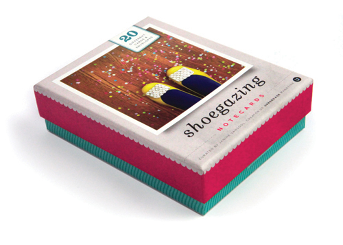
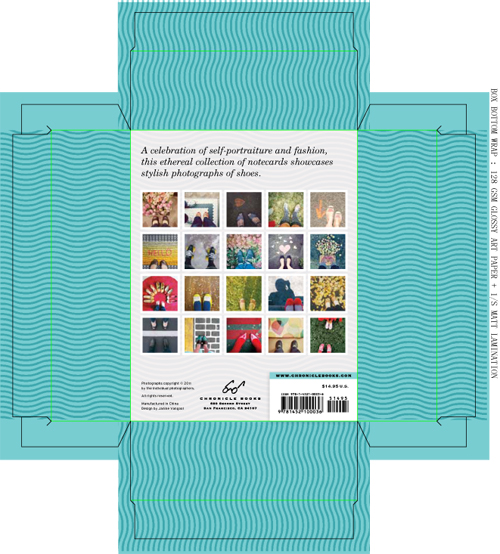
In Issue #6 (Summer 2010), we invited readers to submit photos of themselves “shoegazing”—the classic shot of looking down at ones’ feet and taking a photo (you can still participate in the Flickr pool). Imagine our excitement when Chronicle Books contacted me and suggested that the concept be turned into a set of notecards!
Shoegazing notecards contains 20 different cards with decorative envelopes as curated and designed by UPPERCASE. To work with Chronicle Books has been a career-long dream, so to see this project completed and even co-branded with the UPPERCASE logo is amazing!
Photographs are by Andrea Jenkins, Katrina Tan, Mario Gallucci, Cori Kindred, Shawna Bowers, Kelly Anne Williams, Kristen Hewitt, Siobhan Long, Carolyn Lagattuta, Adriana Botello, Asia Lemko, Lindsay Heggie, Rachel Denbow, Alison Heal, Jay Prynne and Parul Arora.
The box design is very pretty. It was an interesting challenge to design it as I have not designed much packaging before and the project had to reflect the aesthetic of UPPERCASE magazine while fitting with Chronicle Books' requirements and direction. To marry the diverse photographs, I decided to crop them all to a square format and use the photo styling similar to what is used in the magazine's layouts. For texture, I used an old piece of paper, when scanned and colourized, it evoked the texture of concrete and ground. The cards are printed on a matte-finished stock, but there's a nice gloss coating on the photographs. For added interest, I used a wavy line pattern, inspired by the soles of sneakers, for the backs of the cards and on the box bottom.
Here are the files showing the dielines:
Thank you to Kate Woodrow and Kristen Hewitt at Chronicle Books. And thank you to all the fine folks who participated in the call for submissions and who graciously shared their work on this project.

I've been a fan of Chip Kidd's book cover design for a long time. But I must say that Mr. Chip Kidd, presenter, is also entertaining and amusing and complex—and more flamboyant! The first half of his presentation was funny, affected and full of ATTITUDE.
Case in point, on design for printed books:


Chip Kidd was a tough act to follow, especially for the gentlemen of Chermayeff and Geismar who appeared quite tired for their keynote address which closed day one of presentations.
The first full day of the DesignThinkers conference in Toronto's Metro Convention Centre has wrapped (though I'm certain that many attendees are living it up at the conference party—my style was sushi with Glen and Finley and now back at the hotel). I have heard such great things about the Design Thinkers conference over the years and the first day did not disappoint. Thank you so much to the Alberta Magazine Publishers Association for the bursary that has facilitated this trip out east.
To promote UPPERCASE magazine, I donated 500 magazines and copies of Work/Life 2 to the event. For a small indie publisher, to give away this quantity of merchandise is a very big deal so I was happy to see so many scoop them up—they were gone so quickly! I hope people will be inspired enough by experiencing the magazine in person that they will be inclined to support future issues and subscribe. Thank you to Hilary, Michelle and the helpers at the event for helping to coordinate this giveaway and for lugging boxes!
The day's keynote presentations were bookended by some "elder statesment" from design and advertising's wild teenage years of the sixties and punctuated with younger generations for whom social media marketing is the new currency.
KEYNOTE 1: GEORGE LOIS

Much to his dislike, George Lois is often introduced as "the original mad man" in reference to the popular television program. Lois was indeed a driving creative force of Madison Avenue advertising and design in the sixties; his official bio calling him "a pioneer of the landmark Creative Revolution in American Advertising." His iconic Esquire covers set the benchmark for all art directors who followed him. His phrase "I want my MTV" helped launch a new era in broadcasting. The success of his professional output merits the accolades. Time (and ego) have bestowed a reverence towards him. And perhaps this also entitles him to be an opinionated curmudgeon—the persona makes for an entertaining presentation. When an old guy swears and calls people "schmucks", it gets laughs.
Some George Lois words of wisdom, paraphrased from my notes:
(Read his books for his own way with words.)
Lois' presentation ended with a rant about Mad Men that was originally published in an issue of Playboy:
[Mad Men] is nothing more than a soap opera set in a glamorous office where stylish fools hump their appreciative, coiffured secretaries, suck up martinis and smoke themselves to death as they produce dumb, lifeless advertising – oblivious to the inspiring civil rights movement, the burgeoning women’s lib movement, the evil Vietnam war and other seismic events of the turbulent, roller-coaster 1960s that altered America forever. The heroic movers and shakers of the Creative Revolution…bear no resemblance to the cast of characters on Mad Men. The more I think and write about Mad Men, the more I take the show as a personal insult. So f*ck you, Mad Men, you phony gray-flannel-suit, male-chauvinist, no-talent, WASP, white-shirted, racist, anti-Semitic Republican SOBs!
Lois relished delivering this rant (one would assume that he has had the opportunity to deliver it on many occasions) and it elicited much glee from the audience. He ended it with a photo composition of his younger self and Don Draper, proclaiming, "Besides, I was much better looking."
Here's a quick iPhone video I made about the printer proofs, just one step in the production process.

We've landed in Calgary. It is quite a relief to be in the comforts of home! And internet access!!! I've got dozens of photos and links to post about people and things from Renegade LA, but the internet connection in our LA hotel was so bad it would have been less frustrating not to have any internet at all.
Here is Victoria of Paper & Type. We included her in a previous issue's subscriber profiles. Check out her lovely papergoods (very appealing photos on her new website and great attention to detail!)
I love seeing how UPPERCASE magazine inspires creativity in others. Katrina of PuglyPixel is offering up these free downloads of beautiful hexagon patterns inspired by the magazine's colour palette. If you haven't visited PuglyPixel, be prepared to spend some quality hours looking at eye candy and learning a whole lot about blogging, web design, digital art, photoshop... Is it a great resource!
If you want even more, she offers premium access to special downloads and "blog bling" as she calls it. It's an innovative way to earn a living as a designer. Kudos!
Here's a really great idea for recent design grads looking for adventure! A design camp hosted by Chicago's Firebelly Design.
Camp Firebelly offers the next crop of socially-minded designers the chance to use their talent and creativity to make a difference, experiencing what professional life is like Firebelly-style. For 10 days, 10 campers live and work with us to craft a strategic design solution for a non-profit client, from initial research to final implementation.
Nick Adam writes, "Camp is a time where Firebelly stops all client work and closes the studio for 2 weeks. We bring 10 young designers into the studio and connect them with several nonprofits that are in great need of proper design. We house, feed, direct, and teach the designers to solve all the problems, and develop tangible artifacts within ten days. This is Firebelly's 4th year of camp, we are very excited for our next group of campers."
View images from last year's camp on Flickr. Applications are due April 29, click here to download.
Here's the small-but-hefty book mockup for Lisa Congdon's A Collection a Day. Now I've got to go and design all those pages! The special collector's tin is in progress as well and once the artwork is cleared for production, I'll share that with you as well.
(Book preorder price is $25—you save $10 when preordering. The book is also available as part of the UPPERCASE book bundle which includes The Elegant Cockroach which ships immediately, followed by Work/Life 2 in February, A Collection a Day in March and Dottie Angel in June.)
I'm working on a feature for the next issue of UPPERCASE magazine. I'd love to hear your opinion:
Please leave your comments below this post with your name and url.
Are you proud of your own card or one that you've designed for a client? Submit print-resolution files here by November 15 to be considered for publication in the magazine. Make sure to include your contact info and all appropriate design credits.
Coralie Bickford-Smith: imagine if she designed an entire library of books, how gorgeous that would be. I'm pleased to report that Coralie accepted my invitation to be part of our recent call "Feeling Bookish" and we can look forward to her design in issue 7!
Julia Trigg makes digital collages because she can't bear to cut up her collection of papers.
Here's our wall of book cover self portraits! I'll post a few more photos soon. (But you'll have to see these reproduced in the magazine to appreciate their details!) I will email everyone next week and let you know if your work made it into the magazine feature.
It is going to be a laborious weekend, as I concentrate on finishing up issue 7 before it heads off to the printer!
 Hello there!
It's First Thursday and time to get back into a new groove. Although I haven't been in the gallery much these past summer months (our big road trip to San Francisco and the Renegade Craft Fair, working from home so that I can also take care of my baby), with the cool September air signaling the end of summer, I'm eager to return on a more regular basis to my lovely studio and gallery space in Art Central.
Due to the overwhelming success of our recent open call for submissions "Feeling Bookish", I've put together an exhibition of over 40 of the best designs sent in from both professional book designers and our readers at large. The brief was to design a cover that is a self portrait of your life, and as you can see by my design above, it has been a round the clock juggling act between being a new mom and a publisher! (Thanks to Conan O'Brien for the title phrase.)
Please join us this Thursday evening from 5-9pm for this interesting and personal exhibition and other fun activities in Art Central.
Please come by and say hello, we've missed you!
And for all our UPPERCASE friends from near and far, there are some really exciting projects that I'll be announcing in the next week, so please stay tuned to the blog. Not to mention issue 7 of the magazine is off to print this week as well!
All the best,
—Janine
I am so impressed! We have received about 60 submissions for the latest open call in which we ask our readers to interpret themselves as a book cover. This was a challenging concept, but you took me up on it and did an amazing job. The majority of them will be published in the forthcoming issue 7 of UPPERCASE magazine (alas, a few people forgot to follow our size requests or otherwise have unpublishable files—please note that when creating work that might be printed, it is important to build the file to the proper specifications: web resolution doesn't work for print. Print = 300dpi).
We invited some very talented professional book designers to participate as well, and I am thrilled with their work. I will be printing out the best of everyone's submissions for an impromptu exhibition in the gallery for the month of September, so please join us this First Thursday for the show!
Vancouver-based artist Andrea Armstrong did a great cover illustration and even made a mockup:
Andrea writes:
I am a picture book. Not too wordy; likes to hang out with kids; colourful but simple. The thing about a picture book is you can read the words quickly, but to get to know the story well, you have to keep coming back to it to spend time with its images.
I am a picture book about a girl and her chickens. The girl is an introvert; she would rather hang out with chickens than real people most of the time. She’s creative – now don’t laugh, but she invents songs to sing to them, and even wrote a poem about them once. She has a favorite chicken, whose name is, in fact, Favorite. And she’s a little bit odd (hello, she’s best friends with chickens and writes poetry for them.)
I am an autobiographical picture book about a girl and her chickens. True story.
There's a nice mix of illustrations, design and typography in the submissions. Great job, everyone!
By the way, check out Andrea's blog for some great depictions of a drawn version of herself interacting in the real world. Love it!


Cover by Christy Batta

The UPPERCASE Circle is free for subscribers of the print magazine. Find out more.
UPPERCASE is a quarterly print magazine inspired by craft, design and illustration. A playful exploration of creativity, an affinity for vintage ephemera, and a love of handmade are some elements common in each issue. The magazine boasts high-quality paper and printing, a unique design aesthetic and incredible attention to detail.
Janine Vangool
publisher / editor / designer
Send a message →
* Before emailing submissions follow the guidelines here.
Glen Dresser
customer support
Please contact Glen for help with your purchases, wholesale inquiries and questions about your subscription. Include your full name and mailing address so that we can better assist you.
Send a message →
UPPERCASE publishing inc
Suite 201 b
908 17th Avenue SW
Calgary, Alberta T2T 0A3
403-283-5318
The studio is not open to the public—please get in touch to make an appointment. If you'd like to purchase our magazine and books locally, please see the stockist page.