Work/Life 2: Jenn Kitagawa
/

Last Thursday's ACAD portfolio show presented some really top-notch work by soon-to-be grads. This week I'd like to introduce you to some of the fresh talent who are also featured in Work/Lfe 2.
First up is Jacqui Lee, whose work has a lovely balance of child-like wonder with a very sophisticated execution.
For a class project, she illustrated the story of the Bombardier family (some images below, see more on her site):
She also has a lovely lettering style and playful/retro colour palettes:
Here is the illustration included in Work/Life 2:
Jacqui is certainly poised for an excellent career in illustration. To commission Jacqui, please visit her site. To see her current projects, follow along on her blog.
Kate Endle is a collage artist based in Seattle. In my household, we are particularly fond of her children's board book "Who Hoo are You?" (available online at Buy Olympia and at Land, Portland). It was one of Finley's first books and is definite favourite.
Kate's studio is full of amazing collections and inspirational bits of paper and textures.
You can see read more about Kate and her creative process in Work/Life 2 and see more in her portfolio.
Special note: I must admit an error in the book, we listed The Land of Nod, Real Simple, Chronicle Books, Galison/Mudpuppy and IKEA as existing clients in her roster when in fact these are her list of dream clients. However, her actual client list is just as impressive and includes Sesame Street Workshop, Scholastic, Macy's and McGraw Hill among many others. My apologies to Kate for the mixup. I'm sure these companies will be flattered to know they're considered dream clients.
Delphine Lebourgeois recently exhibited work at the Frameless Gallery in London. Now her limited edition prints are available online and the selection includes the illustration featured as a full page in Work/Life 2 (top image).
Julien Chung is a prolific illustrator from Quebec who specializes in licensing his artwork. His cute and graphic animal characters have appeared in surface designs, on products, packaging and in 3 dimensions. Julien shares a new commission with us:
"I'm happy to announce that Ritzenhoff has added this very Canadian scene to their Aqua line this month. The water glass features two of my polarbears taking a swim in icy Arctic waters. On the inside bottom of the glass, a happy polarbear smiles up at you. The design is printed with transparent inks, in blue and white. This is my 28th collaboration with this German glassware company. Available in giftshops online and around the world."
Julien classifies his animal character designs into categories such as baby modern, kid zoo, woodland friends and modern ark. The various styles and licensing information are available on his portfolio website. Visit his blog for images of his work applied to finished products as well as new works. Read more about Julien and peek into his studio in Work/Life 2: the UPPERCASE directory of illustration.

Here's some great news: because of our Issue #7 feature of the extraordinarily talented painter Christopher Stott, the art director at Anthropologie.com commissioned Chris to paint five original works for their website. The paintings will be featured throughout the week.
Last year, the Frugal and Fancy feature on my friend Paige Smith also caught the eye of their buyer and her ring holders (below) are in stores across in the US and Canada. It's very exciting and gratifying to me that UPPERCASE magazine is inspiring such opportunities! And it just goes to show you how Anthropologie as a company embraces independent artists and designers.
I'm an avid Anthropologie fan and I know that many of my readers are enthusiastic customers as well. I would love to have my books and the magazine in their stores. Their curated selection of books is always smart, pretty and inspiring.
Illustrator couple Mike Kerr and Renata Liwska always create lovely images for their holiday greetings. Thanks, guys!
And there she is, a cover design-in-progress for issue 8, out in early February! Thanks to Sarah and Ryan at Lab Partners for the illustration. I love the simple concept and the play on the notion of a type slug (a strip of metal used to space lines of type).
(Lab Partners were previously featured in the magazine, as part of our dynamic duo column. Below is the illustration that they made for that article.) Quite the dapper pair!

Olimpia Zagnoli is an exceptionally talented Italian illustrator. (We featured her work back in issue #2.)
Inspired by vintage matchbox labels, I'd love to see your design, typography and illustrations that pay homage to these small treasures of graphic design. Traditionally, the box label messages were public service announcements, recommending citizens "Eat Vegetables" or "Be Careful with Matches" or "Save For Happiness" or "Alcohol Will Sink Your Plans". Or they celebrate more decorative topics like animals, national sports or fables. What is your modern take in subject matter for a modern matchbox label? Printed inexpensively, specimens from the 50s and 60s have lovely misregistration, overprinting and dot patterns. Feel free to emulate these effects in your design. The best ones will be published in the winter edition of UPPERCASE magazine (Issue #8, out in Jan/Feb 2011).
Submissions should 3" x 2" either horizontal or vertical and 300dpi. Please label the file with your last name and include your name, address and contact details when uploading it here. DEADLINE: NOVEMBER 30.
ABOVE: an excellent submission by John Yates.
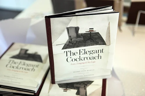
The Elegant Cockroach is a just-back-from-the-printer book that I had the pleasure of art directing and publishing. I fondly describe it as "a storybook for whimsical adults and sophisticated children." Written and co-art directed by Deidre Anne Martin, the book tells the tale of an elegant cockroach living on his own in the big city. Although there's always lots to keep him occupied — learning Spanish guitar, sitting in coffeeshops, going for walks and reading fine literature — the cockroach is out of place and out of sorts. He seems to be the only one of his kind and longs for love.
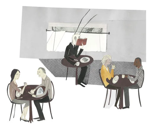
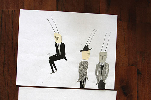
With collage illustrations by New York-based artist Stefanie Augustine, the Elegant Cockroach is a dapper and charming fellow living in a grey metropolis. Designing such a character and setting the scene was a challenge: how do you make an insect an appealing and sympathetic creature? How do you make what is perceived as a pest into the romantic lead? Deidre set the tone with this description: "It’s Charlotte’s Web meets The Elephant Man; Aesop’s Fables crossed with The Magnificent Ambersons; one part Tim Burton, two parts Leonard Cohen." Stefanie deftly used scraps of paper to piece together a cockroach with heart and style.
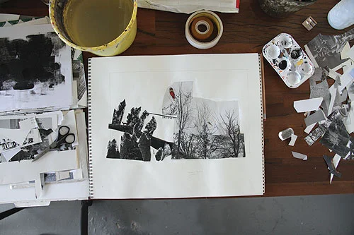
Further inspired by black and white cinema, New York in the 1940s, newspapers and classic literature, the book design is simple yet dramatic. The typography is set to enhance the nuances of the text and subtly shape the reader's experience of the written word.
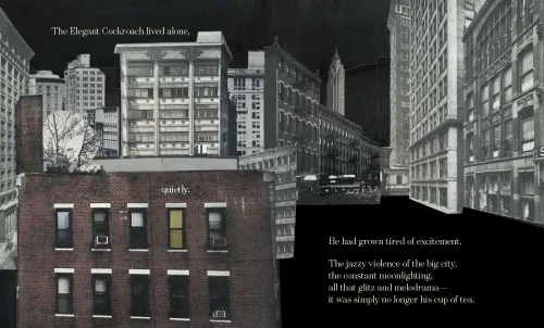
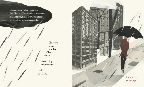
The process of creating this book was very collaborative, with each of us bringing our sensibilities and talents into the mix. "Writing the story was only the beginning," says Deidre. "I had to walk around with it in my back pocket for what seemed an eternity until I came across just the right people to help me turn it into a real book."
(The book is available in our online shop and is also part of the Book Bundle that includes A Collection a Day by Lisa Congdon, The Suitcase Series Volume 2: Dottie Angel, and Work/Life 2.)
Another print to covet, by Bee Things.
Love these prints by Inaluxe (Kristina Sostarko). We featured one of Kristina's beautiful fox paintings on the table of contents page of issue 5. Wouldn't these make great fabrics or applied to tea cups and dinnerware?
Here's a look at the upcoming issue 7 cover, illustrated by Greg Morgan! (I'm finishing up the design files and this will be off to print shortly... but please be patient, it won't be ready for mailing until the start of next month.)
If you're a subscriber and have recently moved, please make sure you update your address here. Click here to become a subscriber, thanks!
I am so impressed! We have received about 60 submissions for the latest open call in which we ask our readers to interpret themselves as a book cover. This was a challenging concept, but you took me up on it and did an amazing job. The majority of them will be published in the forthcoming issue 7 of UPPERCASE magazine (alas, a few people forgot to follow our size requests or otherwise have unpublishable files—please note that when creating work that might be printed, it is important to build the file to the proper specifications: web resolution doesn't work for print. Print = 300dpi).
We invited some very talented professional book designers to participate as well, and I am thrilled with their work. I will be printing out the best of everyone's submissions for an impromptu exhibition in the gallery for the month of September, so please join us this First Thursday for the show!
Vancouver-based artist Andrea Armstrong did a great cover illustration and even made a mockup:
Andrea writes:
I am a picture book. Not too wordy; likes to hang out with kids; colourful but simple. The thing about a picture book is you can read the words quickly, but to get to know the story well, you have to keep coming back to it to spend time with its images.
I am a picture book about a girl and her chickens. The girl is an introvert; she would rather hang out with chickens than real people most of the time. She’s creative – now don’t laugh, but she invents songs to sing to them, and even wrote a poem about them once. She has a favorite chicken, whose name is, in fact, Favorite. And she’s a little bit odd (hello, she’s best friends with chickens and writes poetry for them.)
I am an autobiographical picture book about a girl and her chickens. True story.
There's a nice mix of illustrations, design and typography in the submissions. Great job, everyone!
By the way, check out Andrea's blog for some great depictions of a drawn version of herself interacting in the real world. Love it!
Emily Dumas is a new subscriber who sent an email to introduce us to her work. Very nicely done.
Visit her site Flowers in May for stationery, prints and her blog. Thanks, Emily!
I am very happy that Andrew Bannecker accepted an assignment for the current issue. This is his illustration for Mark Hamilton's article "Colour Coding the Movies: Blue" which explores films with an underwater theme. Here's a snapshot of the magazine from Andrew's blog:
Thanks, Andrew!
The talented and prolific artist Leah Giberson has a new print available at Tiny Showcase this week. And we're happy to have a Work-in-Progress Society profile of Leah in the forthcoming issue. Just look at how busy she's been:


The UPPERCASE Circle is free for subscribers of the print magazine. Find out more.
UPPERCASE is a quarterly print magazine inspired by craft, design and illustration. A playful exploration of creativity, an affinity for vintage ephemera, and a love of handmade are some elements common in each issue. The magazine boasts high-quality paper and printing, a unique design aesthetic and incredible attention to detail.
Janine Vangool
publisher / editor / designer
Send a message →
* Before emailing submissions follow the guidelines here.
Glen Dresser
customer support
Please contact Glen for help with your purchases, wholesale inquiries and questions about your subscription. Include your full name and mailing address so that we can better assist you.
Send a message →
UPPERCASE publishing inc
Suite 201 b
908 17th Avenue SW
Calgary, Alberta T2T 0A3
403-283-5318
The studio is not open to the public—please get in touch to make an appointment. If you'd like to purchase our magazine and books locally, please see the stockist page.