Inspiration: Lucienne Day
/
Around the web:
• Lucienne Day 1917-2010, remembrance in the Guardian
• Robin Day obituary
• An interview and home tour of Robin and Lucienne Day with Wallpaper magazine, December 2008.
• V&A Lucienne Day archives
• Classic Textiles' reissue of some iconic designs


Dispatch from London: Old Buttons at Spitalfield
/
I've been home from London for a few weeks, but since I had my camera round my neck from the entire time I was in the UK I have a LOT of photos still to share! I already posted about the amazing time I had with Emily Chalmers, but after we parted, there were still more stalls to explore in the market.
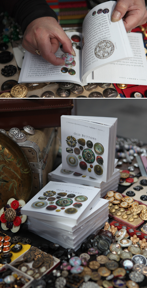
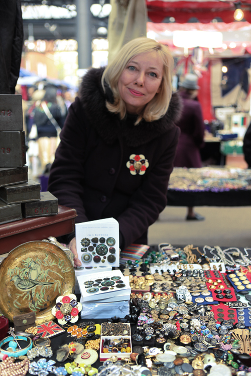
Sylvia Llewelyn is a thespian, collector and author dividing her time between London and other European cities. She has over 300,000 buttons in her collection and recently authored a small but thorough book on the topic of old buttons. I purchased the book plus a few buttons from Sylvia and her booth at Spitalfields' Thursday afternoon antique market.
Most of the buttons reproduced in the book are at actual size, as Sylvia demonstrates. The book and an extensive array of buttons are available in the Old Button Shop.
type tuesday: Museum of Childhood
/
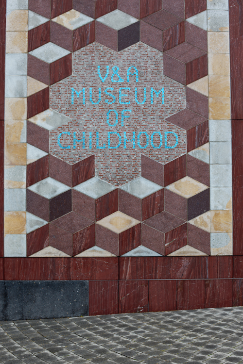
When I return to London (for now that I've been once, I'll have to go back again and again) with Finley and Glen, we'll go to the V & A Museum of Childhood together. This free museum had excellent displays of traditional and historical childhood toys, but also areas for play and a nice place to have a lunch as a family.
This spelling cabinet from 1790 caught my eye. What an amazing specimen!
If it has letters on it, I'm automatically drawn to it.
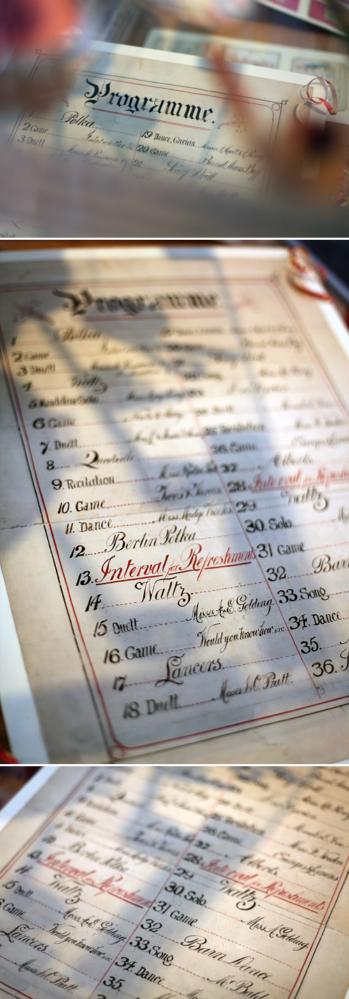
This 1890s Victorian party programme outlined the activities for a wealthy child's party.
Some more modern-day items. (It's funny to see the Fisher Price village as "museum quality" — the one I played with some 30+ years ago is now Finley's.)
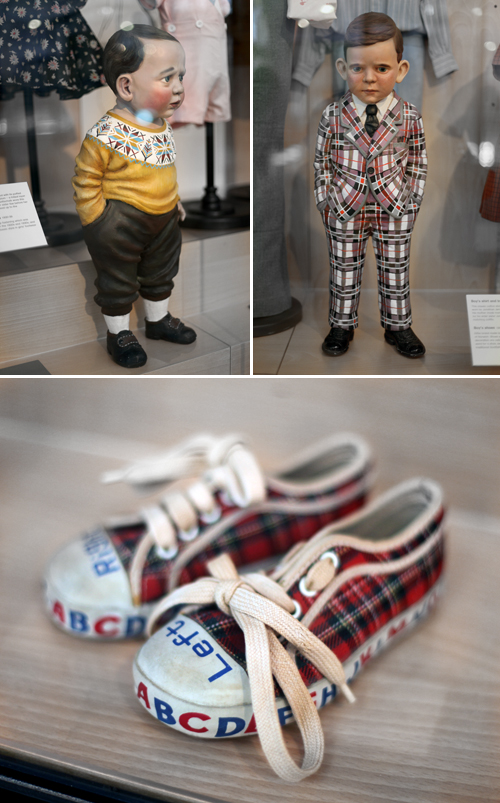
The boy mannequins look unhappy and worried about getting their clothes dirty. If anyone knows where you can get these Left and Right alphabet shoes today, I think Finley and I would both be happy.
Dispatch from London: Type Tuesday
/Here are some old enamel numbers in a shop on Portobello Road. I was really tempted to purchase one of the small numbers that were about an inch long—it would make a cool pendant! But I couldn't decide on a number: none of them had any special meaning to me and they were technically of French rather than English vintage. So I took lots of photos and walked away.
Mitzi's Miscellany
/Speaking of playing cards, in issue #13, Mitzi Curi provided a selection of ephemera for me to include in the magazine. I met Mitzi last year at The Creative Connection. She writes:
"My name is Mitzi Curi and I’m a Michigan antique dealer, crafter, and blogger whose goal in life is to get a little vintage goodness into every home. I rent space at two antique malls which house four booths, each with a specific theme. The selling doesn't quit there. I have an Etsy shop where she I sell my creations made from vintage materials and the occasional vintage find. Favorites are my cuff bracelets made from vintage wallpaper, repurposed furniture hardware jewelry, and vintage hats.
People seem to be appreciating vintage paper ephemera and typography like never before, and I enjoy sharing my large stash of images with the world. Visit my blog at www.mitzismiscellany.com to learn a little and get inspired by my numerous vintage obsessions!
I settled on this classic card 13, pictured below, to include in the issue.
Though I do have a fondness for flash cards (and these ones add up nicely):
And just because:
type tuesday: typographic spam
/Mr. Edwards recently emailed to share his typographic collages with us:
"It is made up of bits of found type and images from my collection of vintage magazines. I don't like to cut them up, as they have survived for so long so I scan them all in. They are the 20th century equivalent of today's spam mail. I like the ambiguity of these snippets of type taken out of context, it makes a kind of Dada poetry. I find it quite mesmerising. I think it should be pasted on subway station walls and at bus stops to pass the time while waiting for public transport."
Read an interview and purchase posters at Empty Frame.
Tomorrow's First Thursday!
/
I've got lots of chalk markers leftover from the Alt party (check out the video)—let's decorate the windows of UPPERCASE and have our own doodle party. I have chocolate cookies to share, too. And if you want to typewrite a Valentine to your sweetie, my typewriters will be available to serve you.
UPPERCASE will be open from 3pm to 8:30pm this Thursday.
type tuesday: Linotype the Film
/The Linotype film will premiere this Friday, February 3rd at the SVA Theatre in New York City followed by questions and answers with the film director and crew, moderated by Steven Heller. Get your tickets here!
Director Doug Wilson's film poster was one of the goodies in issue #8's Letterpress Sampler and 100 copies were randomly inserted into copies of the magazine. Perhaps you were one of the lucky ones! If not, you can purchase a Linotype film poster in the film shop.
Type Tuesday: typewriter ephemera
/
I'm on the hunt for typewriter-related papers, packages, photos and memorabilia! Above is a recent purchase from Agent Obsolete. Check out their Etsy shop for more retro finds. If you have any good leads or have your own collection of typewriter things you'd like to share, please let me know!
Type Tuesday: June Corley
/June Corley's typographic sculptures:
While making a living as an advertising art director and graphic designer, I gradually collected a lot of wonderful old stuff. I was particularly attracted to three categories that were (and still are) very visually pleasing to me — old signage letters, vintage letterpress printing type and found objects that resembled faces. My vast collections were displayed throughout my Atlanta home and office where they provided daily eye treats. Then I, along with all my old stuff, moved.
As I unpacked boxes at my new place, the letters and found objects became jumbled together and serendipity took over. Certain found objects and faces appeared custom made to go with certain letters and type, almost begging to be put together. So I proceeded to do just that, combining this object with that letter and before long I was surrounded with a dozen sculptures. They were quite likable and entertaining to have around, so I made more.
With over 90 sculptures made, there's lots to admire on June's website.
Type Tuesday: Hamilton Wood Type
/The obscure (Hamilton Woodtype Museum) meets mainstream (Target).
Type Tuesday: Typewriter Tins
/
A few tins I noticed on ebay this week.
Vintage matchbox label extravaganza!
/A few years ago, I purchased a binder of old matchbox labels at a local flea market. There were around 80 labels—enough to ignite an interest in searching for more to add to my collection. Ebay was the logical option, but I did not expect to find an amazing haul of literally hundreds of labels! I placed a low bid, certain that I would have lots of competition... but it went unnoticed and I was victorious. When the stash arrived, there were so very many labels that I didn't know what to do with it all and have been saving these piles for a special project.
Inspired by these small labels, I put an open call for submissions for readers to reinterpret the messages and aesthetics of the old labels but with a modern twist. The response was terrific a there are four pages of reader submissions published in the new Issue #8. (I'll be creating a flickr pool so that you can see all the submisions.) In tandem with the reader artwork, I thought it would be fun to include an actual authentic label in each subscriber's magazine. So I decided to part with the collection of labels and disperse them among my readers as a thank you for your fine support of UPPERCASE magazine.
Thank you to the people at Printcrafters for manually inserting each label on the first page of the magazine! We had a nice surprise, too—there were actually hundreds more labels that the ebay listing had advertised and therefore many more copies of the magazine have the special inclusion than I initially anticipated. (But if you're not a subscriber yet, I recommend starting yours quickly to ensure you get a label.)
I've commemorated my former collection by scanning some of the best examples and posting them to a flickr set. I've saved a few for an exhibition that opens this Thursday, but the majority of the labels that you see on flickr are off to subscribers around the world!
And if an authentic label isn't enough of a goodie, each magazine has a letterpress insert as well! (see my previous post.)
Enjoy!
Tins tins tins
/This is a good omen: my vintage typewriter tins are featured on The Dieline today! Coincidentally, I am working on the tin design for A Collection a Day. (Thanks for the tip, Jen!)
Call for submissions: Matchbox labels
/
The recent calls for submissions (Feeling Bookish, Foxes) have been really well-received, so I hope you like the next one... Inspired by vintage matchbox labels, I'd love to see your design, typography and illustrations that pay homage to these small treasures of graphic design. Traditionally, the box label messages were public service announcements, recommending citizens "Eat Vegetables" or "Be Careful with Matches" or "Save For Happiness" or "Alcohol Will Sink Your Plans". Or they celebrate more decorative topics like animals, national sports or fables. What is your modern take in subject matter for a modern matchbox label? Printed inexpensively, specimens from the 50s and 60s have lovely misregistration, overprinting and dot patterns. Feel free to emulate these effects in your design. The best ones will be published in the winter edition of UPPERCASE magazine (Issue #8, out in Jan/Feb 2011).
Submissions should 3" x 2" either horizontal or vertical and 300dpi. Please label the file with your last name and include your name, address and contact details when uploading it here. DEADLINE: NOVEMBER 30.


