


Dear Readers,
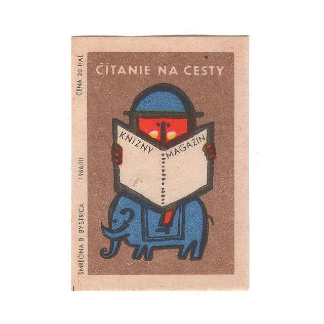
The voluptuous perfection of letterpress on fine paper contrasts with the charming misregistration of vintage graphics printed on cheap matchbox labels. Heavy machinery from a century past allows production of delicate designs and contemporary stationery today. Dollhouses become life-size and the accoutrements of modern living are miniaturized.
In this issue, surprising plays of scale make small things big and big things small. Small is kawaii, small is innovative, small is indie, small is familiar and small is strange. We’re inspired—in a big way—by small things.
Although this issue of the magazine is bigger than ever (sixteen more pages) and with a much larger print run (5000 copies), UPPERCASE is a small, family affair. With the help of my husband Glen Dresser, I gather content, manage contributors, edit submissions, handle subscribers, fulfill shop orders and design pages. Often the size and quality of the magazine belie the very small team that puts it all together!
Thank you to the larger family who makes it all possible: our contributors, subscribers, stockists and advertisers who appreciate all the love and sincere effort that goes into each and every issue.
And as a bonus to our subscribers, I’m sharing an authentic vintage matchbox label here with you, from a personal stash that I’ve been saving for something special. It’s a token of my sincere appreciation for making UPPERCASE magazine part of your lives. It’s the small things that make the difference.

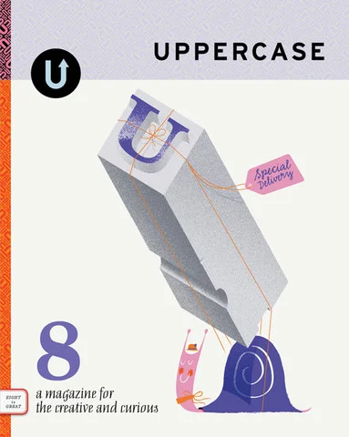
ISSUE 8 IS SOLD OUT
CONTENTS
SNIPPETS
Blog Beautiful
This is naive
by Brian W. Ferry
Book Bundle
Forthcoming books
Beginnings
Poketo by Erin Loechner
FINE PRINT
Library
Frances Atkinson
illustration by Luc Melanson
Small Print
Shorthand by Carolyn Fraser
Noted
Conductors’ notation
by Dan Shepelavy
Collaboration
Bethany Heck
& David Wolske
ART & DESIGN
Studio
Studio on Fire
interview by Rachel Wiles
Design
What makes a
good business card?
Covet
by Andrea Jenkins
Type
My favourite woodtypes
by Bethany Heck
Abecedary
Letterpress printing
by Charlotte Rivers
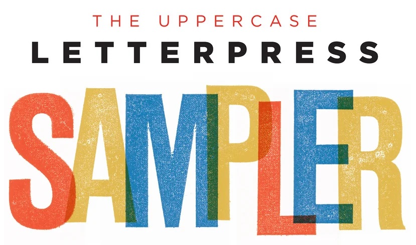
Letterpress sampler
Over 50 printers
Film
Behind the scenes with
filmmaker Faythe Levine
Curiosity
Mambonsai
by Correy Baldwin
illustration by Jen Hsieh
Creature
photography
by Elizabeth Soule
Musing
The power of small
by Carey Jones
illustration by Jason Blower
Recollection/Collection
A perfect match
by Margaret Van Sicklen
photos by Sven Nebelung
Ephemera
Vintage matchbox labels
Participate
A modern take on
old matchbox labels
Sketchbook
Ed Emberley
by Mignon Khargie
Publishing
Alyssa Nassner
Work/Life 2
CRAFT
Work-in-Progress Society
Irma Gruenholz
by Karen Becker
Portfolio
Irma Gruenholz
Gallery
Caroline Waite
Materials
Typecast:
Typography in Glass
Kristin McFarlane
by Glen Dresser
PLACES/SPACES
Home
Modern miniature
dollhouses
by Anna-Maria Sviatko
Boutique
Prairie Collective
by Victoria Smith
Field Trip
Artist Heather Benning
by Rachelle Soucy
STYLE
Stitch
Blue Sky Alpacas
by Christine Chitnis
Accessories
The Toque
by Brendan Harrison
Frugal & Fancy
Buttons
Stylist
Selina Lake’s
Romantic Style
photos by Debi Treloar
Discover
Kawaii
by Lara Rossignol
Kitchen
In praise of small
by Tara O’Brady
Recipe
Winter Spice Doughnuts
by Tara O’Brady
MISC.
Community
Postal Service
Subscriber Profiles
Loves
For the love of print
by Tanya Roberts


