Mark your calendar for DesignThinkers Vancouver

We've featured the DesignThinkers conferences in Toronto quite a few times here on the blog and in social media in the past few years. They been generous in granting UPPERCASE a media pass so that a correspondent can attend, tweet, instagram as well as interview some of the speakers. Some of those interviews or connections have made their way into our printed pages.

Coming up this May, DesignThinkers is heading to Vancouver and I'm partnering with them to spread the world. 


DesignThinkers Vancouver

RGD's Conference offers in-depth analyses of trends and best practices in branding, design thinking, design management, communications technologies and user experience with a range of opportunities to exchange ideas with colleagues, new and old. Attendees leave with a reconsidered and refined design or creative process, feeling inspired, refreshed and connected to the creative communications community.

Conference registration includes two days of speakers, a creative marketplace, roundtable discussions, portfolio reviews, food and drink at our Delegate Party, studio tours and a multitude of opportunities to network with top design professionals.

Tuesday, May 29 and Wednesday, May 30, 2018
Vancouver Playhouse
600 Hamilton Street, Vancouver, BC.
 

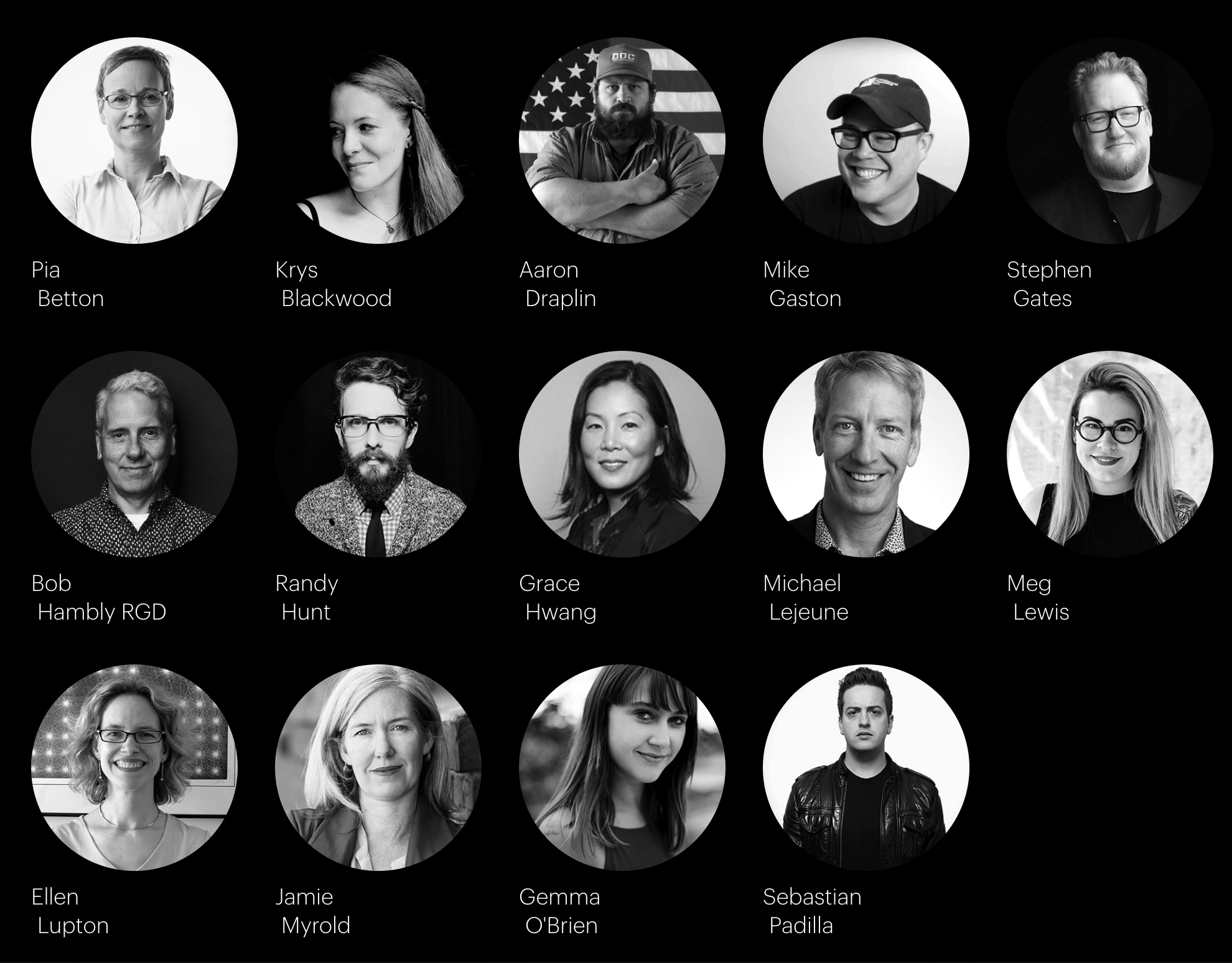
The speakers include:

Pia Betton, Partner at Edenspiekermann
Krys Blackwood, Senior Lead UX Designer at NASA JPL
Aaron Draplin, Founder of Draplin Design Co.
Stephen Gates, Global Head of Design at Citi
Randy Hunt, VP of Design at Etsy
Michael Lejeune, Creative Director at LA Metro
Meg Lewis, Founder of Ghostly Ferns
Ellen Lupton, Writer, Curator and Graphic Designer
Jamie Myrold, VP of Adobe Design
Gemma O’Brien, Australian Designer & Artist
Sebastian Padilla, Co-Founder & Creative Director at Anagrama
And more!


UPPERCASE readers can enjoy 10% off registration! Signup to my newsletter for the details.

For more information, head over to designthinkers.com/Vancouver.

Christopher Rouleau letters his way through Design Thinkers

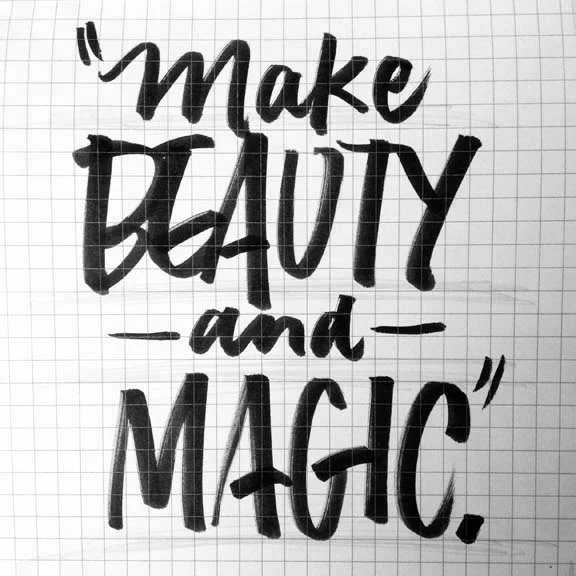
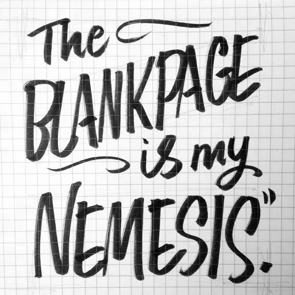
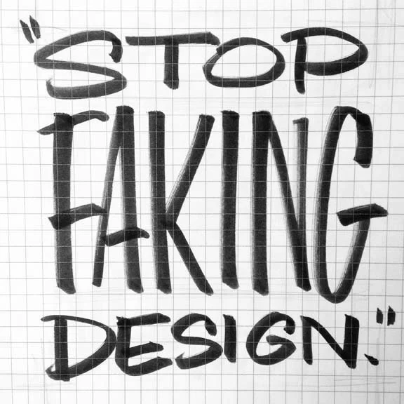
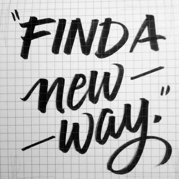
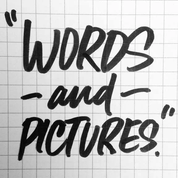
Frequent UPPERCASE magazine contributor Christopher Rouleau—and my Toronto correspondent!—brought his trusty brush pen to this year's Design Thinkers and did a great job of capturing those shareable sound bites that one gets when listening to speakers at a conference. For more details, please visit Christopher's blog. Look for Christopher's contribution in the January issue, in which he and other designers, typographers and letterers share their favourite numeral.

James Victore
James Victore Inc., Brooklyn, NY
"Beauty and Magic"

Josh Clark
Big Medium, Brooklyn, NY
Author: Designing for Touch
"Magical UX and the Internet of Things" (slides here)

Coralie Bickford-Smith
Penguin Books, UK
"Shelf Appeal: How Design is Helping Put Classics in the Hands of Readers
Look for a feature interview with Coralie and Christopher in next spring's issue of UPPERCASE.

Art Chantry
artchantry.com, Seattle, WA
"Art Speaks Posters Yell"

Jean-François Porchez
Typofonderie, Paris
"Adding Value to the Invisibility of Typefaces"

Annie Atkins
Graphic design for films, annieatkins.com
"The Secrets of Designing Worlds for Film"

Karim Rashid
Karim Design, New York, NY
"The Business of Beauty"

Austin Kleon
Designer, author: austinkleon.com, Austin, TX
"How to Steal Like an Artist"

Manuel Lima
CodeAcademy.com, New York, NY
Author: Visual Complexity: Mapping Patterns of InformationThe Book of Trees
"Visualization Metaphors: Unraveling the Big Picture"

Chris Dixon
Design Director, Vanity Fair, New York NY
"Telling Stories with Words and Pictures"

Sebastian Padilla
Co-founder, Anagrama, Monterray + Mexico City, MX
"Going Fast to Nowhere"

Michael Lejeune
Creative Director, Los Angeles Metro
"The Power of Staying Put"

Paddy Harrington
Founder, Frontier Magazine, Toronto, ON
"A Field Guide to Creative Adventuring"

Frank Chimero
frankchimero.com, ofanother.com, Brooklyn, NY
"Design is Borderlands"

Thanks, Christopher! Be sure to visit his website for other great projects and his shop for newly listed holiday fare for lettering lovers and the typographically inclined.

Design Thinkers, part 2

Christopher Rouleau shares more of his conference notes from Design Thinkers.

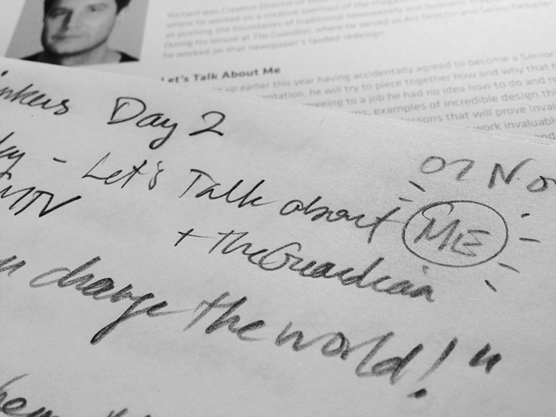
Richard Turley

Senior VP of Storytelling, MTV (previously: Bloomberg Businessweek)

"Let's Talk About Me"

  • "Typography can change the world!"
  • on bad clients: "the worse I made it, the more they liked it…"

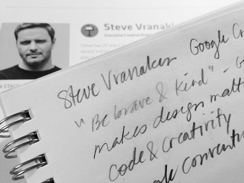
Steve Vranakis

Executive Creative Director, Creative Lab, Google

"Making Technology Matter, and Using Technology to Drive Creativity"


  • the description "must be brave & kind" was listed in a Google Creative Labs job posting
  • make design matter
  • coding = a creative discipline
  • developers = artists
  • code / poetry = right words in the right order
  • break the conventions / structures

Annette Diefenthaler, Ellen Lupton & Lawrence Zeegen

"The Future of Design Education"

What is the most important trait(s) for students leaving college / entering the workforce?

AD: one core skill is more important than multiple skills. A single skill permeates through a portfolio. Don't pretend you can do everything.

LZ: not skill sets, but mindsets / must be able to embrace new thinking – we're looking for innovators who will push the industry forward

EL: don't copy others / "nobody's going to be everything"

What is more important: critical thinking or technical skills?

EL: there should be no division—skill set and mindset should be integrated

AD: students must be adaptable and be able to teach themselves, or know how to acquire the skills they need

LZ: importance of learning both high tech and low tech (analog techniques), as well as learn from each other

How do you teach less-skilled students (the 90% "non-stars")?

LZ: educators are responsible for teaching the entire gamut of students, from all skill levels and backgrounds. strive for better, not best

AD: must question metrics – not just about graphic design "hard skills"
things to consider:

how is the student inspiring / challenging the discipline / industry?
how the student having an impact on his / her community?
how is the student able to communicate / inspire / teach others?
ultimately, educators must embrace diversity of skills and help break down barriers

Should software / technical skills be the core of design programs?

EL: critical thinking is more important that software knowledge
"teach spelling AND poetry in tandem" — always with an element of FUN

How important is coding fluency in a world where students are expected to be multi-disciplinary?

AD: students must have "digital fluency": able to use but not necessarily produce
ability to tell stories with existing apps, platforms, tools of visual distribution

How do you teach students to be "resourceful"?

EL: make students work within constraints, units, specific parameters, this teaches problem solving / resilience creates systems that can change / design is the most basic form of literacy for both designers and non-designers / empower students to do good: either at industry/agency level, or within their community

AD: time = money; make students execute projects in time constraints
find ways to "get to amazing" within 24 hours

What are your thoughts on design departments who are changing the course descriptions from "Graphic Design" to "Communication Design"?

EL: "I will go to my grave as a graphic designer!"
"graphic design" connotes discipline, long standing traditions
"communication design" connotes business, marketing, PR (yuck)

LZ: "graphic design" doesn't adequately describe the tasks any more

What are the constraints of a 3-year design degree? What would you add/change?

LZ: too insular
gap between real money / real time
need to connect graphic design with everything else

EL: too much focus on self, homework, etc. / add communal spaces to create a studio experience, encourage peer-to-peer learning, which is invaluable / also, make all classes electives…

AD: most classroom spaces are terrible – feel too "school-like"
learning / working environments affect how we think, act, and the quality of our work

Visit Christopher's blog for more, including his notes on Jessica Walsh and Erik Spiekermann. Our thanks to Design Thinkers for the press pass to this annual event.

Design Thinkers, part 1

DAY 1, November 6

Christopher Rouleau was our reporter on the scene of the recent Design Thinkers conference in Toronto and conducted an interview with Ellen Lupton that will appear in a future issue of the magazine. Below, he shares his conference notes — those fleeting gems and snippets of ideas that one takes away from such a conference. Visit his blog for more.

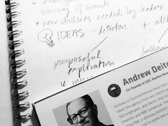
Andrew Deitchmann

CEO & Co-founder, Mother NYC

"A Well-Designed Idea"

  • "have fun and make a living – in that order"
  • PUSH THINGS FURTHER
    novelty is NOT sustainable
  • always work with good people
  • big ideas vs. rich ideas (rich is better)
  • don't be intimidated by the big players
  • Make the complex simple & joyous!

Todd Waterbury

Executive Creative Director & Senior VP of Marketing, Target

"Belief to Behaviour"

  • language is what you believe
  • 21st century literacy = coding
  • diversity – best when one field of interest informs the other (and vice versa)
  • discipline fuels the best creative thinking
  • de-familiarize the ordinary
  • best ideas & experiences = the inevitable + the unexpected
  • Choice is abundant, attention is scarce

Aaron Draplin

Founder, Draplin Design Co.

"Tall Tales from a Large Man"

  • was told "you're not going to make a living in design"

  • "defy the f*cking odds"
  • interested in "creating things for regular people"
  • still surprised he "got away with it..."
  • "don't forget the power of your mouse finger" to help the community organizations
  • on success Field Notes: "You can do this."
  • design as trade, not trend
  • GET DIRTY!
  • go junking – inspiration waits in a world of "dead things"
  • on worrying: "Get cosmic." – think about the bigger picture and what's really important. At a universal scale, "we have no idea what's going on." Chill out.

Debbie Millman

President, Design Division, Sterling Brands
Design Matters podcast

"On Rejection, or How the Worst Moments of Your Life Can Turn Out to Be the Best"

  • get past your fears and work through the discomfort
  • one closed door opens another – opportunity is everywhere
  • every time designers get together, there is opportunity to grow

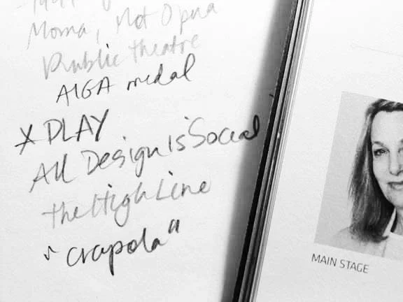
Paula Scher

Partner, Pentagram

"All Design is Social"

  • P L A Y ! ! !

Follow @Chris_Rouleau as he reports from Design Thinkers!

Toronto-based letterer and designer Christopher Rouleau is my reporter on the scene of this year's Design Thinkers. Today's schedule is amazing, with the likes of Debbie Millman, Paula Scher, Sybille Hagmann, Aaron Draplin, Irma Boom and more!

Follow @Chris_Rouleau on Twitter and Instagram for words and images from the event. Our past Design Thinkers coverage is available here.

DesignThinkers: day two

Robert FabricantVP of Creative at frog design  spoke about how good design is good and celebrated.

We're wrapping up our coverage of DesignThinkers. We shared the first half of Christopher Rouleau's coverage of this annual event yesterday. Today we're including another summary of the day. For the full details, please visit Christopher's blog. You'll also want to note his limited edition 2014 calendar—it's a hand lettering extravaganza!

Michael Gough, VP of Experience Design at Adobe said "drawing makes imagination tangible" during his presentation. 

More of Christopher's work from a second hand-lettering workshop with Lara McCormick.

Cyrus HighsmithSenior Designer at Font Bureau spoke about how the work of a creative person is live a river. It's always there, changing flowing—similar but different. 

DesignThinkers: day one

Christopher ChapmanGlobal Creativity & Innovation Director at Disney at The Walt Disney Company spoke about purpose, passion and PENGUINS.

Christopher Rouleau has had the chance to process everything he was exposed to at DesignThinkers last week. He's got much to share with us about his experience. We've captured some of his notes here but you can find more on his blog

Christopher writes, 

"I had the privilege of attending this year's Design Thinkers conference in Toronto as UPPERCASE magazine's correspondent. Over the two-day event, I was able to participate in 14 (!) events & lectures by designers and creatives from around the world. It truly was a remarkable experience, and I am excited to share some inspiration from some of my favourite presenters."

Dmitri SiegelVice President of E-commerce & Executive Creative Director at Patagonia spoke about building Patagonia's brand experience.


Christopher attended a workshop with Lara McCormick and created these lettering sketches. 

Darhil CrooksCreative Director at The Atlantic believes that print will reinvent itself and prevail because of its appeal to human senses.

roving reporter

We're happy to have a roving reporter on the ground in Toronto this week. Christopher Rouleau will be attending the 14th edition of DesignThinkers—Canada's largest conference for visual communicators. 

Christopher is a freelance graphic designer and letterer in Toronto whose clients include: Toronto Star, Pride Toronto, and University of Toronto. When he's not working on personal side projects (like the Toronto Etiquette Project) or making alphabet prints for his online shop, Christopher is out looking for antique lettering samples or hanging out with his two cats, Milo and Cheddar. He's got a thing for hand-lettering and simple, geometric typefaces of the 1940s-1950s, as well as old-fashioned lettering guides, eye charts, maps, packaging, and ephemera. 

Christopher will bring his amazing talent and skill to his coverage for us. The sketch he hand-lettered in graphite (above) reflects the style he will use to share his DesignThinkers experiences. Stay tuned!

Follow him on Twitter and Instagram for news from Toronto.

You may recognize Christopher's name from his office letters submission in issue #19.

DesignThinkers: Stefan Sagmeister

"Actually doing the things that I set out to do increases my level of satisfaction."

Stefan Sagmeister was likely the biggest draw for conference attendees since he does have that 'rockstar' graphic designer status. I have heard Sagmeister present twice before; the first was a great presentation about his first sabbatical from working. The second presentation he must have been seriously jet-lagged because it was a dull and sleepy talk. Third time was a charmer, as Sagmeister talked about The Happy Film and his clues to happiness and satisfaction. 

Things that make Sagmeister happy:

• thinking about ideas and content freely — with the deadline far away

• traveling to new places

• using a wide variety of tools and techniques

• working on projects that matter to me

• having things come back from the printer done well

• designing a project that feels party brand new and partly familiar

• working without interruption on a single project

• getting feedback from people who see our work

"I do more of the things I like to do and fewer of the things I don't like."

I am very bad at predicting what will make me happy in the future. It's like going to a supermarket when you're hungry and you buy too much stuff.

Presenter tip: rather than imagining the audience naked, just start out by showing a picture of yourself naked.

DesignThinkers: Julia Hoffmann

Julia Hoffmann is MoMA's creative director. As the head of the in-house design team of 6 designers and some freelancers, she handles brand identity and exhibit graphics, advertising, signage, collateral, etc. I found her talk quite interesting since during my freelance years I did design work for much smaller cultural institutions such as the local opera as well as art galleries. Some points taken during her presentation: 

They think of the opening graphics to an exhibition as mini brands or book covers to entice visitors into the gallery.

"First think, then design."

The MoMA considers other cultural institutions their "competitors".

"It is the spectators who make the pictures."

—Marcel Duchamp

The MoMa typeface is a Gothic Display created in 2004 by Matthew Carter. It is based on Franklin Gothic. By using one typeface (with creative variations as shown above) the designers can focus on the content itself—and not have to have arguments with curators or artists about what typeface is most suitable for each unique exhibition.

Under the theme of 'design thinking', Julia shared a project that the museum undertook this past summer in an effort to get more American tourists to the MoMa. It was a project large in scope with outside consultants and multiple departments offering input. In the end, it was realized that "you can't be everything for everyone" and this red flag signalled a campaign destined to be ineffectual. What was missing in the failed project was "the gut"—there was too much analyzing, too many voices and opinions through committee to create a unified message. So though designing and thinking to various degrees are always necessary, you have to leave room for emotion, intuition and randomness. "We use the designing and thinking to rationalize our gut," Julia stated during her presentation.

Some other words of advice? Speak up and don't be shy when it comes to design. Question the brief... does it make sense? Challenge the vision of non-designers and ask them to trust you.

The relationship between client and designer is always a little bit of a dance.

DesignThinkers: Chris Hacker

"If everyone does better then we do better." 

Chris Hacker leads all creative processes for brand identity, packaging design and brand imagery for Johnson & Johnson consumer companies. The Global Strategic Design Office is based in New York City and has branch offices globally. The office consists of designers, engineers and technical staff who apply strategic design thinking within the company, in particular related to issues of sustainability. Prior to joining J&J, Chris was Senior VP of Global Marketing and Design for Aveda. Under his leadership, Aveda received the 2004 National Design Award for Corporate Achievement from the Smithsonian Cooper-Hewitt National Design Museum. (from DesignThinkers site)

My notes from Chris Hacker's presentation:

Designers are on a journey where someone gives us a problem and we head out on a journey to find a solution.

Companies need both left and right-brained people

The vision at Jjohnson & Johnson is "caring for the world one person at a time"

Make a case study out of every project

Create a repository of what the brand stands for

"Designers have a responsibility to help make change happen in our world." 

"Remember the dump" i.e. landfill, when making design decisions

Environmental responsibility and economic success are not mutually exclusive

When Johnson & Johnson discovered that Bandaid boxes in Brazil were made from Amazon forest they decided to grow their own sustainable trees.

"Add one paradigm to your design process" think about the blue planet — how can the work you're doing be lighter on the planet make the environment a priority in your work."

"If your boss is a Republican, don't tell him/her, just do it."

DesignThinkers: Randy J. Hunt

Randy J. Hunt

Just a couple weeks ago, I had the pleasure of meeting Randy J. Hunt at HelloEtsy in Eindhoven where he was a panel moderator. Now at DesignThinkers, Randy was presenting an in-depth look at how he, as creative director at Etsy, uses the incredible amount of data generated through the Etsy site to enhance and interpret the Etsy site experience. It is through a combination of "balancing intuitive choices with a set of criteria and constraints" with "making some gut calls".

Randy shared some case studies, notably how the simple act of moving a favourites button affected engagement with the Etsy site—as well as providing new insight to the Etsy team on how the site is used by its visitors. It was an interesting talk and I learned some things that I will try to implement on my own site to increase traffic over to magazine subscriptions.

DesignThinkers: Design Army

Pum and Jake Lefebure

Jake and Pum Lefebure are the husband and wife duo leading Design Army, a successful firm located in Washington, DC. The presentation was divided a bit like "his" and "hers". He takes care of business development, but it seems that she is in charge of the creative vision. A behind-the-scenes video showed the pair at a photoshoot, with Pum communicating the vision and attending to details and Jake with a coffee in hand, sometimes napping. It seems that they play this dynamic up for effect and judging from the caliber of their work, there are no slackers in the Design Army. Their style is a combination of highly art-directed stylized photography with boutique custom typography.

Pum Lefebure with Design Army's work for Neenah Paper.

Washington Ballet

Washington Bride and Groom magazine spread.

Design Army is active in promoting their firm and their partnership (mainly through styled photographs of themselves) published in DC lifestyle magazines and design journals. They are also advocates of entering their work in design annuals and claim to get a lot of new business through the exposure. They believe that if you exert the effort and cover the cost of producing great imagery for use by the media, it will pay off in free publicity because many publications are looking for quality images under time and budget constraints. As a publisher, I would agree with this statement—though the glamorous, styled image that Design Army projects isn't the UPPERCASE aesthetic, I do look for high quality images. 

    If you'd like to be featured in UPPERCASE, here is what I look for when reviewing submissions:

    • Clear, succinct, informative writing 

    • Object photos are well-lit on a simple backdrop (white is nice) or shown in-situ

    • Illustration previews as good scans or as jpg files

    • Intriguing workspaces that show the creative process

    • Photos of the artist or artisan either against a simple backdrop or shown in his/her studio

    • High resolution image files easily available through a provided link (i.e. don't send or email high res images without asking!)

    • All relevant (working!) links and contact information

    Please also follow the submission guidelines here. >>>

    DesignThinkers: Harry Pearce

    Harry Pearce, partner at Pentagram

    Harry Pearce opened the conference with a personal story about finding a rock during an undersea snorkle. He loved the look and feel of the object and took it with him. It turned out to be no ordinary rock—its smooth indentation and once-sharp chiselled edge gave some clues... the rock was actually an ancient implement; one that had functional and historical value as well as the emotional value that Harry ascribed to it.

    This was an apt metaphor for the rest of his presentation in which Harry, a partner at the esteemed firm Pentagram, presented design that challenged him to work, to investigate, to experience, to feel and to react. For Harry, the tools of work can be beautiful and profound. 

    These sample spreads are from a design exercise Harry began—to communicate typographically with very reduced elements—that evolved into a book called Conundrums. On the project, Harry noted, "What you think might be dumb ideas…. [turn into something else]. Ideas are just fantastic and have their own trajectory."

    Some one-liner highlights I noted during his presentation:

    There's beauty in the mystery.

    I just put the logo as big as we f*ing could.

    I was just photographing my kind of rubbish—and they thought me quite mad.

    Apparent crap can be heavenly source material.

    On design: I feel like design is finding me.

    It is a real privilege to be in ideas.

    DesignThinkers day 1

    Piles of complimentary magazines including UPPERCASE, Design Lines and Applied Arts.

    The swag bags can hold a lot of stuff (unlike the epic fail folded paper bags of last year.)

    I've created a roundup of the best tweets and one-liners from the first day. Read it on Storify right here. (If anyone knows how to get a Storify embedded successfully in Squarespace6 that would be helpful! Code blocks do not work.)

    UPPERCASE contributing writer Vinciane de Pape and I enjoyed a nice lunch break.

    And remember to use the code #rgddt in the shop for $15 off subscriptions and renewals.

    (Code is valid until midnight tonight and cannot be retroactively applied!)

    DesignThinkers (plus a discount code for subscriptions/renewals!)

    Greetings from the back of the theatre at the DesignThinkers conference in Toronto. I'm looking forward to the keynotes this morning and bringing you updates and posts throughout the conference. Follow along on Twitter and Instagram, too.

    I've sent a whopping 1200 free copies of UPPERCASE magazine which are available on the long table when you first enter after getting your conference badges. If you don't see UPPERCASE on the table, just ask someone in a yellow tshirt to open a fresh box!

    If you're not at DesignThinkers you can use the code #rgddt for $15 off subscriptions/renewals today! http://upperc.se/VV6ICt

    If you'd like to connect with me here at the conference, just send me a tweet! @uppercasemag

    revisit: the method method

    The following post was previously published [with some slight edits and updates below] on the Alberta Magazine Publishers Association's blog last year. AMPA has generously provided UPPERCASE a bursary to help offset the costs of travel and accommodation to Toronto to attend DesignThinkers. Thanks, AMPA!

    Having heard great reviews of DesignThinkers conference over the years, I finally got to experience it firsthand this year thanks to a bursary from AMPA. With an eclectic variety of speakers, presenters were from a graphic design background (advertising legend George Lois, book designer Chip Kidd, lettering goddess Jessica Hische) and from big companies (speakers representing Google, Oprah Magazine, and Method Home). The conference was very broadly about design thinking—about how creativity can affect change, enhance communities, engage consumers and entertain audiences. As magazine publishers [and creative entrepreneurs], these are our goals.

    Surprisingly, I found the most useful information for succeeding in publishing from two guys who make nice-smelling soap. Method, by combining eco-conscious products with innovative thinking and eye-catching design in a very traditional product category, has become an extremely successful company. Conference keynote presenter Eric Ryan (founder of Method) has a background in advertising; his friend (and co-founder) Adam Lowry was a climate scientist in his previous career. Theirs is an entertaining story [available in their book], honestly presenting the failures alongside the success.

    So how does running a cleaning products company relate to publishing a magazine? It's all in the attitude and using the Method method of business thinking. Here are some of the most relevant points:

    Inspire Advocates
    Create a product that people love and they will not only become dedicated customers but advocates for your brand. If you publish a magazine that people love (not just like), they can't live without it. The magazine [or your product] becomes part of their way of life—they identify themselves by it. They proudly tell others about it, they're invested in the content and they support it financially. My magazine is built on this notion; it was heartening to see this approach work so successful on a bigger scale.

    Kick Ass at Fast
    If you're not one of the "big guys" then you have to be better in other areas. For Method, this means that the relative small size of their company and manufacturing processes allows them to quickly seize opportunities of trends or customer feedback and implement change swiftly. For magazine publishers, it means that interacting and reacting with readers in real time is vital. You can no longer exist just in the realm of print—social media engagement is a vital and required offshoot of publishing content. Readers expect a dialogue; create a platform where this can happen and it will result in a stronger base for your publication. Smaller publications can achieve this much more easily than large publishing conglomerates, since readers can access us on a more intimate level.

    Relationship Retail
    Having fewer but more reliable customers is better than having lots of one-time customers. Method realized that their version of laundry detergent will never compete with "Tide", but they realized that their ideal customer will pay more for a product that they respect and understand. So fewer newsstand sales is fine if you have a strong subscriber base—a long term relationship is what magazines need to cultivate.

    Win on Product Experience
    Method is all about delivering an exceptional product experience. They take the mundane such as toilet bowl cleaner and reinvent the category, elevating the product design and packaging into something unique, useful and memorable. Whatever topic your magazine covers, yours should be the ultimate: the most reliable reference delivering the most intelligent expertise in the most engaging way possible.

    Design Driven
    To differentiate your product on the shelves, your design needs to be different. And not just different for the sake of different, but different for good reason. When Method launched its first product, they hired Karim Rashid, a superstar in industrial design, who created a bottle that not only looked unique, but one that functioned in a whole new way. Theirs was so innovative and unique on the shelves that other companies had to struggle to catch up to this new standard. Good design comes from good thinking. Make sure that the packaging of your magazine [or product] is in service of its content and that it recognizes the intelligence of its readers.