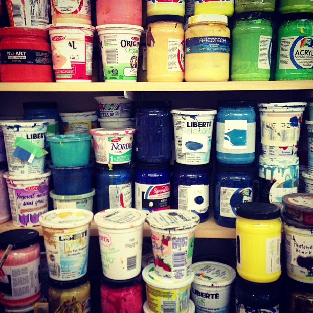
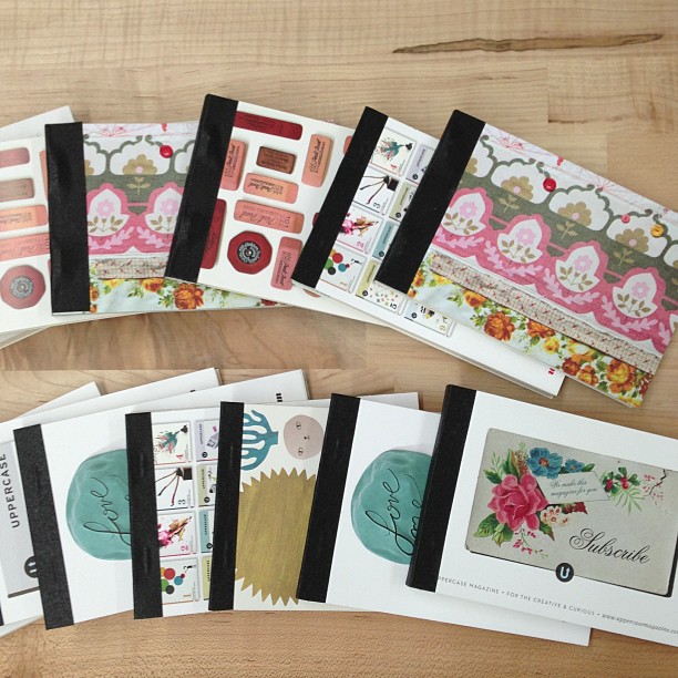
Toronto: open house at Alanna Cavanagh's!
/Alanna Cavanagh is having an open house studio sale in Toronto this weekend. She'll have beautiful silkscreen prints, greeting cards, refreshment and lots of fun to share!
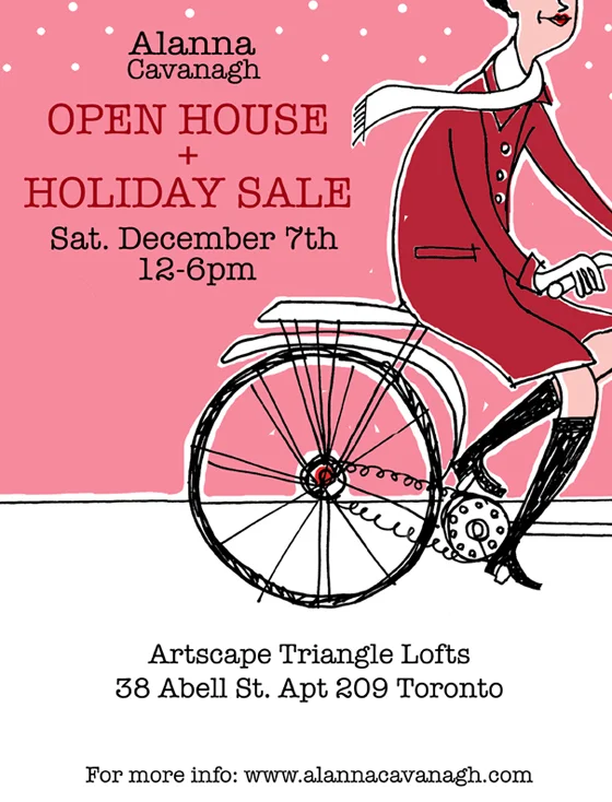
Alanna Cavanagh is having an open house studio sale in Toronto this weekend. She'll have beautiful silkscreen prints, greeting cards, refreshment and lots of fun to share!

Robert Fabricant, VP of Creative at frog design spoke about how good design is good and celebrated.
We're wrapping up our coverage of DesignThinkers. We shared the first half of Christopher Rouleau's coverage of this annual event yesterday. Today we're including another summary of the day. For the full details, please visit Christopher's blog. You'll also want to note his limited edition 2014 calendar—it's a hand lettering extravaganza!

Michael Gough, VP of Experience Design at Adobe said "drawing makes imagination tangible" during his presentation.

More of Christopher's work from a second hand-lettering workshop with Lara McCormick.

Cyrus Highsmith, Senior Designer at Font Bureau spoke about how the work of a creative person is live a river. It's always there, changing flowing—similar but different.

Christopher Chapman, Global Creativity & Innovation Director at Disney at The Walt Disney Company spoke about purpose, passion and PENGUINS.
Christopher Rouleau has had the chance to process everything he was exposed to at DesignThinkers last week. He's got much to share with us about his experience. We've captured some of his notes here but you can find more on his blog.
Christopher writes,
"I had the privilege of attending this year's Design Thinkers conference in Toronto as UPPERCASE magazine's correspondent. Over the two-day event, I was able to participate in 14 (!) events & lectures by designers and creatives from around the world. It truly was a remarkable experience, and I am excited to share some inspiration from some of my favourite presenters."

Dmitri Siegel, Vice President of E-commerce & Executive Creative Director at Patagonia spoke about building Patagonia's brand experience.

Christopher attended a workshop with Lara McCormick and created these lettering sketches.

Darhil Crooks, Creative Director at The Atlantic believes that print will reinvent itself and prevail because of its appeal to human senses.

We're happy to have a roving reporter on the ground in Toronto this week. Christopher Rouleau will be attending the 14th edition of DesignThinkers—Canada's largest conference for visual communicators.
Christopher is a freelance graphic designer and letterer in Toronto whose clients include: Toronto Star, Pride Toronto, and University of Toronto. When he's not working on personal side projects (like the Toronto Etiquette Project) or making alphabet prints for his online shop, Christopher is out looking for antique lettering samples or hanging out with his two cats, Milo and Cheddar. He's got a thing for hand-lettering and simple, geometric typefaces of the 1940s-1950s, as well as old-fashioned lettering guides, eye charts, maps, packaging, and ephemera.
Christopher will bring his amazing talent and skill to his coverage for us. The sketch he hand-lettered in graphite (above) reflects the style he will use to share his DesignThinkers experiences. Stay tuned!

You may recognize Christopher's name from his office letters submission in issue #19.

Small Print Toronto is a non-profit organization that runs interactive literary programs for children.
Their writing workshops and author showcases are designed to inspire kids to explore how stories work. They believe that learning to tell your story and to understand those of others builds self-confidence and develops intellectual curiosity.
They're hosting an event in support of their programs on September 16th. Toronto’s vibrant book, art and indie rock worlds will come together at Storybook Confidential, a night for grownups in support of Small Print's programs for children.

Type Book's Queen Street West location.


Another stop in Toronto last week was to Type Books. Wow, what a great independent neighbourhood bookstore. They were out of stock of the current issue (which I guess is a good thing! They'll just have to stock up next time, hint hint.) We featured Type on the blog previous—remember this amazing time-lapse animation of the shop being rearranged?
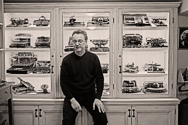
Martin Howard and his collection of early typewriters.


Martin's display of typewriter tins above the workstation where he cleans and repairs his machines.
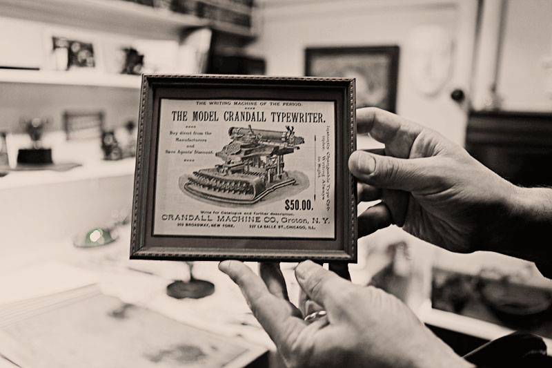
In addition to machines, Martin has an extensive collection of artifacts, like this advertisement for the Crandall Typewriter.

A gorgeous Crandall from 1886.
During my trip to Toronto, I was fortunate to visit Martin Howard and his beautiful collection of early typewriters. His website offers clear and detailed photographs of his collection and is certainly the best site and photographs that I have come across. I am pleased that Martin will be sharing some of his images in The Typewriter: a Graphic History of the Beloved Machine.
I had not previously had the opportunity to see these early typewriters up close, let alone to see how they work. Martin graciously demonstrates two models, a Standard Folding and a Mignon 2, in the videos below.
A note on the photographs The photos above are ones that I took during our visit. Martin and I both kindly request that respect be given to our images and ask that proper credit is given if you use any of these images on your blog or post them to Pinterest or elsewhere. Personally, I have come across many unauthorized uses of my typewriter photographs for blog headers and commercial purposes. We invest a lot of effort into preparing the machines, lighting, equipment, etc and photographs of the machines are copyrighted to the photographers. Just because it is a picture of something old, the photographs themselves are not "public domain". thank you.
This was the opening to the National Magazine Awards last week. It's impressive to see how they've animated all the entries and given motion to static print entries. It was an energetic kick-off to the eventing. (On second viewing, and out of context, it sort of makes the point that "plain old print" is boring and everything has to move and interact and be ADD to hold interest...)
Credits: Creative Direction - Xavier Massé; Animation - Matthew Hemming; Artwork Preparation - Joana Ferret; Music - Bustafunk; Remix & Foley - Joshua Hemming.

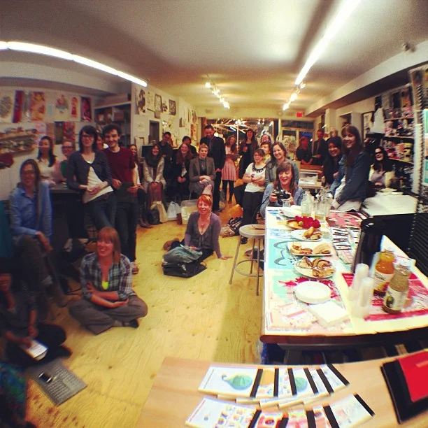
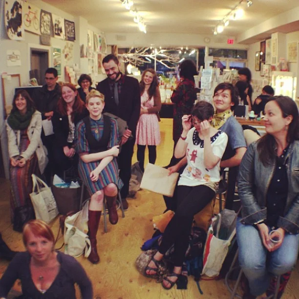
Chris Rouleau (with help from Erin) shows his work at our Show and Tell event held last Thursday at Kid Icarus.
Our Show and Tell event at Kid Icarus last Thursday evening was lots of fun. Everyone presented such interesting work! I look forward to sharing some highlights here on the blog. First up is Christopher Rouleau, who is actually a friend of Jocelyn's (our new subscription/distribution manager). Chris was in Calgary a few weeks ago and generously gave me the excellent print of his capital hand-lettered alphabet. Chris hails from Toronto and is a graphic designer and lettering artist, so we invited him to share his work with the Kid Icarus crowd.


Coincidentally, I ran into Chris randomly in downtown Toronto on Sunday! I guess it's not such a big city after all. (And one could use the Toronto print that he sells to get around.)


Swipe Books is always on my list of places to visit. They have a great selection on books on design and typography.

Swipe is located in this beautiful building, 401 Richmond. (They have a second location at the Design Exchange.)


In addition to our magazine, they also have our other books like Work/Life and Collection a Day.
For more details about Swipe, visit their website and blog. Take a look at our stockist list to find other stores near you that carry UPPERCASE magazine and books.

Paige's lucky table!

I purchased this toy machine. It will polish up nicely for inclusion in The Typewriter book.
I'm having a terrific weekend for typewriter sightings! My friend Paige and I combed the aisles of the St Laurence flea market here in Toronto this morning. I always enjoy going to flea markets with Paige. We both love old stuff, but she's also a great companion because we're each on the lookout for different things, so we're not competing for the ultimate find!
Visit my Instagram feed to see more vintage finds (all of which stayed behind at the tables).


I'm willing to suffer new shoe discomforts for a glimpse downward at my new striped sandals.

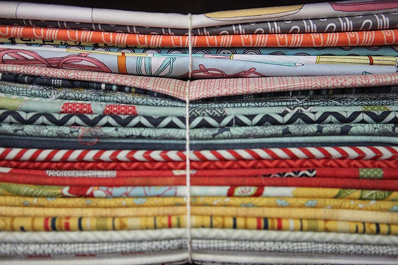
A nice stack.
Another nice stack. Eagle eyes will notice that the workroom has a copy of out-of-print issue #3 and #12 for sale!
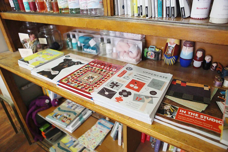
It's always a pleasure to visit the workroom. And I notice that they have some out-of-print back issues like #3 and #12! Head on over to the workroom or contact them to scoop these up!
We had a terrific time at our Show and Tell in Kid Icarus, a wonderful card and gift store slash printmaking studio. It had been a while since I visited Bianca and Mike's Kid Icarus—their previous studio shop was a tiny one with barely enough room to silkscreen let alone do retail. Their new venue is spacious and full of wonderful things to look at (and buy!) They also host workshops in the basement.
Above is a small gallery of instagrams I took this evening. We hosted a Show and Tell where creative Torontonians could take a minute or two to introduce themselves and present an idea or example of their work. I look forward to sharing some of those highlights on the blog soon.

We're heading to Toronto for the National Magazine Awards (UPPERCASE is nominated for Magazine of the Year!) and we'd love to meet our readers.
Janine (publisher, editor and designer of the magazine) and Erin (publicity and marketing) are hosting a Show and Tell at Kid Icarus. Are you an illustrator, craftsperson, designer or a generally creative soul? Do you have an idea to pitch to us? Have you dreamed of being published in UPPERCASE? Bring one example of your work and share it with us!
(Or, just come and say hi. We're really friendly.)
Thursday, June 6
7:30pm-10:00pm
Kid Icarus
205 Augusta Avenue
Please RSVP to Erin by June 5th, space is limited!
Stefan Sagmeister was likely the biggest draw for conference attendees since he does have that 'rockstar' graphic designer status. I have heard Sagmeister present twice before; the first was a great presentation about his first sabbatical from working. The second presentation he must have been seriously jet-lagged because it was a dull and sleepy talk. Third time was a charmer, as Sagmeister talked about The Happy Film and his clues to happiness and satisfaction.
Things that make Sagmeister happy:
• thinking about ideas and content freely — with the deadline far away
• traveling to new places
• using a wide variety of tools and techniques
• working on projects that matter to me
• having things come back from the printer done well
• designing a project that feels party brand new and partly familiar
• working without interruption on a single project
• getting feedback from people who see our work
Presenter tip: rather than imagining the audience naked, just start out by showing a picture of yourself naked.
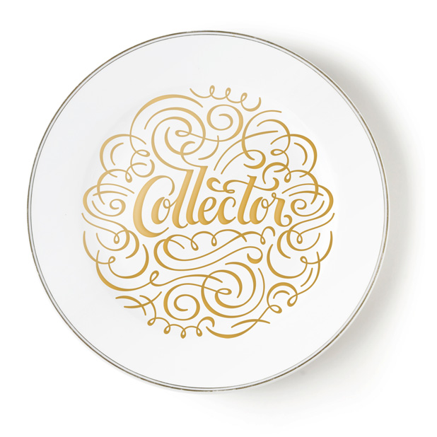
Collector's plate by Mine SF
Christopher Simmons' presentation "How to Build a Park" was one of my favourite presentations, but one that is really hard to summarize. If you have the chance to see Christopher Simmons talk or attend in one of his classes, do so! Follow his on Twitter.

Julia Hoffmann is MoMA's creative director. As the head of the in-house design team of 6 designers and some freelancers, she handles brand identity and exhibit graphics, advertising, signage, collateral, etc. I found her talk quite interesting since during my freelance years I did design work for much smaller cultural institutions such as the local opera as well as art galleries. Some points taken during her presentation:
They think of the opening graphics to an exhibition as mini brands or book covers to entice visitors into the gallery.


The MoMA considers other cultural institutions their "competitors".
—Marcel Duchamp

The MoMa typeface is a Gothic Display created in 2004 by Matthew Carter. It is based on Franklin Gothic. By using one typeface (with creative variations as shown above) the designers can focus on the content itself—and not have to have arguments with curators or artists about what typeface is most suitable for each unique exhibition.
Under the theme of 'design thinking', Julia shared a project that the museum undertook this past summer in an effort to get more American tourists to the MoMa. It was a project large in scope with outside consultants and multiple departments offering input. In the end, it was realized that "you can't be everything for everyone" and this red flag signalled a campaign destined to be ineffectual. What was missing in the failed project was "the gut"—there was too much analyzing, too many voices and opinions through committee to create a unified message. So though designing and thinking to various degrees are always necessary, you have to leave room for emotion, intuition and randomness. "We use the designing and thinking to rationalize our gut," Julia stated during her presentation.
Some other words of advice? Speak up and don't be shy when it comes to design. Question the brief... does it make sense? Challenge the vision of non-designers and ask them to trust you.
Chris Hacker leads all creative processes for brand identity, packaging design and brand imagery for Johnson & Johnson consumer companies. The Global Strategic Design Office is based in New York City and has branch offices globally. The office consists of designers, engineers and technical staff who apply strategic design thinking within the company, in particular related to issues of sustainability. Prior to joining J&J, Chris was Senior VP of Global Marketing and Design for Aveda. Under his leadership, Aveda received the 2004 National Design Award for Corporate Achievement from the Smithsonian Cooper-Hewitt National Design Museum. (from DesignThinkers site)
My notes from Chris Hacker's presentation:
Designers are on a journey where someone gives us a problem and we head out on a journey to find a solution.
Companies need both left and right-brained people
The vision at Jjohnson & Johnson is "caring for the world one person at a time"
Make a case study out of every project
Create a repository of what the brand stands for
"Designers have a responsibility to help make change happen in our world."
"Remember the dump" i.e. landfill, when making design decisions
Environmental responsibility and economic success are not mutually exclusive
When Johnson & Johnson discovered that Bandaid boxes in Brazil were made from Amazon forest they decided to grow their own sustainable trees.
"Add one paradigm to your design process" think about the blue planet — how can the work you're doing be lighter on the planet make the environment a priority in your work."
"If your boss is a Republican, don't tell him/her, just do it."


Just a couple weeks ago, I had the pleasure of meeting Randy J. Hunt at HelloEtsy in Eindhoven where he was a panel moderator. Now at DesignThinkers, Randy was presenting an in-depth look at how he, as creative director at Etsy, uses the incredible amount of data generated through the Etsy site to enhance and interpret the Etsy site experience. It is through a combination of "balancing intuitive choices with a set of criteria and constraints" with "making some gut calls".
Randy shared some case studies, notably how the simple act of moving a favourites button affected engagement with the Etsy site—as well as providing new insight to the Etsy team on how the site is used by its visitors. It was an interesting talk and I learned some things that I will try to implement on my own site to increase traffic over to magazine subscriptions.

Pum and Jake Lefebure
Jake and Pum Lefebure are the husband and wife duo leading Design Army, a successful firm located in Washington, DC. The presentation was divided a bit like "his" and "hers". He takes care of business development, but it seems that she is in charge of the creative vision. A behind-the-scenes video showed the pair at a photoshoot, with Pum communicating the vision and attending to details and Jake with a coffee in hand, sometimes napping. It seems that they play this dynamic up for effect and judging from the caliber of their work, there are no slackers in the Design Army. Their style is a combination of highly art-directed stylized photography with boutique custom typography.

Pum Lefebure with Design Army's work for Neenah Paper.

Washington Ballet

Washington Bride and Groom magazine spread.
Design Army is active in promoting their firm and their partnership (mainly through styled photographs of themselves) published in DC lifestyle magazines and design journals. They are also advocates of entering their work in design annuals and claim to get a lot of new business through the exposure. They believe that if you exert the effort and cover the cost of producing great imagery for use by the media, it will pay off in free publicity because many publications are looking for quality images under time and budget constraints. As a publisher, I would agree with this statement—though the glamorous, styled image that Design Army projects isn't the UPPERCASE aesthetic, I do look for high quality images.
If you'd like to be featured in UPPERCASE, here is what I look for when reviewing submissions:
• Clear, succinct, informative writing
• Object photos are well-lit on a simple backdrop (white is nice) or shown in-situ
• Illustration previews as good scans or as jpg files
• Intriguing workspaces that show the creative process
• Photos of the artist or artisan either against a simple backdrop or shown in his/her studio
• High resolution image files easily available through a provided link (i.e. don't send or email high res images without asking!)
• All relevant (working!) links and contact information
Please also follow the submission guidelines here. >>>


Cover by Christy Batta

The UPPERCASE Circle is free for subscribers of the print magazine. Find out more.
UPPERCASE is a quarterly print magazine inspired by craft, design and illustration. A playful exploration of creativity, an affinity for vintage ephemera, and a love of handmade are some elements common in each issue. The magazine boasts high-quality paper and printing, a unique design aesthetic and incredible attention to detail.
Janine Vangool
publisher / editor / designer
Send a message →
* Before emailing submissions follow the guidelines here.
Glen Dresser
customer support
Please contact Glen for help with your purchases, wholesale inquiries and questions about your subscription. Include your full name and mailing address so that we can better assist you.
Send a message →
UPPERCASE publishing inc
Suite 201 b
908 17th Avenue SW
Calgary, Alberta T2T 0A3
403-283-5318
The studio is not open to the public—please get in touch to make an appointment. If you'd like to purchase our magazine and books locally, please see the stockist page.