Werner Design Werks: timeless design

I've admired Werner Design Werks' design portfolio since I was a design student in college. Sharon Werner's typographic skills combined with an intelligent approach to design problem-solving makes her work seem timeless — even years (yikes, decades?) later, the projects created by Werner Design Werks that I admired back then are still appealing today.

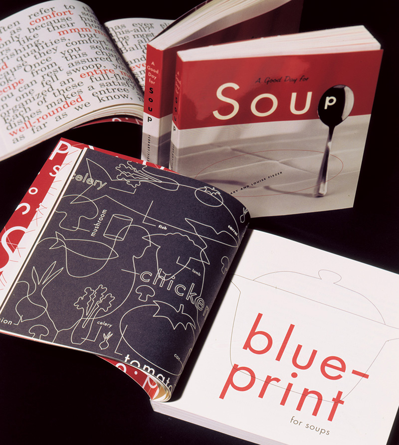
"A Good Day for Soup" was designed by Sharon Werner and published by Chronicle Books in 1995. As a fresh design college grad, I remember admiring its gorgeous and perfectly tomato-soup-coloured red ink on uncoated paper. The book design still looks fresh!

Sharon Werner and Sarah Forss are the small team that have been the mainstay of Werner Design works. Through hard work—combined with their great deal of talent—they have built a strong body of work and set themselves as an important anchor in a design aesthetic that began regionally in Minneapolis-St. Paul in the mid-nineties.

Sharon, during our visit in 2011.

In the early 90s, there was a distinctive design trend emerging from the Minneapolis area. It was a vernacular style that married a workhorse aesthetic with typographic prowess: bold type, simple colours, deliberate misregistration, butcher paper. French Paper was the trendiest stock option and retro-pop line art was being captured from the public domain by Charles S. Anderson. At the time, I was an eager visual communications student at the Alberta College of Art devouring design magazines. Before blogs and Behance, it was the print triumvirate Communication Arts, How and Print that informed the impressionable. Through their pages, I came to admire designs by Sharon Werner.

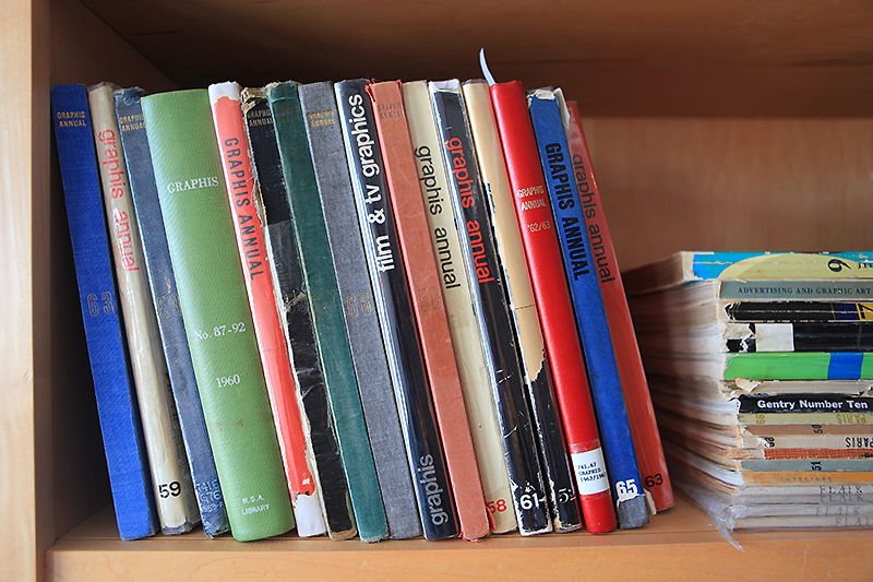
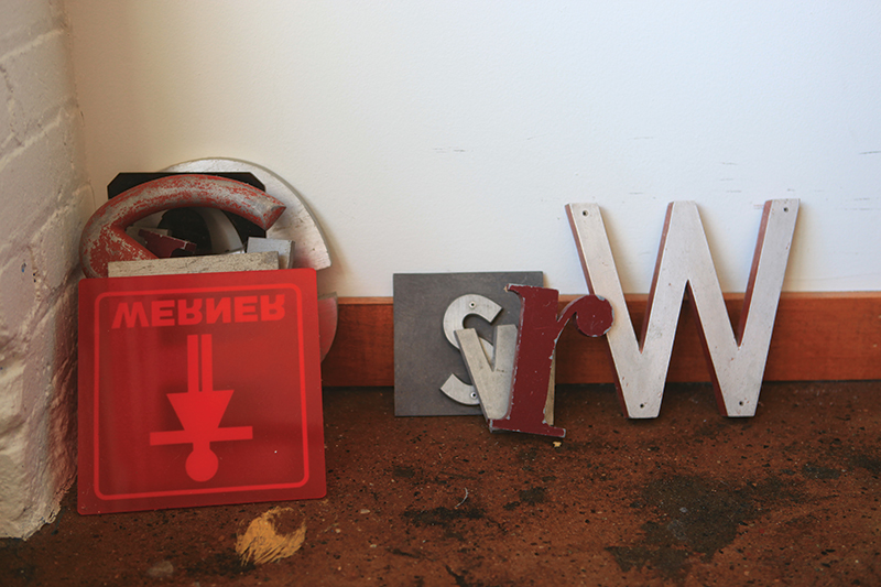
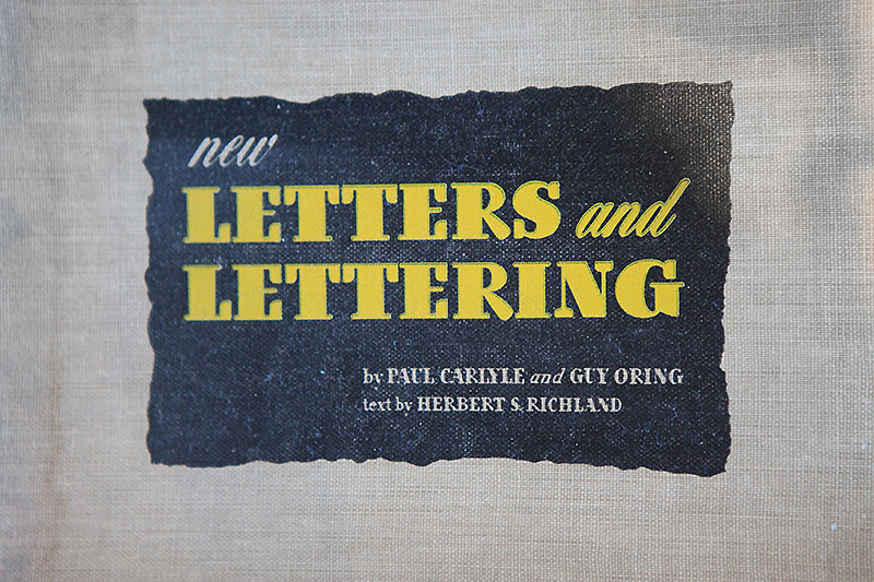
The Werner Design Werks studio is full of books, bits of signage and vintage inspiration.

After six years working for Duffy Design, Sharon founded Werner Design Werks in 1991. Her work appealed to me because the designs were a little quieter and a bit more feminine that the rest of the “guys” profiled in the magazines. I remember checking out a cookbook she designed (A Good Day for Soup, Chronicle Books, 1995), not for the recipes, but to admire the perfectly tomato soup–coloured ink and the delicious typography. When I graduated from college and started my own freelance design pursuits a few years later, I continued to follow Werner Design Werks' output for visual inspiration and also as encouragement for being a female entrepreneur in what was then a seemingly male-oriented industry.

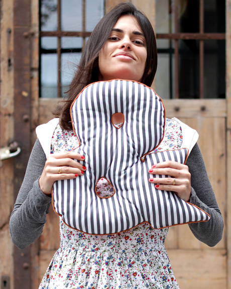
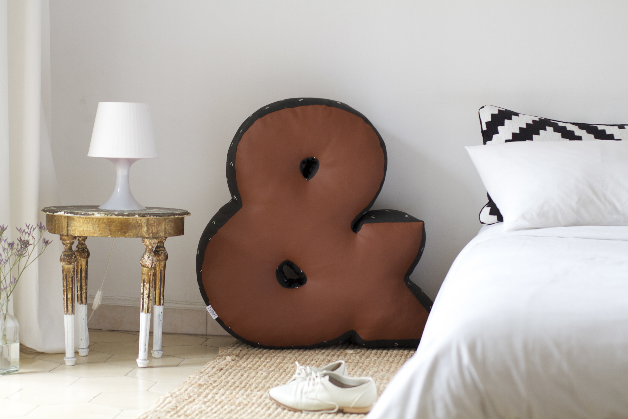
Examples from Alphabeasties.

Issue #14 is still available as a back issue and features a special section on children's book illustration. Cover by Jon Klassen.

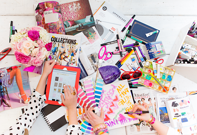
A dozen or so years on, Sharon and I connected through email and postal exchanges. I had been sending her the UPPERCASE directory of illustration and she was reciprocating with her amazing Alphabeasties series of books. In 2011, I was thrilled to finally meet Sharon in her St. Paul office and have a face-to-face chat (and a snoop through her spacious studio). Thinking back to my 20-year-old art-student self, I could not have fathomed that a few decades later I would be publishing a magazine and featuring one of my design heroines within its pages!

Our visit was profiled two years ago in issue #14 (2012) of UPPERCASE, but I've never shared some of the photos I took of that visit—until today! I was prompted to share them in honour of Werner Design Werks' new website, one that shows off current projects, like this identity for Caryn Model & Talent Agency, but also highlights the many projects that helped define the company over the years.

Identity design for Caryn Model & Talent Agency

Identity design for Caryn Model & Talent Agency

Sharon admits that it was quite challenging to decide what to include in the new website: "To edit and select 23 years worth of projects was an arduously difficult task of deciding—what makes the cut?" she explains. "We’re firm believers that you're only as good as your last project! But we also believe our history and experiences make us who we are today. They inform how we think and approach a project. With that in mind we created an archive section for the oldies but goodies. It was similar to going through your closet and if you’ve not worn (or referenced) it in the last 2 years, it goes into the give-away box."

Congratulations to Sharon and Sarah on the new site—and my thanks to them both for their hospitality and support of UPPERCASE projects over the years. Cheers! 

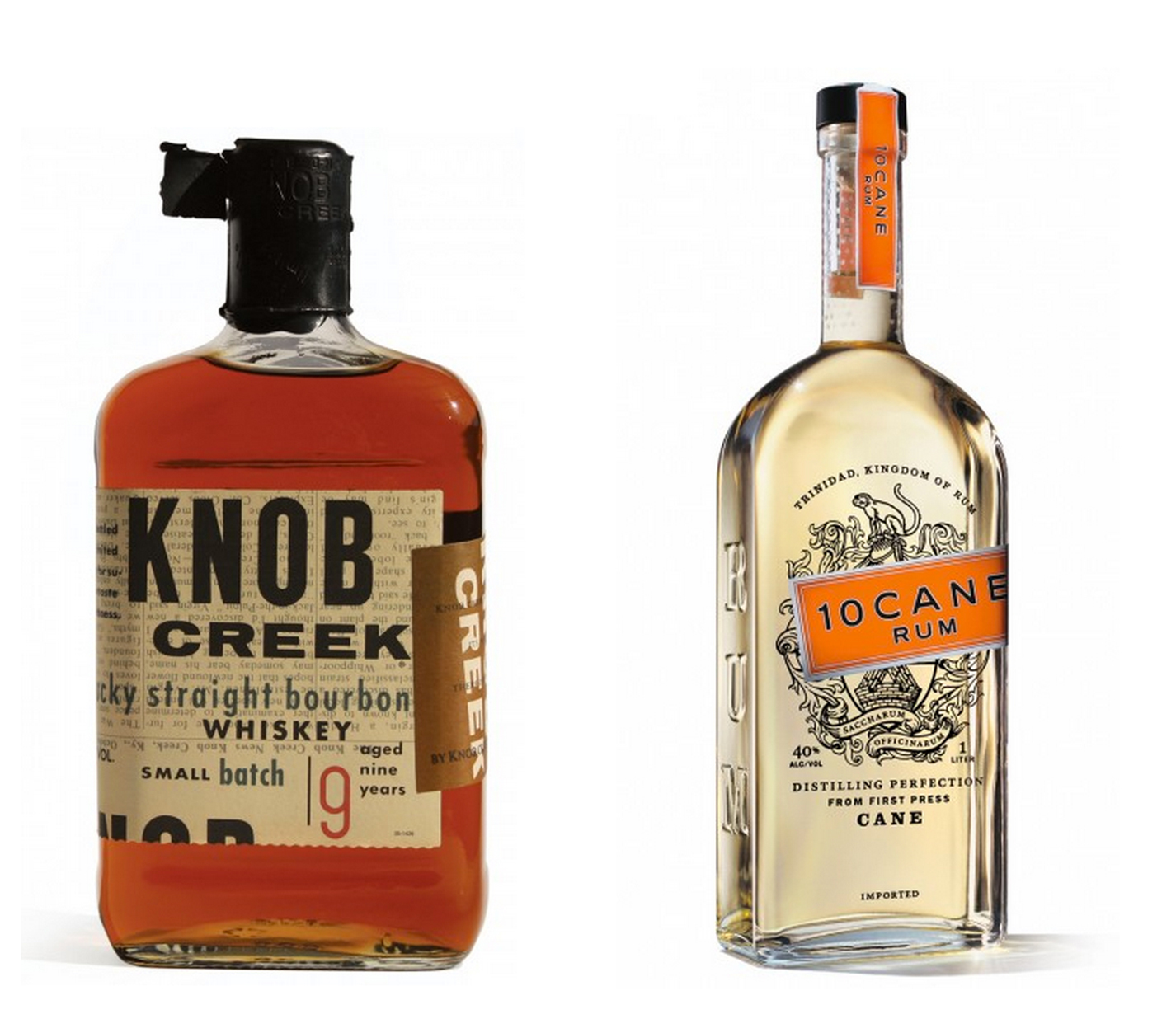
Some iconic spirits packaging. Knob Creek was produced while Sharon was at Duffy Design Group.

Nutmegger Workshop sees making signs as an art form

When I'm sifting through reader submissions, I never know what I'll find. From a fresh-faced illustrator hoping to get their first published piece or a seasoned creative who has turned a new leaf and is looking to share their new direction... surprise and delight are the hallmarks of a good submission.

The work of Peter Vogel of Nutmegger Workshop in Portland, Oregon prompted an immediate response from me—I began to follow him on Twitter, sent out a tweet, emailed a thank you and planned this blog post.

Peter introduced himself as a "30-year graphic designer/design director/creative director now making vintage sign art." His talent for lettering and his love of old signage is combined into his business of making vintage-looking signs. His signs are not meant as functional signage—they don't fabricate signs and to site installations—rather the signs are art meant to be hung interior settings, somewhat like charming set decoration or as interior design features. 

"Generations ago, sign writers were a busy, sought-after bunch, but the heyday of their hand-lettered art was no match for the rising tide of digital sign-making technology. Nutmegger Workshop was created to celebrate the alluring charm of this long-forgotten art form. It is our mission to offer the finest period reproductions and original designs — handcrafted works of typographic art that add unique personality to any well-designed space."

Enjoy a leisurely stroll through the Nutmegger gallery of signs and read more about Peter's approach to his art.

type tuesday: letterpress broadsides

image courtesy of Chandler O'Leary

A collaboration project by letterpress printer Jessica Spring and designer Chandler O'Leary called Dead Feminists is a quarterly letterpress broadside series that features quotes by women in history tied in with current political, social and environmental issues. 

"Broadsides are arguably the oldest form of mass-communication–a rabble-rousing medium that has helped bring about social change for centuries," says Chandler. "It was gratifying to discover that the words of these women still resonate today, and that we had the opportunity to tell our stories through the language of typography."

Each broadside is illustrated and hand-lettered by Chandler and letterpress printed by Jessica. 

type tuesday: feed yourself with letterform

Here's a feed to follow on Instagram: Letterform. Combining a love of food and typography, their online shop is called Nourishing Notes.

"Started in 2007 by Julie Morelli and Andy Schwegler (shortly after they opened their design studio Letterform) Nourishing Notes combines their passions for food, design, illustration, type, and laughter. One joke about a lamb shank quickly turned into the very first greeting card, which led to a crash course in letterpress printing, which led to a full line of stationery, kitchen towels, art prints, and lots more in the years to come." 


Grafolita

Catarina Vaz is a Lisbon-based designer who makes beautiful notebooks. She describes her company, Grafolita, as "a small universe where paper, ink and colour rule." 100% crafted by hand, Catarina's notebooks are letterpress-printed and bound one by one. 

"Grafolita is about one person who self teaches doing what she needs in order to do what she wants: Special handmade notebooks, through traditional techniques, that are reinterpreted and used in a new design approach, in the care for finishings and materials."

photos by Rui Abreu

creative manifesto: Alessandra Lanot

In our current issue #20 (released in January), we had a creative challenge asking our readers to submit their Creative Manifestos. Today we will feature some of the best submissions.

My Creative Manifesto: Follow Your Art

Your Name: Alessandra Lanot

Your City: Quezon City

Your Country: Philippines

Your website: http://www.lifeafterbreakfast.com


creative manifesto: Jane Rainwater

In our current issue #20 (released in January), we had a creative challenge asking our readers to submit their Creative Manifestos. Today we will feature some of the best submissions.

My Creative Manifesto: Beautiful Tyranny

Your Name: Jane Rainwater

Your City: Andover,CT

Your Country: USA

Your website if applicable: http://www.rainwaterdesign.com

creative manifesto: Mary Peterson

In our current issue #20 (released in January), we had a creative challenge asking our readers to submit their Creative Manifestos. Today we will feature some of the best submissions.

My Creative Manifesto: Make. Help. Smile.

Your Name: Mary Peterson

Your City: Los Angeles

Your Country: USA

Your website if applicable.: http://www.marypeterson.com

type tuesday: littered with glitter

I spy UPPERCASE issue 20 amidst this glorious jumble!

Great photos and styling for these sweet posters.

Tiffany Pratt and Stephanie Sterjovski

Stephanie Sterjovski and Tiffany Pratt have a series of limited edition glitter- and gold-theme prints available at SS Print Shop. If you need to add some glamour and pizazz to your studio walls! (Photos by Anna Tsoulogiannis.)

type tuesday: The Grolier Club

St. Nicholas, 1902, Part one. (November 1901–April 1902). New York: The de Vinne Press. 91⁄2 × 71⁄2 in., 576 pp.

Founded in 1884, The Grolier Club is America's oldest society for bibliophiles. Located at 47 East 60th Street in New York City, the Club mounts exhibitions and publishes books to preserve and promote knowledge in the graphic arts.

Their next exhibition opens February 19 and documents Theodore Low De Vinne (1828-1914), one of the nine founders of The Grolier Club, on the centenary of his death. De Vinne produced the majority of the organizations publications prior to 1914, and selections of these will be on display along with design drafts, proofs and other memorabilia.

"De Vinne was a lifelong advocate for the highest standards of printing and book design, and he rose to prominence among his fellow printers because he sincerely loved the printing craft. Following in the footsteps of his Methodist parson father, De Vinne was an evangelist, preaching the gospels of loyalty first to the printing shop, and then to the printing industry as a whole; attention to mechanical details; clarity and readability in books and magazines; and respect for the history of printing. He had a consuming interest in typography, and although nurtured in fussy Victorian typographic styles, he came to value simplicity in typographic design and campaigned tirelessly on its behalf."

In 1896 De Vinne produced this line-by-line re-creation of the first printing manual in the English Language, Joseph Moxon’s 1683 Mechanick Exercises.

The exhibition runs until April 26.

Are you a type designer under 25 years old?

FROM THE SOCIETY OF TYPE DESIGNERS:


SOTA Catalyst Award Call for Entries

The Society of Typographic Aficionados is pleased to announce the fifth annual SOTA Catalyst Award. The award is targeted at young people who have created original work in type design, type history, or other areas related to typography. It recognizes a person 25 years of age or younger who shows both achievement and future promise in the field of typography. The purpose of the award is to act as a catalyst in the career of a young person who does not yet have broad exposure in the profession.

The recipient will be awarded up to $1,500 USD in reimbursement for transportation and lodging expenses to attend the TypeCon2014 conference in Washington, DC — July 30th to August 3rd. They will also have their conference registration fee paid for and will be required to give a 20-minute presentation during the main conference program. Recipients should be available to attend the conference from Thursday to Sunday.

SUBMISSION DEADLINE: March 2nd, 2014

Typies

Soraia Balelo created Typies out of a love of the typographic form. Each product is handmade in Barcelona. Soraia writes, "We are detailed and caring along the process, we love to give life to each letter and character. It started almost two years ago and it was very experimental, limited edition and made to order. This year we launched the second collection with a screen printing pattern specially made for this season."

Go for the glitter

I missed out on a few destinations during my quick 3-day trip to San Francisco. One such place was Tantrum, a gift shop with lots of interesting items for children and grownups. If you need some Valentine's Day gifts, there's lots in store from classic children's books to contemporary prints. They have these fun glitter alphabet stickers by Meri Meri if you're in DIY card-making mode.