

Kristina Klarin: beautifully designed for fall
/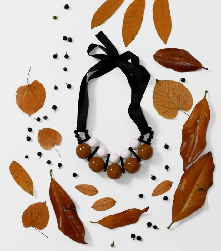
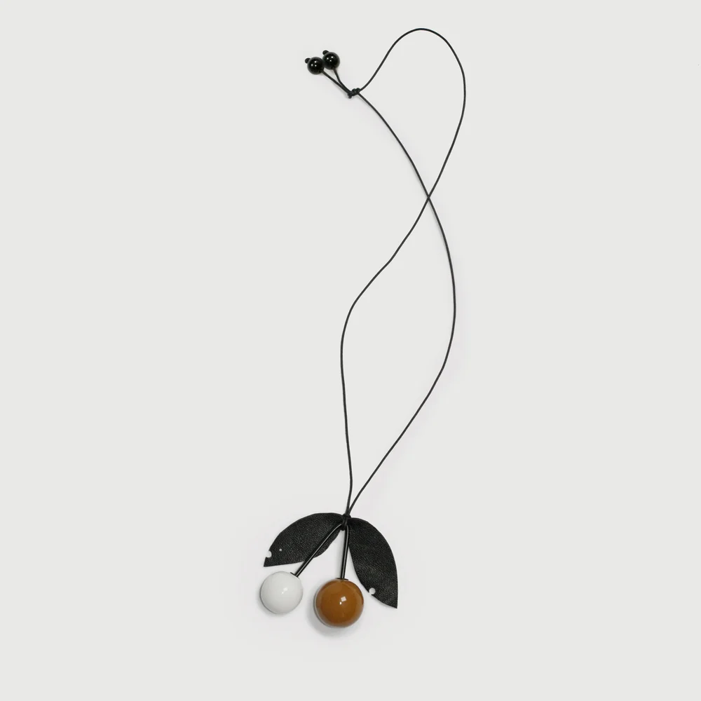
I've always been a fan of Kristina Klarin's large painted wooden beads. Her colour choices are always so interesting. She has just released a new collection, styled for fall, the entire design experience of her online shop is great.
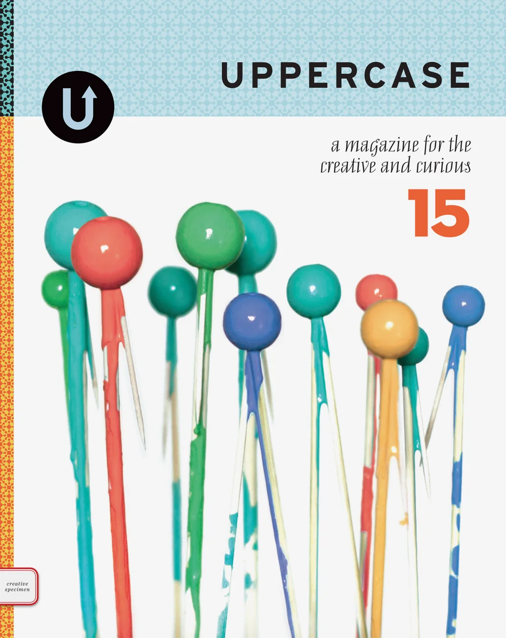
Kristina was the cover artist for issue 15 a few years ago. Here's an excerpt from our article:
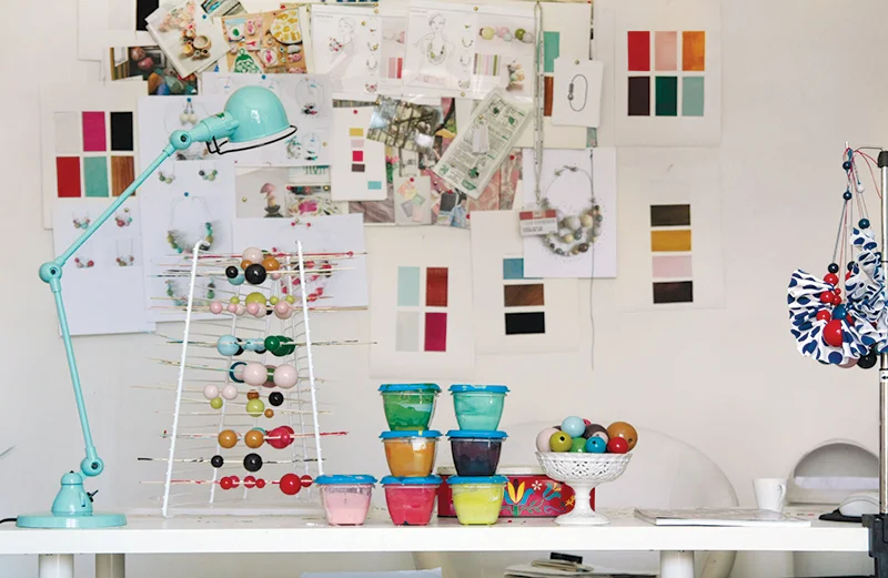
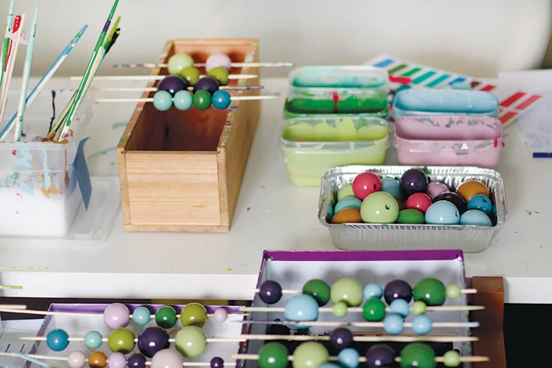
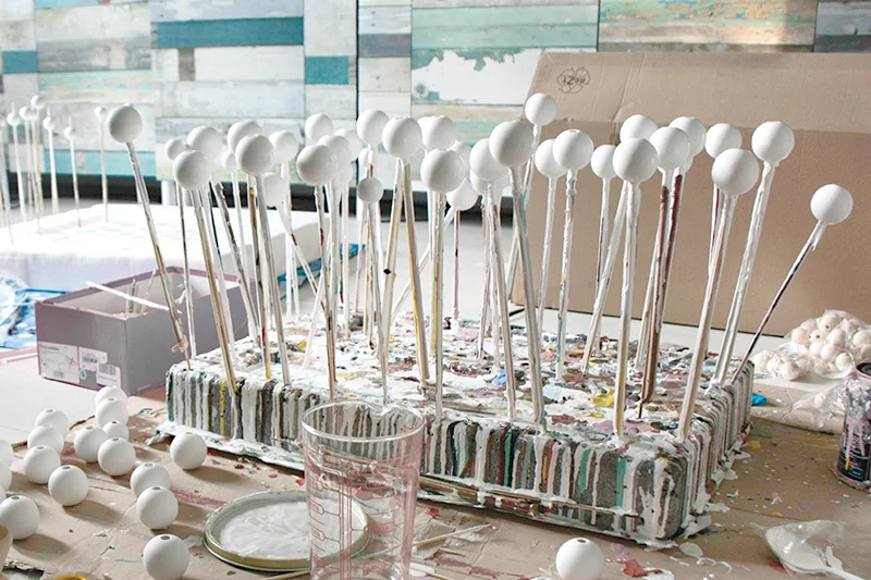
This is no ordinary production line: skewers of freshly painted wooden beads pierce magazine stacks and finished necklaces hang from any available hooks or frame corners of the room. It is awash with vibrant colours, almost as if someone had popped open a fantastical bottle of champagne, its bubbles filling the room with pictorial joy.
Beyond the immediate sensory overload, one rapidly notices the subtle elegance behind each colour combination. There is not a single faux pas as colours marry each other and respond to each other but never clash with each other. This is a delicate exercise in assembling the right shapes with the right hues, one that Kristina Klarin excels in.
Born in Belgrade and now living in Milan, Kristina has always been a colour enthusiast, and her experiences with cultural cross-pollination have helped shaped her take on it. Her home country, Serbia, was historically located at the crossroads of different cultures, and it is there that she believes she gained the ability to use colours in bold, unpredictable ways, as well as appreciate “the beauty from spontaneously mixing different aesthetic influences in a more casual way,” she says. On the other hand, her Italian education and professional experiences urged her to focus more on details—“on perfection,” she muses. “I started designing when I was very young. My passion for it brought me first to study textile design at high school and then drove me all the way to Italy where I graduated in fashion design,” she explains. “It’s indeed in Milan that right after my graduation I started working as a fashion designer. Over the years I saw myself shifting from sartorial and elaborated pieces of clothing to more basic, neat designs with a strong focus on their graphical composition and a flair for striking and eloquent details and accessory.”
Read the full article, written by Olivier Dupon, in issue 15 of UPPERCASE.


