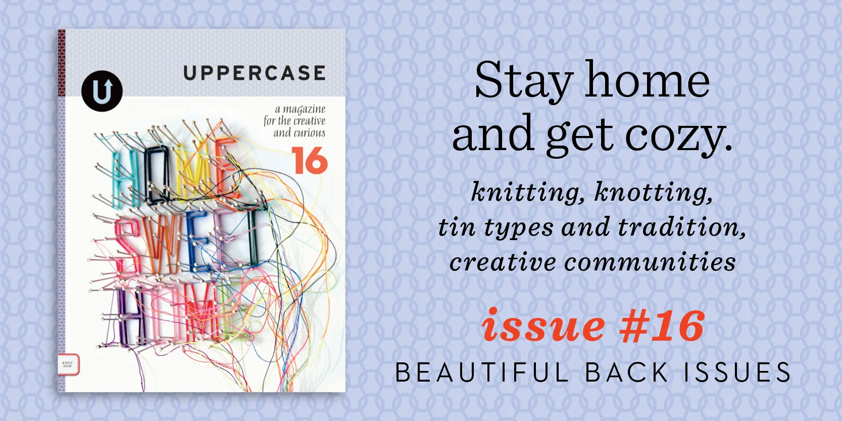
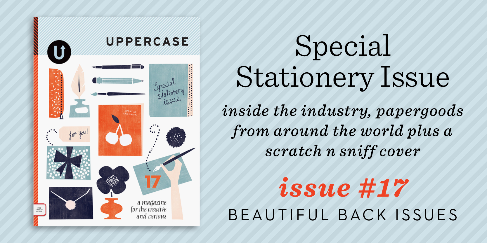
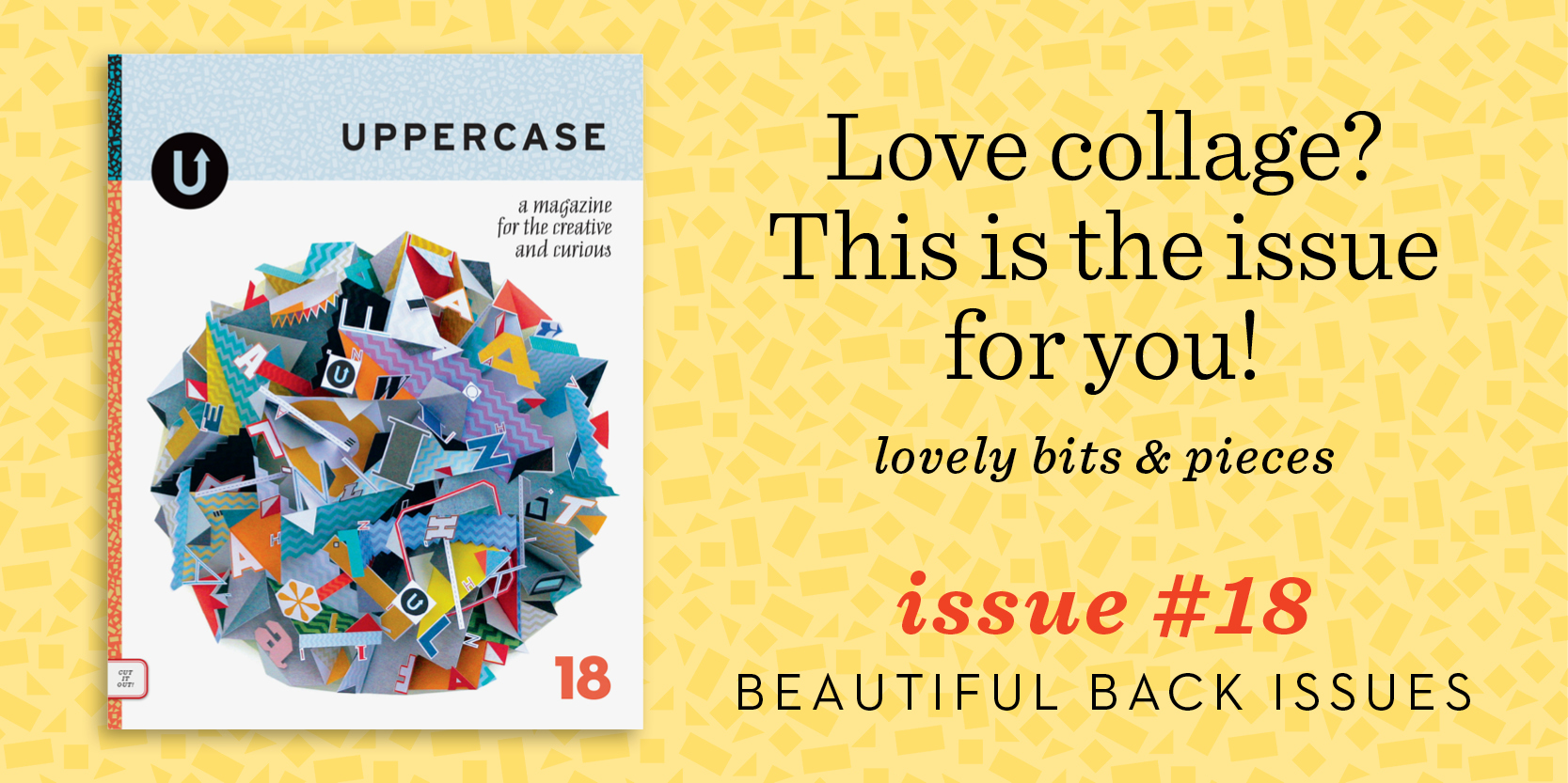
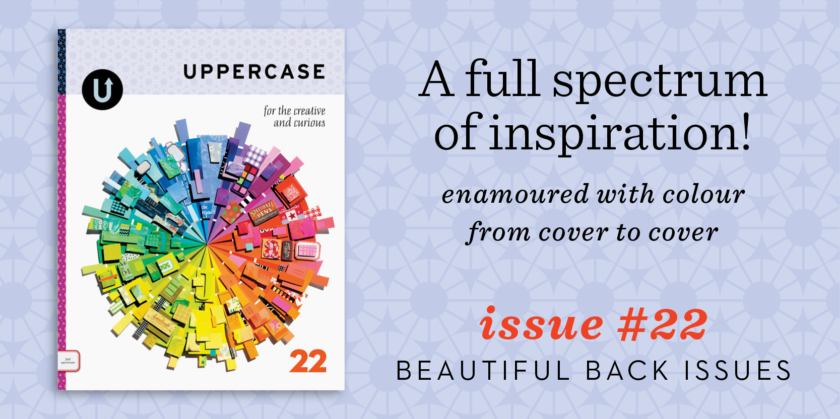
Back issues are just $10 through Monday.

Look at all the work I've done over the years! How time flies when you keep yourself passionately busy. 

All of my babies are available to enjoy while inventory lasts (issue 10 and 11 are running low at this point). On sale for just $10 apiece until end of day Monday, I'd suggest getting one of each. Subscribe starting with #23, the current issue, and you'll be all set for an inspired year ahead.

p.s. Use the code "thankyou" for another $15 off orders over $80.

Kristina Klarin: beautifully designed for fall

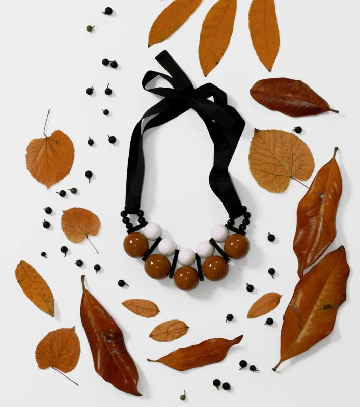
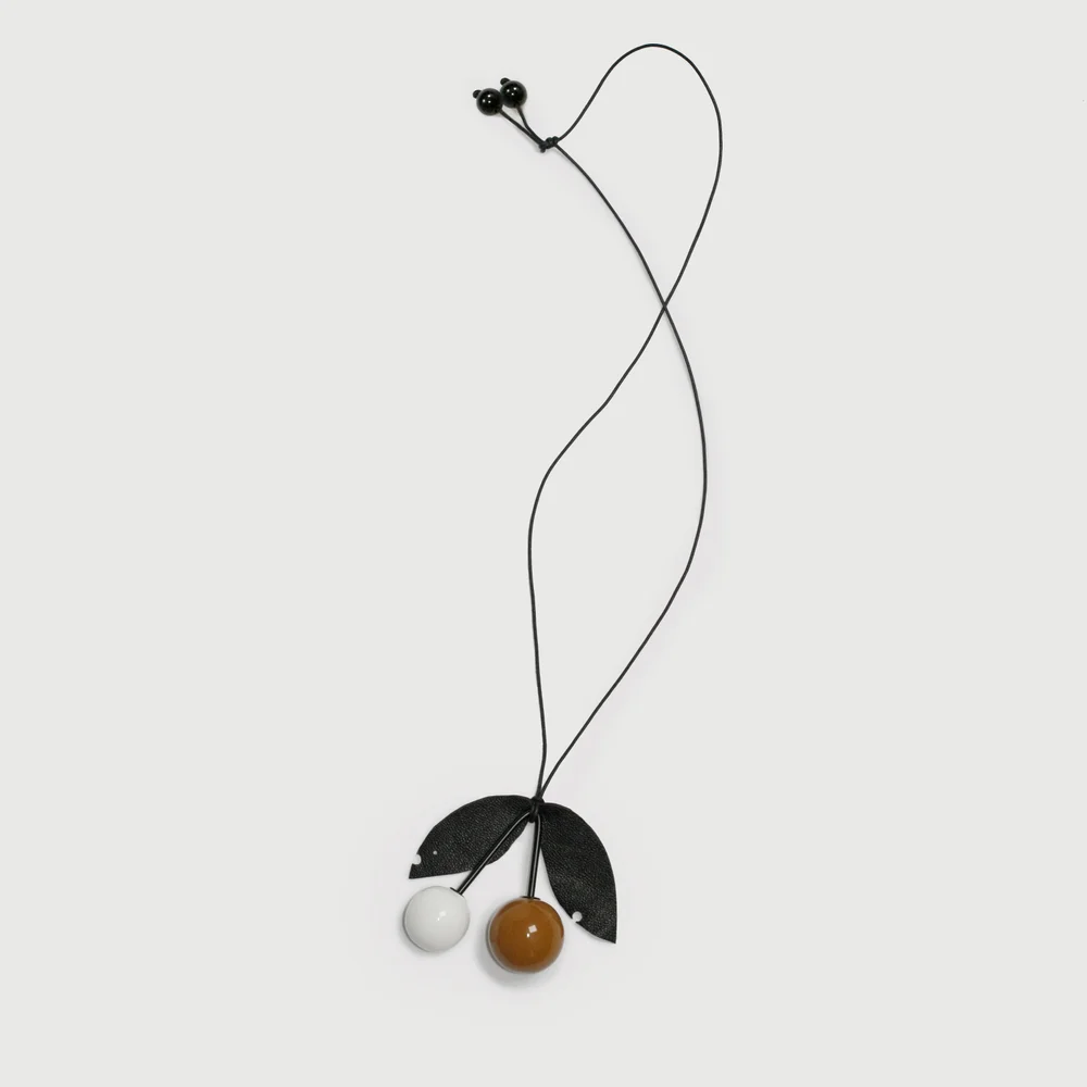
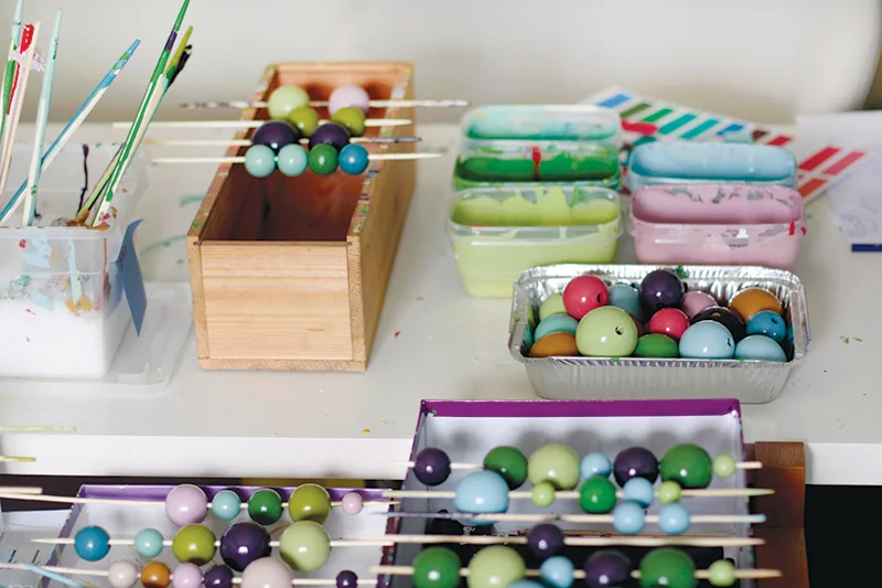
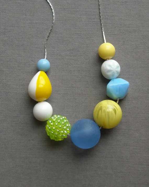
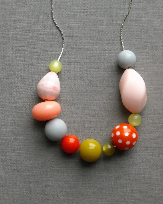
I've always been a fan of Kristina Klarin's large painted wooden beads. Her colour choices are always so interesting. She has just released a new collection, styled for fall, the entire design experience of her online shop is great. 

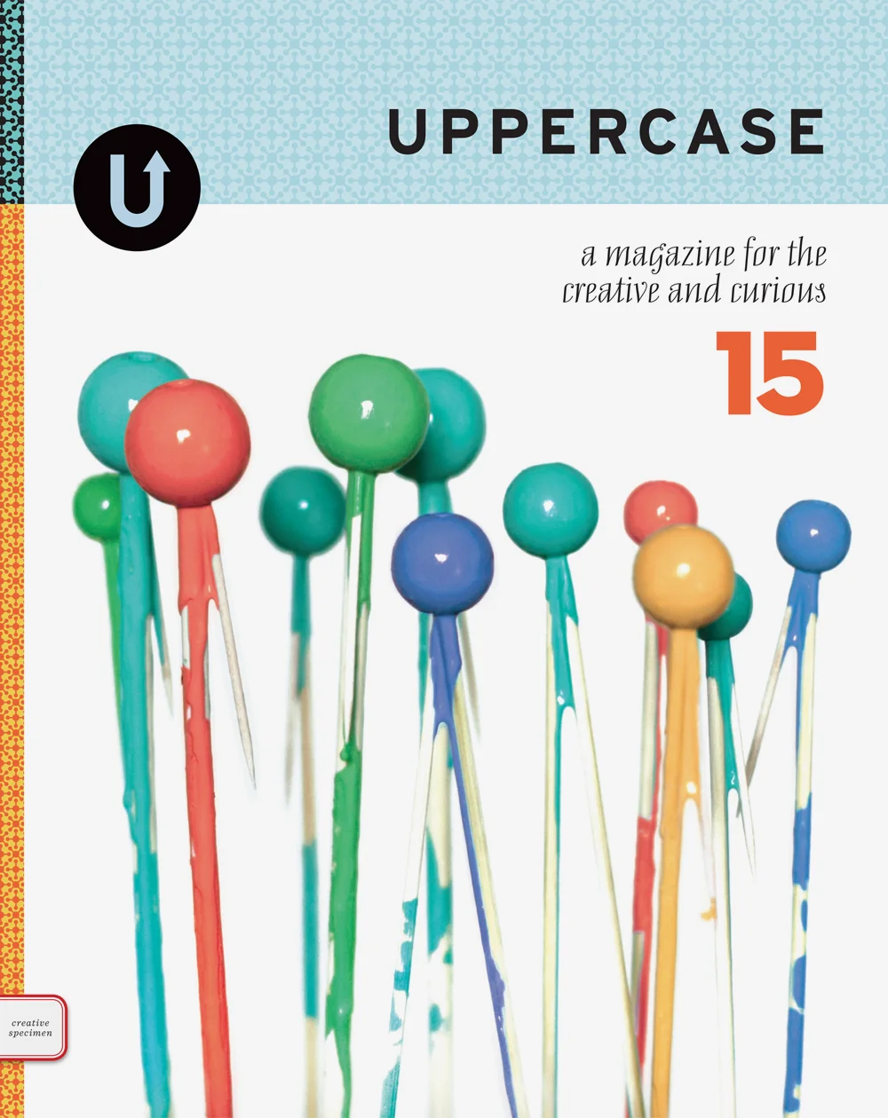
Kristina was the cover artist for issue 15 a few years ago. Here's an excerpt from our article:

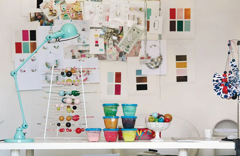
This is no ordinary production line: skewers of freshly painted wooden beads pierce magazine stacks and finished necklaces hang from any available hooks or frame corners of the room. It is awash with vibrant colours, almost as if someone had popped open a fantastical bottle of champagne, its bubbles filling the room with pictorial joy. 

Beyond the immediate sensory overload, one rapidly notices the subtle elegance behind each colour combination. There is not a single faux pas as colours marry each other and respond to each other but never clash with each other. This is a delicate exercise in assembling the right shapes with the right hues, one that Kristina Klarin excels in. 

Born in Belgrade and now living in Milan, Kristina has always been a colour enthusiast, and her experiences with cultural cross-pollination have helped shaped her take on it. Her home country, Serbia, was historically located at the crossroads of different cultures, and it is there that she believes she gained the ability to use colours in bold, unpredictable ways, as well as appreciate “the beauty from spontaneously mixing different aesthetic influences in a more casual way,” she says. On the other hand, her Italian education and professional experiences urged her to focus more on details—“on perfection,” she muses. “I started designing when I was very young. My passion for it brought me first to study textile design at high school and then drove me all the way to Italy where I graduated in fashion design,” she explains. “It’s indeed in Milan that right after my graduation I started working as a fashion designer. Over the years I saw myself shifting from sartorial and elaborated pieces of clothing to more basic, neat designs with a strong focus on their graphical composition and a flair for striking and eloquent details and accessory.” 

Read the full article, written by Olivier Dupon, in issue 15 of UPPERCASE.

Beautiful Bitmaps exhibition!

11984167333_a9c0bcfe5d_b.jpg

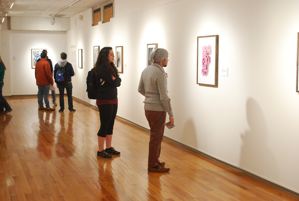
For issue 15 of UPPERCASE, 26 typographers, designers and illustrators were invited to make beautiful bitmaps by taking this vestigial part of digital type—the bitmap—and making it into something to be newly appreciated. I am proud to share that the University of Central Missouri's Gallery of Art and Design is presenting an exhibition, on display from January 13 to February 6, 2014. Thank you to Christian Cutler for the invitation and for giving these prints so much space!

For more photos of the exhibition, view their Flickr set. You can see the full set of bitmaps on our project page and by purchasing a copy of issue 15.

11988031074_a328f9893e_b (1).jpg
11984261074_1794ca1d52_b (1).jpg
11984694726_95aceb826a_b (1).jpg

back issue profile: #15

Issue #15 is lovingly called the 'science issue' around the office. In this issue we investigated the creative side of science and were enthralled with the small bits of matter that, when assembled, create something greater. On the softer side, coloured molecular orbs of baubles and beads were the components of stunning jewellery and art. The flat plane saw pixels, points and grids create a framework for two-dimensional creativity.

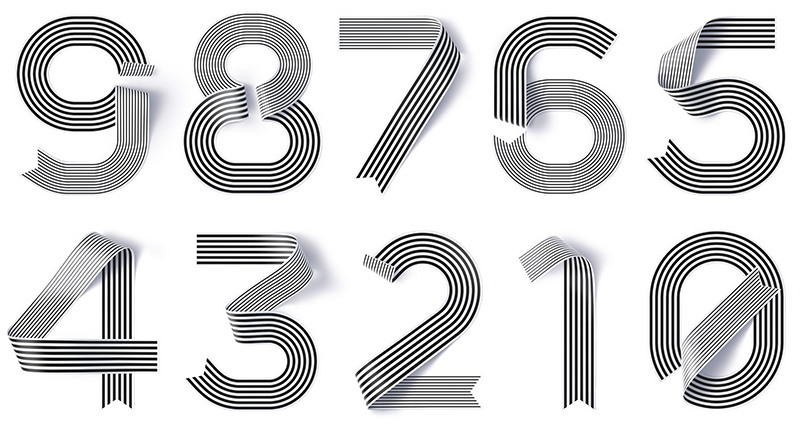
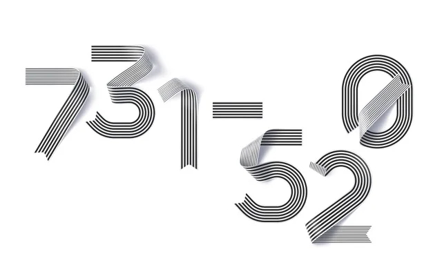
This issue included our special 'Beautiful Bitmaps' special feature (preview it here). For this section, 26 typographers, designers and illustrators interpreted a vestigial component of digital type, the bitmap.

Back issues make great holiday gifts and this creative specimen appeals to both left and right brain thinkers. Bundle up on back issues and save. Purchase three or more back issues and get $3 off each issue.

Get your hands on out-of-print back issues!

Do you love UPPERCASE magazine but you're missing a back issue? Have you recently been introduced to this quarterly magazine for the creative and curious and now you wish you had them all?

Here's your chance to purchase an entire stack of all the issues we've ever printed! We have taken a few of our early issues out of our archives for this one-time only auction. (Issues #1-#7 and #12 are completely sold out elsewhere.)

The purpose of this auction is to raise funds for the upcoming studio move (our current home of the past 8 years is in a building slated for "redevelopment" and so we'll be moving to new accommodations later this summer).

Due to the heavy weight of the package, this stack is only available to ship within North America. However, we have created other listings for individual out-of-print back issues #1, #2, #3, #4, #5, #6, #7 and #12 that we can ship internationally.

Click here to see the listings on eBay. 

Bidding ends next Friday, May 31.

Thank you for your support!

horn-tooting

The Alberta Magazine Publishers Association hosted the Alberta Magazine Awards last Thursday. UPPERCASE received recognition for Best Art Direction of a Single Issue. GOLD for Issue 13 and SILVER for issue 15! The Judges had nice things to say:​

ON ISSUE 13:​

  • This magazine is well suited for its audience. The variety and creativity in imagery and content works well to keep interest throughout.
  • Uppercase is a visual treat from first page to last. The design is simple, engaging, and colorful, and provides the perfect counterpoint to the lush and diverse collection of imagery. There's a rich texture to the ever-changing selection of story presentations. Everything about Uppercase's design, from the paper selection, format size, to the delicate use of metallic ink on the cover, is in perfect harmony with the magazine's editorial mission.
 

ON ISSUE 15:

  • A well curated collection of photos, illustrations, people and stories that remain true to the issue's theme, while still being fresh in approach.
  • Uppercase's design is the complete package: smart, thoughtful, engaging design, great paper, a beautiful, graphic cover, and a rich treasury of imagery. Best of all, the design all works in harmony with the content and the magazine's crafty, DIY aesthetic.

hearts

​Now that issue 15 is starting to arrive in mailboxes, it is fun to see your reactions. (If you haven't received your copy yet, keep in mind that the world is a big, big place and the mail is often a test of patience! Canadians seem to be receiving theirs now, Americans to follow. For Europe and Australia, please know that it will likely take a few weeks.) 

Belinda Fireman tweeted this photos and message:

"I think @uppercasemag and my painting like each other."

I quite agree! On a grey, snowy day it is nice to see some more pops of exuberant colour. Belinda is a Calgary-based artist with a surprising Etsy shop. She poses with her art! I thought this was an unusual and charming way to showcase her work—her personality definitely shines through. I spend quite a bit of time on Etsy and though you often see people who make clothes and accessories posing with their work, I don't think I've ever seen someone presenting their paintings and drawings in this way!

In tribute to James Gordon Irving

​photo by Leslie Fandrich

If you were a kid sometime between 1955 and 1975, you likely remember the Golden Nature Guides. They were pocket-sized books filled with incredible drawings of animals, plants, rocks and minerals. The first one, Birds, was printed in 1949 and was illustrated by James Gordon Irving.

​The opening spread of Leslie Fandrich's article about Golden Guides illustrator James Gordon Irving.

So begins Leslie Fandrich's excellent article in issue #15 about illustrator James Gordon Irving.​ Personally, the Golden Nature Guides had a big impact on me. I used to check them out of the school library religiously... I loved how the small-size guide fit in my hand and that you could collect multiple topics. When I was little, I dreamed of being a botanist or geologist and used to copy drawings and diagrams out of these guides into my own notebooks. As I grew older, I realized that I liked making the drawings and the experience of the books themselves more than the scientific topics.

When Leslie presented the idea of profiling one of the illustrators of the Golden Nature Guides, I was very excited. She describes her personal connection to the books and how the article came to be:​

My husband found his old copies of these beautiful books in his parents’ basement and my two young sons immediately loved them. It sparked a desire in me to find out what had become of Mr. Irving. I wondered if he was still alive and what other work he may have done. Searching online yielded limited information, but I found an article that said he lived nearby in the town of Haworth, New Jersey. We contacted a librarian there, who said she knew of him and thought he had died recently, but, after making a few phone calls, she learned that he was still alive at the royal age of 98 and he would love to hear from us. 

It took at least nine months to arrange a meeting. Mr. Irving was hospitalized with pneumonia for a few months, and when he returned home, communication over the phone was difficult. We finally called the librarian and asked if there was anyone who could help us set up a meeting. She got us in touch with his son Bruce, who had been spending every day taking care of his father since he had come home from the hospital. He felt that it would be a real pleasure for his dad to bask in some attention for a few hours.

Finally, the day had come to interview Mr. Irving, and I was excited about the conversation. Arriving at the modest white split-level house on a warm, sunny morning, we were let in by Bruce, who answered the door. Hung throughout the main floor of the house were at least 13 paintings of Mr. Irving’s signature flowers and birds, along with a few portraits. An amazing oil painting of chrysanthemums hung over the mantle.

We are grateful that Leslie had the opportunity to meet with Mr. Irving and to write such an informative and interesting article about this important artist. Sadly, Gordon passed away in August and the article is now a printed tribute and celebration of his talent and impact.

​A self-portrait of James Gordon Irving from his days in the Navy.

start your subscription today!

If you'd like your subscription to start with issue #14, please place your order today! Issue #15 is almost ready to ship, so we will send them both at the same time. After today, subscriptions will automatically start with #15 and you will have to buy #14 separately. thank you! ​

By the way, our pigeon-covered issue #12 is down to just 10 copies, so if you need it to complete your set, fly on over to our online shop.​

type tuesday: 15 puzzle

As I read through the printer proofs of issue 15, I present these images of the sliding 15 puzzle to ponder. This puzzle, invented around 1874, involves 15 sliding blocks in random order, in rows of 4 with one tile missing. The object is to slide them back into numerical position.

​According to Wikipedia: "The game became a craze in the U.S. in February 1880, Canada in March, Europe in April, but that craze had pretty much dissipated by July. Apparently the puzzle was not introduced to Japan until 1889."

i remember getting cheap versions as birthday party favours when I was a child.​

type tuesday: Elegantissima by Louise Fili

We send our congratulations to Louise Fili and the talented people at her studio on the release of the new monograph about Louise's design and typography.​ I received a copy of Elegantissima last week and it has been my constant companion, sitting beside me at my desk. During breaks from designing issue #15, I'd turn to its pages for visual and mental refreshment. (Ah, such delicious food packaging!)

There is a short and sweet foreword written by Steven Heller, Louise's husband. He shares a typewritten letter from 1982 that he wrote to Louise, complimenting her on her book designs.​ At the time, he was art director of the New York Times Book Review. "I had never met [Louise] and, in fact, had never laid eyes on [her] before. A little more than a year later we were married," he writes.

The works presented in Elegantissima are beautiful examples of the romance​ between designer and letterform. Louise's life-long passion for beauty, perfection and play is evident page after page.

​portrait of Louise Fili by Jordan Provost, issue 9

I am honoured that one of my design heroines has been part of UPPERCASE—we featured Louise in issue 9 in an article written and photographed by Jordan Provost. (See additional photos from the article below.) Louise is also one of the designers who participated in Beautiful Bitmaps, so we can all look forward to seeing her submission in issue 15.​

​Elegantissima is published by Princeton Architectural Press. Issue 9 is available in our online shop along with other back issues—quantities are dwindling and back issues won't be reprinted.

what I did on labour day...

...got it DONE DONE DONE!

Well, the design and prepress, that is. Now it is off to the printer (The Prolific Group) who will craft it into something inky on paper... Look for it in your mailbox in early October.

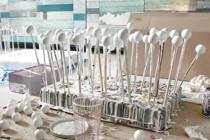
The fall issue explores molecules and pixels as visual motifs. The cover image is by Kristina Klarin​ with some Photoshop colour work by me. The photo shows the process of drying the painted wooden beads that she uses in creating these beautiful necklaces. Six of the cover's coloured beads will be embossed for extra effect. (In all my years as a graphic designer, I've never embossed anything. In each issue, I try something new—this image seems like the perfect subject matter.)

Not a subscriber yet? Please do. Thank you.​

phew. I'm going to go have a nap.​

draw ralf

Meet Ralf, one of Donna Wilson's creatures.​

I'm busy busy working away on the design of issue 15 which will feature the wonderful work of Donna Wilson. I had the pleasure of meeting Donna and her crew this past spring during my whirlwind trip to London.​

Donna's having a fun giveaway project on her blog this month. Draw Ralf, above, being sporty for your chance to win him!​ Details over here. >>>

I like this submission by Oana Befort.​ Click on the image to get to Oana's blog. Lots to love over there!

hey, peeps!

I'm working on the design of UPPERCASE issue 15 (out in October) and there is still a bit of room for more "peeps". What's a peep, you ask?

THE PRINT OFFSPRING OF A TWEET AND THE NEWSPAPER CLASSIFIEDS

Do you have something that you'd like to share with UPPERCASE magazine readers? Now you can publish it in honest-to-goodness ink on paper in our new "peeps" section! Think of a peep as a creative cross between a tweet, the community newspaper classifieds and a type specimen. Thanks to lithographic technology, these "paper tweets" leave a lasting impression. And with beautiful typography and design for each message (typeset by UPPERCASE designer Janine Vangool), these peeps transform a classified into something classy.

Have you just launched your portfolio site or redesigned your blog? Maybe UPPERCASE readers would love your shop with a unique offer just for them? Are you starting a special project that seeks collaboration? Do you have a special message for a fellow reader? A shoutout or just a friendly word of advice to share? Just want to see your name in print? That's what UPPERCASE peeps are for!

Easy and inexpensive, just fill in the form to submit your peep for the next issue.

For other opportunities to advertise in UPPERCASE magazine, you'll find more info on our advertise page. >>>​