Chocolat

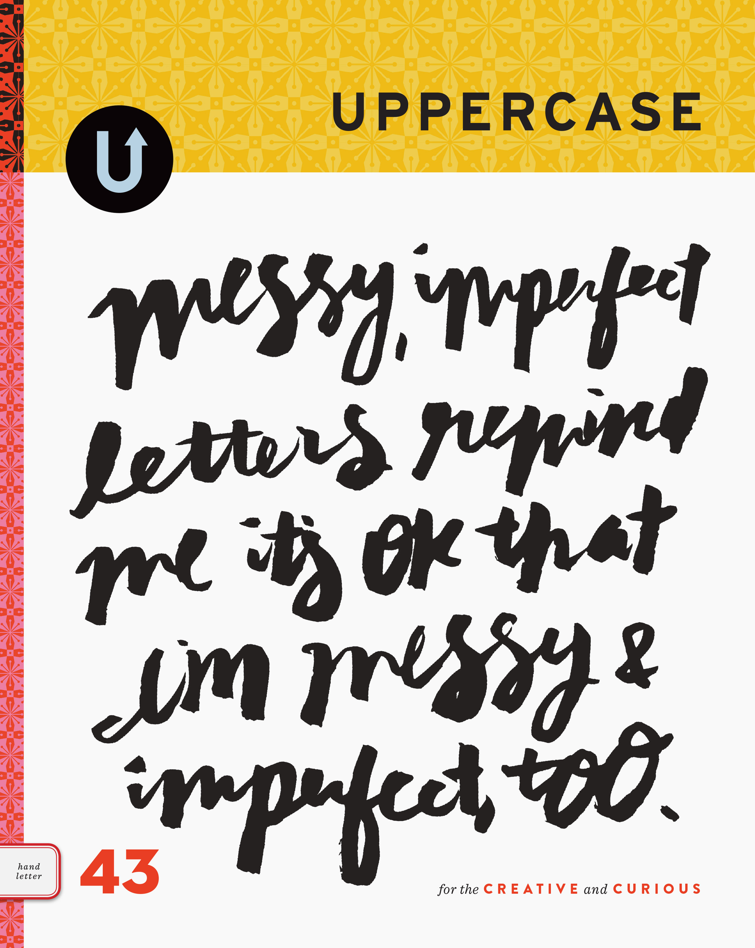
chocolat.jpgUPPERCASE is included in the "Hot Chocolate" section of this new Canadian home design and lifestyle magazine. It's great to be featured in a national magazine (with my photo of our bookshelves included in the table of content graphics as well), but it is particularly fun to be included in the first issue of a newly launched magazine.

First issues of magazines typically have more editorial content and have had significant development and production time. From a design perspective, they are interesting to analyze. The first issue must grab the attention of its target audience (and advertisers) and present the publication's personality with confidence and a distinct style.

Since the folks at Chocolat were kind enough to contact me a few months ago about inclusion in this issue, I won'd be too hard on their design team. However, my main recommendation would be to narrow down the selection of typefaces. There are simply too many, and none of them are particularly refined faces nor do they relate visually to the rather charming masthead.

As a fan of the American homestyle magazine, Domino, I can see that Chocolat is borrowing some of the visual language that Domino has well established in the past few years. I can also see the influence of Martha Stewart's latest magazine, Blueprint, particularly in the masthead and choice of decorative typefaces. Although I see the value in referencing existing magazines and therefore borrowing on their success and subject recognition, it would have been nice for a Canadian magazine to explore some new visual territory.

The trend in magazines is the lifestyle shopping magazine. Many magazines are basically a glorified catalogue of shopping websites, or a paper version of a design style blog (Design Sponge). Domino does a nice job of balancing editorial with the web links and shopping info so that the reader doesn't feel like they're reading a gigantic illustrated shopping list. For me, there is a tangible reason to buy Domino or Blueprint: both the magazines offer a diversion into well-designed world of typography, photo styling, colour and content. For less than the price of a movie ticket, I can be happily entertained for a few hours or more. Other than the personally memorable page on UPPERCASE, Chocolat didn't leave an lasting impression on me. I was left wondering when the new issue of Domino comes out... how nice it will be to curl up on the couch with a new issue!

Matchbox Labels

matchbox.jpg

Thank you to Joanna at Atelier455 for linking to our online poster shop. The image above is from one of her recommended links to Jane McDevitt's Flickr collection of matchbox labels. Both of these sites are full of vintage graphic inspiration! When I get a free moment or two, I'll post some of my collection of Polish matchbox labels that I found at a flea market recently.

matchbox2.jpg 

Emigre Exits (and the influence of design magazines on my career)

emigreend.JPG"Everything must come to an end, and after publishing Emigre magazine for over 21 years we’re both relieved and just a little bit sad to announce that #69 will be our final issue. This milestone issue features a behind-the-scenes look at the history of Emigre magazine, while our contributors and colleagues bid us farewell. It was quite an experience." Rudy VanderLans & Zuzana Licko

Emigre, the magazine and font foundry, has been a significant influence in my design education. I studied visual communications at the Alberta College of Art & Design from 1992-95, so Emigre had already been around for decade when I first became aware of them. It was in the monograph published on occasion of their 10th anniversary where I discovered the origins of digital typography and design.

I remember a most significant purchase made at SWIPE books while on a visit to Toronto. I bought my first issue of Emigre and a copy of the British publication Eye. On my student budget, this was a thoughtul, weighty purchase. And it was the start of what can only be described as a design magazine addiction!

Actually, Communication Arts was the very first magazine to influence my career — in fact, it lead me to my career. I first discovered the magazine in the Saskatoon Public Library when I was in highschool. Until feasting my eyes on its lush glossy pages, I had not realized that my love of images and letters could translate into a real profession. My parents generously paid for the expensive subscription as a Christmas present and very soon afterwards, I made up my mind to become a graphic designer.

Communication Arts has long been my measure for the ultimate in top-quality design, so it was a huge thrill and milestone that my Leaflet project was included in the 2004 Design Annual (and featured on the cover design!). I am equally pleased that they have selected the UPPERCASE line of typographic greeting cards for this year's Annual.

More book design!

classicbooksjackets.jpg

Classic Book Jackets:

The Design Legacy of George Salter


By Thomas S. Hansen


"For more than forty years, his beautifully drawn and lettered covers served as elegant windows onto the works of such revered authors as Albert Camus, John Dos Passos, Jack London, and Thomas Mann. Salter had the rare ability to reduce the illustrated dust jacket — a new part of the book package — to its essential elements. He could visually evoke — with typography, calligraphy, and pictorial imagery — the contents of any given book."

(synopsis from Chronicle Books' website)

Book Design

byitscover.jpg


By Its Cover

By Ned Drew and Paul Sternberger


"We all know we're not supposed to judge books by their covers, but the truth is that we do just that nearly every time we walk into a bookstore... It's really not something we should be ashamed about, for it reinforces something we sincerely believe: design matters."

A few weeks ago, I attended the AIGA conference in Boston. The authors of By Its Cover were presenters in one of the focus sessions entitled "Debunking Nostalgia: The Truth about Graphic Design History". The moderator, Véronique Vienne, made a joke about how most designers don't read graphic design books — they just look at the pictures. I admit that I "read" design books for the visuals. When By Its Cover arrived to the store just before I left for Boston, I looked at each image in the book and then put in on the shelf. Now that I have heard the authors speak about their process behind compiling the book cover designs and their research, I look forward to reading By Its Cover and judging it not only on the beautiful images and great book design, but on the quality of the written content as well.