type tuesday: littered with glitter

I spy UPPERCASE issue 20 amidst this glorious jumble!

Great photos and styling for these sweet posters.

Tiffany Pratt and Stephanie Sterjovski

Stephanie Sterjovski and Tiffany Pratt have a series of limited edition glitter- and gold-theme prints available at SS Print Shop. If you need to add some glamour and pizazz to your studio walls! (Photos by Anna Tsoulogiannis.)

altered books

Designer Trish Leavitt of Silver Lining Design, explores tactile play through altered book art.

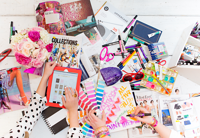
Altered books change the object's form and meaning through mixed media art: the artist "alters" the original format with various techniques such as gluing, ripping, folding, painting, cutting, collaging, etc. As a graphic designer, I focus on detail-oriented work for clients which is produced on a computer. Book art, by comparison, is inspired play. The small format is less daunting than a large, blank page which can cause paralysis from not knowing where to start. 

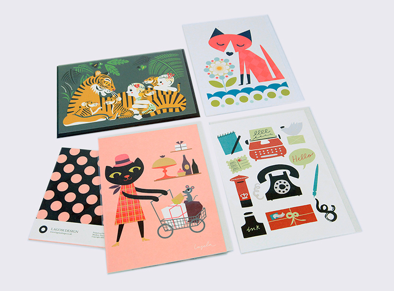
Formal studies in colour, composition, scale and form are guiding principles for my book art. The creative approach is pretty simple in that I let colour be the defining element that ties everything together. To start, I select one key visual and layer similar images or implied meaning around it. The book becomes a series of mini canvases, with a loose process that allows me to segue back and forth between pages if I feel stuck. Although each spread is unique, cohesion is created by extending the page edges, cutting windows and alternating flow. Lush colours are balanced by neutrals, patterns coexist and graphic elements play off of each other. My ephemera collection tends to gravitate towards typography, numbers, patterns, handmade paper and fashion. Vintage magazine advertisements are a favorite source of inspiration. I love creating visual relationships and my design style is minimalist. Initially, the work was very grid-like (rigid!) and it's now becoming more organic. 

Altered books are a tactile, intimate experience in storytelling. It's likely that the observer will flip back and forth between pages, notice tiny details, or turn the book upside down. My intention as an artist is to have fun and enjoy the meditative-like process. If the art compels someone to engage with the work and smile, it becomes meaningful on an entirely different level.

"A woman at her printing press"

Kseniya Thomas of Thomas-Printers on why she loves the business of letterpress:

We're commercial letterpress printers at Thomas-Printerswhich means we primarily print others' designs. This provides us with a great variety of work: we've printed on sheet copper for napkin rings, printed corporate invitations for functions we're not allowed to talk about, and even printed a birth announcement for the son of a German princess. Germany still has princesses! So every day brings a new challenge, but that keeps me looking forward to work every day and to making whatever it is I'm printing look great. One of the best parts of my job is the printer-client interaction: talking to customers about letterpress, educating them about what we do and how letterpress works best, and working together to make a beautiful finished piece.

That's what draws me to printing: the communal nature of what looks like a solitary thing, a woman at her printing press. I love making things every day, interacting with my customers, and problem solving each new job's challenges. The fact that I get to work with antique machines, beautiful paper, and killer designs doesn't hurt either. I really believe in making things by hand, and keeping people involved with processes, and am thankful every time someone chooses a handmade invitation over one made by a machine in a huge plant. That choice not only supports me and the business, but also a whole ecosystem of other humans, from papermakers to plate makers to the postal worker who delivers the finished invitation. Choosing print is an increasingly important choice, and I'm hopeful that the relationships we've established will help keep printed things vital far into the future. 

The (other, so many!) great thing about letterpress printing is the community of printers. While we all have our unique methods and ways of getting ink onto paper, and getting that printed thing out into the world, we all share a love of the craft and a commitment to its continuance. A friend and I started Ladies of Letterpress about six years ago to help encourage the community of printers out there to come together and share knowledge—we now have almost 2000 members all over the world. 

UPPERCASE would like to thank Thomas-Printers for their ongoing support of UPPERCASE. As we transition away from ads in our print magazine, we are very pleased to have Thomas-Printers' ad on our blog sidebar. If you are a creative business owner and would like to advertise with us, we would be happy to hear from you.

make it last, make it count

The UPPERCASE Creative Manifesto is available as a free download until December 26.

Over the past couple years, I have been working on improving my "scrawl" as I call it. I use UPPERCASE projects as a reason to get out my brush pen and start lettering. Some efforts are more successful than others, but overall I think I am finding my style. 

As a Christmas gift to you, dear readers, here is the UPPERCASE creative manifesto available as a free download until December 26. (After that, it will be available as a print for sale in the new poster section I'm setting up in our online shop.) I hope my quirky lettering will inspire you in your creative endeavours through the coming year. Merry Christmas!

UPPERCASE everyday notebooks are here!

Everything looks so good together!

The pattern I designed for issue #19 is one of my favourites. It is inspired by Icelandic knitwear and mineral crystal shapes.

A set of two, warm colours.

Each set comes with a black hex pencil.

The notebooks are completed and look and feel wonderful! I was so excited I took these Instagram videos and shots as I opened up the packages. All the details came together so nicely, even the crystal clear bag that keeps everything secure is the perfect fit.

UPPERCASE everyday notebooks are available in our shop now! Just in time for holiday list-making and gift-giving.

UPPERCASE everyday notebooks

If you follow me on Instagram, you will have seen a few teasers about something I've been working on. .. I am pleased to introduce UPPERCASE everyday notebooks!

Designed for all of your daily musings with patterned covers and colours inspired by your favourite magazine. The warm set includes an orangey-red flower and yellow chevron pattern. The cool set includes a blue dot and teal herringbone.

The notebook is trimmed to our signature size (6.625" x 8"). The smooth uncoated blank pages have ample room for doodles, sketches, collages and other daily creative musings. This two notebook set comes with an UPPERCASE "be sharp" hexagon pencil.

65lb Lynx Opaque cover weight
64 pages, unlined, 60lb Lynx Opaque text weight
Saddle stitched

Here I am assembling a mockup of the notebook set.

Testing the bellyband that will hold the set together.

Getting the mockups ready to be photographed.

The notebook set mockups, cool and warm colours. The will be packaged with a black UPPERCASE hexagon pencil with white-stamped lettering.

Click the pencil to view larger! (This is just a digital mockup of the pencil.)

Looking rather festive on my new cutting mat. After literally a decade of using a too-small mat, I finally bought a nice big one. Such a luxury! 

Some of my favourite spine patterns from past issues repurposed as surface patterns. 

PRE-ORDER SPECIAL: The notebooks are at the printer, the pencils are made and the packaging is set to go. Finished sets will be shipping in a few weeks. (Just in time for the holiday season!) Reserve your sets today by placing an order.

PS Did you know that you can get UPPERCASE iphone cases at Society 6?

colour trend

I'm working on an exciting project for some new UPPERCASE products. I look forward to sharing them here soon.

This afternoon I was creating my project palette. I have a roster of colours that I use over and over in designing the magazine and its cover. Out of curiosity, I went to the Pantone website to see their forecast for colour trends next year...

I guess UPPERCASE colours I've used over the past four years have predicted the trend! Here's a screen capture of the palette that I made before checking the forecast, and the trends showcased on Pantone

Curious! 

call for submissions: Station Identification

Taking inspiration from vintage television station identification graphics, I am inviting readers to create their own on-air graphic. If you had your very own network, what would the logo and branding be like? How would it express your personality and favourite content through the graphic?

Above is the station identification if UPPERCASE was a TV network devoted to the love of print (thus the cyan, magenta, yellow and black) with creative and curious programming. Also a nod to vintage aesthetics and Mad Men-era graphics and music! 

The idea for this open call emerged from one of the themes I'm exploring in the winter issue (January 2014) : broadcasting. I use the term loosely: "broadcasting" in the sense of sharing ideas graphically and publicly through posters, social media and public art. We will also have some articles about amateur ham radio, graphic novels and collecting vintage posters... 

Submit your graphic by November 15. The file should be 6 inches wide at 300dpi. (If you want extra credit and have animated your logo, please provide a link in the submission form.) Please upload your file here

Click here to view some more station identification inspiration!

Laura Sand, advertising & design

Laura at the portfolio show earlier this year.

Laura's arrangement of business cards at the portfolio show.

I met Laura Sand at the ACAD portfolio show in April. The presentation of her portfolio was very memorable and so I visited her portfolio site recently to see what she was up to. The video below is one that Laura made while still a student. Her concept was that she would "run to work" wherever an interview opportunity might present itself. Having quickly landed a job in a local advertising agency right out of school, she never needed to promote this project—but the quality of the video certainly demonstrates her skills and talent!

type tuesday: Roué

In April, I attended the Alberta College of Art & Design's portfolio show for graduating designers, illustrators and photographers. One of the standout pieces was a collaboration between Justine Anweiler and  Kaewjinda Hataitham. They had produced a single large-format fashion magazine called Roué that was digitally printed—and then handlettered the final headlines and embellishments using lipstick on the printed version. It was really fun to see it in person; the lipstick oil was starting to seep through the paper and smudge, but it was truly original—and memorable months later.

Free stationery samples for subscribers!

Lagom Design

​This is the opening statement for the paper-lover's extravaganza of a feature in the forthcoming issue of UPPERCASE magazine. Profiling 50 companies who create greeting cards, wrapping paper, stationery and all variety of paper goods, the UPPERCASE Stationery Guide is an excellent reference if you're a paperholic, have a retail shop and are looking for unique items or are an aspiring stationery designer looking to break into the industry.

The companies we've profiled are all part of the UPPERCASE family; the feature was created from an open call sent out on the website and via social media channels. Once again, the talent of our readers is amazing!

As a bonus to our subscribers, each subscriber copy will include an actual sample from one of the profiled companies. Greeting cards, bookmarks, letterpressed goodies... Erin and I were delighted as we opened each box that arrived at our door. I've photographed the samples to show you want you can expect to be hand-inserted into your subscriber copy. The following represent just a teaser of all the samples.​

​A. Favorite Design

​Mac and Ninny Paper Co

​Tweedle Press

​Curious & Co. Creative

​Steel Petal Pres

Just a small sampling of the amazing selection of what will be randomly included in your subscriber copy. Issue 17 is in print production and we're excited to ship this one out.

These free samples are only included for subscribers as of March 26—so subscribe or renew today to get this nice little bonus.

(Use the code "marchingrightalong" for a surprise discount at checkout. Click here to order!)

Thank you to Sandra, my SAIT intern for a week, who Photoshopped these images for me.

thread week + type tuesday = MaricorMaricar

One cannot have a "thread week" and "type tuesday" without mentioning the incredible talents of MaricorMaricar:

I am so pleased that we have been able to feature their work in UPPERCASE magazine a few times. Most recently, MaricorMaricar made the letter Z for Issue 15's Beautiful Bitmaps.

Available as a print in the UPPERCASE Society 6 shop.

Visit their Big Cartel shop for this print.

Unique NYC: Susy Jack

Susan Connor, the woman behind Susy Jack.

This guest post is by photographer Yvonne Rock.

Susan Connor (Susy Jack herself!) was probably the most outgoing and personable individual I met during the entire Unique NYC event (there was lots of giggling during our chat together) and her items are just as so. 

With a background in painting, Susan went back to school for graphic design to create not-too-cute, not-too-formal stationery. Six years later, Susy Jack, in addition to prettily patterned paper goods, also carries a wide variety of other items—recipe boxes, kitchen towels, calendars, decorative clothespins, and the list goes on. She truly loves creating different types of items. It opens up a new world, enriches her and fulfills her joy of meeting new people. 

Susy Jack's eclectic and friendly patterned paper goods.