The Makers Summit

This guest post is by Tatjana Mai-Wyss, a freelance illustrator in South Carolina. She was our correspondent at last week's Makers Summit in Greenville.

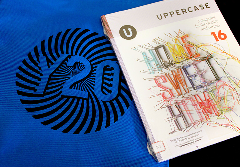
UPPERCASE donated magazines for the Makers Summit goody bags. Photo from the Makers Summit Instagram.

Last weekend I was lucky enough to spend a couple of inspiring days at the Makers Summit in Greenville, South Carolina. This conference is billed as an “event designed for creative entrepreneurs who want to grow successful businesses". I was impressed to learn that the guests and attendees had come from all over the country. How lucky for me to live less than an hour away!

Tatjana with the business card wall.

Attendees could stick their cards to the wall.

The event takes place on the 5th floor of a new office building in the middle of the city. The space is bright and airy; two floors connected by an open staircase with great views of downtown Greenville. The workshops, peer group meetings and expert consultations are held in various classrooms, while the keynote speakers and discussion panels bring everyone back to the stage area.

On Friday, keynote speaker Justina Blakeney kicks things off with a bang. She is enthusiastic, colorful and engaging in person, and her talk makes a definite impression on everyone. Throughout the weekend speakers refer back to her thoughts on finding your passion, focusing on your goals (remember your “north star”) and prioritizing your worklife. Personally I like the part about “moving on”, finishing a project and moving through to the next thing without obsessing too much. (My new mantra will be: "is it good enough?”) I’m impressed by how approachable and charming she is, and enjoy meeting her later over succotash and bourbon/ginger ale cocktails at the “Best Craft Party Ever."

Lettering print by @jennyhighsmith from the goody bag. Photo by @kukajuice.

Most of our lives as creatives are spent in our offices/studios and on our own, so the best part (and also the most challenging sometimes) is being part of a group and meeting so many interesting people in such a short amount of time. It’s so much fun to know that your badge gives you licence to walk up to a stranger and ask any amount of questions over your morning coffee.

Photo from Makers Summit Instagram

Speaking of coffee, the food at the summit deserves mention. There is stylish coffee (and fresh smoothies) throughout the weekend, beautiful (and delicious) cakes for Friday’s coffee break, three fun venues for Friday’s party (my favorite is an outdoor terrace with colorful cushions and twinkly lights) and a decadent breakfast buffet on Saturday. Homemade donuts for saturday’s coffee break continue the party atmosphere, and now that I think of it, the emphasis on good food might be a southern thing.

Photo from the Makers Summit Instagram

The focus of this conference is really on making something concrete and getting it out there, so the discussion panels centre on resources and funding for small businesses, scaling up and managing a growing business, and marketing all around. The panelists have a good variety of approaches and perspectives and answer questions thoughtfully. 

Workshops, peer group and expert sessions can be a bit more customizable and let you ask questions specific to your experience.

It will probably take some time for me to digest all the information from the Makers Summit, but I’m very glad I went, and very happy to have made new friends and experiences.

Follow Tatjana on Instagram and see more of her portfolio here.

TypeCon 2015: Highlights

This guest post is by TypeCon correspondents Almenia Candis and Allie McRae.


From Almenia:

TypeCon 2015 was definitely an experience that I wish was not over in so few days. Not only did I make new friends, rub elbows with giants in the graphic design and typography circles, but I had a wonderful experience learning more and feeling like I was in university again.

I was fortunate to take the expressive brush lettering workshop with calligrapher Stephen Rapp. In this day-long workshop, we were provided with supplies, a few notes, and one on one demonstrations on how to achieve a variety of calligraphy strokes. So many questions were asked, and Stephen provided excellent tips and feedback on pressure, ink flow, and chair position to yield beautiful results.

If you weren't able to go to a workshop, there was still a chance to try your hand at cranking out some letterpress around metro Denver. There were 30 of us on the party bus as we made a series of stops to add pieces to our letterpress sheets. It may have been the only field trip that was educational, fun, and involved free brews while mingling with the very gracious hosts at Matter, Genghis Kern, Foil + Dies, and Now It's Up To You Press.

Last but not least, there was a brief eulogy presented by Akira Kobayashi for Hermann Zapf who passed away in June this year. Akira tells of his early days as a graphic designer, he was given the book "About Alphabets" and it has remained a great source of inspiration to the care and meticulous process of Zapf's typefaces and calligraphy work. Creator of fonts such as Optima and Palatino, Zapf's work surpasses trends and his legacy will continue to set an example for new type designers of tomorrow.
 

From Allie:

It’s tough to pick just three highlights! There were so many spectacular speakers and events that I enjoyed, but I managed to narrow it down to these:

Douglas Wilson gave this great, lighthearted talk on ‘The Beautiful Island of San Serriffe,’ a completely fictional island that made its debut in an April Fool’s edition of The Guardian, a British newspaper. The newspaper dedicated seven pages of articles to this island that included news of its culture, geography, and economy. The island is jam-packed with hilarious typesetting puns: Upper Caisse and Lower Caisse are the names of the two islands; Gill Sands Beach; and the dictator of San Serriffe is General M J Pica. I was laughing through the entire talk. Here’s an article about the prank.

The very first speaker of the program, Mary Mashburn, set the bar high with her talk titled ‘Life Lessons from Globe Poster.’ Countless jazz, blues, and go-go musicians came to Globe Poster in Baltimore to have them design and print their show posters. The Globe Poster Collection is now housed at MICA and students are in the process of sorting through and using the thousands of pieces of type to make new pieces.

And finally, I was very inspired by the works of Ernst Schneidler and his students that Rob Saunders shared with us. Ernst was an influential teacher of letter arts in the 20th century and now much of his work is housed at Letterform Archive, founded by Rob.

UPPERCASE provided complimentary magazines for attendees. Thank you to TypeCon for in turn providing passes to these two correspondents. Want to subscribe to UPPERCASE? Use the code "typecon15" for a subscription discount. Code expires on September 1.

TypeCon 2015: Type of Place

Guest Post by Allie McRae, TypeCon 2015

The speaker I had been waiting for all TypeCon weekend finally made her way up to the stage first thing Sunday morning. Meta Newhouse was my professor for a couple years at Montana State University and we got to know each other very well during a semester abroad in Italy, where she taught Experimental Typography. Even though I have a personal relationship with Meta and was even a contributor to the Type of Place project at its start, her talk went into detail about the parts that I wasn’t involved in: how the project came about and where it is now.

A little background about Type of Place — This research project was started by Meta and her former colleague at Montana State University, Nathan Davis. Meta and Nathan were teaching a workshop at the Atypi Conference held in Reykjavik, Iceland in 2011 when they had a brilliant idea to trek around the city and take photos of native Icelandic type to take back to the classroom to analyze. They were looking to see if they could deduce any cultural characteristics unique to the area from the type specimens they found. Meta puts it more eloquently: “What can be learned from collecting, archiving, comparing, and sharing typography from different parts of the world?”

A year after Atypi, Meta was still thinking about this question and was brainstorming ways that her and Nathan could grow the database of type, preferably from locations around the world. We were in Italy at the time and were the perfect guinea pigs for Type of Place. Between 15 of us students, we took hundreds of photos of type while wandering the streets of Rome. Meta and Nathan took those photos back to Iceland for DesignMarch 2012 to compare them with the collection from Iceland.

One of the catalysts to this whole typographic investigation stemmed from Geert Hofstede’s Dimensions of National Culture. After reading this, Meta thought she could take one of the six dimensions of culture, particularly Masculinity vs. Femininity, to make a connection between this idea and the type specimens. As it turned out, while comparing Hungary with Iceland, Hungary’s type was heavy on the serifs, making it feel commandeering and patriarchal. Iceland, on the other hand, had an abundance of softer sans-serifs that felt more tender and modern. Type of Place was on to something.

Fast forward now to the present day — Type of Place is growing to include more and more collections of vernacular type from places like Toronto, Vienna, Prague, and Seattle. However, they’re not done. Meta and Nathan are going to use crowd sourcing by means of a mobile app that will allow users to constantly expand and give depth to the archive. The Instagram-like app is still in development but a beta version will be available for iPhones in the coming months.

I did not do this research project justice with this brief blog post, so I encourage you to check out typeofplace.com and stay tuned for updates, like the release of the app. Plus, this archive will be shared publicly for anyone to use for research purposes or simply to look at super cool type. I’m looking forward to seeing where this project ends up because I think the potential with this database will be endless. So stock up on those type photos while you’re wandering around your city, we want to see them!

TypeCon 2015: Genghis Kern

Guest Post by Almenia Candis

There is always the thrill of winning an online auction. For Jason Wedekind, owner of Genghis Kern in the Denver Highlands, this was very true when hunting for a complete set of movable type. When he was lucky enough to find a set of slab serif characters, there was something extra that drew a lot of excitement. He soon realized that he held in his hands carved history on the other side. 

From ancient maps of Colorado, to a crude engraving of a figure in a very NSFW position, these hidden gems showcases skills of artists past, but also a few with very common printmaking mistakes. You know to mind your p's and q's? Don't forget to engrave your numbers and symbols in reverse as well. 

We were also lucky enough to see these in person during our Letterpress Tour around the Denver area. It was almost surreal being able to hold something that some would display in a museum behind glass. At the Genghis Kern letterpress studio, it was part of the hands on experience to feel the same thrill as Jason. With so much to learn from experts in diverse fields of typography and new acquaintances to keep in touch with, TypeCon was a truly rewarding experience. 

TypeCon 2015: Marian Bantjes

Guest post by Almenia Candis


Keynote speaker of TypeCon 2015 Marian Bantjes opened with a look back at her portfolio. She has used a variety of mediums including dirt, sand, flowers, My Little Pony hair and has made type to look sweet like candy or haunting like an eerie house.

One of the most interesting aspects of her work is making her audience figure out what is being written. It goes against one of the primary rules of typography of making sure the reader has clarity of the text before them. For Marian, it is more of a puzzle hidden in an obscure pattern. She frames her work using existing grids from magazine layouts or photographs of city structures and invites the reader to peek closely at her hidden messages

Later in her career, Marian has steered away from typography and has focused her attention to pattern design. From fabrics, to carpets, to wallpaper, Marian's designs stay complex using the simplest of repeating shapes. Objects found around her home have been made into ornate patterns that give a kaleidoscope effect with a few tweaks in Photoshop to enhance the colour and beauty in every element. 

Explore the British Columbian Rockies with Marian and her dog in a series of video vignettes. The piece, above, was created in response to her experience.

Marian's presentation has not only stuck with me because of her portfolio, but also from words spoken when she asked herself, "What is worth spending your valuable time on?" It is something anyone can take to heart as they pursue their creative hobbies when they must ask themselves if they want to continue in their current path. In Marian's case, it has opened up a new dimension in her work to create elaborate collages for her own masterpieces.

TypeCon 2015: Denver Letterpress Tour

Guest post by Allie McRae
 

Man, what a weekend it was at TypeCon! I was thoroughly impressed at the vast amounts of intelligence I was surrounded by, and yet how approachable and willing everyone was to meet new people and share their passions. Of all the speakers and activities I participated in, the Denver Letterpress Tour was by far the highlight of my weekend. On Friday evening, after a full day of lectures on topics ranging from the inner workings of Adobe’s type team to the endless possibilities of OpenType features, I was ready to get out of my chair and get my hands in some ink.

The evening started out with 35 of us conference attendees parading up the steps, single file, into an overhauled, matte black school bus that has rightfully earned the title of a Party Bus. With two long benches down each side, a flat screen tv on the back wall, and the bass thumping, we made our way to our first of four destinations—Now It’s Up To You Publications, a backyard letterpress studio belonging to Tom Parson. Tom and his family graciously let us crowd into their yard and admire a staggering amount of letterpress equipment and ephemera that Tom has printed over the years—including some of his own poetry—along with a handful of working presses. With only 25 minutes at each of our stops, we hustled to get our posters printed with our first run; at each stop we were going to add onto our poster until we had a complete print at the end of the evening.

Next up, we swung by Foils + Dies / Vintage Pressworks, to visit Rob Barnes and his stellar team. Foils + Dies is a luxuriously spacious studio with great, stately presses and enough enthusiasm to keep you entertained for hours. In contrast to Tom’s individual operation, Foils + Dies is set up to handle large orders and get them in and out in no time. There’s a bright future for Foils + Dies as they prepare for a move to Rob’s ranch just west of Denver, where an entirely new home (with lake views!) is being built for the presses. With our second colour of our print successfully checked off, we headed out once again to our awaiting Party Bus.

Our third stop was to the cleverly named Genghis Kern Letterpress & Design studio. Jason Wedekind was one of the speakers at TypeCon that morning so we were already aware of his incredible collection of double-sided letterpress blocks that he had on display at his studio. (My fellow correspondent Almenia Candis will be sharing a post about Jason’s passion for finding these rare, double-sided letterforms because they are truly superb specimens.) We grabbed a local Colorado beer and completed our third colour and round of printing. With enough space and time at this stop, we were able to pull our own prints this time, with some helpful guidance from Jason and his team.

And finally, our last stop on the Party Bus was to MATTER, a bustling, full-service design studio with a print shop on the ground floor. As this was our last stop on the letterpress tour, the Party Bus dropped us off here for a more leisurely stay. The walls of the industrial studio were covered in graphic inspiration and Rick Griffith, the head honcho of MATTER, wasted no time in sharing his complex ideas about creativity and MATTER’s design process. For the last time we wound our way through the line to complete our prints. A few of us that stayed a while longer were able to print a bonus round and have Marvin Gaye’s head permanently debossed onto the top of our design. Personally, I think Marvin’s smiling face is what truly made the different elements of the poster come together.

Besides my love of letterpress—the inevitable grime under my fingernails, the smell of ink, the unavoidable ink smudge, the sound of the whirring press—the other 30-some-odd people adventurous enough to climb onto that Party Bus made for the best company. I’m so glad I had the chance to visit some of the quality, local print studios around Denver and to be squished so tightly in that bus that I was bound to make new type-nerd friends.

TypeCon 2015: Meet Correspondent Almenia Candis

I'm lucky to have two correspondents at this week's TypeCon in Denver.

Almenia Candis is a newcomer to the Denver area, so when she applied for one of the free TypeCon passes she wrote, "I would love to be able to attend and see first hand other type designers and inspiration in this new city that I've called home for the past 9 months." 

Here's more from Almenia: "I've been a lover of type for some time and have recently taken up calligraphy as my obsession. I've acquired a lot of great inspiration from people all over on Pinterest and YouTube, including Kyle Gallant whom I'm so glad to see featured in recent UPPERCASE newsletter." 

Made a video of myself doing Reddit's word of the day. Enjoy! Materials: Pilot Parallel Pens (all four sizes) Rhodia 8.3x12.5in Dotpad Pilot Razor Point II (for the date) Song: "New Output" by Sferro

Almenia is posting photos and videos from TypeCon, and you can see some of her previous lettering experiments and practices over on Instagram:

TypeCon 2015: Meet Correspondent Allie McRae

TypeCon kicks off this evening, so I'd like to introduce you to the first of two UPPERCASE correspondents who will be enjoying the typographic and lettering goodness at the event in Denver August 12–16.

Hi all, I'm Allie, a graphic designer in Fort Collins, Colorado. I’m just starting out my career at a small marketing and public relations firm (with some freelance lettering and design work on the side) after recently graduating from Montana State University in Bozeman, Montana.

While in college, I spent a semester abroad in Italy, spending my days studying experimental type — needless to say, I have been in love with letterforms and type design ever since. I am so thrilled to be able to nerd out on typography for a weekend at TypeCon and I’m looking forward to sharing snippets with you guys!

Follow @uppercasemag and Allie on social media and check back here for dispatches from TypeCon. Thank you to TypeCon for the correspondents' free passes. Look for complimentary copies of UPPERCASE in the TypeCon goodie bags!

www.alliemcrae.com
www.instagram.com/alliemcrae
http://twitter.com/alliebmcrae

Gail Anderson: Those who can, teach.

This guest post is by Andrea Marvan, who attended the AIGA Y Conference on behalf of UPPERCASE


I spotted Gail Anderson since the beginning of the Y20 conference, she was chatting with colleagues and listening to the talks from the first row. Gail is a previous contributor for UPPERCASE (issue 10, see related post here) so I recognised her immediately, but I waited until the second day to approach her, as I’m a bit of an introvert and she looked rather serious and intimidating. Believe me, she is not.

New York-based designer, writer, and educator Gail Anderson is fun and kind, she is humble and brilliant, down to earth and absolutely fascinating. Gail began her presentation telling us about the time she posed for a photo with President Obama and – accidentally – grabbed his butt (!). And how she modestly muttered “I make posters” when she was asked by Barack (yes, for the purpose of this conversation we are on a first-name basis) what she did for a living.

Through her career Gail has done way more than posters, and has won a few awards, including the 2008 Lifetime Achievement Medal from AIGA. Her credentials go from senior art director at the Rolling Stone magazine to co-author of several typography books, but what I want to focus on is her role as an inspiring teacher. Gail teaches in the School of Visual Arts MFA, undergraduate and high school design programs, and has lectured about design at organizations and conferences around the world, including a recent workshop she did for design students in Saudi Arabia, which landed her an invitation to a further workshop with none other than a princess.

Gail is the kind of teacher everybody should have. She is proud of her students and supportive, yet she challenges them, inspires them and pushes them to be better. As the topic of Y20 was “design moving forward”. Gail emphasised that, for her, design moving forward has been being a teacher. She beamed with pride as she showed us the new media work from some of her grad students; it was a delightful surprise featuring catchy music and flawless editing. She mentioned that, as the students came from many backgrounds, through exercises she made them comfortable with fonts. “I forced them to have fun! They become so rigid when dealing with typefaces.”

When asked why does she teach, Gail simply answered “I have had many great teachers and mentors through my life. Teaching helps me stay fresh.”

So, I say we should eliminate that infamous quote “Those who can, do; those who can’t teach” from our vocabulary, and start showing admiration to all teachers. How else will the new generations become extraordinary professionals, if not under the nurturing mentorship and guidance of remarkable teachers such as Gail?

Brian Gartside: Doing good work & work for good

This guest post is by Andrea Marvan who attended the AIGA Y Conference.


Brian Gartside is a 27-year-old graphic designer and typographer whose credentials include working at Pentagram, DDB New York, and more recently Deutsch Inc.

Brian began his Y20 presentation with advise for emerging graphic designers (and anybody in the creative industry, really) discussing “Things I wish I knew when I was studying to become a Graphic Designer.” Which can be summed up as doing good work, work that visually improves the space that it occupies. Here are the highlights:

  1. Make ads that don’t look like ads (or whatever you make, make it not look like that).

  2. Become a technical expert, be fast at the things you can control so you can spend time on the things you can’t.

  3. Build a diverse library of inspiration. It will help you be more authentic as it will reduce the risk of inadvertently copying someone else.

  4. Take a break. Have a hobby. Do something else for a bit, it will help you think.

This valuable insight from Brian’s very promising career (in October of 2014 he was named as an ADC Young Gun) was complemented by the second part of his presentation, where Brian discussed what he has learned in putting this knowledge into practice and how his skillset has helped him to do work for good.

Many of the projects Brian worked on while at DDB are partially credited for the creative revival of the agency, including The Drinkable Book, where he worked as a senior designer, and which brought the agency its first Cannes Gold Lion in two decades. The Drinkable Book integrates outstanding design and cutting-edge technology put to the service of a remarkable cause developed by Water is Life.

“The Drinkable Book is a life saving tool that filters water and teaches proper sanitation & hygiene to those in the developing world. Each book is printed on technologically advanced filter paper, capable of killing deadly waterborne diseases. And each page is coated with silver nanoparticles, whose ions actively kill diseases like cholera, typhoid and E. coli. Once water is passed through the filter, bacteria count is reduced by over 99.99%, making the filtered water comparable to tap water in the United States of America.”

We all want to use our skillset for the greater good, but at time the possibilities are overwhelming and the size of the task seem impossible to bear. As Brian put it, doing work for good is easier than we may think:

  • You don’t have to save the world. You might never change the world but what you can do is help the people that can change it. If there is something you believe in, find the company who is doing that important thing without the sexy, approach the company and bring the sexy! Make something people can’t ignore.

  • Agencies love pro-bono work because you get more creative freedom. Use that to your advantage but don’t be a scam artist.

  • Dead doesn’t mean dead. Proceed as if it happening. Persistency is key.

  • Beg for favours. If it’s a good project, people will want to help.

  • Don’t be afraid to invest in yourself. Don’t let funding hold you up. Get it done and sort it our later.

  • Be more than just a graphic designer. These projects happen though sheer force of will. Do whatever you have to do (wear all the hats you need to in order to get things done).

As the long round of applause and stimulating questions from the audience proved, we were all really inspired by Brian’s investment and igniting curiosity, and the endless possibilities of using creativity to help build a better world.


*For more information or to support the Drinkable Book project please go to www.waterislife.com  Photos courtesy of Brian Gartside

Sharon Werner on The Importance of Creative Collaboration

This guest post is by Andrea Marvan

One of the most revealing Y20 talks was Sharon Werner’s insight on collaboration.

Sharon is the founder of Werner Design Werks, a small design studio of storytellers artists and designers located in Saint Paul, Minnesota. They do both large and small projects, from brand development to packaging, for companies of any size from all over the world. No matter the size of the project, their commitment is to create authentic brand stories that people care about.

During her presentation, Sharon described how her small team works on adapting and navigating to meet the future. They follow three simple steps: listen, talk, design; and work in collaboration with other designers so they are open and flexible to different points of view. “The answer to how do we keep moving forward is collaboration.” Collaborators bring inspiration as well as expertise to their projects they are part of the process from the beginning. Freelancers and junior designers attend meetings with clients, as it is important that they hear from the client directly. There is no hierarchy in her company, she believes that is how research and creativity flows best.

Werner Design Werks’ portfolio includes a series of children’s books, Alphabeasties and other Amazing TypesBugs by the NumbersAlphasaurs and other Prehistoric Types, published by Blue Apple Books. I couldn’t miss the opportunity to get a copy for my 4-year-old alphabet fan & zoologist, and Sharon kindly signed it with a cute note for him (“Tomas, T is for Tiger”).

Alphabeasties books were also a good example of collaboration between Sharon and Sarah Forss, senior designer at Werner Design Werks. The project started as a fluke, it was their own personal project and suddenly someone was interested in publishing it as a book. Sharon recalls thinking, “What can we bring to an alphabet book that hasn’t been done before? Typography, that’s what we know about!” and so the first book was born.  As the younger generations are paying more attention to design nowadays, the project aimed to demonstrate “that typography is fun, that type has a personality and can express more than simply the words being spelled.” It was a creative outlet but it not always easy to find the time to work on side projects. The tactics that worked for Sharon to push that personal project was treating it like a real project with a real client; carving up the time to do it. She emphasized the importance of giving personal projects the attention they deserve, from your website to a project you are passionate about.

Reading more about Sharon’s work I found an interview she recently did for AIGA. I thought I would include here part of it, because her collaboration working model really resonated with me and with the Y20 audience:

(AIGA): Clearly this is a model that has worked for you. I’m sure you’ve had opportunities to expand the size or staff of your studio, but you’ve chosen not to do that. Why did you made that choice?

(SW): Well, I love to work with a lot of different people. Sometimes I think when you’re in an office environment; there can be a lot of petty “officeness.” No matter what the agency, no matter what the environment, there’s just this stuff that happens that’s peripheral to the actual work. Sometimes the morning chitchat you have with colleagues is really nice and fun, but when it happens all day long, it’s crazy. I think having a smaller studio, we can avoid that, and then we can bring in people to work on very specific tasks and specific things. Then we can move on and bring in new people. You don’t get caught up in everyone’s personal issues. Another reason I’ve decided to keep the studio small is that I like to stay involved with the actual work and process. As an owner, it’s difficult to do that with more people. You tend to get caught up in the management of people.

Keeping the studio small allows us to stay more focused. We don’t need to sit down and have staff meetings. We know the status of everything that’s going on all the time. I personally like that, though I don’t know if that’s right for everyone. That’s just my personality. I don’t want to sit in a staff meeting. I just want to do the work and I want to brainstorm.”

For the full interview please see http://www.aiga.org/sharon-werner/

Sharon was featured in UPPERCASE issue #14 and at the end of her presentation she kindly agreed to pose with the magazine. Janine visited Sharon in her studio a few years ago, take a look in this post to see more.

Jorge Gutierrez and Sandra Equihua: Saying “no” to the big shots

Y20 Aiga Conference Day 2 post by Andrea Marvan

Jorge and Sandra opened the Y20 Conference on Friday morning. Sandra is a graphic designer and character designer for television and feature films, and her husband Jorge is an animator, painter, writer and director. They are a very dynamic couple with a hyper-Mexican over-the-top style, as they define it themselves. Jorge once suggested the idea of being the next Diego Rivera and Frida Kahlo but Sandra fiercely rejected it “you are not cheating on me!”

Together, they created and designed “El Tigre, The Adventures of Manny Rivera”, a project that earned Equihua an Emmy. And more recently they worked on “The Book of Life”, a CG-animated feature for Reel FX, where Sandra was the lead character designer. Executive produced by Guillermo del Toro and directed by Jorge, “The Book of Life” was Jorge’s life-long dream project and his love letter to their beloved Mexico.

Jorge

Jorge’s graphic style is a bit more experimental while Sandra’s is clean and bold, yet you can see how their style perfectly complement each other, like a good marriage. Jorge is loud and fun, he uses animated sounds and a variety of voices when he speaks (after all he is a specialist in cartoon voice overs!), and Sandra laughs at his stories as if she were hearing them for the first time. They are absolutely charming and extremely talented.

Sandra

Through their presentation, they shared stories about how their studio Mexopolis started and discussed the importance —and sexiness—of turning work down, as odd as it might sound. They are a very determined team and through their career they have been able to work only on projects they truly believe in. They have managed to insert Mexican elements in their work, even when the project had nothing to do with Mexico, and to portray Mexico proudly and with a sense of humour. “We’ve made our bosses like Mexico,” said Sandra, and I beamed.

Being Mexican myself, my opinion and my admiration for them might be biased, but their talent and creativity transcend borders and cultures. Their advice could not be more valuable to any professional in the industry: “Stick to your guns. Learn to say no, you want to work with something you can live with.” and they have ruled their careers by this principle, even if it meant quitting huge projects. Yet, saying no have turned them—as Jorge puts it—into “the hottest girl in town” because they fought for their projects to allow them creative freedom and they have stayed true to their passion. Because of this, Jorge and Sandra have been able to successfully accomplish personal creative vision and commercial success. It had also led them to fail sometimes, but that’s ok, because for them “Failure is great. Failure is the bricks of the pyramid of success.”

*Images courtesy Jorge Gutierrez and Sandra Equihua


Y20 AIGA Conference Day 1: Sharing a Universal Value

This guest post is by Andrea Marvan


As the sun starts to set over San Diego’s Mission Bay area, the first day of Y20 AIGA Conference is coming to an end. Participants head over the reception for cocktails and I look at the breathtaking view trying to allow everything to sink in. While I’ve always appreciated good design and I have an arts and communication background, I’m not a graphic designer and at times I worried my knowledge of design wouldn’t be up-to-date for the conference. But the AIGA talented group of designers shares a universal value: the passion for what they do and a strong sense of community. You don’t have to be in the industry to understand that.

Under the theme of Velocity, professionals from the design industry met at the at The Joan B. Kroc Institute for Peace and Justice on the beautiful campus of the University of San Diego, to discuss how to thrive in an accelerating landscape. The mix of presenters and their styles was for sure an eclectic one: from bold and colourful to elegant and sober.

I got there bright and early and at 8:00 am the vibe was already energizing and thrilling. Janine had donated copies of the magazine and I got excited when I overhead people saying “Oh look, there is UPPERCASE” as they opened their goodie bags.

The day began with highly dynamic Mexican designers Jorge Gutierrez and Sandra Equihua, creators of the movie Book of Life, who spoke about the importance of sticking to your guns and learning to say no—which I will elaborate more on a later post.

Following the explosive Gutierrez–Equihua team was Michael Bierut, partner in the New York office of the international design consultancy Pentagram. He began his talk by saying “Are you ready to see some black and white geometric shapes?” I thought he was being funny for following such a colourful act by the Mexican duo. He was being serious, yet his elegant, clean and crisp work was far from boring, it was exquisite. With a very clever sense of humour, a dynamic composition and an incredible creative branding strategy his team was able to say so much with so little: “A 49 square grid can do anything for us”. It certainly did.

Mid morning lead to Julia Zeltser’s talk. She is the founding partner and creative director at Hyperakt, and provided valuable insight on community engagement and working for the non-for profit sector. She closed by saying, “We need to stay flexible, current and relevant to participate in the future. I hope you stay flexible and nimble.”

After lunch I found the unexpected, as I was not expecting to cry at a design conference! Designer and documentary maker Justin Skeesuck brought tears to our eyes and got a standing ovation when he spoke on how, due to a progressive neurological disorder, he had to redesign his life and use his creativity to adapt to literarily everything: from day-to-day situations to crossing the Pyrenees in a wheelchair.

And last but not least, Sharon Werner, founder of Werner Design Werks and a previous UPPERCASE contributor closed the afternoon session with an inspiring talk on collaboration and on how a small team can achieve wonders when they follow three simple steps: “we listen, we talk, we design.”

Each and one of these professionals of the industry have a very unique perspective, style and approach to design. Their client portfolio covers a wide range, from fashion moguls to non-for-profit organizations, but they all do the same for their clients: they provide fun and creative solutions.

As the day ended with a competition (Pixels of Fury, where 3 contestants had to design a poster in 20 minutes in front of a live audience), I left inspired, motivated and ready to come tomorrow for more

QuiltCon's Lasting Impressions

Guest post by Linzee McCray

Churn Dash 2 Complementary by Martha Pederson

QuiltCon 2015 is winding up. Though I couldn’t help but see some of the quilts that were on the edges of the exhibition, near the vendor booths, I decided to save the main part of the exhibition for last. In addition to the quilts accepted for exhibition and judging, there were special displays, including Quilts of Gee’s Bend, Bill Volkening’s quilts from the 1970s, a sampling of the Modern Quilt Guild’s quilts of the month and of Do.Good.Stitches charity quilts.

The Rabbit Hole by Nydia Kennley

Quilts submitted and accepted for entry were juried in a number of categories: Piecing, Applique, Improvisation, Minimalist Design, Small Quilts, and others (you can see them all here http://www.quiltcon.com/quilt-show/categories/).

Lite Brite by Maria Shell

Walking the aisles was both inspiring and intimidating. There were so many ways to consider the quilts, from the concepts behind them to the workmanship and skills used to create them. It was impossible not to think “I’d love to make a quilt like that,” and then wonder if I was capable. It was humbling to remember that while some quilters have art backgrounds or are graphics professionals, others have no formal training. Every now and then I’d see a proud quilter posing in front of her or his piece, a soothing reminder that even quilts that make artful use of color and design might have been stitched by someone who reminds me of my next-door neighbor. Part of what I find so engaging about “successful” quilts is seeing simple, accessible materials—needle, thread, and fabric—wielded by quilters with an eye for color and design. It makes personal, visual expression seem possible for those of us who don’t paint or draw.

For Tanya by Emily Coffey

When it comes to personal expression, there was one quilt in particular that exemplified what is most interesting to me about QuiltCon. Penny Gold’s quilt Self Portrait, Year Two (Beneath the Surface) shares her stark reality of having lost a child: it’s unlikely that this quilt would be welcome in a traditional quilt show. (Click here to view the quilt.) While quilts usually evoke color, warmth, and a soothing tone, this quilt bleakly, bravely, powerfully expresses Gold’s pain. In the same way that Jacquie Gering’s 2013 Bang, You’re Dead quilt, a handgun dripping blood, stirred controversy, contrasting a quilt’s soothing qualities with harsh reality only serves to strengthen its message. Congratulations QuiltCon, for including the quilt and giving us pause, challenging our expectations, and helping continue the conversation about what a quilt is, should be, and can be.

Gina Pina Hometown Quilt

QuiltCon 2016 will be held in Pasadena, California, Feb. 18-21, 2016.


QuiltCon: Panels and Patchwork

Guest post by Linzee McCray

Vanessa Christensen class "Working with Ombre Fabrics", student work

For day two of QuiltCon, I wasn’t up for the 7:45 a.m. yoga session, but did enjoy the Maker to Making a Living panel at 9 a.m. on Friday. Four industry professionals whose experience ranged from a few to 40 years shared their career paths, their aspirations vs. the reality of “making it” in the quilt industry, and the challenges of small-business ownership. While each panelist (Denyse Schmidt, Mary Fons, Heather Givans, and Brenda Groelz) looks for personal fulfillment and a life filled with making things, they acknowledged that making money to pay the rent (or “buy the kitties food” as moderator Jacqueline Sava called it) was of equal importance. I loved hearing these women riff off one another’s comments and acknowledge the satisfactions, but also the hard, hard work that goes into making careers like theirs happen.

Panel: Maker to Making a Living

Next up was one of my favourite lectures: Modern Materials: Quilts of the 1970s with Bill Volckening. This Portland resident found his first quilt rolled up under a table in an antique store and though he didn’t buy it at first, he couldn’t get it out of his mind and returned for it. He was initially seduced by the colors of the quilts of this era, but also became intrigued by the fabrics themselves—Dacron, polyester, and some quilting cottons—and the context in which they were stitched. (He compared one quilt to the painted bus used by The Partridge Family.) A number of quilts from his collection are on the show floor, so it’s possible to admire them in person. They’re pretty wild.

Log Cabin medallion, unknown maker, c.1975 from the Bill Volkening Collection

Tile Blocks, unknown maker c.1977 from the Bill Volkening Collection

Woven pattern, unknown maker c.1979 from the Bill Volkening Collection

Grandmothers's Fans, unknown maker c.1979 from the Bill Volkening Collection

At noon I gave a talk about UPPERCASE and expanded on the story I wrote about feed sacks for issue #24. Audience members ranged from people who had never heard of feed sacks to two women who had worn feed sack underwear as children. I shared a photo of a doily crocheted from the strings used to hold feed sacks shut and an audience member recalled a relative knitting a pair of socks from the strings she’d saved.  Another pulled the loveliest piece of feed sack material from her purse—the pink, grey, and gold apples had such a contemporary feel.

Feed sack example shared by an audience member.

All day long I ran into people who wanted to talk—about quilts, about feed sacks, about fabric, about a quilt they’d seen on the exhibition floor. Those conversations are the real highlights of QuiltCon. Even after the convention center doors closed for the day, Austin was full of people talking about textiles in hotel lobbies and over dinner and drinks. The quilts and the lectures and the workshops provide fodder for getting a conversation started, but the shared love of stitching keeps them going.

On the scene at QuiltCon

Hi there! It's Saturday evening here in Perth and I've had a very busy time at the Writers Festival so far. I'll try to put together an update soon (please join me on Instagram to see what I've been up to). In the meantime, this guest post is from Linzee McCray, reporting from QuiltCon 2015 in Austin, Texas.

Phew! That’s really the only way to sum up the first day of QuiltCon 2015. It started the day before, when nearly everyone on the airport shuttle was going to QuiltCon. Though we didn’t know one another there was an excited exchange of information about lectures we were attending or workshops we’d gotten into: there was the immediate sense of camaraderie that comes of being with those who share a similar passion.

View from above of the quilt exhibition hall.

I started Thursday by attending the awards ceremony. Though it was delayed due to technical difficulties, Modern Quilting Guild board president Jacquie Gering used her good humour to keep the crowd from getting restless. It also provided the perfect opportunity to meet the quilters around me. I chatted with Candy from Virginia, who is a grants-writer and Girl Scout leader with a fondness for African fabrics in her modern quilts. Soon she was photographing the tote bag of the woman in the next row, also stitched of African fabrics, and sharing fabric sources and design inspirations.

Jacquie took the podium once more, and before announcing the winning quilts, she  shared statistics on who was at QuiltCon 2015. Attendees came from 48 U.S. states and 15 countries and were part of 109 Modern Quilt Guilds worldwide. Two quilters from Sangali, India were recognized for traveling 9,134 miles to be there.

Best in Show: "i Quilt" pieced and quilted by Kathy York from Austin, Texas. Image courtesy the QuiltCon website.

Then it was time for the awards ceremony. More than 1,300 quilts had been entered and 359 of those accepted for exhibition in Austin. There were squeals of joy as Jacquie announced winners and those in attendance came on stage for group hugs and photos. The Best in Show quilt was the last announced: “i quilt” by Kathy York. (You can see all award-winning the quilts here.) 

Modern Traditionalism: 1st Place winner "Long Island Modern Sampler" Pieced & Quilted by: Kim Soper from Centerport, New York. Image courtesy the QuiltCon website.

Those attending workshops were already in classes, learning about appliqué, curved piecing, fabric dying, and screen printing. The rest of us ventured out to lectures, the quilt exhibits, and the vendor hall, where it was hard to know where to look first. In addition to buying fabric, patterns, and books, it was possible to get a sewing-related tattoo or wave a ten-gallon hat from atop a giant aqua sewing machine (courtesy of Austin’s Stitch Lab).

Kathy Mack, Bainbridge Island, WA; Susan Hogan, Dallas, TX and Cheryl Jennings, Austin, TX

My UPPERCASE name badge garnered comments. In the conference “swag bags” were complementary copies, donated by Janine, and many who had never before seen it loved it and stopped to talk with me about it. (Remember, until March 31 there is a special QuiltCon discount for new and gift subscriptions and renewals.)

Lectures scheduled throughout the day varied from how-tos (ways to improve your machine quilting or your creativity) to business matters. After wandering the vendor hall I attended a panel discussion about publishing your work, and a session titled “Quilting and the Copyright War” by Rossie Hutchinson. The thought-provoking conversations that resulted continued over lunch with friends I knew best from email—what a treat to be face-to-face with them.

The day ended with a party at Austin’s Mohawk bar, at a party sponsored by Moda fabrics. People lined up along to the block waiting to get in, and though the night was cool, the outdoor areas were filled with QuiltCon folks, taking in the Austin evening sky and chatting more about their workshops, favourite lectures, and meeting friends old and new.

Jacquie Gering seems to have set the tone for the conference at the morning’s session when she said “These days are about celebrating who we are and what we make.” The celebration is definitely in full force.

Design Thinkers, part 2

Christopher Rouleau shares more of his conference notes from Design Thinkers.

Richard Turley

Senior VP of Storytelling, MTV (previously: Bloomberg Businessweek)

"Let's Talk About Me"

  • "Typography can change the world!"
  • on bad clients: "the worse I made it, the more they liked it…"

Steve Vranakis

Executive Creative Director, Creative Lab, Google

"Making Technology Matter, and Using Technology to Drive Creativity"


  • the description "must be brave & kind" was listed in a Google Creative Labs job posting
  • make design matter
  • coding = a creative discipline
  • developers = artists
  • code / poetry = right words in the right order
  • break the conventions / structures

Annette Diefenthaler, Ellen Lupton & Lawrence Zeegen

"The Future of Design Education"

What is the most important trait(s) for students leaving college / entering the workforce?

AD: one core skill is more important than multiple skills. A single skill permeates through a portfolio. Don't pretend you can do everything.

LZ: not skill sets, but mindsets / must be able to embrace new thinking – we're looking for innovators who will push the industry forward

EL: don't copy others / "nobody's going to be everything"

What is more important: critical thinking or technical skills?

EL: there should be no division—skill set and mindset should be integrated

AD: students must be adaptable and be able to teach themselves, or know how to acquire the skills they need

LZ: importance of learning both high tech and low tech (analog techniques), as well as learn from each other

How do you teach less-skilled students (the 90% "non-stars")?

LZ: educators are responsible for teaching the entire gamut of students, from all skill levels and backgrounds. strive for better, not best

AD: must question metrics – not just about graphic design "hard skills"
things to consider:

how is the student inspiring / challenging the discipline / industry?
how the student having an impact on his / her community?
how is the student able to communicate / inspire / teach others?
ultimately, educators must embrace diversity of skills and help break down barriers

Should software / technical skills be the core of design programs?

EL: critical thinking is more important that software knowledge
"teach spelling AND poetry in tandem" — always with an element of FUN

How important is coding fluency in a world where students are expected to be multi-disciplinary?

AD: students must have "digital fluency": able to use but not necessarily produce
ability to tell stories with existing apps, platforms, tools of visual distribution

How do you teach students to be "resourceful"?

EL: make students work within constraints, units, specific parameters, this teaches problem solving / resilience creates systems that can change / design is the most basic form of literacy for both designers and non-designers / empower students to do good: either at industry/agency level, or within their community

AD: time = money; make students execute projects in time constraints
find ways to "get to amazing" within 24 hours

What are your thoughts on design departments who are changing the course descriptions from "Graphic Design" to "Communication Design"?

EL: "I will go to my grave as a graphic designer!"
"graphic design" connotes discipline, long standing traditions
"communication design" connotes business, marketing, PR (yuck)

LZ: "graphic design" doesn't adequately describe the tasks any more

What are the constraints of a 3-year design degree? What would you add/change?

LZ: too insular
gap between real money / real time
need to connect graphic design with everything else

EL: too much focus on self, homework, etc. / add communal spaces to create a studio experience, encourage peer-to-peer learning, which is invaluable / also, make all classes electives…

AD: most classroom spaces are terrible – feel too "school-like"
learning / working environments affect how we think, act, and the quality of our work

Visit Christopher's blog for more, including his notes on Jessica Walsh and Erik Spiekermann. Our thanks to Design Thinkers for the press pass to this annual event.

Mary Fisher's "100 Good Deeds"

post by Cara Howlett

Artist Mary Fisher was featured in issue #12 (2011), showcasing her talents in jewelry-making, sewing and weaving, as well as designing fabric and making paper. Besides her work as an artist, Mary is known worldwide for her role as a HIV/AIDS activist. After finding out she was HIV-positive over 20 years ago, Mary has used her art to help others affected by HIV/AIDS.

In 2000, Mary was asked by the White House AIDS office to travel to Africa on a fact-finding mission. While in Africa, Mary identified with the stigma attached to women with HIV/AIDS. Mary started ABATAKA, a foundation dedicated to helping these women. About 30 women hand-craft exquisite bracelets using Mary’s designs—thereby learning how to support themselves and becoming self-sufficient business women. 

Following the release of her memoir Messenger in 2012, Mary met filmmaker Thomas Morgan. He and his family created a game in which they would perform 100 good deeds anonymously. After learning about Thomas’ game, Mary responded by creating the 100 Good Deeds bracelet. Each bracelet is hand-braided by vulnerable women worldwide and strung with one hundred glass beads and a single rubber ring. After wrapping it around your wrist, each time you do a good deed, you move the rubber ring one bead closer to the 1GD charm. With every purchase of a 1GD bracelet, one vulnerable woman is employed giving her dignity and freedom. 

The 1GD bracelet is available in ten colours and may be purchased at 100GoodDeeds.org.

Since issue #12 is sold out, you can read the original article about Mary Fisher, written by Christine Chitnis, by clicking here for a pdf.  

meet Cara

Serendipitously our boots match.

Serendipitously our boots match.

Janine and I are happy to introduce you to our first practicum student. Cara Howlett contacted us back in January about coming to work with us. We knew it was meant to be when her interview outfit matched issue #20. Cara will be with us for the next month helping to launch issue #21. She will also share behind-the-scenes posts about her time at UPPERCASE. She writes her own introduction below. 

This morning, I woke to a few centimetres of snow, albeit quite mushy and wet, but snow nonetheless. My grey, fleece-lined rubber boots squished through the muck as I walked to the UPPERCASE office. 

I’ll be wading through Calgary’s unpredictable weather to get to the UPPERCASE office as I finish up my journalism arts diploma at Southern Alberta Institute of Technology. Until mid-April, I’ll be learning the behind-the-scenes process of building an award-winning magazine, attempting to help Erin and Janine, all the while being fully immersed in all-things UPPERCASE. 

For the past two years, I’ve been attending Southern Alberta Institute of Technology in Calgary, Alberta. I graduated from high school in 2006, and after a few years of working at coffee shops and retail stores, I knew I needed to find a career. My interest in reading, writing and photography lead me to journalism. 

Originally signing up for the journalism program with the hopes of becoming a photo-journalist, my focus shifted as I realized the potential in print. While thoroughly enjoying a print production and magazine class at SAIT, I decided to become a Print and Online Journalism Major. 

While searching for a business at which to do my practicum, UPPERCASE was one of the first to come to mind. In a world of online everything, UPPERCASE proves to its thousands of readers that print lives on. With its focus on vintage items, original graphic design and colourful content, UPPERCASE distinguishes itself amongst other magazines I have come across. The opportunity to be a part of it (for a very brief time!) was an occasion I did not want to miss.

As a newbie in the world of print journalism, I am extremely excited for all that I will have the chance to see, experience and learn. 

You can visit my website to see writing samples I completed while at SAIT, along with design samples, photographs and public relations materials. 


Mundania Horvath documents the dwellings of Pittsburgh

GUEST POST BY LISA TOBOZ

Lisa Toboz is a Pittsburgh writer, photographer, and curator of the Studio 5013 window installation series. Follow her adventures in art and travel at The Long Way Home Diaries.

Artist Mundania Horvath didn’t call herself an illustrator until a few years ago: “I considered myself a designer who was good with computers and print design.” But as former office manager of Moss Architects, she’d watch coworkers doing draft sketches, wondering how she could incorporate traditional illustration into her graphic works.

Wanting a yearly project, Mundania created PGH/Digs (PGH is Pittsburgh’s affectionate acronym), an illustration series combining art and design with her admiration for Pittsburgh dwellings. 

Pittsburgh’s various neighbourhoods are clustered with old, at-times unusual, solid brick homes that have survived decades of industrial history, and Mundania—who moved from Uniontown, Pennsylvania to Pittsburgh to attend the Art Institute—drives around the city’s one-way streets, taking photos of houses that she can draw, then fine-tine later in Illustrator and Photoshop.

The simple, clean lines of ’60s ranch-style, “311 S Dallas Ave, Point Breeze” (first in the series, above) appealed to her love of geometry and retro design. She pays attention to house details others may not notice: a slanted roof, or asymmetrical windows.

While the house structures are characteristic of Pittsburgh, Mundania makes them universal through bold colour. Inspired by artist Lisa Congdon’s bright and playful colour schemes, Mundania experiments with changing the original house colours in her pieces to ones you may be reluctant to try in real life. “If you could paint your house any colour,” she says, “it might look like this.” 

PGH/Digs has evolved into commissions—some clients want their houses replicated, while others give Mundania free reign with shape and colour. This year, she’s taking the project beyond city limits, illustrating well-known houses designed by famous architects, in addition to the Pittsburgh houses that continue to inspire. “This project has opened a lot of doors for me, connecting me to people throughout the city. It’s completely changed how I view myself as an artist.”