Lehmann Label and Lithography Company

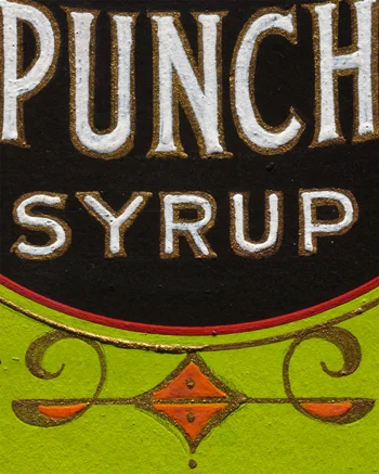
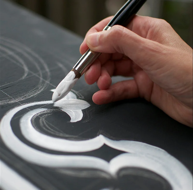
When visiting the Letterform Archive, the piece-de-resistance was this collection of food labels, one of Rob Saunders recent acquisitions. Not the lithographed finals, this collection is comprised of the artist mockups of label designs. Accomplished with fine brushes in gouache and the occasional metallic, these miniature pieces of art were incredible to inspect in person.

The images below were photographed by 42-line, a San Francisco company that specializes in digitization of rare papers, manuscripts and books.

"Lehmann Printing & Lithograph Company of San Francisco, founded in 1911, was one of the largest manufacturers of labels in the world. Labels were created individually for product containers by Lehmann’s permanent staff of artists who provided the illustrations, hand lettering, and designs. The sketches in this collection are hand painted in gouache by an unknown artist, are from 1920–1930 and are sized to fit the bottle, jar or can." 

A calendar of this label artwork can be purchased from 42-line's website.

Rob Saunders' Letterform Archive

The Letterform Archive is a digital gallery of designer, publisher and educator Rob Saunders' extensive collection of printed ephemera. Though Rob has been collecting for decades, the Letterform Archive is a new endeavour, launched last year. Items for the archive are not scanned; they are precisely photographed at high resolution in excellent lighting so that we may enjoy the nuances of the paper and the textural detail of the print.

I was fortunate to see a teaser selection of the archive in person. Visit the website and start browsing... new images are uploaded on a regular basis and you may purchase their 2014 calendar while supplies last. If you'd like to make an appointment, see here. Thank you, Rob, for an excellent visit and for participating in our Show and Tell event as well.

making future magic

This film explores playful uses for the increasingly ubiquitous ‘glowing rectangles’ that inhabit the world. We use photographic and animation techniques that were developed to draw moving 3-dimensional typography and objects with an iPad. In dark environments, we play movies on the surface of the iPad that extrude 3-d light forms as they move through the exposure. Multiple exposures with slightly different movies make up the stop-frame animation. 

Though this project dates to 2010, I still found it quite surprising and clever. For more, click here.

type tuesday: Danthonia Designs

Danthonia Designs is a sign company in Australia with a specialization in hand-carved signs. The prolific company ships signs around the world noting on their blog that they "ship over 100 signs per month to the USA and other international destinations." The company had an interesting beginning: "Thirteen years ago, a small group of enterprising sign-makers from the United States noticed that tourism marketing was a growing industry in Australia. They saw an opportunity to meet the new demand for place-branding signage, and set up shop in an un-used woolshed near Inverell, NSW."

Danthonia takes a traditional approach to physically making signs, but have also created an online Sign Designer. "At Danthonia old and young work together in an environment where traditional work values and hand-skills are passed on to the next generation. We share our responsibilities in such a way that every worker takes ownership and pride in keeping our quality high and our customers happy."

They've released a series of videos explaining the sign carving process. You can watch each edition on YouTube.

type tuesday: Letterforms & Birthdays


JUNE

For the month of June: William Addison Dwiggins, original lettering for brochure cover, Warren’s Paper, circa 1930, 20 x 25.7 cm

Letterform Archive is a physical and digital archive of material related to typography, lettering, and design. The collection includes over 7,000 books, 5,000 pieces of ephemera, and 1,500 volumes of periodicals, including manuscripts and original artwork, proofs and posters. They have a Kickstarter campaign for a 2014 calendar in which each month features a historical example from a different typographer.

Curator Rob Saunders comments, “Our aim for the calendar was that it show off the strengths and scope of the collection. The result is an eclectic showcase of lesser-known works by well-known figures in the letter arts. We are so grateful for the encouragement Letterform Archive is receiving, because we hope this will be the first of many projects bringing our unique content to the printed page.”

type tuesday: sketchnotes

You might have noticed the top sidebar ad for "The Sketchnote Typeface". It's an extensive and useful font made from designer Mike Rohde's own lettering. The sketchnote is a process that Mike uses while taking live notes at events or otherwise getting ideas down on paper. Using handlettering and simple drawings, he jots down the experience of listening and learning while creating engaging and memorable pages in his journal.

The Sketchnote Handbook is a guide for this technique, teaching readers how to balance the act of visual note-taking while still remaining engaged in the live content. For the design of the book, which emulates his own sketchnote visual style, Mike worked with Delve Withrington to digitize Mike's lettering. "I saved literally hundreds of hours by using this typeface," Mike says. You can read about their process here.

A few years ago, Carolyn Sewell was our correspondent at Typecon. Carolyn employs a similar technique for her live notes. I'm inspired to try my hand and sketchnotes during next week's Nearly Impossible conference. 

type tuesday: HWT Gothic Round

FROM THE HAMILTON WOOD TYPE FOUNDRY PRESS RELEASE:

"Gothic Round was first introduced as wood type by the George Nesbitt Co. in 1838. The font is a softened variation of a standard heavy Gothic typeface. The style evokes a much more recent history of the 1960s and 70s and can be seen in such places as donut shops and on children's toys as well as inspiration for such fonts as VAG Rounded.

Gothic Round has not previously been available as a digital font until now. The font was digitized by Miguel Sousa from a wide variety of historical sources, including visits to the Cary Collection at RIT (Rochester, NY), WNY Book Arts Center (Buffalo, NY) and the Hamilton Wood Type Museum (Two Rivers, WI). The result is a very solid and contemporary font with a 175 year history." Read more about the digitization process here.

The font is available from the Hamilton Wood Type Foundry.