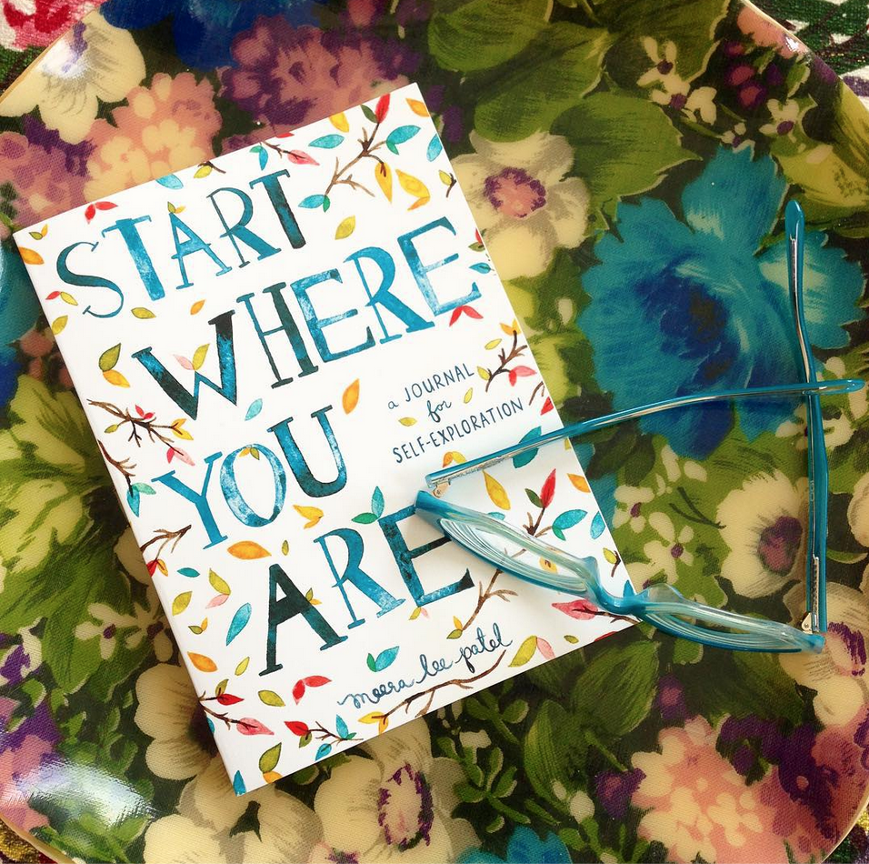
Start Where You Are: Meera Lee Patel

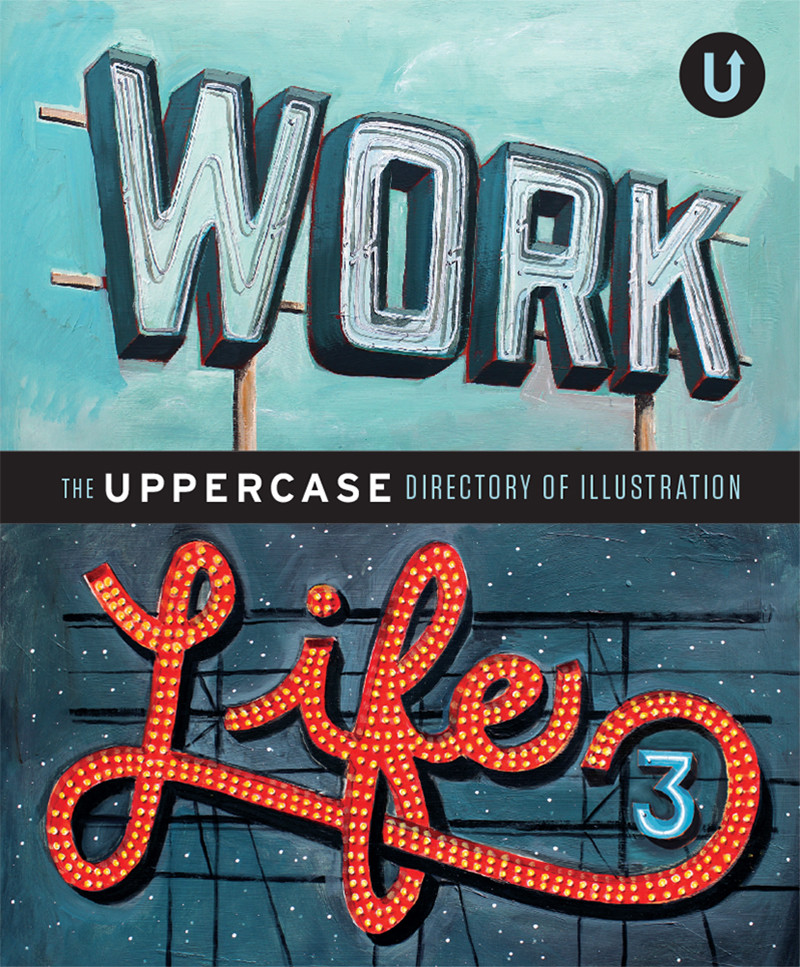
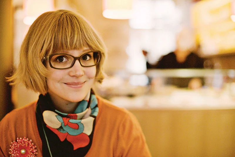
Since we first profiled illustrator Meera Lee Patel in Work/Life 3: the UPPERCASE directory of Illustration, this talented artist has authored and illustrated two books.

“My work has evolved in what feels like a very natural, steady progression, and my career has as well. I published my first book, Daily Zen, in the fall of 2014, and began working on Start Where You Are in the fall of 2014. I've also expanded my line of stationery and textile goods and began selling to retailers around the world. I feel incredibly lucky to be writing and illustrating books, which has always been my dream, and am grateful to be where I am on this path.”

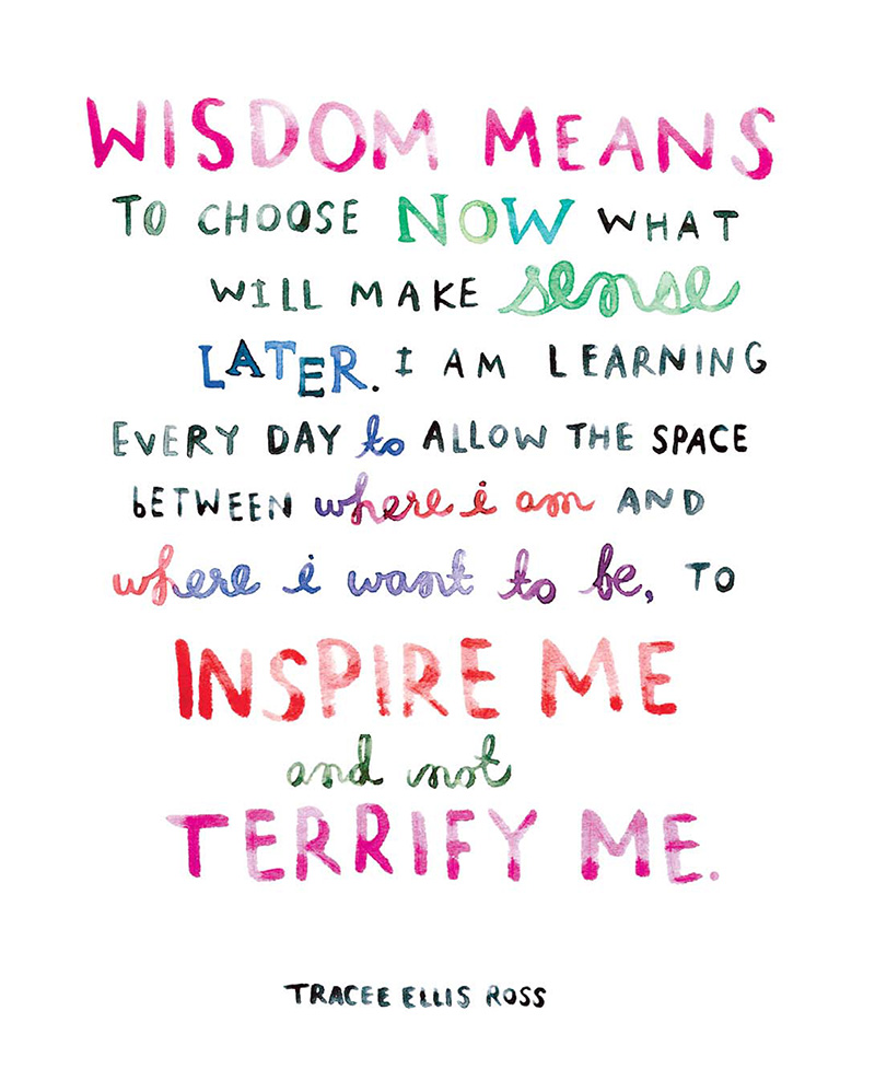
The most recent book is a motivational journal with illustrated quotations. “I wanted to make a book that helped people navigate through the chaos and confusion of everyday life. Start Where You Are guides readers through the practice of introspection by using a series of prompts (writing exercises, questions, charts, and graphics), and helps them feel more connected to themselves, the people around them, and the world itself.”

Meera has always been interested in the publishing industry. Four years ago, she graduated from college and secured a job with a publishing company. “I edited papers and put my knowledge of the Oxford Style Manual to good use. I enjoy writing and literature to a very intense degree—it's what fuels most of my illustration and propels me to tell stories with my work.”

However, the desk job wasn’t for her. “It was only a few months before I knew I'd slowly go insane if I didn't make a drastic change. With a slew of pent-up creative energy and strong desire for self-sustenance, I opened up an Etsy shop, started to take commissioned illustration jobs and began, once again, to let my imagination guide me.”

The transition from words to pictures was natural. “I grew up telling stories with my words; eventually I learned to tell them silently, with scribbles, colour and feeling. I'd always been a creative soul, writing and illustrating my own short stories and novels from a young age, using my imagination as fuel to create my own happiness.”

Creating inspirational books is an organic fit for this artist and her bright and spirited work. “Growth and evolution, as a person, is a natural and necessary process, and self-reflection plays such an important role in facilitating both. Reading so many life lessons from so many inspirational people reminded me (again and again) that anything is possible, both personally and creatively. I may not always currently be where I hope to go, but writing this book has helped me appreciate exactly where I am.”

Beautiful new Cloud9 Fabrics by Elizabeth Olwen

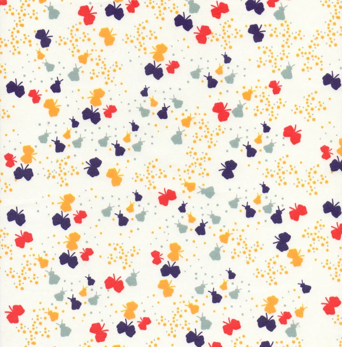
Oh, Elizabeth! You always make such beautiful surface patterns! Congratulations on Wildwood, the latest release for Cloud 9 Fabrics. Warp & Weft is hosting an event with Elizabeth in a few weeks. If you're in Toronto, please go for me! Details here.

Read more about Elizabeth in Work/Life 3 and in issue #21's UPPERCASE Surface Pattern Design Guide. (If you sign up for my weekly newsletter, you will receive the guide as a free download!)

Work/Life series: just 99 copies of the second edition left!

Here's a reminder of the book that I released last year. The Work/Life series features illustrators from around the world.

The first edition is sold out and there are just 99 copies left of Work/Life 2 available before it is out of print! Put Work/Life 3 in your cart and get a special price offer on Work/Life 2.

With the third edition of Work/Life, I pushed the personal nature of Work/Life to a new level. This edition's theme is "An Illustrated Life" in which we explore the ups and downs of illustration and what it takes to stay creative 24/7. Each participant offers their unique take on this theme and have created an original illustration based on a bespoke assignment specific to their interests and story that I assigned. Unlike awards annuals or traditional illustration directories, our publication is personal. Artists were individually interviewed about their creative focus and artistic technique as well as their inspirations and aspirations. Additional imagery (sketchbook pages, studio shots, inspirational objects) are integral to each participant’s spread, allowing the reader to take a peek into their entire work/life. 

from Mississippi to New York: illustrator Kelly Lasserre

Illustrator Kelly Lasserre is featured in Work/Life 3, a directory of illustration published by UPPERCASE. Here is an excerpt from Kelly's profile. 

Kelly seeing herself in Work/Life 3

I am originally from Mississippi. The majority of my family still lives there and I have spent all my summers in the South being exposed to its amazing, strange and beautiful environment. The people, culture and physical landscape is endlessly inspiring. I definitely have a romantic feeling about it, maybe because I’ve been back and forth and am able to see it differently than if I had never left.

I’ve spent most of my life, including my school years, on the south shore of Massachusetts in a small Irish fishing town, very different from Mississippi, but dreamy in its own way. I feel fortunate that I grew up appreciating and learning from two opposite parts of the United States. It makes me feel very balanced in a way.

It became clear to me early in my teenage years that I had a real desire to make things and to communicate visually—it just made each day simpler. At some point I realized it was more than an angsty teenage need to express myself, so I really pushed my interest and had a lot of support from some great teachers. I went to art school in Baltimore, at the Maryland Institute College of Art, where I graduated with a BFA in illustration in 2008.

My style has been extremely pared down over the years into something I feel comfortable with, which is very simple, intentional, concise. I have reduced it down to the bare essential of what it is I am trying to visually discuss or record in my personal work. I used to be more self-conscious about my style because it didn't have this traditional approach to telling stories that fit into the illustration work I was being exposed to. But I eventually just let myself do what came naturally, which happens to be very direct and to the point.

Currently I am living and working in New York City. It’s not the easiest place to live, but it is very stimulating, frustrating, endlessly entertaining and inspiring. You have to be quite crafty to make it work. I just moved to Queens a few weeks ago so I could afford to live in this crazy city but also have enough space to work and breathe a bit. And I have my own studio, which is key.

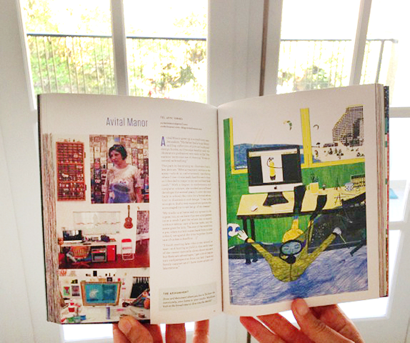
Work/Life 3 is a directory of talent showcasing illustrators around the world. Artists are individually interviewed about their creative focus and artistic technique as well as their inspirations and aspirations. Beautiful images of sketchbook pages, studio shots, inspirational objects or personally illustrated anecdotes are shown on each participant's spread, letting the reader catch a glimpse of the artist's work/life. 

Click here to get your copy of Work/Life 3. 

Kickstarter: Tatay's Gift

Illustrator Brad Woodard (part of Work/Life 3) and his wife Krystal have a Kickstarter project underway to fund a children's book:

In Tatay’s Gift we get to join a young Filipino boy as he goes out to work each day with his Tatay (Tatay is the Tagalog word for dad). The boy and is Tatay do a different job each day of the week, from selling popsicles by the beach to driving a Jeepney through the city. As they work, he learns the lesson of serving and giving to others by watching his Tatay everyday. This vibrant, and colorfully illustrated book is based on stories from Brad’s time spent in the Philippines and the wonderful people he met there. Tatay’s Gift not only celebrates the hardworking, loving, kind, and giving attitudes of the Filipino people, but it also teaches the valuable lesson of giving back to to your community and helping those in need. 

I've put in my pledge!

have a "happy happy" Valentine

The Happy Happy Art Collective is a new group of artists who met, virtually, in Lilla Rogers' Make Art That Sells e-course last year. They decided to join forces to spread their "happy art all over the world."

The group is comprised of three Work/Life 3 artists: Denise Holmes, Tammie Bennett and Emily Balsley as well as Pauline "Muffin" Grayson, Jill Howarth and Lauren Minco. They've posted some cute Valentine downloads (for personal use) on their communal blog. 

Show and Tell: Cleomade

I was happy to meet Cleo Papanikolas in person: Cleo is one of the artists in Work/Life 3 and also created the great hat illustrations in our current issue. If you want to be astounded by her prolific creativity, spend some time on Cleo's blog: she has created a long list of intricately illustrated downloadable projects based around her paintings. Scroll through her Tiny Paintings Project, visit her Pinterest boards and purchase craft kits from her Etsy shop.

Helen Musselwhite's fabric design for Liberty

'Windrush' (© Liberty) will be available in A/W 2014 in the Tana Lawn range of dress fabrics.

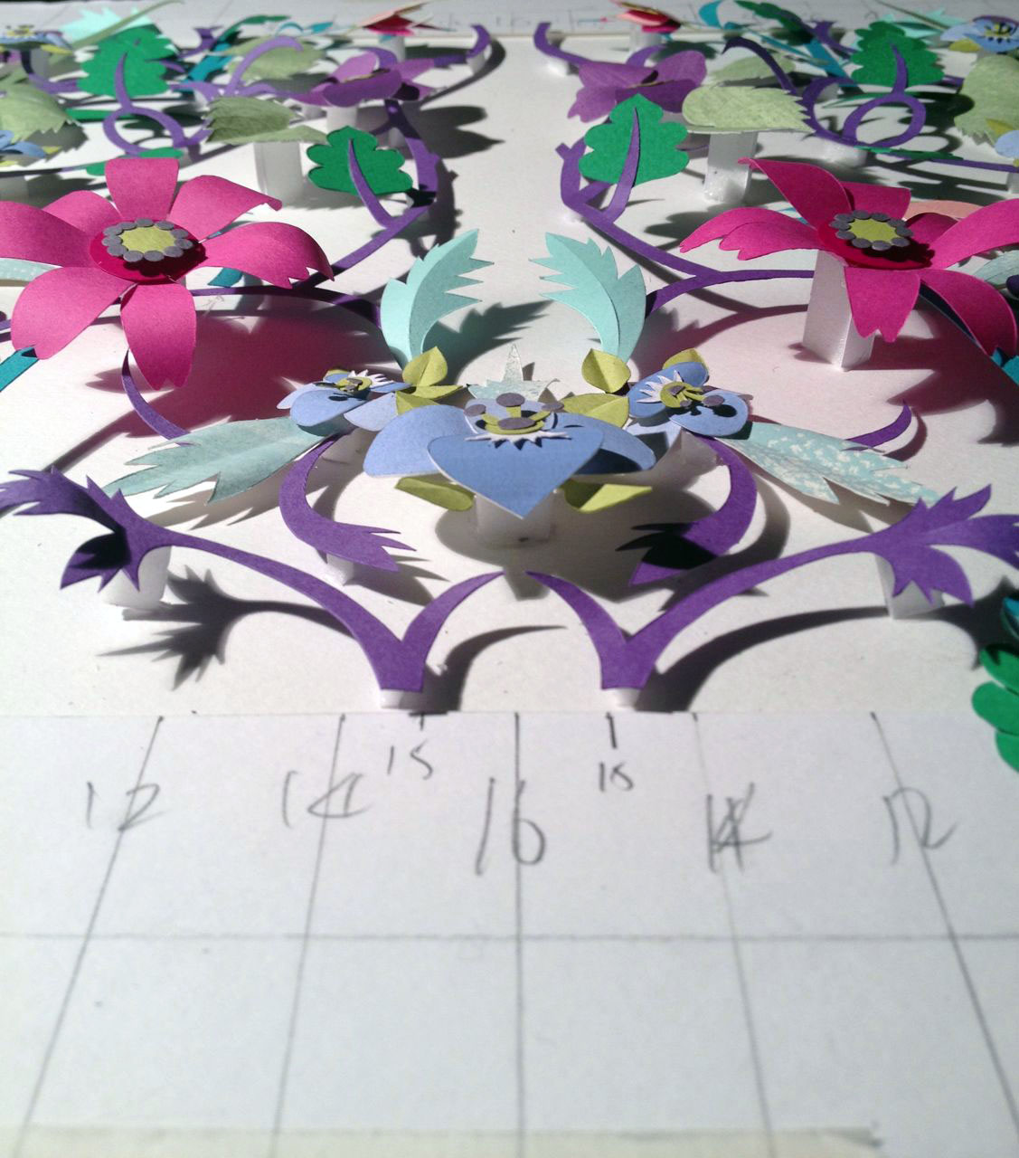
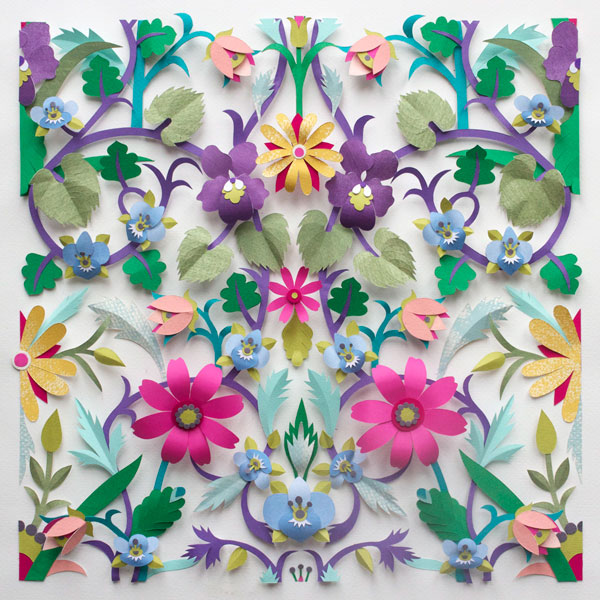
Work/Life 3 artist Helen Musselwhite recently achieved a lifelong ambition as she was approached by Liberty and invited to design a fabric pattern for their collection. Her paper constructions turned into fabric are absolutely stunning! I asked Helen how this collaboration came to be...

In December 2012, I received an email that made my heart skip a beat or two. It was from the design director of Liberty Art Fabric in London asking me if I’d like to design a repeat pattern for inclusion in the Autumn/Winter 2014 collection. Of course I said YES!

The brief was to create a paper cut design inspired by something in the Liberty archive. I’m a great fan of the work of William Morris so his fabrics were my starting point. I used to live near his weekend retreat Kelmscott Manor in Oxfordshire and I imagined him walking through the summer meadows and along the banks of the Windrush River that flows near the Manor. My design takes some of the flora he might have found that is indigenous to the Oxfordshire countryside and re-imagines it in a multi-layered papercut and modern colours.

I started with a line drawing which I then divided in half and flipped vertically. 

I then photocopied several of these and coloured them in to get and idea of how colour would work in the repeat.

It was then divided in half again and flipped vertically to produce the repeat.

I took a high res digital photo of the finished artwork which was then sent to Liberty and they worked some digital magic which resulted in Windrush being printed on their beautiful Tana Lawn cotton fabric in 4 colourways.

A few weeks ago I received a parcel of fabrics and a shirt made of the black background fabric.

Windrush is now the copyright of Liberty London and the paper cut artwork is in their archives, which as I type this gives me goosebumps—I can truly say it is one of my greatest achievements. The process and making was extremely time-consuming and totally in the sprit of the Arts and Crafts Movement. I’m not sure now how long it took me to finish as I got carried away with the making and even though it was a bit mind boggling getting the repeat to work I was in paper-cutting heaven!!

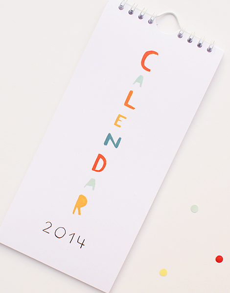
A lovely calendar by Ekaterina Trukhan

Work/Life 3 artist Ekaterina Trukhan has a wonderfully simple and charming calendar available in her newly-launched shop. Check out Ekaterina's pages in Work/Life 3 on her blog.

She also has some prints for sale.

Work/Life 3 and 2 are available in the UPPERCASE shop and make a terrifically inspiring gift for artists, illustrators and those who seek creativity in their everyday lives.

WL3: Cecilie Ellefsen

Meet Cecilie Ellefsen, one of the 100 profiled artists in Work/Life 3

What is your life story in one paragraph?

I grew up in a small town by the sea in southern Norway. As a kid I loved to draw, play the tuba, ride horses and make small forts in the woods with my friends. When I got older I studied graphic design, moved to Oslo and studied Art Direction. This is where I met my husband who is a film director and 3D artist. We now live and work in Oslo with our two daughters.

How and why did you become an illustrator or artist?

I've always loved to draw as a kid and even used to smuggle out pencils and pieces of paper during recess at school and find a quiet place to draw. I initially studied graphic design and Art Direction, but after the financial crisis of 2001 I decided to pursue my dream of becoming an illustrator. I applied to art school here in Oslo to study illustration, but I did not get accepted. So then I just built up a portfolio and showed it to publishers and ad and design agencies and I got offered a job as an in-house illustrator at a design agency and it all snowballed from there.


What is your creative process when working on an assignment?

First I read the brief, take notes and start doing research online if there is a particular object, animal or thing I need to include in the illustration. After the research I often print my research material and often go to a café, out on my balcony or the library and start drawing ideas in my sketchbooks. Since I work from home I find going out for a walk often helps the creative process. I may see something on my walk that I can use in my illustrations. When the sketch is finished I scan it in and finish it on the computer.

What personality traits are exemplified by your illustration style?

Hmm... maybe that I never really grew up? I feel like a kid a lot of the time, and doing illustration is my never ending playground. There is so much colour and life in doing illustration, and I love the feeling of emerging myself colour and drawing new "worlds".

If you were to illustrate a portrait of yourself, what would it look like?

Primary colour skirts and dresses, flower earrings, 60s cat eye glasses, blonde hair and bright red moleskine sketchbooks. I also would include my brown leather messenger bag and brown leather oxford shoes.

What makes you different?

I never went to art school and I am used to this hands-on way of doing things. What I know of illustration, I've learned through working hard through trial and error. I've never gotten a "this is how you illustrate" book or lecture, but then on the other hand I've never been told what not to do in illustration so maybe I think more freely?

What is the best thing and the worst thing about being an illustrator?

The best thing is that I can make a living of playing and drawing. The worst thing is all the endless ideas and the limited time I have to do them all.

How do you maintain a balance between your work and your life? (or not?)

I try to spend as much time as I can with my kids when they are not in daycare. I often make up for the lost hours during the day by working again in the evening when they have gone to bed. That way I get to spend more time with them, and still get my work done. The downside is the lack of social life though, but we try to make up for that in the weekends. Also when I feel the stress of being my own boss and the boss of the family (he he) gets a bit to much I try to wind down a bit and do some yoga. Yoga has given me a whole new and better perspective as to what is important in my life.

What is your ideal day?

I get up at 5:30 and get ready for my day. I then make breakfast for my family, and get the kids off to daycare. I walk through our local park and drop our kids off at the other side of the park where the kindergarten is located. I then meet up with my husband at our local café and we have a coffee and talk about our day and projects. We then walk home to our home studio and start working around 9:00. We work till noon and then have lunch, either at home or at some café. We then bring our sketchbooks and doodle a bit and then go home and work some more. At four my husband picks up the kids, and we have dinner, and play with them until they go to sleep around seven. We then either have some friends over and see a movie, or work until we have to go to sleep again.

What would be your dream illustration assignment?

Designing fabrics for Marimekko or Ikea or wallpaper for Hygge and West, that would be absolutely amazing! I absolutely love working with product design and designing things that everyone can have in their home.

What is your benchmark for success as an illustrator?

I really love to illustrate well-designed everyday products that people can pick up at their local supermarket. I designed chocolate pieces for Freia and illustrated cheese packages for Tine, that was one of my favourite jobs. Also illustrating the new circus line for Blafre was one of the most rewarding things I've done. To see other kids at my daughters daycare holding their new lunchbox that I have illustrated firmly in their little hands as they eat their lunch outdoors is so rewarding. To be part of someone's childhood, and to think that they may love their lunchbox so much that they may save it for their own kids, is priceless.That makes all the hard work worthwhile.

Visit Cecilie's website. Purchase Work/Life 3


the allure of SURTEX

SURTEX from above. Taken by Shelly Brown.

SURTEX is an annual event where where artists, agents and licensors connect with manufacturers and retailers to create many of the beautiful products we use each day. Janine recently explained the allure of SURTEX over on their blog. 

"UPPERCASE is a quarterly magazine for the creative and curious with content inspired by design, illustration and craft. As publisher, editor and designer of this independent magazine, I am always searching for content ideas and new talent to feature within our pages and on the blog. Despite never having attended show in person, SURTEX has been a valuable event in showcasing great talent. Every year, as "SURTEX season" approaches, there is a flurry of activity online as bloggers and artists share forthcoming work and their display preparations. Through these posts, I feel like I experience a bit of SURTEX vicariously.

Indeed, SURTEX reaches mythical status among aspiring surface designers and illustrators. I asked the participants featured in Work/Life 3 —UPPERCASE's latest book featuring 100 illustrators from around the world—about their perceptions of SURTEX."

Read the full article here


Linda Solovic's lovely ode to sewing notions

Linda Solovic's Work/Life 3 illustration.

Linda Solovic created such a lovely illustration for her spread in Work/Life 3. I love the combination of haberdashery and texture within the illustration. Linda has a love of embellishments, textiles and haberdashery so her assignment definitely reflects that.

Linda also has a new product collection to share with us today. It is called Feathered Friends and includes greeting cards and journals, bags and wallets, keyrings, pocket mirrors and an iPhone case. Available through Santoro London.

Work/Life 3: Gabriela Larios' new fabric collection

UK-based illustrator Gabriela Larios has had her first fabric collection produced through Modern Yardage. "It is called Mochi and consists of eight different designs, available in two different sizes, medium and small and two different colour palettes: natural and deep blue," describes Gabriela. "The collection is inspired by my love for nature, imaginary worlds and childhood experiences. The Mochi name itself is inspired by the way my parents called me when I was little ('Mochis')."

Gabriela is understandably excited about the launch of the project, though it is bittersweet. "With all my heart I have dedicated this collection to my mother who unfortunately passed away recently but who thankfully managed to see the whole project finished."

The collection also includes a special touch of fabric gift tags: "It is an extra special piece of fabric that is included with every purchase of Mochi fabric so people can cut them out and use them to wrap up their presents."

Congratulations to Gabriela on a fine entry into fabric design! 

Molly Hatch in London

Work/Life 3 artist Molly Hatch is in London this week as part of London Design Week (September 14-22). You can see her work in person in the beautiful gallery at the Anthropologie location on King's Road. Of this particular body of work, Molly writes: "All of the works in this group source the historic textile collections at the Victoria & Albert Museum and have been sourced in collaboration with curators of the museum for this exhibition."

There is a gallery talk with Selvedge magazine editor Polly Leonard and Molly today, September 17th, from 6-8pm. RSVP details here. I wish I could attend!

To see more of Molly's illustrations and surface pattern design, click here for her portfolio.  Below is Molly's full page image from Work/Life 3:


Work/Life 3 illustration by Molly Hatch

Molly at work on an image.

Molly's studio.