Launch your career with a free spot in The Ultimate Portfolio Builder course! (CONTEST CLOSED)

My friends at Make It In Design have a very special prize for ONE very lucky reader — a free place on the next The Art and Business of Surface Pattern Design – The Ultimate Portfolio Builder course worth $875 (£579).

The Ultimate Portfolio Builder is an advanced seven-week online professional surface pattern design course, consisting of an intense five-week class followed by two weeks of design reviews and live briefs. The classroom is accessible 24/7 so you can join from anywhere in the world, and fit the course into your busy life. Places on this course are limited, but one person from this competition will be guaranteed a spot. 

This course will give you all the tools and advice you need to grow, refine and strengthen your professional design portfolio, make your designs more sellable and give you the fast-track to trade show success.

Brought to you in association with Printsource, one of the top surface and textile design shows in the world, this course will provide you with exclusive insight to help you secure the right buyers for your work, deal effectively with clients, get trade show ready and discover the secrets to landing your dream work. Plus one lucky person on the course will win a free booth at Printsource Aug 2016 and $1,000 to get you to New York! 

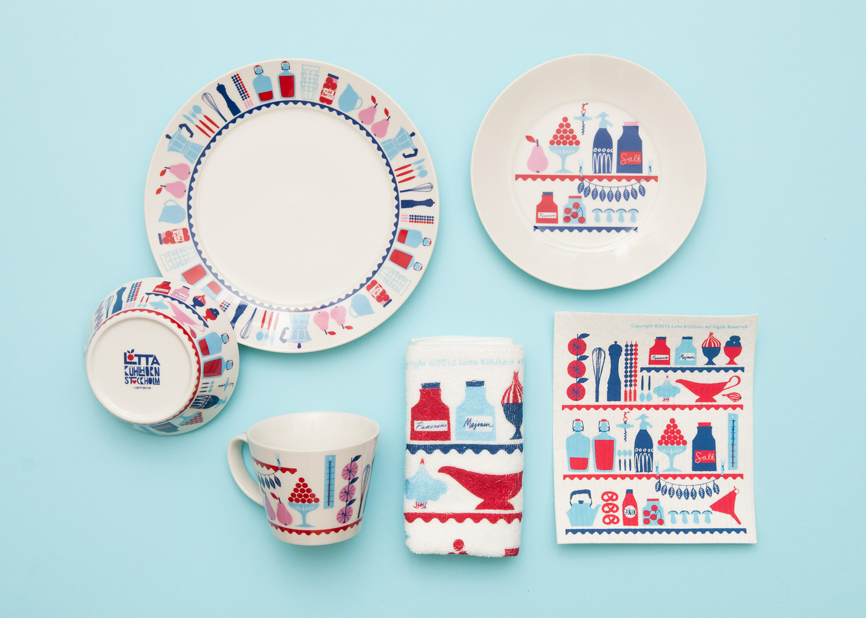
Course alumni have gone on to launch their own design studios, win national awards, be featured in design books, on leading blogs and more. Fancy a bit of this action too? Read on to find out how to enter and read some of the student success stories here.


THE PRIZE

The prize: ONE place on The Art and Business of Surface Pattern Design – The Ultimate Portfolio Builder course starting May 25, 2015, delivered on-line.

How to enter: Check out the course website to find out more about it, then go over to this post on UPPERCASE and leave a comment below in no more than 100 words telling us why this course would benefit you right now and how it could transform your career. (Note: Please do NOT leave your comment on the Make It In Design blog, leave your comment below this post.)

Deadline: 5pm GMT on Wednesday 20th May 2015. Any comments left after this time will not be counted. The winner will be announced on Friday 22nd May 2015. Good luck!

Terms and Conditions: This competition is to win a place on The Ultimate Portfolio Builder course from Make it in Design starting May 25, 2015. One entry allowed per person. The winning place is not transferrable – either by date or to another individual and must not be sold on and no cash alternative will be offered in the event that the winner is unable to use the prize for any reason. By entering this competition you agree to your entry to be promoted on the Uppercase and Make it in Design website and their associated social networks. The judges' decision is final.

Illustrated portraits of the ones you love by Erika Rier

UPPERCASE reader Erika Rier creates custom family portraits in a whimsical storybook style.

"Whether your family is two people or twenty people let me create a special illustrated image of your family in a setting constructed from meaningful symbols, images, and colours." She'll also do a portrait of your pets, too!

Most intriguingly, Erika is also available to make an illustration of your dreams!

Calling Card: Jennifer Joanou

Jennifer Joanou is one of those multi-talented artists who finds a way to express themselves no matter what the medium or the method. The first iteration of her creative career was as a fashion designer in Los Angeles; her work was popular in Hollywood and was sold in Barneys. Then about ten years ago, she began art journaling and found that it encompassed all her loves: fabric, photography, paper and paint.

Her website has an intriguing opening page and is a great invitation inside her journals, which are extensively presented. She also shares work in progress on her blog.

Postcards and stickers of her journal pages are available in her shop. Gift them as a set, send them to friends or tack them to your inspiration wall as incentive to start your own journal in 2015.

Thank you to Jennifer for supporting UPPERCASE magazine through the purchase of a Calling Card. I'm pleased to report that the Calling Card page for the forthcoming issue is now full, but if you're interested in being part of the spring issue, spots are now open.

Enter the Calligraphy-themed fabric design contest on Spoonflower!

Spoonflower is an easy digital printing service that turns your fabric (and wallpaper, and wrapping paper!) dreams into reality. I'm excited to be partnering with them for a fabric design contest (scroll down for details). In issue 21's Surface Pattern Design Guide, I chatted with Spoonflower co-founder Stephen Fraser. Here's an excerpt:


How many yards of fabric are typically produced by Spoonflower in a day?

We produce over 2,000 yards of fabric per day.

The weekly design challenges yield some impressive results, both in quality of design and the sheer number of participants. How are contest themes determined?

Picking contest themes is a lot of fun, and between the suggestions people send us and our own creative team we never seem to run out of ideas. I’m proud to say that we’ve held close to 300 weekly design challenges at this point and have yet to repeat a theme. The biggest challenge is not in coming up with new ideas but coming up with ideas that balance accessibility with our desire to inspire original work. “Vintage” is a fun idea, for example, but at this point we know that if we did a contest with that theme, the likely result would be a lot of people submitting vintage artwork they found on the Internet. It would be hard to separate the work of skilled artists trying to make their own work look vintage from actual vintage art being submitted by people who are just good scavengers of old artwork. So instead of “vintage,” we might try “vintage gadgets.” Having said that, most contest themes we choose have strengths and drawbacks. In the interest of encouraging people to think of our contests as accessible and fun, rather than cutthroat competitive, we moderate the entries very lightly. This is invariably frustrating to the more competitive artists who participate, but I think it’s a good balance of interests most of the time.

What makes a successful design?

I think what makes fabric designs successful is texture, which is ironic given that we sell fabric over the Internet, where its impossible to feel the texture. But in digital design—just as in the brick-and-mortar world, where the texture of fabric is a primary factor—texture is one of the things that makes a surface design stand out. You can see this in the work of Holli Zollinger, one of Spoonflower’s most successful designers. Her artwork is not flashy and her colours, from a digital standpoint, are quite simple and restrained, but she really incorporates texture successfully into colour and pattern in a way that is beautiful and pleasing. The other sorts of designs that are successful, at least in commercial terms, are niche subjects. These are narrow and specific subjects, which means that while they may not have huge audiences, they are easily located by people searching on Google. Because the competition for this sort of fabric is limited, they can often sell successfully in the marketplace.

Do you have advice for aspiring surface pattern designers?

Don’t be afraid to experiment! Fabric is like pizza—even a 'bad' design printed on pretty cotton is still kind of nice!


CONTEST DETAILS

Create a monochromatic pattern using varying shades of black, white or grey with calligraphy as a theme. The winner will be profiled in an upcoming issue of UPPERCASE. The deadline for entry is Tuesday, November 11, 2014. Visit the Spoonflower website for details on how to enter!

Calling Card: Tempest Studios

Artist Erika Schulz believes in keeping busy. "I have a few series of artworks ongoing at the moment. I don't believe in tackling one subject at a time, so I switch between spaceships and robots, medieval gargoyles, birds, nature, and fantasy/macabre illustration. I try to challenge myself to grow as an artist."

"My inspirations are as diverse as my subjects, although if you knew me well, nothing I do would seem such a stretch. I grew up in a house surrounded by Asian artwork, collected by both my mother and grandmother. Summers were spent near the ocean or a mountain lake. My father introduced me to The Lord of the Rings, and Dune at an early age, which lead me to Star Trek. Fantasy novels were always my prefered escape, and throughout my life I have been fascinated by ancient history. What a strange melting pot, but perhaps not that uncommon. Nature, fantasy, fiction, and history, what a wonderful world for creativity and imagination."

She has a busy month ahead: Her Alberta Aviary series will be on display from November 15 to December 4 at the Bluerock Gallery in Black Diamond, Alberta. (Bluerock Gallery is also a fine stockist of UPPERCASE magazine.)

Then, she'll be showcasing her work at Red Deer's "All Things Pretty Market" on November 22 and 23rd. 

Prints, cards and zines are available on her Etsy shop.

Thank you to Erika Schulz for supporting the content in UPPERCASE issue 23 by purchasing a Calling Card ad. If you'd like to have your Calling Card appear on the blog, sidebar, social media and in print, please visit our advertising for the details.

Lisa Congdon's Art Inc.

Lisa Congdon's new book Art Inc. photographed with an original painting that Lisa gave to me.

I'm pleased to be part of the blog tour for Lisa Congdon's just-released book, Art Inc: The Essential Guide for Building your Career as an Artist. I've witnessed Lisa's growth as an artist and I am happy that we have collaborated quite frequently over the years.

In the early days of UPPERCASE, before it was a magazine, I ran a small gallery and bookstore. The exhibitions included artists from around the world, and Lisa was a frequent participant. (During this trip down memory lane, I'l be linking to old posts and articles on an antique version of the UPPERCASE website.) I exhibited Lisa's work as early as 2006, for the Big Little Show.

Her work at the time was mostly collage-based, with touches of painting and geometric decoration. In 2008's Old School exhibition and book, I sent artists packs of school-related ephemera for inspiration and inclusion in artworks. Lisa's submission in a shadow box was one of my favourites. (Old School is out of print, but you can see more here.)

In 2009, a theme of Bonfires was presented both as a gallery show and an article in an early issue of UPPERCASE. (Issue 3, out of print.) By this time, Lisa was doing much more painting and incorporating handlettering in her work.

The vintage ephemera of her early collages would later play an integral role in our biggest collaboration, the publication of the book A Collection a Day. In 2010, Lisa embarked on a year-long project to document her collection daily online through photos and the occasional drawing of arrangements from her curious collections. I began following her daily blog post right from the beginning and for months I thought to myself, "This would be an amazing book." I was expecting a baby that March and put the idea aside thinking that some big publisher would swoop in! But even late nights with a new baby couldn't dampen my interest and to my great pleasure, Lisa agreed to publish the book with me!

At 448 pages, this thick tome of a book is packaged in a collector's tin where you can keep your own little collections. Full of vintage ephemera, inspiring typography and curious oddities, A Collection a Day is a highlight of the UPPERCASE library.

Baby Finley in one of his first gigs as hand model.

Finley opens the tin to reveal the book inside.

Here's Lisa at the opening and book launch for A Collection a Day at The Curiosity Shoppe in San Francisco.

So that brings us to 2011 and the release of Collection a Day. Meanwhile, Lisa's illustration career was on at full speed. Lisa was also a profiled artist in 2011's Work/Life 2: the UPPERCASE directory of illustration.

Lisa's studio in 2011.

Fast forward to fall of 2013, Issue 19, and UPPERCASE magazine featured Lisa's travel sketchbook from a trip to Iceland. She also wrote and photographed an article about Alvar Aalto for that issue.

Over these years, Lisa has learned a lot. She is someone who pushes herself to learn, to improve, to explore uncharted territory. She has shared the stories of her high and lows, the ups and downs, on her blog in her forthright and personal style. With the release of Art Inc., she has created a precise and inspiring guide on how to make a career as an artist. Published by Chronicle Books (and illustrated by Work/Life 3 artist Karolin Schnoor), Art Inc. is the go-to companion for advice on how to start your journey as a professional artist... and how to stay motivated and to grow your artistic practice as you mature in your art.

Many congratulations to Lisa on adding 'published book author' to her long list of creative accomplishments. I'm honoured to have worked with you so many times along the way.


Art Inc. is available to purchase directly from Chronicle Books or wherever books are sold. The other books mentioned are by UPPERCASE and available in my shop (if they're still in print). Lisa has signed copies of A Collection a Day in her Etsy shop as well.

Work/Life series: just 99 copies of the second edition left!

Here's a reminder of the book that I released last year. The Work/Life series features illustrators from around the world.

The first edition is sold out and there are just 99 copies left of Work/Life 2 available before it is out of print! Put Work/Life 3 in your cart and get a special price offer on Work/Life 2.

With the third edition of Work/Life, I pushed the personal nature of Work/Life to a new level. This edition's theme is "An Illustrated Life" in which we explore the ups and downs of illustration and what it takes to stay creative 24/7. Each participant offers their unique take on this theme and have created an original illustration based on a bespoke assignment specific to their interests and story that I assigned. Unlike awards annuals or traditional illustration directories, our publication is personal. Artists were individually interviewed about their creative focus and artistic technique as well as their inspirations and aspirations. Additional imagery (sketchbook pages, studio shots, inspirational objects) are integral to each participant’s spread, allowing the reader to take a peek into their entire work/life. 

Greetings from Canada

"A short teaser for Greetings From Canada, a limited edition run of fine letterpress postcards featuring the work of 10 Canadian artists, illustrators and designers. The first project of its kind in the country, it aims to elevate the art of letterpress printing while showcasing a selection of some of the best creative talent Canada has to offer." 

Back in the day, I had my own set of postcards called "Greetings from Canada." I used to sell them when UPPERCASE was a public gallery.

"It is almost impossible for me to create without colour."

Columbian artist Ximena Escobar has taken the concept of paint by numbers into a completely different medium. By cutting up coloured felt, she assembles portraits of beautiful women with florals. "This medium is very special to me because the colours also have texture and that makes my work richer and more interesting," she explains. "It is a medium where I can't mix the colours, every one of them is a solid block, so I need to use them in a way I can blend the colours without mixing them. That challenges my work and takes me to some interesting and exciting results."

"Colour is a very important element in my work. It defines the mood of what I am creating, it is also the way I communicate my aesthetic no matter which medium I'm using. Colour inspires and challenges me all the time."

"Colour is part of what I am as an artist. I was born in Colombia which is a very tropical and colourful country. It is almost impossible for me to create something without colour, it is how I communicate what I want to say."

Ripe bananas and other outtakes from issue 22

Cover artist Shelley Davies was wonderful to work with. And she is always so generous with her creativity! Above's an "outtake" called Ripe Banana.

I asked Shelley to make the collage for the cover because of her affinity for working with paint swatches, her love of incorporating type into her work and her overall exuberance for bright colour. Here are some more colourful compositions from Shelley. 

Here are some roughs that Shelley made when working on the cover. We decided that the radiating colour wheel was more dynamic, but these studies are nice on their own!

Hello Pattern by Judy Kaufmann

Judy Kaufmann has just released this fresh collection of patterns. "This collection has a wide selection of geometric, organic, typographic forms which can be applied from paper to fabric, from wood to walls." Her fantastical representations of her patterns in use is a terrific way of promoting this new work.

Judy is another talented designer who was featured in the UPPERCASE Surface Pattern Design Guide in the spring issue. 

Colours and Emotions with Maria Carluccio

In response to my weekly newsletter that I sent on Tuesday, Maria Carluccio shares this composition with us, made of chopped up old watercolour paintings. "It was so liberating!" she exclaims.

"Out with the old, in with the new—reusing old art to make new art."

"I highly recommend it as a fun way to explore colour connection," advises Maria. "After I pieced these together I started thinking about how colours remind me of emotions and feelings so I wrote in pencil the first thing that came to me when I thought of that swatch."

Maria is one of the 100 artists profiled in the UPPERCASE Surface Pattern Design Guide included in the spring issue (#21). The Guide is also available as a free download when you sign up for my newsletter—I'll send inspiring content directly to your inbox once a week!

inky hands at the Letterpress Academy

Saint Gertrude Letterpress Academy is a letterpress workshop in Melbourne, Australia that designs and prints letterpress ephemera on their 100-year-old platen affectionately named Gordon. Saint Gertrude is now offering hands-on letterpress classes. 

"Letterpress Academy is a new open access workshop offering participants the chance to learn more about the process of modern letterpress printing," says founder and Creative Director Amy Constable

The classes are open to professional designers and beginners alike. To get your hands dirty (and inky) with Saint Gertrude, click here

Swedish illustrator Lotta Kühlhorn


Lotta Kühlhorn is a Swedish illustrator who, at the age of ten, already knew that she wanted to be an illustrator when she grew up.

Lotta's illustrations and patterns can be found on cookware, books, fabrics, textiles–even wall tiles!

In January, Lotta released her book called Designing Patterns for Decoration, Fashion and Graphics.