1348 pages of content created in 2015!

The end of the year's always a time for reflection—and for making resolutions and plans! Please join me in looking at the past year at UPPERCASE... and find out how you can be in the magazine next year!

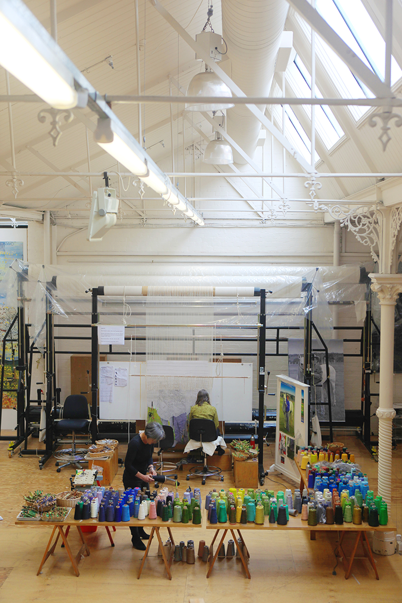
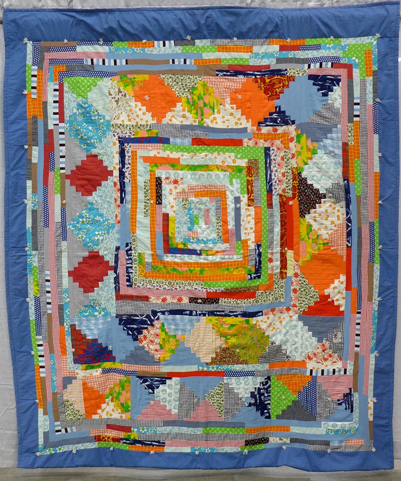
This has been one amazing year. It started with a lot of travel: In January I was in Austin, Texas to help judge hundreds of beautiful quilts in for QuiltCon. (That's me in a very cute fabric store in Austin.) It felt like I was barely home before I was on a 32-hour odyssey to Australia to speak at the Perth Writer's Festival and then the Creative Women's Circle in Melbourne. I spoke at the HOW conference in Chicago in May, I was in Toronto in June for the National Magazine Awards, onward to Portland in October... it's a wonder I got anything done this year with so much time away.

But now that I look at it all, it sure stacks up. UPPERCASE published a whopping 1348 printed pages of content in 2015. Thank you to all my amazing contributors—the writers and photographers and illustrators and crafters who make such inspiring content. Thank you to all the readers who submitted their work for inclusion. Thank you to Correy Baldwin for copy editing. Thank you to Chris Young at Prolific for handling the printing on all these projects (except for The Typewriter which was printed by Asia Pacific Offset). Thank you to my husband Glen Dresser for his assistance in writing The Compendium, his contributions to the magazine and for taking on customer service recently.

Let's see how all those pages add up:

UPPERCASE 24: January/February/March 2015  
116 pages  

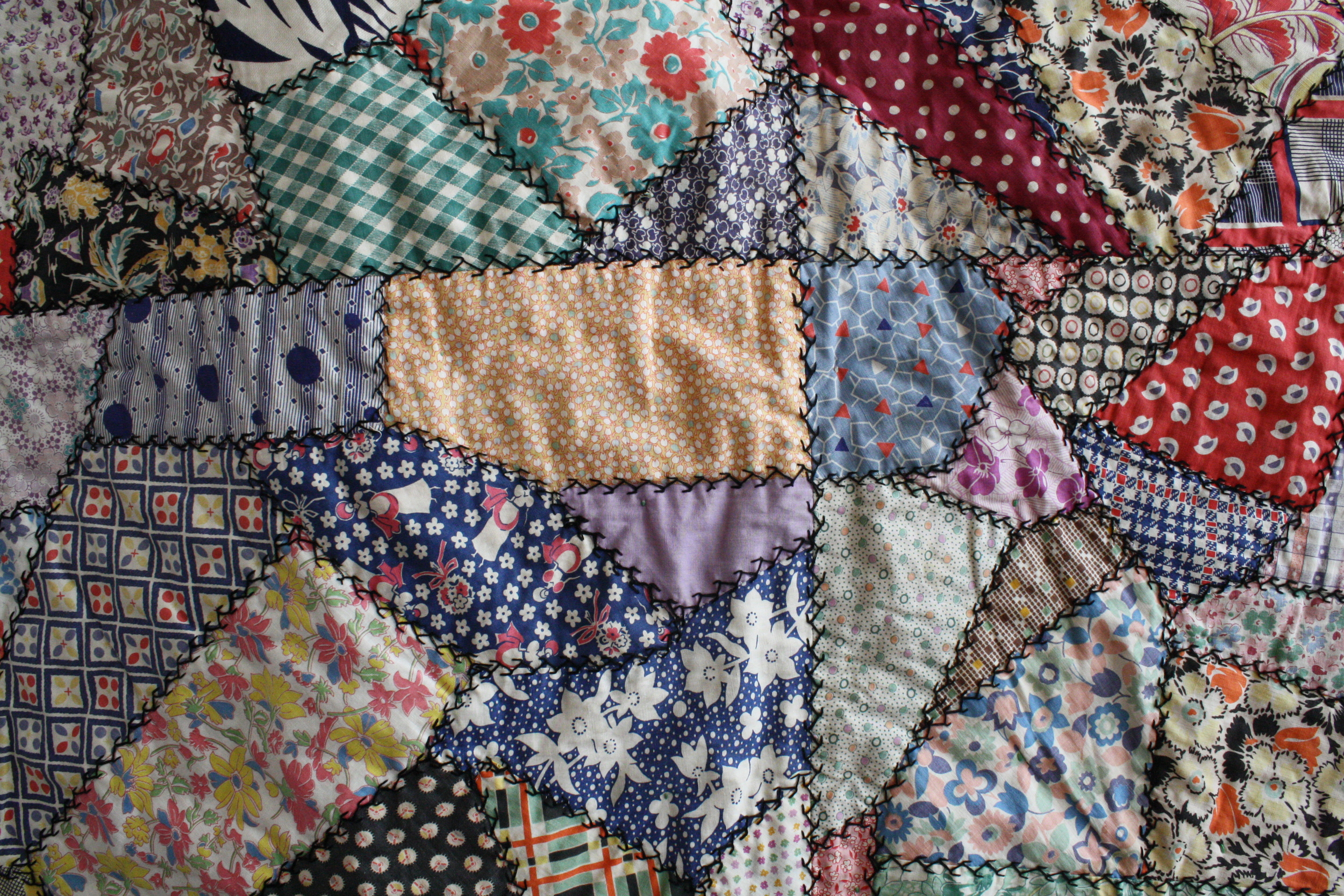
If I were to play favourites, I'd have to say that issue 24 is mine—I love the illustration by Andrea D'Aquino and each of the 10,000 copies had a piece of antique feed sack fabric applied to the cover! The feed sack swatches were sent in by readers from all over and it was such fun to receive little bits of fabric in the mail. (This issue sold out quickly and will not be reprinted... however, a book project has emerged from this issue, it's in the very early stages and I look forward to sharing more! If you've got a feed sack collection, please get in touch!)

UPPERCASE 25: April/May/June 2015  
116 pages

This issue is dedicated to printmaking in all its forms. The cover is by Joey Hannaford. The Profiles in Printmaking section introduces dozens of talented readers who work in everything from monotypes to risograph to letterpress to collographs. Subscribers enjoyed a free printmaking sample inserted into their issues. Get issue 25 here. (Photo by stockist Tiny Feast.)

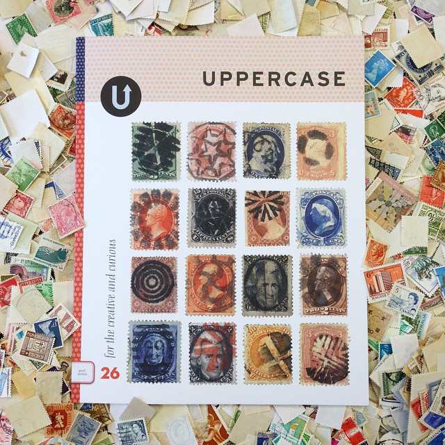
UPPERCASE 26: July/August/September 2015  
116 pages

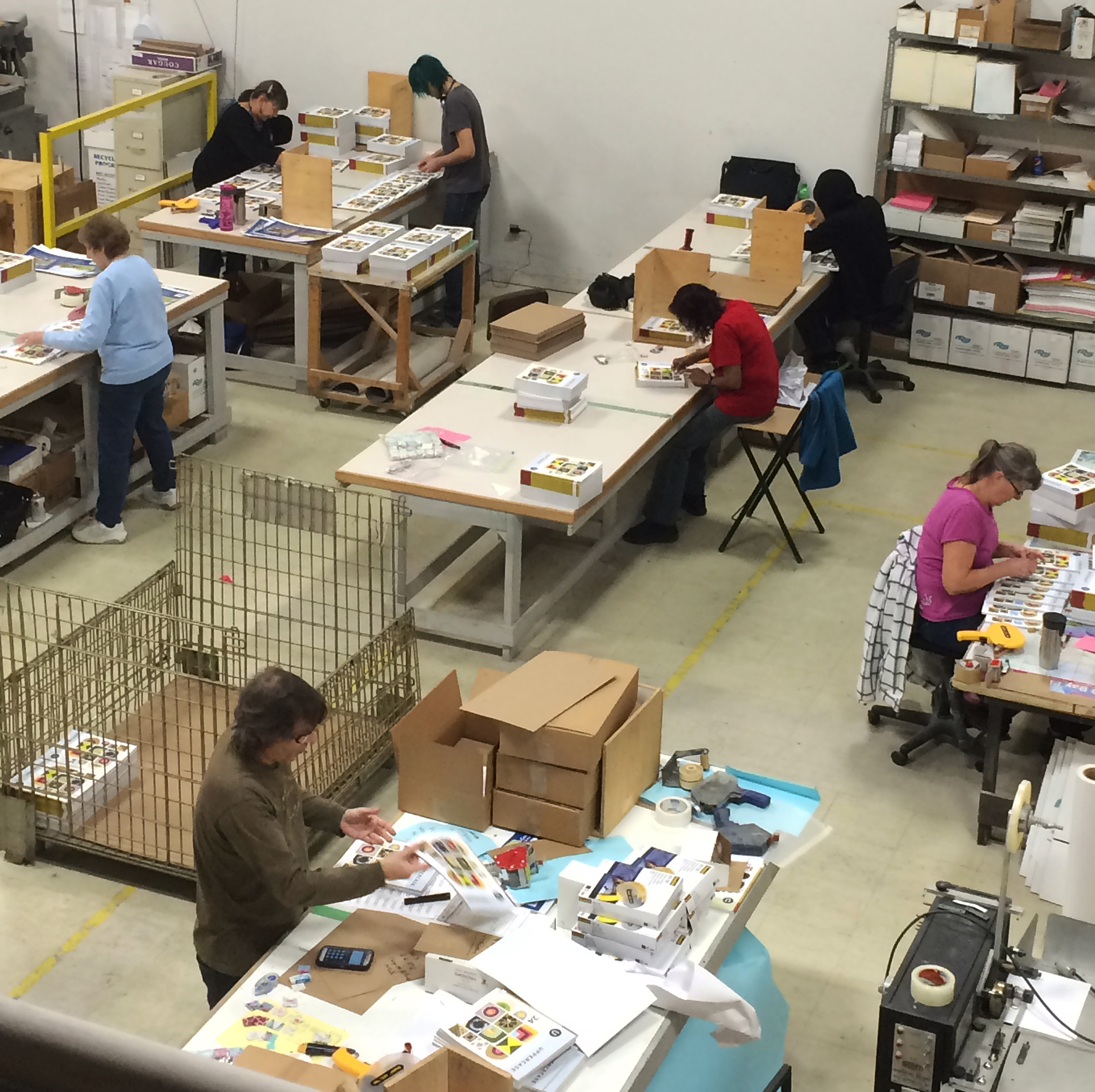
I do love little bits of paper. And stamps? They tell such great stories. The cover is by Richard Benson and features fancy cancels. Subscribers were treated to a glassine envelope of vintage stamps inserted into their issue. Thank you to a dedicated group of stamp-sorting, envelope-stuffing philatelists who got thousands of envelopes ready for subscribers. Get issue 26 here.

UPPERCASE 27: October/November/December 2015  
116 pages

This issue has a focus on new illustration talent as well as articles about creative education, wonder and the secrets to longevity (in a creative field). Get issue 27 here (it's now listed as a back issue, so add it to your cart with other back issues and you'll pay less per issue.) Cover by Brian Hurst.

The Typewriter: a Graphic History of the Beloved Machine
336 pages + 16-page insert

Of all the projects this year, this one was the toughest. I spent three years working on this epic visual history of typewriter ephemera. To say that I'm glad it's done is an understatement. The project certainly tested my stamina and "stick-to-it-iveness", but it got done! And now that I have a few months separating me and all the work, it feels even better. The book got a great full-page review in Canada's national newspaper. Purchase it here. (If you're in Europe, get the book through Central Books.)

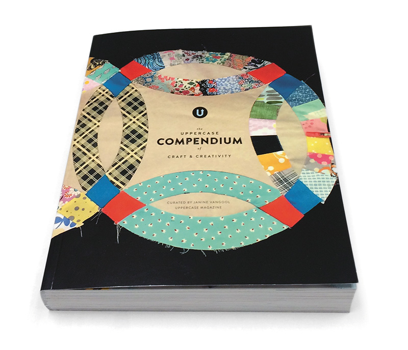
The UPPERCASE Compendium of Craft & Creativity
384 pages

My most recent book project, it was exactly a year ago that this project began with a call for entries in my newsletter. Featuring 66 artisans, artists and craftspeople from around the world, the Compendium is look into what's happening in craft right now. I look forward to doing a second edition... maybe every couple of years? Order it here. (If you're in Europe, my distributor Central Books will have the book in about a month—ask your local bookseller to stock it through them.)

UPPERCASE 28: Jan/Feb/Mar 2016
116 pages

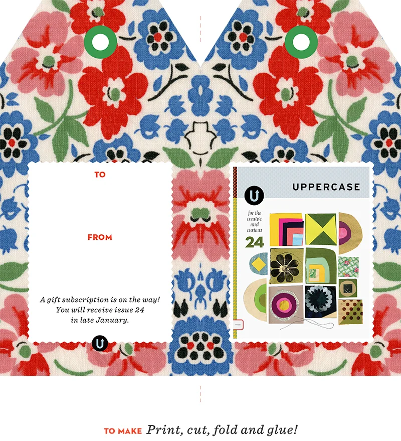
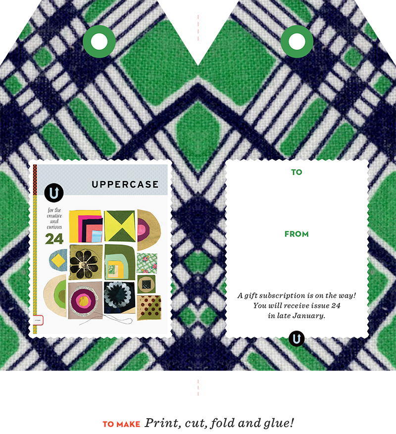
The new issue is mailing out to subscribers right now! It will be arriving in mailboxes in the next few weeks. This was the best year ever for Gift Subscriptions. Well done, Santa! Subscribe here. Cover of old bus tickets from the collection of Kindra Murphy.

UPPERCASE Creative Calendar 2016
32 pages

For subscribers as of December 17, you'll get a free insert of this fun and inspiring calendar. Keep your creativity on track everyday next year. (Subscribe here to be part of future subscriber-only benefits like this.) Cover by Tara Lilly.


With such a busy year behind me I'm really enjoying a holiday pace right now. I've been taking it slow and being crafty. My problem is that with more time to be contemplative and space to think... I keep coming up with new ideas! Three book ideas for 2016? The launch of Little U? Plus all the regular UPPERCASE magazine-y goodness? 

I can't wait to dive in!

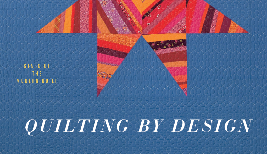
2015 started out with quilts and fabric... and it has ended that way, too! With my very own collection with Windham Fabrics!!! Look for a sneak peek in issue 28.

I'm going to QuiltCon in February. Are you? I will be giving a 30-minute presentation... any suggestions? Want to meet up for an UPPERCASE event?


Calls for Submissions

There are two new open calls for the spring issue. I expect to get a lot of submissions on these topics, so the open call ends on January 15. 

Folded
Submit creative projects in which folds and folding are integral to its execution and design. Projects can be in any material, medium or scale. Submit here.

Book Arts
Book arts, unusual book designs, artist's books, intriguing book formats, books as sculpture, books that aren't books... projects in which the concept of a book is the starting point for creative exploration. Submit here.

QuiltCon's Lasting Impressions

Guest post by Linzee McCray

Churn Dash 2 Complementary by Martha Pederson

QuiltCon 2015 is winding up. Though I couldn’t help but see some of the quilts that were on the edges of the exhibition, near the vendor booths, I decided to save the main part of the exhibition for last. In addition to the quilts accepted for exhibition and judging, there were special displays, including Quilts of Gee’s Bend, Bill Volkening’s quilts from the 1970s, a sampling of the Modern Quilt Guild’s quilts of the month and of Do.Good.Stitches charity quilts.

The Rabbit Hole by Nydia Kennley

Quilts submitted and accepted for entry were juried in a number of categories: Piecing, Applique, Improvisation, Minimalist Design, Small Quilts, and others (you can see them all here http://www.quiltcon.com/quilt-show/categories/).

Lite Brite by Maria Shell

Walking the aisles was both inspiring and intimidating. There were so many ways to consider the quilts, from the concepts behind them to the workmanship and skills used to create them. It was impossible not to think “I’d love to make a quilt like that,” and then wonder if I was capable. It was humbling to remember that while some quilters have art backgrounds or are graphics professionals, others have no formal training. Every now and then I’d see a proud quilter posing in front of her or his piece, a soothing reminder that even quilts that make artful use of color and design might have been stitched by someone who reminds me of my next-door neighbor. Part of what I find so engaging about “successful” quilts is seeing simple, accessible materials—needle, thread, and fabric—wielded by quilters with an eye for color and design. It makes personal, visual expression seem possible for those of us who don’t paint or draw.

For Tanya by Emily Coffey

When it comes to personal expression, there was one quilt in particular that exemplified what is most interesting to me about QuiltCon. Penny Gold’s quilt Self Portrait, Year Two (Beneath the Surface) shares her stark reality of having lost a child: it’s unlikely that this quilt would be welcome in a traditional quilt show. (Click here to view the quilt.) While quilts usually evoke color, warmth, and a soothing tone, this quilt bleakly, bravely, powerfully expresses Gold’s pain. In the same way that Jacquie Gering’s 2013 Bang, You’re Dead quilt, a handgun dripping blood, stirred controversy, contrasting a quilt’s soothing qualities with harsh reality only serves to strengthen its message. Congratulations QuiltCon, for including the quilt and giving us pause, challenging our expectations, and helping continue the conversation about what a quilt is, should be, and can be.

Gina Pina Hometown Quilt

QuiltCon 2016 will be held in Pasadena, California, Feb. 18-21, 2016.


QuiltCon: Panels and Patchwork

Guest post by Linzee McCray

Vanessa Christensen class "Working with Ombre Fabrics", student work

For day two of QuiltCon, I wasn’t up for the 7:45 a.m. yoga session, but did enjoy the Maker to Making a Living panel at 9 a.m. on Friday. Four industry professionals whose experience ranged from a few to 40 years shared their career paths, their aspirations vs. the reality of “making it” in the quilt industry, and the challenges of small-business ownership. While each panelist (Denyse Schmidt, Mary Fons, Heather Givans, and Brenda Groelz) looks for personal fulfillment and a life filled with making things, they acknowledged that making money to pay the rent (or “buy the kitties food” as moderator Jacqueline Sava called it) was of equal importance. I loved hearing these women riff off one another’s comments and acknowledge the satisfactions, but also the hard, hard work that goes into making careers like theirs happen.

Panel: Maker to Making a Living

Next up was one of my favourite lectures: Modern Materials: Quilts of the 1970s with Bill Volckening. This Portland resident found his first quilt rolled up under a table in an antique store and though he didn’t buy it at first, he couldn’t get it out of his mind and returned for it. He was initially seduced by the colors of the quilts of this era, but also became intrigued by the fabrics themselves—Dacron, polyester, and some quilting cottons—and the context in which they were stitched. (He compared one quilt to the painted bus used by The Partridge Family.) A number of quilts from his collection are on the show floor, so it’s possible to admire them in person. They’re pretty wild.

Log Cabin medallion, unknown maker, c.1975 from the Bill Volkening Collection

Tile Blocks, unknown maker c.1977 from the Bill Volkening Collection

Woven pattern, unknown maker c.1979 from the Bill Volkening Collection

Grandmothers's Fans, unknown maker c.1979 from the Bill Volkening Collection

At noon I gave a talk about UPPERCASE and expanded on the story I wrote about feed sacks for issue #24. Audience members ranged from people who had never heard of feed sacks to two women who had worn feed sack underwear as children. I shared a photo of a doily crocheted from the strings used to hold feed sacks shut and an audience member recalled a relative knitting a pair of socks from the strings she’d saved.  Another pulled the loveliest piece of feed sack material from her purse—the pink, grey, and gold apples had such a contemporary feel.

Feed sack example shared by an audience member.

All day long I ran into people who wanted to talk—about quilts, about feed sacks, about fabric, about a quilt they’d seen on the exhibition floor. Those conversations are the real highlights of QuiltCon. Even after the convention center doors closed for the day, Austin was full of people talking about textiles in hotel lobbies and over dinner and drinks. The quilts and the lectures and the workshops provide fodder for getting a conversation started, but the shared love of stitching keeps them going.

On the scene at QuiltCon

Hi there! It's Saturday evening here in Perth and I've had a very busy time at the Writers Festival so far. I'll try to put together an update soon (please join me on Instagram to see what I've been up to). In the meantime, this guest post is from Linzee McCray, reporting from QuiltCon 2015 in Austin, Texas.

Phew! That’s really the only way to sum up the first day of QuiltCon 2015. It started the day before, when nearly everyone on the airport shuttle was going to QuiltCon. Though we didn’t know one another there was an excited exchange of information about lectures we were attending or workshops we’d gotten into: there was the immediate sense of camaraderie that comes of being with those who share a similar passion.

View from above of the quilt exhibition hall.

I started Thursday by attending the awards ceremony. Though it was delayed due to technical difficulties, Modern Quilting Guild board president Jacquie Gering used her good humour to keep the crowd from getting restless. It also provided the perfect opportunity to meet the quilters around me. I chatted with Candy from Virginia, who is a grants-writer and Girl Scout leader with a fondness for African fabrics in her modern quilts. Soon she was photographing the tote bag of the woman in the next row, also stitched of African fabrics, and sharing fabric sources and design inspirations.

Jacquie took the podium once more, and before announcing the winning quilts, she  shared statistics on who was at QuiltCon 2015. Attendees came from 48 U.S. states and 15 countries and were part of 109 Modern Quilt Guilds worldwide. Two quilters from Sangali, India were recognized for traveling 9,134 miles to be there.

Best in Show: "i Quilt" pieced and quilted by Kathy York from Austin, Texas. Image courtesy the QuiltCon website.

Then it was time for the awards ceremony. More than 1,300 quilts had been entered and 359 of those accepted for exhibition in Austin. There were squeals of joy as Jacquie announced winners and those in attendance came on stage for group hugs and photos. The Best in Show quilt was the last announced: “i quilt” by Kathy York. (You can see all award-winning the quilts here.) 

Modern Traditionalism: 1st Place winner "Long Island Modern Sampler" Pieced & Quilted by: Kim Soper from Centerport, New York. Image courtesy the QuiltCon website.

Those attending workshops were already in classes, learning about appliqué, curved piecing, fabric dying, and screen printing. The rest of us ventured out to lectures, the quilt exhibits, and the vendor hall, where it was hard to know where to look first. In addition to buying fabric, patterns, and books, it was possible to get a sewing-related tattoo or wave a ten-gallon hat from atop a giant aqua sewing machine (courtesy of Austin’s Stitch Lab).

Kathy Mack, Bainbridge Island, WA; Susan Hogan, Dallas, TX and Cheryl Jennings, Austin, TX

My UPPERCASE name badge garnered comments. In the conference “swag bags” were complementary copies, donated by Janine, and many who had never before seen it loved it and stopped to talk with me about it. (Remember, until March 31 there is a special QuiltCon discount for new and gift subscriptions and renewals.)

Lectures scheduled throughout the day varied from how-tos (ways to improve your machine quilting or your creativity) to business matters. After wandering the vendor hall I attended a panel discussion about publishing your work, and a session titled “Quilting and the Copyright War” by Rossie Hutchinson. The thought-provoking conversations that resulted continued over lunch with friends I knew best from email—what a treat to be face-to-face with them.

The day ended with a party at Austin’s Mohawk bar, at a party sponsored by Moda fabrics. People lined up along to the block waiting to get in, and though the night was cool, the outdoor areas were filled with QuiltCon folks, taking in the Austin evening sky and chatting more about their workshops, favourite lectures, and meeting friends old and new.

Jacquie Gering seems to have set the tone for the conference at the morning’s session when she said “These days are about celebrating who we are and what we make.” The celebration is definitely in full force.

Meet UPPERCASE's QuiltCon 2015 Correspondent, Linzee McCray

Alas, I can't be in two places at once, so while I'm over here in Australia, Linzee McCray is in Austin experiencing QuiltCon and will be our correspondent on the scene. -Janine

Linzee McCray

Greetings! Linzee McCray, here. I’m a quilter, knitter, embroiderer, and a former weaver and spinner. I’m also a long-time writer and editor who’s had the good fortune to focus on textiles, fiber, and craft for nearly a decade. So I’m especially excited about covering QuiltCon 2015 for UPPERCASE.

I pitched my first modern quilting story in 2009, when I noticed that while traditional quilt guilds had been around for decades, blogs and Flickr were changing the status quo. If modern quilters—those interested in functional quilts influenced by modern design—couldn’t find like-minded sewists down the street, they sought them out online. In January, 2009, Jacquie Gering’s virtual quilting bee, Project Improv, drew 225 participants via her Tallgrass Prairie Studios blog. In October of that same year, the first Modern Quilt Guild meeting took place in Los Angeles. Quilters from geographically diverse regions, including Denyse Schmidt on America’s East Coast and Weeks Ringle and Bill Kerr in the Midwest, were designing quilts with a modern feel, too. All this coincided with a rising interest in handmade goods and DIY.

Linzee's string-pieced quilt

Not surprisingly, fabric-lovers are a tactile bunch, and the opportunity to both touch quilts and meet face-to-face with other quilters spurred the growth of the Modern Quilt Guild. Today, there are more than 100 groups around the world, as well as many individual members. In 2013, the Modern Quilt Guild organized the very first QuiltCon in Austin, Texas, to bring many of them together.

Mod Nine Patch Pattern by Elizabeth Dackson, pieced by Linzee.jpg

I missed that first QuiltCon, which is why I’m especially looking forward to this year’s speakers, workshops, and exhibitions. If you can’t make it, I’ll share some of the excitement and eye candy with you.

Vintage feed sack crazy quilt

If you will be attending, I hope to say hello in person. In addition, I’ll be doing a demo on Friday at 12 noon in Exhibit Hall B, sharing information about UPPERCASE, including a special QuiltCon subscription discount, and expanding on the story about feed sacks that I wrote for the latest issue. Join me to learn more about this remarkable bit of history, which touches on issues of recycling, early marketing to women, and of course, fabric. (Feed sacks so fascinate Janine that she had 10,000 tiny pieces of vintage feed sacks applied to each cover of issue #24. Janine is sending along 10 copies of that issue—come to the demo for a chance to win one!)

3 days, 300 quilts

Rosettes made by Elizabeth Hartman

It's QuiltCon this week! Linzee McCray will be there representing UPPERCASE and will be sending in some blog posts from Austin. For event goodie bags, I've provided 1500 copies of both the current issue and favourite back issues. 

The 300+ quilts that I judged with Carolyn Friedlander and Stevii Graves will be on display. I learned a lot about quilt-making in the process of judging, from the practical to the subjective. I've not actually finished my own quilt yet; I was there as the "outsider" to judge from an design perspective, but when I do dive headlong into quilting (which is inevitable) I will have a lot to live up to!

Three days, 300 quilts

  • Dark fabrics show through light colours. Press your seams towards the dark and use white batting under white fabric to get a clean look.
  • Binding matters! A poorly applied quilt edge can really make a difference in the perception of the overall quilt. There were some impressive examples of binding where the maker had matched the binding colours to the design. Unfortunately, there were also submissions where the binding was literally falling off. Facing the quilt was also an effective design choice.
  • Machine quilting motifs should work to enhance the piecing and be harmonious... or completely contrasting with purpose and intent.
  • Pet hair is never a good idea. A few entries caused fits of sneezes! A few entries were quite full of hair or threads and hadn't been properly cleaned before submission. It's hard to judge an entry when no obvious care was put into the submission.
  • Creating a dynamic and unique composition is harder than it looks. The modern aesthetic pushes the use of negative space in interesting ways.
  • Though pre-bundled fabrics have lovely colour and pattern combinations, unless it's a fabric challenge to specifically use a particular collection, try to mix up the fabric selections from beyond a single source.
  • An extremely high level of craftsmanship and technique is possible—and breathtaking to see—but perhaps was more rare than I was anticipating considering we were viewing quilts to be judged.
  • Be inspired by a variety of sources — quoting "Pinterest" as a design source is not very impressive. My favourite entries had interesting and personal descriptions of how the quilt's inspiration came into play.
  • There was a deep appreciation and respect for all the quilts that were submitted, by the judges and from the entire team at QuiltCon (who where impeccably organized and efficient).
  • Quilts in which the personality of the maker shone through were the most pleasurable to look at—and the most memorable weeks later. 

It's here!

Cover illustration by Andrea D'Aquino

On Thursday, I received my sample copies of the lovely issue 24. It's my favourite issue ever. (Am I allowed to say that? I guess I feel that way whenever a new issue comes out!)

If you subscribed or renewed before January 6, your issues are on their way! For folks who subscribed after the mailing data was sent to the printer, your copies will begin be dispatched just as soon as inventory arrives in the fulfillment warehouses. 

Not a subscriber yet? Now's your chance! Just click here to get started.

Got it covered...

Scenes from my printer, The Prolific Group in Winnipeg, from earlier this week. Thank you to all the busy and skilled hands who applied tape and pasted 10,000 little bits of fabric onto each cover! Thank you to Chris Young for the photos.

Sample copies are on the way to me and shipping is in progress. If you missed being on the first round of mailing, don't worry: you can still subscribe now and your copy will ship just as soon as it arrives at the fulfillment warehouses.

And off it goes!

The files for issue 24 were sent to the printer yesterday. I'll see proofs early next week and then it will be on press between Christmas and New Year's. The handwork of applying the fabric swatches on the cover will happen in the first week of 2015 and then this issue is slated for mailing the week of January 12.

The subscriber database will be finalized on January 6, so get your subscriptions and renewals in before then and you'll be part of the list. Thanks!

Just playing with the cover! A few thousand tiny squares left to cut up.

A video posted by Janine Vangool (@uppercasemag) on

Happiness through typography

I'm working on the 24th issue of UPPERCASE magazine. TWO DOZEN ISSUES! That's over 2700 pages of content that I have designed over the years. This next issue will be released early in the new year and it felt like it was time to do a bit of a design revamp. It's easy to keep doing the exact same thing over and over, but I'm a graphic designer by training and getting to design my own magazine is the fun part of independent publishing. The underlying grid and basic typography is staying pretty much the same, but I'm introducing a new font family to keep myself challenged and to see each layout with fresh eyes.

In previous issues, I was using Bodoni Poster Italic for some of the headlines, but overall I was tiring of how bold it was. The new selection really isn't all that different—it is the Bauer Bodoni family. It's kind of funny that I've selected a typeface design from 1791, but it's a style I've always loved. My design intention with this revamp is to make the spreads feel a little bit lighter overall, a bit more sophisticated but still playful. More places to breathe, little typographic details to delight the eye, some fun typographic touches... all the things that I love about design.

I agonized over which font to purchase (there are so many permutations of Bodoni and of Didone-style typefaces), but now that I've had a few days to get to know it, I am happy with the decision. It works really well with all the existing fonts I use (Sentinel, Tungsten, Neutraface) and with various weights plus roman and italic, there is a lot of possible variation. Certainly room to grow!

Throughout my career as a graphic designer, the typography has always been front and centre to my design process and inspiration. I posted the image above of a page in progress on Instagram and viewer Samantha Epstein commented, "everything about this makes my heart sing". Her comment made me so happy! Yes — beautiful typography does make the heart sing!

And not only is the typography beautiful, the content in this issue is overwhelmingly so! I can't wait to show more as I progress through the design.

It goes to the printer on the 15th of December, so it is going to be one marathon effort over here to get through the design while filling orders and managing customer service. But I'm energized by the new design direction and look forward to each new page.

Make Something Monday

Feedsack quilt block by reader Lisa Courtnage

Happy Monday and Happy December 1st! There's no denying that the end-of-the-year rush is on. Today, let's just catch our breath and get back to doing what we love... making things! 

Today's the day to create a good old-fashioned made-by-hand gift. It doesn't have to be something complicated, just something simple showing your recipient that you took some time. Time is precious; showing someone that you took time out of the busy season to make something heartfelt is powerful and will be appreciated.

Create something that comes from YOU. It could be a handwritten card, a little embroidery on a hankie, some cookies made from scratch, a simply sewn pin cushion, an ornament made from found objects, a collage of pretty pictures, a finger-painting made with your child, a handmade notebook of blank pages with a found-paper cover... just take a look at an issue of UPPERCASE and I'm sure an idea will come to mind.

Stay away from DIY posts and Pinterest! These days, it is too easy to get bogged down into the perceived perfection of Pinterest and the tyranny of step-by-step craft instructions. Today's the day to unplug from these distractions. Comparing yourself to others and following directions can be so detrimental to genuine creativity. Use your own ideas, your own resources, your own ingenuity... you will make something that is from you and your heart.

Make something out of nothing. Be experimental. Be silly. Creativity comes from letting yourself go a little bit. If you worry about stitching a straight line, today's the day to zigzag. Just gather up all your creative supplies onto the table and see what emerges.

Enjoy the process. Making things is a lot of fun! Share what you're up to on Twitter and Instagram #makesomethingmonday #uppercasereader. 

A huge thank you to UPPERCASE reader Lisa Courtnage for the beautiful quilt block made of vintage feedsacks. She writes, "I saw your request for feedack fabric on your blog. I found a vendor while at the International Quilt Festival in Houston who was selling charm squares of feedsack fabric (5 inch squares) so I snagged a few packs. I have enclosed 419 one-and-a-half-inch squares. Also made a mini-quilt block with the leftover scraps... that is how quilts were made back in the day!" Once again, I'm amazed and inspired by the generosity and talent of UPPERCASE readers. Thank you, Lisa.

My son was with me at the office when I received Lisa's package of feedsacks. He was instantly enamoured with the quilt block and wanted it for his teddy bear. I have other plans for the block, so I suggested that we make teddy his own special blanket. All my sewing supplies are here in the office so Finley selected a favourite feedsack square from Lisa's packet and we went to work. My mother-in-law had recently downsized her fabric collection and I acquired some of it, so the blue and white fabric was at-the-ready. The train fabric was purchased from a thrift store on a car trip home to Saskatchewan some summers ago. Finley helped by sitting under the table and pushing on the sewing machine pedal or by taking out the pins as needed. Within an hour, we had a cute but wonky tiny blanket and a happy mother and son. We'll both cherish the blanket for the stories of how the fabrics were chosen and the fun we had putting it together. I think teddy liked it, too.

Speaking of quilts, I'm excited to tell you that I'll be one of three judges for next year's QuiltCon! I look forward to spending three days surrounded by beautiful quilt designs.

Have a lovely day making something!

It's the next cover!

It is my great pleasure to unveil the cover of the next issue! Featuring a collage by Andrea D'Aquino, I am overjoyed with this design for an issue that will explore the modern quilt movement plus the creation and modification of surface through tattoos, weaving and more.

See that swatch of patterned fabric on the right? That's going to be an actual piece of vintage feedsack fabric hand applied to each subscriber cover. Be still my beating heart!

I can't wait to see how the collage changes a bit with each different piece of fabric. It will be delightfully random. Thanks to the many wonderful readers who have sent in feedsack swatches! If you're planning on sending some, the details are here. If you could also please send me an email with the quantity of squares you're sending so that I can keep a tally that would be helpful. We're pretty close to the goal of 10,000!

Oh, and another happy thing? Tattly is generously providing some temporary tattoo goodies in each subscriber copy of issue 24. Subscribe or renew today to get all these special touches!

Vintage feedsack squares... times 10,000?

The theme of the winter issue (out in January) is "the creation and modification of surface". In this issue, there will be profiles of modern weavers and tapestry artists, how graphic design informs quilt design, using scraps/scavenging materials, flea market treasures, the history of vintage feedsacks and their contemporary reuse, plus 'tattooed artists’ profiles with illustrators, crafters, artists who have tattoos. 

I'm excited to share that Andrea D’Aquino will be creating the illustration for the cover. My vision is that each copy will have a swatch of authentic patterned vintage feedsack fabric adhered to the front cover. It will be a random square, applied by hand, enhancing Andrea’s collage artwork and providing both a nod to the content within and also the theme of modification of surface. I love the element of chance in the design as well, since the colour and pattern of the feedsack is an unknown variable. It’ll be gorgeous, exciting, random and unique!

I’ve scored some feedsacks on eBay (photos above), but I’d love your help. We will need thousands of squares (roughly 1.25” square) to ensure that each cover has this special feature. In the spirit of old-fashioned quilting bees, let’s make this into an UPPERCASE community project. If you have some feedsacks scraps that you’re willing to spare, please cut them into 1.25” squares and mail them to me by November 30.

I’m also going to save at least one square from each reader-submitted package, which will be incorporated into a quilt!

Send your squares by November 30 to:
UPPERCASE publishing inc
Suite 201b - 908 17 AVE SW
CALGARY AB CANADA T2T 0A3