love or no love?

LOVE LOVE LOVE by UPPERCASE The poster I designed in 2009 and sold via my website. It was designed by typing the word love with various pressures on my Royal typewriter and then scanning and enlarging the results. See the original blog post here.

LOVE LOVE LOVE by The Gap This week, Eleanor came to work wearing this shirt. This isn't a new shirt, she recalls purchasing it maybe three years ago which would place both designs to the same time period (and right when my posters were making the blog rounds). This design from The Gap uses various weights of the font Trixie. 

What do you think? Creative coincidence or lazy knockoff? Love or no love for The Gap?

However this tshirt came to be, it is old news now. And that's the thing... it is so difficult to police your designs once they are out on the web and in the world. If Eleanor hadn't worn the shirt to work, I would have never seen this design so very similar to my own. In the course of design career, my work has been copied and blatantly ripped off a few times. Unfortunately, there has been a case quite recently where I could very obviously trace the path from my work directly to some other company's product. In fact, I could overlay their design onto my original and trace the similarities in fonts, angles and placement of elements—let alone that the overall impression of the design was that it looked like it was by UPPERCASE. I sent polite but firm letters to the offenders, consulted with a lawyer and was very disappointed with my lack of choices to see the wrongs made right. Ultimately, I decided that I could not commit the time, emotional energy or funds to pursue it and I had to just "let it go". But the disappointment lingers and I wonder how the infringement will affect my income. It is very hard to let it go.

NOT LETTING GO: ANOTHER TSHIRT TALE

Modern Dog is a Seattle-based design firm who is standing up to the big guys in another case of infringement on a tshirt. They have chosen to fight, at considerable expense and effort. In order to offset the costs, they have set up a website which accepts donations to help in their legal bills. I made a small donation to show my support. 

Modern Dog writes: "Compelled to make things right, we entered into a lawsuit that is now a year in the making. If anyone had asked me a year ago if I thought this case would drag out for months, I would have said no. I naively believed that this case would be settled in a few weeks.

Boy, was I wrong.

We find ourselves in a battle with some of the biggest corporations in the world, and we have no idea how long and hard they intend to fight as they have seemingly unlimited resources. Our jury trial date is not until September 2013, in that time the process could easily bankrupt us. We need money to see this case go to trial; money for depositions, forensic accounting, expert witness testimonies, and other expenses related to the case.

In June of 2012, I made the decision to sell our Greenwood house, partly to reduce our overhead expenses, and partly to fund the lawsuit. I realize now that we are in it for the long haul. I cried the day I handed the new owners the keys, but I also felt a sense of relief because I knew that I personally would be able to help my company fight."

Please help the underdogs.

And do your part when it comes to respecting intellectual property. Know the difference between inspiration and infringement. Don't put images on Pinterest if you don't know who created them. Don't repin or post without attribution. Give credit where credit it due.

DesignThinkers: Stefan Sagmeister

"Actually doing the things that I set out to do increases my level of satisfaction."

Stefan Sagmeister was likely the biggest draw for conference attendees since he does have that 'rockstar' graphic designer status. I have heard Sagmeister present twice before; the first was a great presentation about his first sabbatical from working. The second presentation he must have been seriously jet-lagged because it was a dull and sleepy talk. Third time was a charmer, as Sagmeister talked about The Happy Film and his clues to happiness and satisfaction. 

Things that make Sagmeister happy:

• thinking about ideas and content freely — with the deadline far away

• traveling to new places

• using a wide variety of tools and techniques

• working on projects that matter to me

• having things come back from the printer done well

• designing a project that feels party brand new and partly familiar

• working without interruption on a single project

• getting feedback from people who see our work

"I do more of the things I like to do and fewer of the things I don't like."

I am very bad at predicting what will make me happy in the future. It's like going to a supermarket when you're hungry and you buy too much stuff.
Presenter tip: rather than imagining the audience naked, just start out by showing a picture of yourself naked.

DesignThinkers: Julia Hoffmann

Julia Hoffmann is MoMA's creative director. As the head of the in-house design team of 6 designers and some freelancers, she handles brand identity and exhibit graphics, advertising, signage, collateral, etc. I found her talk quite interesting since during my freelance years I did design work for much smaller cultural institutions such as the local opera as well as art galleries. Some points taken during her presentation: 

They think of the opening graphics to an exhibition as mini brands or book covers to entice visitors into the gallery.

"First think, then design."

The MoMA considers other cultural institutions their "competitors".

"It is the spectators who make the pictures."

—Marcel Duchamp

The MoMa typeface is a Gothic Display created in 2004 by Matthew Carter. It is based on Franklin Gothic. By using one typeface (with creative variations as shown above) the designers can focus on the content itself—and not have to have arguments with curators or artists about what typeface is most suitable for each unique exhibition.

Under the theme of 'design thinking', Julia shared a project that the museum undertook this past summer in an effort to get more American tourists to the MoMa. It was a project large in scope with outside consultants and multiple departments offering input. In the end, it was realized that "you can't be everything for everyone" and this red flag signalled a campaign destined to be ineffectual. What was missing in the failed project was "the gut"—there was too much analyzing, too many voices and opinions through committee to create a unified message. So though designing and thinking to various degrees are always necessary, you have to leave room for emotion, intuition and randomness. "We use the designing and thinking to rationalize our gut," Julia stated during her presentation.

Some other words of advice? Speak up and don't be shy when it comes to design. Question the brief... does it make sense? Challenge the vision of non-designers and ask them to trust you.

The relationship between client and designer is always a little bit of a dance.

DesignThinkers: Design Army

Pum and Jake Lefebure

Jake and Pum Lefebure are the husband and wife duo leading Design Army, a successful firm located in Washington, DC. The presentation was divided a bit like "his" and "hers". He takes care of business development, but it seems that she is in charge of the creative vision. A behind-the-scenes video showed the pair at a photoshoot, with Pum communicating the vision and attending to details and Jake with a coffee in hand, sometimes napping. It seems that they play this dynamic up for effect and judging from the caliber of their work, there are no slackers in the Design Army. Their style is a combination of highly art-directed stylized photography with boutique custom typography.

Pum Lefebure with Design Army's work for Neenah Paper.

Washington Ballet

Washington Bride and Groom magazine spread.

Design Army is active in promoting their firm and their partnership (mainly through styled photographs of themselves) published in DC lifestyle magazines and design journals. They are also advocates of entering their work in design annuals and claim to get a lot of new business through the exposure. They believe that if you exert the effort and cover the cost of producing great imagery for use by the media, it will pay off in free publicity because many publications are looking for quality images under time and budget constraints. As a publisher, I would agree with this statement—though the glamorous, styled image that Design Army projects isn't the UPPERCASE aesthetic, I do look for high quality images. 

    If you'd like to be featured in UPPERCASE, here is what I look for when reviewing submissions:

    • Clear, succinct, informative writing 

    • Object photos are well-lit on a simple backdrop (white is nice) or shown in-situ

    • Illustration previews as good scans or as jpg files

    • Intriguing workspaces that show the creative process

    • Photos of the artist or artisan either against a simple backdrop or shown in his/her studio

    • High resolution image files easily available through a provided link (i.e. don't send or email high res images without asking!)

    • All relevant (working!) links and contact information

    Please also follow the submission guidelines here. >>>

    type tuesday: The Heads of State at TypeCon

    The Heads of State are masters of saying a lot with very little—and without sacrificing style or visual interest. They're special presenter's at this summer's TypeCon in Milwaukee:

    "For ten years, Jason Kernevich and Dustin Summers have been working together as The Heads of State for clients as diverse as The New York Times, Starbucks, the School of Visual Arts, Penguin, and bands like R.E.M., Wilco, and The National. Throughout those years they’ve had an up and down relationship with typography. This talk will feature various typographic tales in which our heroes fall in love with letters, rebel against fonts, forsake letterforms to become illustrators, and then beg for forgiveness."

    Are you going to TypeCon this year? We're looking for a few correspondents to report back for the blog. Leave us a comment with your website or send us an email for more details.

    Shoegazing Notecards featured at Papyrus

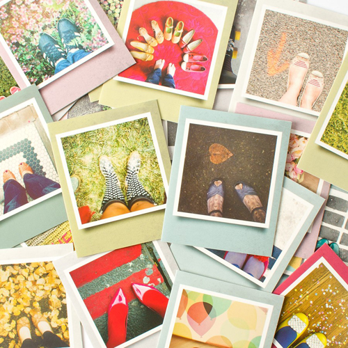
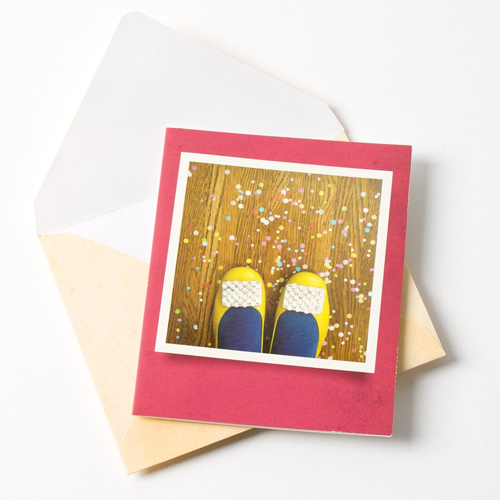
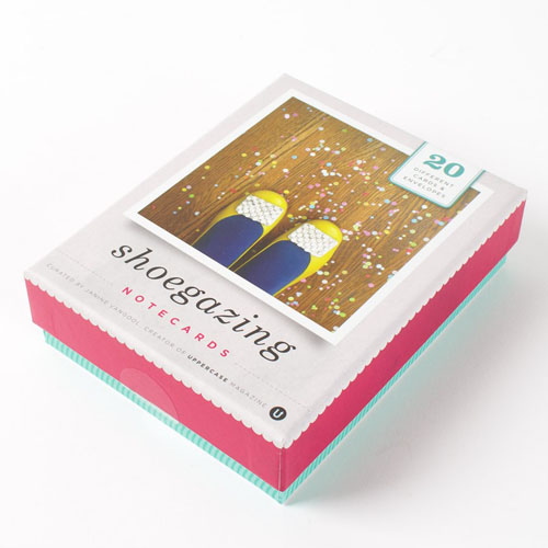
    This happy assortment are the Shoegazing Notecard designs from the set I curated and designed with Chronicle Books.Pretty shoes and confetti—a combination suitable for lots of occasions or even an everyday hello.The pretty box with a scallop motif.

    Kate Woodrow, who was my editor at Chronicle Books on this project, emailed today to share that our Shoegazing Notecards are nicely featured on the Papyrus website. (Check them out in the banner!) Papyrus is also having a big sale: buy one stationery set, get one for 50% off. So, start with Shoegazing Notecards and perhaps the lovely Polaroid set as well?

    Surtex: a learning experience

    Image by Mark Hoffmann, represented by i2i Art Inc.

    Shelley Brown reports from NYC:

    There's lots to learn about surface design and the more you learn, the more you discover it's just the tip of the iceberg!

    The past two days I've attended seven seminars at Surtex. Some of the info covered challenges the right brain big time, and the seminars are held in underground suites away from the hustle and bustle of the show. There's no eye candy here, just the nitty gritty stuff. It's important, though, for anyone thinking of pursuing the business of surface design. Each session was an hour and a half long and included lots of Q+A.  It's great to get real specific answers to your questions.

    Day 1: 

    • The Basics of Art Licensing - Part I + II, and 
    • Understanding Legal Basics - Contracts and Copyrights

    Day 2:

    • New Legal Strategies - Royalties, Terms and More
    • Strategies for Working with Manufacturers
    • Futurecast:  Business Trends in Art Licensing
    • Understanding and Enhancing Retailer / Manufacturer Relationships


    Some of the educational highlights from the Surtex seminars: 

    Licensing is a $192 billion dollar business worldwide.

    The artist is the Licensor and the buyer of your art (usually a manufacturer or retailer) is the Licensee.

    The business is changing but there are always opportunities for great art.

    It's not absolutely necessary, but it's preferable to register your copyright on any art you have licensed (in case of any infringement). To save money, don't register everything you create until you license it. 

    You need to be prolific because it's best to have lots of samples to promote yourself to potential Licensors.

    If you're looking for an agent, make sure you choose someone you get along with. Good communication and transparency make for a good marriage (in life and in the artist/agent relationship!).

    If at all possible, try to get your name on any products you license.

    When you're selling your art to a manufacturer or retailer, get an advance and royalty as part of your license agreement, if possible.  

    The average royalty is 5% - 7% for household products, and up to 10% for paper goods or wall decor. 

    Words to avoid in a contract: assignment, all rights and work for hire.

    It takes about 1-2 years to get to know and achieve some level of success in surface design, so don't get discouraged a few months in.

    Before you do a deal with a licensee check their reputation. Do they send royalty statements on time and pay royalties owning according to their agreements?

    Before you sign a licensing agreement, have a copyright lawyer who specializes in licensing review the contract.  

    Beware of exclusivity and make sure it is only for a narrowly defined category.

    Don't be afraid to conduct an audit (through your copyright attourney), if you have reason to believe your royalties are not being correctly reported. In most royalty agreements you should receive a statement quarterly. 

    There is a great online tool for finding your images which may be in use without your permission. It's called TinEye. Go to tineye.com and do a reverse image search on any of your images.

    Familiarize yourself with a manufacturer or retailer's style or brand before you approach them with samples. Also find out in what format and how often they prefer you submit your art. 

    Attend a show like Surtex. Take the seminars to learn as much as you can about the business.

    Inspiration: Lucienne Day

    Lucienne Day, circa 1952The work of Lucienne Day inspires a lot of contemporary interpretations, but it always worthwhile to know more than the surface of a designer's work. Day's work is part of Designing Women: Post-War British Textiles: a current exhibition at the British Textiles Museum. The book Robin and Lucienne Day: Pioneers in Modern Design by Lesley Jackson (Chronicle, 2001) is also worth adding to your library.

    Around the web:

    • Lucienne Day 1917-2010, remembrance in the Guardian

    • Robin Day obituary

    • An interview and home tour of Robin and Lucienne Day with Wallpaper magazine, December 2008.

    • V&A Lucienne Day archives

    Classic Textiles' reissue of some iconic designs


    CalyxLapisFall

    Ducatoon

    photo by Anne-Katrin Purkiss

    Surtex coverage!

    When Alanna Cavanagh offered to be the UPPERCASE correspondent at Surtex of course we said yes! And even better, Alanna's rep from i2i Art Inc, Shelley Brown, will be sharing her experiences as well. The two have travelled to NYC from Toronto and will be sending in their daily recaps. Surtex is THE place to go to buy and sell licensing of art and design and I know that many of you aspire to be represented there some day.

    To set the mood, here are some of Alanna's pattern designs:


    National Stationery Show: Blackbird Letterpress

    An instagram of the Blackbird Letterpress booth at NSS.

    I'd like to thank Kathryn Hunter from Blackbird Letterpress for all her support of UPPERCASE magazine — she's an avid reader, takes lovely photos of the magazine on location in Louisiana, provided samples for our letterpress issue #8, and advertises in our pages as well.

    We wish her much success at the Stationery show in NYC.

    These animal cards are great for including paper gifts like birthday money."Get Whale" funny pun!hmmm...this "missing U" card could make a good reminder for former subscribers who've forgotten to renew!

    National Stationery Show: Happy Cactus

    The National Stationery Show is the ultimate destination for a lot of small papergoods companies. At the show, they'll be exposed to buyers, media and potential partners from across North America—contacts that could determine the future of their creative business enterprise. Happy Cactus Designs is a new company, less than a year old, and this is their first time at the big show. Proprietor Brannon Cullum has a good post on the Happy Cactus blog about her road to the NSS.

    The name of a stationery company can go a long way in helping the success of a brand. The name should communicate the aesthetic style, appeal to its audience and denote quality. The Happy Cactus name suits the friendly illustrative style of their cards. Brannon explains the name:

    So just where did the name for the design studio originate? While living in New York City, Brannon bought a tiny one-inch tall cactus to remind her of her Texas roots. With loving attention (and a lot of sunlight), the little cactus grew into a thriving plant…a very happy cactus indeed! Now in Texas, the happy cactus is enjoying the warm Texas sun. Just like the plant, Brannon’s goal for the studio is to take her tiny seed of an idea for a paper goods company and grow it into a line of products that bring color and happiness to everyone. 

    Best wishes, Happy Cactus, and all the new companies debuting at the show!

    Calling all fearless designers

    Chicago's Firebelly Design came up with an interesting solution to all the internship requests they receive. Camp Firebelly, an intensive apprenticeship experience like no other, was created for 10 talented folks looking to break into the design profession and use their powers for good. Camp Firebelly challenges students and recent grads to address social issues through a collaborative project of their own design.

    Are you a fearless and highly talented designer? Get your application in by May 4.

    In rainbows

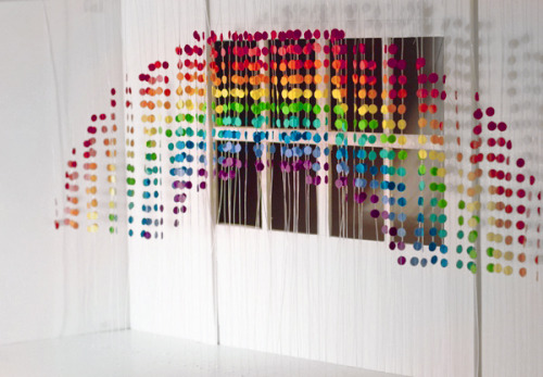
    Sitting here in the Calgary airport awaiting my flight to the UK, I've been browsing the websites of some of the folks who RSVP'd for next Friday's Meet and Greet at Ray Stitch (see the sidebar at right for details). Pui Yee Cheung has a nice design portfolio and this rainbow fits our weather theme of issue #13. This rainbow invite, below, is quite clever.

    See you on the other side of the ocean!