the unique artwork of Laura Buchanan

Laura Buchanan was featured in our Surface Pattern Design Guide for her nostalgic and humorous patterns.

"My work explores the link between nostalgia and contemporary design through colour, photography and pattern. I am influenced by mid-century modern and Scandinavian design as well as the Irish designer Orla Kiely," says Laura. 

To see more of Laura's colourful collection, take a look at her website here

sparks fly at Camp Firebelly

Chicago design company Firebelly is preparing for their 6th year of Camp Firebelly and are searching for ambitious, fearless, amazingly talented, and ready-for-anything young designers to help them make great designs. 

Nick Adam writes, "Camp Firebelly promises non-stop adventure in good design for good reason. We anticipate long days (seriously) and a ton of work. But don’t worry, we know all design and no play makes for stir-crazy campers and crabby counselors. So we’ll have plenty of chances to find inspiration, build camaraderie and develop our creative skills too. There will be secret field trips, surprise guests and a view of the Chicago design community only 9 others will ever say they got to experience."

Applications are due May 9. Click here to download your form

Werner Design Werks: timeless design

I've admired Werner Design Werks' design portfolio since I was a design student in college. Sharon Werner's typographic skills combined with an intelligent approach to design problem-solving makes her work seem timeless — even years (yikes, decades?) later, the projects created by Werner Design Werks that I admired back then are still appealing today.

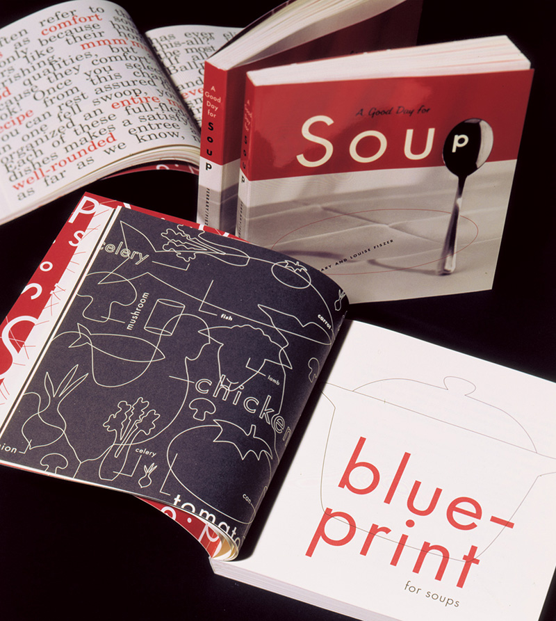
"A Good Day for Soup" was designed by Sharon Werner and published by Chronicle Books in 1995. As a fresh design college grad, I remember admiring its gorgeous and perfectly tomato-soup-coloured red ink on uncoated paper. The book design still looks fresh!

Sharon Werner and Sarah Forss are the small team that have been the mainstay of Werner Design works. Through hard work—combined with their great deal of talent—they have built a strong body of work and set themselves as an important anchor in a design aesthetic that began regionally in Minneapolis-St. Paul in the mid-nineties.

Sharon, during our visit in 2011.

In the early 90s, there was a distinctive design trend emerging from the Minneapolis area. It was a vernacular style that married a workhorse aesthetic with typographic prowess: bold type, simple colours, deliberate misregistration, butcher paper. French Paper was the trendiest stock option and retro-pop line art was being captured from the public domain by Charles S. Anderson. At the time, I was an eager visual communications student at the Alberta College of Art devouring design magazines. Before blogs and Behance, it was the print triumvirate Communication Arts, How and Print that informed the impressionable. Through their pages, I came to admire designs by Sharon Werner.

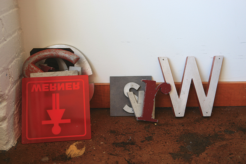
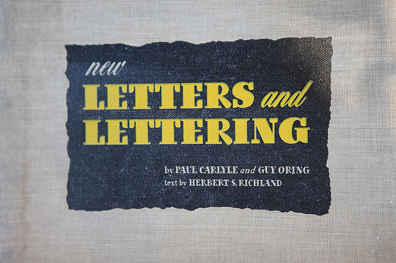
The Werner Design Werks studio is full of books, bits of signage and vintage inspiration.

After six years working for Duffy Design, Sharon founded Werner Design Werks in 1991. Her work appealed to me because the designs were a little quieter and a bit more feminine that the rest of the “guys” profiled in the magazines. I remember checking out a cookbook she designed (A Good Day for Soup, Chronicle Books, 1995), not for the recipes, but to admire the perfectly tomato soup–coloured ink and the delicious typography. When I graduated from college and started my own freelance design pursuits a few years later, I continued to follow Werner Design Werks' output for visual inspiration and also as encouragement for being a female entrepreneur in what was then a seemingly male-oriented industry.

Examples from Alphabeasties.

Issue #14 is still available as a back issue and features a special section on children's book illustration. Cover by Jon Klassen.

A dozen or so years on, Sharon and I connected through email and postal exchanges. I had been sending her the UPPERCASE directory of illustration and she was reciprocating with her amazing Alphabeasties series of books. In 2011, I was thrilled to finally meet Sharon in her St. Paul office and have a face-to-face chat (and a snoop through her spacious studio). Thinking back to my 20-year-old art-student self, I could not have fathomed that a few decades later I would be publishing a magazine and featuring one of my design heroines within its pages!

Our visit was profiled two years ago in issue #14 (2012) of UPPERCASE, but I've never shared some of the photos I took of that visit—until today! I was prompted to share them in honour of Werner Design Werks' new website, one that shows off current projects, like this identity for Caryn Model & Talent Agency, but also highlights the many projects that helped define the company over the years.

Identity design for Caryn Model & Talent Agency

Identity design for Caryn Model & Talent Agency

Sharon admits that it was quite challenging to decide what to include in the new website: "To edit and select 23 years worth of projects was an arduously difficult task of deciding—what makes the cut?" she explains. "We’re firm believers that you're only as good as your last project! But we also believe our history and experiences make us who we are today. They inform how we think and approach a project. With that in mind we created an archive section for the oldies but goodies. It was similar to going through your closet and if you’ve not worn (or referenced) it in the last 2 years, it goes into the give-away box."

Congratulations to Sharon and Sarah on the new site—and my thanks to them both for their hospitality and support of UPPERCASE projects over the years. Cheers! 

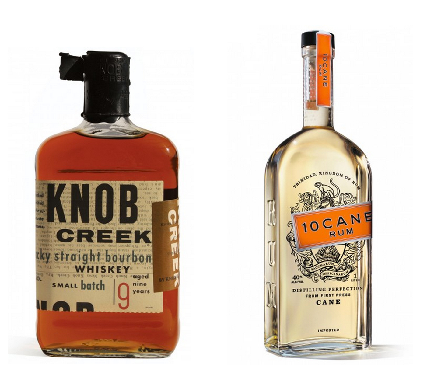
Some iconic spirits packaging. Knob Creek was produced while Sharon was at Duffy Design Group.

ceramic adventures with Mariko Paterson

Jessika Hepburn walked four short blocks from her home in Lunenberg Nova Scotia to interview ceramic artist Mariko Patterson. Mariko moved to Lunneberg in 2013 from Gabriola Island, BC, after a sudden change uprooted her studio. Mariko took a huge leap across Canada to a town she didn’t know when a friend told her moving anywhere else was “too safe”. Instead of safety she chose adventure, bought a heritage house, set up studio in an outbuilding, found new love and got busy making a creative life. 

Mariko's studio is a cheerfully cluttered eclectic space that mirrors her personality. Tucked away in a cozy period outbuilding, the studio is painted white and green to match her 1885 Victorian house with plenty of gingerbread trim and mansard roof. Inside the studio the walls are painted a cheerful yellow called American Cheese and are covered with photos, letters, sketches of dogs and donuts, and bits of ephemera. A big bank of shelves in the back holds Mariko's finished work while a huge canvas-covered table filled with glazes, paintbrushes and clay bodies in different stages of completion takes up the centre of the room. A smaller kiln and a much larger new kiln have a special place in the back. It is an efficient space, and if the amount of work on the tables and shelves is any indication, it is a well-used one.

Do you identify as an artist and a maker or do you feel there is a divide between art and craft?

I like straddling both worlds—the academic and the maker. I've noticed that the older generation of artists often do not like the words crafter or maker. They want to be known as artists. They'll get into the craft-versus-art debate so easily, all you need to do is pick a bit, but I see makers out there doing art and farmer's markets and making a living. I participate in studio tours and gallery shows, but for me markets and social media like Pinterest are really the best for sales and marketing. 

What tools are essential for you to create?

I don't need much more than a canvas-covered table and some clay. I do mostly hand building with little snakes of coiled clay that I push into shape. Though all my mugs are wheel-thrown I'm not a potter who throws on a wheel. Eventually I might move to another form but I'm slow to change, like a glacier. I travelled for so many years that I try to keep things really low key. I have a glaze line that I love and a few brushes, but that is about it. 

How do you create your pieces? 

I hand-build them and wait until the clay gets leather-hard, then take a calligraphy pen and start drawing. I use a piece of plastic wrap that I trace the outline of my illustrations onto with a permanent marker, lay it on, take my wooden tool and lightly trace the drawing onto the clay. Then I'll incise the artwork with a calligraphy pen, put a black wash over top, let it harden and wipe it back with a sponge. Afterwards there is this entire process of sanding and smoothing that never ends, glazing, adding decals, and then firing, firing, firing.

What is your favourite part of the process? 

I think it is putting the image on the mugs, when I get to the part where I put the black stain on it before it is even fired and all of a sudden it just comes to life. Then I go, “Aah, you are with the world.”

This excerpt is from issue #21 which also includes profiles of eclectic creatives in Bangkok, the UK and Sweden. Subscribe here.

Araceli Robledo: inspired by UPPERCASE

Araceli Robledo is a Spanish born ceramic artist living and working in Sydney, Australia.

"My passion for ceramics started in Toronto, after attending a foundation pottery course. I had been drawing all my life and saw the pots I was creating as the perfect canvas for my illustrations," says Araceli. 

The Owen Jones patterns in issue #21 were Araceli's inspiration for her tea cup sketch.

We came across Araceli's work when she tagged us in one of her Instagram photos. Be sure to tag us @uppercasemag with the hashtag #uppercaselove when you post images of your work so we can see your creative artistry, too! 

Thanks, Araceli, for spreading the UPPERCASE love! 

issue #21 cover girl Molly Hatch

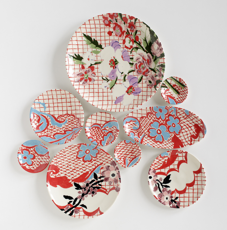
Issue #21's cover artist, Molly Hatch, is an award-winning ceramicist from Northampton, Massachusetts, whose work ranges from plate paintings to notecards. Her beautiful creations are sold at Anthropologie, Galison, and Chronicle Books. Molly's ceramic painting Lyon Silk: Grid was perfect for the cover of our form, function and ornamentation issue as she effortlessly blends decoration and purpose.

Molly studied painting, drawing, printmaking, and ceramics at the School of the Museum of Fine Arts in Boston, and in 2000, received a Bachelor of Fine Arts. Eight years later, Molly obtained a Master of Fine Arts in ceramics at the University of Colorado. In 2009, Molly was awarded the Arts/Industry Residency in Pottery at the John Michael Kohler Arts Center in Wisconsin.

photo by Mike Jensen

In February, at The High Museum of Art in Atlanta, Molly presented Physic Garden, a "plate painting" comprised of 456 dinner plates that reached two stories high! Physic Garden is currently installed in the Museum's Margaretta Taylor Lobby. You can watch the installation of Molly's two-year project here

Molly has some upcoming events that we would like to share with you: 

Lyon Silk: Grid, Issue #21's cover piece will be exhibited at the Spring Masters 2014 at the Park Avenue Armory opening May 1-4.

On April 30, Ben Carter, the host of Red Clay Rambler podcast will be airing an hour-long interview with Molly about. You can listen to the podcast here. 

Also, Molly is currently working on a collaboration project that will be released mid-summer with Chasing Paper, a removable wallpaper company based in New York City. 

Be sure to follow Molly on twitterfacebook, and Pinterest as her career continues to blossom! 

They Draw & Travel contest winner: Natalie Very B.

Congratulations to Natalie, the winner of the "It's a Creative & Curious World" contest with They Draw & Travel! Natalie has won a year's subscription to UPPERCASE, a copy of Work/Life 3, and will be featured in an upcoming issue of UPPERCASE.

Natalie Very B. Favourite Place: NYC "St. Stevens court seems to be just a typical residential area of Toronto, but to me it's filled with sparkles and magic of existence. It means "home", love, friendship, family, and all those precious m…

Natalie Very B. Favourite Place: NYC "St. Stevens court seems to be just a typical residential area of Toronto, but to me it's filled with sparkles and magic of existence. It means "home", love, friendship, family, and all those precious moments spent together. Every day becomes an adventure in our Curious Court."

They Draw & Travel contest runner up: Dave Douglass

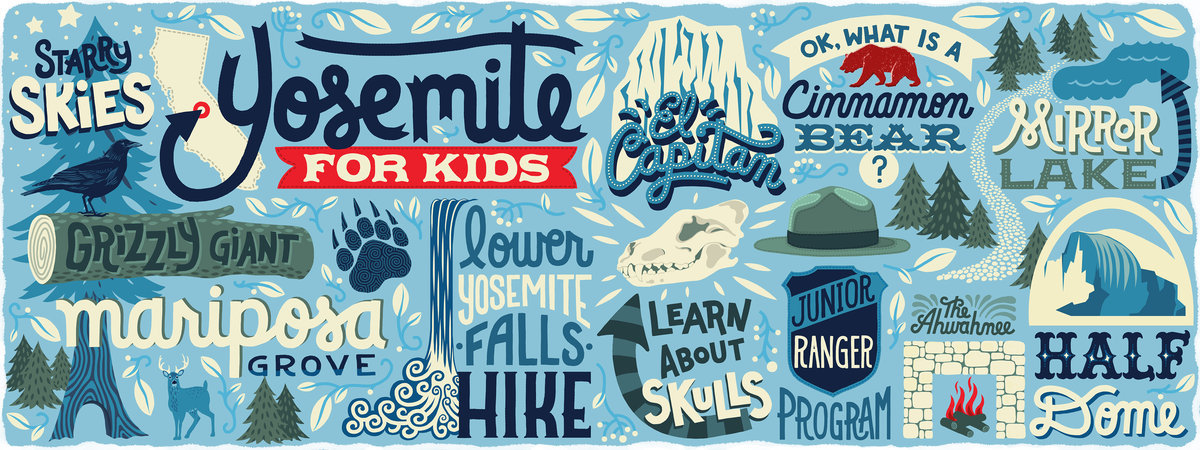
Dave Douglass Favourite Place: San Francisco, USA "I recently took my wife & kids to Yosemite National Park in California... What an amazing and inspiring place! I had to put all the kid-friendly activities we enjoyed into a map."

Dave Douglass Favourite Place: San Francisco, USA "I recently took my wife & kids to Yosemite National Park in California... What an amazing and inspiring place! I had to put all the kid-friendly activities we enjoyed into a map."

"I live in South Pasadena. It's a favourite for film & television productions because of it's beautiful Craftsman-style homes, friendly small-town feel and proximity to the film industry. I've been learning about some fun shooting locations used…

"I live in South Pasadena. It's a favourite for film & television productions because of it's beautiful Craftsman-style homes, friendly small-town feel and proximity to the film industry. I've been learning about some fun shooting locations used in some pretty memorable movies."

They Draw & Travel contest runner up: Aunyarat Watanabe

Aunyarat Watanabe Favourite Place: Bangkok, Thailand "These are my favourite pastry shops in Tokyo. I especially love the apricot cake from Cafe Zinc. (in the lower left corner) It really goes well with their coffee. Please come to Tokyo and en…

Aunyarat Watanabe Favourite Place: Bangkok, Thailand "These are my favourite pastry shops in Tokyo. I especially love the apricot cake from Cafe Zinc. (in the lower left corner) It really goes well with their coffee. Please come to Tokyo and enjoy these cute and colourful cakes!"

"When I lived in Sydney, my favourite place was Taronga zoo! The Zoo has animal shows, keeper talks, and animal encounters all day. The best way to arrive at the zoo is via ferry from Circular Quay. Once you arrive at the port, you can catch the rop…

"When I lived in Sydney, my favourite place was Taronga zoo! The Zoo has animal shows, keeper talks, and animal encounters all day. The best way to arrive at the zoo is via ferry from Circular Quay. Once you arrive at the port, you can catch the rope way known as Sky Safari! It gives you magnificent views of the zoo and the harbour. You can even camp in a safari tent in the zoo, so why not try the Roar and Snore! Sleeping in the zoo is fantastic!"

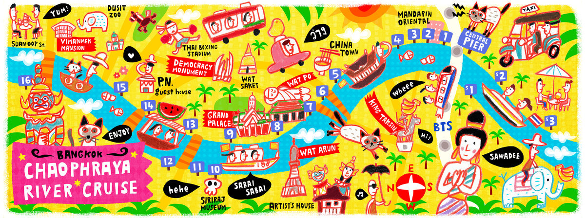
"The best way to explore Bangkok is pier hopping! It's really cool to go across Chaophraya river by boat, feeling the tropical wind. There are many piers (tha) along the river, and each pier (tha) has its own style. The most popular tourist sights a…

"The best way to explore Bangkok is pier hopping! It's really cool to go across Chaophraya river by boat, feeling the tropical wind. There are many piers (tha) along the river, and each pier (tha) has its own style. The most popular tourist sights are located between Central Pier to 13th pier (Tha Phra Athit) , but my favourite is 15th pier (Tha Thewet). The 15th pier has a lovely flower market, and you can feed fish while waiting for your boat. Fun! I lived in Dusit district. My apartment was on Suan Ooy street (in the upper left corner). I miss the yummy street food in that neighbourhood!"

They Draw & Travel contest: honourable mentions

Throughout the day today we are posting the honourable mentions, runners-up, and the winner of the "It's a Creative & Curious World" contest with They Draw & Travel. If you missed this contest, take a look at the contest page to see all of the creative submissions. 

Congratulations to all the honourable mentions!

Yebin Mun Favourite Place: Seoul, South Korea "I am an illustrator currently living and working in Seoul. I used to go these places with my mom when she visited me. Actually, I love every part of Seoul. Especially, Bukchon Hanok Village. I wish you could visit there once. You will love it."

Camila Tubaro Favourite Place: Buenos Aires, Argentina "This is my point of view of the places I like the most of my city, Buenos Aires. Its colours, its architecture and the spirit of a city full of people, music and culture. The technique I used represents, to me, my child memories of some of these places: some of which still remain and others that no longer exist. However, if they are drawn here it is because they are all important to me and make me feel that, no matter where I go, there will never be any place better than my home: Buenos Aires. Hope you like it!"

Lori Weitzel Favourite Place: Orlando, USA "57 Million People visit Orlando each year, and most just hit the amusement parks. This is a map of the other parks not to be missed."

Kate Mason Favourite Place: French Alps, France "I was born in Adelaide & have lived here all my life. I can't imagine living anywhere else. Its smallish and beautiful. and was a very well planned city settlement back in 1836. The River Torrens runs right through the city centre straight out to the beach. Its surrounded by bike paths and you can bike all the way around from beach through the city to the hills. The city centre is made up of orderly blocks & four main squares. The neat city centre is surrounded by parks and gardens. We have everything practical that we need here as well as all the crazy adventurous stuff, and we are paradise for foodies. We are world famous for our Barossa Valley wines, great white sharks, city of Churches, WOMADelaide, Tasting Australia, Adelaide & Fringe Festivals, the magnificent Adelaide Oval Cricket Ground and Tour Down Under Cycling. Adelaide is a great place to raise a family because its a very affordable living city. Its perfect as a base to travel the world, then come home to blissful life. There's no place like home! Ranked in top 10 in The Economists Worlds most liveable cities in 2010, 2011 & 2012. Also ranked THE most liveable city in Australia {Property Council of Australia] in 2011, 2012 & 2013! On my map, I've included all the artsy & quirky & adventurous things to do in Adelaide & surrounds. They are all the places I recommend & take visitors new to our city to. Come & visit & see all the amazing things we have to offer!"

Nutmegger Workshop sees making signs as an art form

When I'm sifting through reader submissions, I never know what I'll find. From a fresh-faced illustrator hoping to get their first published piece or a seasoned creative who has turned a new leaf and is looking to share their new direction... surprise and delight are the hallmarks of a good submission.

The work of Peter Vogel of Nutmegger Workshop in Portland, Oregon prompted an immediate response from me—I began to follow him on Twitter, sent out a tweet, emailed a thank you and planned this blog post.

Peter introduced himself as a "30-year graphic designer/design director/creative director now making vintage sign art." His talent for lettering and his love of old signage is combined into his business of making vintage-looking signs. His signs are not meant as functional signage—they don't fabricate signs and to site installations—rather the signs are art meant to be hung interior settings, somewhat like charming set decoration or as interior design features. 

"Generations ago, sign writers were a busy, sought-after bunch, but the heyday of their hand-lettered art was no match for the rising tide of digital sign-making technology. Nutmegger Workshop was created to celebrate the alluring charm of this long-forgotten art form. It is our mission to offer the finest period reproductions and original designs — handcrafted works of typographic art that add unique personality to any well-designed space."

Enjoy a leisurely stroll through the Nutmegger gallery of signs and read more about Peter's approach to his art.

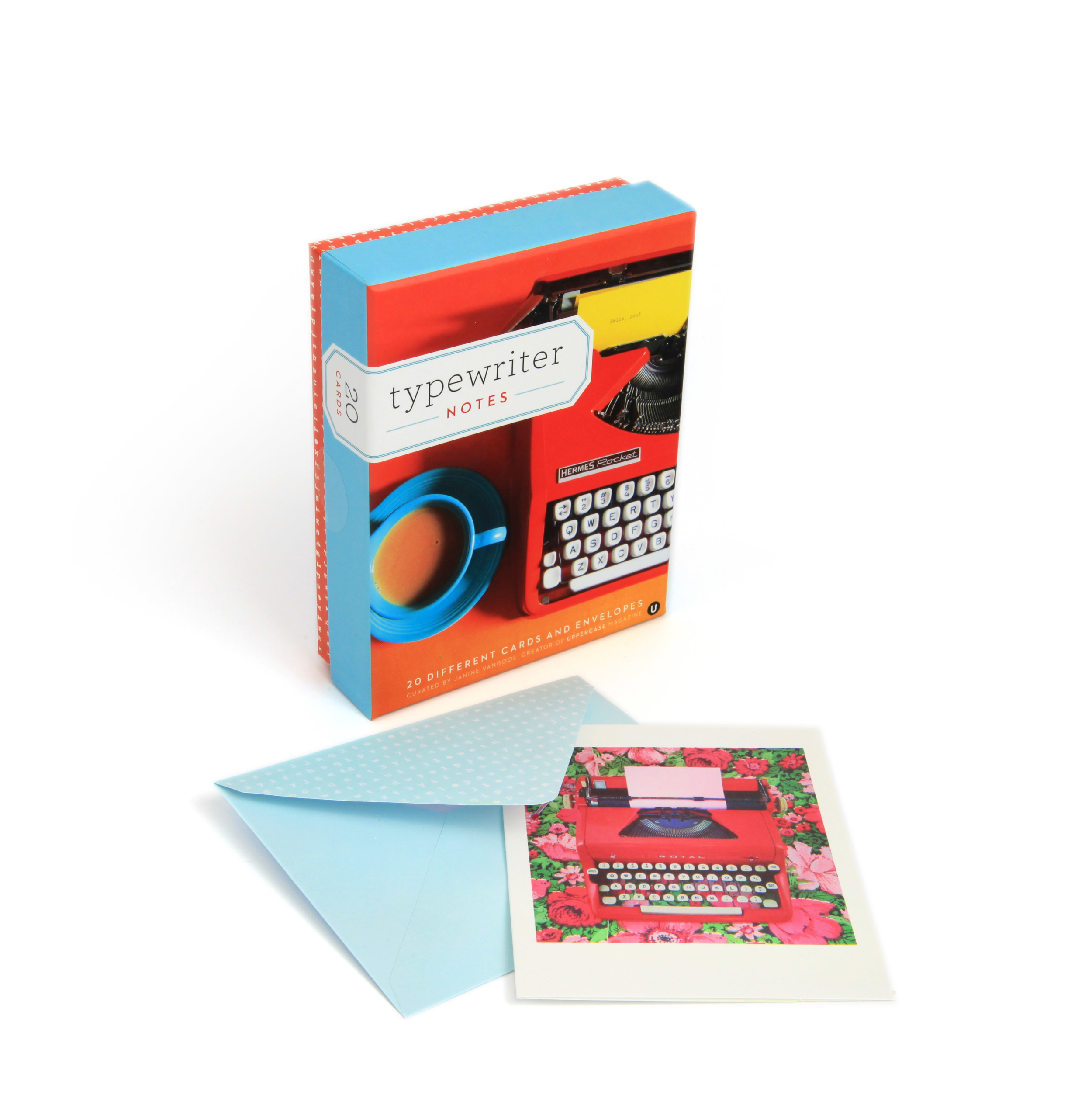
Typewriter Notes

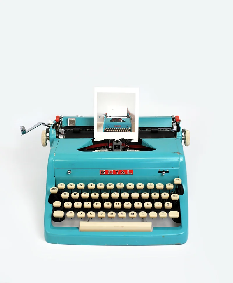
Typewriter Notes is a box set of 20 different cards capturing the timeless appeal of the typewriter. Published by Chronicle Books, I curated and designed the set. It features photographs by UPPERCASE readers. The cover photo is by Jane Bernstein.

In addition to a few of my own photos, there are photographs by Brianne Walk, Andrea Corrona Jenkins, Cari Wayman, Celina Wyss, Cori Kindred, Denise Regan, Jane Bernstein, Joanna Brown, Sarah Book, Shelley Davies, Svenja Schulte-Dahmen, Tracey Ayton and Vanessa Pham.

Thank you to Caitlin and Kristen at Chronicle Books for being so lovely to work with!

Sets can be purchased in our online shop along with Shoegazing Notecards, a previous collaboration with Chronicle. Thanks!