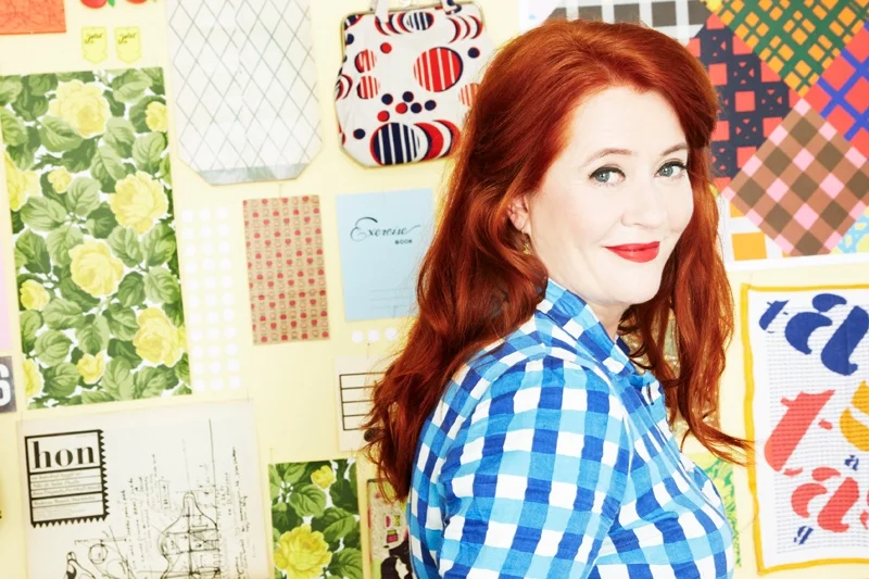
Why Do I Study Physics?
/{via Motionographer}


Jason Taylor was featured in Issue #21, and has an exhibition this week at The Harley Gallery from June 11 to August 10, 2014.
Here is an excerpt from Fun with Function written by Vinciane de Pape.
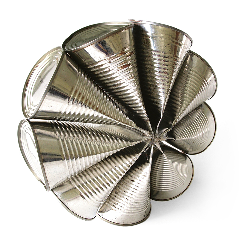
Jason Taylor is an established, UK-based artist and industrial designer whose innovative work plays with the form and function of readymade objects. His line of lighting and furniture designs has been sold internationally and exhibited in museums and art galleries around the world. Jason brings an artistic sensibility to his design process and enjoys the restrictions and challenges of creating unconventional products inspired by mundane objects.
Finding early on that he enjoyed manipulating and inventing simple designs from objects like tin cans, Jason pursued an education in design to follow his passion for experimentation and to further develop his skill set.
“I chose to do a 3D design course because of the techniques I could learn in different materials, but the focus was mainly on functional objects,” he explains. “An object would become my starting point and I developed different paths I could go down, such as developing a different function for it or remaking it in a different material.”
Somewhat frustrated with the compromises required by the commercial side of product design, Jason decided to go back to what he does best—experimenting with objects. This is when his Everyday Objects project came to life.
“I learned with a previous project that I could be more productive than I thought, and I also enjoyed the sculptural side,” Jason describes. “But what would be the reason and how could I make myself do it? I had seen other people do everyday photography projects and then thought of the double meaning of ‘everyday objects’ and I had to go for it.”
To read the full article about Jason Taylor in Issue #21, click here.
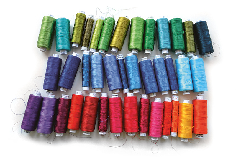
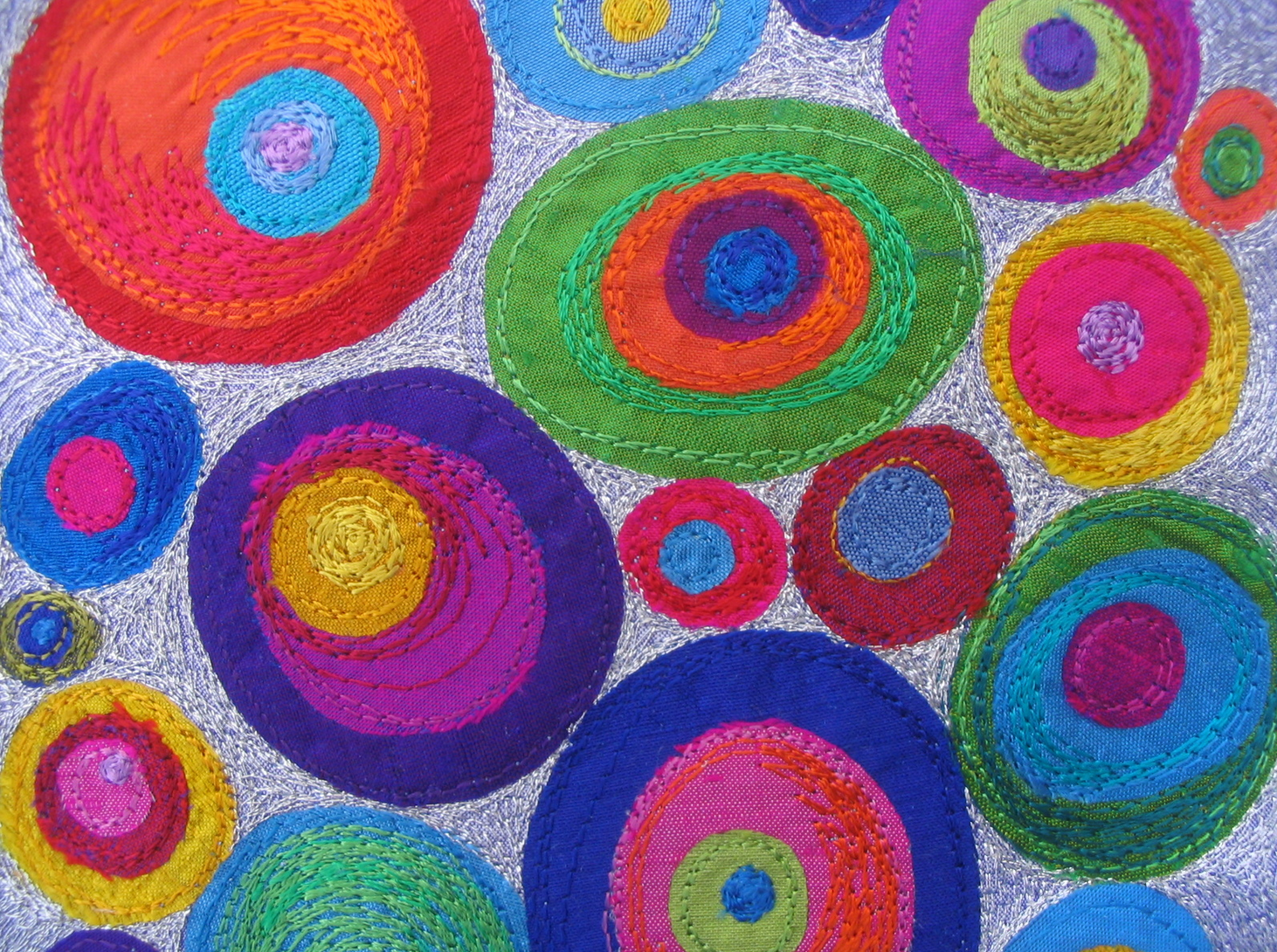
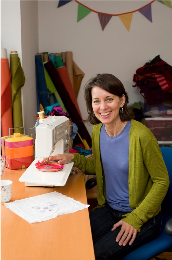
Saskia Wassing is a textile artist who lives and works in Toronto, Canada. She attended the Embroidered & Woven Textiles program at the Glasgow School of Art in Scotland. Saskia submitted to our recent open call for submissions “What Does Colour Mean to You?” and we’re pleased to share more of her beautiful work with you today.
Saskia’s unique fabric pieces reflect the work of an extensive traveller. Influences from Britain, Polynesia, New Zealand, Australia, India, and Canada are visible in her colourful creations.
"Colour means everything to me. It is the most important element in my creative life. I realize that sounds extreme but I love colour. I live and breathe colour and as an artist and designer, colour is the driving force behind all of the work that I produce,” says Saskia.
"If I had to live and work with only two mediums it would be my fabrics and my threads. Cutting, piecing and embroidering with these wonderful, tactile materials allows me to translate my sketchbook diaries into my personal colourful language so that other people can see and feel colour the way I do. Turquoise and reds, purples and oranges, chartreuse and pink, I am in love with colour and all it’s possibilities. The richly coloured fabrics and threads in my home studio are always yelling out “pick me” when I sit down to work. My past experiences, memories and personal identity are always presenting themselves in vivd colour. Black is not an option in my life or my work. Take a look at my sketchbooks, open my portfolio, come visit my studio, look through my online gallery and colour is everywhere in my work and my life.”
For Saskia's and other colourful musings submitted by our readers, please subscribe here. Issue #22 will be shipping soon!
Creativebug is an online source for craft and design video workshops. They have just released a video introducing their June classes with instructors Marisa Lynch, Maggie Pace, Elke Bergeron, and Lia Griffith teaching a range of crafts–from how to make a braided leather bracelet, to knitting a pair of baby booties.
For more information on Creativebug, click here.
The Creatory was founded by Gill Brooks and Romana Toson in Sydney, Australia. "Long time friends, we both come from a designer/maker background, so we wanted to create a space where we could indulge our love of 'handmade' and share it with a wider community. Our shop is very much a reflection of who we are and what we love,” say the duo.
At The Creatory, you can find a wide variety of handmade pieces from artisans in Sydney, Australia, and abroad.
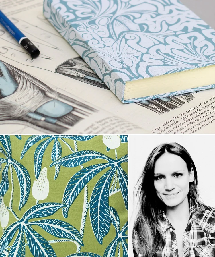
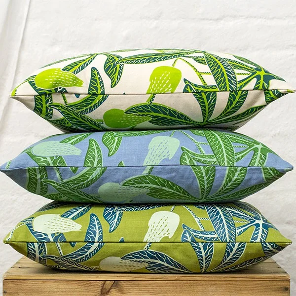
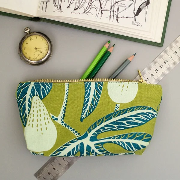
Fanny Shorter is a printmaker and designer who grew up in country town of Winchester, UK. Fanny is inspired by the intricacies of flowers and nature, and you can see her interest flowing through her work.
“Nature’s never just attractive,” says Fanny. “There’s always something else going on. There’s a reason why a plant looks like it does. I like combing the fact that its aesthetically attractive with the fact that its interesting.”
Fanny was trained as an illustrator at Brighton University, and she uses ethically sourced materials and water-based inks on all of her creations.
Her work can be found on furnishings, stationery and accessories in her online shop.
{video via Confessions of a Design Geek}
photo by Neil Zeller
Beakerhead is a new annual event held in Calgary each September. For 5 days, Calgary “turns into a giant laboratory” where Beakerhead visitors are entertained with public performances, contraptions built in people’s backyards, ingenuity competitions, and engineered art. Last year was Beakerhead’s first year and it was met with open arms by excited event-goers. "On the surface, Beakerhead looks like a week of spectacular fun every September. But it’s more than a schedule of mesmerizing events: it’s a time and place where engineers show their creative sides, and artists get technical, where science hits the street, and everyone gets ingenious,” say organizers.
On May 23, Beakerhead organizers wanted to amp up excitement for Beakerhead 2014, so they worked with the City of Calgary and artist Michael Mateyko and Hans Thiessen, also known as Komboh, to develop “green graffiti” to paint on a Calgary underpass. The “green graffiti” is made of eco-chalk and is entirely environmentally friendly from the application to removal.
Michael Mateyko is a Work/Life 3 participant and works and lives here in Calgary. I asked Michael a few questions about his participation with Beakerhead.
photo by Penny Breedon
What was your involvement with the "green graffiti" painted downtown? What was your role?
I came up with the commuting beakerhead(s) and designed the characters with feedback from the whole Beakerhead crew.
Who initially asked you and Hans for your help, and how did they know that you would be the right people to contact to help with this project?
I was contacted out of the blue last year by Hanan Chebib, who is the Director of Creative Experiences over at Beakerhead. She somehow ended up with a poster I made and was pretty stoked on working with us on something. Our interests align pretty well; art, science, engineering, and trying to get people interested in the intersection between those three.
Had you heard of this "green graffiti" before you were approached to help?
Not really. Originally the idea was to do a bit of pressure-washed reverse graffiti, but unfortunately (?) Calgary's underpasses are way too clean for that.
What do you enjoy about Beakerhead? What is your favourite "event" that you have attended?
I actually didn't even get the chance to attend last year, but I'm definitely making my way down for 2014. I dig Beakerhead because it's really all about encouraging what by all accounts is a pretty conservative town to let loose and admit that we're all actually artists and engineers on the inside.
Did you attend the initial "green graffiti" event while the figures were being painted? If so, what was the experience like? What were passersby's
reactions to the graffiti?
It was all being put up overnight, I believe around midnight or thereabouts. I had to do a TV interview at 5 in the morning the next day so I was trying to get as much sleep as I reasonably could and wasn't there for the install. During the photo shoot with the Mayor later the same day there was a pretty good crowd going and everyone seemed pretty pumped about it all. I received a lot of really positive comments from people that were just excited to see some public art that was a little weirder than usual. Also, Mayor Nenshi did his best to psychoanalyze each character in turn, so that was pretty fun too.
photo by Neil Zeller
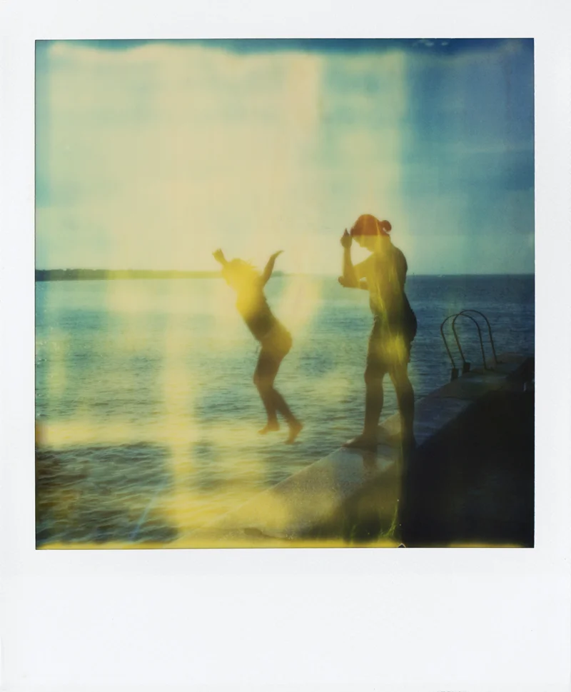
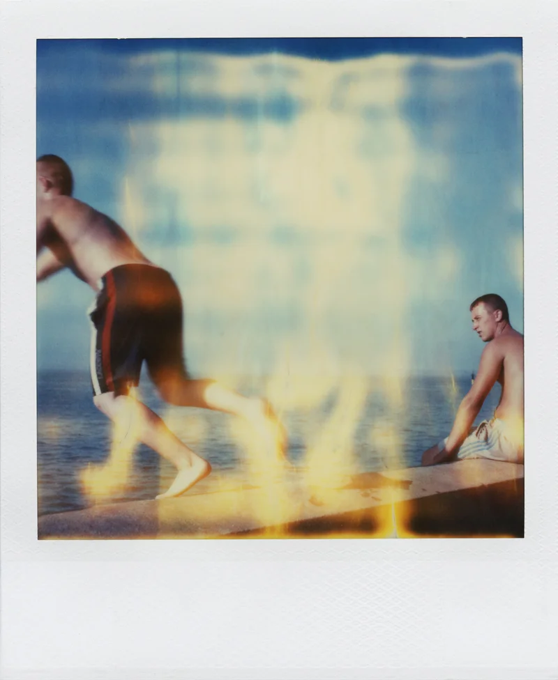
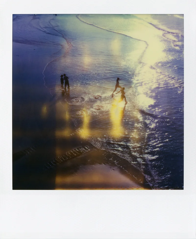
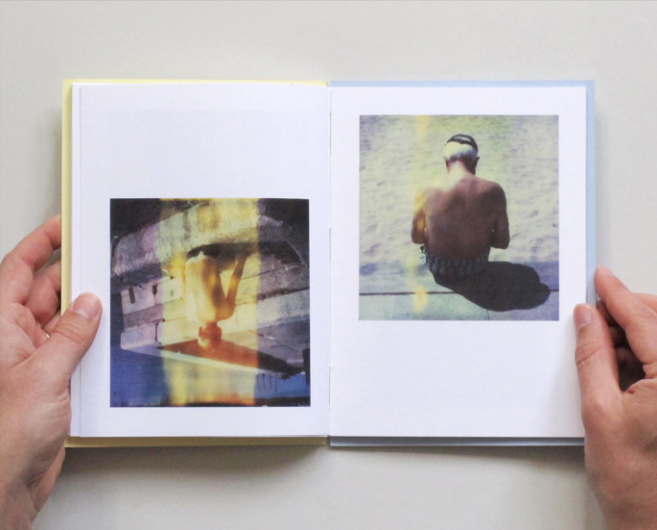
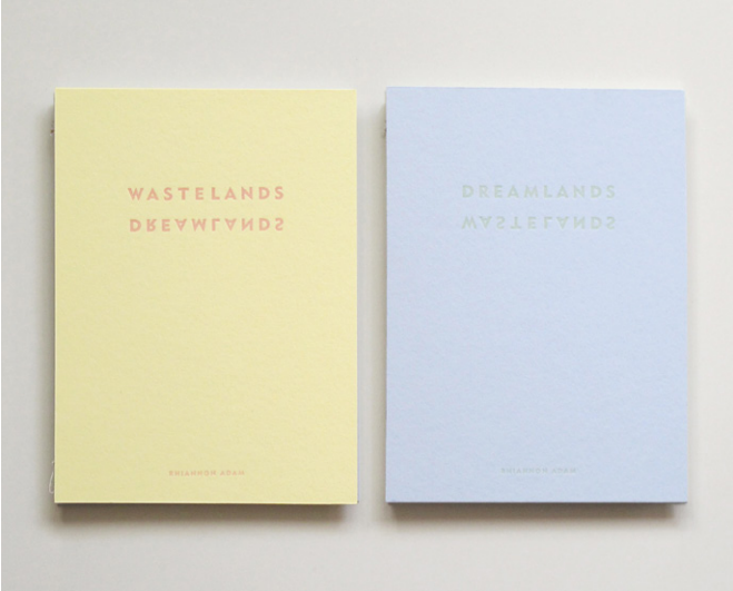
Rihannon Adam is an artist who lives and works in London, England. She attended Central Saint Martins College of Art and Design, and also the University of Cambridge. She recently released her new book called Dreamlands / Wastelands, a collection of photographs taken on expired Polaroid film in the resort towns of Margate and Benidorm.
"I’ve always been interested in 'the holiday destination', partly down to my unusual upbringing aboard our boat, Jannes. While sailing, we spent a lot of time in coastal holiday locations stocking up on supplies. Most people that we met there assumed we were on holiday, like them, rather than our nomadic existence being a lifestyle choice," says Rihannon in her book.
Here is an excerpt written by Rihannon from Dreamlands / Wastelands:
"MARGATE Mar – Gate. Gateway to the sea. Though I hated living on our boat, I still love the sea and am always drawn back to it. It also hard to avoid when living in the UK – drive in any direction and you eventually hit water.
Somehow Britishness relates to being an Island nation, having an indefatigable spirit, and being determined to make the best of what we have. There is nothing more British than standing on a beach in gale force winds with your toes buried in cold clammy sand having a ‘good time’. Or sitting in a parked car with a thermos, the windscreen wipers brushing away the tears of another summer downpour.
Margate is a place that most of us have heard of. It is the poster child British seaside town, its name synonymous with childhood memories of swimming in water that's just a bit too cold, of buckets and spades, ice cream, deck chairs and donkeys. Its history riddled with familiar pairs: mods and rockers, Chas and Dave, Del Boy and Rodney, highs and lows, boom and bust. We all have our own Margate – you can find one on every British coast.
This project explores what is beautiful about Margate - then, and now. Shot entirely with expired Polaroid film echoing family snapshots of yesteryear, these pictures show what a good old-fashioned British holiday resort looks like on the cusp of resurgence. Polaroids imbue a cultural cellular memory and nostalgia for all of the millions of childhood moments spent ‘beside the seaside, beside the sea’.
The film is now extremely expired causing imperfections, bearing resemblance to the scars of passing time and memories transforming, blurring the boundaries between past and present. These effects also mirror the cracks and decay that permeate the walls of every British resort town. These photographs are my memories, your memories, our memories.
Even after a recession, a change in taste, and the advent of cheap flights and package holidays abroad, Margate is still beautiful when the sun shines."
For more information on Dreamlands / Wastelands, click here.
Saint Gertrude Letterpress Academy is a letterpress workshop in Melbourne, Australia that designs and prints letterpress ephemera on their 100-year-old platen affectionately named Gordon. Saint Gertrude is now offering hands-on letterpress classes.
"Letterpress Academy is a new open access workshop offering participants the chance to learn more about the process of modern letterpress printing," says founder and Creative Director Amy Constable.
The classes are open to professional designers and beginners alike. To get your hands dirty (and inky) with Saint Gertrude, click here.
Mr. Ned (aka Ned Jolliffe) is an illustrator and designer from Oxford, England whose work can be seen on book covers, magazines and theatre posters. He has been compiling a scrapbook for about 10 years in which he pastes his collected ephemera items. "Juxtaposing a new bit or bob in its pages makes me very happy; It's not finished - there's lots of pages blank, and I fear the thing will disintegrate before I complete it,” says Ned.
"It's small, squarish little thing that has grown stout over the years from absorbing little ephemeral treasures as I trudge along the streets of wherever I happen to be at the time. My scrapbook is the one possession I would rescue from the raging flames."
To see more of Mr. Ned’s work, take a look at his portfolio here.
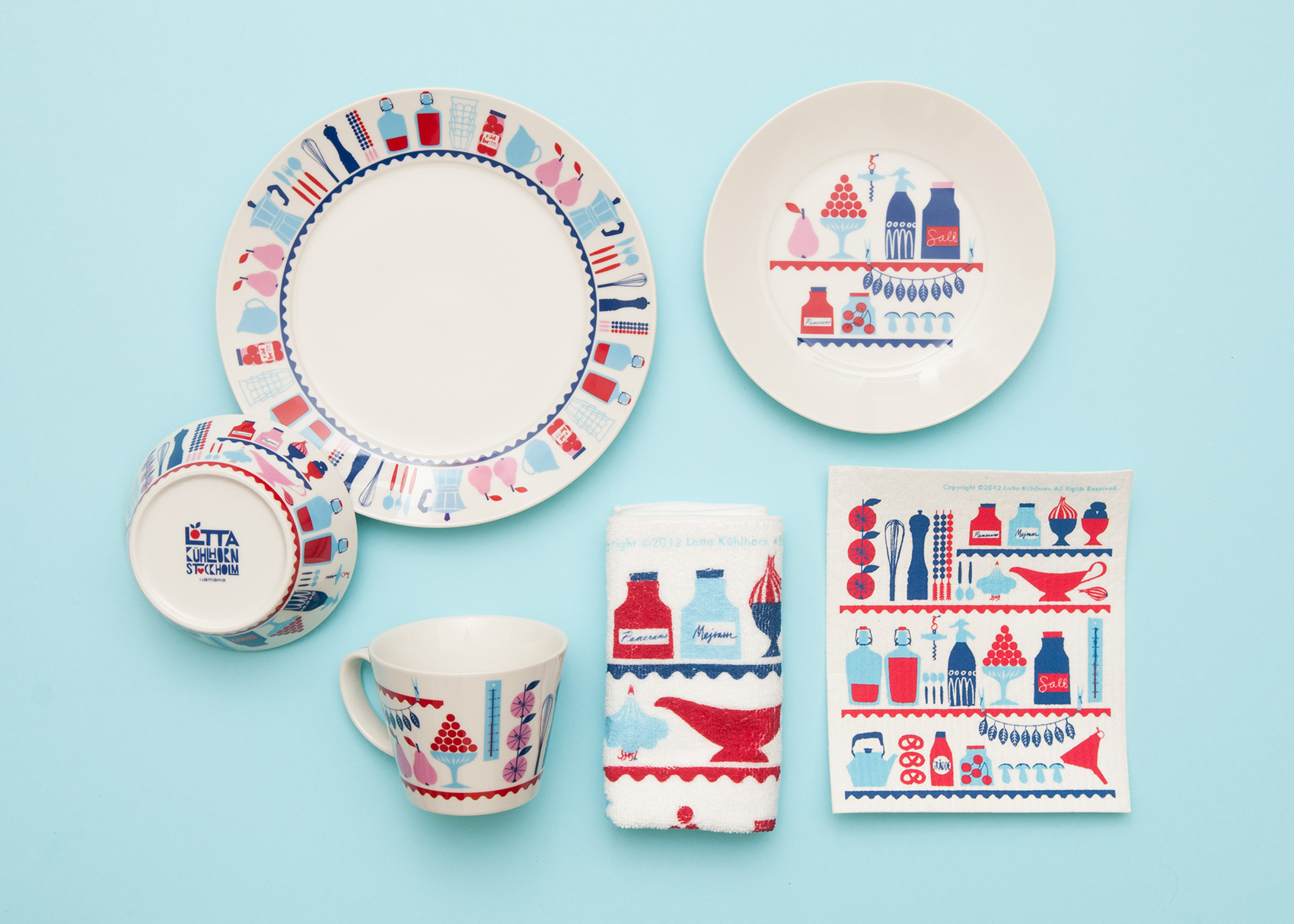
Lotta Kühlhorn is a Swedish illustrator who, at the age of ten, already knew that she wanted to be an illustrator when she grew up.
Lotta's illustrations and patterns can be found on cookware, books, fabrics, textiles–even wall tiles!
In January, Lotta released her book called Designing Patterns for Decoration, Fashion and Graphics.
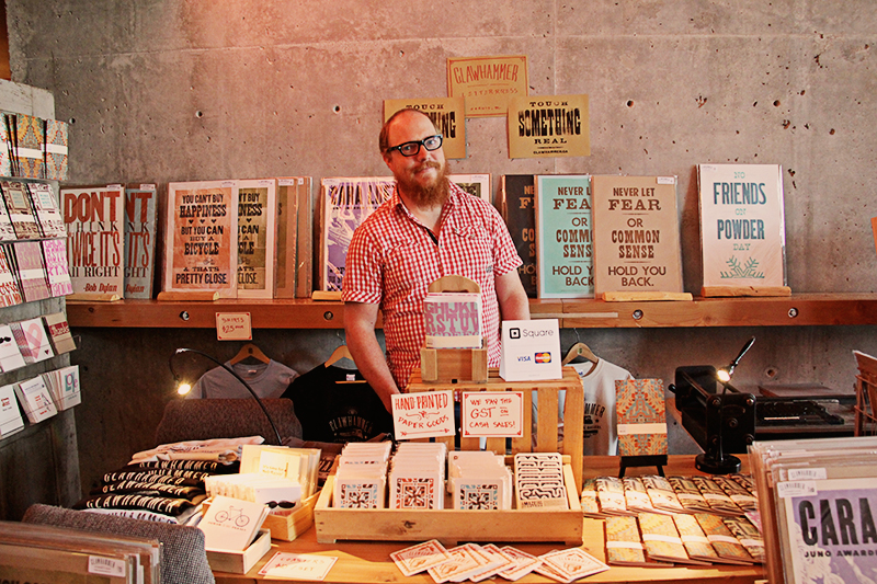
Michael Hepher is the owner and operator of Clawhammer Letterpress. Michael creates letterpress printed posters, coasters, cards and notebooks using presses made in the early 1900s.
After working as a graphic artist for a few years, Michael was intrigued by the art of hand-set type, and through a connection with his local printer, ended up with a large press in his garage. After getting his hands on an original operating manual for the press, Michael immersed himself in the world of all things letterpress. In 2011, Michael and his wife Anie opened their shop in Fernie, British Columbia.
For more information on Clawhammer Press and hand-set type, visit their website.
Becca Cleaver is a librarian and quilter from Calgary. It was Becca’s first time showing at New Craft Coalition, and she even transported all of her beautiful quilts, bibs and booties to the show using this awesome bike! You can follow Becca on Instagram to see behind-the-scenes photos of her gorgeous quilts and bibs.
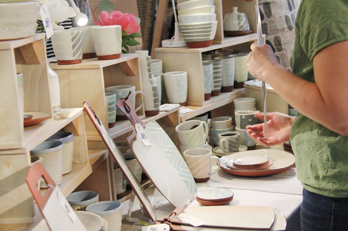
Kalika Bowlby is a full time ceramicist who lives and works in Nelson, British Columbia. She studied ceramics at the Alberta College of Art and Design and also at Kootenay School of the Arts.
“I make contemporary pottery to celebrate the pleasures of eating and drinking. Objects to bring more delight, and texture to life, made by hand for your hands. Objects to nourish you as much as the food you may serve,” says Kalika.
To see more of Kalika’s work, be sure to take a look at her website.
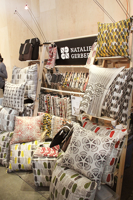
This past weekend, we were at the New Craft Coalition Spring Show + Sale in Calgary. We were happy to meet with some local subscribers and introduce ourselves to new ones. It was great to meet the other vendors and learn more about their beautiful work—we will be showcasing some of the artists who set up shop at the Spring Show + Sale.
The Assembly is a brand new store in Singapore carrying brands like Benjamin Barker, Cote & Ciel, and Acme Made. Offering its customers “indie brands,” The Assembly also sells UPPERCASE magazine. Customers can soon flip through the pages of UPPERCASE while they sip a coffee at The Assembly Ground, the store’s attached cafe set to open in June.
Dreaming of UPPERCASE back issues?
We've made it easy to have your own instant collection of all available issues of UPPERCASE magazine. Purchase a Back Issue Collection and save off the individual cover prices as well.
One dozen issues of UPPERCASE magazine sitting pretty on your shelf and offering you years of inspiration! You'll get issue #9 through #21 (except for issue #12 which is out of print and not included).
With topics covering illustration, stationery design, journaling, children's book illustration, creative adventure, studio tours, interviews with artists and designers plus the Surface Pattern Design Guide and so much more!
Beautifully presented articles on design, illustration, craft, typography, ephemera and creative living makes this UPPERCASE collection a must-have for any creative library.
Illustrator Kelly Lasserre is featured in Work/Life 3, a directory of illustration published by UPPERCASE. Here is an excerpt from Kelly's profile.
Kelly seeing herself in Work/Life 3
I am originally from Mississippi. The majority of my family still lives there and I have spent all my summers in the South being exposed to its amazing, strange and beautiful environment. The people, culture and physical landscape is endlessly inspiring. I definitely have a romantic feeling about it, maybe because I’ve been back and forth and am able to see it differently than if I had never left.
I’ve spent most of my life, including my school years, on the south shore of Massachusetts in a small Irish fishing town, very different from Mississippi, but dreamy in its own way. I feel fortunate that I grew up appreciating and learning from two opposite parts of the United States. It makes me feel very balanced in a way.
It became clear to me early in my teenage years that I had a real desire to make things and to communicate visually—it just made each day simpler. At some point I realized it was more than an angsty teenage need to express myself, so I really pushed my interest and had a lot of support from some great teachers. I went to art school in Baltimore, at the Maryland Institute College of Art, where I graduated with a BFA in illustration in 2008.
My style has been extremely pared down over the years into something I feel comfortable with, which is very simple, intentional, concise. I have reduced it down to the bare essential of what it is I am trying to visually discuss or record in my personal work. I used to be more self-conscious about my style because it didn't have this traditional approach to telling stories that fit into the illustration work I was being exposed to. But I eventually just let myself do what came naturally, which happens to be very direct and to the point.
Currently I am living and working in New York City. It’s not the easiest place to live, but it is very stimulating, frustrating, endlessly entertaining and inspiring. You have to be quite crafty to make it work. I just moved to Queens a few weeks ago so I could afford to live in this crazy city but also have enough space to work and breathe a bit. And I have my own studio, which is key.
Work/Life 3 is a directory of talent showcasing illustrators around the world. Artists are individually interviewed about their creative focus and artistic technique as well as their inspirations and aspirations. Beautiful images of sketchbook pages, studio shots, inspirational objects or personally illustrated anecdotes are shown on each participant's spread, letting the reader catch a glimpse of the artist's work/life.
Click here to get your copy of Work/Life 3.
Cover by Christy Batta
The UPPERCASE Circle is free for subscribers of the print magazine. Find out more.
UPPERCASE is a quarterly print magazine inspired by craft, design and illustration. A playful exploration of creativity, an affinity for vintage ephemera, and a love of handmade are some elements common in each issue. The magazine boasts high-quality paper and printing, a unique design aesthetic and incredible attention to detail.
Janine Vangool
publisher / editor / designer
Send a message →
* Before emailing submissions follow the guidelines here.
Glen Dresser
customer support
Please contact Glen for help with your purchases, wholesale inquiries and questions about your subscription. Include your full name and mailing address so that we can better assist you.
Send a message →
UPPERCASE publishing inc
Suite 201 b
908 17th Avenue SW
Calgary, Alberta T2T 0A3
403-283-5318
The studio is not open to the public—please get in touch to make an appointment. If you'd like to purchase our magazine and books locally, please see the stockist page.