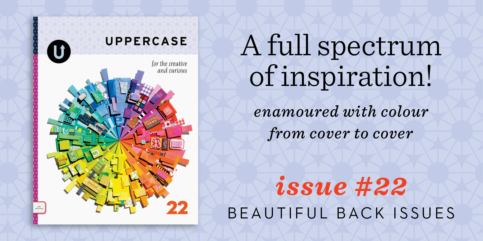
Back issues are just $10 through Monday.

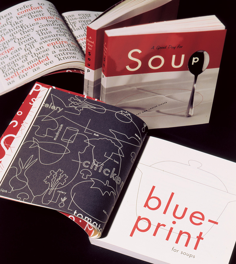
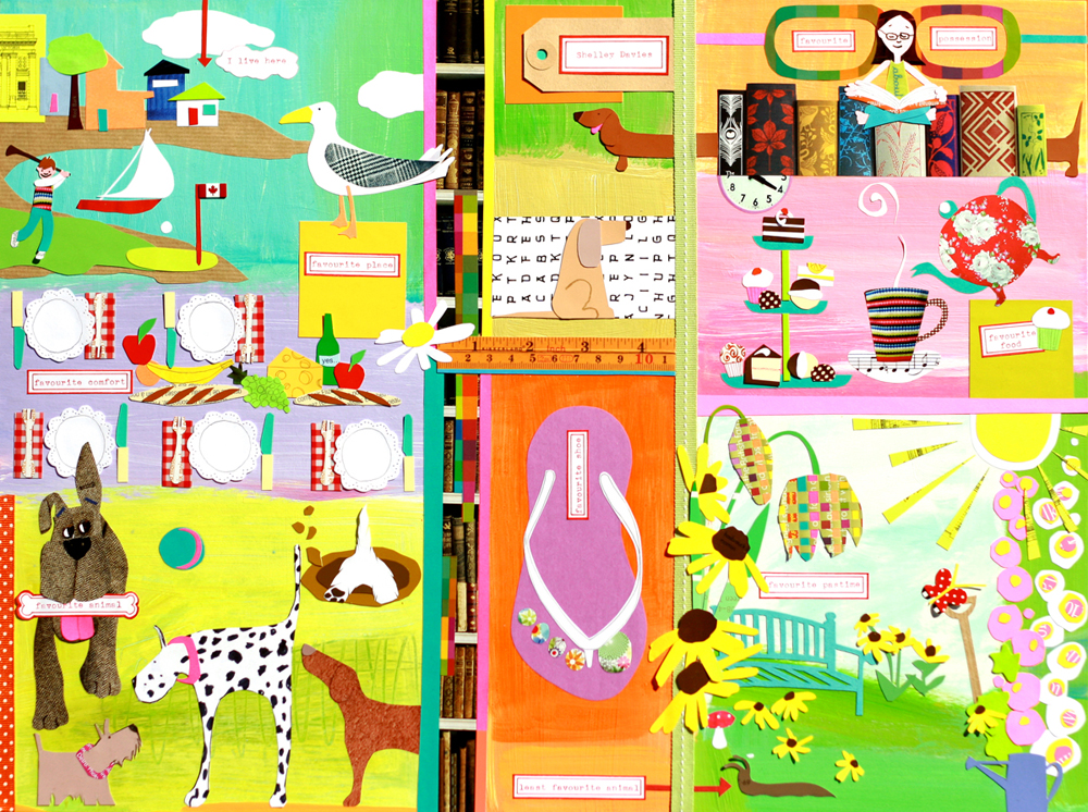
Look at all the work I've done over the years! How time flies when you keep yourself passionately busy. 

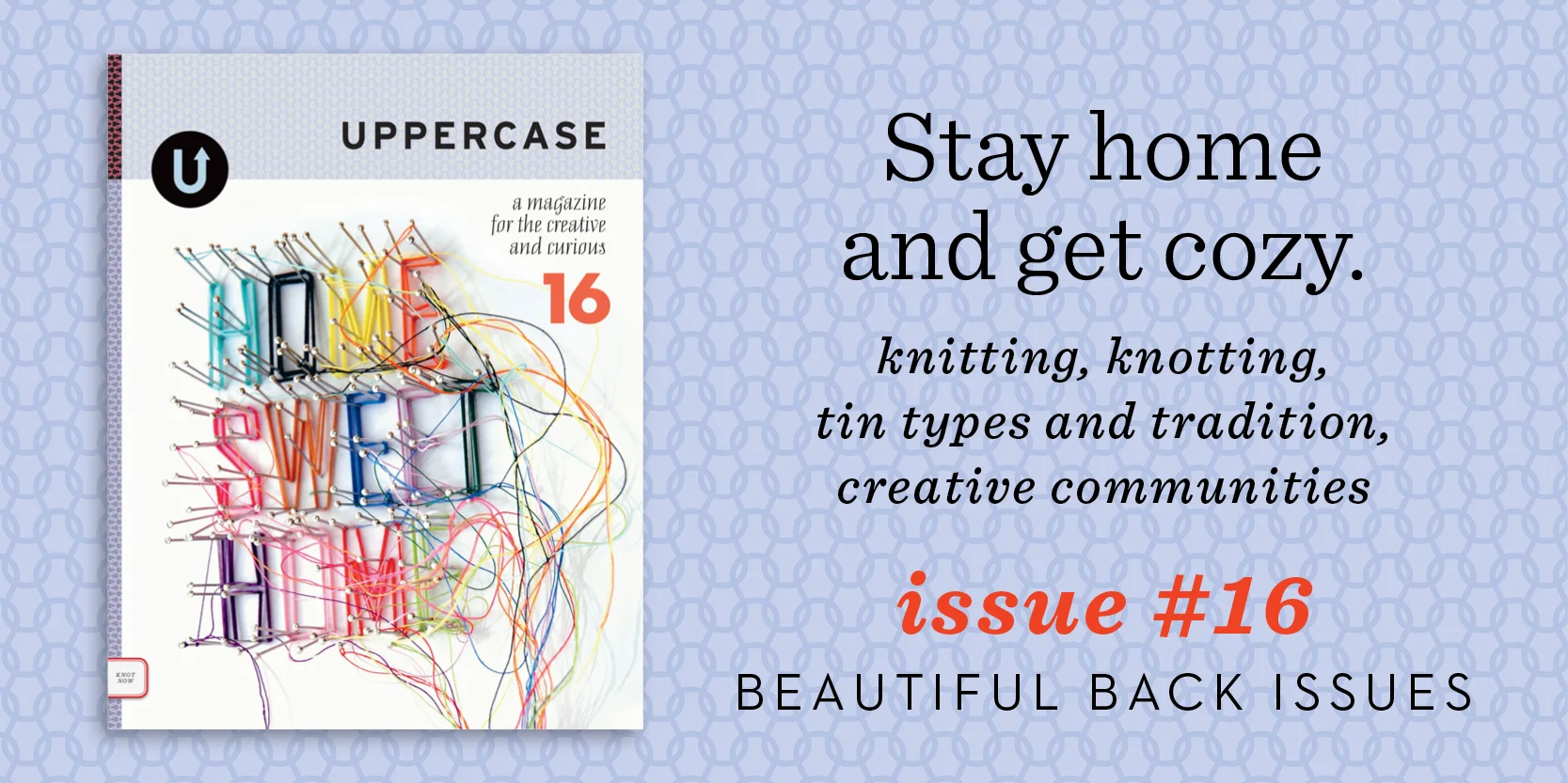
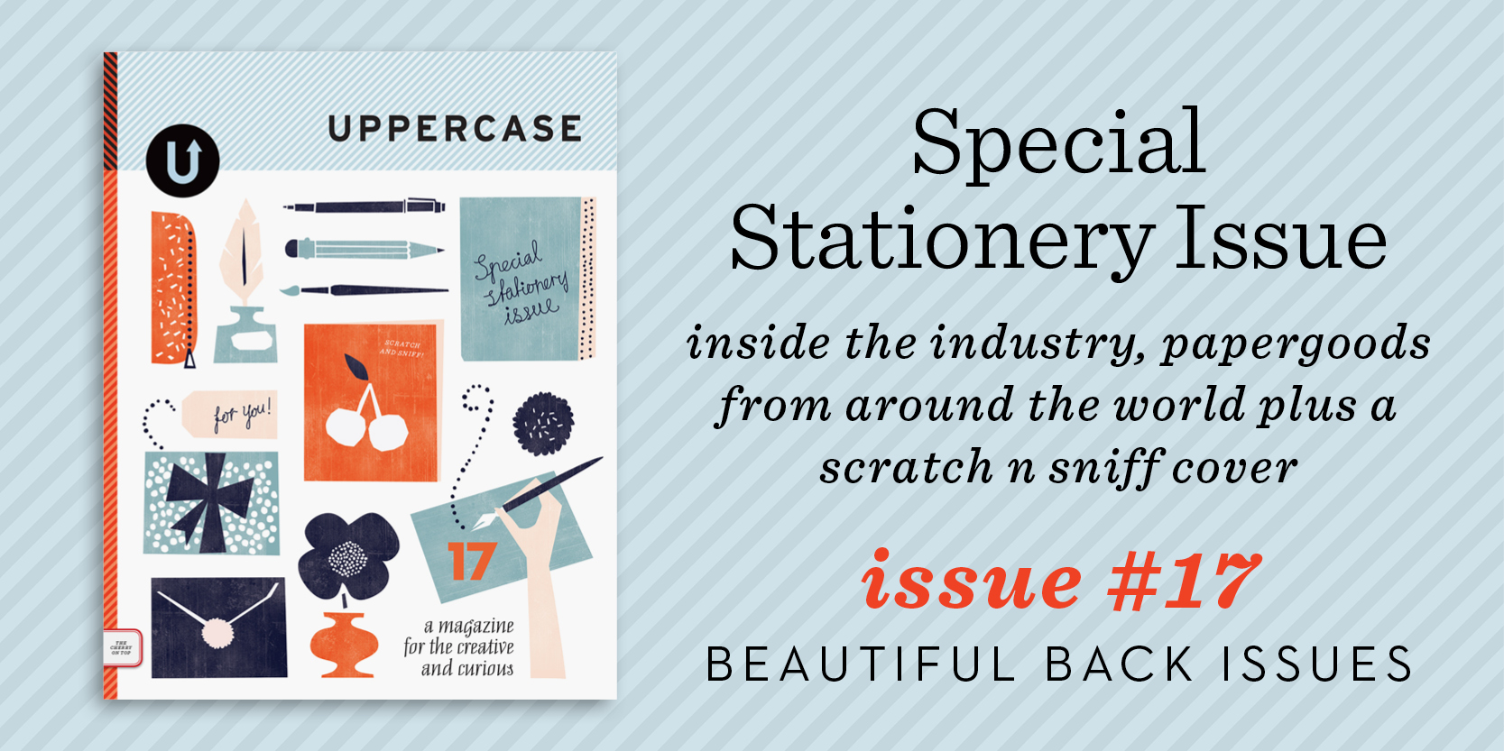
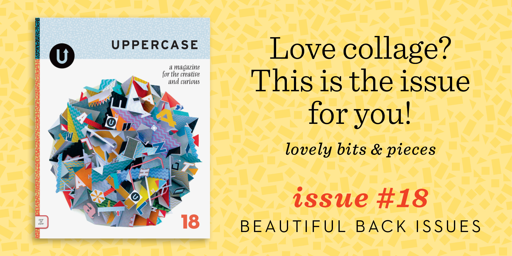
All of my babies are available to enjoy while inventory lasts (issue 10 and 11 are running low at this point). On sale for just $10 apiece until end of day Monday, I'd suggest getting one of each. Subscribe starting with #23, the current issue, and you'll be all set for an inspired year ahead.

p.s. Use the code "thankyou" for another $15 off orders over $80.

Werner Design Werks: timeless design

I've admired Werner Design Werks' design portfolio since I was a design student in college. Sharon Werner's typographic skills combined with an intelligent approach to design problem-solving makes her work seem timeless — even years (yikes, decades?) later, the projects created by Werner Design Werks that I admired back then are still appealing today.

"A Good Day for Soup" was designed by Sharon Werner and published by Chronicle Books in 1995. As a fresh design college grad, I remember admiring its gorgeous and perfectly tomato-soup-coloured red ink on uncoated paper. The book design still looks fresh!

Sharon Werner and Sarah Forss are the small team that have been the mainstay of Werner Design works. Through hard work—combined with their great deal of talent—they have built a strong body of work and set themselves as an important anchor in a design aesthetic that began regionally in Minneapolis-St. Paul in the mid-nineties.

Sharon, during our visit in 2011.

In the early 90s, there was a distinctive design trend emerging from the Minneapolis area. It was a vernacular style that married a workhorse aesthetic with typographic prowess: bold type, simple colours, deliberate misregistration, butcher paper. French Paper was the trendiest stock option and retro-pop line art was being captured from the public domain by Charles S. Anderson. At the time, I was an eager visual communications student at the Alberta College of Art devouring design magazines. Before blogs and Behance, it was the print triumvirate Communication Arts, How and Print that informed the impressionable. Through their pages, I came to admire designs by Sharon Werner.

The Werner Design Werks studio is full of books, bits of signage and vintage inspiration.

After six years working for Duffy Design, Sharon founded Werner Design Werks in 1991. Her work appealed to me because the designs were a little quieter and a bit more feminine that the rest of the “guys” profiled in the magazines. I remember checking out a cookbook she designed (A Good Day for Soup, Chronicle Books, 1995), not for the recipes, but to admire the perfectly tomato soup–coloured ink and the delicious typography. When I graduated from college and started my own freelance design pursuits a few years later, I continued to follow Werner Design Werks' output for visual inspiration and also as encouragement for being a female entrepreneur in what was then a seemingly male-oriented industry.

Examples from Alphabeasties.

Issue #14 is still available as a back issue and features a special section on children's book illustration. Cover by Jon Klassen.

A dozen or so years on, Sharon and I connected through email and postal exchanges. I had been sending her the UPPERCASE directory of illustration and she was reciprocating with her amazing Alphabeasties series of books. In 2011, I was thrilled to finally meet Sharon in her St. Paul office and have a face-to-face chat (and a snoop through her spacious studio). Thinking back to my 20-year-old art-student self, I could not have fathomed that a few decades later I would be publishing a magazine and featuring one of my design heroines within its pages!

Our visit was profiled two years ago in issue #14 (2012) of UPPERCASE, but I've never shared some of the photos I took of that visit—until today! I was prompted to share them in honour of Werner Design Werks' new website, one that shows off current projects, like this identity for Caryn Model & Talent Agency, but also highlights the many projects that helped define the company over the years.

Identity design for Caryn Model & Talent Agency

Identity design for Caryn Model & Talent Agency

Sharon admits that it was quite challenging to decide what to include in the new website: "To edit and select 23 years worth of projects was an arduously difficult task of deciding—what makes the cut?" she explains. "We’re firm believers that you're only as good as your last project! But we also believe our history and experiences make us who we are today. They inform how we think and approach a project. With that in mind we created an archive section for the oldies but goodies. It was similar to going through your closet and if you’ve not worn (or referenced) it in the last 2 years, it goes into the give-away box."

Congratulations to Sharon and Sarah on the new site—and my thanks to them both for their hospitality and support of UPPERCASE projects over the years. Cheers! 

Some iconic spirits packaging. Knob Creek was produced while Sharon was at Duffy Design Group.

back issue profile: #14

Back issues make great holiday gifts and playful #14 is sure to delight everyone on your list. Bundle up on back issues and save. Purchase three or more back issues and get $3 off each issue.

Issue #14 was all about play, which seems fitting for this festive time of the year. We explored the mark-making of sport, the aesthetic allure of baseball and the graphic appeal of blocks. We took an extended visit to the wonderful world of children’s books (where donning a chicken suit is all in a day’s work). We zigged and zagged with a love of chevrons; we played with letters and words to create poetry and products and we ate pancakes for breakfast, lunch and supper. 

See our blog posts about #14 here

Get your hands on out-of-print back issues!

Do you love UPPERCASE magazine but you're missing a back issue? Have you recently been introduced to this quarterly magazine for the creative and curious and now you wish you had them all?

Here's your chance to purchase an entire stack of all the issues we've ever printed! We have taken a few of our early issues out of our archives for this one-time only auction. (Issues #1-#7 and #12 are completely sold out elsewhere.)

The purpose of this auction is to raise funds for the upcoming studio move (our current home of the past 8 years is in a building slated for "redevelopment" and so we'll be moving to new accommodations later this summer).

Due to the heavy weight of the package, this stack is only available to ship within North America. However, we have created other listings for individual out-of-print back issues #1, #2, #3, #4, #5, #6, #7 and #12 that we can ship internationally.

Click here to see the listings on eBay. 

Bidding ends next Friday, May 31.

Thank you for your support!

more hat theft

Issue #14 cover artist Jon Klassen was awarded the 2013 Caldecott Medal for This Is Not My Hat a book he wrote and illustrated. 

From Caldecott's press release:

In this darkly humorous tale, a tiny fish knows it’s wrong to steal a hat. It fits him just right. But the big fish wants his hat back. Klassen’s controlled palette, opposing narratives and subtle cues compel readers to follow the fish and imagine the consequence.
“With minute changes in eyes and the slightest displacement of seagrass, Klassen’s masterful illustrations tell the story the narrator doesn’t know,” Caldecott Chair Sandra Imdieke said.

Congratulations Jon!

start your subscription today!

If you'd like your subscription to start with issue #14, please place your order today! Issue #15 is almost ready to ship, so we will send them both at the same time. After today, subscriptions will automatically start with #15 and you will have to buy #14 separately. thank you! ​

By the way, our pigeon-covered issue #12 is down to just 10 copies, so if you need it to complete your set, fly on over to our online shop.​

Etsy & UPPERCASE: Linzee McCray

I "met" one of our regular contributors​, Linzee McCray, through Etsy. I was doing some research on a story about Type Truck and discovered Linzee's excellent article on the Etsy blog. She covered everything I was hoping to write about in the article, so rather than reinvent the wheel, I contacted Linzee and Etsy to see if we could update the article and run it in issue #12.

Later, I commissioned Linzee to write about oilcloth, featured in the current issue #14. The article features two Etsy sellers:​

​Modern June

Oilcloth by the Yard​

We can all look forward to a new article from Linzee in issue #16 next year! 

Read through Linzee's archive of Etsy posts here >>>.​ 

Etsy & UPPERCASE: century of the child

​A post on The Etsy Blog introduced us the MoMA exhibition The Centruy of the Child: Growing by Design, 1900-2000.  For those of us not lucky enough to visit New York before early November, there's a remarkable exhibition website. This cave of wonders goes beyond a mere survey of toys and extends into the dark realities of political conflict and exploitation in the lives of children. 

In 1900, Swedish design reformer Ellen Key stated that the ‘century of the child’ was upon us, predicting that we’d spend the next 100 years addressing how children should be raised and nurtured. Now, we can safely say that Key was right. We live in a time where dad bloggers, car seat designers, Diaper Genies and mountains of parenting books are the norm. Century of the Child: Growing by Design, a new exhibition at the Museum of Modern Art, begins with Key’s statement and tries to explain how we got to this point, through a history of children’s toys and memorabilia.
— Chappell Ellison for The Etsy Blog

Double-page spread from A War-Time Handbook for Young Americans (1942)

All photos by Museum of Modern Art ​

Etsy & UPPERCASE: Sushipot Vintage

​The current issue, #14, features the Etsy seller Suzanna Scott's collection of vintage play blocks. Suzanna actually has two shops: Sushipots Vintage sells beautiful old toys, instant collections and fodder for creativity and Sushipot highlights Suzanna's original collages and assemblages.

Vintage Sewing Basket full o' Crafty Notions

Suzanna's product shots are fantastic!​

Sushipot art block.​

Such a gorgeous photo makes these little game pieces all the more appealing.

another side of Oliver

​By Oliver Jeffers from Neither Here Nor There copyright Gestalten 2012

​By Oliver Jeffers from Neither Here Nor There copyright Gestalten 2012

​By Oliver Jeffers from Neither Here Nor There copyright Gestalten 2012

​By Oliver Jeffers from Neither Here Nor There copyright Gestalten 2012

​In issue #14 we featured the Brooklyn studio of Oliver Jeffers the popular Irish children's book illustrator. In Neither Here Nor There: The Art of Oliver Jeffers another side is on display, revealing the full range of his work.  

​By Oliver Jeffers from Neither Here Nor There copyright Gestalten 2012​

​By Oliver Jeffers from Neither Here Nor There copyright Gestalten 2012

keep your eye on the ball

​If these photos (found on One Plus One) of baseball players in the 1800's don't say old-fashioned summer fun, we don't know what does. There is an explanation of how they were created, but we prefer to think of them as an example of how we all want to take moments from the long days of August and stop them in time. We hope your weekend is filled with frozen treats and picture-perfect moments. 

sketchbook: Isabelle Arsenault

In issue #14 we profiled Isabelle Arsenault and have more of her work to share here.  Karen wrote that, "Isabelle's distinctive illustration style looks fragile and ethereal, but the grey and black tones prevent it from becoming too sweet or precious. Her [Isabelle's] marks are confident, yet experimental."

I see my sketchbook as a place where I can experiment, try different ideas or visual approaches. It’s the place where I draw for my own pleasure.
— Isabelle Arsenault

contributor: Karen Klassen

​Little Red Cap, Karen Klassen

​Little Red Cap, Karen Klassen

Karen Klassen wrote an article for issue #14. Her creativity extends beyond the written word into her work as an illustrator.

"My Little Red Cap piece is the first in my GRIM series, a collection of fashion illustrations based on selected Grimms' Fairy Tales. Other pieces that are currently underway are Snowdrop, Hansel & Gretel, and Snow White & Rose Red. Those Grimm brothers were not a cheery pair."

Karen's work was also a part of The Shatner Show. ​