illustrating courtroom drama for 38 years
/{Via NY Times}
Illustrator Kelly Lasserre is featured in Work/Life 3, a directory of illustration published by UPPERCASE. Here is an excerpt from Kelly's profile.

Kelly seeing herself in Work/Life 3
I am originally from Mississippi. The majority of my family still lives there and I have spent all my summers in the South being exposed to its amazing, strange and beautiful environment. The people, culture and physical landscape is endlessly inspiring. I definitely have a romantic feeling about it, maybe because I’ve been back and forth and am able to see it differently than if I had never left.

I’ve spent most of my life, including my school years, on the south shore of Massachusetts in a small Irish fishing town, very different from Mississippi, but dreamy in its own way. I feel fortunate that I grew up appreciating and learning from two opposite parts of the United States. It makes me feel very balanced in a way.

It became clear to me early in my teenage years that I had a real desire to make things and to communicate visually—it just made each day simpler. At some point I realized it was more than an angsty teenage need to express myself, so I really pushed my interest and had a lot of support from some great teachers. I went to art school in Baltimore, at the Maryland Institute College of Art, where I graduated with a BFA in illustration in 2008.

My style has been extremely pared down over the years into something I feel comfortable with, which is very simple, intentional, concise. I have reduced it down to the bare essential of what it is I am trying to visually discuss or record in my personal work. I used to be more self-conscious about my style because it didn't have this traditional approach to telling stories that fit into the illustration work I was being exposed to. But I eventually just let myself do what came naturally, which happens to be very direct and to the point.

Currently I am living and working in New York City. It’s not the easiest place to live, but it is very stimulating, frustrating, endlessly entertaining and inspiring. You have to be quite crafty to make it work. I just moved to Queens a few weeks ago so I could afford to live in this crazy city but also have enough space to work and breathe a bit. And I have my own studio, which is key.


Work/Life 3 is a directory of talent showcasing illustrators around the world. Artists are individually interviewed about their creative focus and artistic technique as well as their inspirations and aspirations. Beautiful images of sketchbook pages, studio shots, inspirational objects or personally illustrated anecdotes are shown on each participant's spread, letting the reader catch a glimpse of the artist's work/life.
Click here to get your copy of Work/Life 3.

Victoria Weiss is the founder of Butterpop Studio, an illustration, graphic design and web design shop based in New York. "I graduated from Parsons with a Communication Design degree, although my last 15 years has been mostly in animation, licensing, graphic and web design. I’ve lived in Hong Kong for some years as well and now freelancing from my house in Virginia Beach,” says Victoria.
"I grew up in NYC and I spent many days in newsstands and bookshops just going through magazines in the mid nineties. Things have changed so much. Its hard to find ones with great content and treated with great care. UPPERCASE is beautiful."
Victoria’s on her way to SURTEX this year for the first time, and will be at booth 726.
"My portfolio is set up in a way for art directors to be able to use many icons to develop patterns for their collections. I’m aiming for wall art, stationery, gift, home decor and fabric companies this year. Also craft markets like scrapbooking.”
Be sure to check out Victoria’s website and stop by her booth at SURTEX!
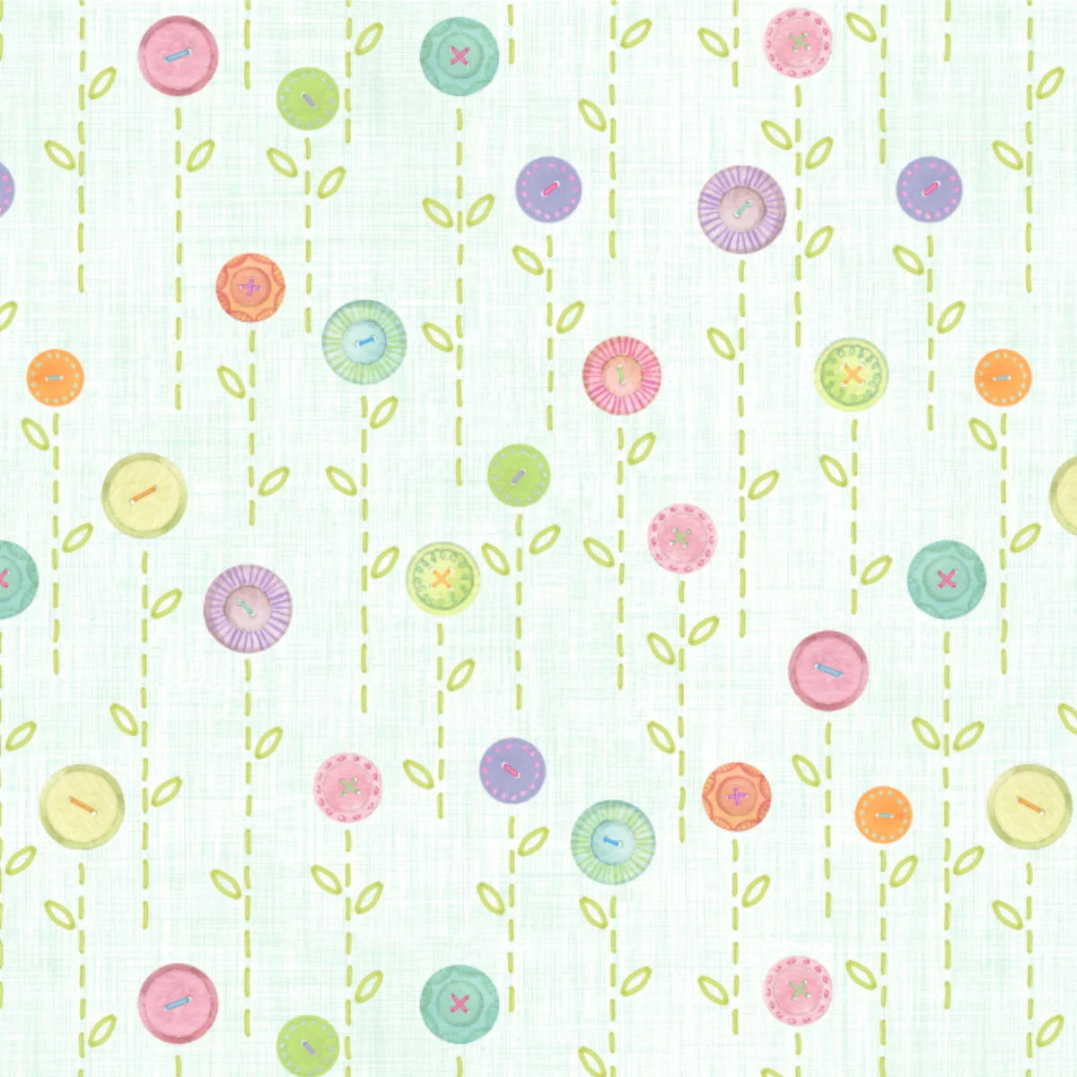
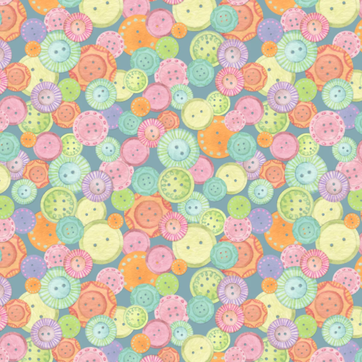
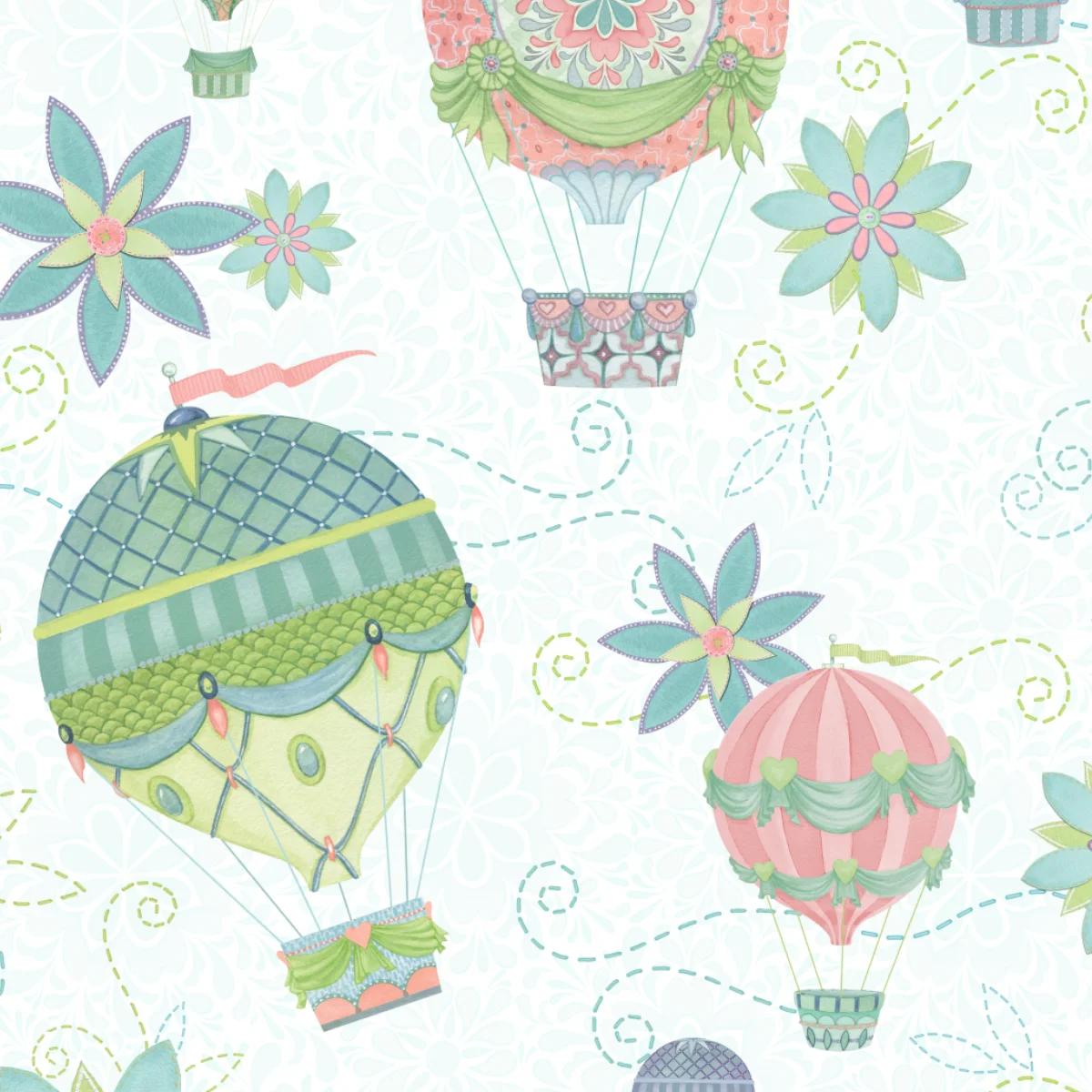
Nicole Tamarin works in watercolour and is drawn to classic themes and imagery, anything from florals to children’s to the everyday. She loves details and little extras, and tries to deliver a consistent level of polish to all of her work. She launched her business at SURTEX in 2012 and is excited to return for her third show this spring.
If you would like to know more about surface pattern design, you can download the UPPERCASE Surface Pattern Design Guide here.

Paper & Cloth is a design studio in the UK with a strong focus on illustrational talent. "There has been the odd flamingo running crazy in the studio,” they write about their promo piece. "We are loving all the gorgeous painterly, inky trends we are seeing… Check out the dapper zebra. Inky and yet somewhat debonair don't you think?"


Holly Maguire is an illustrator based in Bristol, UK, with a big passion for surface pattern and textiles. Her work tends to include detailed yet playful and bright imagery made using gouache, and pen and ink. Holly really enjoys being able to apply her work to homeward, clothing and functional items. Her patterns are inspired by vintage design, packaging, fashion and popular culture. They often feature elements of nature and food, as well as everyday objects.
Be sure to take a look at Molly’s Etsy page to purchase her cheerful patterns on prints and cards.
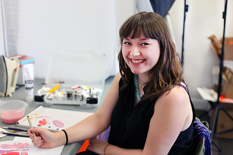
photos by Cara Howlett
Illustration has always been a part of Melanie’s life. As a child growing up in Saskatoon, Saskatchewan, Melanie seemed to be born with the skills of an illustrator. “Illustration was always there. My parents always bought me sketchbooks. As soon as I was done with one, they would have a new one for me right away. They were really happy that I was so into drawing,” says Melanie.
Throughout high school, Melanie’s love for art continued, but she wasn’t sure if she wanted to pursue it right after graduating. “I was kind of done with school for a little bit, so I took a year off and worked retail…it was horrible. Partway through that year all I thought was, 'Okay, I’m going back to school for sure!’" Melanie had a friend that was enrolled in the animation program Sheridan College in Ontario, and after hearing about how exciting things were at Sheridan, Melanie decided to register into the illustration program and work towards a Bachelor of Applied Arts.
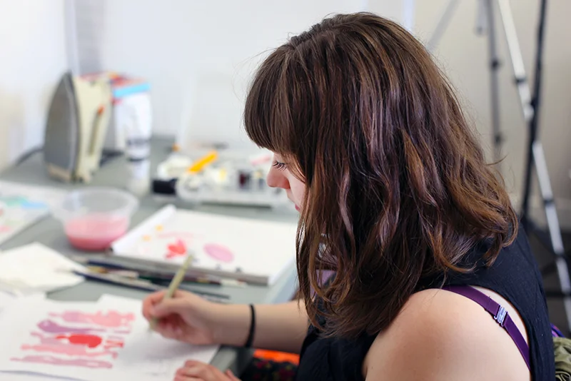
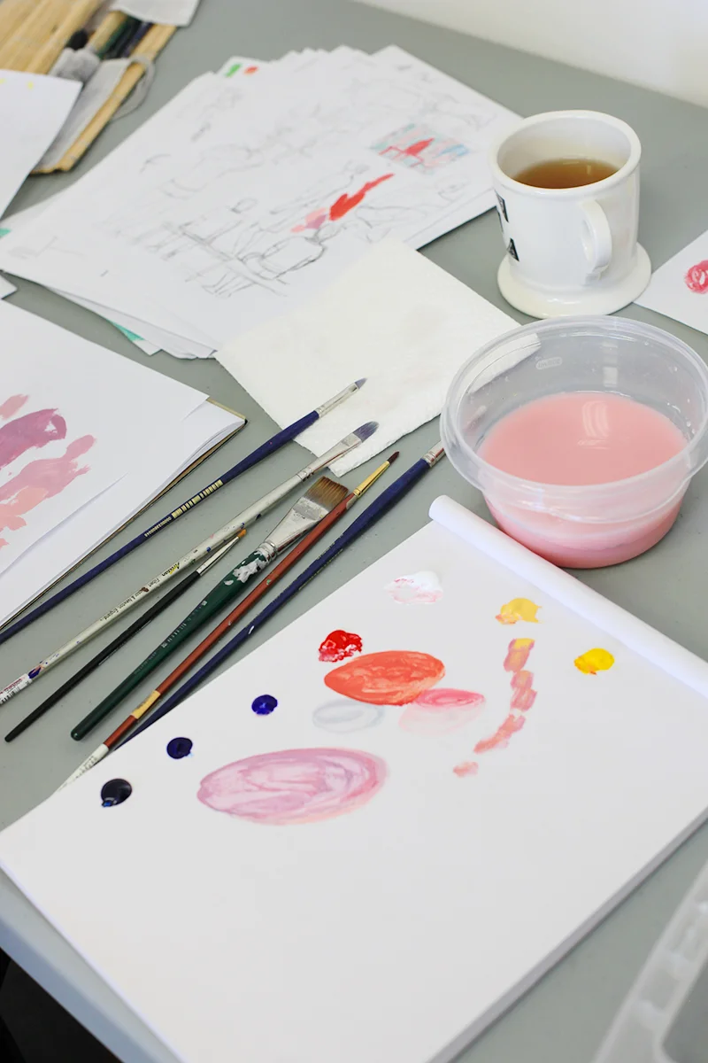
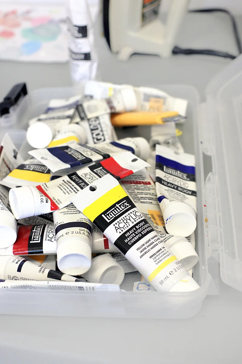
Over the years, Melanie developed her own unique style of illustration using ink, acrylic paint, and sometimes charcoal. Her narrative and emotive illustrations usually take the viewer on a journey. “I definitely enjoy telling stories, and that’s always been the case…even when I was little I’d always draw these really elaborate stories and they didn’t really make much sense, but they were very dramatic with lots of action and stuff, so I guess that’s kind of stuck with me.”
An owner of two little dogs named Douglas and Veronica, Melanie loves to illustrate her furry family members. “My dogs are always up to something. I have lots of ideas for little comics or little images of them getting into trouble.” You can see illustrations of Melanie’s pooches on her website.

After Melanie finished her degree at Sheridan, she and her partner moved to Calgary in September 2013. “When I moved to Calgary, I knew I wanted to be a part of UPPERCASE,” says Melanie. “I just knew that I wanted to get involved more with the arts scene here in Calgary, and I figured working with Janine would be a good way to jump-start that and hopefully get my freelance going a little bit more.”
During Melanie’s time here at UPPERCASE, she’s working on an illustrated booklet about teen issues. Using colours to emphasize emotion and action, Melanie hopes that readers will relate to her drawings and be reminded of their teenage years through her use of colour. “I had a really nerdy, kind of sheltered, safe little teenage-hood, but I’m kind of going off of experiences from other people and things I witnessed first-hand. I’m trying to keep it easy to get into, but not too heavy,” says Melanie.
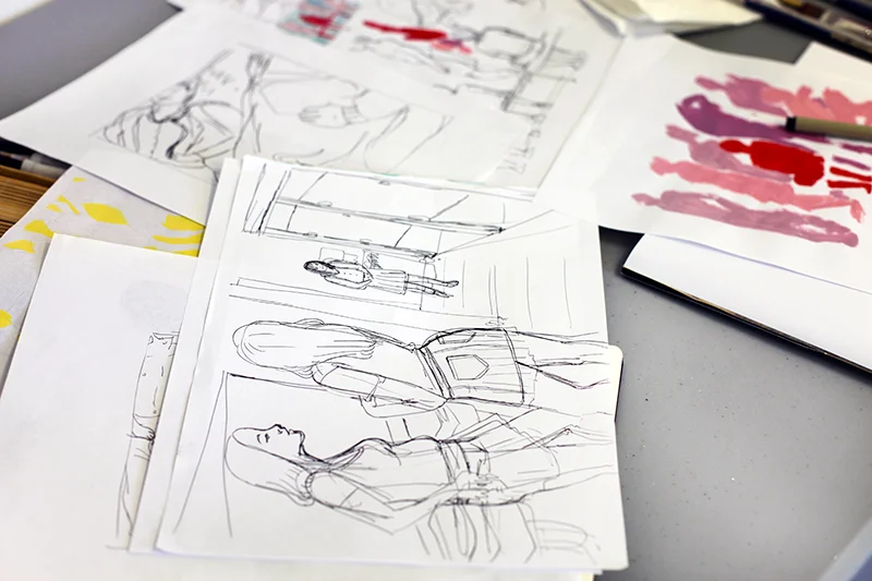

After her residency at UPPERCASE, Melanie hopes to illustrate full time. “That’s the dream, to do it for a living, and to just really enjoy it."
We’re looking forward to seeing Melanie’s work throughout the month and we’re even more excited to see her work in the summer issue of UPPERCASE.

I have to say that one of the nicest things about UPPERCASE readers is their generosity. Not only do you share your work with me in each and every issue, but your tweets and instagram photos and emails of compliments and suggestions are very much appreciated. I am also completely spoiled when it comes to getting amazing mail from all over the world.

Kim Welling, an illustrator from the Netherlands, surprised me with this beautiful plate for my birthday. (You can read our profile about Kim here.) The lady on the plate resembles me a bit—I'm not sure if that's on purpose!—but I'd definitely love to dress like her with that stylish cape and fashionable envelope purse. Thank you, Kim!

illustration by Kim Welling for Flow Magazine
Kim just launched a new website where it is easier than ever to appreciate the great work in her portfolio.

Winter Camping by Kim Welling
{Hand lettering by Neil Tasker}

Join Carolyn Fisher in celebrating her new book called WEEDS Find A Way. A book launch party will be held at Monkeyshines Childrens Books at 2:00 pm on Saturday, April 26. Take a look at the WEEDS book trailer here.
Surface Pattern Design Guide and Work/Life 3 participant Lesley Barnes was asked by 3M, the makers of the famous Post-it note pad collection, to work on some designs for their Signature SERIES. Lesley's Lavish Elegance and Eclectic Chic collections are available for purchase here.

Our friend Shelley Davies created this colourful Easter assemblage.
Happy Easter, everyone!
{ via My Life in Vogue video contest }
Thank you for all your orders and subscriptions this week! It looks like everyone is excited as we are about issue #21 and the UPPERCASE Surface Pattern Design Guide! I've been receiving lots of exclamation-marked emails from the participants that got into the guide. Susse Linton even sent this little pup in her message:

I am thankful for ALL the submissions—even if I didn't select your particular entry—it was an abundance of great stuff and it was really a tough challenge to whittle it down to just 100. Stay tuned... I'll be posting a video about the guide and some of the things I learned after reviewing over 2,000 pattern designs!
If you need a creative infusion, Lisa Congdon will be teaching a four-week class on the basics of line drawing over on Creativebug. Whether you already draw and want to deepen your practice — or want to overcome the intimidation of picking up a pen for the first time — this class offers something for everyone. Participants can benefit from weekly chats with Lisa, as well. Access the class with an monthly membership to Creativebug (now only $9.95 per month). I've been a paying member of Creativebug for many months—their videos are terrifically produced and the content is great. I'm still benefiting from the Brand course I took through Creativebug.

Illustrator Brad Woodard (part of Work/Life 3) and his wife Krystal have a Kickstarter project underway to fund a children's book:
In Tatay’s Gift we get to join a young Filipino boy as he goes out to work each day with his Tatay (Tatay is the Tagalog word for dad). The boy and is Tatay do a different job each day of the week, from selling popsicles by the beach to driving a Jeepney through the city. As they work, he learns the lesson of serving and giving to others by watching his Tatay everyday. This vibrant, and colorfully illustrated book is based on stories from Brad’s time spent in the Philippines and the wonderful people he met there. Tatay’s Gift not only celebrates the hardworking, loving, kind, and giving attitudes of the Filipino people, but it also teaches the valuable lesson of giving back to to your community and helping those in need.
I've put in my pledge!

During our recent Open Pitch, illustrator Megan Eckman sent in the above illustration with an interesting note:
"I am an anti-hoarder. While most people who love ephemera have boxes overflowing with letters, postcards, and photographs, I love ephemera by turning it into art. Recently I've been playing with mundane telegrams. Telegrams themselves seem magical to us nowadays and yet, these flower orders from a wholesale florist to his supplier are at odds with that (unless some magic is boring). My most recent painting combines pen and ink and acrylic atop such a boring telegram. The merging of fantastical portraiture and realistic ephemera creates a tug for the viewer and urges them to see even boring paperwork in a new light."
Visit Megan's blog for more work.


The UPPERCASE Circle is free for subscribers of the print magazine. Find out more.
UPPERCASE is a quarterly print magazine inspired by craft, design and illustration. A playful exploration of creativity, an affinity for vintage ephemera, and a love of handmade are some elements common in each issue. The magazine boasts high-quality paper and printing, a unique design aesthetic and incredible attention to detail.
Janine Vangool
publisher / editor / designer
Send a message →
* Before emailing submissions follow the guidelines here.
Glen Dresser
customer support
Please contact Glen for help with your purchases, wholesale inquiries and questions about your subscription. Include your full name and mailing address so that we can better assist you.
Send a message →
UPPERCASE publishing inc
Suite 201 b
908 17th Avenue SW
Calgary, Alberta T2T 0A3
403-283-5318
The studio is not open to the public—please get in touch to make an appointment. If you'd like to purchase our magazine and books locally, please see the stockist page.