type tuesday: print weave make

​A poster by Luke Lucas:

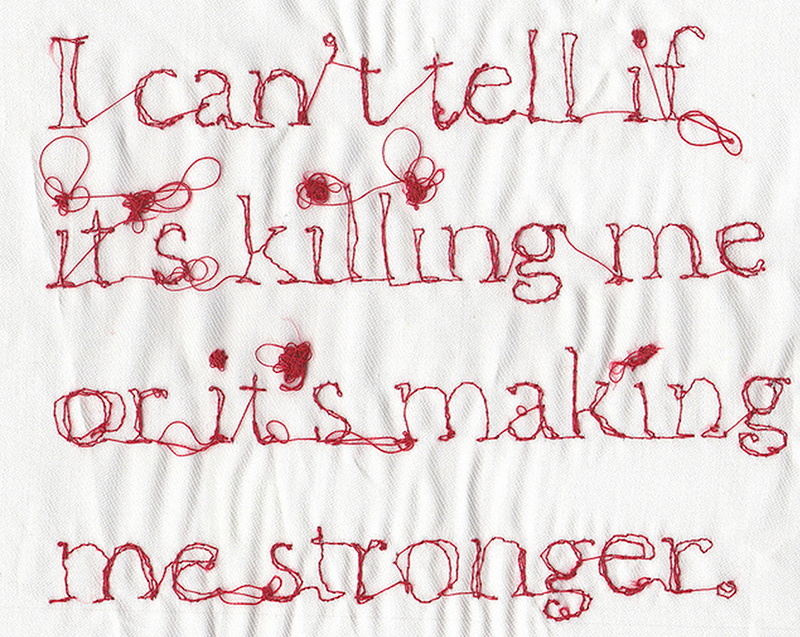
"I was commissioned to create an ID for a series of open days for CraftAustralian Print Workshop and the Australian Tapestry Workshop

I wanted to represent the hand crafted arts of the respective institutions through a hand crafted approach. My response was to develop a simple typographic ID and then created individual executions that represented the respective institutions texturally and aesthetically. Combining modelling clay, hand stitched letter forms and a coarse halftone pattern synonymous with the printing of yesterday I created a physical layout which I photographed and retouched."

Luke was part of our Beautiful Bitmaps project published in issue 15 and on display in this online gallery.​

type tuesday: intersections

​Another group project of note, this one in Vancouver, Canada:

Intersections

"Great cities are defined by great intersections; locations that play host to significant historical events, define the culture of a neighbourhood, and are the meeting point for diverse groups of people. On view at Vancouver's Waterfront Station through the Summer of 2013, Intersections invited seven Vancouver-based designers to explore seven essential locations throughout the city."

Denman & Davie by State Creative Group

The intersection at Denman and Davie sits as a little island of colour amidst the backdrop of the more muted Pacific Northwest environment; a little gem in the city. Hence the "gem" graphic, which consists of colours that conjure up the era of architecture in the neighbourhood but also represent the intersection’s unique surroundings: palm trees, ocean, sand, sunsets and fireworks. The clean lines and geometric nature of the lettering were inspired by the fonts used to display the building names seen in so many of the apartment lobbies in the West End.

Broadway & Granville by 10Four Design 

The focus for the Broadway & Granville poster was the prevalence of public transit found at the intersection. Six major bus routes converge on the intersection and the 99B-line along the Broadway corridor moves more people than any other transit route in North America. The layered, abstract photograph of the trolley cables creates visual texture in the background of the poster. The custom typography is reminiscent of the hand painted shop signs and storefront windows from the high society days.

SE Marine & Knight by Working Format

For a city that’s managed to escape the construction of large freeways, the intersection at SE Marine & Knight St is about as close as we get. Most of us are familiar with the intersection from routine trips to Ikea, and little more. Its oversized clover-leafs and reputation as the most dangerous intersection in Vancouver is hardly something to celebrate, yet it remains a critical through-fare, carrying people and products in and out of the city, and across the Lower Mainland.

Thank you to Working Format, one of the organizers of The Platform Gallery.​

typeforce chicago

The folks at Firebelly Design invite us to a typography exhibition in Chicago opening later this week:

TYPEFORCE is an annual celebration of typographic innovation and excellence, a Chicago-centric exhibition featuring some of today's youngest, strongest and most contemporarily relevant design, type, and lettering talent. This year there are 45 artists creating 22 projects for the 4th year of our event, scheduled for Friday, March 1st. 

thread week + type tuesday = MaricorMaricar

One cannot have a "thread week" and "type tuesday" without mentioning the incredible talents of MaricorMaricar:

I am so pleased that we have been able to feature their work in UPPERCASE magazine a few times. Most recently, MaricorMaricar made the letter Z for Issue 15's Beautiful Bitmaps.

Available as a print in the UPPERCASE Society 6 shop.

Visit their Big Cartel shop for this print.

tab-a-lets

Here's a simple idea executed nicely: Tab-a-Lets are inspired by those metal visitor tags that you get a big museums and galleries. Just fold the tab over a string or ribbon and adorn to your heart's content.

Info graphic of museum tags from Fast Co.

The Obsessive Imagist made a garland out of all the museum tags she's collected. Now I wish I'd have saved the various tags I've seen over the years.

type tuesday: bodoni gold

Greek designer Andreas Xenoulis and tind (self-proclaimed "silkscreen printer extraordinaire" indulged in some printmaking glory when producing Andreas' poster homage to Bodoni. Here are the variations they produced:

Gold on Dark Brown Paper 180gsm / series of 11
2 different Gold inks on Dark Brown Paper 180gsm / series of 10
Gold & Real Gold Foil on Dark Brown Paper 180gsm / series of 5
Gold & Alumi Foil on Dark Brown Paper 180gsm / series of 1
Gold on White Perl Paper 240gsm / series of 1
Gold on White Adhesive Sticker / series of 1
Gold on Transparent Adhesive Sticker / series of 1 

See more process photos here. Available here.

type tuesday: Nikki Villagomez's Culture and Typography

It's Type Tuesday and today I'd like to introduce you to Nikki Villagomez and her blog, Culture and Typography. Her (very entertaining) blog studies how place and culture inform typography in public space. The seed idea for the blog dates to a project from 2004:

"Several years ago I founded and was president of the South Carolina chapter of AIGA. We had a ton of fantastic speakers that came through, but there was one event that had the most impact for me. I made friends with the president of the Honolulu chapter at a leadership retreat and talked her into doing a ‘Culture Exchange’ for our upcoming December event. We boxed up things that were specific to South Carolina in addition to projects designed for SC clients by SC designers. The Honolulu chapter did the same. We mailed the boxes to each other and on the day of the event, the packages were opened.

I was blown away by how much their culture affects their design and it forced me to look at design in a completely different way. Font selection, colour usage and other design choices inspired by the visual language of their cultural surroundings were inspiring and revealing."

From Nikki's Pinterest board, The Manhole Project.

Nikki's blog is really fun to read—her level of enthusiasm for the seemingly mundane manhole (Manhole Mondays) to ghost signs and No Parking signs knows no bounds.

"After my term as president of the AIGA South Carolina chapter was over, I stayed very active teaching typography and graphic design at the University of South Carolina. I had a couple of kids (one named after a font! ha!) and freelanced. These two exchanges stuck with me over the years. After I started working full time as an in-house designer for a healthcare consulting firm in Ohio 2 years ago, I needed a creative outlet. I started my blog purely as a way for me to feed my love for typography. I post 5 days a week and as of the spring of this past year, it has started to catch on."

She often compares vernacular typography from one locale to another. Here's a taste of her writing comparison of two signs, one from South Caroline and the other from Ohio. She titles her post "Holy Red Cursive Lettering!".

"This is one of those pairings that gets me all hot and bothered inside. And I mean that in the best way possible. What."

Both of these type treatments have such a story to tell and I’m totally listening. I lived in Columbia, SC for 9 years and Pecknel Music was around for as long as I can remember. I love these letters. They each have such a strong personality they couldn’t possibly be joined together. It’d be too overwhelming. So, they stand alone. That k is out of control. All she’s missing is a string of pearls around her neck and she’ll be ready to hit the town. That 2nd e looks a bit lonely but the l is right there lending a hand. 

Unlike PecknelCarroll is happily connected and loving life. Not sure what’s going on with that 2nd l. He seems to be falling a bit. Poor guy. Such beautiful typography.

The popularity of her blog has led to numerous speaking engagements. She'll be speaking at AIGA San Antonio, AIGA South Dakota, AIGA Orlando and AIGA Upstate NY early next year.

"For my speaking engagements, I ask local creatives to take pictures of anything type related that is unique to their city (graffiti, ghost signs, manhole covers, etc.) and send them to me 1 month prior to my talk. I pair their pictures with pictures that I have collected (either taken myself or have been shared with me) from all over the world. It has made my presentation more interactive and each presentation is unique to the city it is in. It has been a really rewarding experience traveling to different cities and highlighting how easy it is to take our surroundings for granted and just how unique each city is." 

A sign in Columbus, Ohio. "I still can’t believe how awesome this sign is. Obviously I’m nuts for the type but the colours, the worn metal, the light bulbs…that CLOCK!"

type tuesday: Font Aid

Font Aid has initiated projects after some major disasters to help raise funds for the Red Cross. In response to the events of Hurricane Sandy, Font Aid is asking for submissions of asterisks and will be creating a typeface to be sold as a fundraiser. Get your submissions in by November 17.

Why the asterisk? An asterisk can denote something that requires attention — and an event of this magnitude and impact certainly deserves some attention. The asterisk can also provide *emphasis* to important information amidst fields of plain text. The root of the word comes from the Greekastēr or “star” - signifying hope and light. In computer terms, it’s a wildcard character … and hurricanes are certainly wild and unpredictable.

type tuesday: beautiful bitmap b

A beautiful b by Jason Santa Maria.​

​I was stunned when I first saw Jason Santa Maria's Beautiful Bitmaps submission... one would assume that this inky depiction is photoshopped, but it is not. Up close, you can see the reflection of the photo lights in the wet black. The talent and confidence to do this! So expertly done not only in execution, but also the concept behind this Baskerville b is interesting and thoughtful.

Jason is a very busy designer living in Brooklyn.​ Among his many projects, he is creative director at Typekit, on the faculty of the School of Visual Arts and founder of Typedia.

type tuesday: 15 puzzle

As I read through the printer proofs of issue 15, I present these images of the sliding 15 puzzle to ponder. This puzzle, invented around 1874, involves 15 sliding blocks in random order, in rows of 4 with one tile missing. The object is to slide them back into numerical position.

​According to Wikipedia: "The game became a craze in the U.S. in February 1880, Canada in March, Europe in April, but that craze had pretty much dissipated by July. Apparently the puzzle was not introduced to Japan until 1889."

i remember getting cheap versions as birthday party favours when I was a child.​

type tuesday: Elegantissima by Louise Fili

We send our congratulations to Louise Fili and the talented people at her studio on the release of the new monograph about Louise's design and typography.​ I received a copy of Elegantissima last week and it has been my constant companion, sitting beside me at my desk. During breaks from designing issue #15, I'd turn to its pages for visual and mental refreshment. (Ah, such delicious food packaging!)

There is a short and sweet foreword written by Steven Heller, Louise's husband. He shares a typewritten letter from 1982 that he wrote to Louise, complimenting her on her book designs.​ At the time, he was art director of the New York Times Book Review. "I had never met [Louise] and, in fact, had never laid eyes on [her] before. A little more than a year later we were married," he writes.

The works presented in Elegantissima are beautiful examples of the romance​ between designer and letterform. Louise's life-long passion for beauty, perfection and play is evident page after page.

​portrait of Louise Fili by Jordan Provost, issue 9

I am honoured that one of my design heroines has been part of UPPERCASE—we featured Louise in issue 9 in an article written and photographed by Jordan Provost. (See additional photos from the article below.) Louise is also one of the designers who participated in Beautiful Bitmaps, so we can all look forward to seeing her submission in issue 15.​

​Elegantissima is published by Princeton Architectural Press. Issue 9 is available in our online shop along with other back issues—quantities are dwindling and back issues won't be reprinted.