TypeCon 2015: Highlights

This guest post is by TypeCon correspondents Almenia Candis and Allie McRae.


From Almenia:

TypeCon 2015 was definitely an experience that I wish was not over in so few days. Not only did I make new friends, rub elbows with giants in the graphic design and typography circles, but I had a wonderful experience learning more and feeling like I was in university again.

I was fortunate to take the expressive brush lettering workshop with calligrapher Stephen Rapp. In this day-long workshop, we were provided with supplies, a few notes, and one on one demonstrations on how to achieve a variety of calligraphy strokes. So many questions were asked, and Stephen provided excellent tips and feedback on pressure, ink flow, and chair position to yield beautiful results.

If you weren't able to go to a workshop, there was still a chance to try your hand at cranking out some letterpress around metro Denver. There were 30 of us on the party bus as we made a series of stops to add pieces to our letterpress sheets. It may have been the only field trip that was educational, fun, and involved free brews while mingling with the very gracious hosts at Matter, Genghis Kern, Foil + Dies, and Now It's Up To You Press.

Last but not least, there was a brief eulogy presented by Akira Kobayashi for Hermann Zapf who passed away in June this year. Akira tells of his early days as a graphic designer, he was given the book "About Alphabets" and it has remained a great source of inspiration to the care and meticulous process of Zapf's typefaces and calligraphy work. Creator of fonts such as Optima and Palatino, Zapf's work surpasses trends and his legacy will continue to set an example for new type designers of tomorrow.
 

From Allie:

It’s tough to pick just three highlights! There were so many spectacular speakers and events that I enjoyed, but I managed to narrow it down to these:

Douglas Wilson gave this great, lighthearted talk on ‘The Beautiful Island of San Serriffe,’ a completely fictional island that made its debut in an April Fool’s edition of The Guardian, a British newspaper. The newspaper dedicated seven pages of articles to this island that included news of its culture, geography, and economy. The island is jam-packed with hilarious typesetting puns: Upper Caisse and Lower Caisse are the names of the two islands; Gill Sands Beach; and the dictator of San Serriffe is General M J Pica. I was laughing through the entire talk. Here’s an article about the prank.

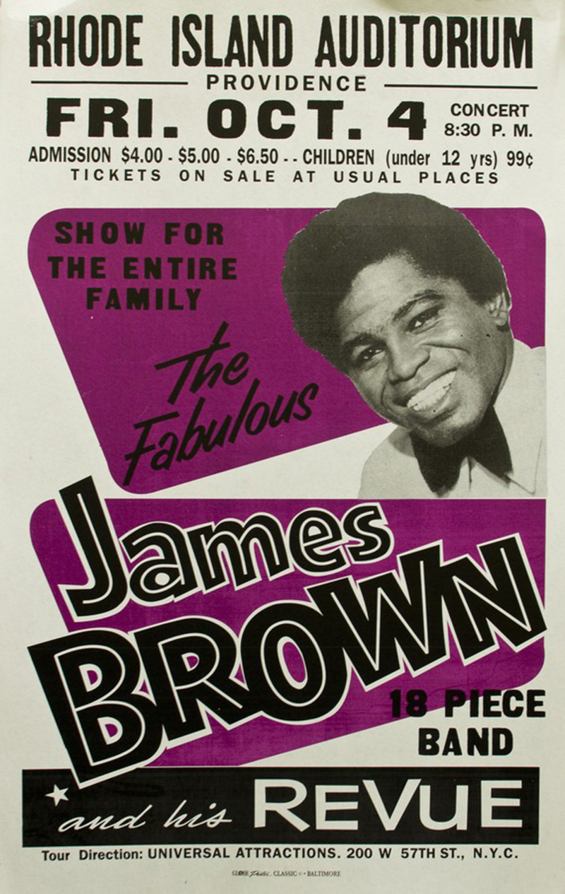
The very first speaker of the program, Mary Mashburn, set the bar high with her talk titled ‘Life Lessons from Globe Poster.’ Countless jazz, blues, and go-go musicians came to Globe Poster in Baltimore to have them design and print their show posters. The Globe Poster Collection is now housed at MICA and students are in the process of sorting through and using the thousands of pieces of type to make new pieces.

And finally, I was very inspired by the works of Ernst Schneidler and his students that Rob Saunders shared with us. Ernst was an influential teacher of letter arts in the 20th century and now much of his work is housed at Letterform Archive, founded by Rob.

UPPERCASE provided complimentary magazines for attendees. Thank you to TypeCon for in turn providing passes to these two correspondents. Want to subscribe to UPPERCASE? Use the code "typecon15" for a subscription discount. Code expires on September 1.

TypeCon 2015: Type of Place

Guest Post by Allie McRae, TypeCon 2015

The speaker I had been waiting for all TypeCon weekend finally made her way up to the stage first thing Sunday morning. Meta Newhouse was my professor for a couple years at Montana State University and we got to know each other very well during a semester abroad in Italy, where she taught Experimental Typography. Even though I have a personal relationship with Meta and was even a contributor to the Type of Place project at its start, her talk went into detail about the parts that I wasn’t involved in: how the project came about and where it is now.

A little background about Type of Place — This research project was started by Meta and her former colleague at Montana State University, Nathan Davis. Meta and Nathan were teaching a workshop at the Atypi Conference held in Reykjavik, Iceland in 2011 when they had a brilliant idea to trek around the city and take photos of native Icelandic type to take back to the classroom to analyze. They were looking to see if they could deduce any cultural characteristics unique to the area from the type specimens they found. Meta puts it more eloquently: “What can be learned from collecting, archiving, comparing, and sharing typography from different parts of the world?”

A year after Atypi, Meta was still thinking about this question and was brainstorming ways that her and Nathan could grow the database of type, preferably from locations around the world. We were in Italy at the time and were the perfect guinea pigs for Type of Place. Between 15 of us students, we took hundreds of photos of type while wandering the streets of Rome. Meta and Nathan took those photos back to Iceland for DesignMarch 2012 to compare them with the collection from Iceland.

One of the catalysts to this whole typographic investigation stemmed from Geert Hofstede’s Dimensions of National Culture. After reading this, Meta thought she could take one of the six dimensions of culture, particularly Masculinity vs. Femininity, to make a connection between this idea and the type specimens. As it turned out, while comparing Hungary with Iceland, Hungary’s type was heavy on the serifs, making it feel commandeering and patriarchal. Iceland, on the other hand, had an abundance of softer sans-serifs that felt more tender and modern. Type of Place was on to something.

Fast forward now to the present day — Type of Place is growing to include more and more collections of vernacular type from places like Toronto, Vienna, Prague, and Seattle. However, they’re not done. Meta and Nathan are going to use crowd sourcing by means of a mobile app that will allow users to constantly expand and give depth to the archive. The Instagram-like app is still in development but a beta version will be available for iPhones in the coming months.

I did not do this research project justice with this brief blog post, so I encourage you to check out typeofplace.com and stay tuned for updates, like the release of the app. Plus, this archive will be shared publicly for anyone to use for research purposes or simply to look at super cool type. I’m looking forward to seeing where this project ends up because I think the potential with this database will be endless. So stock up on those type photos while you’re wandering around your city, we want to see them!

TypeCon 2015: Genghis Kern

Guest Post by Almenia Candis

There is always the thrill of winning an online auction. For Jason Wedekind, owner of Genghis Kern in the Denver Highlands, this was very true when hunting for a complete set of movable type. When he was lucky enough to find a set of slab serif characters, there was something extra that drew a lot of excitement. He soon realized that he held in his hands carved history on the other side. 

From ancient maps of Colorado, to a crude engraving of a figure in a very NSFW position, these hidden gems showcases skills of artists past, but also a few with very common printmaking mistakes. You know to mind your p's and q's? Don't forget to engrave your numbers and symbols in reverse as well. 

We were also lucky enough to see these in person during our Letterpress Tour around the Denver area. It was almost surreal being able to hold something that some would display in a museum behind glass. At the Genghis Kern letterpress studio, it was part of the hands on experience to feel the same thrill as Jason. With so much to learn from experts in diverse fields of typography and new acquaintances to keep in touch with, TypeCon was a truly rewarding experience. 

TypeCon 2015: Marian Bantjes

Guest post by Almenia Candis


Keynote speaker of TypeCon 2015 Marian Bantjes opened with a look back at her portfolio. She has used a variety of mediums including dirt, sand, flowers, My Little Pony hair and has made type to look sweet like candy or haunting like an eerie house.

One of the most interesting aspects of her work is making her audience figure out what is being written. It goes against one of the primary rules of typography of making sure the reader has clarity of the text before them. For Marian, it is more of a puzzle hidden in an obscure pattern. She frames her work using existing grids from magazine layouts or photographs of city structures and invites the reader to peek closely at her hidden messages

Later in her career, Marian has steered away from typography and has focused her attention to pattern design. From fabrics, to carpets, to wallpaper, Marian's designs stay complex using the simplest of repeating shapes. Objects found around her home have been made into ornate patterns that give a kaleidoscope effect with a few tweaks in Photoshop to enhance the colour and beauty in every element. 

Explore the British Columbian Rockies with Marian and her dog in a series of video vignettes. The piece, above, was created in response to her experience.

Marian's presentation has not only stuck with me because of her portfolio, but also from words spoken when she asked herself, "What is worth spending your valuable time on?" It is something anyone can take to heart as they pursue their creative hobbies when they must ask themselves if they want to continue in their current path. In Marian's case, it has opened up a new dimension in her work to create elaborate collages for her own masterpieces.

TypeCon 2015: Denver Letterpress Tour

Guest post by Allie McRae
 

Man, what a weekend it was at TypeCon! I was thoroughly impressed at the vast amounts of intelligence I was surrounded by, and yet how approachable and willing everyone was to meet new people and share their passions. Of all the speakers and activities I participated in, the Denver Letterpress Tour was by far the highlight of my weekend. On Friday evening, after a full day of lectures on topics ranging from the inner workings of Adobe’s type team to the endless possibilities of OpenType features, I was ready to get out of my chair and get my hands in some ink.

The evening started out with 35 of us conference attendees parading up the steps, single file, into an overhauled, matte black school bus that has rightfully earned the title of a Party Bus. With two long benches down each side, a flat screen tv on the back wall, and the bass thumping, we made our way to our first of four destinations—Now It’s Up To You Publications, a backyard letterpress studio belonging to Tom Parson. Tom and his family graciously let us crowd into their yard and admire a staggering amount of letterpress equipment and ephemera that Tom has printed over the years—including some of his own poetry—along with a handful of working presses. With only 25 minutes at each of our stops, we hustled to get our posters printed with our first run; at each stop we were going to add onto our poster until we had a complete print at the end of the evening.

Next up, we swung by Foils + Dies / Vintage Pressworks, to visit Rob Barnes and his stellar team. Foils + Dies is a luxuriously spacious studio with great, stately presses and enough enthusiasm to keep you entertained for hours. In contrast to Tom’s individual operation, Foils + Dies is set up to handle large orders and get them in and out in no time. There’s a bright future for Foils + Dies as they prepare for a move to Rob’s ranch just west of Denver, where an entirely new home (with lake views!) is being built for the presses. With our second colour of our print successfully checked off, we headed out once again to our awaiting Party Bus.

Our third stop was to the cleverly named Genghis Kern Letterpress & Design studio. Jason Wedekind was one of the speakers at TypeCon that morning so we were already aware of his incredible collection of double-sided letterpress blocks that he had on display at his studio. (My fellow correspondent Almenia Candis will be sharing a post about Jason’s passion for finding these rare, double-sided letterforms because they are truly superb specimens.) We grabbed a local Colorado beer and completed our third colour and round of printing. With enough space and time at this stop, we were able to pull our own prints this time, with some helpful guidance from Jason and his team.

And finally, our last stop on the Party Bus was to MATTER, a bustling, full-service design studio with a print shop on the ground floor. As this was our last stop on the letterpress tour, the Party Bus dropped us off here for a more leisurely stay. The walls of the industrial studio were covered in graphic inspiration and Rick Griffith, the head honcho of MATTER, wasted no time in sharing his complex ideas about creativity and MATTER’s design process. For the last time we wound our way through the line to complete our prints. A few of us that stayed a while longer were able to print a bonus round and have Marvin Gaye’s head permanently debossed onto the top of our design. Personally, I think Marvin’s smiling face is what truly made the different elements of the poster come together.

Besides my love of letterpress—the inevitable grime under my fingernails, the smell of ink, the unavoidable ink smudge, the sound of the whirring press—the other 30-some-odd people adventurous enough to climb onto that Party Bus made for the best company. I’m so glad I had the chance to visit some of the quality, local print studios around Denver and to be squished so tightly in that bus that I was bound to make new type-nerd friends.

TypeCon 2015: Meet Correspondent Almenia Candis

I'm lucky to have two correspondents at this week's TypeCon in Denver.

Almenia Candis is a newcomer to the Denver area, so when she applied for one of the free TypeCon passes she wrote, "I would love to be able to attend and see first hand other type designers and inspiration in this new city that I've called home for the past 9 months." 

Here's more from Almenia: "I've been a lover of type for some time and have recently taken up calligraphy as my obsession. I've acquired a lot of great inspiration from people all over on Pinterest and YouTube, including Kyle Gallant whom I'm so glad to see featured in recent UPPERCASE newsletter." 

Made a video of myself doing Reddit's word of the day. Enjoy! Materials: Pilot Parallel Pens (all four sizes) Rhodia 8.3x12.5in Dotpad Pilot Razor Point II (for the date) Song: "New Output" by Sferro

Almenia is posting photos and videos from TypeCon, and you can see some of her previous lettering experiments and practices over on Instagram:

TypeCon 2015: Meet Correspondent Allie McRae

TypeCon kicks off this evening, so I'd like to introduce you to the first of two UPPERCASE correspondents who will be enjoying the typographic and lettering goodness at the event in Denver August 12–16.

Hi all, I'm Allie, a graphic designer in Fort Collins, Colorado. I’m just starting out my career at a small marketing and public relations firm (with some freelance lettering and design work on the side) after recently graduating from Montana State University in Bozeman, Montana.

While in college, I spent a semester abroad in Italy, spending my days studying experimental type — needless to say, I have been in love with letterforms and type design ever since. I am so thrilled to be able to nerd out on typography for a weekend at TypeCon and I’m looking forward to sharing snippets with you guys!

Follow @uppercasemag and Allie on social media and check back here for dispatches from TypeCon. Thank you to TypeCon for the correspondents' free passes. Look for complimentary copies of UPPERCASE in the TypeCon goodie bags!

www.alliemcrae.com
www.instagram.com/alliemcrae
http://twitter.com/alliebmcrae

type tuesday: forming words at Flow Gallery

Susanne Matsche

I recently heard from Flow Gallery, located in London's Notting Hill. Their current exhibition entitled "Forming Words" includes work by issue 16 cover artist Debbie Smyth. Though I'm on the other side of the ocean, the exhibition has introduced me to some intriguing artists such as Susanne Matche, featured in this post.

​If you are fortunate enough to be in London, a visit to this exhibition promises to be an experience of note:

Flow has asked selected artists to create new work based on a piece of writing of their choice, from poetry to a letter to lyrics. Whether it is the shapes, lines and curves which letters create that inspire the work, as in vibrant wall pieces by Debbie Smyth that motivate the work. Or simply the fluidity of the writing, artists exploring this theme express the diverse approaches and outcomes this one theme can manifest. Many of the artists have chosen to utilise the meaning of their selected text or the message that the text communicates to inform their work. Other artists, such as Aino Kajaniemi take a personal approach to using text with particular memories woven in thread. The work in this exhibition traverses disciplines. Jewellery will be exhibited alongside silver teacups, ceramic vessels and enamel plates. The variety in material has resulted in an exhibition that intends to capture the endless inspiration of the written word.

​The exhibition continues until May 17.

Susanne Matsche

Susanne Matsche

Susanne Matsche

type tuesday: beautiful bitmap b

A beautiful b by Jason Santa Maria.​

​I was stunned when I first saw Jason Santa Maria's Beautiful Bitmaps submission... one would assume that this inky depiction is photoshopped, but it is not. Up close, you can see the reflection of the photo lights in the wet black. The talent and confidence to do this! So expertly done not only in execution, but also the concept behind this Baskerville b is interesting and thoughtful.

Jason is a very busy designer living in Brooklyn.​ Among his many projects, he is creative director at Typekit, on the faculty of the School of Visual Arts and founder of Typedia.

beautiful bitmaps: X

Louise Fili: When asked to create a bitmapped letter, I began to brainstorm on what forms bitmapping could take. Of course, there are pixels and grids, but how could I transform a harsh, gridded letterform into something beautiful? I began looking into the process of filet lacemaking, and I loved how simple, small squares of thread can translate into lush patterns, forms, and in this case, letters. 

​Here are some other images of filet lacemaking, showing the grid and pixel-like patterns common to this technique.

beautiful bitmaps: Dominique Falla

​From a detailed plan…

to the intricate layering of coloured ribbon.​

Dominique Falla: When I think of beautiful bitmaps, I think of pixels and I wanted to create a blurry pixellated effect with my letter. Each “pixel” that makes up the letter Q is the bottom of a strip of ribbon and I overlaid hundreds of different coloured ribbons to build up a multi-coloured effect. I wasn’t expecting the little bits of fluff at the end of each ribbon to appear, but it adds to the overall shimmering effect and I also love how the colours underneath show through the ribbons above. 

For issue 15, we invited 26 typographers, designers and illustrators to make beautiful bitmaps by taking this vestigial part of digital type—the bitmap—and making it into something to be newly appreciated.

This issue will be arriving in your mailboxes shortly, and we will be celebrating its release with a gallery exhibition of Beautiful Bitmaps here in the UPPERCASE studios (Thursday, October 4 from 5-8pm). All of the artworks are available to view online and will be sold as digital prints. A portion of proceeds from Beautiful Bitmaps will go to creating an UPPERCASE scholarship fund to assist a reader in pursuing education in design, illustration, typography or craft.​

type tuesday: Elegantissima by Louise Fili

We send our congratulations to Louise Fili and the talented people at her studio on the release of the new monograph about Louise's design and typography.​ I received a copy of Elegantissima last week and it has been my constant companion, sitting beside me at my desk. During breaks from designing issue #15, I'd turn to its pages for visual and mental refreshment. (Ah, such delicious food packaging!)

There is a short and sweet foreword written by Steven Heller, Louise's husband. He shares a typewritten letter from 1982 that he wrote to Louise, complimenting her on her book designs.​ At the time, he was art director of the New York Times Book Review. "I had never met [Louise] and, in fact, had never laid eyes on [her] before. A little more than a year later we were married," he writes.

The works presented in Elegantissima are beautiful examples of the romance​ between designer and letterform. Louise's life-long passion for beauty, perfection and play is evident page after page.

​portrait of Louise Fili by Jordan Provost, issue 9

I am honoured that one of my design heroines has been part of UPPERCASE—we featured Louise in issue 9 in an article written and photographed by Jordan Provost. (See additional photos from the article below.) Louise is also one of the designers who participated in Beautiful Bitmaps, so we can all look forward to seeing her submission in issue 15.​

​Elegantissima is published by Princeton Architectural Press. Issue 9 is available in our online shop along with other back issues—quantities are dwindling and back issues won't be reprinted.

type tuesday: Jan Middendorp visit

​JAN MIDDENDORP VISITS THE UPPERCASE STUDIO, JULY 30, 2012

​JAN MIDDENDORP VISITS THE UPPERCASE STUDIO, JULY 30, 2012

If you don't already receive the occasional transmissions from My Fonts entitled "Creative Characters", you should definitely sign up. With in-depth profiles and lots of visuals, these mailings go beyond your typical e-newsletter. "Creative Characters" is written by Jan Middendorp, a designer and writer currently based in Berlin. Jan was travelling through Calgary to visit some family before heading off to TypeCon this week—I was honoured that he stopped by UPPERCASE.

Jan is the author of an amazing typographic tome, Dutch Type, released in 2004. The 300+ page book is an excellent guide to the many prolific Dutch typographers both historical and contemporary. I'm lucky enough to have a copy that I ordered from the Netherlands back when it was first released; the book is quite rare now and Jan himself has just a couple copies left. 

Jan shared a preview of his newest work, Shaping Text.​ Published in two editions (Dutch and English) this book is an overview of typography with a very current and appropriate slant: whether in print or on the web examples of good design are shown with equal importance rather than relegating web- or multimedia-based design projects to an afterthought chapter.

Thanks, for stopping by, Jan. Have fun at TypeCon!​

type tuesday: stampede posters

​For those of you not familiar with the Calgary Stampede, it is an annual exhibition and rodeo with midway rides, nightly fireworks and associated free pancake breakfasts scattered throughout the city (apparently there's an app for finding the breakfast nearest you). For ten days each summer, the city transforms into a strange cowboy and western set: hay bales are public seating, barnwood is tacked up on restaurant doorways, downtown office windows are painted with "yeehaws" and "howdy, partners". Not to mention the fashion: all shades of denim, bandanas, cowboy hats and boots (the more tassels, pattern and snaps the better)—it really aims to be the greatest outdoor show on earth. This year, the Stampede is marking its 100th year. I've lived in Calgary for 20 of them now, so I consider myself a proud Calgarian.

But Stampede is not quite my cup of tea...​ The Stampede is loud; I'm quiet. Beer tents and drinking is advertised as a featured activity; I don't drink. The midway offers bigger thrill rides; I have a weak stomach. Other than the fireworks and the photographic appeal of the midway at dusk, there's not a lot about Stampede that I can relate to.

I wonder what the early years of Stampede were like... I'd love to attend Stampede 1912 rather than 2012. Thanks to an exhibition in Art Central, I was able to a step back in time with the poster graphics of years gone by.​

​The exhibition is presented by AXIS Contemporary Art and Quintaro Graphic Reproduction and features digital poster reproductions on various substrates such as metal and rawhide. In addition to the typographic interest of the earliest posters, from a design standpoint it is interesting to see how versatile digital printing technology is. The show gave me lots of ideas of how I could reproduce graphic art and posters.

The posters will be on display until July 20th on the main level of Art Central, Calgary.​ (UPPERCASE's studio is on the upper level of Art Central.)