UPPERCASE Volume 2: Dots, Dashes & Diamonds
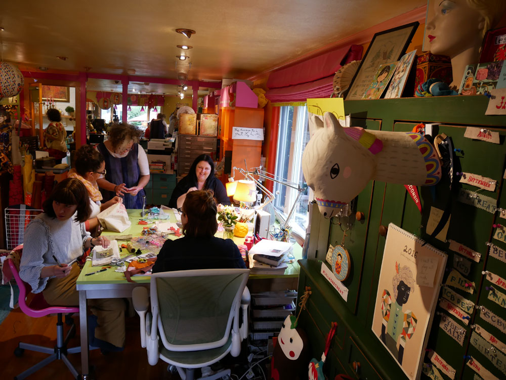
My second collection with Windham Fabrics will be available stores in November! Leading up to its release, I though I'd share some of the process and behind-the-scenes looks at how it came to be. Like my first collection, the designs are inspired by the patterns that appear on the cover and spine of UPPERCASE magazine.

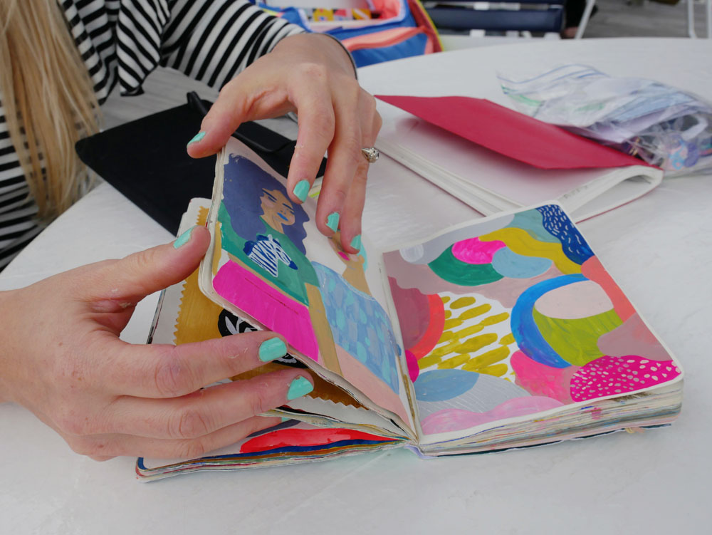
As you can see, there was a lot to work with! It was a matter of whittling it down to create a cohesive collection, while adding in a few new patterns to tie it all together.

My design brief for Volume 2 was "the same but different." So designs that could work as basics, but also some with more colours within a pattern.

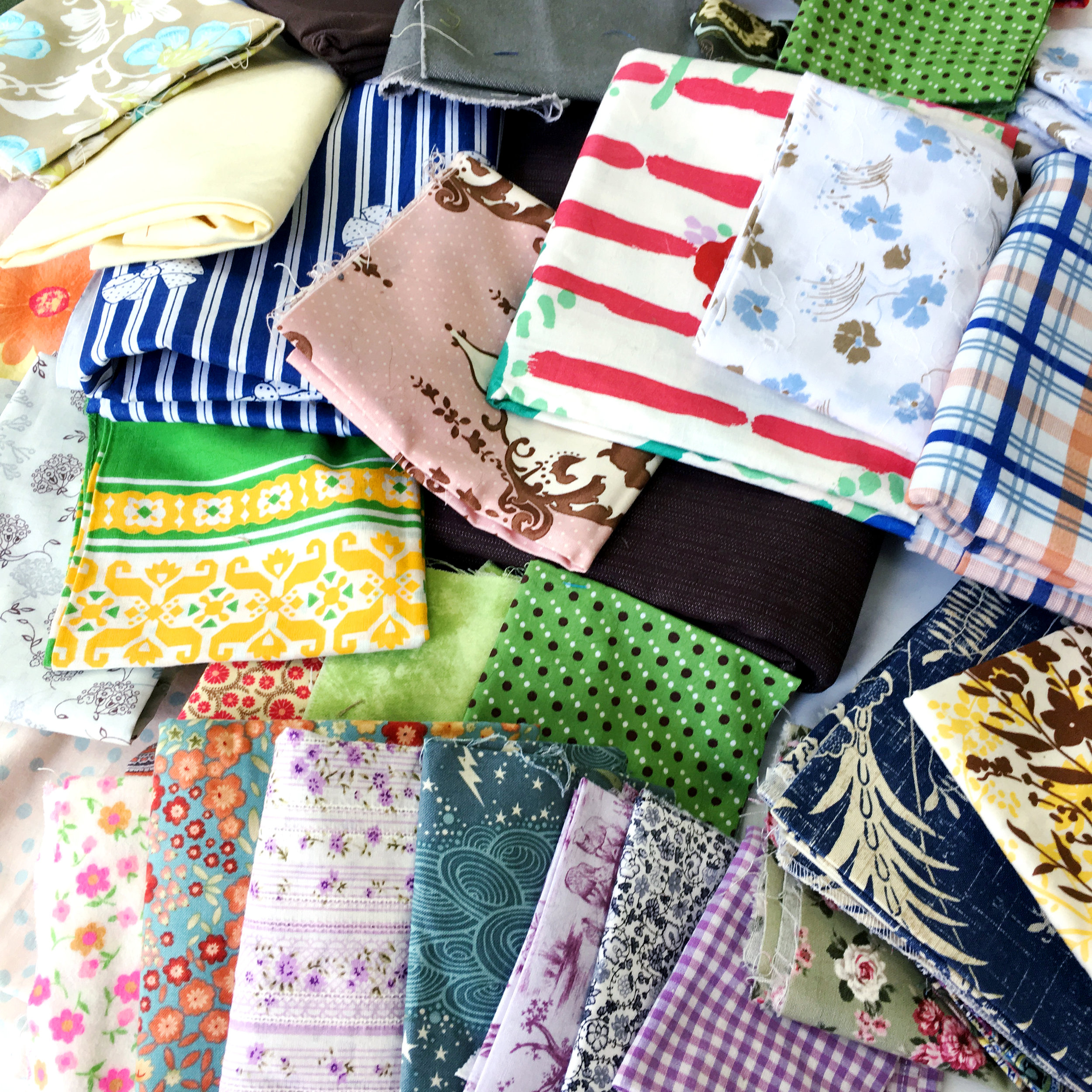
The fabric swatches on the left are from my first collection. They're placed on some paper ink jet printouts to see how they work together. The common motifs for Volume 2 are dots (both circular and diamond-shaped), diamonds (squares on an angle) and dashes (repeated lines).

The colour palette is similar to the first collection, with little hits of black giving some graphic punch to many of the designs. (Not all of the paper designs pictured in this post ended up in the final collection.)

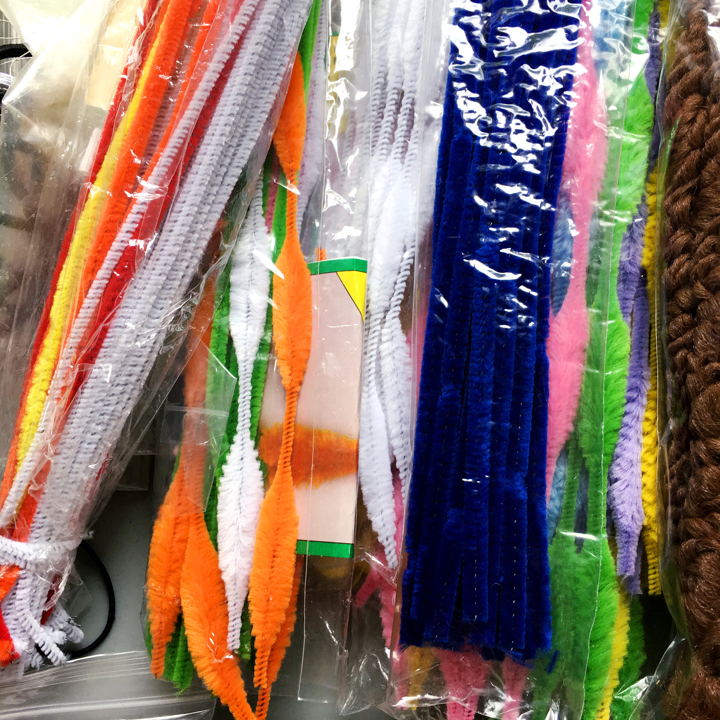
Researching and designing (and collecting!!!) swatches for the Feed Sacks book also influenced the collection. There were two specific designs that I reinterpreted to fit within the collection.

These vintage feed sacks' diamond motif inspired some of the new patterns.

I made lots and lots of printouts with various colours and designs before narrowing it down to present to Windham.

In my next post, we'll look at the strike offs!

Fresh: Joan Garcia

Whether you are a fresh graduate or mature artist, it is often a dream to be published for the first time! In the current (and future) issues of UPPERCASE, I have a new column dedicated to featuring such talents.

In issue 35, we meet Joan Garcia, a recently retired public school teacher who would like to become a professional illustrator.

“I have been drawing and painting all of my life and I would like to make this dream of growing as an artist and creating and selling my work a reality. My background has been as an educator of young children with an emphasis on children’s literature. Children’s storybooks and illustrations have always been such a strong part of my life. I feel my work reflects a love of stories and a strong love of colour. My dream clients would be people who appreciate a story told through art and my dream would be to illustrate a book.”

The acrylic painting of the white haired woman is my great aunt Antonia from Spain. The layers of this piece include dressmakers’ pattern tissue, sculpting medium used with stencils and hand-painted coloured tissue paper, giving the impression of Spanish tile in the background. 

The girl with the bow is my grandmother Nina as a young girl. I have a photo of her in sepia and I have always loved it—especially the bow. She loved colour and was a very happy, optimistic lady.

A combination of mono print and ink illustration, pieces in the Menagerie collection are created with archival inks from handcut stamps and detailed with pen and ink.  Image sizes are approximately 3x5 inches.

I always work in my journal while my paint dries on my canvas. It keeps the flow going!

Paola 58 is part of my "influential women" series.

See more from Joan on her website and Instagram. Do you dream of being featured in print? Apply here.

For Courtney Beyer, a trip overseas led to a whole new career path

Here's an inspiring story from an UPPERCASE reader. It would have been a good fit to the content of the summer issue #34's Explore issue, but I had already finished that issue when I heard from Courtney. She writes, "I went to Granada, Spain for an Islamic Art workshop that I signed up for on a whim. It changed my life and now I am a pattern designer."

"Last September traveled to southern Spain and Morocco to celebrate my 30th birthday and take in as much Islamic pattern tile as possible. At the time I was a web designer in Silicon Valley and feeling like I was going to more meetings then designing. Before the trip I came across a workshop in Granada, Spain called the Art of Islamic Pattern, a 5-day workshop to learn to draw Islamic patterns and visit the Alhambra." The dates of the workshop lined up with her itinerary and she signed up. "I am usually not this spontaneous," she admits. 

But this leap of faith turned out to be life-changing. "I reconnected and re-valued the craft of drawing and pattern making," she says. "I also connected with other artist on the trip who were mostly Arab in background either from England or the Middle East. I learned so much from them, about history—and about how much is actually not taught in school."

"The trip set me on a path to quitting my job." Inspired to start creating with her hands again, she decided to specialize in block prints and surface pattern designs through her company Courtney Beyer Design that she founded in January of this year. "I sell hand-printed cards, journals and tea towels on my Etsy shop and I am working on a pattern line."

Courtney says that one of her instructors taught the class a prayer that she now recites to herself before taking on a creative assignment or project:

May we all be guided by truth
May we have beauty revealed to us
and may it result in the good 

There's more to Courtney's story and art over on her website.

Lilla Rogers' Gorgeous Garden

Illustration rep Lilla Rogers' home studio is inspiring (see this previous post) but her gorgeous yard is competing for attention. Full of pinks and lush greens, the yard has many places to sit, ponder and sketch, linked together with meandering paths and changes of elevation.

Lilla worked with Susan Redmond of Redmond Design Group on this backyard design project, that was completed earlier this year. "We had redone the front yard the previous year," says Lilla. She so enjoyed the process and collaboration with Susan, that this year they redid the back.

"We worked on the design together. It all started innocently enough," Lilla explains. "I simply wanted a fenced area to keep out the groundhogs, rabbits and chipmunks from my cutting beds and vegetables. Ha ha ha," she laughs. "Then project creep happened, happily." She added three garden arches "smothered in mandevilla and climbing red roses" along with lots of bird houses, a bird bath, many paths and an egg swing—"which is great for meditation."

Walking up the path leads to a very cute potting shed, that Lilla uses for writing—and perhaps as a retreat and studio for visiting guest artists someday.

A fenced area keeps critters out of her cutting garden; its symmetry offers a nice geometric contrast to the rest of the yard.

With decorations by both Lilla and her artists, the yard is punctuated by personality and colour.

Thank you, Lilla, for inviting me to your 2017 artists' retreat.

Botanica is printed!

I signed off on the proofs earlier this week and The Prolific Group in Winnipeg doesn't waste time... Botanica was on press today!

4,000 copies are being produced and the book is 448 pages so that's a lot of paper! (UPPERCASE books and magazines are printed on 100% post-consumer recycled paper.)

As indicated above, the next step is some drying time before the book is folded and bound. It's the Canadian Thanksgiving long weekend, so that's perfectly timed.

It will be ready to ship very soon, so make sure to place your order for Botanica on its own or as part of the UPPERCASE Encyclopedia of Inspiration.

Happy Thanksgiving!

A story of UPPERCASE connections

Kim Fox

One of the fun challenges when putting together an issue of UPPERCASE is curating the various artists and topics that will appear within its pages. I usually have a few themes to help focus my attention when assigning articles to my contributors or when inviting artists to be profiled. Sometimes, the thread of connection between one article to the next is obvious, other times a bit more obscure. At least to me, all articles within an issue are related in one way or another. Once an issue is edited, designed and printed, it is out of my hands and into the world where I hope it will inspire readers and help them make their own creative connections.

How and why an issue might affect an individual reader's life isn't something I can typically know. That's why I was so happy to receive a message from Kim Fox, an artist from Pittsburgh. She wrote in to share "a little story about how your magazine changed my life." I first discovered Kim's work at Porridge Papers in Lincoln, Nebraska, where author Linzee Kull McCray and I were researching our Feed Sacks book. I just love Kim's upcycling of vintage tins combined with quilting motifs, so I followed her on Instagram right away.

Kim has been working with tin as a material for 5 years or so. Through her company Worker Bird, she straddles "the border between wanting to create fine art and making products for wholesale and retail."

"A couple of years ago I fell in love with traditional quilting and the array of patterns and the stories behind them. I started "tin quilting" on salvaged wood and my work took off in a new direction. I began thinking about wanting to put together a gallery exhibit of contemporary quilters with a mix of traditional fabric quilters and makers using other materials. I had in mind a fabric quilter and myself but it felt like something was missing—that a third component would really tie it together but I didn't know what that was." Lo and behold, issue 30 arrived in her mail and Kim read Linzee's article about cover artist Laura Petrovich-Cheney, who makes wooden quilts using salvaged wood (the cover art features debris from Hurricane Sandy.)

Issue 30 cover by Laura Petrovich-Cheney

"I fell in love with her work immediately and knew that she was my missing link. But I'm new to this world and she's so established and wonderful so I didn't really know what to do with this new love." Kim kept Laura in mind for months until one day last October "I just thought OK—it never hurts to ask so just reach out to her!"

In fact, the cover for issue 30 was Laura's first major article and magazine cover. Laura decided to forego the usual fee that I pay my cover artists; instead she received that value in actual copies of the magazine. Laura smartly leveraged the magazine feature to send it to potential galleries and to gain interest in exhibitions of her work. When Linzee and I were in Lincoln, we toured the International Quilt Study Center & Museum and photographed a portion of their feed sack archives. I brought a copy of issue 30 to give to the museum's curator—which was the museum's first introduction to Laura's work. I am thrilled to report that Laura will have a solo exhibition at the International Quilt Study Center & Museum in 2018.

Laura Petrovich-Cheney

Back to our story... Laura returned Kim's email that day, excited by Kim's work and ideas. "She had been thinking along the very same lines about a similar exhibit," recalls Kim. "We began corresponding and chatted on the phone and decided to proceed together toward the same goal. We met in NYC in January for a coffee and then walked over to the gallery in Brooklyn where she had some work on show. The gallery, A.I.R., is a womens' co-operative gallery founded in 1972 to further the work of women artists and Laura is a working member of the gallery which affords her a solo show every 3 years. She proceeded to suggest that we do our quilting show at the same gallery this fall when she was slated for a solo show." 

The pair began to look for other non-traditional quilters. "We traded Instagram pictures of great work we found and also began forming our thoughts about the work that we're doing—issues of 'women's work' and 'men's work' along with the use of recycled materials and the environment."

Now a year later, their exhibition Beyond the Bed Covers featuring Kim Fox, Laura Petrovich-Cheney, Rachel Farmer, Ariel Jackson, Luke Haynes, Carolina Meyer, Faith Ringgold and Jessica Skultety opens on October 12 in Brooklyn. (Incidentally, Luke Haynes was profiled in issue 16 in 2013.)

Luke Haynes

Ariel Jackson

And there's more good news! "I have since been asked to include work in an exhibit in Providence, Rhode Island," says Kim "and have been approached by a gallery in Morgantown, West Virginia for an exhibit in 2018. I owe this new direction to you and your magazine!!!!"

Kim Fox

Although I'm certain that Kim and Laura would have eventually discovered each other, I'm thrilled that their connection was made through the printed magazine! It is a proud moment for me to know that such a ripple effect of positive experiences came about because of UPPERCASE.

Lilla Rogers' Artist Retreat

I was invited to give a presentation at Lilla Rogers' Artist Retreat, September 17–19 in Arlington, Massachusetts. The first day was programming for the artists. On the second day, I was one of many art directors talking about what we do and how we work with artists and commission work. With representatives from teNeues, Hallmark, Candlewick Press, BlueQ and other publishing companies, it was an honour to be included! Following the presentations, there was a "speed dating" round in which the artists came to show each of us their portfolio, one on one. On the third day, Lilla let me hang around her studio and participate in craft day, bedazzling canvas tote bags. Here's a video showing snippets of that afternoon:

Anne Bentley, Clairice Gifford, Mara Penny, Lilla Rogers, Flora Waycott, Kate Mason, Marenthe Otten, Katie Vernon, Trina Dalziel. Front row: Terri Fry Kasuba, Jessica Allen and Sarah Walsh. Not pictured: Suzy Ultman.

Market Collective celebrates 9 years in Calgary

Market Collective is presenting a spectacular event this weekend, in celebration of its 9th year of hosting craft fairs in Calgary.

"Join us in celebrating 9 years of community building through the arts! We'll be in a brand new location with lots of room for artists new and old, as well as all kinds of interactive special installations and features. Come on down for a weekend of food trucks, DJs, live music, and shopping from the amazingly talented local creative community."

SEPTEMBER 15-17, 2017
Friday: 4pm - 9pm
Saturday: 10am - 6pm
Sunday: 10am - 6pm

$5 for the weekend (Kids under 12 Free)

NEW LOCATION:
Inglewood Warehouse
1390 17th AVE SE

UPPERCASE is happy to provide a few magazines for giveaways at this weekend's event. And look for some of our books and magazines for sale at Independent Study Club, a brand new indie pop up book fair starting out at this weekend's Market Collective. "Independent Study’s vision is to promote an appreciation of art book culture in Calgary and Alberta by featuring independent book sellers, publishers, and artists."

Indie Craft Parade

The start of fall means the return of craft fairs! UPPERCASE is happy to provide complimentary magazines to some cool fairs around the continent.

Indie Craft Parade started in 2010 as a way to bring talented artists together under one roof. That inaugural show laid the groundwork for an art festival that now draws artists and makers from across the Southern states to Greenville, South Carolina every September. 

The show is juried anonymously and showcases quality handcrafted goods in every genre, from ceramics and jewelry to handbags and children’s items. The eighth annual Indie Craft Parade will feature 34 new artists and 46 returning artists. Admission is $5 at the door and children 12 and under are free. 

Indie Craft Parade is an initiative of the Makers Collective, whose mission is to empower creative entrepreneurs while cultivating a supportive community around them. 

Look for a free UPPERCASE magazine in the maker totes!

Art Makers Denver

UPPERCASE has been happy to provide some complementary magazines to Art Makers Denver participants for the past few years. Art Makers Denver is a 3-day art retreat featuring over a dozen instructors teaching more than 35 different workshops in painting, collage, decals on enamel (I'd like to take that one! or this. I'd just really like to try enamelling!). Botanica artist Carrie Schmitt is also an instructor.

September 24 -26, 2017
Denver, Colorado, USA

Registration for this urban art retreat includes a full day workshop, lunch, happy hour, morning yoga, and much more. To find out more, visit their website.

Designing for Print

I’ve been in love with print and paper since I was young. My parents would bring home used paper from their offices, with typewriting or photocopied graphics on one side, and I’d cut these down and staple together little booklets—creating my own stories and drawings on the blank side of the page. I dreamed of these little books being printed en masse, available in bookshops and libraries.

When I was old enough, I began to pursue my interest as a career option. I had a few summer jobs in printing companies, working a process camera, doing negative stripping, plate-making and a bit of bindery. Years later, when I graduated from art college in 1995, computers and desktop publishing software had become graphic designers' primary tools. 

My first Macintosh computer was a PowerMac 7100 and I purchased the biggest monitor I could afford. The box took up the entire trunk of my car. Nicknamed Mr Big, the monitor was so heavy, so large and cumbersome that I couldn’t carry it up to my second-floor studio by myself and I had to call a friend to help. There I was, 22 years old with all the equipment I needed to start a career in graphic design: computer, monitor, scanner, laser printer and fax machine.

I had some natural design ability combined with what I had learned in school, but the one thing I was missing—even with an bit of experience in print shops—was how to properly design for print. How to spec paper, what sizes were economical, how to prepare for printing on coated versus uncoated stock, binding methods, spot varnish or flood aqueous? The terminology and the options were all new to me.

On some early jobs, I encountered a few older print salesmen who were patronizing and less than helpful, but eventually I found some really good companies with people willing to lend their expertise and help me learn, step by step. As my freelance design business grew, so did my knowledge of print and paper. I prided myself on providing “clean” files when sending jobs to prepress departments—something that saved me time and my clients money. I was interested in learning new techniques and printers were genuinely happy to help explain—which benefited me and my breadth of knowledge, but also them later on when I had clients who could afford a few “bells and whistles” when jobs went into print production.

Over the next dozen years, I freelanced for arts and culture clients as well as book and magazine publishers. Though I also did some signage, product design and digital projects, my focus and expertise was on print. When I decided to start my own publishing company and later launch UPPERCASE magazine, I had all the tools and skills and contacts at the ready to produce something beautiful in print.

My print education really has been learning by doing. I didn’t have a manual—or even Google, in the early days—to learn how things were done.


Designing for Print is a book by author, designer and educator Marina Poropat Joyce that really is "the epitome of print education.” Marina’s book covers all aspects of what a graphic designer needs to know when creating a print project. As I page through it, I am amazed to see all of the information, terminology and tips that I had learned (sometimes the hard way) from two decades of creating design for print. The book is thoughtful and thorough and an excellent resource for anyone about to set foot into the world of print on paper. And for experienced (ie older!) designers like me, it’s a great refresher. It’s also a useful reference, with standard paper and envelope sizes, paper weight equivalency charts and generalized print method cost comparisons. Designing for Print is the manual I wish I had way back when. Congratulations, Marina, for creating something so vital for new generations of print enthusiasts!

To find out more about this project, visit Marina's Kickstarter campaign.

Sew a Softie Day

Finley and I hosted a Sew A Softie party at our house today! Founded by UPPERCASE reader Trixi Symonds, the yearly event encourages passing on the love of hand sewing to the next generation.

Trixi writes, "It encourages parents and children to turn off their computers, put down their smart phones and discover the fun and fulfillment that comes from creating a simple-to-sew softie together. This year Sew a Softie will take place from July 1st to 31st."

I've been teaching Finley to sew for a while and he was proud to be a Kid Ambassador for the event. We invited a few friends and parents over and had some fun making creatures (with a break for cookies and muffins, of course.)

Rather than have a set project that we were going to make—and set up expectations of what something is "supposed" to look like—I simply offered the framework for what were going to do.

1. Draw the body shape of your creature on an 8.5" x 11" sheet of paper (this way, it won't be too large and take too long to sew).

2. Cut out your paper pattern and trace around it on two pieces of fabric. Or have a parent cut around the pattern. We used fleece, felt and various remnants.

3. Cut out eyes, ears, feet, beaks, wings or any other embellishments out of felt. Use a simple running stitch to attach the features to the front fabric piece. Attach any button eyes at this point. We used contrasting thread so that it was easy to see what we were stitching.

4. Put front and back together and stitch around the perimeter, leaving 2-3 inches open so that you can stuff the softie. A running stitch is easiest. Finley used a whip stitch, which was a new technique for him to learn today. Sandwich any feet or wings between the front and back layers and sew them in when you're going around the edge. We used safety pins to hold things together in the meantime.

5. Stuff your creature and then finish by stitching the opening closed. Done!

Our friends were ages 5 through 7, and although some attention spans started to wander we were able to finish our softies in about two hours.

To find out more about Sew A Softie, visit Trixi's website and join the Facebook group!

Painted Windows Exhibition

Buds of Buds is a grassroots collective that supports local artists and makers in Calgary. During this year's Calgary Stampede, the group is hosting a Painted Windows Exhibition.

This Stampede there’ll be more than a bucking horse and rider decorating windows of Calgary businesses. Buds of Buds Collective (Buds), has teamed up with artists and business owners to present the Painted Windows Exhibition. This event was inspired by community and social collaboration. Katie Pearce of Buds says, “we're building on Stampede culture, Alberta heritage, and connecting communities.” For its first year the Painted Windows Exhibition will focus on communities surrounding the Stampede grounds: East Village; Victoria Park; and Bridgeland Riverside. In future years, Buds will be expanding the project footprint. 

Since the call for artists in March earlier this year, 18 window painters have signed on. The content of submissions was wide-ranging. Geneva Haley, a Painted Windows artists, speaks about the inspiration for her submission, “Alberta isn't all about wild roses. Our history is a lot older than the last hundred years we have in our social studies textbooks. The collision of cultures, landscapes, and architectures over time has left us with a profoundly unique place to call home and live our lives. Alberta is filled with endless images to be examined: Our rough edges and our ugliness are just as important as our sunsets.” 

You can find the decorated windows at participating business from July 1 – 15th, 2017. Download the free Painted Windows Exhibition App for a GPS-enabled map of the window locations and to cast your vote for People’s Favourite. (Search for 'Buds of Buds' in the App store.)

Photos from Buds of Buds' instagram account, click over for credits.

Mrs. Williams: an homage to a homemaker

The "Ready for Dinner" Housedress

Artists Melanie Thompson and Judith Barnett have created a stunning installation in praise of women's work. "We are the makers of every item in the show," says Melanie. Melanie is a basket maker and mixed media artist. "Judith," describes Melanie, "is an accomplished seamstress with no formal art background but boundless enthusiasm."

Installation view.

Triptych by Melanie Thompson

"The installation of a 1950s kitchen was inspired by an old wooden recipe box given to Judith by her 93-year-old neighbour Mrs. Williams. The box held a lifetime's recipes, all beautifully scripted in pen and ink. The idea that this box represented the lifetime of one woman's work seemed too great not to acknowledge in art. The strong emotional and nostalgic feelings it provoked felt like a call to make a body of work that referenced the era of the homemaker in the 1950s-honouring women’s work."

The "Everyday" Housedress

Installation view.

"We have made a wide variety of art pieces evoking the homemaker style of the 50s," describes Melanie. "The iconic apron and house dress have been rendered in knitted copper wire, pattern paper, tea stained canvas covered with written recipes, cotton embroidered and dyed with onion skins, image transfer on painted organza, recipe pages, black garden netting and pieced material remnants. There are mixed media wall pieces using stitching, buttons, collage, embroidery, and acrylic paint. Mixing bowl sets made with looping copper wire, handmade paper, and chicken wire as well as stitched samplers on baking trays and a cutlery box with utensils from the era. We have stitched and repaired clothing, small wire houses, recipe books deconstructed, handmade books, a set of pot holders and a tea cozy made from used tea bags and so many more items too numerous to describe. It needs to be seen to be fully appreciated."

Apron made from chicken wire.

The work is on view at the Artcraft Showcase Gallery on Salt Spring Island, British Columbia until
July 5, 2017.

Editor's note: Below these paper dresses, the third card from the left is from the UPPERCASE book Feed Sacks: The Colourful History of a Frugal Fabric by Linzee Kull McCray.

International Typewriter Day!

June 23 is International Typewriter Day, marking this day in 1868 that the patent was granted to Christopher Latham Sholes. 

Here's an excerpt from The Typewriter: a Graphic History of the Beloved Machine:

Christopher Latham Sholes

The Father of the Typewriter

The notion of a machine to replace handwriting had been toyed with for centuries. English engineer Henry Mill patented the concept in 1714 as “an artificial machine or method for impressing or transcribing of letters, one after another, as in writing, whereby all writing whatsoever may be engrossed in paper or parchment so neat and exact as not to be distinguished from print.”

Though there is a long list of inventors preceding him, Christopher Latham Sholes is the man history has awarded the winning title of inventor of the typewriter, patented on June 23, 1868. His machine was the first to be commercially successful and from it all other modern typewriters evolved.

“I do feel that I have done something for the women who have always had to work so hard. This will enable them more easily to earn a living.”

–CHRISTOPHER LATHAM SHOLES

To read more about The Typewriter: A Graphic History of the Beloved Machine please visit the book's website.

LanaBetty: Leaving the Corporate Life

Photos of Lana Lepper by Jeanie Ow of Stu-di-o by Jeanie.
"I didn't know a photograph could make me feel so happy or beautiful until I saw her work," says Lana.

Lana Lepper designs and makes contemporary geometry-inspired jewellery. “I love my craft fiercely and passionately,” she says. “It’s unparalleled to any other task or job I've ever performed.” She lives in Vancouver with her husband and dog. “We live in a small (but not too small) apartment overlooking the city of Vancouver.” She has a bachelor of science in biology and enjoys snowboarding. (“And I'm cocky about how good I am,” she admits.)

Nearly two years ago, Lana was laid off from a corporate job. “I was devastated. I sobbed and sobbed and sobbed, worrying about how I would pay my mortgage or how I would share my perceived failure with my husband and friends.” She felt like she had failed, that she wasn’t good enough. For the job, for anything. “What if I never worked again? Would my husband still love me? Think of all the nasty terrible fears you have deep down inside you about your performance or job expectations—those fears hit me like a wall and nearly drowned me in their miasma.”

Fortunately, Lana’s husband showed his support. “He told me that we would adjust. Find our centre and continue to achieve our goals. He said he trusted me. He believes in me.” Her friends rallied around her as well as she tried to find new footing.

For years she had been living a double life, one in the corporate world, the other as a jewellery designer LanaBetty in the off hours. With a holiday season fast approaching, Lana and her husband decided she should give the holiday markets her absolute best effort. “I decided that I would attack the markets with ferocity and passion. I would get angry about my job loss and funnel that energy into design, production and sales. I would fix up my website. I would set targets and hit them.” The backup plan? “If it all tanked, I would put LanaBetty on hold and look for another corporate job.”

Lana’s primary goal, though, was to be happy. “No more working with stress so high I couldn't sleep. No more working so hard I forgot to eat. No more pushing papers for a company that didn't care.”

“It's been almost two years now and I can honestly say I am happy. I have never worked so hard in my life. Every moment is spent on social media or in the studio. Everything I have done before this moment has prepared me for the next. I have had my jewelry featured in blogs, on models, in magazines, doubled my sales and have kicked up quite a niche market in custom jewellery.”

Lana has found that the most satisfying aspect of running her creative enterprise is that she is accountable to herself. “There has never been anything more empowering or satisfying.”

She is quick to share some hard-earned advice:

“Dive head first into your passion and let every single moment be the best moment. Be happy with who you are and content when you get into bed every night. Strive for greatness and (sometimes) be humble about it. Be proud of yourself and always, always, do what makes you happy.”

Visit LanaBetty's website and instagram

Creative Supplies Swap recap

The Creative Supplies Swap was a success! We had fun, enjoyed talking craft and creativity and everyone went home with a little something new to play with.

Thank you to my co-host Rosalyn Faustino of Calgary Craft Alert and to all the enthusiastic folks who came out to share and snoop!

If you're interested in starting your own swap in your community, I've compiled some tips.