A story of UPPERCASE connections

Kim Fox

One of the fun challenges when putting together an issue of UPPERCASE is curating the various artists and topics that will appear within its pages. I usually have a few themes to help focus my attention when assigning articles to my contributors or when inviting artists to be profiled. Sometimes, the thread of connection between one article to the next is obvious, other times a bit more obscure. At least to me, all articles within an issue are related in one way or another. Once an issue is edited, designed and printed, it is out of my hands and into the world where I hope it will inspire readers and help them make their own creative connections.

How and why an issue might affect an individual reader's life isn't something I can typically know. That's why I was so happy to receive a message from Kim Fox, an artist from Pittsburgh. She wrote in to share "a little story about how your magazine changed my life." I first discovered Kim's work at Porridge Papers in Lincoln, Nebraska, where author Linzee Kull McCray and I were researching our Feed Sacks book. I just love Kim's upcycling of vintage tins combined with quilting motifs, so I followed her on Instagram right away.

Kim has been working with tin as a material for 5 years or so. Through her company Worker Bird, she straddles "the border between wanting to create fine art and making products for wholesale and retail."

"A couple of years ago I fell in love with traditional quilting and the array of patterns and the stories behind them. I started "tin quilting" on salvaged wood and my work took off in a new direction. I began thinking about wanting to put together a gallery exhibit of contemporary quilters with a mix of traditional fabric quilters and makers using other materials. I had in mind a fabric quilter and myself but it felt like something was missing—that a third component would really tie it together but I didn't know what that was." Lo and behold, issue 30 arrived in her mail and Kim read Linzee's article about cover artist Laura Petrovich-Cheney, who makes wooden quilts using salvaged wood (the cover art features debris from Hurricane Sandy.)

Issue 30 cover by Laura Petrovich-Cheney

"I fell in love with her work immediately and knew that she was my missing link. But I'm new to this world and she's so established and wonderful so I didn't really know what to do with this new love." Kim kept Laura in mind for months until one day last October "I just thought OK—it never hurts to ask so just reach out to her!"

In fact, the cover for issue 30 was Laura's first major article and magazine cover. Laura decided to forego the usual fee that I pay my cover artists; instead she received that value in actual copies of the magazine. Laura smartly leveraged the magazine feature to send it to potential galleries and to gain interest in exhibitions of her work. When Linzee and I were in Lincoln, we toured the International Quilt Study Center & Museum and photographed a portion of their feed sack archives. I brought a copy of issue 30 to give to the museum's curator—which was the museum's first introduction to Laura's work. I am thrilled to report that Laura will have a solo exhibition at the International Quilt Study Center & Museum in 2018.

Laura Petrovich-Cheney

Back to our story... Laura returned Kim's email that day, excited by Kim's work and ideas. "She had been thinking along the very same lines about a similar exhibit," recalls Kim. "We began corresponding and chatted on the phone and decided to proceed together toward the same goal. We met in NYC in January for a coffee and then walked over to the gallery in Brooklyn where she had some work on show. The gallery, A.I.R., is a womens' co-operative gallery founded in 1972 to further the work of women artists and Laura is a working member of the gallery which affords her a solo show every 3 years. She proceeded to suggest that we do our quilting show at the same gallery this fall when she was slated for a solo show." 

The pair began to look for other non-traditional quilters. "We traded Instagram pictures of great work we found and also began forming our thoughts about the work that we're doing—issues of 'women's work' and 'men's work' along with the use of recycled materials and the environment."

Now a year later, their exhibition Beyond the Bed Covers featuring Kim Fox, Laura Petrovich-Cheney, Rachel Farmer, Ariel Jackson, Luke Haynes, Carolina Meyer, Faith Ringgold and Jessica Skultety opens on October 12 in Brooklyn. (Incidentally, Luke Haynes was profiled in issue 16 in 2013.)

Luke Haynes

Ariel Jackson

And there's more good news! "I have since been asked to include work in an exhibit in Providence, Rhode Island," says Kim "and have been approached by a gallery in Morgantown, West Virginia for an exhibit in 2018. I owe this new direction to you and your magazine!!!!"

Kim Fox

Although I'm certain that Kim and Laura would have eventually discovered each other, I'm thrilled that their connection was made through the printed magazine! It is a proud moment for me to know that such a ripple effect of positive experiences came about because of UPPERCASE.

Get a free copy of issue 16 with subscriptions and renewals!

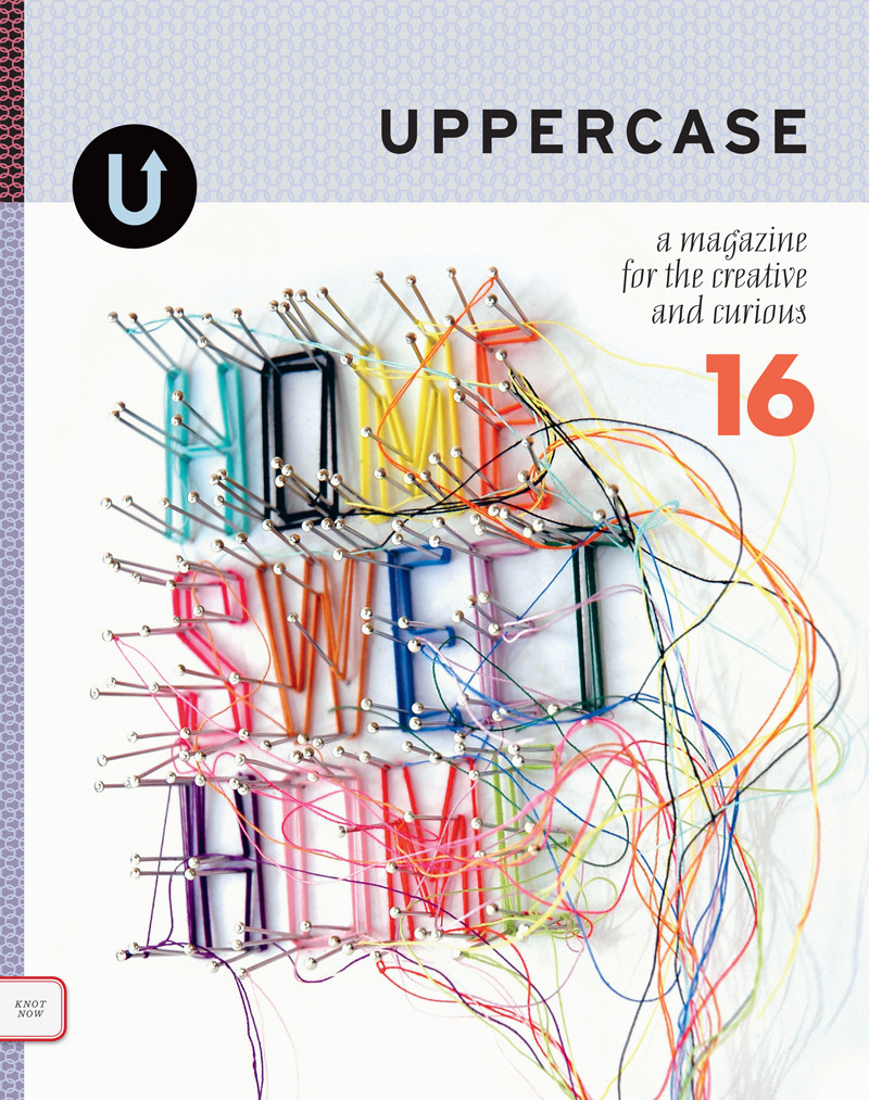
Some of you might remember issue 16, released nearly three years ago! The cover was created by UK artist Debbie Smyth and we had a brief two-page spread about her work.

I'm happy to say Debbie will be back in issue 28 this coming January, this time with a special tour of her studio and home by photographer Kasia Fiszer and an interview by regular UPPERCASE contributor Jane Audas.

In anticipation, I am happy to offer you a chance to experience issue 16 once again! Until the end of day November 15, subscriptions, renewals and gift subscriptions will be eligible for a FREE copy of issue 16 while supplies last! 

Issue 16 was a turning point for UPPERCASE. It was the first issue printed on our luscious 100% post-consumer paper Rolland Enviro—a gorgeous stock that prints exceptionally well, resulting in better, brighter images.

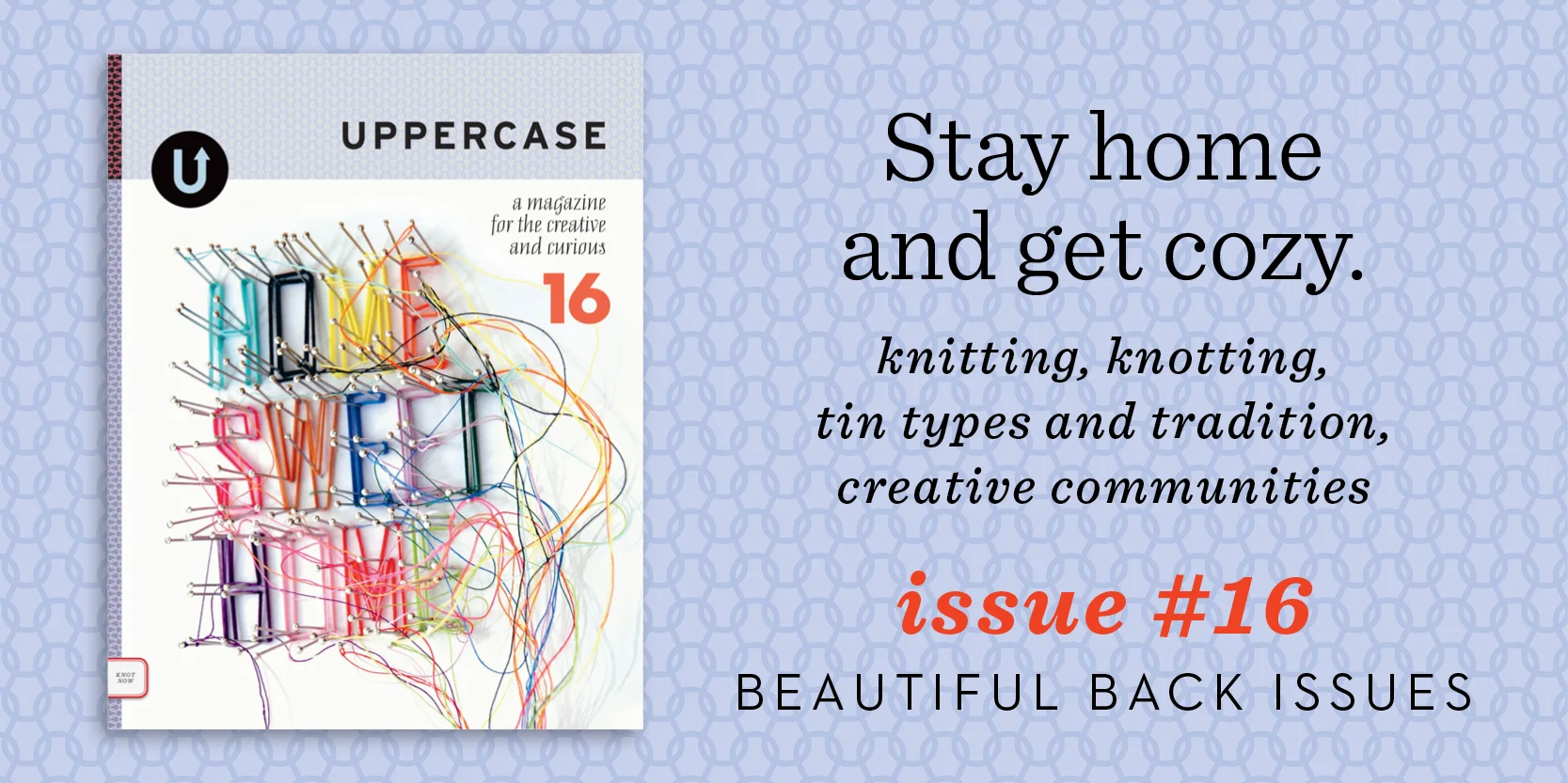
The content themes in issue 16 are about looking back and nesting. Here's what I wrote all those years ago: "Techniques, traditions and styles of other centuries and other histories influence in fresh ways. The tintype is revitalized, embroidered samplers speak volumes, old factories, warehouses and hospitals foster new creative communities. Old-fashioned hard work is celebrated with stylish nods to workwear and peasant garb; the straw broom is an emblem of honouring tradition. With knitting, knotting and needlework, we stay busy and cozy in our home sweet homes."

It's one of my old favourites. Discover it again or add this beautiful back issue to your collection. Already have this issue? You could gift the extra one; UPPERCASE content is always timeless.

Purchase a gift subscription, subscribe for yourself or renew to get this free issue.

Subscriptions can start with the current issue 27, which is mailed right away, or you can start it with issue 28 in January.

Go to CAMP with Aaron Draplin!

The magnanimous Aaron Draplin is coming to town!

I've had the pleasure of meeting Aaron a couple of times now, most recently at the How conference in Chicago this past May where we were both speakers. I think it is safe to say that we are polar opposites when it comes to presentation style. Me: small, soft-spoken, trepidatious... while Draplin commands the room with his gregarious, entertaining and heart-felt delivery style. His presentations are AWESOME (he'll bring tears to your eyes) and I am happy that's he's delivering the love once again at this month's CAMP Festival in Calgary, September 21-22.

You can also get some time with Draplin and his design expertise in an afternoon workshop entitled "Logo Tips, Tricks, Triumphs, Turds, Threats and Tales from the DDC" on Sunday, September 20th. The fee is $150 and I'm sure you'll find it was well spent. Sign up now while there's still room!

UPPERCASE is involved in quite a few local events in the coming months. I'm sponsoring CAMP by giving away free magazines in the goodie bags!

Now let's step back a few years when Draplin was last speaking in Calgary. UPPERCASE writer Brendan Harrison interviewed him for issue 16:

Aaron Draplin photographed by Heather Saitz in the Lion's Den, Calgary 2012

Aaron Draplin is an American archetype, a kid from a small town in Michigan who moved west to become a self-made man. His pursuit of happiness led him to the American dream after his search for good times and deep powder put him on a path to becoming one of the best-known graphic designers of our time.

His love affair with thick line logos and Futura Bold began while he was still living hand to mouth in Bend, Oregon. His first design job was a graphic for Solid snowboards, but he was soon picking up work lettering café signs and designing logos for local businesses. This early taste of design success spurred him on to see if he had the chops to play with the big boys. To find out, he signed on for a degree in graphic design from the Minneapolis College of Art + Design. After graduating in 2000, he started to make his mark in the design world, doing a stint art directing Snowboarder Magazine before taking a senior design role at a big studio in Portland. 

Throughout it all, he continued to design personal projects that were close to his heart. In August 2004, he quit his full-time job and hung his shingle as the Draplin Design Co. In the years since, he’s worked for clients as large as Nike and the Obama administration and as small as the Cobra Dogs hotdog cart. And while a lesser designer would have enjoyed some much needed rest, Draplin co-founded Field Notes and transformed the way hipsters everywhere scribble down their ideas.

The phrase larger-than-life comes to mind when talking about Draplin, not because of his imposing physique but because of his oversize personality. On his recent Tall Tales from a Large Man speaking tour, he travelled the country holding audiences captive for hours with little more than a profane PowerPoint presentation and a gift for the gab.

On the day of his visit to Calgary, I pick him up from the lobby of a Best Western. He’s been working in his room all morning. We pile into my truck and drive to a diner on the outskirts of downtown, a place with taxidermy on the wall, ashtrays in the washroom and golden oldies on the jukebox. It’s the kind of place where Draplin seems right at home.

Writer Brendan Harrison and UPPERCASE publisher Janine Vangool have a chat with Aaron Draplin. Calgary, 2012. Photo by Heather Saitz.

We sidle into a booth and order breakfast. I turn on my recorder and plant it in front of him, opening my notebook to a page of questions I’d jotted down the night before. I ask him where we should start. “Wherever you want man, wherever you want. I can talk, man. So don’t be afraid to be like, hey, chill out a little bit.”

Photo by Heather Saitz.

I do no such thing. I’m happy to play the part of passive participant in our conversation, sitting back to enjoy his rambling replies. His stories meander and digress in the most enjoyable way, revealing plainspoken wisdom and insight into the life of a creative professional. Throughout our discussion, Draplin comes across as something of a cultural magpie, a life-long junker who figured out a way to incorporate his love for old memo books and ration tins into a signature visual style.

“As a designer, I always had an appreciation for old stuff,” he says. “Not in the sense of it’s like a movie prop – because I get a lot of that too. Kids are like, what are you, some kind of sentimentalist or something? I’ll take that word and run with it, no problem. I mean, what are you, a futurist? I’d rather look back at the restraint and try to use that in my new work. Using one colour effectively. Making a killer logo… There’s just a sense of like, that stuff’s on the way out and I don’t want it to go away.”

Aaron Draplin in the Lion's Den, Calgary, 2012. Photo by Heather Saitz.

Read the full article in UPPERCASE issue 16. And if you're in Calgary, please make a point of coming to CAMP and participating in Aaron Draplin's workshop. Other workshops on offer:

Learn How to Draw (Better) in One Day With Yuko Shimizu
Sunday, September 20th, 10:00 AM – 5:00 PM

Going Digital: Bridging the Gap
With Edward Keeble, David Nagy, Marc Binkley
Sunday, September 20th, 2:00 PM – 5:00 PM

As well as a programming workshop for kids.

Back issues are just $10 through Monday.

Look at all the work I've done over the years! How time flies when you keep yourself passionately busy. 

All of my babies are available to enjoy while inventory lasts (issue 10 and 11 are running low at this point). On sale for just $10 apiece until end of day Monday, I'd suggest getting one of each. Subscribe starting with #23, the current issue, and you'll be all set for an inspired year ahead.

p.s. Use the code "thankyou" for another $15 off orders over $80.

back issue profile: #16

Issue #16 looks right at home at stockist Spruce Collective in Abbotsford, Canada.

Issue #16 is perfectly suited to this time of year—full of inspiration to fuel the feathering of your nest. In #16, we look to techniques, traditions and styles of other centuries and other histories to influence in fresh ways. The tintype is revitalized, embroidered samplers speak volumes, old factories, warehouses and hospitals foster new creative communities. Old-fashioned hard work is celebrated with stylish nods to workwear and peasant garb; the straw broom is an emblem of honouring tradition. With knitting, knotting and needlework, we stay busy and cozy in our home sweet homes.

Bundle up on back issues and save! Purchase three or more back issues and get $3 off each issue.

Read blog posts about issue #16 here

button tree decorations

It is that time of year when I bring out my typewriter Christmas tree! Finley was spending the afternoon at the office, so I let him do the honours of unfolding the tree.

I didn't have any decorations for it—normally its tinsel branches and strange typewriter base are enough for me—but Finley thought it needed something more...

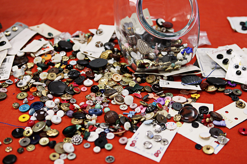
Lucky for us, I have no shortage of creative odds and ends... like a jarful of vintage buttons. These are the leftovers from assembling the goodies that come with the Dottie Angel book we published a few years ago (by the way, there are just a few copies left in the shop). Since all these buttons have shanks, we couldn't include them in the flat goodie envelopes that come with each book.

Also on hand? Some handy waxed thread from the Maine Thread Company—we profiled them in issue #16 earlier this year.

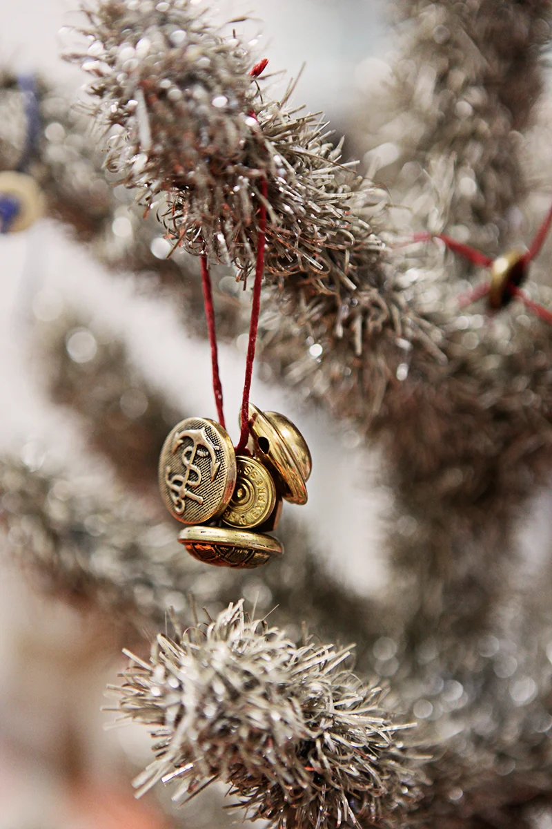
Finley and I proceeded to string multiple buttons onto lengths of the thread and I tied them into a loop.

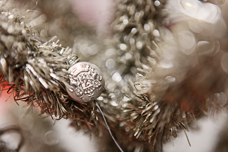
I also made a string garland of buttons by knotting the shank of the buttons at even intervals on a 6-foot length of string. The waxed thread worked really well since nothing slips out of position.

This was a fun! And super easy. The best kind of spur-of-the-moment creative activity.

Get your hands on out-of-print back issues!

Do you love UPPERCASE magazine but you're missing a back issue? Have you recently been introduced to this quarterly magazine for the creative and curious and now you wish you had them all?

Here's your chance to purchase an entire stack of all the issues we've ever printed! We have taken a few of our early issues out of our archives for this one-time only auction. (Issues #1-#7 and #12 are completely sold out elsewhere.)

The purpose of this auction is to raise funds for the upcoming studio move (our current home of the past 8 years is in a building slated for "redevelopment" and so we'll be moving to new accommodations later this summer).

Due to the heavy weight of the package, this stack is only available to ship within North America. However, we have created other listings for individual out-of-print back issues #1, #2, #3, #4, #5, #6, #7 and #12 that we can ship internationally.

Click here to see the listings on eBay. 

Bidding ends next Friday, May 31.

Thank you for your support!

type tuesday: forming words at Flow Gallery

Susanne Matsche

I recently heard from Flow Gallery, located in London's Notting Hill. Their current exhibition entitled "Forming Words" includes work by issue 16 cover artist Debbie Smyth. Though I'm on the other side of the ocean, the exhibition has introduced me to some intriguing artists such as Susanne Matche, featured in this post.

​If you are fortunate enough to be in London, a visit to this exhibition promises to be an experience of note:

Flow has asked selected artists to create new work based on a piece of writing of their choice, from poetry to a letter to lyrics. Whether it is the shapes, lines and curves which letters create that inspire the work, as in vibrant wall pieces by Debbie Smyth that motivate the work. Or simply the fluidity of the writing, artists exploring this theme express the diverse approaches and outcomes this one theme can manifest. Many of the artists have chosen to utilise the meaning of their selected text or the message that the text communicates to inform their work. Other artists, such as Aino Kajaniemi take a personal approach to using text with particular memories woven in thread. The work in this exhibition traverses disciplines. Jewellery will be exhibited alongside silver teacups, ceramic vessels and enamel plates. The variety in material has resulted in an exhibition that intends to capture the endless inspiration of the written word.

​The exhibition continues until May 17.

Susanne Matsche

Susanne Matsche

Susanne Matsche

fans all around

​The cover of the latest issue of Covet Garden was illustrated by Work/Life 3 participant and regular UPPERCASE contributor Alanna Cavanagh. Covet Garden is interested in spaces that have not been styled by interior decorators and that reflect the passions and interests of those who live in them. In a happy coincidence, Michelle, one of Covet Garden's participants, happens to be a fan of issue #16

jump into print

If you've been a blog reader or online follower for a while, now's a great time to jump into a print subscription. Subscribe and start with #16 which will ship out immediately. #17 will be quick on its heals in April.

In case you missed it on Twitter, we have a sale running on our online shop: use the discount code "springfling" at checkout for 15% off anything in our online shop! (Discount code cannot be retroactively applied to past purchases, nor can it be applied to wholesale orders. Valid until the end of the month.)​ 

stockist: Spruce Collective

​Issue #16 looks right at home at stockist Spruce CollectiveThe shop, located in Abbotsford BC, is a bricks and mortar collaboration between five women brought together by their love of vintage treasures. The shop is where they share their love of home decor and teach others to do the same. For locals in the mood to get their hands dirty they  offer classes and their beautiful space is also available for rent

Erick Wolfmeyer

written by Linzee Kull McCray

Though he embraces a traditional craft, Erick Wolfmeyer says he’s on the margins of the quilting world. “I don’t belong to a guild or go to quilting conventions,” he says. “I just happen to work in that medium.”

Erick—who has a BFA in photography—started quilting on a whim in 1990, when he was drawn to the graphic beauty of Amish quilts and stitched a baby quilt for friends. “None of this was planned,’” he says. “I just had a general sense that I needed to do this. People saw something in my work and that was great encouragement when times were tough.”

Times were tough in part because of Erick’s dedication to his art. His quilts often take up to six months to make and to support himself he drove a school bus and lived in a rural town, where rents were cheap. Though he’s moved into a city and has a fulltime job, he still works in the same way, completing one quilt at a time, then giving away or selling it. While his quilts could be used on a bed—they are intensively pieced and employ no embellishments—they most often adorn a wall. “I think of myself as a painter in fabric, making abstract art,” he says. “It’s the shapes, colors, design, and movement I’m drawn to.”

Even so, Erick has deep respect for traditional quilters and little concern about engagement in an arena traditionally populated by women. “I try to leave gender out of it—it’s about whether the work can stand on its own,” says Erick. “I balance seeing its infinite possibilities with staying true to a medium and history so tightly woven with women.”

Indeed, quilting is a thread that purposefully ties Erick to women—specifically the mother who gave him up for adoption when he was seven months old. “For most of us, some things in life don’t work out as we’d planned,” he says. “Women lose kids, kids lose their moms. I’m working it out through my quilts.”

Recognition of those quilts is growing. In September, Erick was one of five quilters invited to China as part of the U.S. embassy-sponsored Sum of Many Parts: 25 Quiltmakers from 21st Century America. Another quilt recently appeared in Material Men: Innovation and the Art of Quilting in LaConner, WA. While he’s grateful for the accolades and opportunities, Erick’s commitment to quilting doesn’t depend on it.

“My perception of quilting hasn’t changed—the heart and the essence of it are still the same,” he says. “If the shows and fabrics and markets disappeared, I’d still make quilts, even if I had to chop up my clothes. I forever have the compulsion to keep recreating a whole—to put pieces back together. This is how I do it.”

calling all iowans

There is an upcoming gathering for the creative and curious in Iowa City. New stockist, Home Ec. Workshop is hosting a party on January 25 to celebrate the local connections of an article in issue #16. The piece explores the work of Sonya Darrow who draws upon her Czech heritage and local goodwill as a source for her folkloric creations. The profile was written by Linzee Kull McCray, photographed by Heather Atkinson with make-up services provided by Tonya Kehoe-Anderson. 

men in quilts

When I'm preparing content for the blog, I sometimes like to pick a topic and just search and browse and brainstorm and see what comes up. For me, it is a really fresh way to find content to post... rather than just visiting my usual roster of popular blogs, I find new sites and usually discover a wormhole of interesting things.

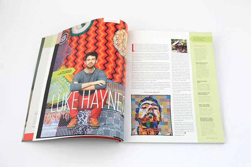
My topic this week started broadly as men in craft, but, inspired by Adrienne Breaux's profile of Luke Haynes in the current issue (that's him in the video above) and yesterday's feature on the quilting fabric designs by Mark Cesarik, I decided to focus on "men in quilts."

I encourage you to pick up issue #16 to discover more about Luke Haynes, an architect-turned-quilter.

Luke is often the subject of his own quilts.

"My most recent works have been investigating nostalgia and function. I work with quilts because they embody these subconsciously while lending a unique materiality to the process and resultant product. I can work with disparate pieces of fabric and create a cohesive final product that is greater than the sum of its parts."

thread week: an eclectic stash

Artist: Vicky Lindo

As this post goes live, we'll be deep in the midst of thread, vintage finds and crafty friends. Sounds like a perfect Saturday eh? When Janine recently visited STASH, and discovered a kindred spirit, we knew it would be the perfect place to hold our Embroidery Bee and Issue #16 launch. 

In addition to her thriving business, STASH proprietress Veronica Murphy maintains an amazingly eclectic Pinterest pressence. If you aren't able to join us visiting her boards will give you a taste of the STASH experience. 

Artist: Jose Romussi
Image Source: The Jealous Curator

thread week: the sublime Jenny Hart

We've been getting ready for our Issue #16 launch with Sublime Stitching. Their excitement for their craft is infectious and prompted us to pick up our needles.

Jenny Hart is the Founder/Owner of 
Sublime Stitching. After looking at her work, it's shocking to discover that she's only been embroidering since 2000. Her works have appeared in numerous books and magazines including Vogue and Rolling Stone.  

thread week: Debbie Smyth

I've had Debbie Smyth's website bookmarked for quite some time and when I was working out the concepts for issue 16—which includes both thread/string/knitting/knotting as well as concepts of home and nesting—I asked to see if she would share her work on our cover. Fortunately she agreed and the result is a very attractive cover that touches on multiple themes.

Debbie Smyth is textile artist most identifiable by her statement thread drawings; these playful yet sophisticated contemporary artworks are created by stretching a network of threads between accurately plotted pins. Her work beautifully blurs the boundaries between fine art drawings and textile art, flat and 3D work, illustration and embroidery, literally lifting the drawn line off the page in a series of “pin and thread” drawings.

“On first glance, it can look like a mass of threads but as you get closer sharp lines come into focus, creating a spectacular image. The images are first plotted out before being filled out with the thread, the sharp angles contrasting with the floating ends of the thread.  And despite the complexity of the lengthy process I try to capture a great feeling of energy and spontaneity, and, in some cases, humour.”

Debbie plays with scale well; creating both gallery installations and works for domestic interiors. Her unique style lends itself to suit corporate environments, public spaces, window display, set design, graphic design and illustration. By collaborating with interior designers, architects and other creative practitioners, Debbie pushes the expected scope of her work even further.

“I feel as if I am taking thread out of its comfort zone, presenting it on monumental scale and creating an eye-catching, and in some cases, jaw-dropping effect.”

This post kicks off "Thread Week" here on the blog. Each day we will be sharing posts related to thread, needlework and all variety of creativity related to string—from the simple to the extraordinary.

For our local friends, make sure that you join us this Saturday for our Embroidery B and issue launch at Stash in Inglewood! Click here for details and to RSVP.

voila!

Cover artwork by Debbie Smyth

Contents page artwork by Happy Red Fish

Feature about Konstepidemin, the artist community in Gothenburg where Camilla Engman has her studio. 

Article about architect-turned-quilter Luke Haynes.

The amazing collaboration of handlettering by Ryan Feerer, Jeff Rogers and Dana Tanamachi for the interior of Ryan's new restaurant in Abilene, Texas.

A compendium of knitting and knotting...

To hold a new issue in my hands and think, "this is the best issue yet" is the best feeling. After scrutinizing every detail, the photoshopping and prepress adjustments of hundreds of images (yes, I do that myself!), the seemingly infinite series of microscopic decisions along the way... it was all worth it.

Issue 16 is entering the mailing system and is off to our stockists. For the list of contents and digital preview, click here.

{Subscribe!}

embroidery B

Giovannella Brusatin gave this sampler to Janine on a recent trip to Amsterdam.

In Issue #16 we investigate knitting, knotting and needlework. To celebrate the release of our winter issue, we've partnered with STASH Needle Art Lounge and Sublime Stitching to host an Embroidery Bee. Experienced embroiderers will enjoy meeting new crafters and those new to the craft will receive a taste of this creative pursuit. A desire to embroider is not required for this event—join us to say hi and share a treat! Copies of Issue #16 will be available for purchase. 

STASH Needle Art Lounge (#1B, 1215 13 Street SE in Inglewood) 
Saturday, January 19 from 1:00-4:00pm
Light refreshments will be served

RSVP by January 16 to Erin. 

While the creative and curious of all ages are welcome to attend, STASH is a working studio and little people will require supervision.

STASH photos from Janine's recent visit

happy new year

Thank you for all the orders that have poured in over the holidays. We're really grateful for your support of UPPERCASE magazine and books. As I prepare the database for the next issue's mailing, here's the video of issue 16 on press once again. I hope it will entice you to subscribe... nothing beats real ink on paper!

NEW YEAR'S DAY SALE (extended by popular demand): For you revellers that missed the flash sale last night: enter the code newyearsday for $13 off orders over $80.

(Code is valid until midnight January 1 MST and cannot be retroactively applied.)